Introduction
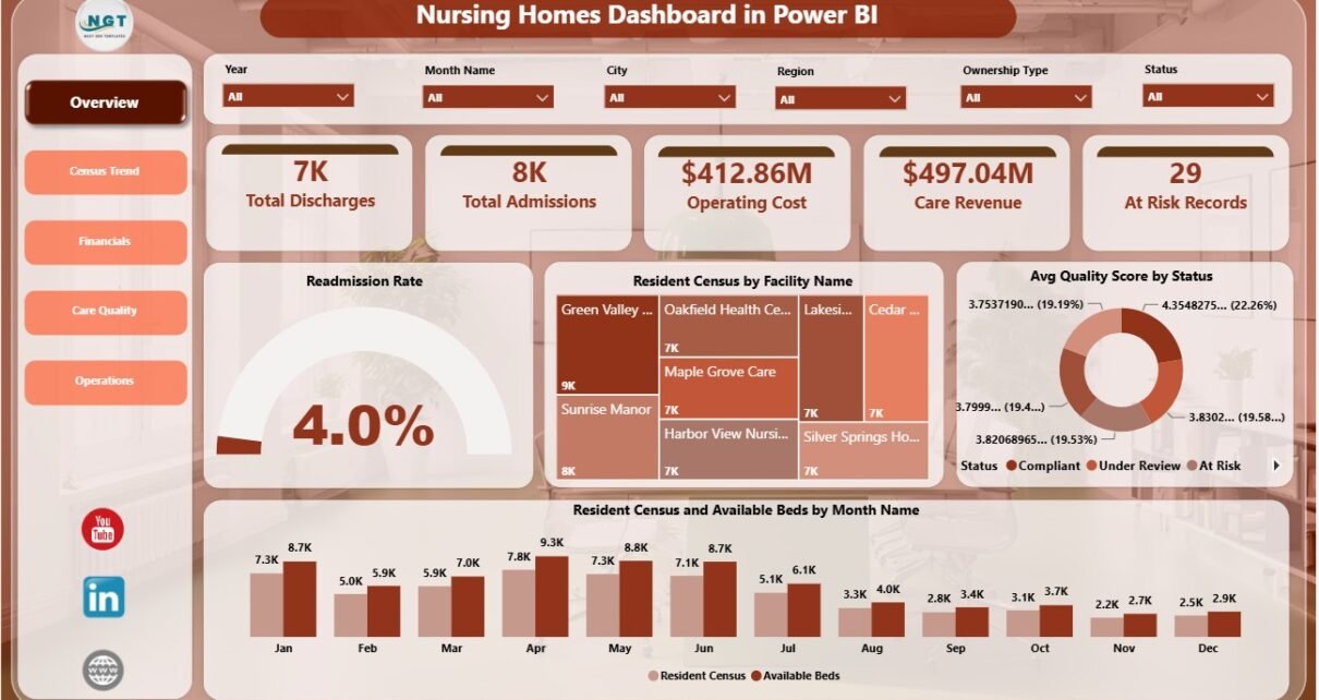
Nursing Homes Dashboard in Power BI is a ready-to-use reporting template for long-term care administrators, nursing home operators, healthcare analysts, finance teams, and care quality managers who need a clear view of admissions, discharges, census, beds, revenue, operating cost, readmissions, quality, satisfaction, and at-risk records. Nursing homes often review these measures in separate files, which makes monthly performance review slow and inconsistent. This Power BI dashboard brings the most important operational, financial, and care quality signals into one structured report.
The report includes 5 Power BI pages, 5 high-level KPI cards, multiple slicers, and 16 focused visuals. Users can review the Overview page for a leadership snapshot, then move into Census Trend, Financials, Care Quality, and Operations for detailed analysis.
Click here to purchase Nursing Homes Dashboard in Power BI
Nursing Homes Dashboard in Power BI
Key Features of Nursing Homes Dashboard in Power BI
- 5 Power BI report pages: Overview Page, Census Trend, Financials, Care Quality, and Operations.
- 5 KPI cards: Total Discharges, Total Admissions, Operating Cost, Care Revenue, and At Risk Records.
- Interactive slicers: Filter the dashboard quickly during review meetings.
- Healthcare-specific metrics: Track readmissions, resident census, available beds, occupancy rate, quality score, satisfaction score, net operating margin, and more.
- Editable Power BI file: Customize visuals, relationships, measures, page names, fields, and formatting in Power BI Desktop.
- Management-ready layout: Designed for census planning, financial review, care quality meetings, and operations monitoring.
Dashboard Pages Explanation
1. Overview Page
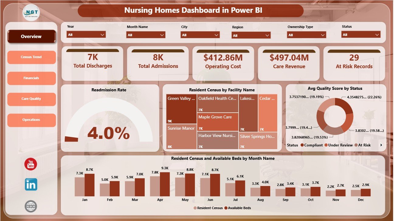
The Overview Page shows the main management summary. At the top, the cards display Total Discharges, Total Admissions, Operating Cost, Care Revenue, and At Risk Records so leaders can understand the current position quickly.
Readmission Rate by Status: This chart compares readmission rate across resident status groups. It helps care teams identify where follow-up or discharge planning may need more attention.
Resident Census by Facility Name: This visual compares resident volume across facilities. It helps administrators spot which locations are carrying higher resident load.
Avg Quality Score by Status: This chart reviews care quality by status group. It helps quality managers see whether certain resident groups need a deeper review.
Resident Census and Available Beds by Month Name: This chart compares resident census with available beds over time. It helps leadership monitor capacity pressure month by month.
Overview Page
2. Census Trend
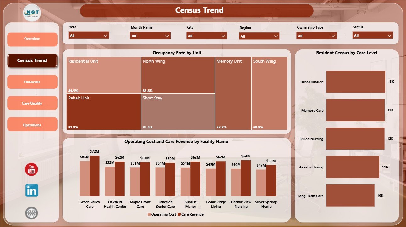
The Census Trend page focuses on resident volume, care level mix, occupancy, and facility-level financial balance.
Occupancy Rate by Unit: This chart compares occupancy rate across units. It helps teams find units that are underused, full, or moving toward capacity limits.
Resident Census by Care Level: This view shows how residents are distributed across care levels. It helps leaders understand service intensity and resident mix.
Operating Cost and Care Revenue by Facility Name: This chart compares cost and revenue by facility. It helps finance leaders see where the operating balance is strong or under pressure.
Census Trend
3. Financials
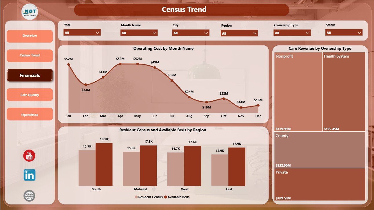
The Financials page helps users review cost movement, revenue by ownership, and regional capacity.
Operating Cost by Month Name: This chart tracks operating cost across months. It helps teams identify rising cost periods and compare monthly spending patterns.
Care Revenue by Ownership Type: This chart compares care revenue by ownership model. It supports ownership-level review and financial benchmarking.
Resident Census and Available Beds by Region: This visual compares regional resident demand with bed capacity. It helps leadership plan capacity and regional priorities.
Financials
4. Care Quality
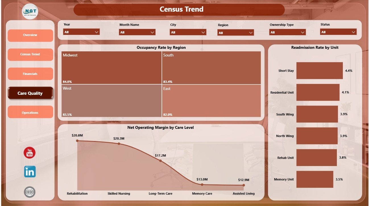
The Care Quality page connects occupancy pressure, unit-level readmission performance, and margin by care level.
Occupancy Rate by Region: This chart compares occupancy by region. It helps teams understand where resident load may be creating operational pressure.
Readmission Rate by Unit: This chart compares readmission rate across units. It helps care managers identify units that may need clinical process review.
Net Operating Margin by Care Level: This chart compares margin by care level. It helps finance and operations teams understand which care levels are contributing stronger or weaker returns.
Care Quality
5. Operations
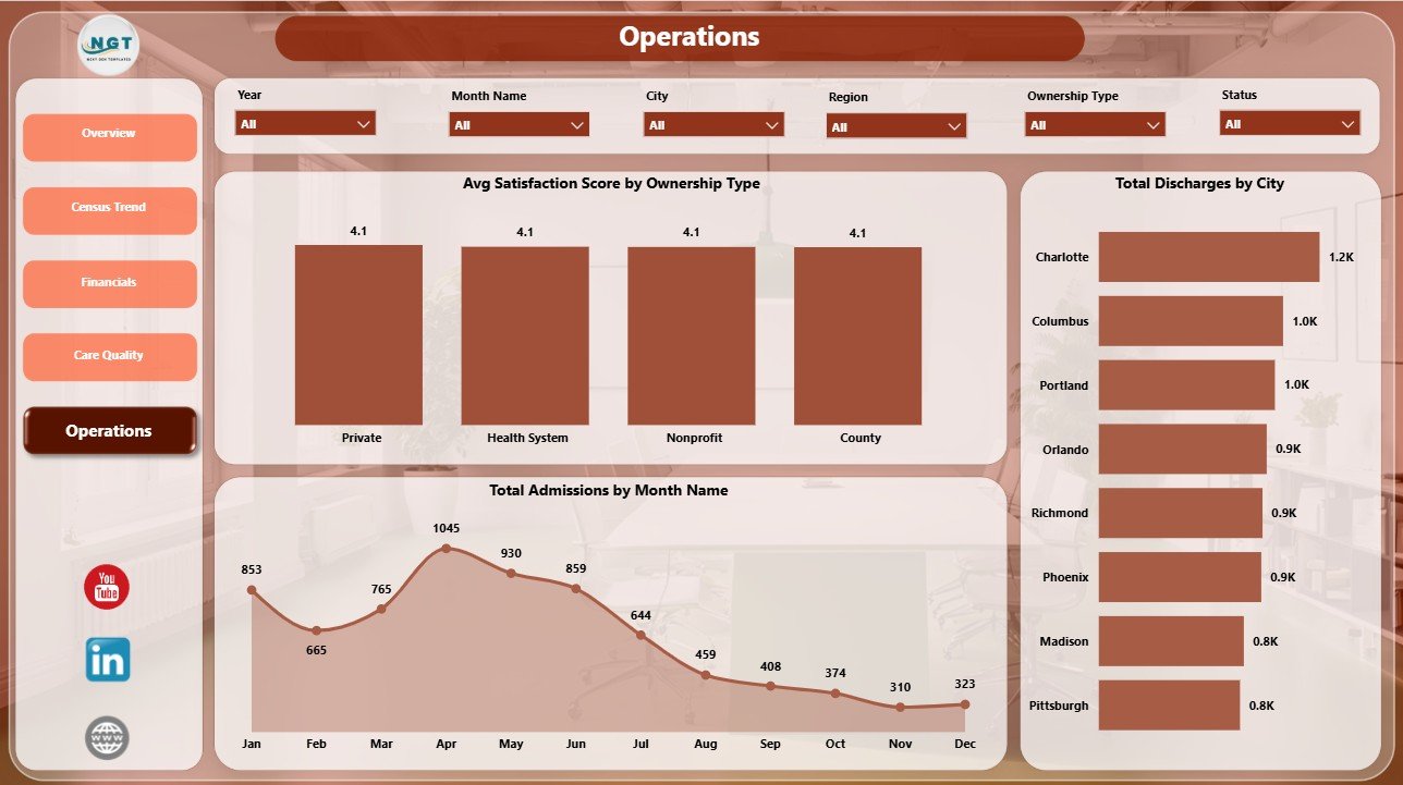
The Operations page supports review of satisfaction, city-level discharges, and monthly admission demand.
Avg Satisfaction Score by Ownership Type: This chart compares resident satisfaction across ownership types. It helps leaders connect resident experience with ownership-level performance.
Total Discharges by City: This visual shows discharge volume by city. It helps operations teams understand where resident flow is highest.
Total Admissions by Month Name: This chart tracks monthly admission volume. It helps facilities plan staffing, beds, and operating capacity around demand patterns.
Operations
Nursing Homes Dashboard in Power BI vs. Tableau vs. Paid CRM/SaaS – Feature Comparison
| Feature | Nursing Homes Dashboard in Power BI | Tableau or Qlik Alternative | Paid Healthcare SaaS |
|---|---|---|---|
| Cost | $17.99 one-time template purchase | BI license and custom build cost | Recurring subscription |
| Platform | Power BI Desktop and Power BI Service | Separate BI platform | Vendor-hosted software |
| Setup time | Open .pbix and replace sample data | Report rebuild usually required | Vendor onboarding |
| Real-time team collaboration | Available after publishing to Power BI Service | Available by plan | Usually included |
| Mobile access | Available through Power BI apps | Available by plan | Usually included |
| Customizable fields | Editable model, visuals, measures, and pages | Editable with BI skills | Often limited by vendor setup |
| Share with link | Supported through Power BI permissions | Supported by platform permissions | Usually account-based |
| Year-1 cost at 5 users | $17.99 plus any Microsoft licensing | Often hundreds or thousands | Often thousands per year |
| Nursing home analysis | Built for census, admissions, discharges, cost, revenue, readmissions, quality, satisfaction, and margin | Must be built or adapted | Depends on purchased modules |
Who Should Use This Template
This dashboard is useful for nursing home administrators, regional directors, healthcare finance analysts, quality managers, operations leaders, facility owners, and Power BI consultants who prepare recurring nursing home performance reports. It is best for teams that already export or maintain structured data and want a practical Power BI reporting layer.
It is not a replacement for an EHR, EMR, resident record system, billing system, payroll system, or HIPAA compliance platform. Use it as an analytics dashboard after your data is prepared for reporting.
Real-World Use Cases
Facility administrator: Reviews admissions, discharges, resident census, available beds, and at-risk records before weekly operations meetings.
Care quality manager: Uses readmission rate, quality score, occupancy rate, and satisfaction score to prepare care review discussions.
Finance lead: Compares operating cost, care revenue, and net operating margin by month, ownership type, facility, region, and care level.
Advantages of Nursing Homes Dashboard in Power BI
- It centralizes census, finance, quality, and operations analysis in one Power BI report.
- It helps leaders move from raw exports to visual review pages.
- It supports fast filtering with slicers during meetings.
- It can be customized in Power BI Desktop.
- It avoids a separate dashboard subscription for teams that only need a template-based reporting layer.
Opportunities for Improvement
Advanced users can extend the dashboard with automated data refresh, Power Query cleaning steps, role-level security, custom DAX measures, additional targets, and Power BI Service scheduled refresh. Teams with strict privacy requirements should review internal data handling and permissions before publishing any resident-related dashboard.
Best Practices
- Keep facility, region, city, unit, ownership type, care level, status, and month values consistent.
- Validate admissions, discharges, census, revenue, cost, and readmission fields before refresh.
- Review Overview first, then use supporting pages for deeper analysis.
- Use slicers to isolate one facility, region, unit, or ownership type before making conclusions.
- For users new to Power BI Desktop, review Microsoft Learn’s official guidance: Get started with Power BI Desktop.
Explore Relevant Templates
- Nursing Homes KPI Dashboard in Power BI
- Nursing Homes Dashboard in Excel
- Medical Tourism Dashboard in Power BI
- Healthcare Services Dashboard in Google Sheets
- Browse more Power BI Dashboard templates
Frequently Asked Questions
What is the Nursing Homes Dashboard in Power BI?
It is a Power BI dashboard template for reviewing nursing home admissions, discharges, operating cost, care revenue, resident census, available beds, occupancy, readmissions, quality, satisfaction, and margin.
How many pages are included?
The report includes 5 pages: Overview Page, Census Trend, Financials, Care Quality, and Operations.
Can I use my own data?
Yes. Replace or connect the sample source in Power BI Desktop, then refresh the report.
Does this replace nursing home management software?
No. It is a reporting template, not an EHR, billing system, payroll system, or resident record system.
Can I customize the dashboard?
Yes. You can edit visuals, pages, measures, filters, relationships, labels, colors, and data connections in Power BI Desktop.
Do I need Power BI Desktop?
Yes. Power BI Desktop is needed to open and edit the .pbix file.
About the Author
Built by PK – Microsoft Certified Professional with 15+ years of Excel, Google Sheets, and Power BI experience. Founder of NextGenTemplates, reaching 300K+ subscribers across YouTube channels. Every template is hand-built and tested before release.
Conclusion
The Nursing Homes Dashboard in Power BI gives long-term care teams a structured way to review admissions, discharges, census, beds, care revenue, operating cost, readmissions, quality, satisfaction, occupancy, and margin in one editable Power BI report. It is a practical fit for teams that want faster reporting without starting a full dashboard build from scratch.
Click here to purchase Nursing Homes Dashboard in Power BI
Visit our YouTube channel to learn step-by-step Excel, Power BI, and dashboard tutorials.