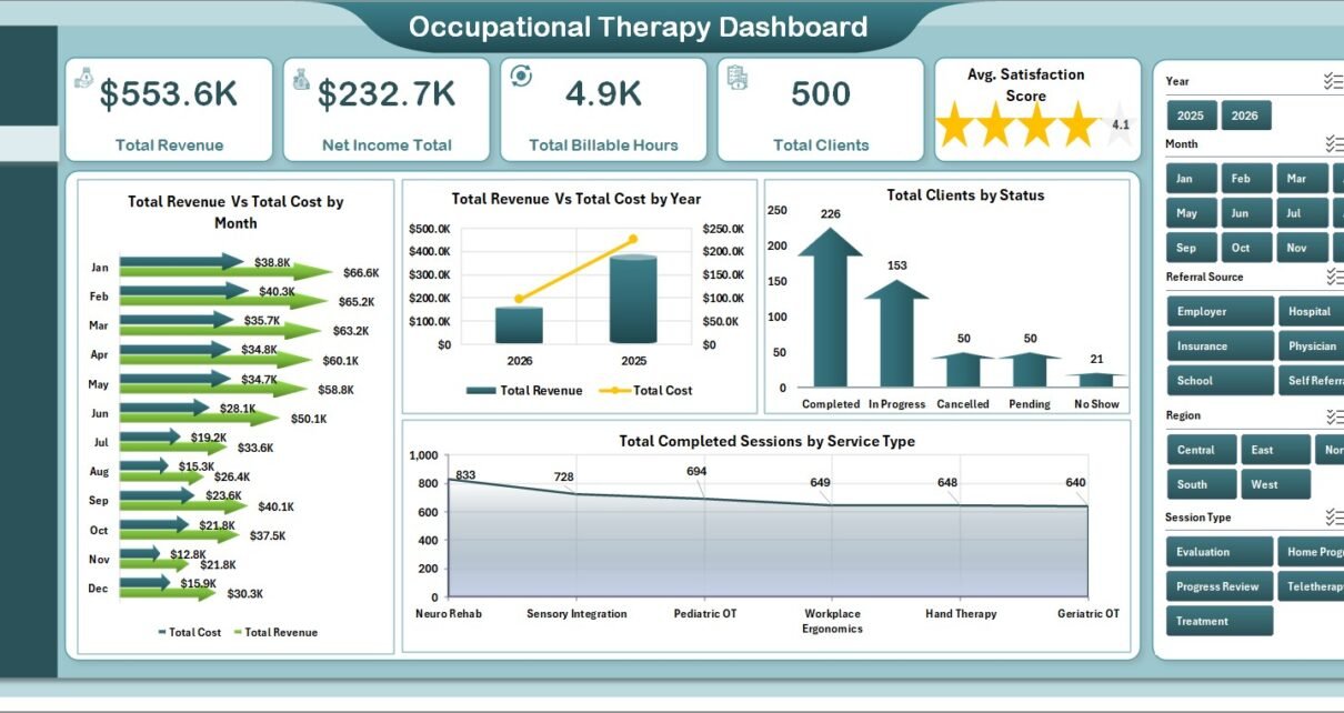
Occupational Therapy Dashboard in Excel helps therapy clinics review revenue, cost, billable hours, clients, therapist performance, service delivery, and operations from one editable workbook. Occupational therapy teams often manage a mix of clinical, operational, and financial data: sessions completed, referral sources, service types, diagnosis categories, satisfaction scores, priorities, discharge status, and billable hours. When these numbers sit in separate files, managers spend more time preparing reports than acting on them.
This Excel dashboard solves that reporting gap with 5 dashboard pages, 5 executive KPI cards, 18 chart views, interactive slicers, a structured Data sheet, and a Support sheet powered by pivot tables. Instead of rebuilding charts manually, you update the data table, click Refresh All from the Excel Data tab, and review the refreshed dashboard pages.
Click here to download the Occupational Therapy Dashboard in Excel.
Key Features of Occupational Therapy Dashboard in Excel
This template is built for practical reporting, not for replacing your clinical system. The purpose is to give therapy leaders a clean reporting layer where the most important business and care delivery numbers are easier to review.
- 5 dashboard pages: Overview, Care Trends, Therapist, Services, and Operations.
- 5 KPI cards: Total Revenue, Net Income Total, Total Billable Hours, Total Clients, and Avg. Satisfaction Score.
- 18 chart views: Analyze revenue, cost, completed sessions, therapist performance, client sources, diagnosis mix, region, discharge status, and priority.
- Multiple slicers: Apply filters quickly and view the dashboard for specific periods, clinics, therapists, service groups, or categories.
- Data sheet: Add occupational therapy records in a structured table format.
- Support sheet: Pivot tables drive the dashboard dynamically and can be kept hidden after setup.
- Excel workflow: Works inside Microsoft Excel, so users can customize formulas, pivots, charts, and formatting when needed.
Dashboard Pages Explanation
1 – Overview Page
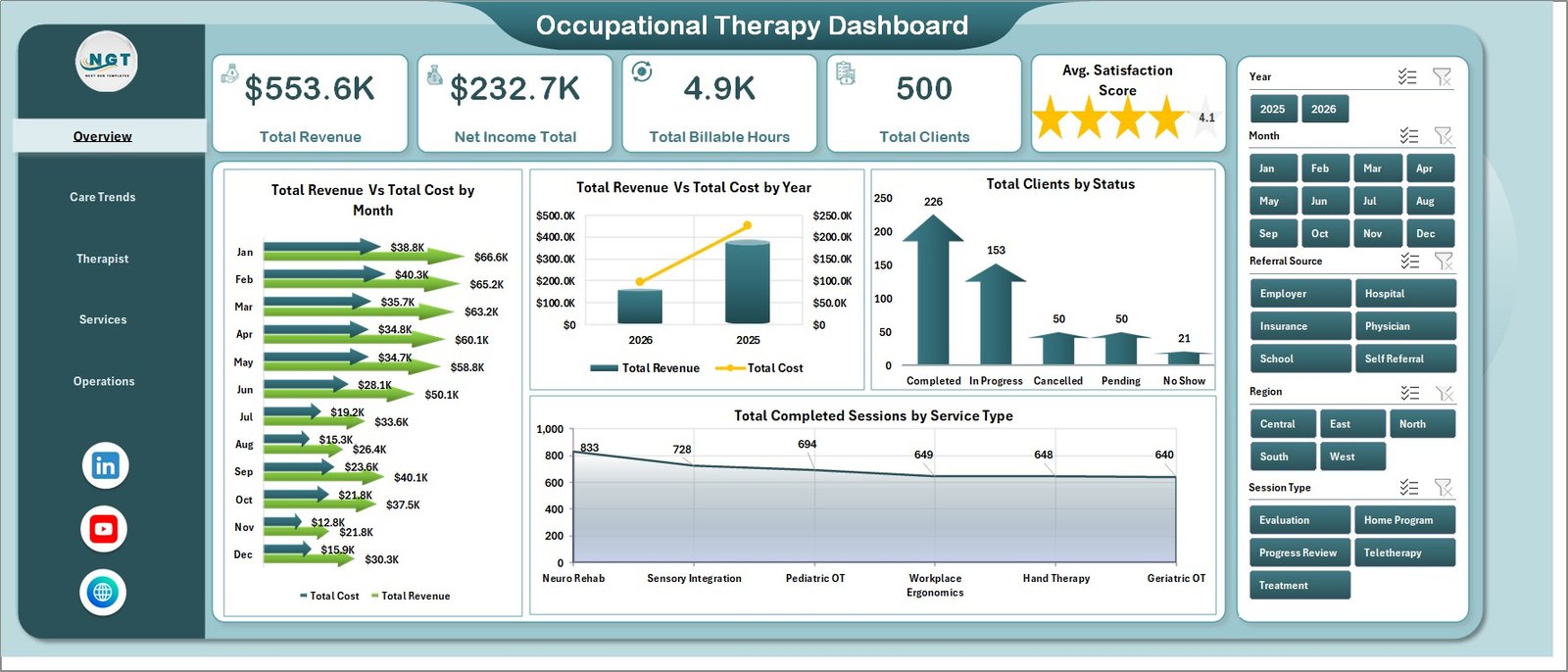
The Overview Page is the main leadership view. At the top, it shows Total Revenue, Net Income Total, Total Billable Hours, Total Clients, and Avg. Satisfaction Score. These cards give a fast health check before users move into detailed analysis.
Total Revenue and Total Cost by Month compares monthly income and expense movement. It helps the clinic identify periods where cost growth is outpacing revenue growth.
Total Revenue and Total Cost by Year supports annual comparison. It is useful for reviewing longer-term growth, budgeting, and financial planning.
Total Clients by Status shows the client pipeline by status. Managers can see active, completed, pending, or other status groups without opening the raw data.
Total Completed Sessions by Service Type highlights which occupational therapy services are being delivered most often. This can guide staffing, scheduling, and service planning.
2 – Care Trends
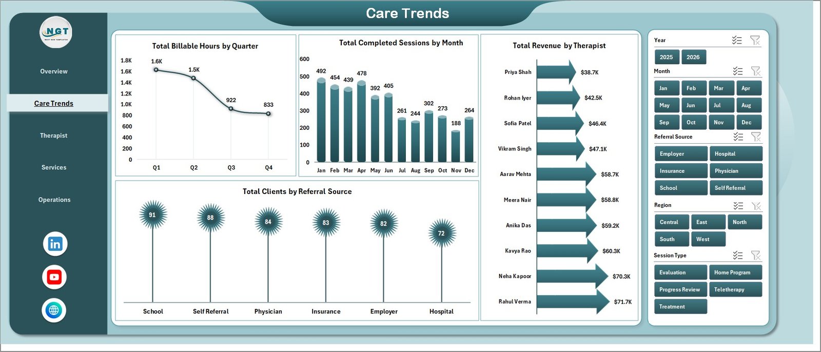
The Care Trends page focuses on time-based service activity and referral analysis. It is helpful for understanding demand patterns, therapist contribution, and client acquisition sources.
Total Billable Hours by Quarter helps clinics see quarterly workload and revenue potential. It is useful when reviewing staffing needs across the year.
Total Completed Sessions by Month shows service delivery movement month by month. If completed sessions decline, managers can investigate scheduling, cancellations, or referral volume.
Total Revenue by Therapist compares revenue contribution by therapist. This view can support workload balancing, productivity review, and performance discussions.
Total Clients by Referral Source shows which sources bring clients into the clinic. Teams can use it to evaluate physician referrals, online leads, partnerships, or other acquisition channels.
3 – Therapist
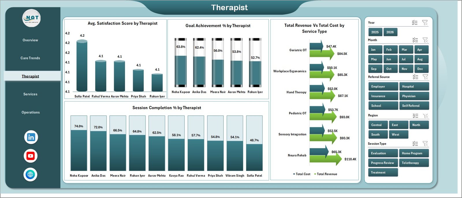
The Therapist page gives a provider-focused view of quality, outcome, financial, and completion indicators. It is useful for managers who need to coach therapists and review service consistency.
Avg. Satisfaction Score by Therapist compares client satisfaction across therapists. It helps identify strong performers and areas where the client experience may need attention.
Goal Achievement % by Therapist measures outcome progress by provider. This is valuable for therapy leaders who track care plan effectiveness.
Total Revenue and Total Cost by Service Type connects the service mix with financial performance. Users can see which service types create higher revenue and which carry higher costs.
Session Completion % by Therapist highlights completion rates by therapist. Lower completion percentages can point to scheduling issues, cancellations, or follow-up gaps.
4 – Services
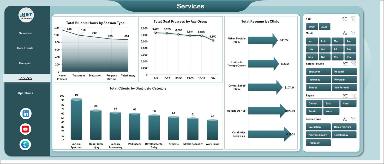
The Services page helps managers understand how therapy services are distributed across session types, age groups, clinics, and diagnosis categories.
Total Billable Hours by Session Type shows how time is being spent across different visit types. This helps teams plan capacity and understand revenue drivers.
Total Goal Progress by Age Group compares progress across client age bands. It can help identify whether certain groups need different program planning or review.
Total Revenue by Clinic compares revenue across clinic locations. Multi-location teams can use this to spot strong and weak revenue centers.
Total Clients by Diagnosis Category explains the client mix by diagnosis group. This helps with staffing skills, treatment planning, and service specialization.
5 – Operations
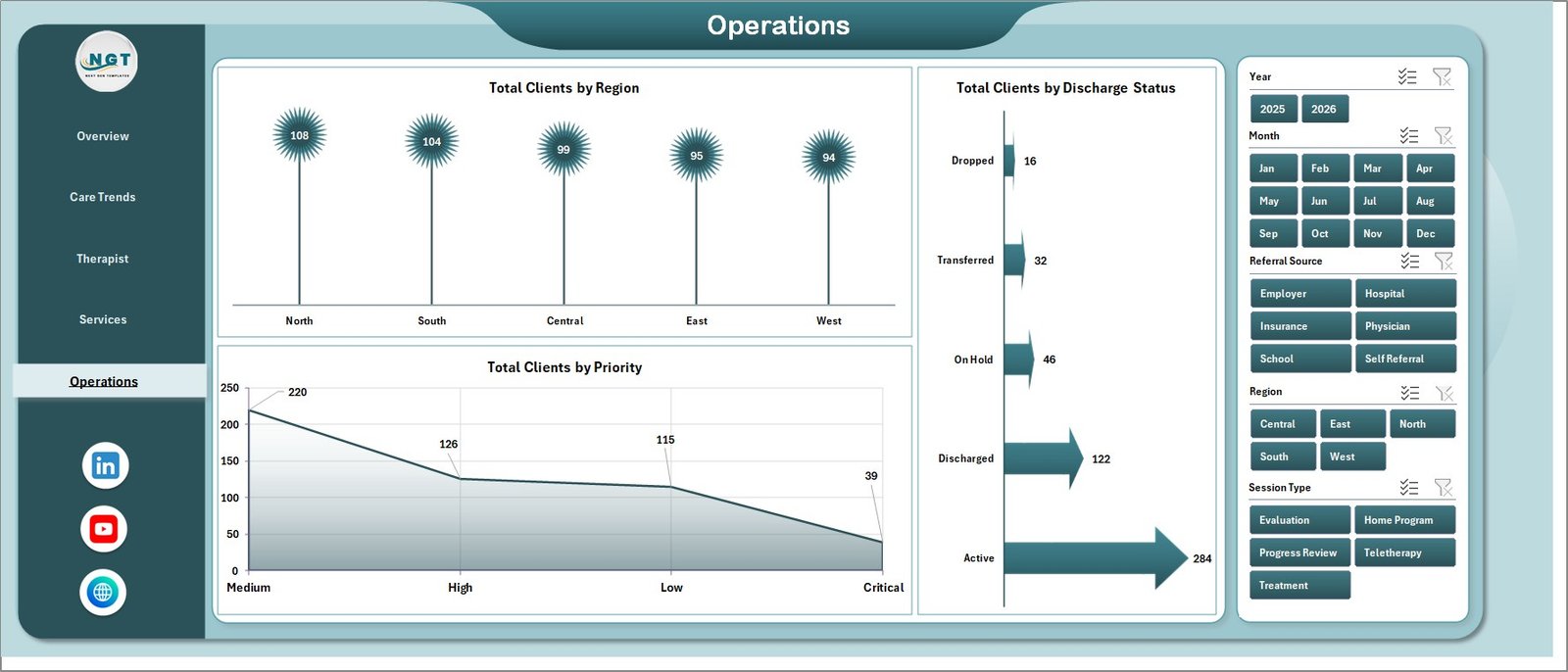
The Operations page is designed for day-to-day management review. It focuses on client distribution, discharge status, and priority.
Total Clients by Region shows where clients are located. This can support outreach planning, territory review, and regional demand analysis.
Total Clients by Discharge Status helps teams monitor client movement through care. It can show how many clients are discharged, active, transferred, or still in progress.
Total Clients by Priority highlights workload urgency. Managers can use this view to review high-priority cases and ensure attention is going where it is needed.
6 – Data Sheet Tab
The Data sheet is where users enter or paste occupational therapy data. Keep the same table format so the dashboard calculations, pivot tables, and charts continue to work correctly. After updating data, use the Refresh All command in Excel.

7 – Support Sheet Tab
The Support sheet contains the pivot tables that power the dashboard. Once the Data sheet is updated, go to the Excel Ribbon, open the Data tab, and click Refresh All. The pivots and dashboard charts will refresh together. This sheet can be hidden to keep the workbook cleaner for end users.

Occupational Therapy Dashboard in Excel vs. Google Sheets vs. Paid CRM/SaaS – Feature Comparison
| Feature | Occupational Therapy Dashboard in Excel | Google Sheets alternative | Paid healthcare SaaS |
|---|---|---|---|
| Cost | One-time template purchase | Free to build, but requires setup time | Monthly or annual subscription |
| Platform | Microsoft Excel | Google Sheets | Vendor-hosted cloud system |
| Setup time | Replace data and refresh pivots | Build formulas, pivots, charts, and layout manually | Implementation and onboarding |
| Real-time team collaboration | Available with OneDrive or SharePoint workflow | Native collaboration | Usually included |
| Mobile access | Limited by Excel mobile experience | Available through Google Sheets app | Usually included |
| Customizable fields | Editable workbook, charts, pivots, and formulas | Editable, but requires dashboard design work | Often limited by vendor settings |
| Share with link | Possible through OneDrive or SharePoint | Native sharing | Vendor-specific |
| Year-1 cost at 5 users | Template price plus Microsoft Excel access | No template cost, but higher build time | Often hundreds or thousands per year |
| Pivot refresh workflow | Built in with Refresh All | Requires manual setup | Handled by vendor |
| Clinical record management | Not included | Not included | May be included depending on system |
Who Should Use This Template
This dashboard is best for occupational therapy clinics, therapy managers, finance teams, billing coordinators, operations managers, and healthcare analysts who already have structured data and need a clean reporting workbook. It is especially useful for teams that want a one-time purchase Excel solution instead of a recurring reporting subscription.
It is not designed to replace an EHR, practice management system, scheduling system, billing platform, or clinical documentation workflow. It should be used as an analytics and reporting layer for exported or manually maintained data.
Real-World Use Cases
Clinic owner: Reviews Total Revenue, Net Income, Billable Hours, Total Clients, and Satisfaction Score before a weekly performance meeting.
Therapy manager: Compares therapist satisfaction, goal achievement, and session completion to identify coaching opportunities.
Billing coordinator: Checks billable hours, completed sessions, service type, and clinic revenue before monthly reporting.
Operations lead: Uses priority, discharge status, and regional client charts to plan workload and follow-up actions.
Advantages of Occupational Therapy Dashboard in Excel
- It centralizes financial, service, therapist, client, and operations reporting in one workbook.
- It uses familiar Excel features, so teams can edit and extend the template.
- It includes slicers, pivots, and charts, reducing manual reporting work.
- It separates raw data from dashboard views, keeping reporting cleaner.
- It works well for small and mid-sized therapy practices that need practical reporting without a large software rollout.
Opportunities for Improvement
The template is intentionally built as an Excel analytics file. Advanced users could extend it by connecting the Data sheet to exported EHR reports, adding Power Query cleanup steps, building role-specific dashboard pages, or creating a separate monthly management summary. Teams with very large datasets may also consider moving the model into Power BI for stronger refresh, sharing, and data modeling options.
Best Practices
- Keep the Data sheet column names and structure consistent.
- Refresh all pivots after every data update.
- Review slicer selections before interpreting dashboard numbers.
- Validate revenue, cost, and billable hour fields before management meetings.
- Keep the Support sheet hidden for regular users, but do not delete it.
- Use consistent naming for therapists, clinics, service types, and diagnosis categories.
- Store a backup copy before making structural changes to pivots or formulas.
Explore Relevant Templates
You may also find these templates useful: Occupational Therapy KPI Dashboard in Excel, Nursing Homes Dashboard in Power BI, Senior Living KPI Scorecard in Excel, and Service Booking Data Entry System in Excel.
For Microsoft guidance on Excel tables, pivots, and analysis features, visit Microsoft Excel Support.
Frequently Asked Questions
What is the Occupational Therapy Dashboard in Excel?
It is an Excel dashboard template for reviewing occupational therapy revenue, cost, billable hours, clients, satisfaction, therapist performance, services, and operations.
How many dashboard pages are included?
The workbook includes 5 dashboard pages: Overview, Care Trends, Therapist, Services, and Operations. It also includes a Data sheet and a Support sheet.
Can I add my own occupational therapy data?
Yes. Replace the sample rows in the Data sheet while keeping the same table structure, then refresh the workbook.
How do I refresh the dashboard?
Go to the Excel Ribbon, open the Data tab, and click Refresh All. This refreshes the pivot tables and connected charts.
Can I customize the workbook?
Yes. You can edit charts, pivots, formulas, colors, fields, and dashboard layout in Microsoft Excel.
Is this dashboard a clinical management system?
No. It is a reporting dashboard and does not replace EHR, billing, scheduling, documentation, or compliance software.
Can I hide the Support sheet?
Yes. The Support sheet can be hidden after setup, but it should not be deleted because it powers the dashboard.
About the Author
Built by PK – Microsoft Certified Professional with 15+ years of Excel, Google Sheets, and Power BI experience. Founder of NextGenTemplates, reaching 300K+ subscribers across YouTube channels. Every template is hand-built and tested before release.
Conclusion
The Occupational Therapy Dashboard in Excel gives therapy teams a practical way to review revenue, cost, billable hours, clients, satisfaction, therapist performance, services, and operations without building a dashboard from scratch. With structured data, slicers, pivot tables, and multiple dashboard pages, it turns routine therapy data into a management-ready reporting workbook.
Download the Occupational Therapy Dashboard in Excel from NextGenTemplates.
Visit our YouTube channel to learn step-by-step Excel dashboard tutorials.


