Nightclubs Dashboard in Power BI is a ready-to-use Power BI dashboard template for nightclub owners, venue managers, event promoters, finance teams, and hospitality analysts who need a cleaner way to review club performance. The report includes 5 Power BI pages, 5 executive KPI cards, 16 chart views, and multiple slicers for fast filtering. Instead of checking table sales, bar sales, revenue, cost, capacity, attendance, incidents, and promoter performance in separate files, this dashboard brings the key nightclub metrics into one interactive .pbix report.
Nightclub reporting is often spread across POS exports, reservation logs, promoter sheets, capacity records, event calendars, and finance summaries. A Power BI dashboard helps turn those rows into a visual report that can be filtered by month, region, city, club, event type, promoter, music genre, customer segment, and status. Click here to view the Nightclubs Dashboard in Power BI product draft.
Key Features of Nightclubs Dashboard in Power BI
- 5 report pages: Overview Page, Revenue Trend, Event Analysis, Venue Ops, and Customer Mix.
- 5 KPI cards: Total Table Sales, Total Revenue, Total Cost, Net Profit, and Total Capacity.
- 16 chart views: Analyze revenue, cost, net profit, table sales, bar sales, guests, attendance, incidents, completion, city, region, club, promoter, music genre, and customer segment results.
- Interactive slicers: Filter the dashboard quickly during review meetings without rebuilding visuals.
- Editable .pbix file: Customize visuals, model fields, DAX measures, labels, colors, and report pages in Power BI Desktop.
- One-time download: Use the template as a reporting layer without signing up for a recurring dashboard subscription.
Dashboard Pages Explanation
1 – Overview Page
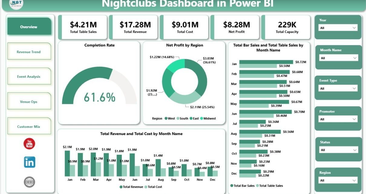
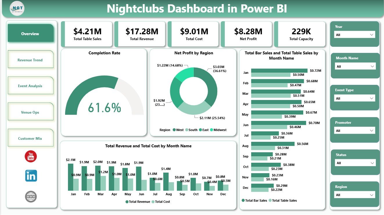
The Overview Page is the leadership summary of the report. The top cards show Total Table Sales, Total Revenue, Total Cost, Net Profit, and Total Capacity, so owners and managers can understand scale, cost pressure, profitability, and venue capacity in one screen.
Completion Rate by Overall Status: This chart shows how events or records are distributed by completion status. It helps managers see whether operations are completed, pending, cancelled, or delayed before follow-up.
Net Profit by Region: This visual compares profit contribution across regions. It helps multi-location operators identify where performance is strongest and where margin needs attention.
Total Bar Sales and Total Table Sales by Month Name: This chart compares two major revenue streams month by month. It shows whether bar revenue or premium table revenue is leading performance in each period.
Total Revenue and Total Cost by Month Name: This view places revenue beside cost over time. It helps users spot months where high revenue is being reduced by higher operating cost.
2 – Revenue Trend
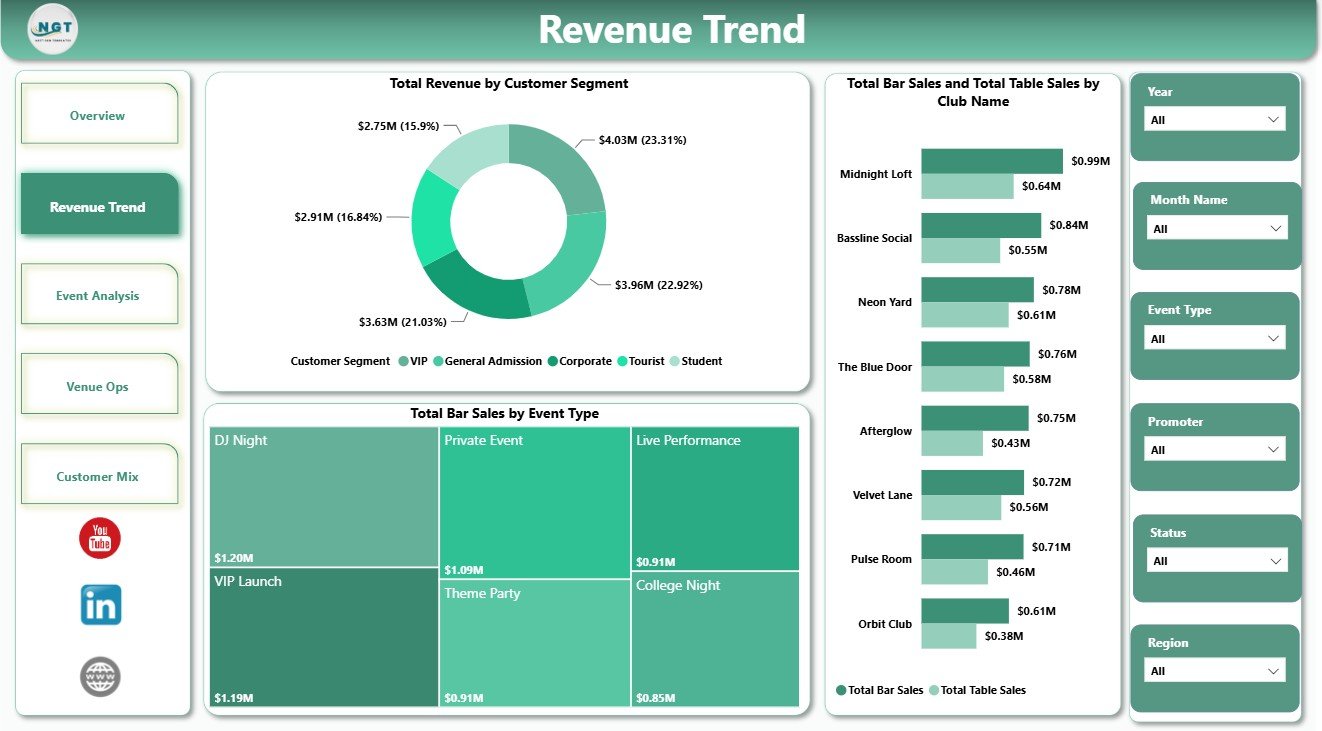
The Revenue Trend page focuses on revenue mix and sales drivers. It is useful for finance reviews, weekly owner meetings, and promoter discussions where the team needs to understand which segments, clubs, and event types are producing sales.
Total Revenue by Customer Segment: This chart breaks revenue down by customer segment. It helps identify whether VIP, regular, corporate, tourist, or other guest groups are driving sales.
Total Bar Sales and Total Table Sales by Club Name: This visual compares revenue mix across club locations or brands. It helps benchmark which clubs depend more on bar sales and which rely more on table sales.
Total Bar Sales by Event Type: This chart shows bar sales across event types. It helps promoters understand which event formats generate stronger bar performance.
3 – Event Analysis
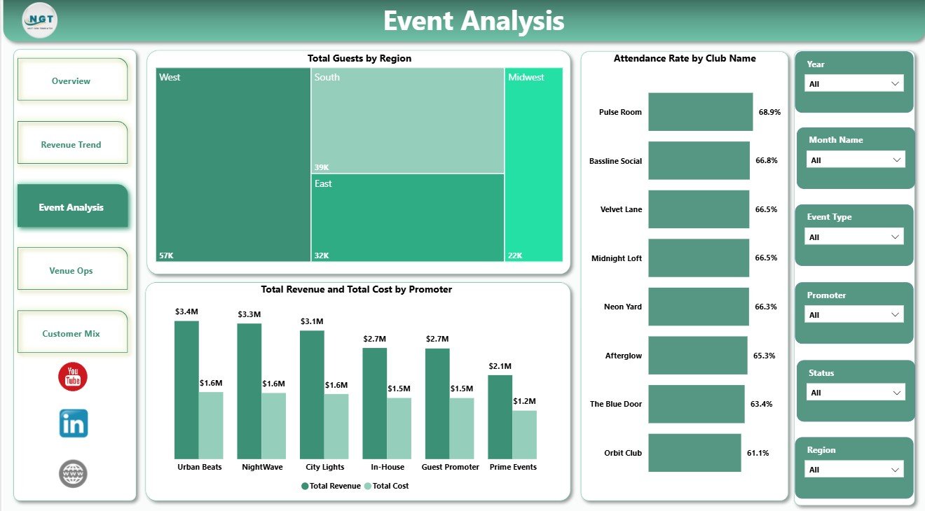
The Event Analysis page connects guest demand, location, promoter cost, and revenue results. It helps users evaluate whether events are commercially strong and whether promoter activity is producing healthy returns.
Total Guests by Region: This chart compares guest volume across regions. It helps identify where attendance demand is strongest and where marketing may need additional support.
Attendance Rate by Club Name: This visual benchmarks attendance rate by club. It helps operators understand which venues are using capacity well and which clubs may need stronger event planning.
Total Revenue and Total Cost by Promoter: This chart compares promoter-level revenue with promoter-level cost. It helps owners see which promoters create stronger value after costs are included.
4 – Venue Ops
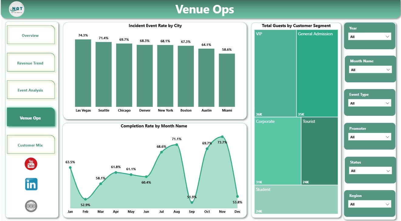
The Venue Ops page supports operational review. It moves beyond revenue and helps managers check incident patterns, guest mix, and completion consistency over time.
Incident Event Rate by City: This chart compares incident rates across cities. It helps operations teams identify locations that may need better staffing, crowd control, security planning, or service process review.
Total Guests by Customer Segment: This visual explains guest count by segment. It helps managers and marketers understand the audience mix attending club events.
Completion Rate by Month Name: This chart tracks completion performance by month. It helps identify months where event execution was less consistent.
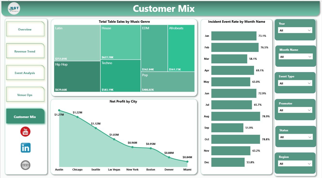
5 – Customer Mix
The Customer Mix page explains how genres, months, and cities contribute to table sales, incidents, and profit. It helps leaders connect entertainment programming with financial and operational outcomes.
Total Table Sales by Music Genre: This chart shows table sales by music genre. It helps event planners understand which genres support stronger premium table demand.
Incident Event Rate by Month Name: This visual tracks incident rate over time. It helps managers monitor safety and service pressure across the calendar.
Net Profit by City: This chart compares profit by city. It helps owners review which cities are producing the strongest financial contribution.
Nightclubs Dashboard in Power BI vs. Tableau vs. Paid CRM/SaaS – Feature Comparison
| Feature | Nightclubs Dashboard in Power BI | Tableau or Qlik alternative | Paid venue SaaS |
|---|---|---|---|
| Cost | $17.99 one-time sale price | License and build cost | Recurring subscription |
| Platform | Power BI Desktop and Power BI Service | Separate BI platform | Vendor cloud system |
| Setup time | Open .pbix and replace sample source | Build model and visuals | Implementation and onboarding |
| Real-time team collaboration | Available after publishing to Power BI Service | Available by plan | Usually included by plan |
| Mobile access | Available through Power BI apps after publishing | Available by plan | Usually included |
| Customizable fields | Editable visuals, model, DAX, labels, and report pages | Editable with BI skills | Depends on vendor permissions |
| Share with link | Available through Power BI permissions | Available by plan | Depends on seats and plan |
| Year-1 cost at 5 users | $17.99 plus any Microsoft licensing needed | Often hundreds or thousands | Often hundreds or thousands |
| Nightclub metrics | Revenue, cost, profit, table sales, bar sales, capacity, guests, attendance, incidents, promoters, clubs, cities, regions, genres, and customer segments | Must be built manually | Depends on purchased modules |
Who Should Use This Template
This dashboard is useful for nightclub owners, club general managers, venue operators, event promoters, hospitality finance teams, regional managers, entertainment analysts, and Power BI consultants who prepare performance reports for nightlife venues.
It is not a POS system, ticketing platform, reservation system, payroll tool, payment processor, live accounting system, or staff scheduling app. It works best when your club, event, sales, cost, and attendance data is already available in a structured source such as Excel, CSV, database tables, or exported operational reports.
Real-World Use Cases
Maya, nightclub owner: uses the Overview and Revenue Trend pages before weekly leadership meetings to check table sales, revenue, cost, net profit, capacity, and sales mix.
Dev, event promoter: reviews Event Analysis to compare guest demand by region, attendance rate by club, and revenue versus cost by promoter.
Arun, venue operations manager: checks Venue Ops and Customer Mix to track incidents, completion rate, guest segments, music genre table sales, and net profit by city.
Advantages of Nightclubs Dashboard in Power BI
- It brings financial, event, venue, and customer reporting into one Power BI report.
- It gives leaders a quick Overview Page and deeper pages for revenue, events, operations, and customer mix.
- It can be customized by users who know Power BI visuals, measures, relationships, and filters.
- It avoids recurring SaaS dashboard costs for teams that only need a report template.
- It supports filtered review meetings where owners and managers need fast answers.
Opportunities for Improvement
Advanced users can extend the model with Power Query connections, POS exports, reservation system data, marketing campaign cost, security staffing records, booking channels, and weekly refresh workflows. Teams that require live POS integration, automated ticketing, payment processing, payroll, table reservations, or customer messaging should use this dashboard alongside the dedicated systems that manage those workflows.
Best Practices
- Keep club, city, region, promoter, event type, music genre, and customer segment names consistent.
- Review revenue and cost together before judging performance.
- Use slicers in owner meetings to answer follow-up questions quickly.
- Check attendance rate and capacity together to understand venue utilization.
- Monitor incident rate by city and month so operational risk is not hidden behind revenue growth.
- Publish to Power BI Service only after reviewing permissions and data sensitivity.
For users new to Power BI, Microsoft provides official guidance here: Get started with Power BI Desktop.
Explore Relevant Templates
You may also like Nightclubs Dashboard in Excel, Music Festivals Dashboard in Power BI, and Micro Breweries Pubs Dashboard in Power BI. You can also browse all Power BI Dashboard templates.
Frequently Asked Questions
What does the Nightclubs Dashboard in Power BI track?
It tracks table sales, bar sales, total revenue, total cost, net profit, total capacity, total guests, attendance rate, completion rate, incident event rate, region, city, club name, promoter, event type, music genre, month, and customer segment.
Do I need Power BI Desktop?
Yes. You should open and edit the .pbix file in Power BI Desktop. Power BI Desktop is available from Microsoft.
Can I connect my own nightclub data?
Yes. Use Power BI’s Transform Data area to replace or connect the sample source, then refresh the model.
Can I customize the dashboard pages?
Yes. You can edit visuals, colors, fields, relationships, measures, filters, page names, and report layout if you are comfortable with Power BI.
Is this a full nightclub management system?
No. It is an analytics dashboard. It does not replace POS, ticketing, reservations, payroll, accounting, or staff scheduling systems.
Is this a subscription?
No. It is a one-time downloadable Power BI template from NextGenTemplates.
About the Author
Built by PK – Microsoft Certified Professional with 15+ years of Excel, Google Sheets, and Power BI experience. Founder of NextGenTemplates, reaching 300K+ subscribers across YouTube channels. Every template is hand-built and tested before release.
Conclusion
The Nightclubs Dashboard in Power BI gives nightclub teams a practical reporting layer for table sales, bar sales, revenue, cost, net profit, capacity, guests, attendance, incidents, promoters, club names, cities, regions, music genres, and customer segments. It is best for teams that already have structured data and want an editable Power BI report for faster performance review.
Click here to view the Nightclubs Dashboard in Power BI
Visit our YouTube channel for step-by-step Excel and Power BI tutorials: youtube.com/@PKAnExcelExpert