Quantum Computing Labs Dashboard in Excel helps research teams turn quantum experiment records into clear management reporting. Quantum labs often need to compare experiments, shots, runtime hours, fidelity scores, grant budget, cloud compute cost, cryogenic cost, error events, and published outputs at the same time. Instead of building a report from scratch, this Excel dashboard gives you structured pages for executive review, operations tracking, research output, platform quality, and budget control.
The dashboard is designed for users who already work in Microsoft Excel and want a practical reporting workbook. You can add data in the Data Sheet tab, refresh the workbook from the Excel Data ribbon, and review the updated pages with slicers and charts. For Excel refresh guidance, Microsoft also provides documentation for refreshing PivotTable data.
Quantum Computing Labs Dashboard in Excel
Key Features of Quantum Computing Labs Dashboard in Excel
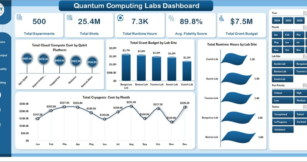
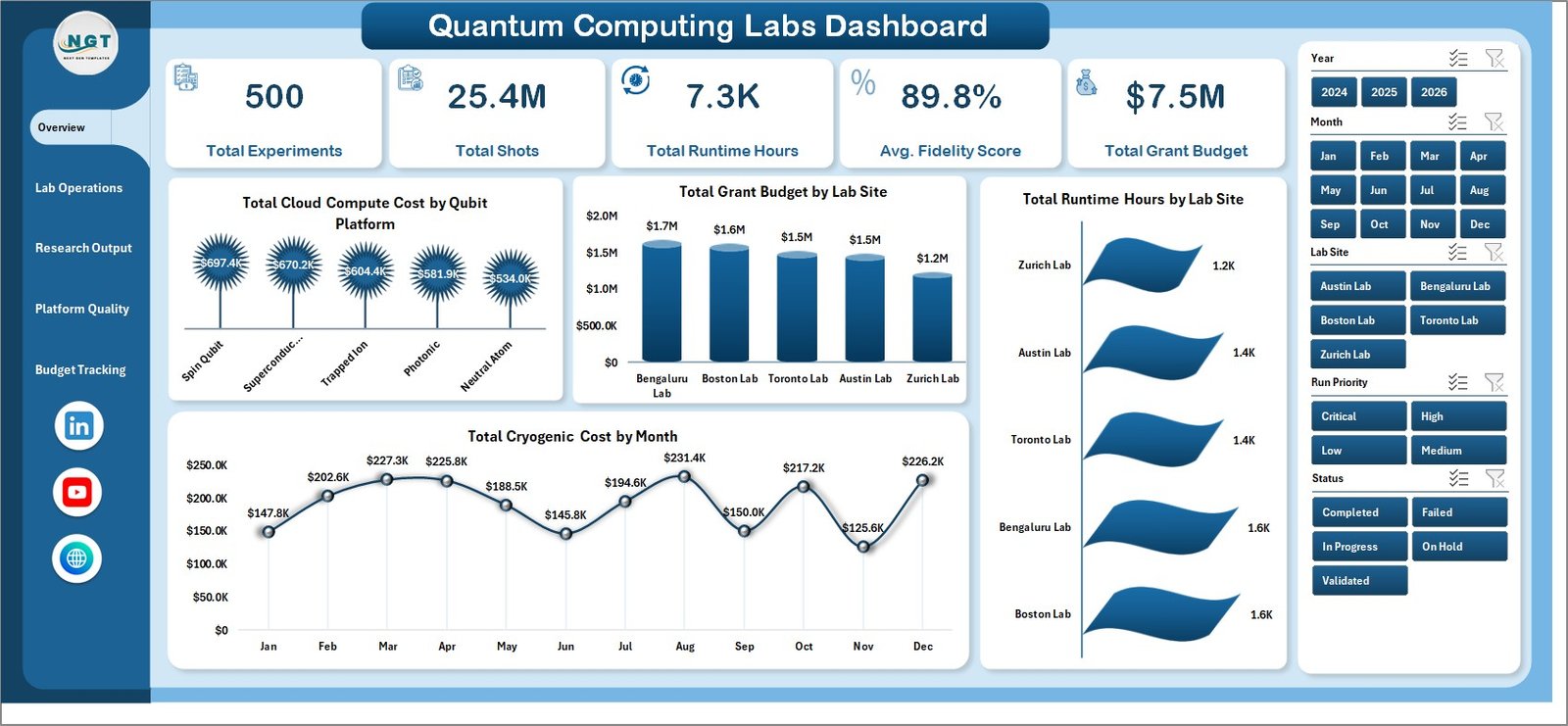
This workbook includes multiple dashboard pages, KPI cards, slicers, charts, a data input sheet, and a support sheet. The top-level cards show Total Experiments, Total Shots, Total Runtime Hours, Avg. Fidelity Score, and Total Grant Budget so leadership can quickly understand lab performance.
The dashboard pages are structured around the way quantum research teams work. Lab operations can review compute clusters, run priorities, research teams, and experiment status. Research leaders can review validation percentage, published outputs, fidelity by platform, and fidelity by experiment type. Platform teams can review error events and runtime, while finance or grant teams can review budget utilization and cost movement.
Dashboard Pages Explanation
Overview Page
The Overview Page is the main executive summary page. It includes high-level cards for Total Experiments, Total Shots, Total Runtime Hours, Avg. Fidelity Score, and Total Grant Budget.
Total Cloud Compute Cost by Qubit Platform: This chart compares cloud compute spending across qubit platforms. It helps teams identify which platforms are driving the largest compute cost.
Total Grant Budget by Lab Site: This view shows how grant budget is distributed across lab sites. It is useful for funding reviews and site-level budget comparison.
Total Runtime Hours by Lab Site: This chart compares runtime consumption by location. It helps leaders see which lab sites are using the most experiment time.
Total Cryogenic Cost by Month: This monthly chart tracks cryogenic spending trends. It helps teams spot cost increases and compare recent periods with earlier months.
Lab Operations
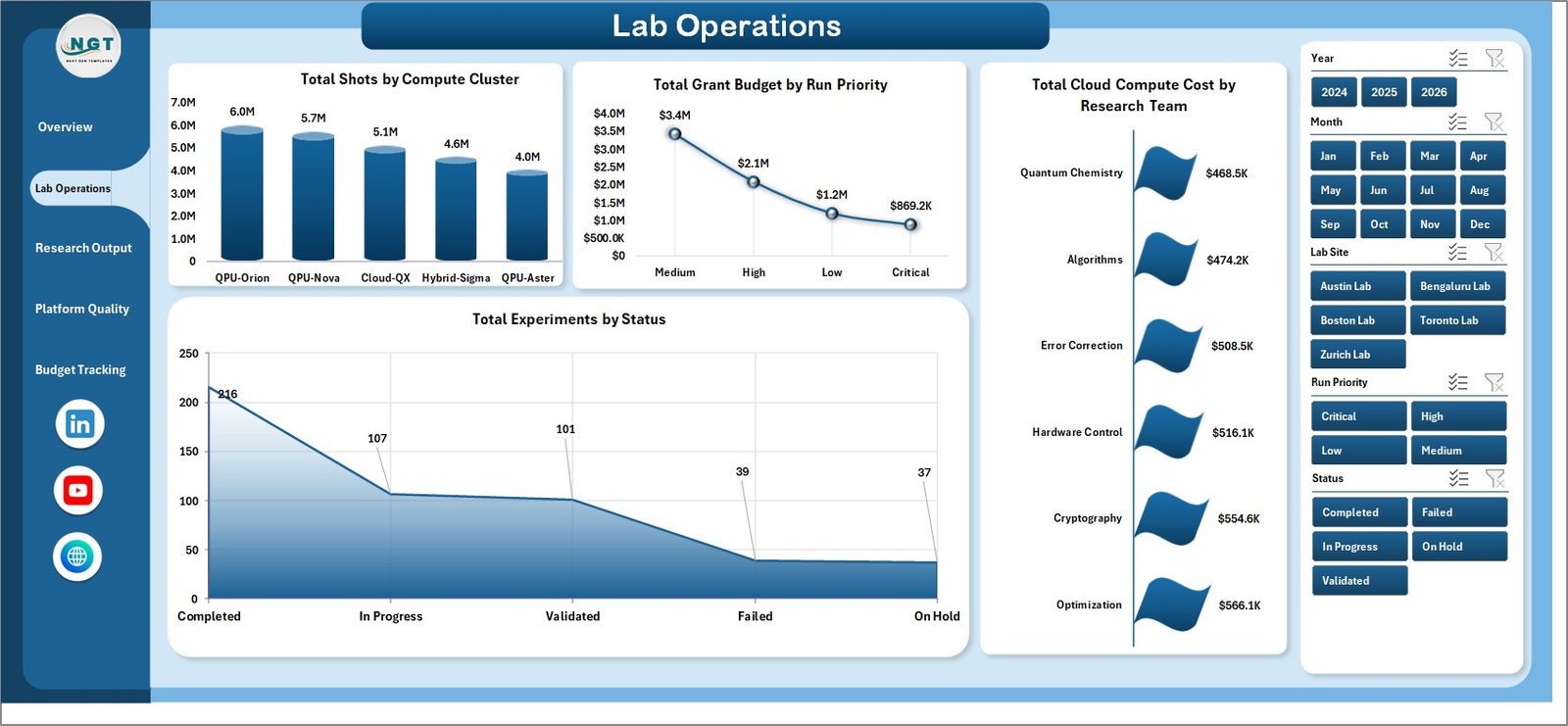
The Lab Operations sheet focuses on workload, team activity, and experiment execution status.
Total Shots by Compute Cluster: This chart shows how total shots are distributed across compute clusters. It helps identify the clusters handling the heaviest experiment volume.
Total Grant Budget by Run Priority: This analysis compares grant budget by priority level. It helps confirm whether high-priority runs are receiving appropriate funding attention.
Total Cloud Compute Cost by Research Team: This chart shows cloud cost by team. It helps operations and finance teams identify where compute spending is concentrated.
Total Experiments by Status: This chart summarizes experiments by their current status. It helps managers review completed, pending, failed, or active experiment work quickly.
Lab Operations
Research Output
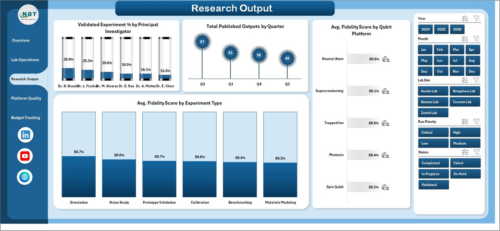
The Research Output page connects experiment execution with research quality and publication outcomes.
Validated Experiment % by Principal Investigator: This chart compares validation rate across principal investigators. It helps teams understand where experiment quality and review completion are strongest.
Total Published Outputs by Quarter: This quarterly view tracks published outputs over time. It helps research leaders connect lab activity with visible academic or commercial output.
Avg. Fidelity Score by Qubit Platform: This chart compares average fidelity across qubit platforms. It helps evaluate which platform is producing stronger experimental performance.
Avg. Fidelity Score by Experiment Type: This analysis compares fidelity by experiment type. It helps identify which categories of experiments are achieving better results.
Research Output
Platform Quality
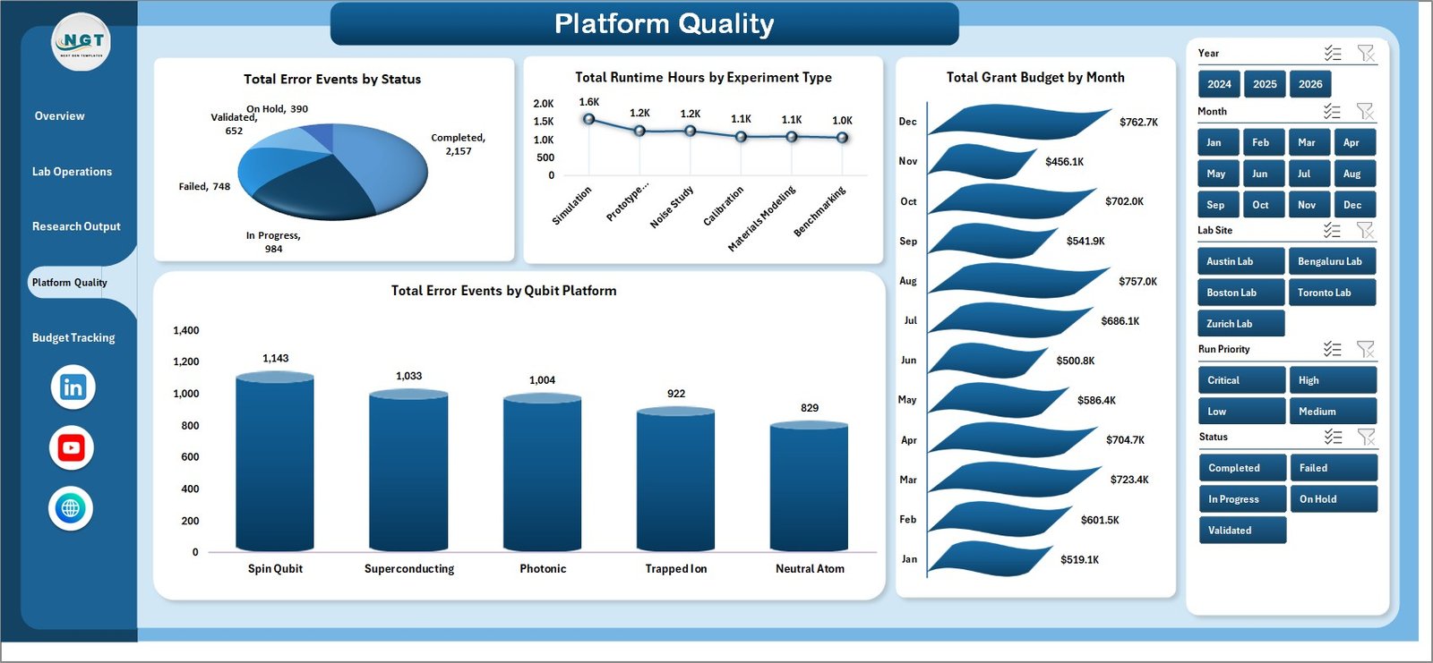
The Platform Quality page helps teams investigate reliability, errors, runtime usage, and funding movement.
Total Error Events by Status: This chart groups error events by status. It helps teams separate unresolved issues from closed or reviewed error events.
Total Runtime Hours by Experiment Type: This view compares runtime hours across experiment types. It helps reveal which experiment categories consume the most lab time.
Total Grant Budget by Month: This chart tracks grant budget across months. It helps program managers see budget timing and funding movement.
Total Error Events by Qubit Platform: This analysis compares error events by platform. It helps platform owners identify where reliability investigation may be needed.
Platform Quality
Budget Tracking
The Budget Tracking page gives finance, grant, and program teams a focused view of cost and utilization.
Budget Utilization % by Lab Site: This chart compares how much budget has been used by lab site. It helps identify sites that may be overusing or underusing available funds.
Total Experiments by Run Priority: This chart shows experiment count by priority. It helps teams compare operational activity against urgency or strategic importance.
Total Cloud Compute Cost by Lab Site: This view compares cloud compute cost across sites. It helps finance teams understand where cloud spending is concentrated.
Total Cryogenic Cost by Research Team: This chart compares cryogenic cost by team. It helps managers review specialized operating costs tied to research activity.
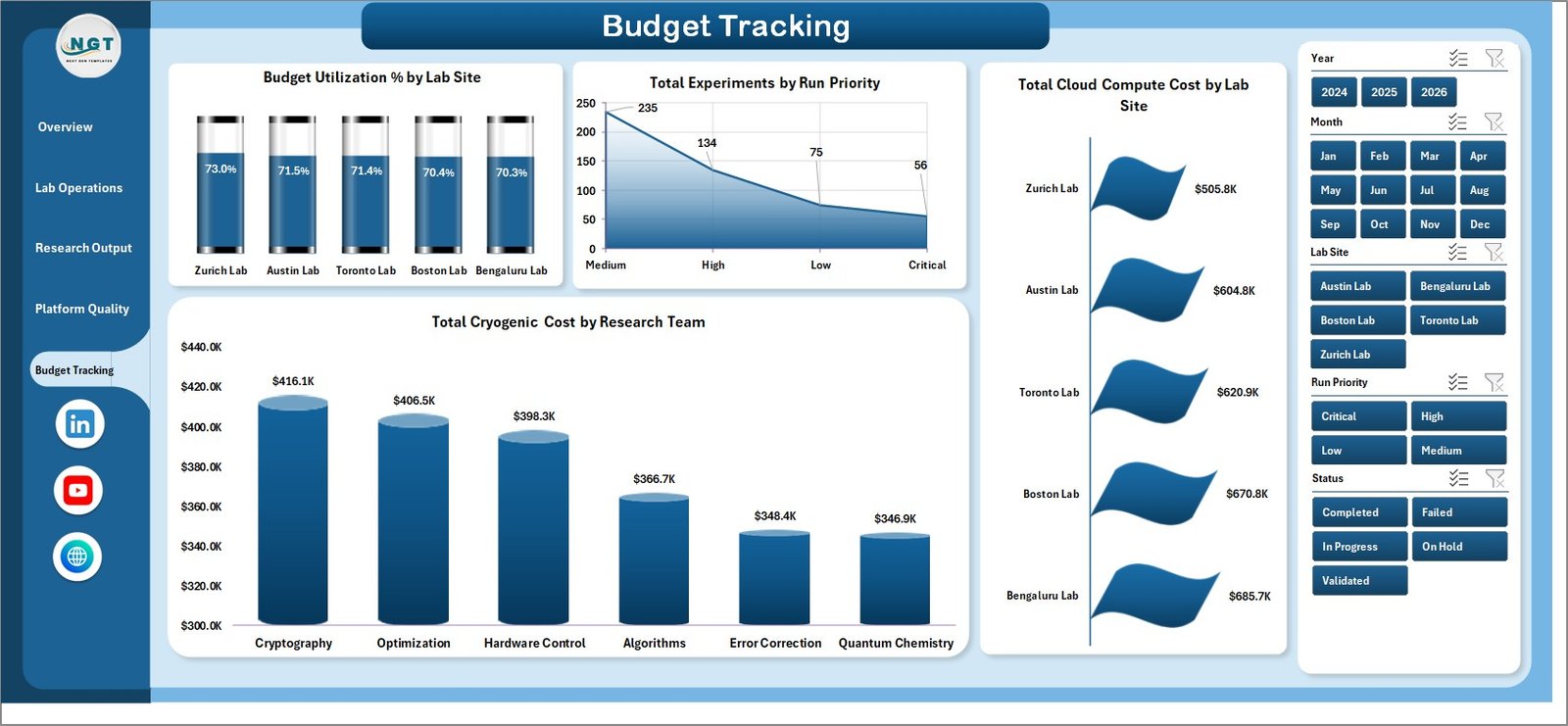
Budget Tracking
Data Sheet Tab
The Data Sheet tab stores the source records for the dashboard. Add your data in the same format, keep column structure consistent, and then refresh the workbook so the dashboard pages update.

Data Sheet tab
Support Sheet Tab
The Support Sheet contains multiple pivot tables used to create the dashboard dynamically. After updating the Data Sheet, go to the Data tab in the Excel ribbon and click Refresh All. You can keep this sheet hidden after setup.

Support sheet tab
Quantum Computing Labs Dashboard in Excel vs. Google Sheets vs. Paid CRM/SaaS – Feature Comparison
| Feature | This Excel dashboard | Google Sheets alternative | Paid SaaS alternative |
|---|---|---|---|
| Cost | One-time template purchase | Low-cost or free account-based use | Recurring subscription |
| Platform | Microsoft Excel | Google Sheets | Browser-based SaaS |
| Setup time | Replace data and refresh | Requires equivalent sheet and chart setup | Requires configuration and onboarding |
| Real-time collaboration | Best with shared workbook setup | Strong native collaboration | Usually strong |
| Customizable fields | Editable workbook structure | Editable but easier to break in shared use | Controlled by admin settings |
| Lab-specific metrics | Built for shots, fidelity, runtime, platforms, and grants | Possible with manual build | Depends on vendor fit |
| Year-1 cost at 5 users | Template price plus existing Excel licenses | Depends on workspace plan | Can become expensive quickly |
Who Should Use This Template
Use this dashboard if you manage quantum research operations, coordinate an academic or commercial lab, prepare grant reports, track research teams, or need an Excel-based performance review file. It works especially well for teams that want a dashboard they can inspect and adapt directly.
Real-World Use Cases
Research Director: Review fidelity scores, validation percentage, and published outputs before a quarterly research meeting.
Lab Operations Manager: Track total shots, runtime hours, compute clusters, and experiment status across active teams.
Grant Analyst: Compare budget utilization, grant budget, cloud compute cost, and cryogenic cost across sites and teams.
Advantages of Quantum Computing Labs Dashboard in Excel
The biggest advantage is speed. You can start with a ready-made workbook instead of designing pages, slicers, charts, pivots, and formulas from nothing. The template also keeps reporting transparent because users can inspect the data sheet and support sheet directly.
Another advantage is cost control. For teams that do not need a full SaaS system, a one-time Excel dashboard can be enough for internal reviews, research operations meetings, and funding reports.
Opportunities for Improvement
This is an Excel template, so it does not replace a connected database, automated lab instrument feed, user permission model, or workflow approval system. Teams with strict regulatory audit requirements or live multi-system integrations may need a database-backed solution. However, for planning, analysis, and recurring reporting, Excel is often a faster starting point.
Best Practices
Keep the Data Sheet columns consistent. Add new records below the existing data, avoid deleting support structures, and refresh all pivots after every data update. Use slicers during review meetings to compare lab sites, research teams, platforms, statuses, priorities, and months. Keep a backup copy before making structural changes to formulas, pivots, or charts.
Explore Relevant Templates
You can get the product draft here: Quantum Computing Labs Dashboard in Excel. You can also browse more Excel dashboard templates on NextGenTemplates.
Frequently Asked Questions
Can I use this with my own lab data?
Yes. Replace the sample data in the Data Sheet tab using the same format, then refresh the workbook.
Does the dashboard include slicers?
Yes. The workbook includes slicers so you can filter the dashboard quickly and review focused results.
What metrics are included?
The dashboard covers experiments, shots, runtime hours, fidelity score, grant budget, cloud compute cost, cryogenic cost, error events, published outputs, and budget utilization.
Can the Support Sheet be hidden?
Yes. The Support Sheet contains pivot tables used for dynamic dashboard creation and can be hidden after setup.
Is this better than paid SaaS?
It depends on your need. This Excel dashboard is better for quick reporting and editable analysis; SaaS may be better for live integrations, permissions, and workflow automation.
About the Author
Built by PK – Microsoft Certified Professional with 15+ years of Excel, Google Sheets, and Power BI experience. Founder of NextGenTemplates, reaching 300K+ subscribers across YouTube channels. Every template is hand-built and tested before release.
Conclusion
Quantum Computing Labs Dashboard in Excel gives research teams a practical way to monitor experiments, shots, runtime, fidelity, platform quality, published output, grant budgets, and operating costs. It is a useful option for lab teams that want a clear Excel dashboard before investing in a larger reporting system. For more Excel and dashboard tutorials, visit PK An Excel Expert on YouTube.