Quantum Computing Labs Dashboard in Power BI helps research teams monitor experiments, shots, runtime hours, grant budget, cryogenic cost, cloud compute cost, fidelity, and validation in one editable PBIX report. Quantum research reporting can become difficult when teams need to compare lab sites, compute clusters, qubit platforms, principal investigators, experiment types, run priorities, and monthly cost movement at the same time. This Power BI dashboard gives you 5 focused report pages, executive KPI cards, slicers, and charts designed for recurring lab operations and budget review.
The report is built for users who want a practical Power BI starting point instead of building a model, pages, slicers, and visual layouts from scratch. You can open the PBIX file in Power BI Desktop, replace or connect the sample source, refresh the report, and review each page with interactive filters. Microsoft also provides documentation for working with reports in Power BI Desktop.
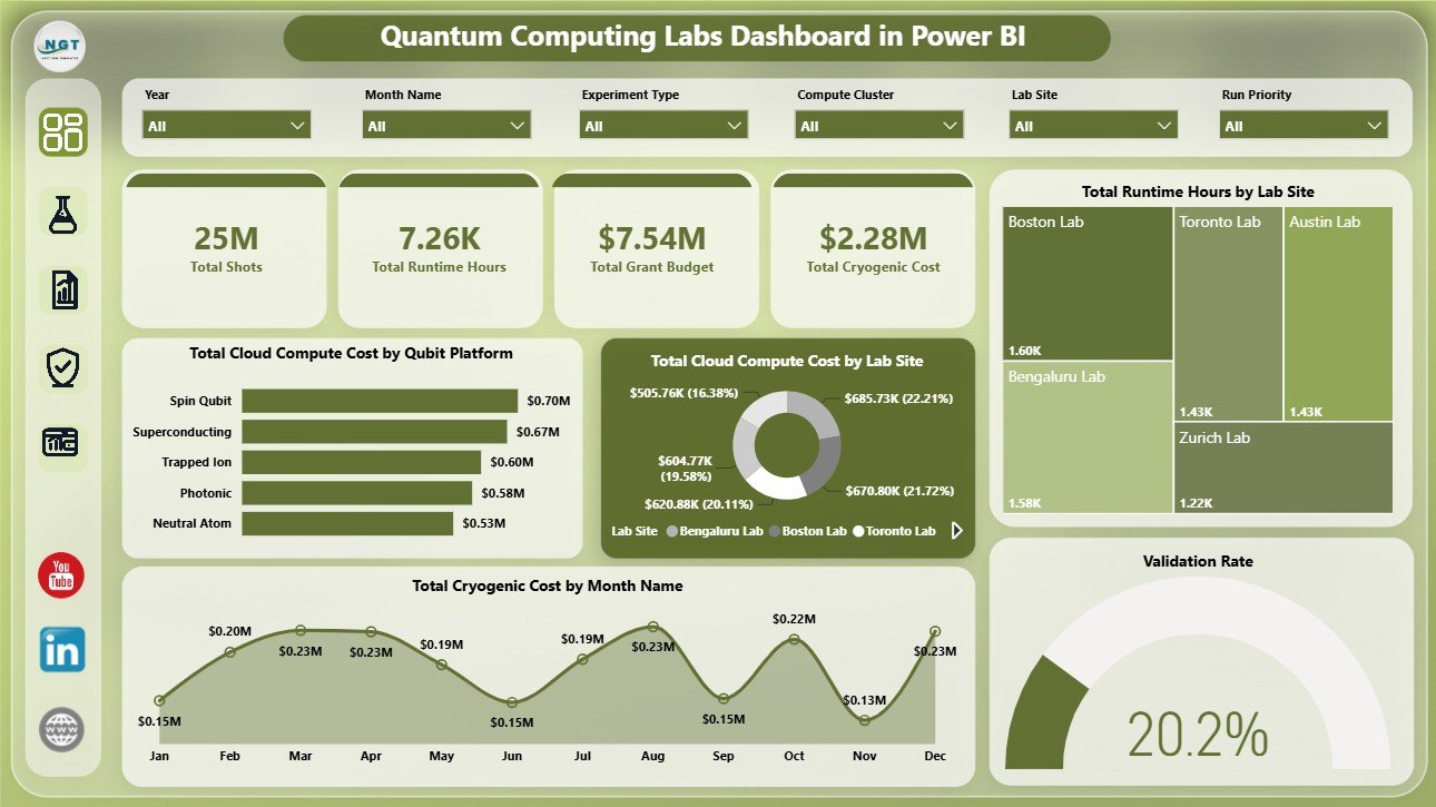
Quantum Computing Labs Dashboard in Power BI
Key Features of Quantum Computing Labs Dashboard in Power BI
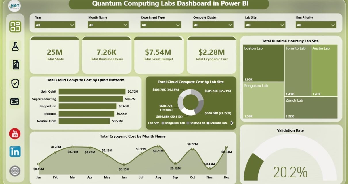
This template includes 5 report pages: Overview Page, Lab Operations, Research Output, Platform Quality, and Budget Tracking. The top of the Overview Page includes cards for Total Shots, Total Runtime Hours, Total Grant Budget, and Total Cryogenic Cost, giving decision makers a fast summary before they inspect the charts.
The dashboard also includes multiple slicers so users can filter the report quickly. That makes it easier to compare specific lab sites, research teams, qubit platforms, statuses, run priorities, months, and experiment types during review meetings. Because it is a PBIX file, analysts can customize visuals, measures, fields, source connections, and page layouts in Power BI Desktop.
Dashboard Pages Explanation
Overview Page
The Overview Page is the main executive summary page. It gives a high-level view of Total Shots, Total Runtime Hours, Total Grant Budget, and Total Cryogenic Cost, with slicers for fast filtering.
Total Cloud Compute Cost by Qubit Platform: This chart compares cloud compute cost across qubit platforms. It helps leaders identify which hardware or platform categories are consuming the largest share of compute spend.
Total Cloud Compute Cost by Lab Site: This chart shows cloud compute cost by site. It helps finance and operations teams compare site-level cloud usage and spot cost concentration.
Total Runtime Hours by Lab Site: This visual compares runtime hours across lab locations. It helps teams understand which sites are using the most experimental runtime capacity.
Total Cryogenic Cost by Month Name: This monthly view tracks cryogenic spending over time. It helps teams see whether cooling-related cost is stable, rising, or concentrated in certain months.
Validation Rate: This visual summarizes the experiment validation rate. It helps research leaders review quality and completion progress at a glance.
Lab Operations
The Lab Operations page focuses on workload, execution status, compute clusters, run priorities, and research team cost behavior.
Total Experiments by Status: This chart shows how experiments are distributed across statuses. It helps managers quickly separate completed, pending, active, failed, or review-needed work.
Total Grant Budget by Run Priority: This chart compares budget allocation across priority levels. It helps leadership check whether higher-priority work is receiving appropriate funding attention.
Total Shots by Compute Cluster: This visual shows the total shots handled by each compute cluster. It helps operations teams identify high-volume clusters and possible capacity pressure.
Total Cloud Compute Cost by Research Team: This chart compares compute cost by team. It helps finance and lab managers understand where spending is concentrated across research groups.
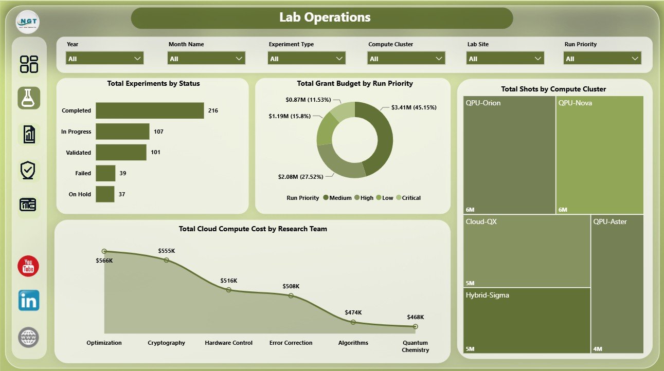
Lab Operations
Research Output
The Research Output page connects budget, experiment type, platform quality, and principal investigator validation performance.
Total Grant Budget by Quarter: This chart tracks grant budget by quarter. It helps program managers review funding movement across reporting periods.
Budget Utilization by Experiment Type: This visual compares budget usage by experiment category. It helps teams see which experiment types are consuming more of the allocated budget.
Average Fidelity Score by Qubit Platform: This chart compares average fidelity score across platforms. It helps researchers evaluate which platform categories are producing stronger experimental quality.
Validated Experiment Count by Principal Investigator: This visual counts validated experiments by PI. It helps research leaders understand validation throughput and review completion by owner.
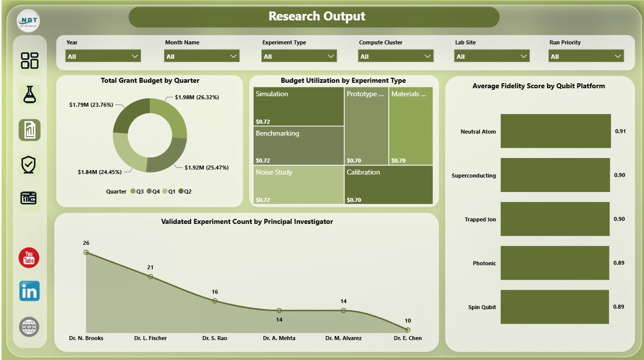
Research Output
Platform Quality
The Platform Quality page helps teams compare platform efficiency, runtime intensity, cryogenic cost, and grant budget trends.
Total Runtime Hours by Experiment Type: This chart shows runtime consumption by experiment category. It helps teams identify which types of experiments are using the most lab time.
Total Cryogenic Cost by Lab Site: This visual compares cryogenic cost across locations. It helps lab managers see where cooling-related operating cost is highest.
Cost Per Runtime Hour by Qubit Platform: This chart compares cost efficiency by platform. It helps decision makers evaluate whether certain qubit platforms are more expensive per operating hour.
Total Grant Budget by Month Name: This monthly chart tracks grant budget movement. It helps finance teams compare timing and budget availability across months.
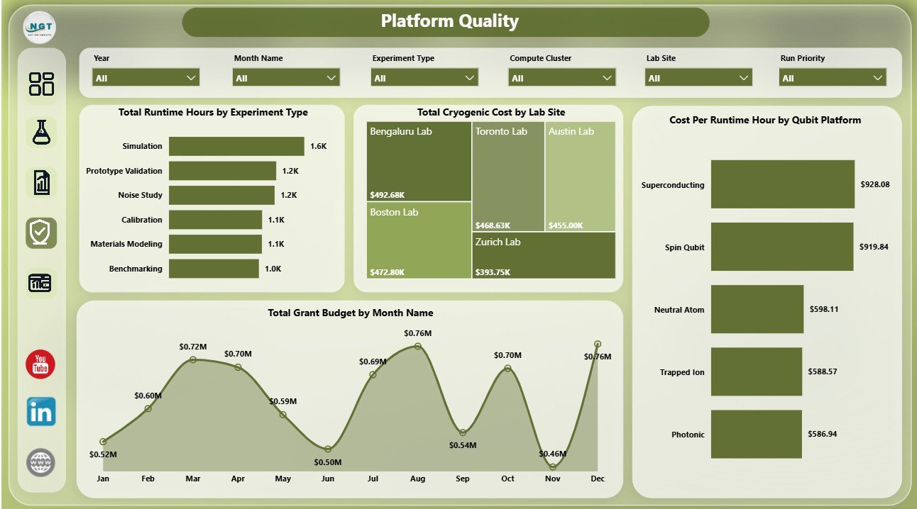
Platform Quality
Budget Tracking
The Budget Tracking page gives grant, finance, and program teams a dedicated view of utilization and operating cost.
Budget Utilization by Lab Site: This chart compares budget usage across lab sites. It helps identify sites that may be overusing or underusing available funding.
Total Experiments by Run Priority: This visual shows experiment count by priority level. It helps teams compare workload against strategic or urgent research needs.
Total Cloud Compute Cost by Lab Site: This chart breaks cloud cost down by location. It helps finance teams identify where cloud spending is concentrated.
Total Cryogenic Cost by Research Team: This visual compares cryogenic cost by team. It helps managers review specialized operating cost tied to different research groups.
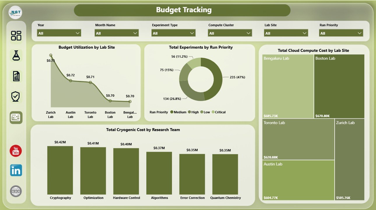
Budget Tracking
Quantum Computing Labs Dashboard in Power BI vs. Tableau vs. Paid CRM/SaaS – Feature Comparison
| Feature | This Power BI dashboard | Tableau or Qlik alternative | Paid SaaS alternative |
|---|---|---|---|
| Cost | One-time template purchase | License plus analyst build time | Recurring monthly or annual subscription |
| Platform | Power BI Desktop and optional Power BI Service | BI desktop or cloud platform | Vendor cloud platform |
| Setup time | Open PBIX, replace source, refresh | Build model, pages, measures, and visuals | Onboarding, configuration, and integration |
| Customizable fields | Edit visuals, measures, model, and pages | Editable with BI skills | Limited by product settings and plan |
| Share with link | Possible through Power BI Service | Possible through platform sharing | Usually available |
| Year-1 cost at 5 users | Template price plus Microsoft licensing choice | License cost plus analyst time | Often hundreds or thousands per year |
| Quantum lab metrics | Designed for shots, runtime, grants, cryogenic cost, compute cost, fidelity, and validation | Possible with custom build | Depends on vendor fit |
Who Should Use This Template
Use this template if you manage quantum research operations, coordinate a university or commercial quantum lab, prepare grant reporting, monitor research teams, or need a Power BI reporting layer for recurring lab performance meetings. It is especially useful for teams that already maintain experiment records and want an interactive dashboard rather than static spreadsheet summaries.
Real-World Use Cases
Research Director: Review validation rate, fidelity score, runtime hours, and grant budget before quarterly governance meetings.
Lab Operations Manager: Track experiment status, shots by compute cluster, runtime by site, and compute cost by research team during weekly planning.
Grant Analyst: Compare budget utilization, grant budget by quarter, cryogenic cost, and cloud compute cost across lab sites and teams.
Advantages of Quantum Computing Labs Dashboard in Power BI
The main advantage is speed. Instead of building a Power BI model and report pages from scratch, users start with a prepared PBIX structure, clear pages, relevant visual groups, and slicers. The template also keeps analysis flexible because the report can be edited in Power BI Desktop.
Another advantage is cost control. A one-time dashboard template can be enough for internal review meetings, grant reporting, and research operations tracking before a team invests in a larger database-backed reporting system.
Opportunities for Improvement
This dashboard does not replace a lab management system, instrument feed, approval workflow, user permission model, or regulatory audit trail. Teams that need live integrations, automated data capture, or strict controlled-access workflows may need a custom data platform. For recurring analysis and reporting, however, this Power BI dashboard can be a fast and useful starting point.
Best Practices
Keep your source data structure consistent, document any field changes, and refresh the report after each data update. Use slicers during review meetings to compare lab sites, qubit platforms, research teams, run priorities, statuses, experiment types, quarters, and months. Keep a backup copy before changing the data model, measures, or page layout.
Explore Relevant Templates
You can review the product draft here: Quantum Computing Labs Dashboard in Power BI. You can also browse more Power BI templates and Power BI dashboard templates on NextGenTemplates.
Frequently Asked Questions
Can I use this with my own lab data?
Yes. Replace or connect the sample source with your own structured lab data, then refresh the PBIX report.
Does the dashboard include slicers?
Yes. The dashboard includes multiple slicers so users can filter pages quickly during analysis and review meetings.
What metrics are included?
The dashboard covers shots, runtime hours, grant budget, cryogenic cost, cloud compute cost, validation rate, experiment status, fidelity score, budget utilization, and cost per runtime hour.
Do I need Power BI Desktop?
Yes. Power BI Desktop is needed to open and edit the PBIX file. Power BI Service is optional for sharing.
Is this better than paid SaaS?
It depends on your requirements. This dashboard is better for quick reporting and editable analysis; SaaS may be better for live integrations, permissions, and workflow automation.
About the Author
Built by PK – Microsoft Certified Professional with 15+ years of Excel, Google Sheets, and Power BI experience. Founder of NextGenTemplates, reaching 300K+ subscribers across YouTube channels. Every template is hand-built and tested before release.
Conclusion
Quantum Computing Labs Dashboard in Power BI gives research teams a practical way to monitor shots, runtime, grants, compute cost, cryogenic cost, validation, fidelity, research output, platform quality, and budget utilization. It is a useful option for lab teams that want an editable Power BI dashboard before investing in a larger reporting system. For more Excel and dashboard tutorials, visit PK An Excel Expert on YouTube.