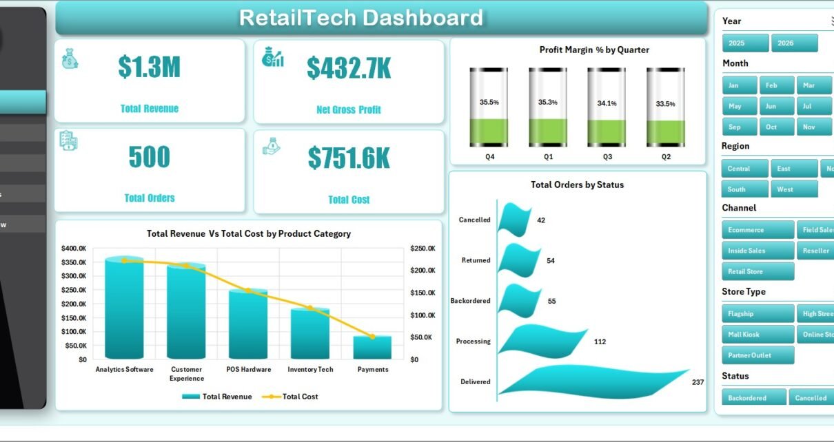
Retail teams often work with data from several places: POS exports, ecommerce orders, payment methods, customer segments, product categories, store locations, and support tickets. The challenge is not only collecting the data; it is turning that data into a clear dashboard that managers can use quickly. The RetailTech Dashboard in Excel is designed for that exact use case. It brings revenue, cost, profit, orders, channels, product mix, customer ratings, and support workload into one Excel dashboard workbook.
This template is helpful for small and mid-sized retail businesses that need a practical reporting file without paying for a full business intelligence or retail CRM platform. You can enter or paste data into the Data sheet, refresh the workbook, and use slicers to review performance from different angles. For teams already comfortable with Excel tables and PivotTables, Microsoft also provides official guidance on working with structured Excel tables here: Microsoft Support – Create and format tables.
RetailTech Dashboard in Excel
Key Features of RetailTech Dashboard in Excel
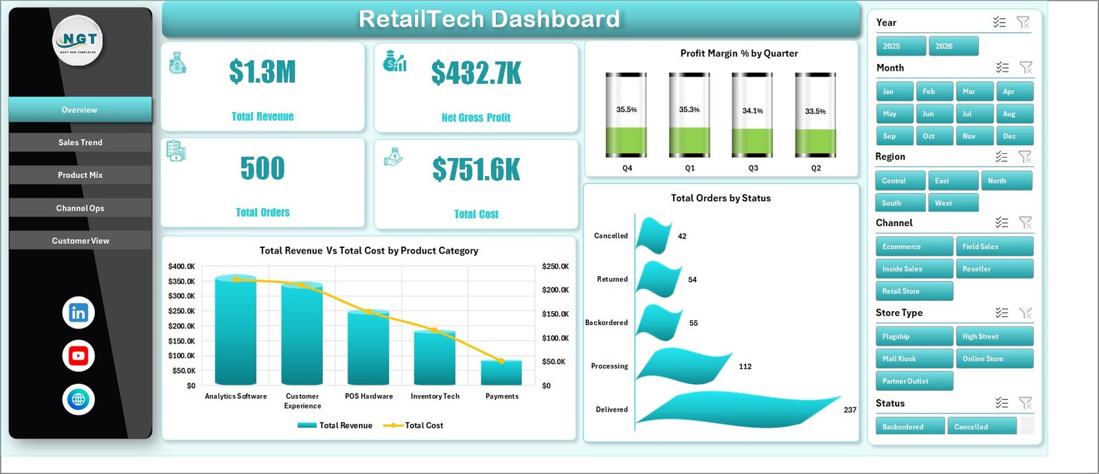
The workbook includes multiple dashboard pages built around common retail questions. At the top level, it tracks Total Revenue, Net Gross Profit, Total Orders, and Total Cost. These four cards give leadership a quick reading of business performance before moving into more detailed charts.
The dashboard also includes slicers so users can filter the report quickly. This is important because retail analysis usually needs more than one view. A sales manager may want to review revenue by channel, while an operations manager may care more about support tickets, order status, region, city, or store type. The same workbook can support these different questions without rebuilding the report.
The template includes seven worksheet tabs: Overview, Sales Trend, Product Mix, Channel Ops, Customer View, Data, and Support. The visible dashboard tabs are meant for analysis. The Data sheet is where you update the records. The Support sheet contains pivot tables that power the dashboard and can be hidden after setup.
Dashboard Pages Explanation
Overview Page
The Overview page is the executive summary of the workbook. It displays high-level cards for Total Revenue, Net Gross Profit, Total Orders, and Total Cost. These cards help users see the main retail numbers before reviewing chart-level detail.
Profit Margin % by Quarter: This chart shows how profitability changes from quarter to quarter. It is useful for identifying seasonal margin changes, pricing pressure, promotional impact, or cost movement.
Total Revenue Vs Total Cost by Product Category: This chart compares revenue and cost for each product category. It helps users identify categories that generate high sales but may not deliver enough profit after cost is considered.
Total Orders by Status: This chart groups orders by status. It can help teams review completed, pending, cancelled, or delayed order patterns and understand where order processing needs attention.
Sales Trend
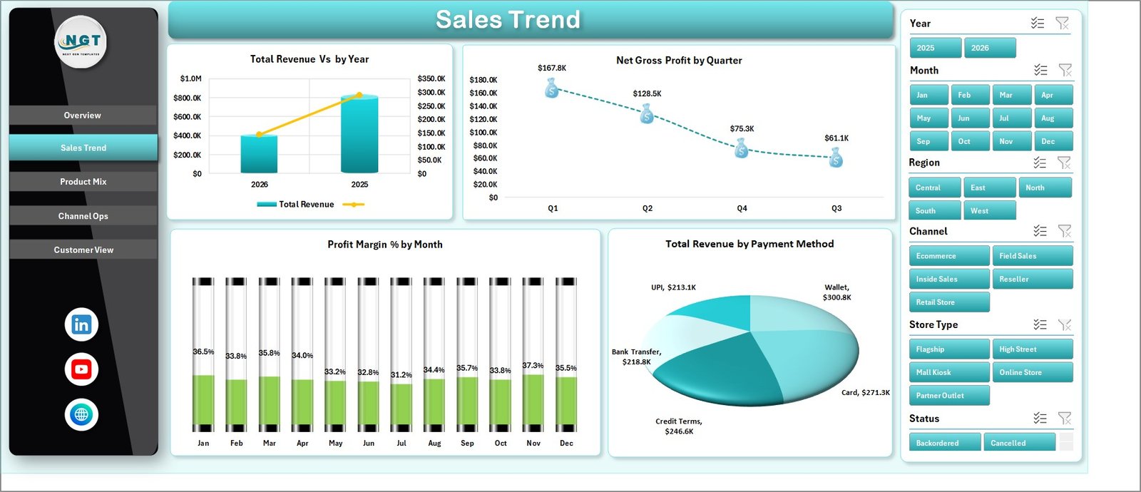
The Sales Trend page focuses on performance over time and payment behavior. It includes Total Revenue by Year, Net Gross Profit by Quarter, Profit Margin % by Month, and Total Revenue by Payment Method. This page is useful for monthly reviews, quarterly performance meetings, and yearly trend analysis.
Total Revenue by Year: This chart shows whether the business is growing, flat, or declining across years. It gives a broad view of sales momentum.
Net Gross Profit by Quarter: This chart highlights profit performance across quarters. It helps users compare seasonal profit patterns with revenue trends.
Profit Margin % by Month: This chart shows monthly margin movement. It is helpful when promotions, supplier costs, discounts, or product mix changes affect profitability.
Total Revenue by Payment Method: This chart shows how revenue is distributed across payment types. Retail teams can use it to understand customer payment behavior and channel preferences.
Sales Trend
Product Mix
The Product Mix page is designed for category, product, store type, and region analysis. It includes Total Revenue by Product Category, Profit Margin % by Product, Total Revenue Vs Total Cost by Store Type, and Profit Margin % by Region.
Total Revenue by Product Category: This chart shows which categories contribute the most revenue. It helps merchandising teams prioritize categories for promotions, stock planning, or deeper margin review.
Profit Margin % by Product: This chart compares product-level profitability. It can reveal products that sell well but have weak margin, or products that deserve more attention because of strong profitability.
Total Revenue Vs Total Cost by Store Type: This chart compares sales and cost across store formats. It is useful for comparing physical stores, online channels, franchise models, or other store classifications.
Profit Margin % by Region: This chart helps users compare profitability across regions. Regional margin differences can point to pricing, freight, discounting, or product mix differences.
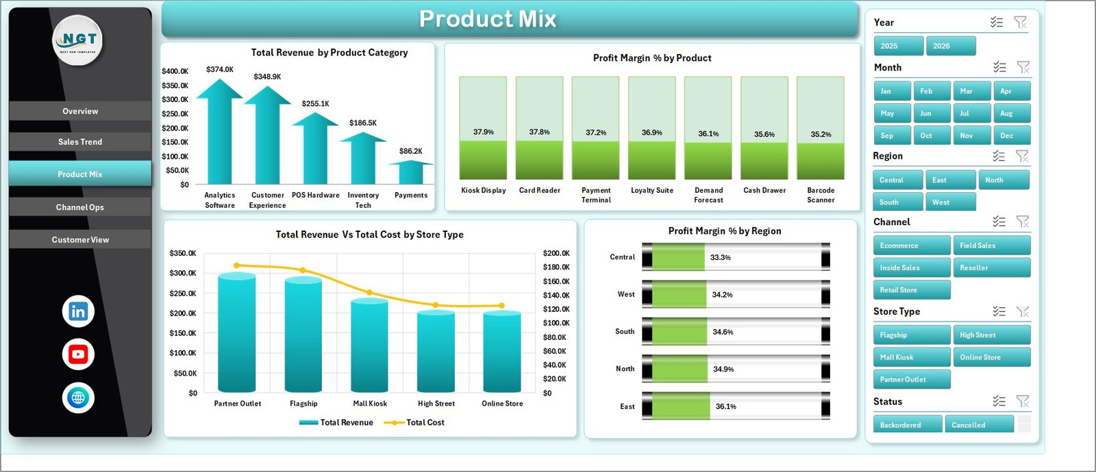
Product Mix
Channel Ops
The Channel Ops page connects sales channel performance with operations. It includes Total Revenue by Channel, Total Orders by Region, Total Revenue Vs Total Cost by City, and Total Support Tickets by Store Type.
Total Revenue by Channel: This chart shows the revenue contribution from each channel. It helps users compare ecommerce, retail stores, marketplace, or other sales channels.
Total Orders by Region: This chart shows where orders are coming from geographically. It is useful for regional operations planning and fulfillment analysis.
Total Revenue Vs Total Cost by City: This chart compares city-level revenue and cost. It can highlight locations where sales are strong but cost control needs review.
Total Support Tickets by Store Type: This chart shows where support demand is concentrated. It helps managers review whether specific store types are creating more service workload.
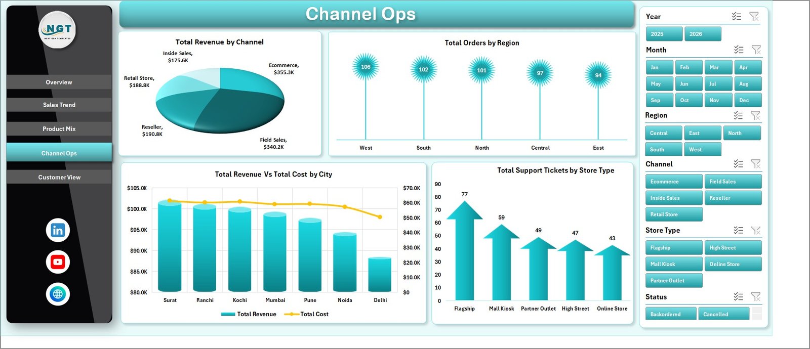
Channel Ops
Customer View
The Customer View page focuses on customer segment profitability, order channels, and product category ratings. It includes Net Gross Profit by Customer Segment, Total Orders by Channel, and Avg. Rating by Product Category.
Net Gross Profit by Customer Segment: This chart shows which customer groups contribute the most profit. It helps users focus on segments that create stronger business value.
Total Orders by Channel: This chart shows how order volume is distributed by channel. It is useful for comparing channel workload and customer buying behavior.
Avg. Rating by Product Category: This chart compares customer ratings across categories. It helps users identify category-level satisfaction issues or strengths.
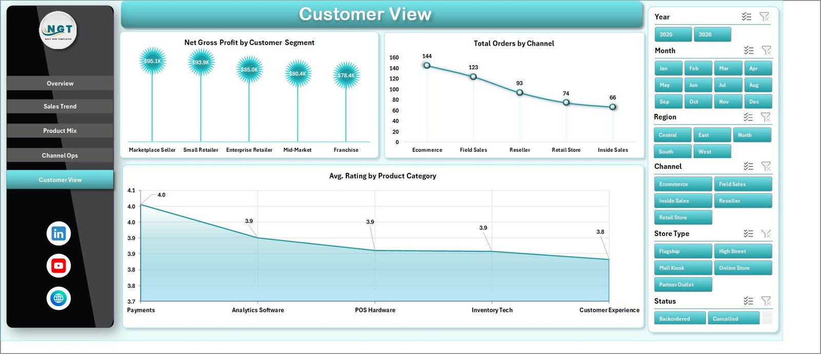
Customer View
Data Sheet Tab
The Data sheet is the input area for the workbook. Users should add their retail records in the same format as the sample data. Keeping the same column structure allows the dashboard, pivots, and charts to update correctly.

Data Sheet tab
Support Sheet
The Support sheet contains multiple pivot tables used to create the dashboard dynamically. After updating the Data sheet, go to the Data tab in the Excel ribbon and click Refresh All. The pivots and charts will refresh based on the updated data. You can keep this sheet hidden during normal use.

Support sheet tab
RetailTech Dashboard in Excel vs. Google Sheets vs. Paid CRM/SaaS – Feature Comparison
| Feature | RetailTech Dashboard in Excel | Google Sheets Alternative | Paid Retail SaaS Alternative |
|---|---|---|---|
| Cost | One-time download | Low cost depending on workspace plan | Recurring monthly or annual fee |
| Platform | Microsoft Excel | Google Sheets | Retail CRM, POS, ERP, or BI platform |
| Setup time | Short setup using the included Data sheet | Short setup for simple dashboards | Usually requires configuration and training |
| Real-time team collaboration | Available through OneDrive or SharePoint | Native collaboration | Usually included |
| Mobile access | Best on desktop Excel | Good mobile and browser access | Usually strong mobile access |
| Customizable fields | Editable workbook structure | Editable spreadsheet structure | May require admin setup or higher plan |
| Share with link | Available with Microsoft 365 sharing | Native sharing | Role-based sharing |
| Year-1 cost at 5 users | Low one-time purchase | Depends on Google Workspace plan | Can become expensive over a year |
| Retail analytics depth | Strong for spreadsheet-based reporting | Good for collaborative lightweight reporting | Strong for connected operational systems |
| Offline use | Yes, with Excel desktop | Limited offline mode | Usually requires internet access |
Who Should Use This Template
This template is suitable for retail owners, store managers, ecommerce teams, merchandising analysts, operations managers, sales analysts, and Excel consultants who need a reusable dashboard for retail performance. It is also useful for consultants who create monthly reports for retail clients and want a workbook that can be updated from exported data.
The best users for this template are comfortable working in Excel and can keep their data in a clean table format. The workbook is designed to save time for users who already have retail data but need better visual reporting.
Real-World Use Cases
Monthly Retail Review: A retail owner can use the Overview and Sales Trend pages to review revenue, cost, orders, and profit movement each month.
Merchandising Planning: A product manager can use the Product Mix page to compare product category revenue, product-level margin, and regional profitability before deciding which categories need promotion or pricing review.
Channel Performance Meeting: An ecommerce and store operations team can use Channel Ops to compare sales channels, regional order patterns, city-level cost, and support tickets by store type.
Customer Experience Review: A customer success manager can use Customer View to compare customer segments, order channels, and average product category ratings.
Advantages of RetailTech Dashboard in Excel
The biggest advantage is speed. Instead of designing a workbook, creating pivot tables, formatting charts, and adding slicers manually, users can begin with an organized template. The dashboard already includes multiple analysis pages, which makes it easier to review business performance from several angles.
Another advantage is control. Because this is an Excel file, users can modify labels, formulas, chart colors, pivot layouts, slicers, and source data structure as needed. A paid SaaS platform may offer automation, but it may also limit customization or charge more for advanced reporting.
The template also supports repeatable reporting. Once the data structure is understood, users can update the Data sheet, refresh the workbook, and review the refreshed dashboards during weekly or monthly meetings.
Opportunities for Improvement
This template is not meant to replace a live retail data warehouse, POS analytics system, or enterprise BI deployment. It does not automatically connect to every data source unless the user adds their own connection or import process. It is best for exported data, manual updates, and Excel-based reporting workflows.
Users with advanced needs may want to extend the workbook with extra fields, Power Query imports, additional slicers, or custom KPIs. For example, a retailer may add inventory turnover, return rate, discount rate, basket size, customer acquisition source, or fulfillment time if those fields are available in the source data.
Best Practices
Keep the Data sheet clean and consistent. Do not change column names unless you also update the connected pivots and formulas. Add new rows below the existing data structure and avoid blank rows inside the table.
Refresh the workbook after every data update. Go to the Data tab in Excel and click Refresh All so the pivot tables and charts update together. If you keep the Support sheet hidden, unhide it only when you need to inspect or adjust the pivots.
Review revenue and margin together. High revenue does not always mean strong performance if costs are also high. Use the charts that compare Total Revenue and Total Cost to identify where profit may need attention.
Use slicers during meetings. Slicers make it easier to answer follow-up questions quickly, such as which region, category, channel, or store type is driving a result.
Explore Relevant Templates
You can download the RetailTech Dashboard in Excel from NextGenTemplates. You can also browse more Microsoft Excel templates and Excel dashboard templates for sales, operations, finance, inventory, customer service, and other business reporting needs.
Frequently Asked Questions
What is the RetailTech Dashboard in Excel?
It is a ready-to-use Excel dashboard template for retail analytics. It tracks revenue, costs, orders, profit margin, product mix, sales channels, customers, ratings, and support tickets.
How many sheets are included?
The workbook includes seven sheets: Overview, Sales Trend, Product Mix, Channel Ops, Customer View, Data, and Support.
Can I use this dashboard with my own retail data?
Yes. Replace the sample rows in the Data sheet with your own retail records in the same format, then refresh the workbook.
What does the Support sheet do?
The Support sheet contains pivot tables that power the dashboard charts. It can be hidden once the workbook is set up.
Do I need advanced Excel skills?
You do not need to build the dashboard from scratch. Basic Excel skills are enough for updating data and refreshing the workbook. Advanced users can customize the workbook further.
Can this template be used for ecommerce?
Yes. It can work for ecommerce, physical retail, hybrid retail, and channel-based sales reporting if the data is prepared in the required format.
Is this a live connected dashboard?
No. It is an Excel dashboard template. You can manually update the Data sheet or extend the workbook with your own import process if needed.
About the Author
Built by PK – Microsoft Certified Professional with 15+ years of Excel, Google Sheets, and Power BI experience. Founder of NextGenTemplates, reaching 300K+ subscribers across YouTube channels. Every template is hand-built and tested before release.
For more Excel dashboard tutorials, visit youtube.com/@PKAnExcelExpert.
Conclusion
The RetailTech Dashboard in Excel gives retail teams a practical way to review sales, costs, profitability, orders, products, channels, customers, and support tickets in one workbook. It is a strong fit for businesses that want a downloadable Excel reporting tool with multiple dashboard pages and a simple update process.
If your team already exports data into Excel or CSV, this dashboard can help you move from raw rows to filterable retail insight much faster. Update the Data sheet, refresh the workbook, and use the dashboard pages to support retail decisions with clearer numbers.