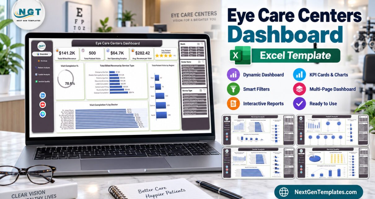
Running more than one eye-care site turns a simple question into an awkward one. A single clinic owner can feel how the month went. Put eight centers across five regions in front of the same person and the feel disappears – you need the numbers side by side, in the same units, on one page. The Eye Care Centers Dashboard in Excel is built for exactly that moment: a reporting workbook that takes a flat list of patient visits and turns it into five linked pages a practice manager can take into a monthly meeting.
Before anything else, the important part. This is a business reporting template, not clinical software. It is an Excel workbook that charts figures you type or paste in. It gives no medical, optometric, ophthalmic or diagnostic advice. It performs no vision testing, screening, triage or refraction. It is not a patient record, not an electronic health record, not a prescription, not a clinical audit and not a referral of any standing. Nothing in it should be used to support a decision about the care of a patient. If that is what you need, you need practice management software, and this article is not about that.
What the Eye Care Centers Dashboard in Excel Actually Does
The workbook ships with 500 demo visit records covering a full calendar year. Each row is one visit, with 34 columns behind it: a visit identifier and date, an age band, gender, the center and region, the practitioner, the service type, how the appointment was booked, the payer, the fee and cost columns, wait time, consultation duration, a satisfaction score, and the visit status. Five report pages sit on top of that table, all driven by pivot tables and three synchronised slicers.
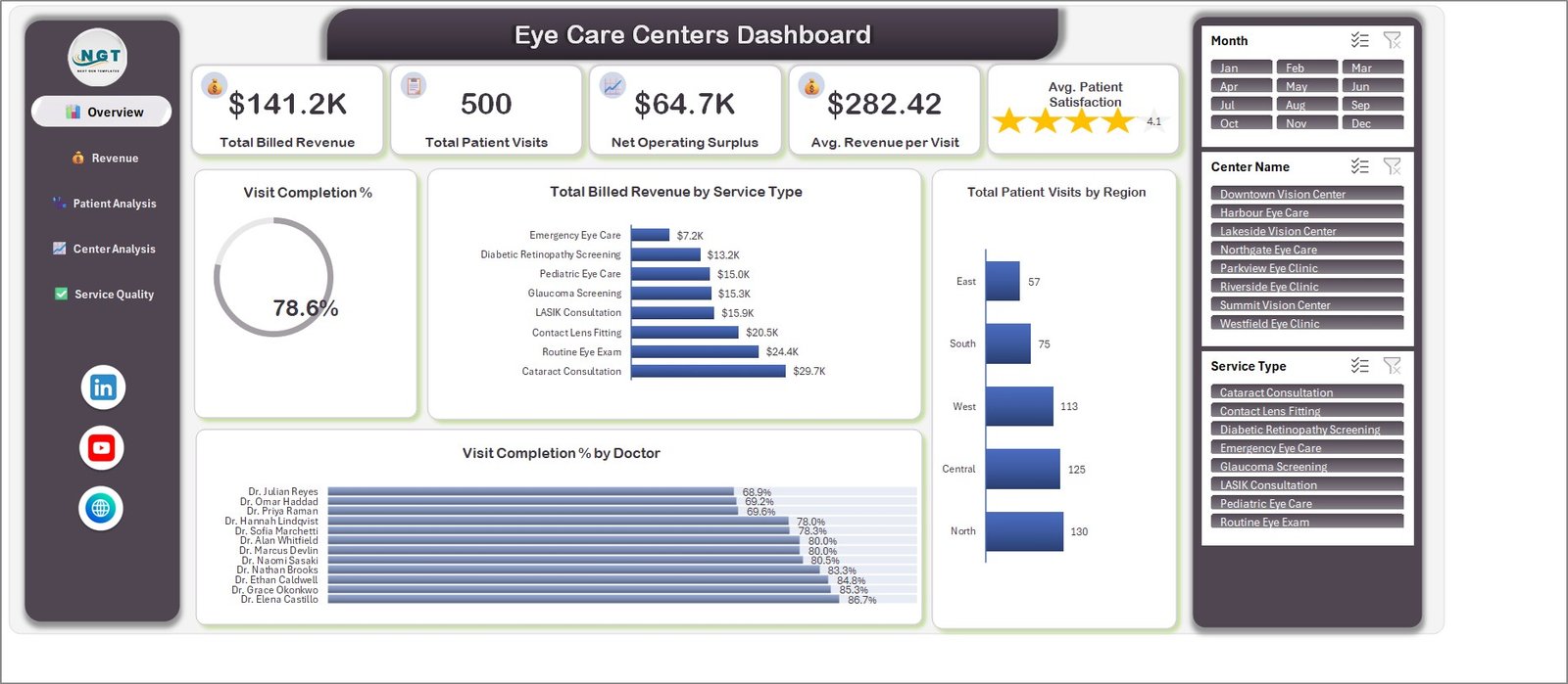
The Overview page opens with four KPI cards and a star meter: total billed revenue of $141.2K, 500 patient visits, a net operating surplus of $64.7K, average revenue per visit of $282.42, and an average satisfaction score of 4.1 drawn as five stars rather than a bare number. Below them sits a completion ring showing that 78.6% of booked visits were actually completed, billed revenue split across the eight service types, visits by region, and a completion rate for each of the twelve practitioners.
The service-type chart is the one most people look at twice. It runs from Emergency Eye Care at $7.2K up to Cataract Consultation at $29.7K, with Routine Eye Exam at $24.4K and Contact Lens Fitting at $20.5K in between. That ordering is the argument for how chair time gets allocated, and it is visible in one glance.
The Four Analysis Pages
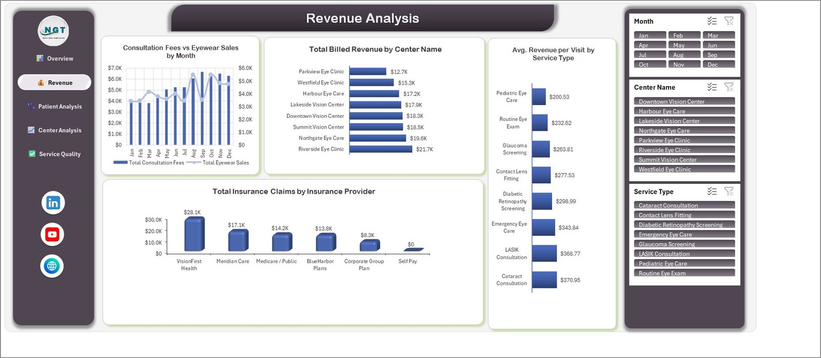
Revenue Analysis plots consultation fees against eyewear sales month by month on a dual axis, ranks billed revenue by center from $12.7K to $21.7K, shows average revenue per visit by service type, and totals claim value by payer. Six payers appear, and Self Pay correctly sits at zero – self-funding patients file no insurance claim, so a zero bar there is the chart being right rather than the chart being broken.
Patient Analysis puts visit counts and billed revenue side by side across five age bands, splits visits by gender – 252 and 248 of the 500 – and ranks the five appointment channels. Online Booking leads with 147 visits, then Phone Call at 112, Walk-In at 92, Mobile App at 87 and Doctor Referral at 62. If you are trying to work out whether an online booking push has moved anything, that single chart is the answer.
Center Analysis is the page that justifies the whole exercise. Visits against net operating surplus per center, average revenue per visit from $241.41 to $319.25, billed revenue against operating cost for all five regions, and average wait time by center running from 17.2 minutes at the best site to 22.5 at the slowest. Five minutes of difference across eight sites is the kind of thing nobody notices until it is charted.

Service Quality closes the set with the visit-status mix – 393 completed, 33 no-show, 31 cancelled, 22 scheduled and 21 rescheduled – a star rating per practitioner, average consultation time by service type from 24.6 to 37.6 minutes, and completion rate against no-show rate by quarter. That last chart climbs from 71.7% in Q1 to 84.7% in Q4, which is the sort of trend a quarterly review is built around.
Three Slicers, Five Pages, One Cache
The Month, Center Name and Service Type slicers repeat on every page and share a single pivot cache. Filter to one center on Overview and Service Quality is already filtered when you arrive. This sounds like a small thing and is not – it is the difference between a dashboard you explore and five charts you keep re-filtering by hand.
Everything else is read from the data columns, so nothing is hard-coded. Replace the eight sample centers with your own twelve, add a ninth service type, rename the practitioners, and the pivots and slicers pick up the new lists on the next refresh. There are no macros anywhere in the file. It is a plain .xlsx, which means it opens without a security warning and survives email filters that quietly eat macro-enabled workbooks.
Being Careful With Real Patient Data
Every figure in the shipped file is demo data. The 500 visit rows, the practitioner names, the center names and the payer names were invented so the charts would render. None of it is real and no row describes a real person. That matters when you come to replace it.
The moment you paste in real visit information – names, appointment details, payer details, anything describing a visit – you are handling special-category health data, and every obligation that comes with it is yours. Lawful basis, consent where it is required, where the file is stored, whether it is encrypted, who can open it, how long you keep it, when it is deleted, and what you do if it goes astray. An ordinary spreadsheet has no access control, no audit trail, no encryption of its own and no de-identification step. It cannot help you with any of that.
It is also worth saying plainly: buying a template establishes compliance with nothing. Not HIPAA, not GDPR or UK GDPR, not the NHS Data Security and Protection Toolkit, not FDA or CE medical-device rules, and not any optical-dispensing or professional-registration requirement anywhere. It is not a medical device and does not claim to be one.
The practical answer most multi-site groups land on is to keep the reporting layer aggregated. Counts, totals and rates only, no identifiable rows. The five pages work perfectly well that way, because not one chart in the workbook needs a patient name to draw itself.
What We Found When We Checked the Build
We open every page before we list a template. Four things are worth knowing about this one, none of them fatal, all of them cosmetic or definitional.
On Service Quality, the pie chart’s four small slices print their data labels on top of one another. The values underneath are correct – 393, 33, 31, 22 and 21, totalling 500 – but “Cancelled, 31” and “Scheduled, 22” overlap on screen and can be misread as “Cancelled, 22”. Dragging the labels apart or switching the chart to a legend fixes it in seconds.
On Center Analysis, the first chart truncates its center names to “Downtown…”, “Riverside…” and so on. Widening the chart restores them. Every other chart on the page prints the names in full.
The practitioner star chart prints each value label over the fifth star, hiding the partial-star fill behind the number. The numbers are correct and readable; only the decoration is obscured.
The definitional one is more interesting, and worth understanding before you present from the file. Total Billed Revenue counts only visits that were actually completed. The 107 cancelled, no-show, scheduled and rescheduled rows contribute nothing to it, even though those rows still carry a notional consultation fee and procedure charge in their own columns. That is why the Revenue Analysis consultation-fee and eyewear totals – $63.3K and $49.8K – sum to more than the $141.2K headline: they include visits that were never billed. In the same vein, Avg. Revenue per Visit divides by all 500 visits rather than the 393 completed ones, giving $282.42 where revenue per completed visit is $359.32. Neither is an arithmetic error and both are applied consistently throughout; they are simply definitions worth knowing before someone in the meeting asks why two numbers do not add up.
We also recomputed the cross-page totals from the source table. Billed revenue sums to $141,212.37 identically on Overview, by service type, by center and by region. Operating cost sums to $76,560.19. Every visit-count breakdown – region, age band, gender, channel and status – totals exactly 500. The 78.6% completion figure is 393 divided by 500, computed the way its caption describes, and the count cards are formatted as counts rather than currency. The workbook reconciles.
Who Should Use It
It suits practice managers and owners running two or more sites, regional managers assembling a monthly trading pack, and finance staff who already pull a visit export out of their practice system and want it charted without paying for a reporting module. If you need a board-ready set of pages you can screenshot straight into a deck, that is precisely what this is.
It does not suit anyone looking for software to run a clinic with. It books nothing, records nothing clinically, issues no prescriptions, manages no recalls, handles no dispensing or claims submission, and connects to no practice-management, EHR or optical point-of-sale system.
How It Compares to the Other Eye-Care Templates
Two names in our catalogue sit close enough to this one to cause confusion, and they are genuinely different products. The KPI Dashboard and KPI Scorecard lines are compact month-picker scorecards built around targets, thresholds and traffic lights – you set a goal and the sheet tells you red, amber or green. This is the analytical line: pivot tables and slicers across five pages, built for slicing and comparing rather than scoring. Neither replaces the other, and plenty of practices run both.
If your interest is the dispensing and eyewear retail side rather than the clinical service mix, the Optical Retail Dashboard in Excel covers stock and brand analysis instead. For a scorecard view of an ophthalmology service, see the Ophthalmology Services KPI Dashboard in Excel, and the same service charted analytically in Power BI is the Ophthalmology Services Dashboard in Power BI. If scheduling rather than reporting is the gap, the Optical Store Appointment Calendar in Excel is the companion piece – a calendar layout, not a booking system.
Getting Started
Download the ZIP and unpack it. You get the .xlsx workbook and a PDF user manual. Open the Data sheet, where the table starts at row 3. Decide first whether you actually need identifiable rows – the pages run on aggregates, so most people do not. Delete the demo rows, paste your own export, edit the list columns to your own centers and service types, then press Data > Refresh All (Ctrl + Alt + F5). All five pages redraw in one step.
It runs in Excel 2016 and later on Windows, in Microsoft 365, and in Excel for Mac. It ships with 500 rows and stays responsive into the tens of thousands; past roughly 100,000 rows a refresh starts to be noticeable on an average laptop.
The Eye Care Centers Dashboard in Excel will not tell you anything about a patient. It will tell you, honestly and in one place, how eight sites compared last month – and for a practice manager with a board meeting on Thursday, that is the job.
Get the Eye Care Centers Dashboard in Excel for $17.99 (regular $29.99) – instant download, one-time payment, lifetime access, no subscription.