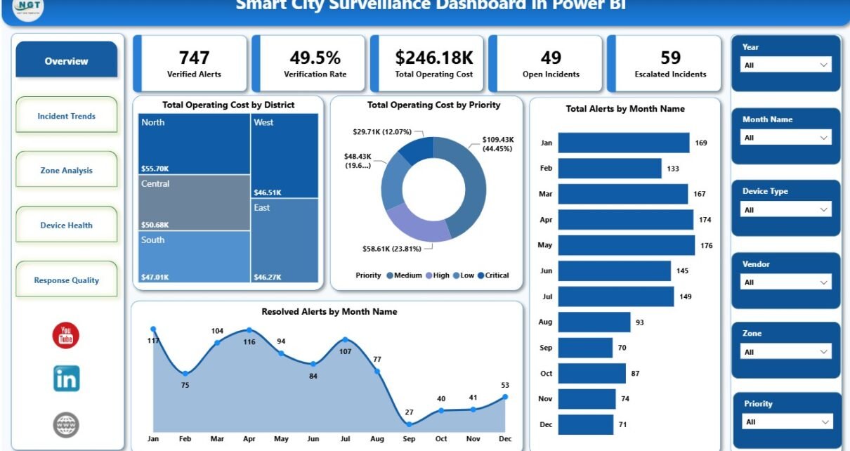
Smart City Surveillance Dashboard in Power BI is designed for surveillance operations, smart city control rooms, CCTV monitoring teams, public safety analysts, and security vendors that need a clean reporting view of incidents and alerts. A typical surveillance program may track thousands of records across districts, zones, vendors, device types, priorities, shifts, incident types, verification status, response time, and operating cost. This Power BI template turns those raw records into 5 report pages, 5 executive KPI cards, and 15 focused charts so teams can review performance faster and make practical decisions from the data.
The dashboard is available as a downloadable Power BI template on NextGenTemplates: Smart City Surveillance Dashboard in Power BI. You can open the .pbix file in Power BI Desktop and replace the sample data with your own source. If you are new to Power BI Desktop, Microsoft also provides official guidance here: Get started with Power BI Desktop.
Key Features of Smart City Surveillance Dashboard in Power BI
- 5-page report layout: Overview, Incident Trends, Zone Analysis, Device Health, and Response Quality pages organize the analysis by workflow.
- Executive KPI cards: Verified Alerts, Verification Rate, Total Operating Cost, Open Incidents, and Escalated Incidents summarize the most important numbers at the top.
- Cost visibility: Operating cost can be reviewed by district, priority, year, zone, and device type.
- Incident trend tracking: Monthly alert and resolution charts help teams compare demand and closure activity over time.
- Vendor and device analysis: Vendor, zone, device type, and priority views help managers identify operational pressure points.
- Response quality reporting: Response time, verification rate, and open incident analysis help teams improve operational reliability.
- Slicers for fast filtering: Users can filter the dashboard quickly and review focused segments without rebuilding visuals.
Dashboard Pages Explanation
1. Overview Page
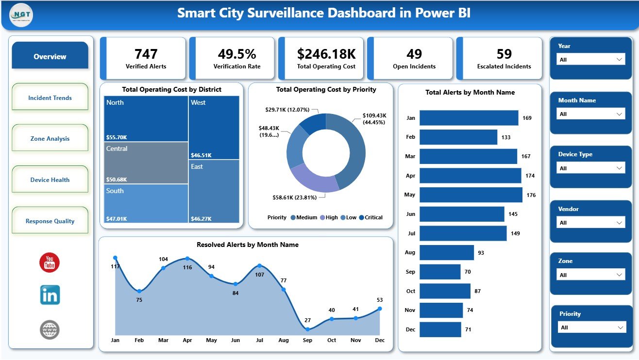
The Overview page is the starting point of the report. At the top, it displays 5 cards: Verified Alerts, Verification Rate, Total Operating Cost, Open Incidents, and Escalated Incidents. These KPIs help leadership quickly understand alert quality, current workload, risk pressure, and spending before going into detailed charts.
Verified Alerts: This card shows how many alerts have been checked and confirmed. It helps separate meaningful incidents from unverified noise.
Verification Rate: This card shows the percentage of alerts that have been verified. A higher rate indicates stronger alert validation and a lower chance of wasted response effort.
Total Operating Cost: This card summarizes the total cost linked to surveillance operations. It helps finance, security, and operations teams monitor budget pressure.
Open Incidents: This card shows unresolved incidents that still need attention. It is useful for shift handovers and daily operational reviews.
Escalated Incidents: This card highlights incidents that have moved beyond normal handling. It gives managers a quick view of risk concentration and priority workload.
Total Operating Cost by District: This chart compares cost across districts so managers can see which areas are consuming the most budget. It supports location-based cost review, resource planning, and district-level accountability.
Total Operating Cost by Priority: This visual shows how operating cost is distributed across priority levels. It helps teams understand whether high-priority incidents are driving most of the spend or whether routine incidents are accumulating hidden cost.
Total Alerts by Month Name: This monthly chart shows alert volume over time. It helps analysts identify seasonal changes, unusual spikes, recurring events, or changes caused by deployment patterns.
Resolved Alerts by Month Name: This chart tracks how many alerts were resolved each month. It helps compare closure activity against alert volume and highlights months where resolution capacity may need attention.
2. Incident Trends
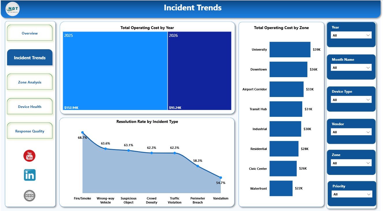
The Incident Trends page gives a longer-term view of cost and resolution behavior. Instead of focusing only on today’s workload, it shows how cost, zone performance, and incident type resolution are developing across reporting periods.
Total Operating Cost by Year: This chart shows cost movement year by year. It helps leadership understand whether the surveillance program is becoming more expensive, more efficient, or stable over time.
Total Operating Cost by Zone: This visual compares cost across zones. It helps identify which zones need more budget control, maintenance review, staffing support, or operational investigation.
Resolution Rate by Incident Type: This chart compares resolution performance for each incident type. It helps teams find which incident categories close smoothly and which ones may require process improvement.
3. Zone Analysis
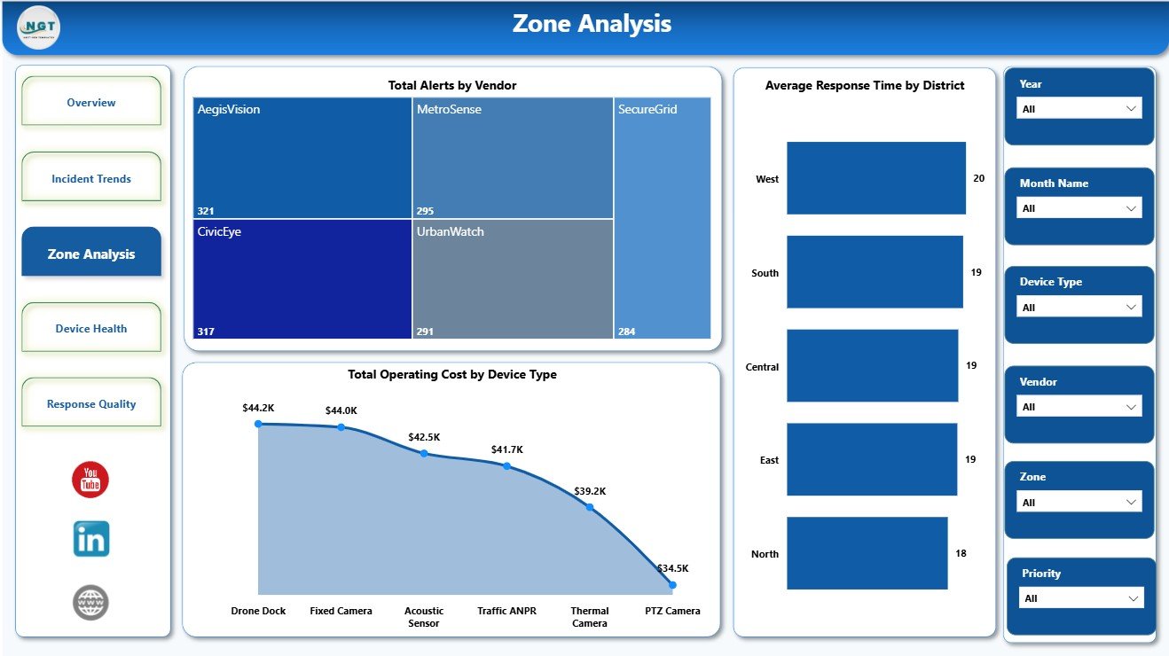
The Zone Analysis page is useful when the surveillance team wants to understand how locations, vendors, districts, and devices compare. It connects alert volume, response speed, and cost to operational responsibility.
Total Alerts by Vendor: This chart shows alert count for each vendor. It helps compare vendor workload and may reveal differences in device coverage, alert sensitivity, or service performance.
Average Response Time by District: This visual compares response speed across districts. It helps managers identify areas where dispatch, operator workflow, routing, or staffing may be slowing down response.
Total Operating Cost by Device Type: This chart shows cost by device category. It helps teams understand whether specific device groups are creating higher maintenance, monitoring, or response cost.
4. Device Health
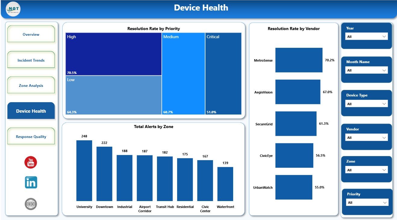
The Device Health page helps teams review whether alerts are being resolved consistently across priorities, vendors, and zones. It is a practical page for monthly operational review with vendors and technical teams.
Resolution Rate by Priority: This chart compares resolution percentage by priority level. It helps confirm whether urgent incidents are being handled with the expected attention.
Resolution Rate by Vendor: This visual compares vendor-level resolution performance. It supports vendor review meetings and service quality discussions.
Total Alerts by Zone: This chart shows alert concentration by zone. It helps identify where devices, citizens, infrastructure, or public safety activity are generating the most monitoring workload.
5. Response Quality
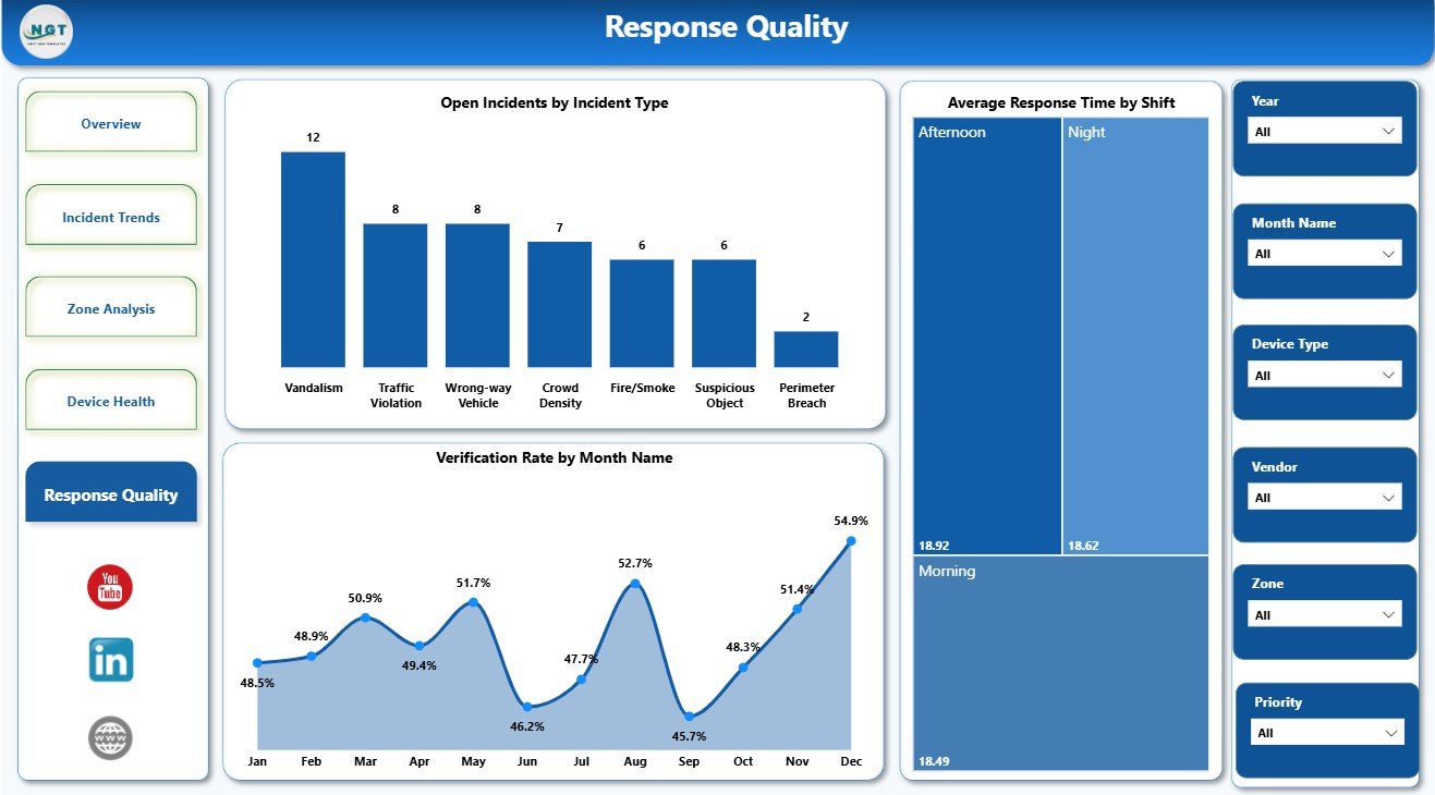
The Response Quality page focuses on unresolved work, shift-level response speed, and verification consistency. This is the page managers can use for process improvement and operator performance discussions.
Open Incidents by Incident Type: This chart shows which incident categories still have open work. It helps teams prioritize the backlog and focus on incident types that remain unresolved for longer.
Average Response Time by Shift: This visual compares response speed by shift. It helps managers identify whether response quality changes between day, evening, and night operations.
Verification Rate by Month Name: This chart tracks verification quality over time. It helps teams review whether alert validation is improving or declining month by month.
Smart City Surveillance Dashboard in Power BI vs. Tableau vs. Paid Security SaaS – Feature Comparison
| Feature | This Power BI dashboard | Tableau alternative | Paid security SaaS |
|---|---|---|---|
| Cost | $17.99 one-time template price | License and build cost | Recurring subscription |
| Platform | Power BI Desktop and Power BI Service if published | Tableau Desktop or Server | Vendor cloud system |
| Setup time | Replace sample data and refresh | Build visuals and model manually | Implementation and onboarding |
| Real-time team collaboration | Possible when published to Power BI Service | Possible with Tableau Server or Cloud | Usually included by plan |
| Mobile access | Available through Power BI apps if published | Available with Tableau mobile options | Usually browser or app based |
| Customizable fields | Editable report model and visuals | Editable with Tableau skills | Limited by vendor configuration |
| Share with link | Possible with Power BI Service permissions | Possible with hosted Tableau | Usually account based |
| Year-1 cost at 5 users | Template cost plus Power BI sharing licenses if needed | Often higher | Often much higher |
| Live camera feed | No, reporting only | No, reporting only | Possible in specialist systems |
Who Should Use This Template
This template is best for public safety analysts, municipal command center teams, security operations managers, CCTV monitoring vendors, smart city project teams, and consultants who need to present surveillance alert performance in Power BI. It is also useful for teams moving away from spreadsheet-only reporting and toward a cleaner visual model.
Real-World Use Cases
City surveillance manager: uses the Overview page during weekly reviews to check verified alerts, escalations, open incidents, and cost pressure.
Vendor operations lead: uses Device Health and Zone Analysis to compare vendor performance, resolution rates, and zone alert concentration before a service review.
Public safety analyst: uses Incident Trends and Response Quality to identify costly zones, slow response shifts, and incident types with weaker resolution rates.
Advantages of Smart City Surveillance Dashboard in Power BI
- It reduces the time needed to build a surveillance report from scratch.
- It gives a structured page layout for executive, trend, zone, device, and response quality analysis.
- It uses Power BI visuals and slicers, so users can filter and drill into segments quickly.
- It supports recurring reporting because users can replace the sample data and refresh the file.
- It provides a one-time purchase option for teams that do not need a full surveillance SaaS platform.
Opportunities for Improvement
This dashboard is a reporting template, so it does not include live CCTV streams, automated dispatching, AI detection, case assignment, or real-time notification workflows. Teams with those requirements should connect it to existing operational systems or use it as a reporting layer alongside a dedicated security platform.
Best Practices
- Keep district, zone, vendor, priority, incident type, shift, and device type names consistent in the source data.
- Refresh the report after updating source records.
- Review high-cost districts and zones separately from high-alert districts, because cost and volume do not always move together.
- Use verification rate and resolution rate together to understand both alert quality and closure quality.
- Review response time by shift during staffing and handover discussions.
Explore Relevant Templates
- Smart City Surveillance Dashboard in Power BI
- Smart City Surveillance Dashboard in Excel
- AI Chatbot Providers Dashboard in Power BI
- Power BI Dashboard templates
Frequently Asked Questions
What is included in the Smart City Surveillance Dashboard in Power BI?
It includes 5 report pages: Overview, Incident Trends, Zone Analysis, Device Health, and Response Quality, with KPI cards, charts, and slicers for surveillance alert analysis.
Can I use my own data?
Yes. Open the .pbix file in Power BI Desktop, replace the sample data with your own surveillance records, and refresh the report.
Does this dashboard track operating cost?
Yes. It includes operating cost analysis by district, priority, year, zone, and device type.
Does it show response quality?
Yes. It includes open incidents by incident type, average response time by shift, and verification rate by month.
Is this a live CCTV monitoring system?
No. It is a Power BI reporting dashboard for incident and alert analytics, not a live monitoring or dispatch platform.
Can I publish it to Power BI Service?
Yes, if your Power BI environment and licensing allow publishing and sharing. The template itself is delivered as a Power BI file.
About the Author
Built by PK – Microsoft Certified Professional with 15+ years of Excel, Google Sheets, and Power BI experience. Founder of NextGenTemplates, reaching 300K+ subscribers across YouTube channels. Every template is hand-built and tested before release.
Conclusion
The Smart City Surveillance Dashboard in Power BI gives surveillance teams a practical way to analyze verified alerts, operating cost, open incidents, escalations, vendor performance, device health, response time, and verification quality. It is a strong fit for teams that already collect surveillance incident data and want a clean Power BI report without building every page from scratch.
For tutorials and more dashboard examples, visit YouTube.com/@PKAnExcelExpert.
Last updated: August 12, 2026.