Most library reporting still happens in a spreadsheet the night before the board meeting. Somebody exports circulation from the ILS, somebody else has the gate counts, the programme attendance lives in a shared folder, and the finance number arrives last. Two hours later there is a table nobody can interrogate.
The Library Services KPI Dashboard in Power BI replaces that ritual with one file. It tracks 14 library KPIs grouped into 6 KPI groups, scores every one against its own target, and shows the verdict twice – month to date and year to date – as a coloured status light. Pick a month from the slicer and the whole report follows. The sample data runs twelve full months to December 2025, so the report is populated the moment you open it.
One thing to be clear about up front: this is a KPI scorecard, not an analytical dashboard. It answers “did we hit target, and which direction are we heading?” It does not slice circulation by branch, format and borrower type. NextGenTemplates publishes both kinds and they carry similar names, so it is worth knowing which one you are looking at.
Key Features of the Library Services KPI Dashboard in Power BI
- 14 KPIs across 6 groups – Access & Usage, Collection Use, Programs & Outreach, Community Reach, Finance & Efficiency and Service Delivery.
- Dual-horizon traffic lights – each KPI carries a Status Light (MTD) and a Status Light (YTD), reading On Target, At Risk or Missed.
- A month picker that drives everything – the five summary cards, every light and every arrow recalculate when you change it.
- A 12-month sparkline on every row – the trend column stays on the full year even when the report is filtered to one month, so a single bad month never reads as a collapse.
- Year-over-year arrows – a signed percentage against the same month last year, coloured for direction.
- Direction-aware achievement – eleven KPIs are higher-is-better; three are lower-is-better and score above 100% when they come in under target.
- Five slicers – Month, KPI Group, Owner, Priority and Direction.
- Two hidden tooltip pages – compact 280×360 report pages that surface on hover.
- Native visuals only – nothing to install from AppSource, nothing locked, one custom theme file driving the colours.
Dashboard Pages Explanation
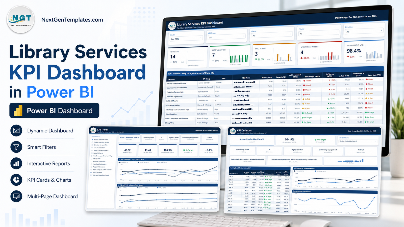
The .pbix holds six pages: four you navigate and two hidden tooltip pages.
Page 1 – KPI Scorecard
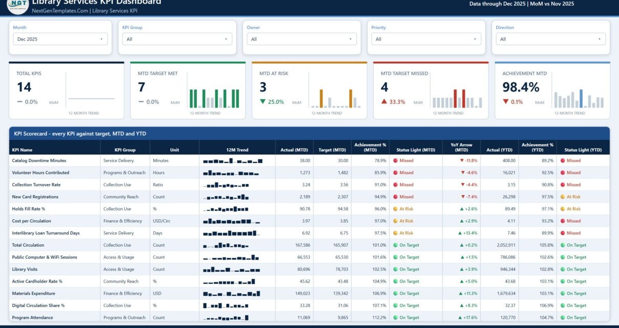
The landing page. Five slicers sit across the top – Month, KPI Group, Owner, Priority and Direction – and below them five summary cards: Total KPIs, MTD Target Met, MTD At Risk, MTD Target Missed and Achievement MTD. Each card carries a month-on-month delta and its own twelve-month trend bar, so you can see whether four missed KPIs is normal or a spike.
Under the cards sits the scorecard table itself, twelve columns wide: KPI Name, KPI Group, Unit, 12M Trend, Actual (MTD), Target (MTD), Achievement % (MTD), Status Light (MTD), YoY Arrow (MTD), Actual (YTD), Achievement % (YTD) and Status Light (YTD). In the sample month, Total Circulation lands at 167,586 against a 165,907 target – green on both horizons – while Volunteer Hours Contributed sits at 1,273 against 1,482 and lights red. Putting the two horizons side by side is the point: a KPI can be red this month and green for the year, and a board deserves to see both.
Page 2 – KPI Trend
Choose one KPI from the list on the left and the page becomes that KPI. Six context cards restate what you selected – the KPI, its group, its unit, its direction, its owner and its priority. Five value cards give KPI Actual (MTD), KPI Target (MTD), KPI Achievement % (MTD), KPI Status (MTD) and KPI YoY % (MTD).
Two line charts fill the rest of the page: CY MTD vs PY MTD vs Target MTD by Month and CY YTD vs PY YTD vs Target YTD by Month. Three series each – current year, prior year and target – which is exactly the picture a trustee asks for when a number moves.
Page 3 – KPI Definition
The same KPI selection carries across; the slicer is synced between the two pages rather than being a drillthrough, so nothing is lost when you switch. This page adds the two things that stop arguments: the formula and the definition. For Active Cardholder Rate % the formula reads “Cards Used in Last 12 Months / Service Area Population” and the definition reads “Residents holding a card used at least once in the trailing twelve months.”
Below that sits a month-by-month detail table – Month Year Short, KPI Actual (MTD), KPI Target (MTD), KPI Achievement % (MTD), KPI Status (MTD), KPI Actual (YTD), KPI Achievement % (YTD) – alongside MTD Actual vs Target by Month and Achievement % by Month charts.
Page 4 – Get More Templates
An in-report catalogue page with customisation notes and contact details. It ships inside the file, so it is shown honestly in the product gallery rather than cropped out.
The data behind it
The report reads a Data.xlsx workbook with a Read Me and three input sheets: Input_ Target (168 rows – 14 KPIs by 12 months), Input_ Actual (336 rows – the same grid for the current and prior year) and KPI Definition (14 rows by 9 columns holding group, name, unit, formula, definition, direction, owner and priority). Change the workbook, hit Home > Refresh in Power BI Desktop, and the whole report moves.
Power BI Scorecard vs Tableau or Qlik vs Paid Library Analytics Software – Feature Comparison
| This Power BI scorecard | Tableau / Qlik build | Paid library analytics platform | |
|---|---|---|---|
| Cost | One-off template price | Per-user licence plus build time | Annual subscription |
| Platform | Power BI Desktop (free) | Tableau or Qlik | Vendor-hosted web app |
| Setup time | Paste your numbers, then Refresh | Built from scratch | Vendor onboarding |
| Connects to your ILS | No – reads Data.xlsx | Depends on the build | Usually yes |
| Real-time team collaboration | Via Power BI Service if you publish | Via the vendor’s server | Built in |
| Mobile access | Power BI mobile app | Vendor app | Built in |
| Customisable fields | Every visual and measure is editable | Yes | Vendor-defined |
| Share with a link | After publishing to the Service | After publishing | Built in |
| Year-1 cost at 5 users | The template price, once | Five licences plus build | Five seats, recurring |
| MTD and YTD lights side by side | Yes | Build it yourself | Varies |
Who Should Use This Template
Library directors and branch managers who report monthly to a board, a council or a funding authority and need the same fourteen numbers in the same shape every time.
Assessment and systems librarians who already pull circulation, gate counts, holds and session data and want somewhere consistent to put them.
Consortium and regional analysts running one copy of the file per member library, all on the same workbook layout.
Consultants and BI freelancers who need a presentable library scorecard on day one rather than week three.
It is not the right tool if you want a live feed from your ILS or discovery layer, per-item or per-patron drill-down, or an external benchmark. Every target in the file is a placeholder you replace.
Real-World Use Cases
The monthly trustee pack. Set the Month slicer, screenshot the scorecard, and pull the KPI Trend page for whatever turned red. In the sample month that would be Catalog Downtime Minutes at 38 against a target of 30, and Volunteer Hours Contributed at 85.9% of target.
Departmental accountability. The Owner slicer splits the fourteen KPIs across Branch Services, IT Services, Collection Services, Digital Services, Public Programming, Volunteer Coordination, Community Engagement, Finance, Collection Development and Resource Sharing. Each department head sees only what they own.
The definitions argument. Somebody will always dispute how Collection Turnover Rate is calculated. The KPI Definition page shows the formula and the wording on screen, in the meeting, and the argument ends.
Triage by priority. The Priority slicer filters to Critical KPIs only – here that is Library Visits, Total Circulation, Holds Fill Rate %, Active Cardholder Rate % and Cost per Circulation – for a five-minute version of the same review.
Advantages of the Library Services KPI Dashboard in Power BI
- One file, no stack. Power BI Desktop is free and the report has no external dependencies beyond the workbook it ships with.
- Both horizons, always. Most scorecards show one. Showing MTD and YTD together stops a single soft month from being read as a trend.
- Lower-is-better done properly. Cost per Circulation, Interlibrary Loan Turnaround Days and Catalog Downtime Minutes are scored so that falling is winning.
- Self-documenting. Formula, definition, owner and priority live in the report, not in a separate policy document.
- Editable end to end. No locked visuals, no custom visuals, and the theme file recolours the whole report at once.
Opportunities for Improvement
Honest limitations, so nobody is surprised after buying:
- No live ILS connection. You maintain the workbook. If you want an automated feed, you would repoint the query at your own source – doable, but it is work you do.
- Fourteen KPIs is a starting set. Adding a fifteenth means editing three sheets, not one.
- Monthly grain only. There is no weekly or daily view in the file.
- No branch dimension. The scorecard is system-level. Per-branch comparison needs an analytical dashboard, not this one.
- Targets are yours. The sample targets are illustrative numbers, not sector benchmarks.
Best Practices
- Set targets once a year, not once a month. A target you move when you miss it is not a target.
- Name an owner for every KPI. The Owner column is only useful if it is real.
- Keep the KPI count near fourteen. Boards read a page, not a spreadsheet.
- Load the prior year before your first meeting. The YoY arrows and the prior-year lines are what make the trend page persuasive.
- Check the direction flag when you add a KPI. Mark cost, wait-time and downtime measures as lower-is-better or they will light red for improving.
- Take the screenshot from a fixed month. Consistent packs are easier to compare across meetings.
Explore Relevant Templates
- Library Services KPI Dashboard in Excel – the same scorecard without Power BI Desktop.
- Library Services KPI Dashboard in Google Sheets – browser-based and shareable by link.
- Libraries & Archives KPI Dashboard in Power BI – a different, wider archives scope.
- Museum Operations KPI Dashboard in Power BI – the same format for a cultural venue.
- Music Festival KPI Dashboard in Power BI – event-side scorecard from the same line.
- Compliance Monitoring Dashboard in Power BI – analytical reporting for governance teams.
- Coaching Networks Dashboard in Power BI – programme-delivery analytics.
Frequently Asked Questions
Does it connect to my library management system?
No. It reads the included Data.xlsx. There is no ILS, discovery-layer or gate-counter connector in the file.
Is this the analytical library dashboard or the scorecard?
The scorecard. It reports KPI against target with traffic lights, trend and definition pages. Analytical library and archive dashboards are separate products.
What software do I need?
Power BI Desktop, which is free from Microsoft, plus Excel or any tool that can save an .xlsx for editing the data.
Can I change the KPIs?
Yes. Edit the KPI Definition sheet and the two input sheets, then refresh. Names, units, formulas, owners, priorities and the higher/lower-is-better flag are all data, not hard-coded.
Are the sample targets real benchmarks?
No. They are placeholders. Nothing in the template represents a national, state or professional-association standard.
Can I share it with my board?
Yes – export a PDF or PowerPoint from Power BI Desktop, or publish to the Power BI Service if your organisation licenses it.
What is in the download?
A single zip containing the .pbix, the Data.xlsx workbook and a Power BI Dashboard user manual PDF.
About the Author
Built by PK – Microsoft Certified Professional with 15+ years of Excel, Google Sheets, and Power BI experience. Founder of NextGenTemplates, reaching 300K+ subscribers across YouTube channels. Every template is hand-built and tested before release.
Conclusion
Library performance reporting does not fail because the numbers are hard. It fails because the numbers arrive in five formats, get retyped, and land in a table nobody can question. A scorecard fixes the shape of the conversation: fourteen KPIs, a target each, a light each, and a page that explains where every figure comes from.
If that is the meeting you want to walk into, get the Library Services KPI Dashboard in Power BI, drop your numbers into the workbook and refresh. For walkthroughs of this and every other template, subscribe at youtube.com/@PKAnExcelExpert.