Running a sporting goods store means watching many moving parts at once: bikes and fitness equipment that sell at high prices, footwear and apparel that sell in volume, online orders that grow every month, and returns that quietly eat into profit. The Sporting Goods Dashboard in Power BI puts all of that on one screen. In this guide we walk through every page of the report, explain what each chart tells you, and show how to plug in your own data.
Watch the Sporting Goods Dashboard in Power BI walkthrough
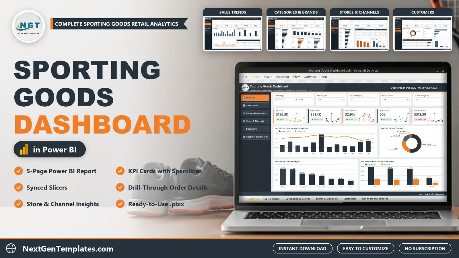
The template is a ready-to-use .pbix file with 500 sample orders for 2025. It covers net sales, gross profit and margin, brands and categories, store locations and sales channels, and customer segments. If you have been looking for a power bi retail dashboard that a store manager can understand in a minute, this is a good place to start. You can download the Sporting Goods Dashboard in Power BI here.
Why a sporting goods retailer needs a dashboard
Sporting goods retail is unusual because the product mix is so wide. A single store can sell a $600 road bike, a $20 pair of socks and a $230 golf driver on the same day. Each category has a different margin, a different return rate and a different season. Looking only at total sales hides most of what matters.
A good retail dashboard power bi users can rely on answers practical questions quickly:
- Which product categories bring the most gross profit, not just the most sales?
- Which brands deserve more shelf space?
- Which store locations and regions are pulling their weight?
- How fast is online and mobile app selling growing compared with in-store?
- Which customer segments buy the most, and which return the most?
This dashboard is built around exactly those questions. It works as a retail analytics dashboard for one store or a chain of many.
What is inside the Sporting Goods Dashboard in Power BI
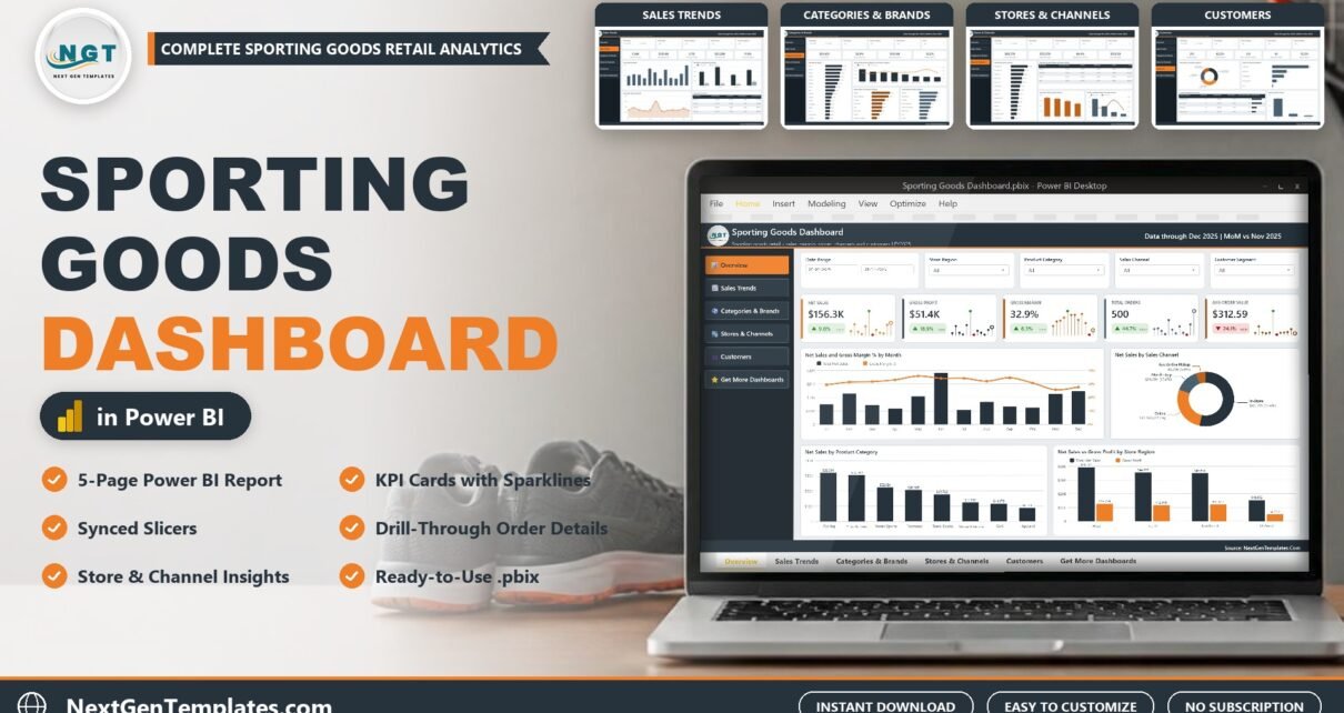
The report has five analysis pages, a Get More Dashboards page, a hidden Details drill-through page and custom tooltip pages. A left-side navigation bar moves you between pages, and every page shares the same slicer row: Date Range, Store Region, Product Category, Sales Channel and a fifth slicer that changes with the page (Customer Segment, Brand, Store Location or Payment Method). The slicers are synced, so a filter you set on one page follows you to the next.
The data behind it is one simple table in Data.xlsx with 17 columns: Order ID, Order Date, Store Region, Store Location, Sales Channel, Product Category, Brand, Customer Segment, Payment Method, Units Sold, Unit Price, Gross Sales, Discount Amount, Net Sales, Cost of Goods, Return Status and Customer Rating. The 500 sample orders are fictional and cover January to December 2025.
Page 1: Overview
The Overview page is the one most managers will open every morning. Five KPI cards sit at the top: Net Sales, Gross Profit, Gross Margin, Total Orders and Avg Order Value. Each card shows the month-over-month change as a green or red badge and a small monthly sparkline, so you see both the latest figure and its direction. In the sample data the year closes at $156.3K net sales and a 32.9% gross margin.
- Net Sales and Gross Margin % by Month combines monthly sales columns with a margin line. A month with high sales but a falling margin usually points to heavy discounting.
- Net Sales by Sales Channel is a donut that splits revenue between In-Store, Online, Mobile App and Buy Online Pickup.
- Net Sales by Product Category ranks the eight categories: Cycling, Fitness Equipment, Water Sports, Footwear, Team Sports, Outdoor and Camping, Golf and Apparel.
- Net Sales vs Gross Profit by Store Region compares West, South, Northeast and Midwest.
Page 2: Sales Trends
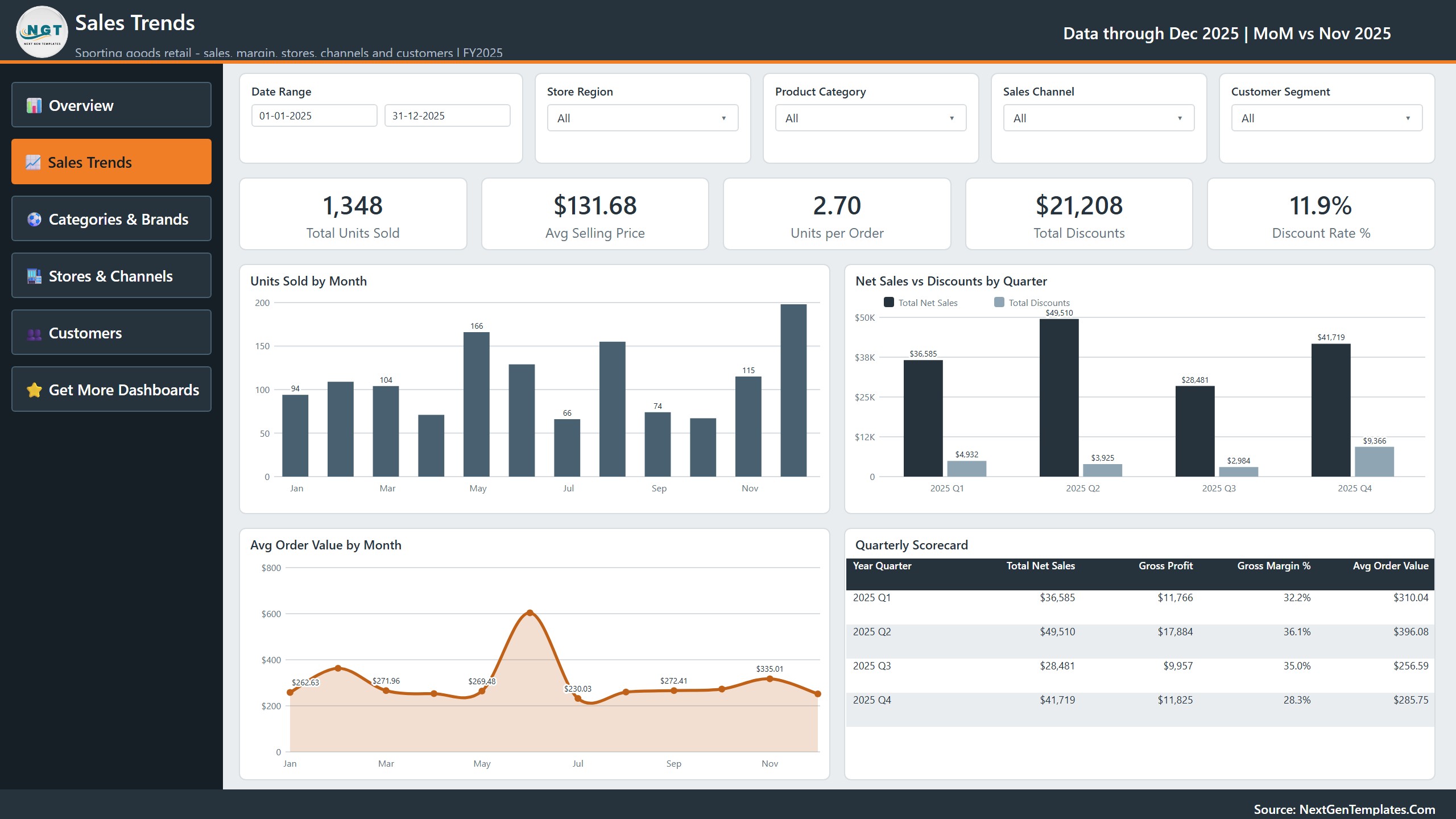
Sporting goods sales are seasonal, and this page makes the seasons visible. The cards show Total Units Sold, Avg Selling Price, Units per Order, Total Discounts and Discount Rate %. The charts are Units Sold by Month, Net Sales vs Discounts by Quarter, Avg Order Value by Month and a Quarterly Scorecard table with net sales, gross profit, margin and average order value for each quarter. Use it to plan stock before the busy months and to check whether discounts are buying real growth.
Page 3: Categories and Brands

This page is about the product mix. Net Sales by Brand ranks all 16 brands in the sample, from Trek and Speedo at the top. Gross Profit and Gross Margin % by Product Category shows profit as columns with the margin line on top, which quickly separates high-volume, thin-margin categories from smaller but more profitable ones. Return Rate % by Product Category and Units Sold by Product Category complete the picture. In the sample, apparel sells the most units but also has the highest return rate, which is exactly the kind of insight a buyer needs.
Page 4: Stores and Channels

The cards compare In-Store Net Sales with Digital Net Sales and show the Digital Sales Share %. Net Sales by Store Location ranks 15 US store cities. A matrix shows Net Sales by Store Region and Sales Channel with totals, Avg Order Value by Sales Channel compares basket size, and Orders and Return Rate % by Sales Channel shows whether a channel that brings many orders also brings many returns. If you run several stores, this is the page for your regional review.
Page 5: Customers
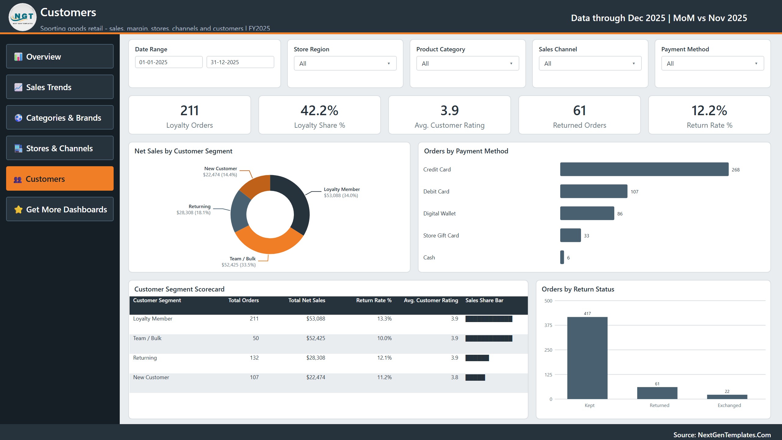
The last analysis page looks at who buys. Cards show Loyalty Orders, Loyalty Share %, Avg. Customer Rating, Returned Orders and Return Rate %. Net Sales by Customer Segment splits revenue between Loyalty Member, Team / Bulk, Returning and New Customer. Orders by Payment Method, a Customer Segment Scorecard and Orders by Return Status (Kept, Returned, Exchanged) finish the page. Team and bulk buyers place few orders but large ones, so this page helps you decide where to spend on loyalty and team sales.
Drill-through and tooltips
Two features make the report feel like an app rather than a static picture. First, right-click any bar and choose Drill through, then Details, to see the individual orders behind that number. Second, hovering a chart opens a custom tooltip page with margin, orders and the channel mix for that point. If you like this style, our guide on Power BI dashboard design that looks like an app explains the design choices behind it.
How to use your own data
- Extract the ZIP to a folder on your PC.
- Open Data.xlsx and replace the sample rows with your orders. Keep the same 17 column headers.
- Open the .pbix file in Power BI Desktop and click Home, then Refresh.
- If Power BI asks for the file location, go to Transform data, then Data source settings, and point it to your Data.xlsx.
- Check the KPI cards against your own totals, then share the report with your team.
Because the measures are built on simple columns like Net Sales, Cost of Goods and Discount Amount, most point-of-sale or ecommerce exports can be mapped in a few minutes.
Who should use this power bi sales dashboard
- Owners of sporting goods, cycling, golf, outdoor or fitness equipment stores.
- Retail analysts who need a finished power bi sales dashboard to show a manager.
- Multi-channel sellers who want store, website and app sales in one view.
- Power BI learners who want a real-world project to study slicers, drill-through and KPI cards.
Frequently asked questions
Do I need a paid Power BI licence?
No. The report opens in the free Power BI Desktop. A Pro licence is only needed if you want to publish and share it in the Power BI Service.
Is the sample data real?
No. The 500 orders are fictional and are there so you can learn the report before you add your own data.
Can I add my own pages or change colours?
Yes. The .pbix is fully editable, and one custom theme controls the colours of every visual.
What is the difference between this and the Sporting Goods KPI Dashboard?
This product is the full five-page analytical report. The KPI Dashboard is a separate template that tracks monthly KPIs against targets.
Does it run on a Mac?
Power BI Desktop is a Windows program. Mac users can run it in a Windows virtual machine or view the published report in a browser.
Related Power BI dashboards
If you work in retail or fitness, you may also like the Fitness Trackers and Wearables Dashboard in Power BI, the Pharmacy Dashboard in Power BI and the Laundromat Dashboard in Power BI. For KPI tracking, see the Sporting Goods KPI Dashboard in Power BI.
Get the Sporting Goods Dashboard in Power BI
Stop guessing which stores, brands and channels make you money. Download the Sporting Goods Dashboard in Power BI with the .pbix file, Data.xlsx sample data and the user manual, and have your first retail report running today. Want to build dashboards like this yourself? Our Excel Pivot Tables and Dashboards course teaches the steps from basic to advanced.