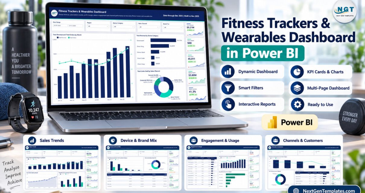
Fitness Trackers & Wearables Dashboard in Power BI is a ready analytical template for teams reporting on wearable-device sales, subscriptions, brand mix, customer channels, and descriptive engagement data. Its sample view covers 500 orders, 45,011 units sold, and $9.21M in revenue across five visible analytical pages. Those figures are demonstration data, not promised results. The report is intended for commercial and operational analysis; it is not a medical device, diagnostic tool, or source of personal health recommendations.
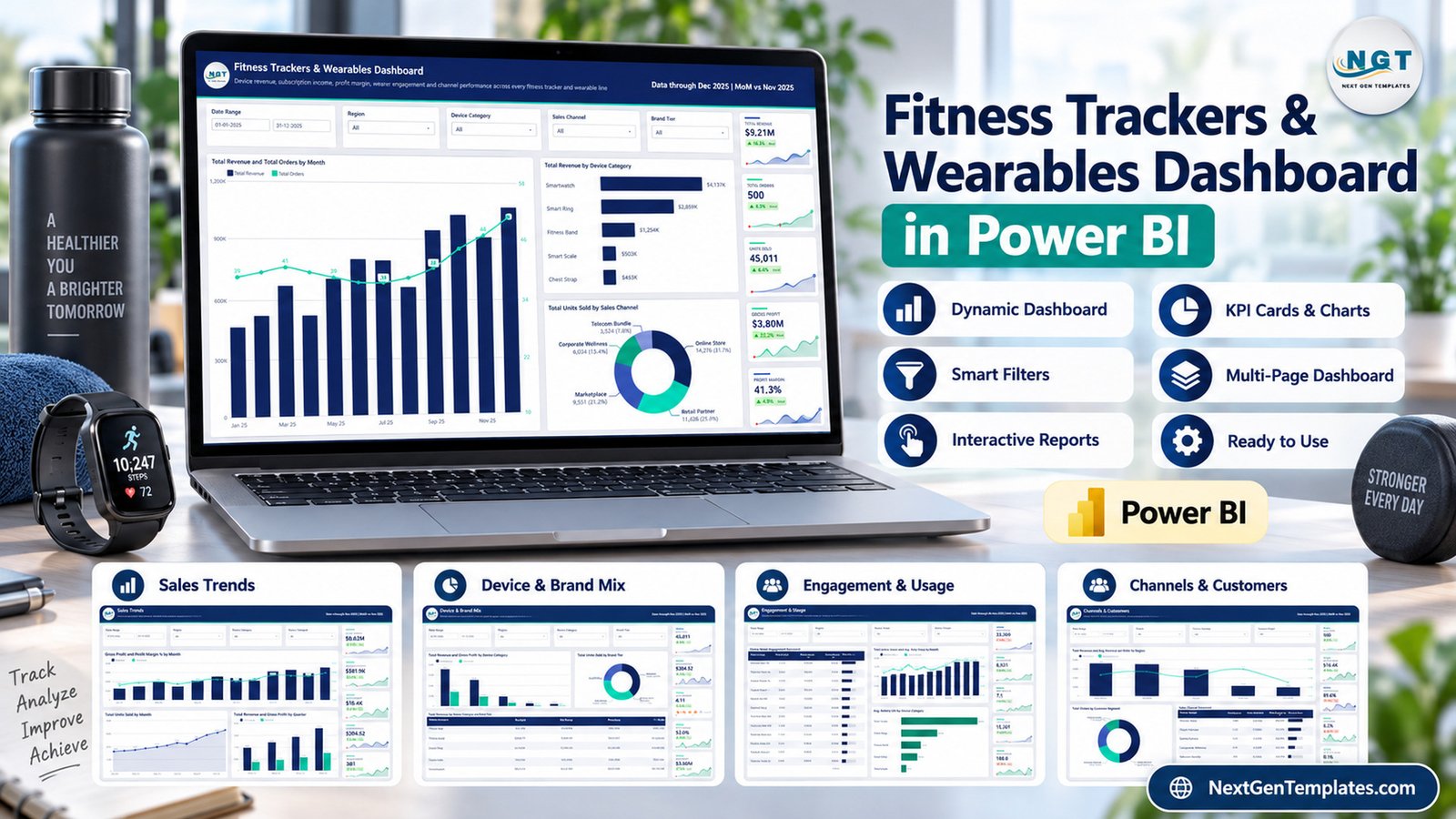
Wearable businesses often need to connect revenue, subscriptions, units, channels, devices, and customer segments in one review. A static sales summary cannot explain whether growth came from Smartwatches, Smart Rings, marketplaces, corporate wellness, or a particular region. This wearable analytics dashboard gives that discussion a consistent Power BI structure without pretending to replace source systems or specialist health platforms.
Key Features of Fitness Trackers & Wearables Dashboard in Power BI
- Five visible analytical pages with consistent navigation and formatting.
- Date, region, device category, sales channel, brand tier, customer segment, and subscription-plan filtering.
- Revenue, orders, units, gross profit, profit margin, subscription income, average order value, fulfillment, returns, and warranty indicators.
- Device categories including Smartwatch, Smart Ring, Fitness Band, Smart Scale, and Chest Strap.
- Descriptive engagement fields for active users, daily steps, sleep hours, sync sessions, and battery life.
- Hidden Details and tooltip pages that support interactive report behavior.
- Download package containing the PBIX, Data.xlsx, and a user manual.
The same report can be described as a Power BI fitness dashboard, fitness device sales dashboard, or wearable technology dashboard. In every case, the scope remains business reporting based on structured data.
Dashboard Pages Explanation
1. Overview
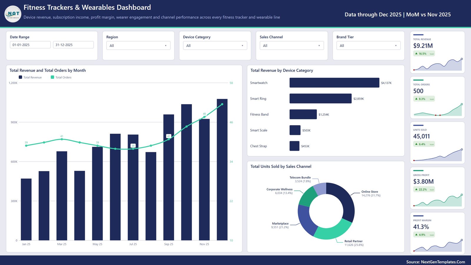
The Overview page puts five core cards beside monthly and categorical analysis. Total Revenue, Total Orders, Units Sold, Gross Profit, and Profit Margin summarize the selected context. A combined monthly view compares revenue with order volume, while the supporting visuals rank device categories by revenue and split units sold across channels.
This page is useful for an executive opening view because it answers three immediate questions: how much activity occurred, which device categories contributed the most revenue, and where units were sold. The filters allow the same questions to be asked for a chosen date range, region, category, channel, or brand tier.
2. Sales Trends
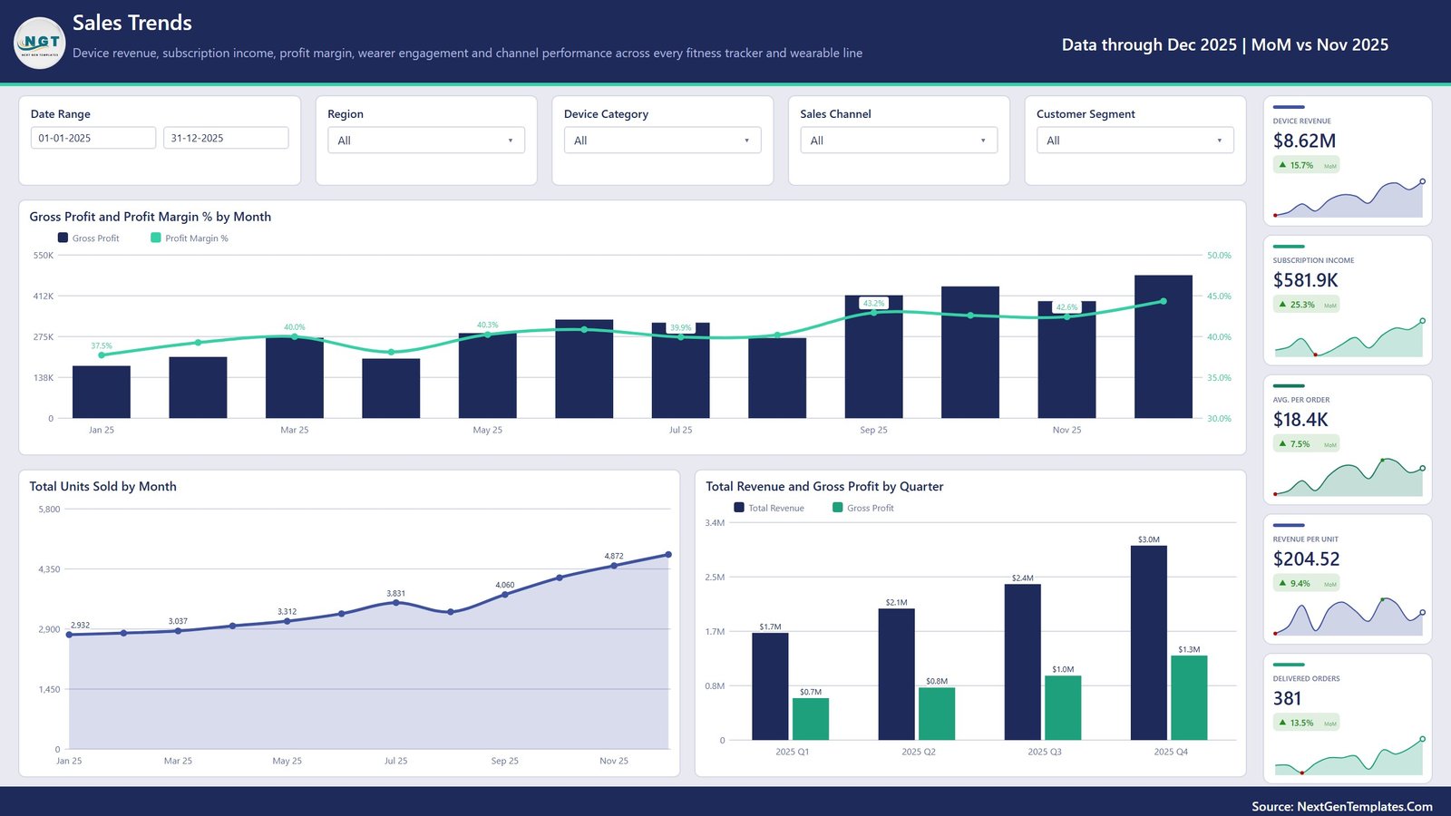
Sales Trends compares gross profit and profit margin by month, units sold by month, and quarterly revenue against quarterly gross profit. The right-side cards add device revenue, subscription income, average revenue per order, revenue per unit, and delivered orders.
The separation between device revenue and subscription income is especially useful for a business with hardware plus recurring plans. It keeps the report descriptive: users can observe the mix and movement in their source data without assuming the dashboard predicts future performance.
3. Device & Brand Mix
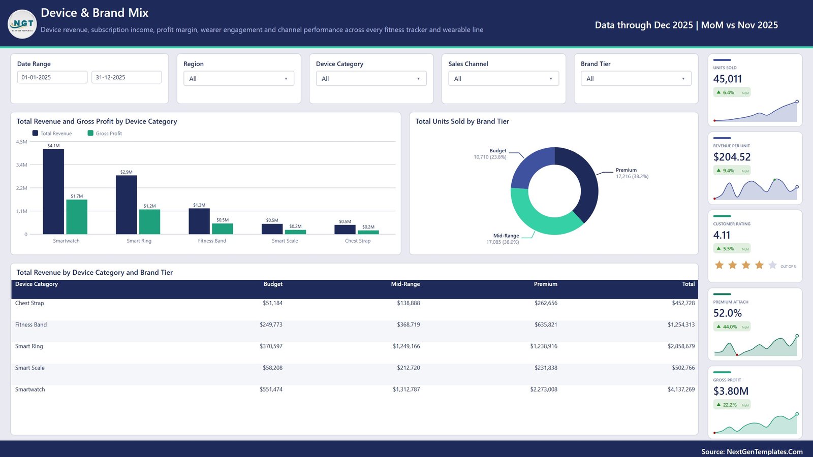
This page compares revenue and gross profit across Smartwatches, Smart Rings, Fitness Bands, Smart Scales, and Chest Straps. A brand-tier visual splits unit volume among Budget, Mid-Range, and Premium, while the matrix shows device-category revenue inside each tier.
Commercial teams can use the page to discuss portfolio balance, premium mix, and category concentration. The sample customer-rating card is simply a field in the demo dataset; it is not a medical, clinical, or product-safety assessment.
4. Engagement & Usage
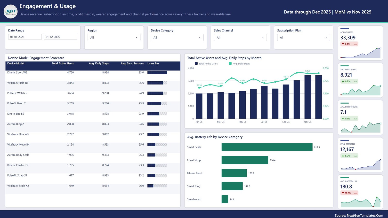
Engagement & Usage provides a model-level scorecard for active users, average daily steps, and average sync sessions. It also tracks active users and steps by month and compares average battery life by device category. Supporting cards show active users, daily steps, sleep hours, sync sessions, and battery life.
These metrics can help a product team organize descriptive usage reporting when the source data contains them. They should not be interpreted as recommendations, diagnoses, health outcomes, or proof that one device improves wellbeing. Any real deployment should apply appropriate privacy, consent, and data-governance controls outside the template.
5. Channels & Customers
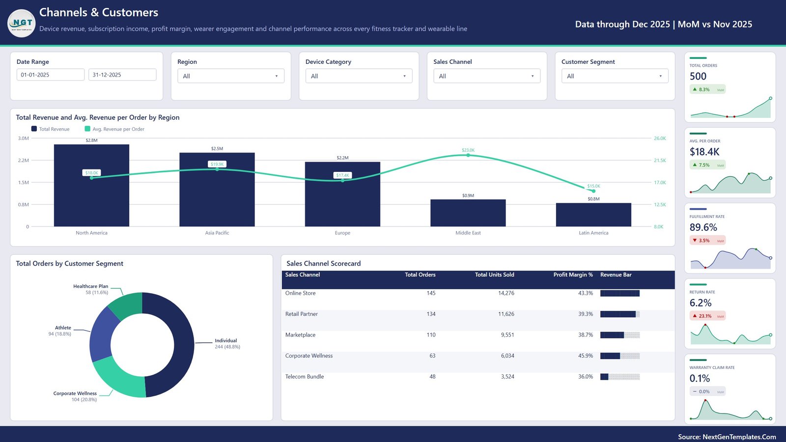
Channels & Customers compares revenue and average order value across regions, orders across customer segments, and channel performance across online store, retail partner, marketplace, corporate wellness, and telecom bundle routes. KPI cards show orders, average order value, fulfillment rate, return rate, and warranty claim rate.
This page supports channel reviews because it places revenue, volume, margin, fulfillment, returns, and claims in the same reporting context. It does not replace order management, warranty workflows, or ecommerce systems.
Fitness Trackers & Wearables Dashboard in Power BI vs. Tableau vs. Paid Analytics SaaS – Feature Comparison
| Factor | This Power BI template | Tableau alternative | Paid analytics SaaS |
|---|---|---|---|
| Cost model | One-time template purchase | Build effort plus licensing choice | Recurring subscription |
| Platform | Power BI Desktop PBIX | Tableau workbook | Vendor-controlled web application |
| Starting point | Five designed analytical pages | Custom build or converted design | Predefined vendor modules |
| Collaboration | Sharing may require Power BI Service | Sharing may require Cloud or Server | Usually plan dependent |
| Customization | Editable report and model | Editable with Tableau expertise | Depends on vendor permissions |
| Wearable reporting | Devices, sales, subscriptions, usage, customers | Requires equivalent custom design | May emphasize integrations or operations |
Who Should Use This Template
Wearable-device brands can use the report as a monthly commercial review layout. Retail and channel teams can compare regions, customer segments, and sales routes. Subscription managers can keep device revenue and subscription income visible together. Power BI consultants can use the design as a client-ready starting point after validating and adapting the model.
The template is not suitable as a clinical dashboard, personal health record, live IoT integration, CRM, ecommerce platform, warranty system, or device-management console. It also does not supply legal or regulatory compliance.
Real-World Use Cases
Monthly business review: A wearable brand analyst filters the report to a region and reviews revenue, unit movement, profit, and channel results with management.
Portfolio review: A product manager compares category and brand-tier mix to identify where the current dataset is concentrated.
Channel meeting: A retail manager compares online store, marketplace, partner, corporate wellness, and telecom bundle performance.
Usage reporting: A product operations team reviews active users, sync sessions, battery life, and other supplied engagement fields while keeping the discussion descriptive.
Advantages of Fitness Trackers & Wearables Dashboard in Power BI
The strongest advantage is coverage: commercial performance, device mix, engagement, regions, customers, and channels are separated into focused pages but use a consistent visual system. The PBIX is editable, so experienced Power BI users can adjust measures, fields, visuals, and formatting. The supplied Data.xlsx makes the expected source structure easier to inspect than a report delivered without a sample dataset.
The page design is also presentation friendly. Each visible page uses a clear title, filters at the top, analysis in the center, and compact KPI cards on the right. This makes the report easier to explain during a meeting than a single overloaded canvas.
Opportunities for Improvement
The template does not include a live device API connector, automated ecommerce ingestion, row-level security configuration, deployment pipeline, or mobile-specific layout. Teams that need those capabilities should plan additional Power BI development. The report also depends on consistent source fields; replacing the sample data without matching the schema can break calculations or visuals.
Because engagement fields may relate to individuals, a production deployment should define data ownership, privacy controls, retention, access, and consent outside the template. The dashboard itself does not create that governance.
Best Practices
- Open the PBIX in Power BI Desktop and review all pages before changing the model.
- Inspect Data.xlsx and map your source fields to the expected columns.
- Refresh and reconcile totals against the originating system before presenting results.
- Keep sample and production files separate so demo data cannot be mistaken for live data.
- Apply appropriate privacy and access controls when engagement fields relate to identifiable users.
- Document any measure or definition changes for future report owners.
Explore Relevant Templates
For closely related reading on this site, see the Fitness Apps Dashboard in Power BI, Online Fitness Communities Dashboard in Power BI, and CrossFit Gym KPI Dashboard in Power BI. Each covers a different reporting scope, so they are useful comparisons rather than duplicates.
Frequently Asked Questions
What is included in the download?
The ZIP includes the Power BI PBIX, Data.xlsx, and a Power BI Dashboard user manual.
How many pages does the PBIX contain?
It contains five visible analytical pages, a visible Get More Dashboards page, a hidden Details page, and two hidden tooltip pages.
Can I replace the sample data?
Yes. Match your data to the supplied structure, refresh the model, and validate the results against your source.
Does it connect directly to wearable devices?
No. It analyzes structured source data and does not include a live device API integration.
Is this a medical dashboard?
No. It is a business analytics template and does not diagnose, treat, monitor clinical conditions, or provide health advice.
Can I share the report online?
You can publish it according to your organization’s Power BI licensing, workspace, security, and data-governance arrangements.
Is Power BI experience required?
Basic Power BI familiarity helps when replacing data or modifying the model. The included user manual provides orientation.
About the Author
Built by PK – Microsoft Certified Professional with 15+ years of Excel, Google Sheets, and Power BI experience. Founder of NextGenTemplates, reaching 300K+ subscribers across YouTube channels. Every template is hand-built and tested before release.
Conclusion
The Fitness Trackers & Wearables Dashboard in Power BI provides a structured starting point for wearable-product business reporting. Its five analytical pages connect sales, subscriptions, devices, engagement, customers, and channels without making medical claims. Review the screenshots, confirm the source structure, and download the dashboard from NextGenTemplates when the scope matches your reporting needs.
For more Excel and Power BI tutorials, visit PK-AnExcelExpert on YouTube.