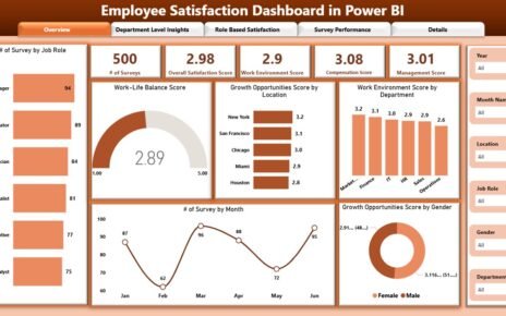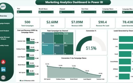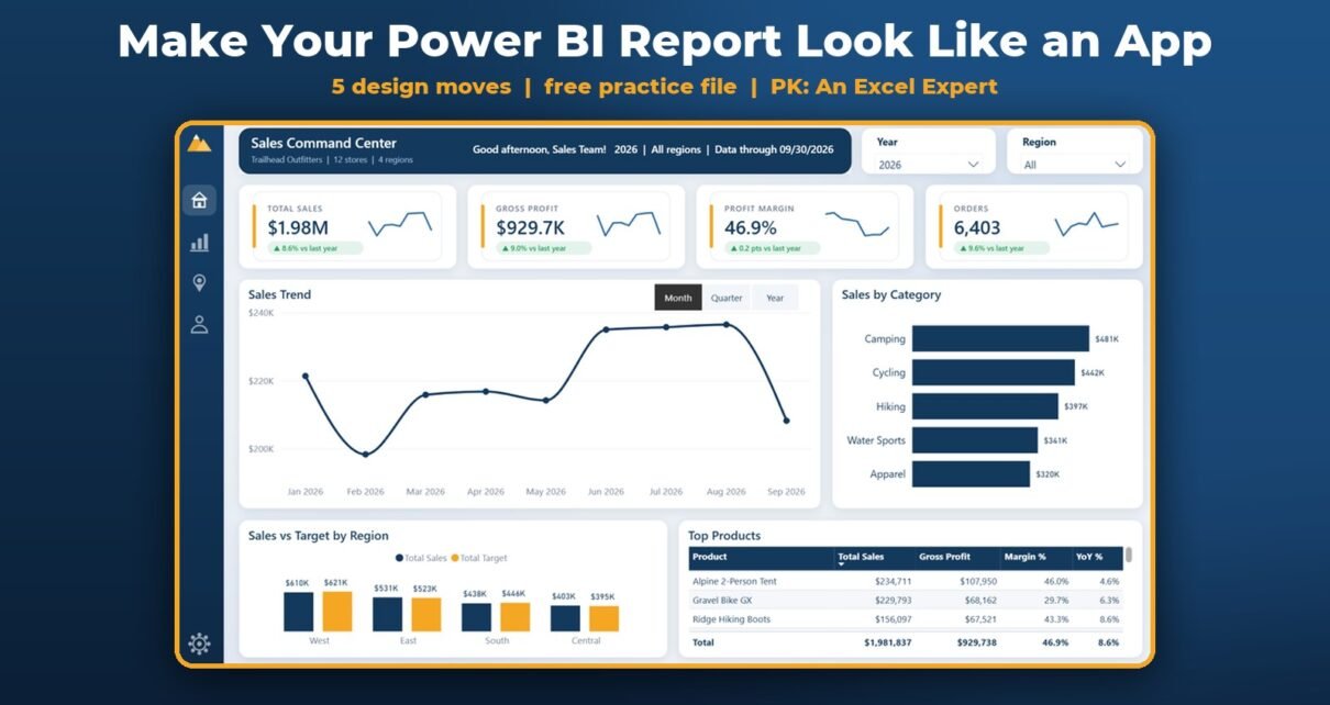
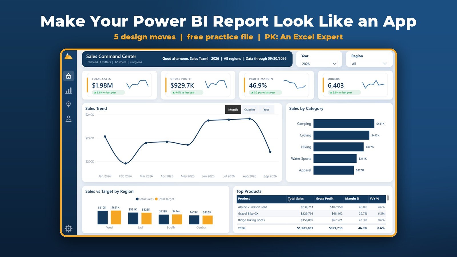
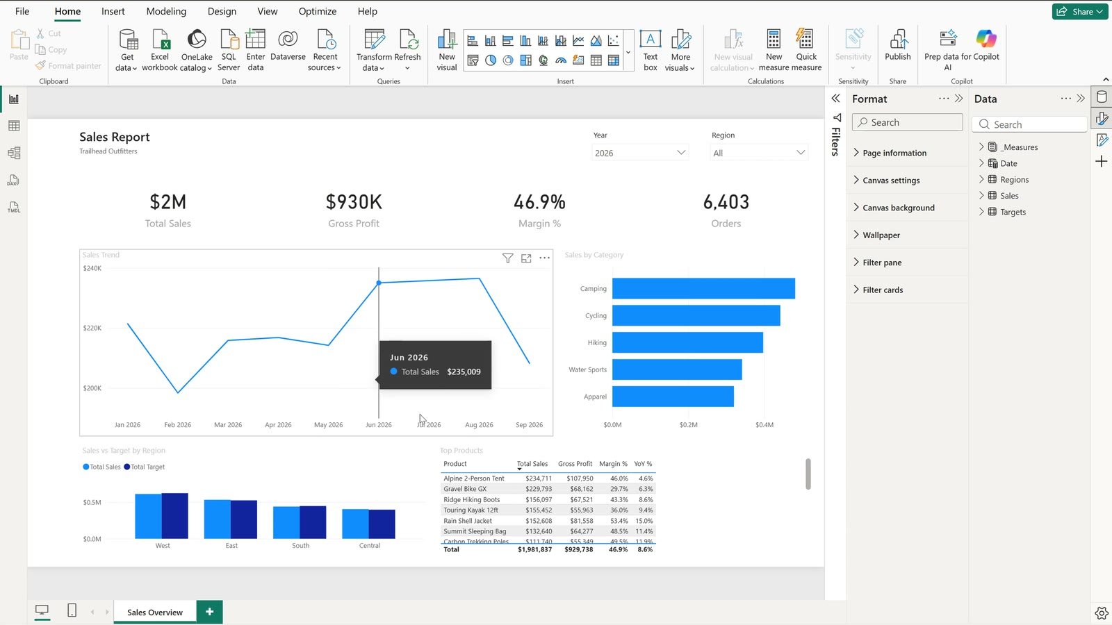
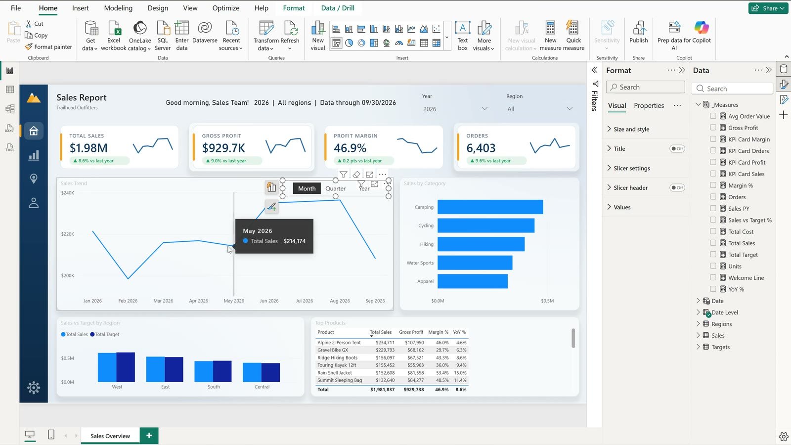
Your Power BI dashboard design can be correct and still nobody opens it. In this tutorial we take a plain Trailhead Outfitters sales report – $1.98M in sales for January to September 2026, $929.7K gross profit, a 46.9% margin and 6,403 orders – and turn it into a report that feels like an app with just five design moves. The data does not change at all, only the design.
⬇️ Download the Free Practice File
Practice + Solution .pbix, sales data, background image and DAX cheat sheet · .zip · Power BI Desktop
Watch the Video Tutorial
Video Overview
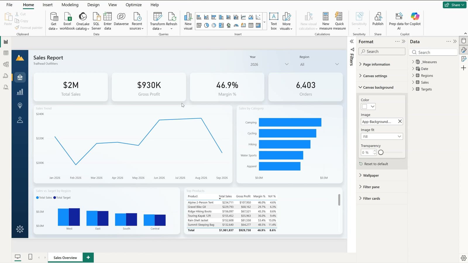
The video starts from the free practice file: one Power BI report page with the default theme, plain cards and a monthly trend chart. Move one adds a script-made background image with a dark navigation rail. Move two selects all eight visuals with Ctrl + click and gives them a white background, 12 px rounded corners, a light border and a soft shadow in one go. Move three writes a Welcome Line measure that greets the sales team by time of day and repeats the slicer choices. Move four is the big one: a DAX measure that draws a complete KPI card as an SVG picture – label, value, a green or red badge against last year and a monthly sparkline – shown through the Image visual. Move five replaces bookmarks with a field parameter, so a tile slicer switches the trend chart between Month, Quarter and Year.
What You Will Build
- A background image with a navigation rail and a soft grey canvas (no text baked in).
- Card containers – rounded corners, border and shadow on every visual.
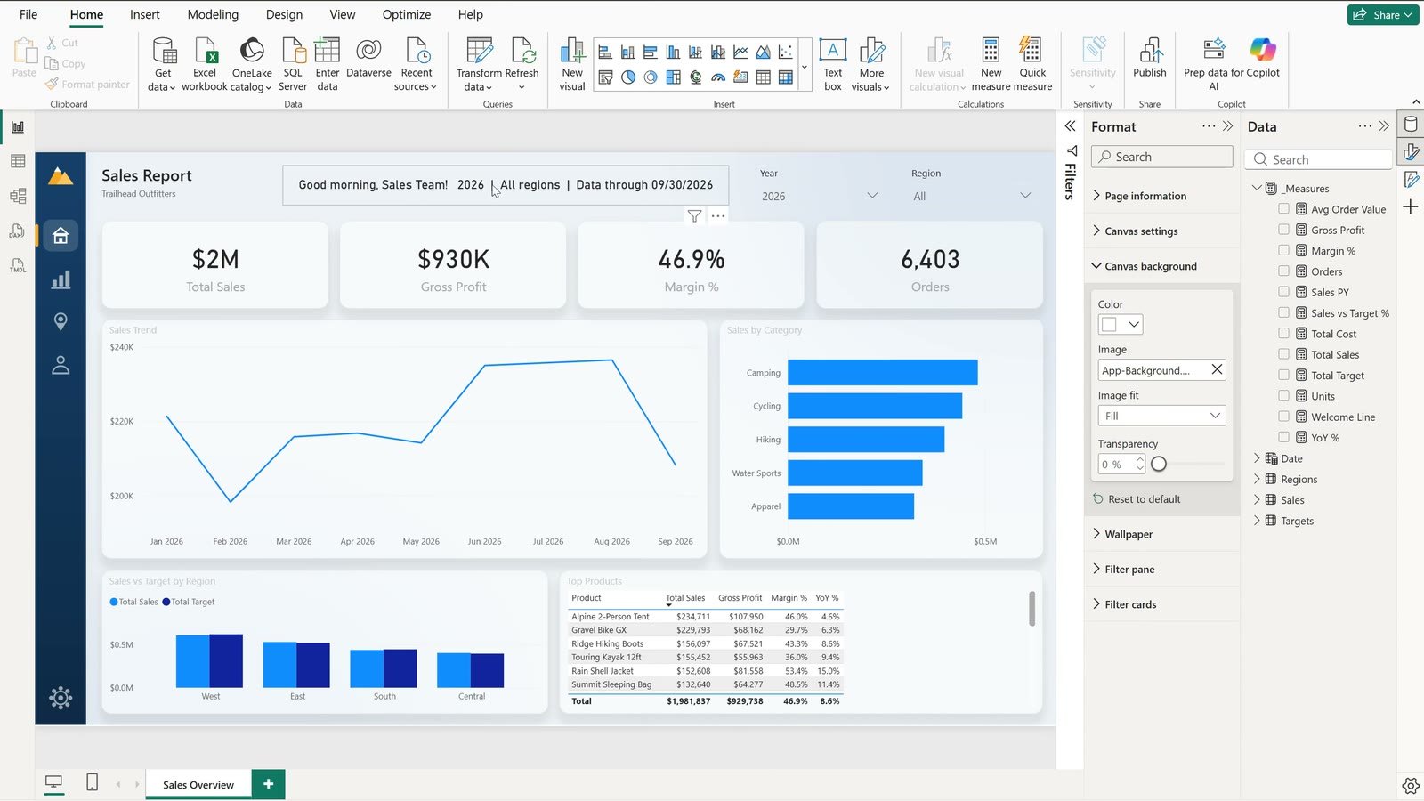
- A dynamic welcome line: “Good morning, Sales Team! 2026 | All regions | Data through 09/30/2026”.
- Four SVG KPI cards: Total Sales $1.98M (up 8.6%), Gross Profit $929.7K (up 9.0%), Profit Margin 46.9% (up 0.2 pts) and Orders 6,403 (up 9.6%).
- A Month / Quarter / Year switcher built with a field parameter – no bookmarks, no hidden visuals.
The Practice File
The download has a Practice .pbix (the plain “before” report with 11 ready measures), a Solution .pbix with all five moves done, the Trailhead-Outfitters-Sales.xlsx data (20,960 order lines from 01/01/2025 to 09/30/2026 for 12 US stores in 4 regions), the background image and a DAX cheat sheet with every measure from the video.
Move 1 – Add a Background Image
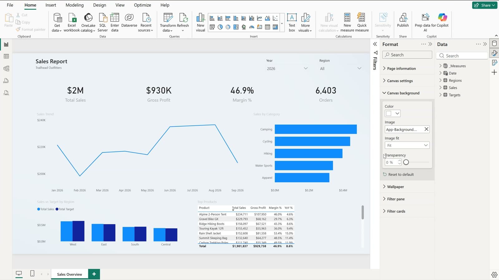
Click an empty part of the page so nothing is selected. In the Format pane open Canvas background, click Browse and pick App-Background.png. Then open Image fit, choose Fill and keep the transparency at 0%. The image only carries the rail and the canvas colour – titles and numbers stay Power BI visuals, so you can still edit them.
Move 2 – Rounded Card Containers With a Soft Shadow
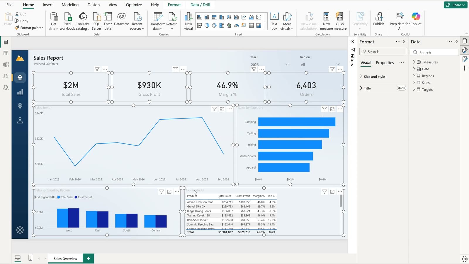
Click the first card, hold Ctrl and click every other visual – the other three cards, the trend chart, the category chart, the region chart and the table. With all eight selected, open Size and style and switch on Background, Visual border and Shadow. Set the rounded corners to 12 px, pick a light grey border, then a light grey shadow with the position set to Bottom.
Move 3 – A Dynamic Welcome Line in DAX
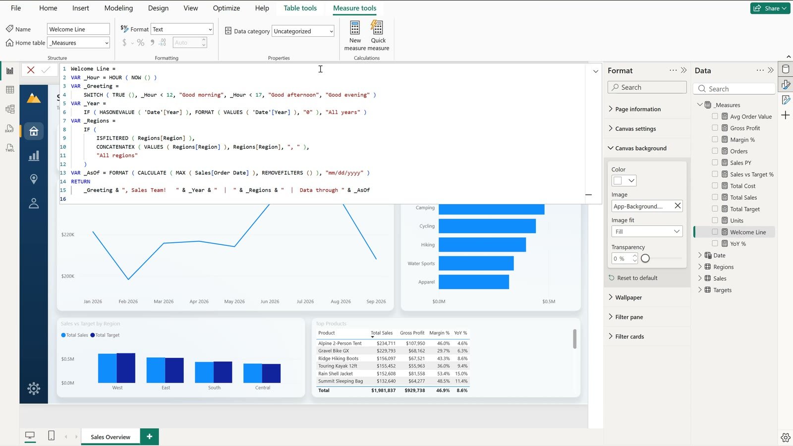
Click the Measures table, choose Home › New measure and paste this measure. NOW gives the current hour and SWITCH turns it into a greeting, HASONEVALUE reads the year slicer, CONCATENATEX lists the selected regions and the last part finds the latest order date.
Welcome Line =
VAR _Hour = HOUR ( NOW () )
VAR _Greeting =
    SWITCH ( TRUE (), _Hour < 12, "Good morning", _Hour < 17, "Good afternoon", "Good evening" )
VAR _Year =
    IF ( HASONEVALUE ( 'Date'[Year] ), FORMAT ( VALUES ( 'Date'[Year] ), "0" ), "All years" )
VAR _Regions =
    IF (
        ISFILTERED ( Regions[Region] ),
        CONCATENATEX ( VALUES ( Regions[Region] ), Regions[Region], ", " ),
        "All regions"
    )
VAR _AsOf = FORMAT ( CALCULATE ( MAX ( Sales[Order Date] ), REMOVEFILTERS () ), "mm/dd/yyyy" )
RETURN
    _Greeting & ", Sales Team!   " & _Year & "  |  " & _Regions & "  |  Data through " & _AsOf
Tick Welcome Line to create a card, switch off the category label, set the callout font to 13 and place it in the header next to the title. Pick West in the Region slicer and the line changes by itself.
Move 4 – SVG KPI Cards With Badge and Sparkline
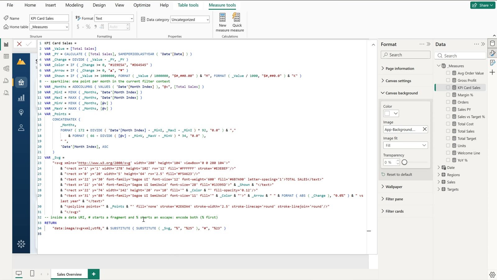
This is the big one. Each card is one picture drawn by a DAX measure: the label, the value, a green or red badge against the same period last year and a small monthly sparkline. Create a new measure and paste KPI Card Sales:
KPI Card Sales =
VAR _Value = [Total Sales]
VAR _PY = CALCULATE ( [Total Sales], SAMEPERIODLASTYEAR ( 'Date'[Date] ) )
VAR _Change = DIVIDE ( _Value - _PY, _PY )
VAR _Color = IF ( _Change >= 0, "#1E9E5A", "#D64545" )
VAR _Arrow = IF ( _Change >= 0, "▲", "▼" )
VAR _Shown = IF ( _Value >= 1000000, FORMAT ( _Value / 1000000, "$#,##0.00" ) & "M", FORMAT ( _Value / 1000, "$#,##0.0" ) & "K" )
-- sparkline: one point per month in the current filter context
VAR _Months = ADDCOLUMNS ( VALUES ( 'Date'[Month Index] ), "@v", [Total Sales] )
VAR _MinI = MINX ( _Months, 'Date'[Month Index] )
VAR _MaxI = MAXX ( _Months, 'Date'[Month Index] )
VAR _MinV = MINX ( _Months, [@v] )
VAR _MaxV = MAXX ( _Months, [@v] )
VAR _Points =
    CONCATENATEX (
        _Months,
        FORMAT ( 172 + DIVIDE ( 'Date'[Month Index] - _MinI, _MaxI - _MinI ) * 92, "0.0" ) & ","
            & FORMAT ( 66 - DIVIDE ( [@v] - _MinV, _MaxV - _MinV ) * 34, "0.0" ),
        " ",
        'Date'[Month Index], ASC
    )
VAR _Svg =
    "<svg xmlns='http://www.w3.org/2000/svg' width='280' height='104' viewBox='0 0 280 104'>"
        & "<rect x='1' y='1' width='278' height='102' rx='12' fill='#FFFFFF' stroke='#E3E8EF'/>"
        & "<rect x='0' y='20' width='5' height='64' rx='2.5' fill='#F5A623'/>"
        & "<text x='22' y='30' font-family='Segoe UI' font-size='12' font-weight='600' fill='#6B7A90' letter-spacing='1'>TOTAL SALES</text>"
        & "<text x='22' y='64' font-family='Segoe UI Semibold' font-size='28' fill='#13395D'>" & _Shown & "</text>"
        & "<rect x='22' y='74' width='142' height='20' rx='10' fill='" & _Color & "' fill-opacity='0.12'/>"
        & "<text x='31' y='88' font-family='Segoe UI Semibold' font-size='11' fill='" & _Color & "'>" & _Arrow & " " & FORMAT ( ABS ( _Change ), "0.0%" ) & " vs last year" & "</text>"
        & "<polyline points='" & _Points & "' fill='none' stroke='#2E6DA4' stroke-width='2.5' stroke-linecap='round' stroke-linejoin='round'/>"
        & "</svg>"
-- inside a data URI, # starts a fragment and % starts an escape: encode both (% first)
RETURN
    "data:image/svg+xml;utf8," & SUBSTITUTE ( SUBSTITUTE ( _Svg, "%", "%25" ), "#", "%23" )
The trap that breaks most SVG cards: inside an image link the hash sign starts a fragment, so every colour code breaks the picture. The last line replaces % with %25 and then # with %23.
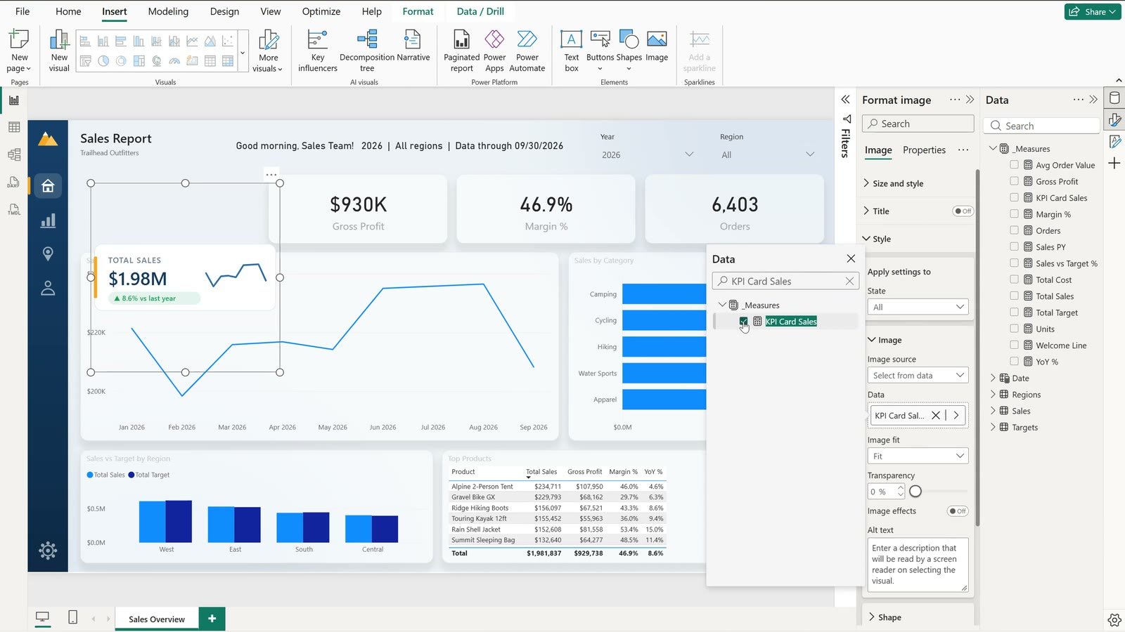
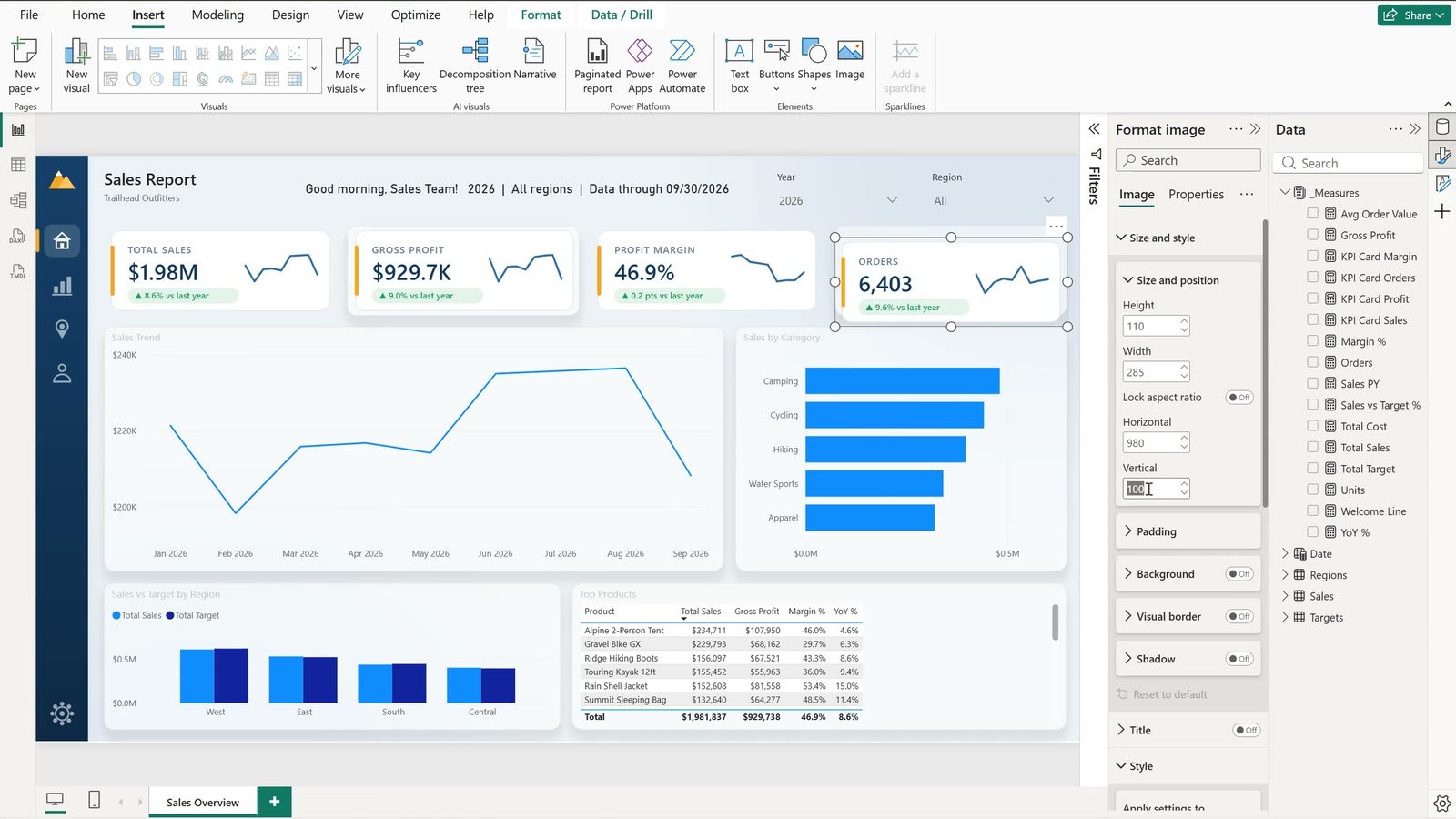
On Measure tools › Data category choose Image URL. Delete the old Total Sales card, click Insert › Image, open Style, set Image source to Select from data, click Add data and pick KPI Card Sales. Give it the same size and position as the old card (110 x 285).
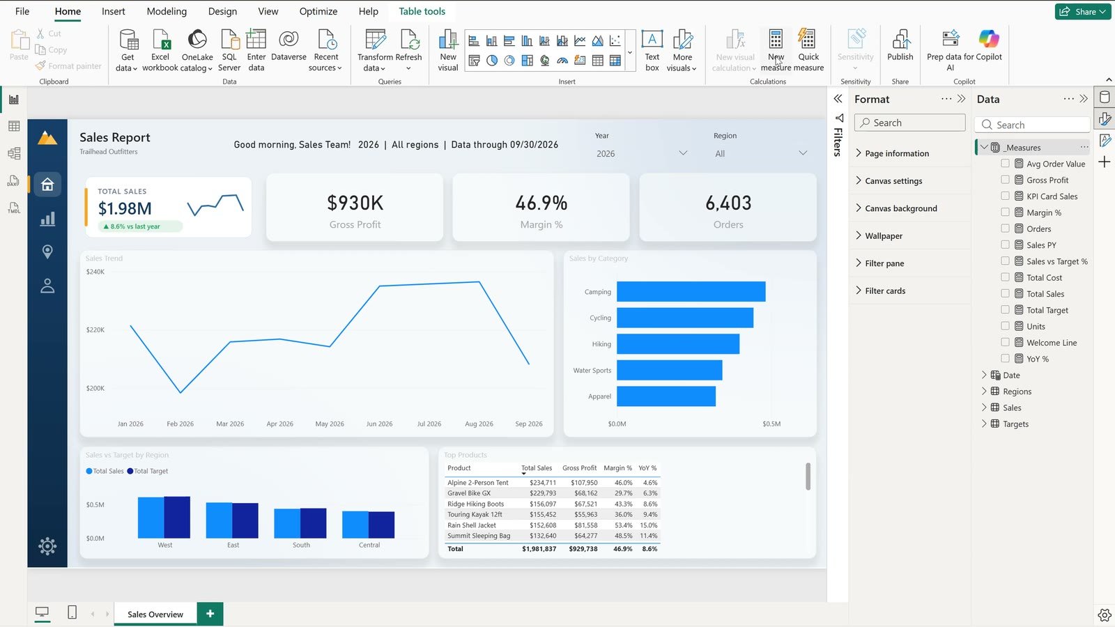
The other three cards use the exact same template – only the label, the base measure and the number format change. The margin card shows its change in points (46.7% to 46.9% is +0.2 pts), and the orders card is a plain count with no dollar sign.
Move 5 – A Date Switcher With a Field Parameter
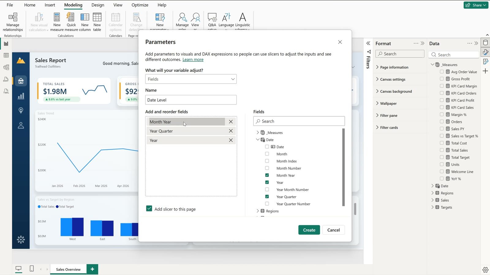
Instead of bookmarks and hidden visuals, use a field parameter. On the Modeling tab click New parameter › Fields, name it Date Level and tick Month Year, Year Quarter and Year in that order (the first one becomes the default). Rename them Month and Quarter, keep Add slicer to this page ticked and click Create. Power BI writes this table:
Date Level =
{
    ("Month", NAMEOF ( 'Date'[Month Year] ), 0),
    ("Quarter", NAMEOF ( 'Date'[Year Quarter] ), 1),
    ("Year", NAMEOF ( 'Date'[Year] ), 2)
}
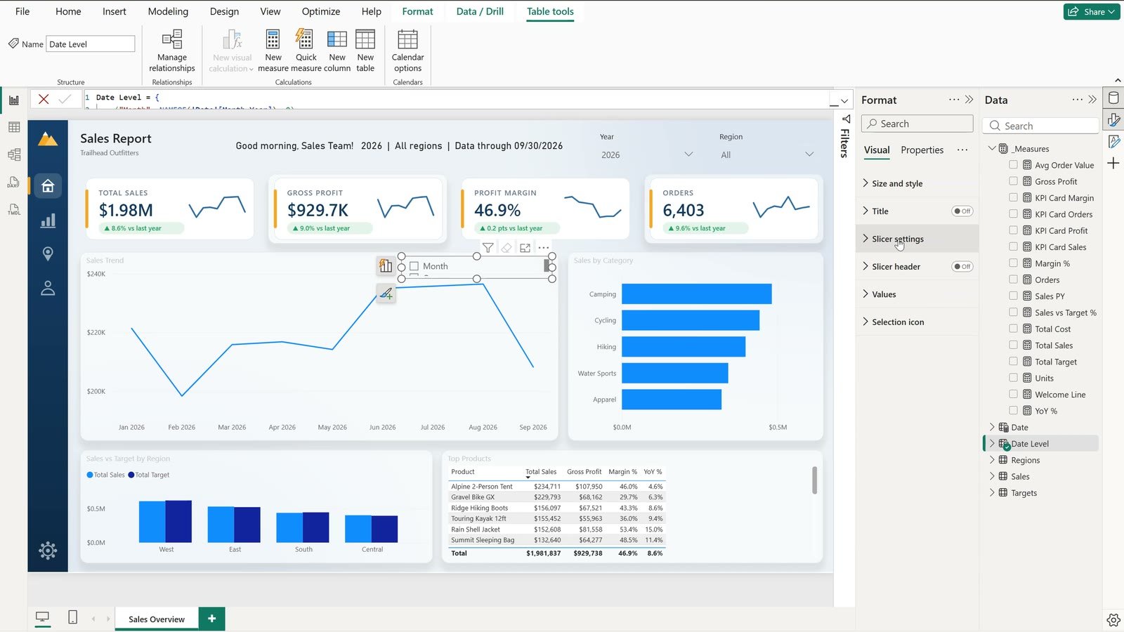
Place the slicer in the top right corner of the trend chart, switch off its header, set Slicer settings › Style to Tile and turn on Single select. Then remove Month Year from the chart’s X axis and add Date Level instead.
Before vs After
| Element | Default report | App-style report |
|---|---|---|
| Page | White canvas | Background image with navigation rail |
| Visuals | Floating, no edges | Rounded cards, border and soft shadow |
| Header | Static title | Welcome line that follows the slicers |
| KPIs | Plain numbers | SVG cards with badge vs last year and sparkline |
| Date levels | Month only | Month / Quarter / Year via a field parameter |
Tips
- Keep text out of the background image so every title stays editable.
- Style all visuals in one multi-select so the containers stay consistent.
- Reuse one SVG template for every KPI card – change the colour once and every card follows.
- Bonus:
NOW()uses your computer clock in Desktop but UTC in the Power BI service – subtract your offset inside the measure. - Microsoft’s documentation on field parameters lists every option the dialog offers.
Want It Ready-Made?
If you would rather start from a finished design, browse our ready-to-use Power BI dashboards at affordable rates – for example the DIY Craft Stores Dashboard in Power BI for retail. We also customise any dashboard or build a brand new one on demand, at affordable rates, with a 1-2 day turnaround – see custom dashboards. More examples on this site: Forensics & Investigation Dashboard in Power BI, Lawn Care Business KPI Dashboard in Power BI and, for Excel, How to Make a Production Tracker in Excel.
Frequently Asked Questions
How do I make a Power BI report look like an app?
Use five design moves: a background image with a navigation rail, rounded card containers with a soft shadow on every visual, a dynamic welcome line written in DAX, SVG KPI cards with a badge and sparkline, and a field-parameter date switcher instead of bookmarks.
How do I add a background image to a Power BI report page?
Click an empty part of the page, open Format › Canvas background, click Browse and pick the image, then set Image fit to Fill and keep the transparency at 0%. Keep text out of the image so titles stay editable visuals.
How do I create an SVG KPI card in Power BI?
Write a DAX measure that returns the text data:image/svg+xml;utf8, followed by the SVG markup, set the measure's Data category to Image URL, then insert an Image visual and set Style › Image source to Select from data with that measure.
Why does my SVG measure show a broken image in Power BI?
Inside an image data URI the hash sign starts a fragment, so every colour code such as #F5A623 breaks the picture. Replace % with %25 and then # with %23 with SUBSTITUTE before you return the string.
What is a field parameter in Power BI?
A field parameter is a small calculated table that holds a list of columns or measures. Put it on a visual's axis and a slicer on the parameter lets the viewer switch, for example, between Month, Quarter and Year with one click.
Is a field parameter better than bookmarks for switching date levels?
Yes for this job. A field parameter needs one visual and one slicer, while bookmarks need a hidden visual per level plus buttons that you must keep in sync whenever the report changes.
Why does the NOW() greeting show the wrong time in the Power BI service?
Power BI Desktop uses your computer clock, but the Power BI service evaluates NOW() in UTC. Subtract your offset inside the measure, for example 4 or 5 hours for New York.
Can I get a ready-made app-style Power BI dashboard instead?
Yes. NextGenTemplates.com has ready-to-use Power BI dashboards at affordable rates, and the team also customises any dashboard or builds a new one on demand with a 1-2 day turnaround.
Download the Practice File
Get the Practice and Solution .pbix files, the Trailhead Outfitters data, the background image and the DAX cheat sheet in one zip.
⬇️ Download the Free Practice File
Practice + Solution .pbix, sales data, background image and DAX cheat sheet · .zip · Power BI Desktop
About the Author
PK (Priyendra Kumar) runs PK: An Excel Expert and NextGenTemplates.com and has been teaching Excel, Power Query and Power BI on YouTube for years. Every number in this tutorial comes from the Solution file you can download above.
Conclusion
Good Power BI dashboard design is not about more visuals – it is about framing the ones you have. A background image, card containers, a welcome line, SVG KPI cards and a field-parameter switcher turn a correct report into one people actually want to open, and the data never changes.