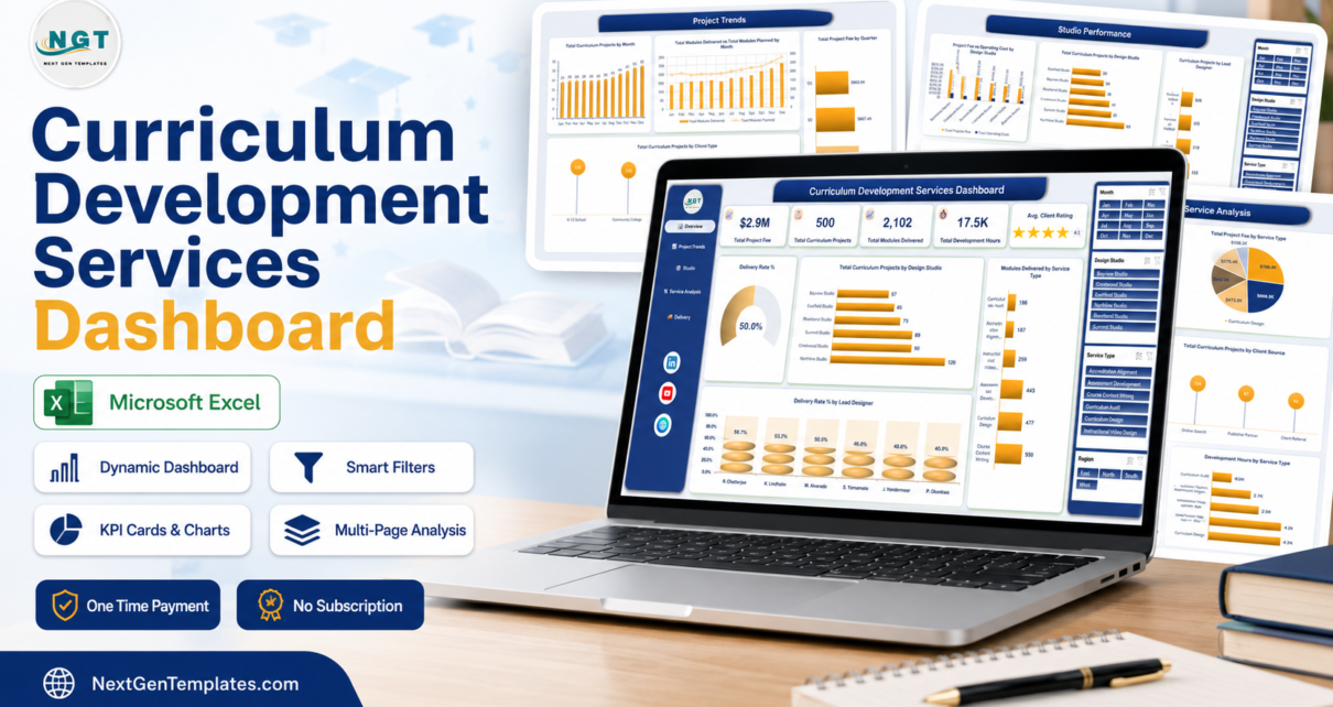
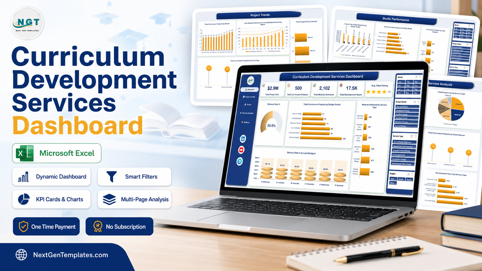
Curriculum studios are project businesses that behave like publishing houses: work arrives as briefs, leaves as modules, and gets billed somewhere in between. The bit that goes missing is everything in the middle. The Curriculum Development Services Dashboard in Excel is a five-page workbook built to hold that middle in one view. The sample build carries 500 curriculum projects, $2.9M in project fees, 2,102 modules delivered against 2,594 planned, 17,454 development hours and a 4.1 average client rating, spread across six design studios, six lead designers, six service types, five client types, three delivery formats and four regions – and every one of those numbers is a pivot table you can filter, not a hard-coded label.
This post walks through all five pages, what each chart is actually telling you, where the template stops, and how to get your own data into it. Worth saying up front: this is the analytical dashboard, not the month-picker KPI scorecard of the same name. They are different templates on the same subject.
Key Features of the Curriculum Development Services Dashboard in Excel
- Five linked dashboard pages – Overview, Project Trends, Studio Performance, Service Analysis and Delivery Outcomes, plus a Data sheet and a Support sheet.
- 20 charts driven entirely by pivot tables. No macros, no add-ins, no external data connections. The file is a plain .xlsx.
- Four synced slicers – Month, Design Studio, Service Type and Region. They share a single pivot cache, so a filter set anywhere applies everywhere.
- Five KPI cards on the Overview page: Total Project Fee, Total Curriculum Projects, Total Modules Delivered, Total Development Hours and Avg. Client Rating.
- 27 source columns and 500 sample rows, so the dashboard is fully populated the moment you open it.
- Cost visibility as standard – project fee sits next to operating cost by studio, and development hours sit next to fee by service type.
Dashboard Pages Explanation
Page 1 – Overview
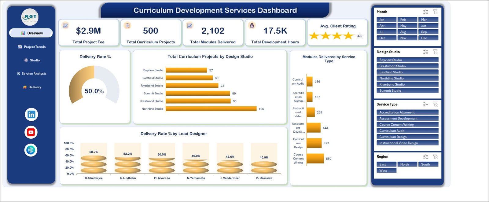
Everything on one screen. The KPI row reads $2.9M total project fee, 500 curriculum projects, 2,102 modules delivered, 17.5K development hours and a 4.1 average client rating shown as a star card.
Underneath, a Delivery Rate % gauge sits at 50.0%. That is not a target or a benchmark – it is simply 250 of the 500 sample projects carrying a Delivered status, and it moves the moment you filter. Total Curriculum Projects by Design Studio ranks Northline Studio at 126, Crestwood 90, Summit 89, Riverbend 73, Eastfield 65 and Bayview 57. Modules Delivered by Service Type ranks the work itself: Course Content Writing 550, Curriculum Design 477, Assessment Development 443, Instructional Video Design 259, Accreditation Alignment 187 and Curriculum Audit 186. The last chart, Delivery Rate % by Lead Designer, runs from R. Chatterjee at 58.7% to P. Okonkwo at 40.9%.
Page 2 – Project Trends
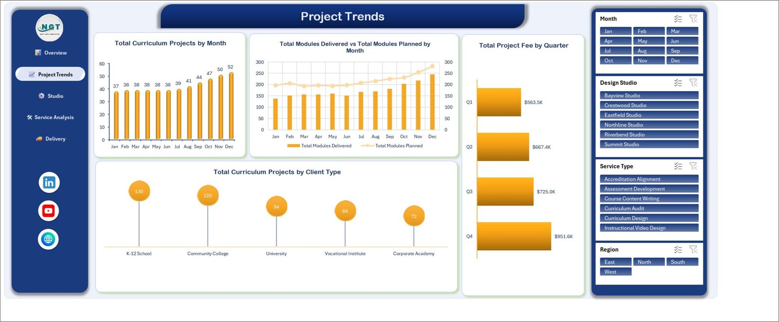
The time view, and the most uncomfortable page in the workbook. Total Curriculum Projects by Month rises steadily from 37 in January to 52 in December. Total Project Fee by Quarter follows the same shape: $563.5K, $667.4K, $725.0K and $951.6K.
Then there is Total Modules Delivered vs Total Modules Planned by Month, a combination chart with delivered modules as bars and planned modules as a line. In the sample data the line sits above the bars in every single month – 2,102 delivered against 2,594 planned, about 81%. That is exactly the kind of gap a monthly revenue chart hides and a plan-versus-actual chart cannot. Total Curriculum Projects by Client Type closes the page: K-12 School 130, Community College 120, University 94, Vocational Institute 84, Corporate Academy 72.
Page 3 – Studio Performance
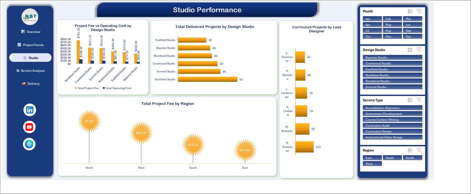
Where the money is made. Project Fee vs Operating Cost by Design Studio is a clustered column chart pairing revenue against running cost for each of the six studios: Northline $761.6K against $148.3K, Crestwood $521.1K against $102.5K, Summit $514.3K against $102.3K, Riverbend $404.3K against $81.3K, Eastfield $373.6K against $73.5K, Bayview $332.6K against $65.0K.
Total Delivered Projects by Design Studio ranks output rather than revenue – Northline 63, Summit 45, Crestwood 42, Riverbend 36, Bayview 34, Eastfield 30 – and reading it against the fee chart is how you spot a studio that bills well on fewer projects. Curriculum Projects by Lead Designer spreads the workload from R. Chatterjee’s 121 projects to S. Yamamoto’s 63, and Total Project Fee by Region shows North at $1.2M, West at $846.9K, South at $521.1K and East at $373.6K.
Page 4 – Service Analysis
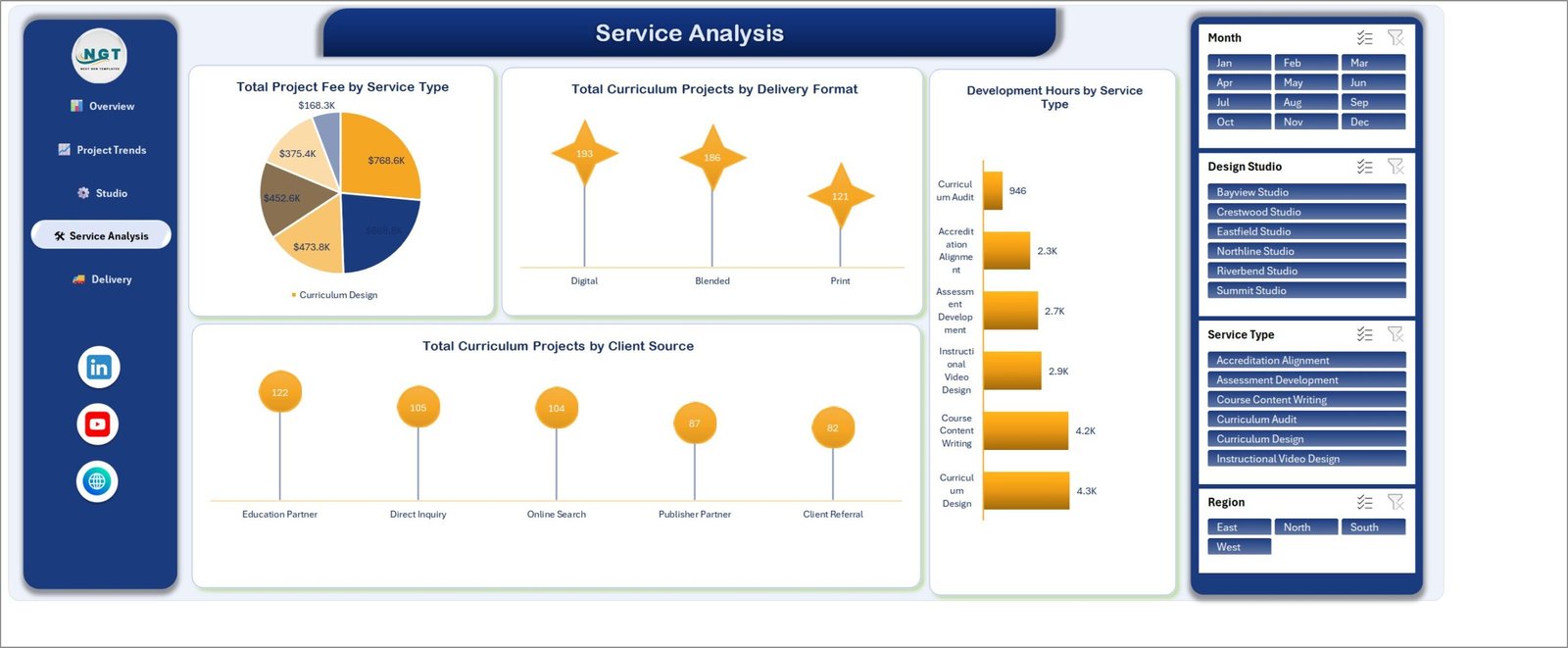
Which service lines are worth the capacity. Total Project Fee by Service Type splits the $2.9M across the six services: Curriculum Design $768.6K, Course Content Writing $668.8K, Instructional Video Design $473.8K, Assessment Development $452.6K, Accreditation Alignment $375.4K and Curriculum Audit $168.3K.
The chart beside it is the one that earns its place. Development Hours by Service Type reads Curriculum Design 4.3K hours, Course Content Writing 4.2K, Instructional Video Design 2.9K, Assessment Development 2.7K, Accreditation Alignment 2.3K and Curriculum Audit 946. Read the two together and fee-per-hour falls out without a formula: Curriculum Audit earns the least in total but consumes by far the fewest hours. Total Curriculum Projects by Delivery Format gives Digital 193, Blended 186 and Print 121, and Total Curriculum Projects by Client Source ranks Education Partner 122, Direct Inquiry 105, Online Search 104, Publisher Partner 87 and Client Referral 82.
Page 5 – Delivery Outcomes
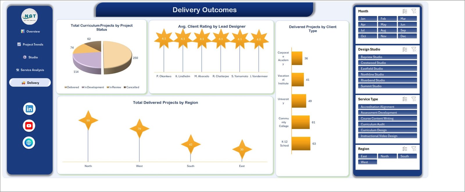
What actually shipped, and how it landed. Total Curriculum Projects by Project Status splits the 500 into 250 Delivered, 114 In Development, 74 In Review and 62 Cancelled. The cancelled slice is deliberately on the page rather than filtered away; 62 cancellations out of 500 is a number a studio should be looking at.
Avg. Client Rating by Lead Designer is flat by design – 4.1 for five designers, 4.0 for the sixth – which is a useful reminder that a rating that never moves is not a differentiator. Delivered Projects by Client Type reads K-12 School 63, Community College 61, University 49, Vocational Institute 41, Corporate Academy 36. Total Delivered Projects by Region gives North 99, West 79, South 42, East 30.
Curriculum Development Services Dashboard in Excel vs. Google Sheets vs. Paid Project SaaS – Feature Comparison
| This Excel dashboard | Google Sheets build | Monday.com / Smartsheet | |
|---|---|---|---|
| Cost | $17.99 once | Free, but you build it | $12-$25 per user per month |
| Platform | Excel 2016+ / Microsoft 365 | Browser | Browser and mobile app |
| Setup time | About 15 minutes to paste data in | Days of chart building | Weeks of configuration |
| Real-time team collaboration | Via OneDrive or SharePoint | Yes, natively | Yes, natively |
| Mobile access | Excel mobile, view-only in practice | Yes | Yes |
| Customisable fields | Any column you like | Any column you like | Within the plan’s field limits |
| Share with a link | Yes, via OneDrive | Yes | Yes |
| Year-1 cost at 5 users | $17.99 | $0 plus your build time | $720-$1,500 |
| Plan vs delivered modules by month | Built in, page 2 | Build it yourself | Custom report or add-on |
| Fee against operating cost by studio | Built in, page 3 | Build it yourself | Usually a paid reporting tier |
| Works offline | Yes | No | No |
Who Should Use This Template
It suits curriculum development agencies and instructional-design studios that bill project work to schools, colleges and corporate academies; in-house curriculum teams at multi-campus institutions who need a single view across sites; publisher services groups tracking authoring and accreditation-alignment work; and independent instructional designers coordinating subcontracted output who want fee, hours and delivery in one place.
It is not the right tool if you need a live task board with assignments and due-date alerts – this reports on projects rather than running them. It is not a learning management system: it does not host courses or hold learner records. And “Accreditation Alignment” here is a service-type label on your own project rows, nothing more; the workbook does not assess or evidence compliance with any accrediting body’s standards.
Real-World Use Cases
A 22-person curriculum studio. Revenue lived in the accounting package and project status in a spreadsheet nobody trusted. Twelve months of projects pasted into the Data sheet produced page 3 in an afternoon, and the fee-against-operating-cost comparison started a conversation about two studios that had been overdue for a year.
A multi-campus vocational institute. The board asks the same quarterly question: are we delivering what we planned? Total Modules Delivered vs Total Modules Planned by Month became the standing slide, precisely because it does not flatter anyone – the gap between the line and the bars is the answer.
A freelance lead coordinating six subcontractors. Filtering Service Type to Assessment Development and reading Delivery Rate % by Lead Designer beside Avg. Client Rating by Lead Designer is how the next accreditation-alignment brief gets allocated.
Advantages of the Curriculum Development Services Dashboard in Excel
- It opens where your data already is. No connector, no sign-in, no admin approval. Export from wherever you track projects, paste, refresh.
- Nothing is hidden. Every chart is a pivot table on the Support sheet. If a number looks wrong you can trace it in three clicks instead of filing a ticket.
- Cost sits next to revenue. Most project dashboards show fee only; this one puts operating cost on the same axis and development hours next to fee by service.
- Plain .xlsx. No macros means it opens on locked-down corporate machines and survives email filters that reject .xlsm.
- One-time cost. A per-seat tool at $15 a user per month costs more in a single quarter than this does forever.
Opportunities for Improvement
Honest limitations, so nobody is surprised after download:
- Manual refresh. There is no live connection. New data means paste and Refresh All. That is a deliberate trade for portability, but it is still a manual step.
- The sample data covers a single year. All 500 records fall in 2025, so there is no year-on-year comparison until you add a second year of your own.
- Ratings barely vary. In the sample, average client rating sits at 4.0-4.1 for every designer. With real data it will spread; with sample data it looks flatter than a real studio would.
- Slicers need the desktop app. Excel for the web renders the pages but slicer behaviour is limited. See Microsoft’s own note on using slicers to filter data.
- No forecasting. The workbook describes what happened. It does not project pipeline or model capacity.
Best Practices
- Keep one row per project. The whole model assumes a flat table; a row that summarises three projects will quietly distort every average.
- Fill Modules Planned even when it hurts. Page 2’s most valuable chart is useless if the planned column is blank or copied from delivered.
- Rename values, not headers. Design Studio can become your pod, practice or vendor. Leave the 27 column headers where they are so the pivots keep working.
- Log cancellations rather than deleting them. A Cancelled status costs you nothing and makes the delivery rate honest.
- Refresh before you screenshot. Data > Refresh All, then check the KPI cards moved, before anything goes into a client pack.
- Save a filtered copy per client. Set the slicers, save as a new file or export to PDF – it is your workbook, nothing is locked.
Explore Relevant Templates
- Curriculum Development Services Dashboard in Excel – the template this post covers.
- Curriculum Development Services KPI Dashboard – the traffic-light scorecard on the same subject.
- Digital Curriculum Startups Dashboard in Excel – for product-led curriculum businesses.
- Online Certification Providers Dashboard in Excel – the certification side of the same market.
- Education & School Management Bundle – eight education templates in one purchase.
Frequently Asked Questions
Is this the same as the Curriculum Development Services KPI Dashboard?
No. That one is a month-picker KPI scorecard with traffic lights against monthly targets. This is the five-page analytical dashboard – four slicers, twenty charts and a 500-row project table you filter and explore. Same subject, different template.
Do I need macros or an add-in?
No. It is a plain .xlsx built on pivot tables, pivot charts and slicers. Nothing to enable, nothing to install.
Which versions of Excel does it work in?
Excel 2016 and later on Windows, Excel for Mac, and Microsoft 365. The desktop app is recommended because slicer behaviour is limited in Excel for the web.
How do I add my own studios, designers or service types?
Type them into the Data sheet. They are values in the data, not settings – refresh, and the charts and slicers pick them up automatically.
Is the data in the screenshots real?
No. All 500 rows are generated sample records for a fictional studio, included so every chart is populated on first open. Delete them before pasting your own.
Does it store learner or personal information?
No. There are no learner records and no personal data fields. It reports on curriculum projects you have already recorded.
Can I edit or extend the charts?
Yes. Everything is standard Excel. The pivot tables are on the Support sheet, so you can add a chart of your own or restyle the existing ones.
About the Author
Built by PK – Microsoft Certified Professional with 15+ years of Excel, Google Sheets, and Power BI experience. Founder of NextGenTemplates, reaching 300K+ subscribers across YouTube channels. Every template is hand-built and tested before release.
Conclusion
The Curriculum Development Services Dashboard in Excel does one thing well: it takes a flat list of curriculum projects and gives you five angles on it – the headline numbers, the trend, the studios, the service mix and what actually shipped. The charts that matter most are the awkward ones. Modules planned against modules delivered. Fee against operating cost. 62 cancellations sitting in plain view. A dashboard that only shows good news is decoration; this one is built to be read.
Paste your projects into the Data sheet, hit Refresh All, and you will have your first filtered view in about fifteen minutes. Get the Curriculum Development Services Dashboard in Excel – one payment, unlimited re-downloads, free lifetime updates.
For step-by-step Excel dashboard walkthroughs, subscribe to youtube.com/@PKAnExcelExpert.