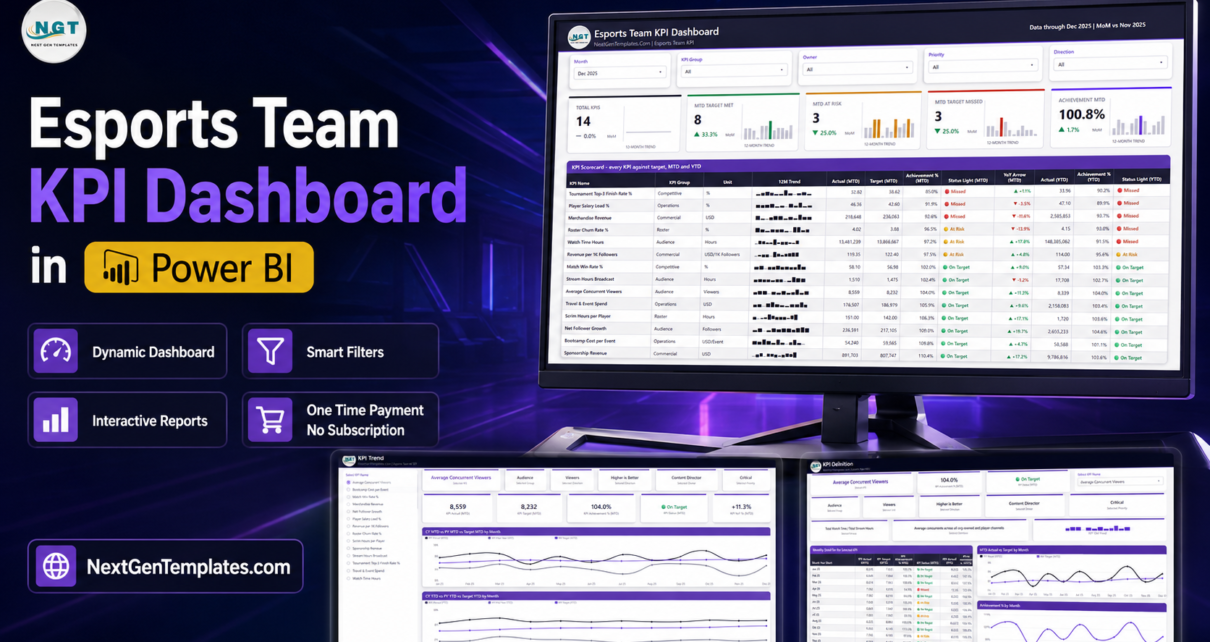
Running an esports organisation means answering three different questions in the same meeting. Did we win? Is anyone watching? Are we making money? Most orgs answer them in three different places – a coach’s spreadsheet of map results, a screenshot from a streaming dashboard, and a finance file nobody else opens. The Esports Team KPI Dashboard in Power BI puts all three on one scorecard, scores each KPI against its own monthly and year-to-date target, and colours it green, amber or red.
It ships as a .pbix that opens in the free Power BI Desktop, with a three-sheet Excel data pack you edit and refresh. The sample month in the file – December 2025 – reads 8 KPIs on target, 3 at risk and 3 missed, at 100.8% overall MTD achievement, so you can watch the traffic lights behave before you replace a single number.
One thing to be clear about before anything else: this file connects to nothing. There is no game API, no Riot, Valve, Blizzard, Steam or Epic integration, no tournament-platform feed such as Battlefy, Toornament, FACEIT or ESEA, and no Twitch, YouTube or Kick streaming-analytics connection. Every figure on every page is one you type into Data.xlsx, or export from wherever you already keep it and paste in. The numbers that ship with it are invented demonstration data for a fictional organisation – not a real team’s results, and not a benchmark for yours.
This is the KPI scorecard, not the analytical dashboard
NextGenTemplates publishes two different esports products for Power BI and the names sit close together, so it is worth separating them.
This one is the KPI scorecard: a table-led monthly review pack. Fourteen KPIs, each with a target, two traffic lights, a sparkline and a prior-year comparison, plus a trend page and a definition page for drilling into any single KPI. You read it top to bottom in a management meeting.
The Gaming Esports Dashboard in Power BI and the Esports Streaming Dashboard in Power BI are the analytical products: charts that slice and explore rather than score. They are companions to this one, not duplicates of it.
The same scorecard idea also exists on two other platforms – the Esports Team KPI Dashboard in Excel and the Esports Team KPI Dashboard in Google Sheets. They were built separately and their KPI lists are not identical, so buy the one that matches the tool your org already reports in.
Key Features of the Esports Team KPI Dashboard in Power BI
- 14 KPIs across 5 groups – Competitive, Roster, Audience, Commercial and Operations, all on one page.
- Two traffic lights per KPI – MTD and YTD scored separately, so a KPI can read At Risk for the month and Missed for the year.
- A 12-month sparkline on every row that stays on the full year even when the Month slicer is set to one month.
- Direction-aware scoring – each KPI is tagged UTB (higher is better) or LTB (lower is better), so beating a cost or a churn target scores above 100%.
- Fixed bands – On Target at 100% or more, At Risk from 95% to just under 100%, Missed below 95%.
- Five slicers on the scorecard – Month, KPI Group, Owner, Priority and Direction – plus a KPI selector synced between the Trend and Definition pages.
- Two years of actuals in the data pack, so every prior-year line and YoY arrow has real history behind it.
- An owner and a priority per KPI, both free text you rename to your own org chart.
- Nothing hard-coded – add, rename or delete KPIs in Excel and hit Refresh.
- Native Power BI visuals only – no custom visual to install, no locked report.
The 14 KPIs it ships with
| # | Group | KPI | Unit | Direction | Owner (sample) |
|---|---|---|---|---|---|
| 1 | Competitive | Match Win Rate % | % | Higher is better | Head Coach |
| 2 | Competitive | Tournament Top-3 Finish Rate % | % | Higher is better | Head Coach |
| 3 | Roster | Scrim Hours per Player | Hours | Higher is better | Performance Director |
| 4 | Roster | Roster Churn Rate % | % | Lower is better | Team Operations |
| 5 | Audience | Average Concurrent Viewers | Viewers | Higher is better | Content Director |
| 6 | Audience | Stream Hours Broadcast | Hours | Higher is better | Content Director |
| 7 | Audience | Watch Time Hours | Hours | Higher is better | Content Director |
| 8 | Audience | Net Follower Growth | Followers | Higher is better | Social Media Lead |
| 9 | Commercial | Sponsorship Revenue | USD | Higher is better | Partnerships Lead |
| 10 | Commercial | Merchandise Revenue | USD | Higher is better | Merch & Retail |
| 11 | Commercial | Revenue per 1K Followers | USD/1K Followers | Higher is better | Commercial Director |
| 12 | Operations | Bootcamp Cost per Event | USD/Event | Lower is better | Team Operations |
| 13 | Operations | Player Salary Load % | % | Lower is better | Finance Manager |
| 14 | Operations | Travel & Event Spend | USD | Lower is better | Team Operations |
Every one of those is editable. The KPI name is the join key across the three input sheets, so renaming Scrim Hours per Player to Practice Hours per Player in all three sheets and refreshing is all it takes. Adding a fifteenth KPI, or dropping down to eight, works the same way.
Dashboard Pages Explanation
Six pages in total: four you navigate, and two hidden 280×360 tooltip pages (Trend Detail and KPI Detail) that appear as rich hover cards over the visuals rather than as tabs.
Page 1 – KPI Scorecard
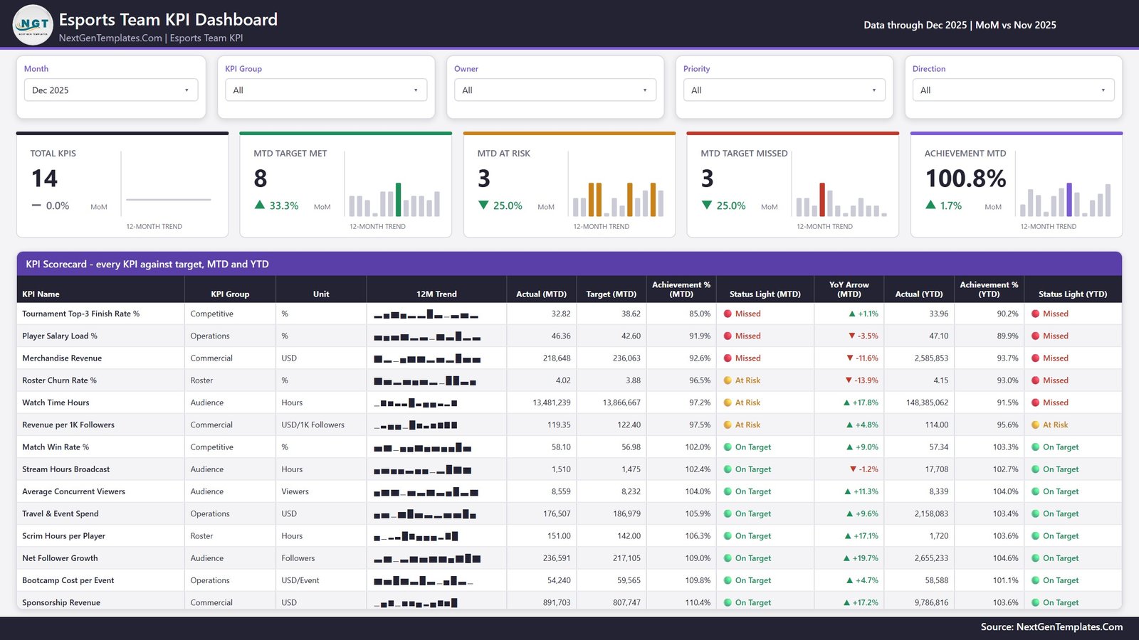
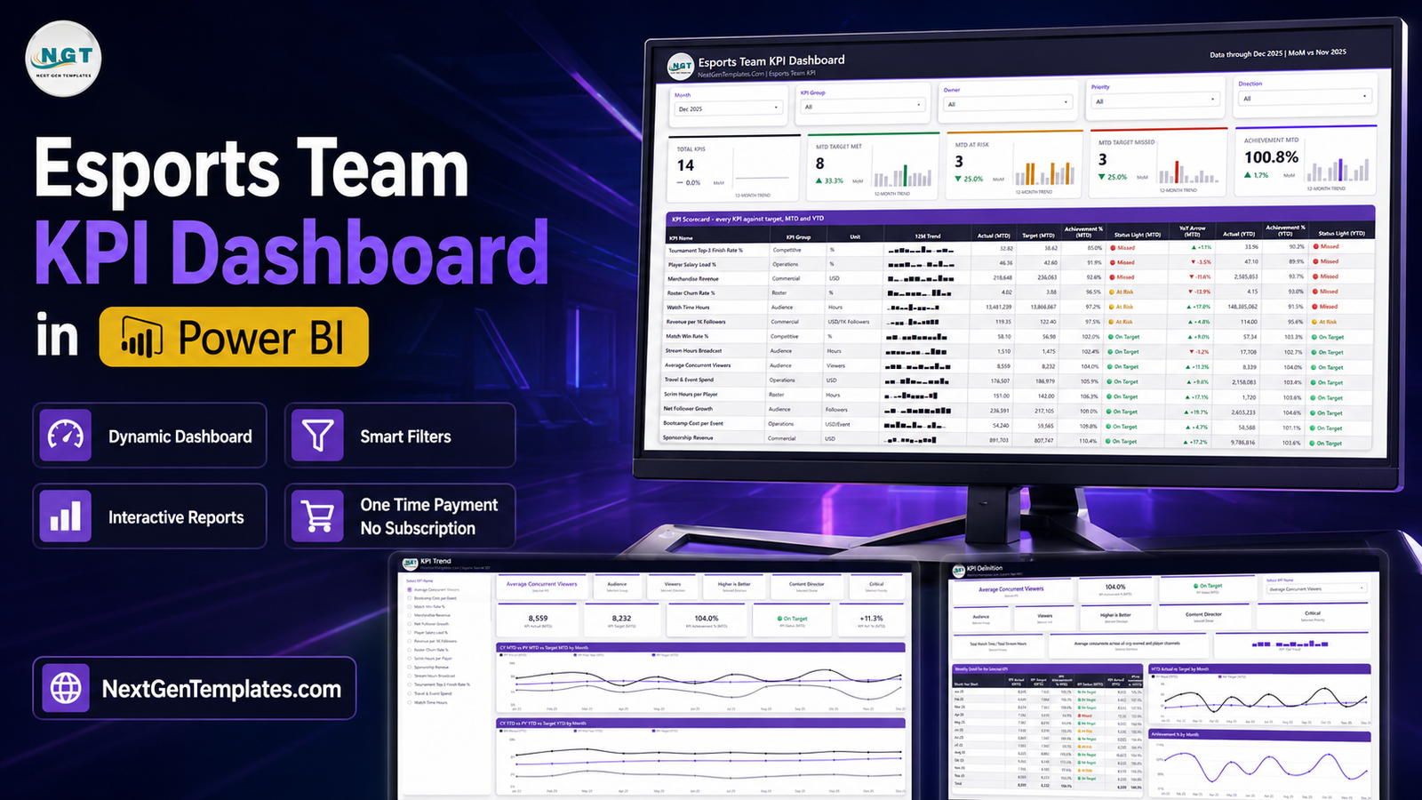
Five slicers across the top – Month, KPI Group, Owner, Priority, Direction – then five summary cards, each with its own 12-month trend and a month-on-month delta: Total KPIs, MTD Target Met, MTD At Risk, MTD Target Missed and Achievement MTD. In the shipped December 2025 sample those read 14, 8, 3, 3 and 100.8%.
Below them sits the full fourteen-row table: KPI Name, KPI Group, Unit, 12M Trend, Actual (MTD), Target (MTD), Achievement % (MTD), Status Light (MTD), YoY Arrow (MTD), Actual (YTD), Achievement % (YTD) and Status Light (YTD). It is ordered worst-first, so whatever is missing target is already at the top when the page opens.
Worth noticing in the sample: Roster Churn Rate % and Watch Time Hours both read At Risk for the month but Missed for the year. That is the whole argument for two traffic lights instead of one – a month that looks recoverable inside a year that is not.
Page 2 – KPI Trend
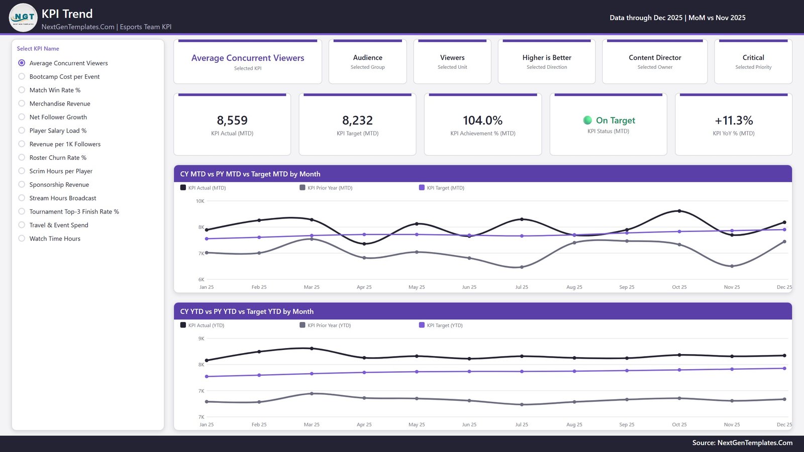
Pick one KPI from the list on the left and the entire page becomes that KPI. Six context cards restate what you selected – the KPI, its group, unit, direction, owner and priority – then five value cards give Actual (MTD), Target (MTD), Achievement % (MTD), Status and YoY %. Two line charts follow: CY MTD vs PY MTD vs Target MTD by Month and CY YTD vs PY YTD vs Target YTD by Month, each plotting three series across the twelve months.
The prior-year series is why the data pack carries two years of actuals rather than one. Without it, those grey lines are empty and half the page stops earning its space.
Page 3 – KPI Definition
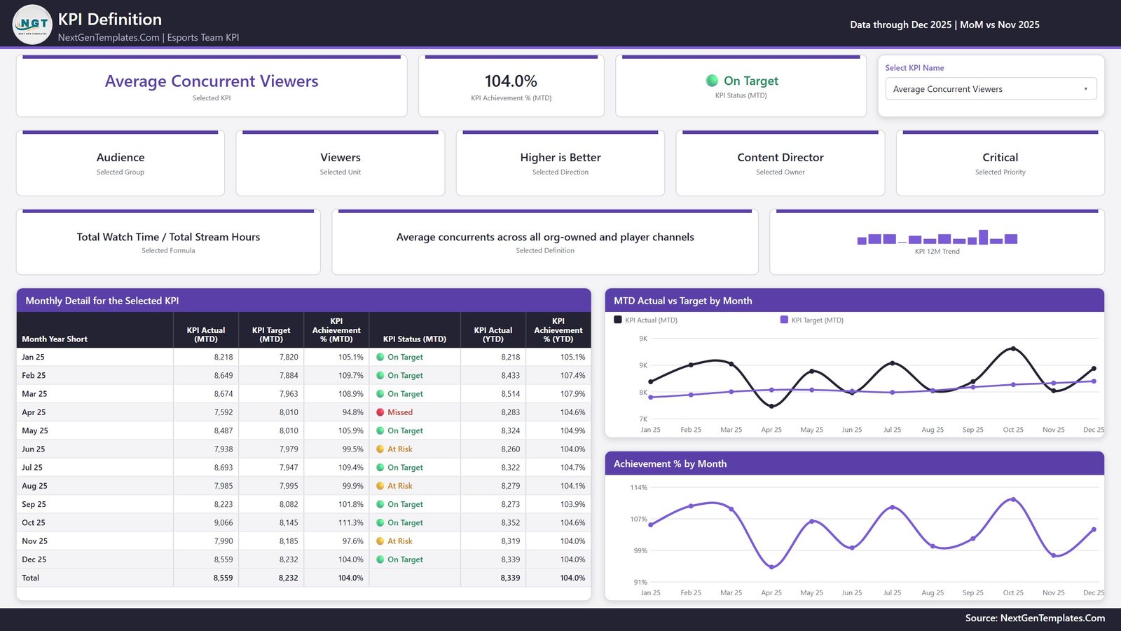
The same KPI selection, synced from page 2, plus the two things that stop a KPI review turning into a definition argument: the KPI’s formula and its plain-English definition. For Average Concurrent Viewers the file states “Total Watch Time / Total Stream Hours” and “Average concurrents across all org-owned and player channels”, so everyone in the room is scoring the same thing.
Underneath sits a month-by-month table – Actual (MTD), Target (MTD), Achievement % (MTD), Status, Actual (YTD), Achievement % (YTD), with a total row – alongside two charts, MTD Actual vs Target by Month and Achievement % by Month.
Page 4 – Get More Templates
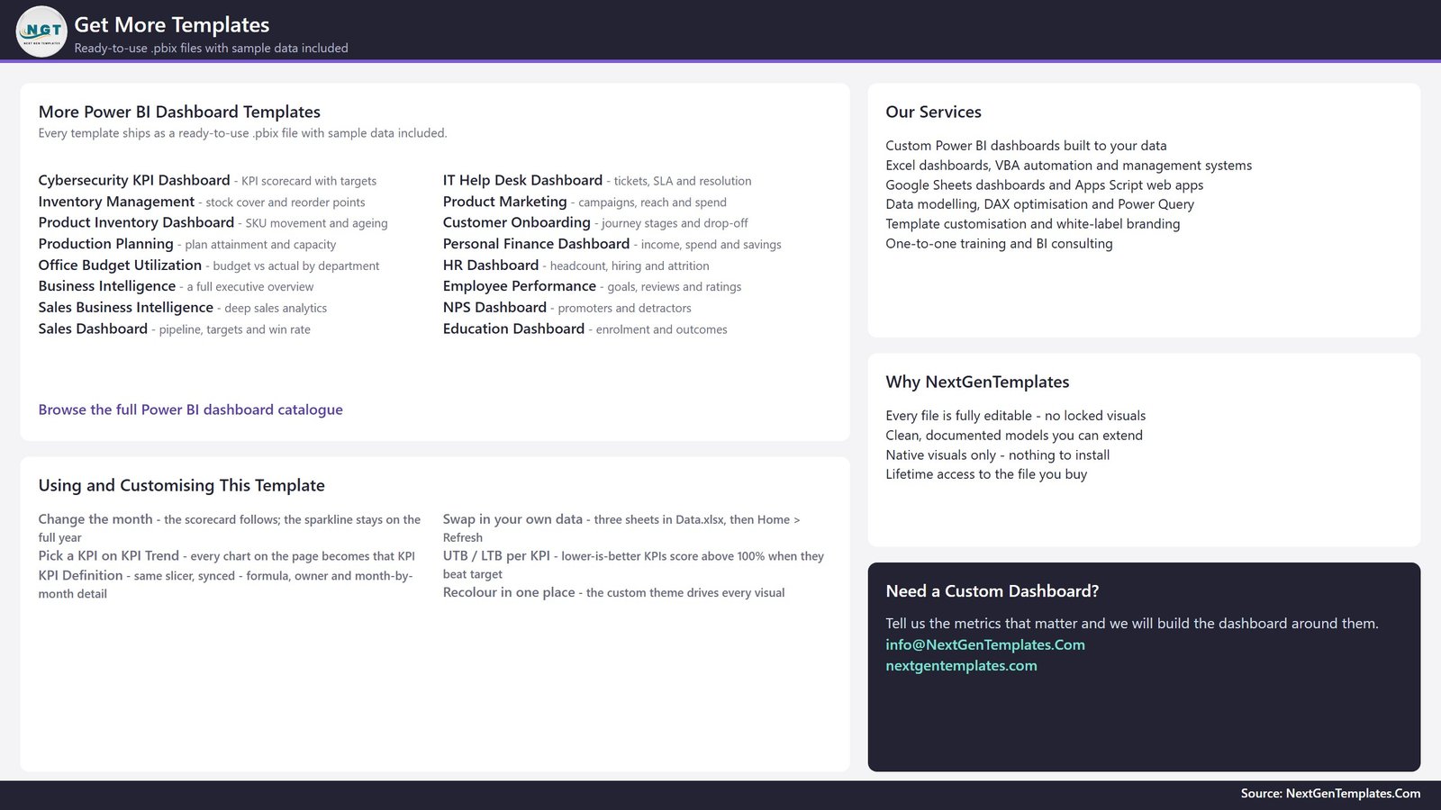
Being straight about this one: page 4 is a catalogue page, not a report page. It lists other Power BI templates and NextGenTemplates services, and it carries a genuinely useful in-file guide – how to change the month, how to swap in your own data, what UTB and LTB mean, and where to recolour the theme in one place. It is shown here so the fourth tab is no surprise after you buy.
Esports Team KPI Dashboard in Power BI vs. Tableau or Qlik vs. a Tournament or Stream Analytics Portal – Feature Comparison
| This template | Tableau / Qlik build | Tournament or stream analytics portal | |
|---|---|---|---|
| Cost | One-time, $12.99 on sale | Per-user subscription plus build time | Recurring, or bundled with the platform |
| Platform | Power BI Desktop (free from Microsoft) | Tableau or Qlik licence | The vendor’s own web portal |
| Setup time | Open, replace 3 sheets, refresh | Days to weeks of modelling | Instant, but only what the vendor built |
| Reads match, stream or platform data automatically | No – you export or type into Excel and refresh | With a connector you build | Yes, for its own platform only |
| Competitive, audience and commercial KPIs side by side | Yes, all 14 on one page | If you build it | Rarely – portals cover one domain |
| MTD and YTD scored separately | Yes, two traffic lights per KPI | If you build it | Rarely |
| Customisable KPIs | Add, rename or delete any KPI in Excel | Fully, with developer effort | Only the vendor’s fixed metric set |
| Owner and priority per KPI | Yes, free text you control | If you build it | Rarely |
| Prior-year comparison | Yes, two years of actuals ship in the pack | If you load it | Depends on the platform’s retention |
| Mobile access | Power BI mobile app once published | Yes | Yes |
| You own the file forever | Yes | No | No |
Who Should Use This Template
- Esports org managers and GMs who already write a monthly owner or investor update and want it to come off one page.
- Performance directors and head coaches who want scrim volume, win rate and podium rate sitting next to roster churn instead of in a separate document.
- Content and social leads who want concurrents, stream hours, watch time and follower growth scored against targets rather than screenshotted once a month.
- Partnerships and commercial leads who need sponsorship and merch revenue in the same review as the competitive results, with a monetisation-per-audience figure alongside.
- Finance and operations at an org where bootcamp, travel and salary load are the three lines that actually move the P&L.
Who should not buy it: anyone expecting automatic data. If you want match history to appear on its own, or Twitch concurrents to update live, this is not that product and no amount of configuration will make it that product. It is also not a roster or contract management system, not payroll, not a scouting database, and not a tournament administration platform.
Real-World Use Cases
- The monthly org review. One page, fourteen KPIs, worst-first, MTD and YTD lights – the agenda in the order it should be discussed.
- Coaching check-ins. Filter KPI Group to Competitive and Roster and the conversation is four numbers wide.
- Content planning. A month where stream hours rose but concurrents did not becomes visible instead of arguable.
- Sponsor renewal prep. Sponsorship Revenue, Merchandise Revenue and Revenue per 1K Followers with twelve months of history behind each.
- LAN season cost control. Bootcamp Cost per Event, Travel & Event Spend and Player Salary Load % are all lower-is-better, so beating budget scores above 100% and reads as the win it is.
- Board and investor packs. Publish to the Power BI Service and share a link, or export the scorecard page to PDF.
Advantages of the Esports Team KPI Dashboard in Power BI
- One scoring language across very different units. Viewers, hours, dollars and percentages cannot be compared directly, so the file compares Achievement % and counts of KPIs instead. Absolute values only ever appear per KPI, where they mean something.
- Lower-is-better metrics are not an afterthought. Four of the fourteen KPIs are LTB and they score correctly, which is the single most common thing a hand-built scorecard gets wrong.
- The definition travels with the number. Page 3 shows the formula and the definition next to the value, which kills the “how are we calculating that?” tangent.
- The data pack is honest about the YTD trap. The Read Me states that for rates and ratios, YTD is the average of the months so far and never a sum. A compliance percentage that adds to 1,900% by December is the classic KPI-pack failure, and the file warns you about it.
- Nothing is locked. Native visuals, an editable model, and an Excel source you own.
Opportunities for Improvement
Two things worth knowing before you buy, both minor and both stated so nothing surprises you:
- There is no drillthrough in this build. Some dashboards in this family use one to reach the KPI Definition page; this one uses a KPI slicer synced between the Trend and Definition pages instead. The in-file guide on page 4 says the same. Functionally you land in the same place – it is just worth stating plainly rather than letting the family pattern imply otherwise.
- Two charts repeat an axis label. On page 2, the CY YTD vs PY YTD vs Target YTD by Month chart prints “7K” on both of its bottom two gridlines; on page 3, MTD Actual vs Target by Month prints “9K” on both of its top two. The plotted lines and every figure are correct – it is whole-thousand rounding on a narrow value range. Setting the axis to a fixed minimum, or adding a decimal to the display units, clears it in a few seconds.
Neither affects a number. Both are one-click fixes in Power BI Desktop, and the file is fully editable so you can make them.
Best Practices
- Set targets before the month starts, not after. A target typed in retrospect scores nothing; the file’s whole value is the gap between plan and result.
- Fill the prior year. It costs one extra paste and it is what makes every YoY arrow and grey line meaningful.
- Get the YTD rule right per unit. Sum money, volume and counts. Average percentages, ratios, indices and “per player” figures.
- Keep the KPI count near fourteen. A scorecard with forty rows is a database, and nobody reviews it.
- Name a real owner per KPI. The sample uses roles – Head Coach, Content Director, Partnerships Lead – which is also good privacy practice: no individual’s name needs to be in the file.
- Review by group, not row by row. Competitive with the coaching staff, Audience with content, Commercial with partnerships. The KPI Group slicer exists for exactly that.
- Keep Data.xlsx beside the .pbix. If you move it, use Home > Transform data > Data source settings > Change Source; the path is also commented inside the Data query.
Explore Relevant Templates
- Esports Team KPI Dashboard in Excel – the same scorecard idea as a workbook.
- Esports Team KPI Dashboard in Google Sheets – the same scorecard idea as a live sheet.
- Gaming Esports KPI Dashboard in Power BI – the wider gaming and esports industry scorecard.
- Gaming Esports Dashboard in Power BI – the analytical companion.
- Esports Streaming Dashboard in Power BI – broadcast and streaming performance.
- Esports Team KPI Scorecard in Excel – the one-page Excel review sheet.
- Sports Team Dashboard in Power BI – the traditional-sports equivalent.
- Browse every Power BI KPI Dashboard, or the full Power BI catalogue.
Frequently Asked Questions
Does it connect to Riot, Valve, Blizzard, Steam, Twitch or a tournament platform?
No – to all of them. There is no game API, no publisher integration, no tournament-platform feed and no streaming-analytics connection anywhere in the file. Every number is typed or pasted into Data.xlsx by you, and the report refreshes from that workbook only.
Does it prove anything about competitive integrity?
No. It does not detect cheating, smurfing, match-fixing, boosting or betting irregularities, it is not an investigation or compliance tool, and it is not evidence of anything to a league, publisher or federation. It is a management reporting template for numbers you already hold.
Do I need a paid Power BI licence?
No, not to use it. Power BI Desktop is free from Microsoft and opens, edits and refreshes the file. A Pro or Premium licence is only needed to publish it to the Power BI Service and share the link.
Can I change the 14 KPIs?
Yes, completely. Nothing hard-codes a KPI name. Add a row to the KPI Definition sheet plus its monthly Target and Actual rows, rename one across all three sheets, or delete one from all three, then Home > Refresh. Card counts, the scorecard table, the KPI selector list and every chart follow.
How does it handle metrics where lower is better?
Each KPI is tagged UTB or LTB in the data pack. Higher-is-better KPIs score Actual / Target; lower-is-better KPIs score Target / Actual, so beating a cost, churn or salary-load target scores above 100% instead of looking like a miss.
What are the two hidden pages?
Trend Detail and KPI Detail – 280×360 tooltip pages that surface as rich hover cards over the visuals. They are hidden in view mode deliberately, and you can unhide them in Power BI Desktop to edit them.
Is this the same as the Excel or Google Sheets version?
Same idea, different platforms, and the three editions were built separately – their KPI lists are not identical. This one is a Power BI .pbix with synced slicers, tooltip pages and a Power BI data model. Choose the platform your organisation already reports in.
What exactly is in the download?
One ZIP containing the .pbix, its Data.xlsx source and a Power BI Dashboard user manual PDF. Data.xlsx has four sheets: a Read Me, KPI Definition (14 rows across 9 columns), Input_ Target (168 rows – 14 KPIs x 12 months, MTD and YTD) and Input_ Actual (336 rows – the same for the reporting year and the year before it).
Are the sample numbers real?
No. Every figure is invented demonstration data for a fictional organisation, chosen so that on target, at risk and missed all appear. Nothing in it is a real team’s result, an industry benchmark or a target you should adopt.
About the Author
Built by PK – Microsoft Certified Professional with 15+ years of Excel, Google Sheets, and Power BI experience. Founder of NextGenTemplates, reaching 300K+ subscribers across YouTube channels. Every template is hand-built and tested before release.
Conclusion
An esports organisation is three businesses stacked on top of each other – a competitive team, a media channel and a commercial partnership operation – and each one is usually reported separately. The Esports Team KPI Dashboard in Power BI puts all fourteen numbers on one page, scores each against its own MTD and YTD target, and shows you the two or three that need a conversation this month. It connects to nothing and claims nothing about your competitive standing; it just makes the numbers you already keep readable in one place.
Get the Esports Team KPI Dashboard in Power BI for $12.99 (regular $19.99) – a one-time price for a file you own and can edit end to end.
Last updated: 26 August 2026.