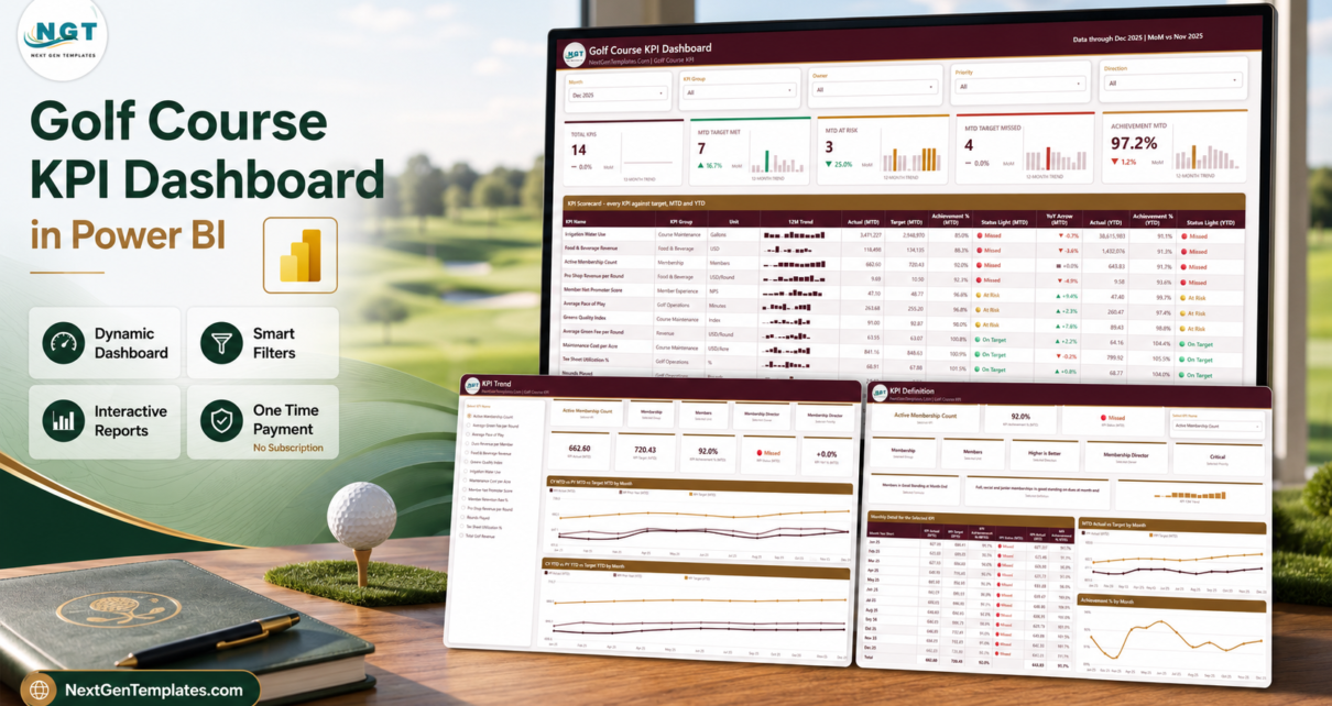
Most golf clubs already have the numbers. They are just scattered – rounds and utilisation in the tee sheet, green fees and merchandise in the POS, dues in the accounting package, survey scores in a mailbox. The monthly management pack then becomes an evening of copy-paste, and by the time it is finished nobody remembers what last year looked like. The Golf Course KPI Dashboard in Power BI is a four-page KPI scorecard that fixes the last mile of that job: 14 club KPIs across 6 groups, each scored against target for MTD and YTD, each carrying a 12-month sparkline and a prior-year arrow, all driven by a three-sheet Excel data pack holding 168 target rows and 336 actual rows.
One thing to be clear about before anything else, because the catalogue contains near-identical names on purpose: this is the KPI scorecard family, not the analytical Power BI dashboard family. A scorecard answers “did we hit target, and are we better or worse than last year”. An analytical dashboard lets you slice a fact table twelve ways. They are companions, and plenty of clubs eventually own both.
Key Features of the Golf Course KPI Dashboard in Power BI
- 14 KPIs across 6 groups – Golf Operations, Revenue, Membership, Food & Beverage, Course Maintenance and Member Experience.
- Direction-aware achievement – higher-is-better KPIs score Actual / Target, while lower-is-better KPIs such as Average Pace of Play, Maintenance Cost per Acre and Irrigation Water Use score Target / Actual. Beating a cost or pace target scores above 100%, which is the only way a mixed KPI set can share one column.
- Three status bands – On Target at 100% and above, At Risk between 95% and 100%, Missed below 95%. All three are DAX defaults you can edit.
- MTD and YTD in the same row – separate actual, achievement % and status light for each, plus a year-on-year arrow.
- A 12-month sparkline per KPI that deliberately ignores the month slicer, so the trend stays whole while the numbers filter.
- Five slicers synced across pages – Month, KPI Group, Owner, Priority and Direction.
- 38 DAX measures referenced by the report visuals, all reading the three input sheets – no external service, no gateway, no custom visual to install.
- Two hidden tooltip pages (280×360) that appear on hover, on top of the four pages you navigate.
Dashboard Pages Explanation
1. KPI Scorecard
The landing page. Five summary cards run across the top – Total KPIs, MTD Target Met, MTD At Risk, MTD Target Missed and Achievement MTD – each with a 12-month trend bar and a month-on-month delta underneath. Below sits the scorecard table itself: KPI name, group, unit, sparkline, MTD actual and target, achievement %, status light, YoY arrow, then YTD actual, achievement % and status light. It sorts worst-first, so the KPIs that need discussion arrive at the top of the page rather than the bottom.
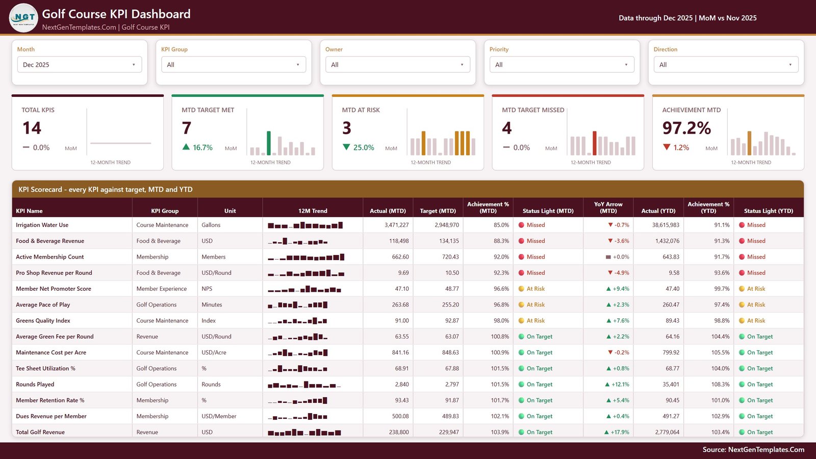
KPI Scorecard page
2. KPI Trend
Choose one KPI from the list on the left and the whole page becomes that KPI. Context cards restate its group, unit, direction, owner and priority so nobody has to remember which way is good. Five figure cards give MTD actual, target, achievement %, status and YoY %. Then two line charts: CY MTD vs PY MTD vs Target MTD by Month and CY YTD vs PY YTD vs Target YTD by Month. Seeing the current year, the prior year and the target on one axis is what separates “we had a bad month” from “we have been drifting since March”.
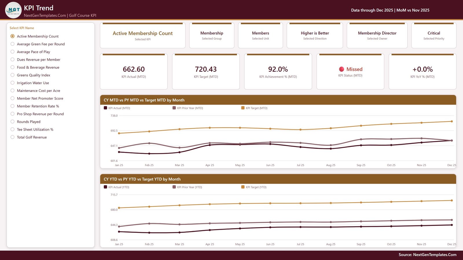
KPI Trend page
3. KPI Definition
The documentation page, and the one that quietly prevents arguments. The KPI you picked on the Trend page arrives here through a synced slicer, and the page shows its formula in plain words, its written definition, its owner, its priority, its direction and a 12-month trend. Underneath, a month-by-month table of MTD actual, target, achievement %, status and YTD sits beside MTD Actual vs Target by Month and Achievement % by Month. Worth knowing: this build has no drillthrough – the page is reached by clicking the tab, and the selection follows through the slicer sync group.
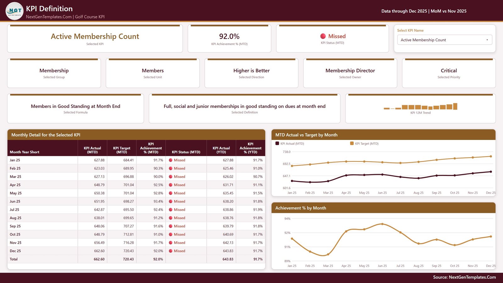
KPI Definition page
4. Get More Templates
The fourth tab is a catalogue page rather than a reporting page: other Power BI templates, a short “Using and Customising This Template” panel, and contact details for custom work. It ships inside the file, so it is shown here rather than quietly cropped out of the screenshots – four tabs means four tabs.
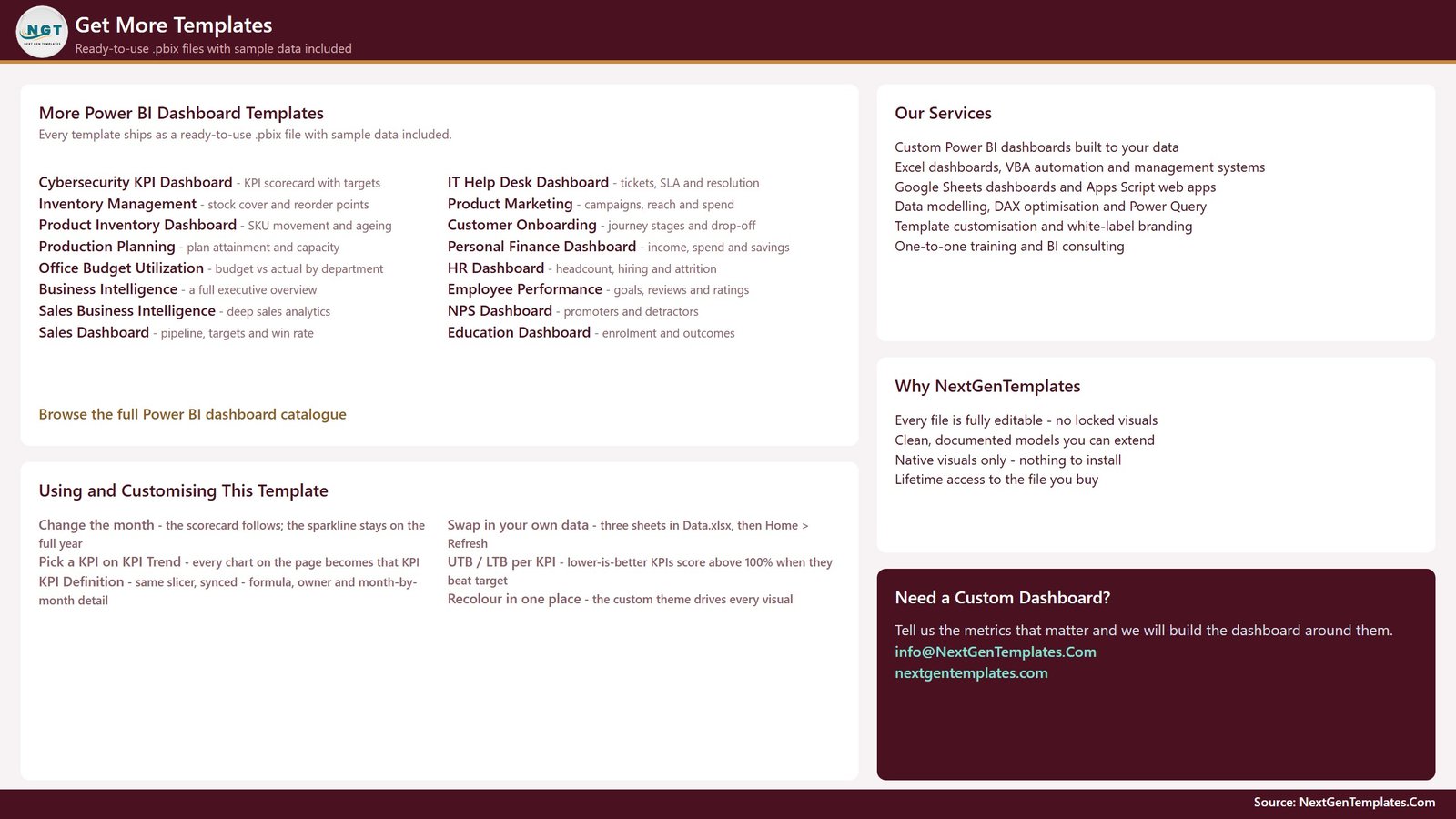
Get More Templates page
The data pack behind it
Data.xlsx carries four sheets. A Read Me explains the model. Input_ Target holds 168 rows – one per KPI per month. Input_ Actual holds 336 rows, covering the reporting year and the year before it, because the prior year is what every YoY arrow and PY line reads from. KPI Definition holds 14 rows across 9 columns: group, name, unit, formula, definition, UTB/LTB type, owner and priority. The KPI name is the join key across all three, so renaming a KPI means renaming it in all three sheets.
Golf Course KPI Dashboard in Power BI vs. Excel vs. Paid Club Management SaaS – Feature Comparison
| This Power BI scorecard | Excel KPI dashboard | Paid club management SaaS | |
|---|---|---|---|
| Cost | One payment, no renewal | One payment, no renewal | Recurring per-course fee |
| Platform | Power BI Desktop (free) | Microsoft Excel | Vendor web app |
| Setup time | Open, repoint the data source, Refresh | Open and type over the sample data | Implementation project |
| Connects to tee sheet / POS | No – figures are entered | No – figures are entered | Yes |
| Real-time team collaboration | Publish to your own workspace | Share the file | Built in |
| Mobile access | Power BI mobile app after publishing | Excel mobile | Built in |
| Customisable KPI list | Yes – rows in the workbook | Yes – rows in the workbook | Usually a support request |
| Prior-year comparison | Yes, MTD and YTD | Varies by build | Yes |
| Year-1 cost, small club | Under 20 USD | Under 20 USD | Typically four figures and up |
Who Should Use This Template
General managers and directors of golf who present a monthly pack to an owner or a board. Club controllers who already assemble the numbers and want one page instead of four exports. Membership directors who need retention and dues per member on the same sheet as rounds and revenue. Management companies running several properties who want the fourteen lines to mean the same thing everywhere.
It is not for anyone expecting live data. The file connects to no tee-sheet or booking platform, no point-of-sale system, and no handicap authority – not the USGA, WHS or CONGU – and it neither calculates handicaps nor takes bookings. Every figure is typed or pasted into the workbook by you. It also makes no agronomic judgement: Greens Quality Index is whatever composite audit score you enter, compared to whatever target you enter, and the report has no opinion about turf.
Real-World Use Cases
A 27-hole daily-fee course. The general manager runs the monthly ops meeting from page 1 alone. Because the table sorts worst-first, the agenda writes itself – the misses lead, the on-target KPIs get a nod.
A private members’ club. The membership director filters to the Membership group, then opens KPI Trend for Active Membership Count and shows the board twelve months against target and prior year instead of a single month’s number that could be seasonal noise.
A three-property management company. The controller keeps one copy per property with identical KPI definitions, so “Tee Sheet Utilization %” is computed the same way at every course and the board pack is genuinely comparable.
Advantages of the Golf Course KPI Dashboard in Power BI
- Nothing is hard-coded. Add, rename or delete a KPI in the three input sheets, click Refresh, and the counts, scorecard, KPI list and every chart follow.
- Mixed units coexist honestly. Gallons, minutes, NPS, USD per round and percentages sit in one table because cross-KPI comparison only ever happens through achievement % or a count of KPIs.
- Ownership is explicit. Every KPI has a named owner and a priority, and both are slicers, so a department head can filter to their own lines in one click.
- Native visuals only. Nothing to install, nothing locked, and the custom theme means a rebrand is one colour change rather than a visual-by-visual edit.
- It opens fully populated. A complete sample year plus prior year means you can evaluate the logic before typing a single one of your own numbers.
Opportunities for Improvement
An honest list, because a template review that finds nothing is not a review:
- Active Membership Count renders to two decimals – “662.60 Members” on the scorecard and trend cards. It is a number-format setting on the measure, not a calculation error, and it takes a moment to fix, but it ships that way.
- No drillthrough. KPI Definition is reached by clicking the tab, with the selection carried by a synced slicer. That works, but a right-click drillthrough from the scorecard row would be quicker.
- One property per file. There is no course or property dimension, so a multi-site operator keeps one copy per property rather than filtering a single report.
- The fourth tab is a catalogue page, not analysis. If you are publishing the report internally, you will probably hide it first.
- Everything is manual input. If your tee sheet already exports a monthly CSV, you will want to replace the Excel source with a folder query rather than typing – straightforward in Power Query, but it is work you do, not work the file does.
Best Practices
- Get YTD right. Sum it for money, volume and counts. Average it for percentages, indices and ratios. A percentage that adds up to 1,900% by December makes every YTD chart meaningless, and it is the most common mistake in a KPI pack.
- Load the prior year properly. Input_ Actual wants two years. Skip the older one and every PY line and YoY arrow reads as flat.
- Set direction before targets. Marking a KPI UTB when it is really LTB inverts its score and its traffic light – the single most damaging one-character error in the workbook.
- Write the definition column properly. “Rounds Played” means different things to a starter and a controller. The KPI Definition page exists to settle that once.
- Keep the .pbix and Data.xlsx together. If you move them, use Transform data > Data source settings > Change Source, and grab the free Power BI Desktop from Microsoft if you do not have it.
- Review targets annually, not monthly. Moving a target mid-year to turn a red light green is the fastest way to make a scorecard worthless.
Explore Relevant Templates
- Golf Course KPI Dashboard in Power BI – the template reviewed here.
- Golf Course KPI Dashboard in Excel – the same KPI thinking for Excel-first teams.
- Golf Course KPI Dashboard in Google Sheets – the browser-based edition.
- Golf Course KPI Scorecard in Excel – the scorecard-only Excel build.
- Private Clubs Dashboard in Power BI – the analytical companion, for slicing rather than scoring.
- Sports & Recreation KPI Dashboard in Power BI – the wider leisure-sector scorecard.
Frequently Asked Questions
Does it connect to my tee sheet, POS or a handicap system?
No, to all three. There is no integration with any booking or tee-sheet platform, no point-of-sale link, and no connection to the USGA, WHS or CONGU. Every figure on every page comes from Data.xlsx.
Are the numbers in the screenshots real industry benchmarks?
No. They are realistic sample values so the report opens fully populated. No figure, target or threshold in the file is a benchmark – replace them all.
Can I add or remove KPIs?
Yes. Add a row in KPI Definition plus its monthly target and actual rows, then Refresh. Delete a KPI by removing its rows from all three sheets. The report rebuilds around whatever exists.
Do I need a Power BI Pro licence?
Not to use the file. Power BI Desktop is free. A Pro or Premium licence only matters if you want to publish and share it through the Power BI service.
How do I change the traffic-light thresholds?
They are DAX defaults – On Target at 100%, At Risk from 95%, Missed below 95% – and you edit them like any other measure.
Which is right for me: the scorecard or the analytical dashboard?
If your question is “did we hit target this month”, the scorecard. If it is “why”, the analytical build. The two are cross-linked above.
Can I rebrand it?
Yes. The report uses a custom theme, so recolouring is done in one place rather than visual by visual, and every object is editable.
About the Author
Built by PK – Microsoft Certified Professional with 15+ years of Excel, Google Sheets, and Power BI experience. Founder of NextGenTemplates, reaching 300K+ subscribers across YouTube channels. Every template is hand-built and tested before release.
Conclusion
The Golf Course KPI Dashboard in Power BI does one job properly: it turns fourteen scattered club numbers into a single monthly page that shows target, prior year and trend at the same time, without a subscription and without an implementation project. It will not fetch your data for you – nothing here connects to a tee sheet, a till or a handicap authority – but if you already assemble those numbers each month, this is the last mile, and it takes an afternoon to make it yours.
Get the Golf Course KPI Dashboard in Power BI – editable .pbix, Excel data pack with a full sample year plus prior year, and a user manual. One payment, lifetime access.
For step-by-step Power BI and Excel tutorials, subscribe to youtube.com/@PKAnExcelExpert.