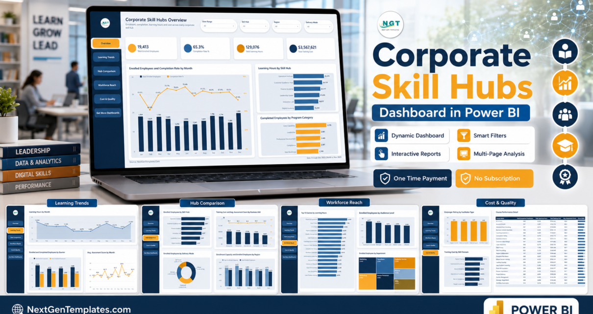
Most corporate learning teams can tell you how many people signed up. Far fewer can put enrolment, completion, delivered hours, cost and quality on one screen and slice all five by hub, region and delivery mode at once. The Corporate Skill Hubs Dashboard in Power BI is built for exactly that. The sample file carries 500 training sessions across 21 columns spanning January to December 2025, and its Overview page opens on 19,413 enrolled employees, a 65.3% completion rate, 129,076 learning hours and $3,567,621 of training cost across six skill hubs, seven departments, five regions and 24 courses.
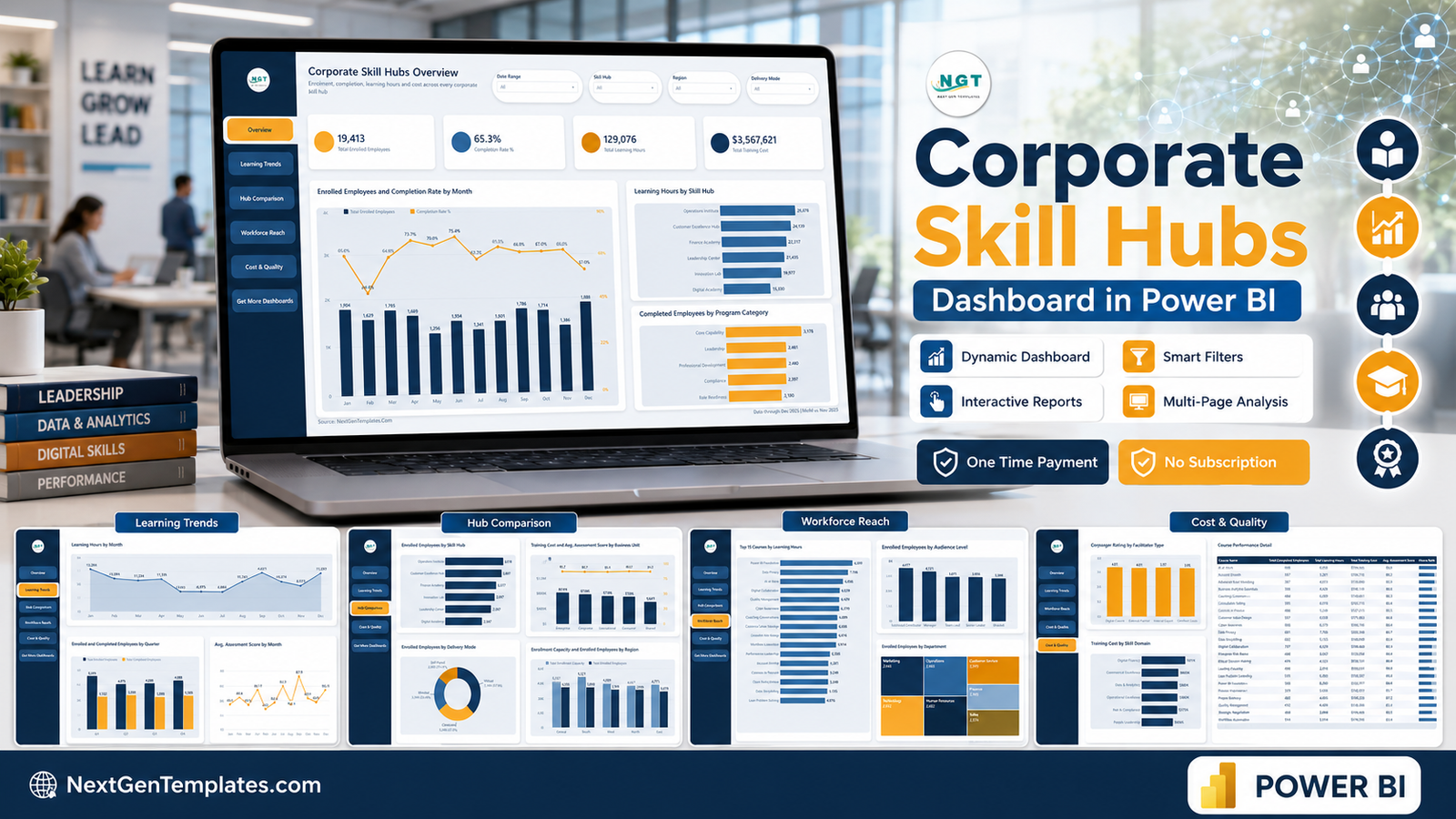
This walkthrough goes page by page through what the report actually contains, what the numbers mean, where it is honestly weak, and who should and should not buy it.
Key Features of the Corporate Skill Hubs Dashboard in Power BI
- Nine pages in the file – six you can see (Overview, Learning Trends, Hub Comparison, Workforce Reach, Cost & Quality, Get More Dashboards) plus a hidden Details drillthrough page and two hidden 280 x 360 tooltip pages.
- A left navigation rail repeated on every page, so moving between views is one click rather than a hunt along the page tabs.
- Four slicers per page. Date Range, Skill Hub and Region appear everywhere; the fourth is chosen for the page – Delivery Mode on Overview, Program Category on Learning Trends, Business Unit on Hub Comparison, Department on Workforce Reach, Skill Domain on Cost & Quality.
- A Details drillthrough bound on 11 fields – Skill Hub, Business Unit, Department, Region, Delivery Mode, Program Category, Skill Domain, Course Name, Audience Level, Facilitator Type and Status.
- Eleven measures drive the visuals – Total Enrolled Employees, Total Completed Employees, Total Enrollment Capacity, Total Learning Hours, Total Training Cost, Completion Rate %, Avg. Assessment Score, Avg. Manager Rating, Sessions, Hours Rank and a Report Context card that echoes the active filters.
- 500 rows of realistic sample data in a bundled
Data.xlsx, plus a user manual PDF, both inside the ZIP with the.pbix.
Dashboard Pages Explanation
Page 1 – Overview
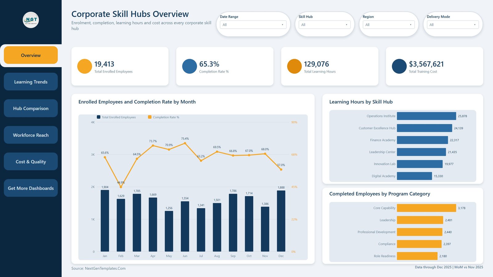
Four KPI cards run across the top: Total Enrolled Employees, Completion Rate %, Total Learning Hours and Total Training Cost. Below them, Enrolled Employees and Completion Rate by Month pairs monthly enrolment columns with a completion-rate line – in the sample, enrolment peaks at 1,904 in January and 1,888 in December, while completion swings from a 44.9% low in February to 75.4% in June. To the right, Learning Hours by Skill Hub ranks the six academies (Operations Institute 25,878 hours down to Digital Academy 15,330) and Completed Employees by Program Category puts Core Capability on top at 3,178.
Page 2 – Learning Trends
An area chart, Learning Hours by Month, shows delivery dipping to around 6,900 hours in June and July before recovering to 14,023 in September. Enrolled and Completed Employees by Quarter puts the two series side by side for Q1 to Q4, and Avg. Assessment Score by Month tracks quality on a tight 84.6 to 87.9 band. That narrow band is worth noticing: assessment quality in this dataset is stable even when volume is not.
Page 3 – Hub Comparison
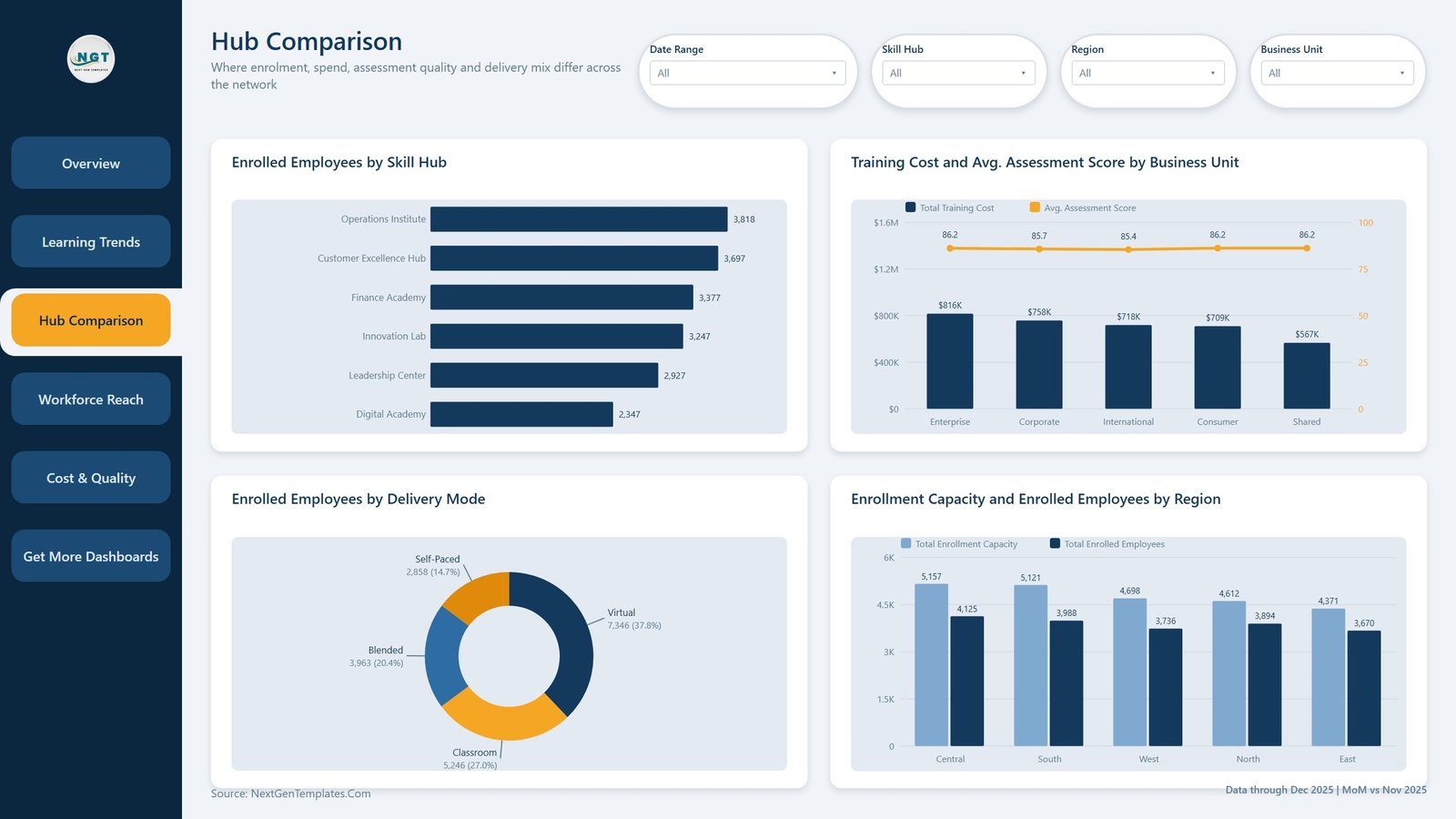
This is the page that settles arguments. Enrolled Employees by Skill Hub ranks the academies; Training Cost and Avg. Assessment Score by Business Unit puts spend as columns against score as a line, showing that Enterprise spends $816K to Shared Services’ $567K while every unit lands between 85.4 and 86.2 on score. Enrolled Employees by Delivery Mode is a donut – Virtual 37.8%, Classroom 27.0%, Blended 20.4%, Self-Paced 14.7% – and Enrollment Capacity and Enrolled Employees by Region shows the gap between seats offered and seats taken in each region.
Page 4 – Workforce Reach
Top 15 Courses by Learning Hours leads with Power BI Foundations at 8,260 hours, Data Privacy at 7,706 and AI at Work at 6,956. Enrolled Employees by Audience Level compares Individual Contributor, Manager, Team Lead, Senior Leader and Graduate, and Enrolled Employees by Department is a treemap across all seven departments, from Marketing at 2,942 down to Sales at 2,574. Reach is remarkably even in the sample data – which is itself a finding.
Page 5 – Cost & Quality
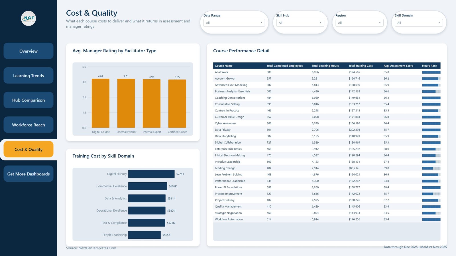
Avg. Manager Rating by Facilitator Type compares Digital Course, External Partner, Internal Expert and Certified Coach – all four sit between 3.95 and 4.01, so facilitator type is not the quality lever here. Training Cost by Skill Domain ranks the six domains from Digital Fluency at $721K to People Leadership at $505K. The Course Performance Detail table then lists every course with completed employees, learning hours, training cost, average assessment score and an Hours Rank column rendered as data bars.
Page 6 and the hidden pages
Page 6 is a Get More Dashboards page listing other NextGenTemplates reports and contact details. Behind the scenes sit the Details drillthrough page – three cards (Sessions, Total Enrolled Employees, Completion Rate %) over a session-record table – and two tooltip pages that surface three cards and a small chart when you hover a category or a quarter. Microsoft’s own drillthrough documentation explains the mechanic if you want to extend it.
Corporate Skill Hubs Dashboard in Power BI vs. Tableau vs. a Paid LMS Analytics Add-On – Feature Comparison
| This Power BI template | Tableau / Qlik build | LMS analytics add-on | |
|---|---|---|---|
| Cost | $17.99 once | Tableau Creator from $75/user/month | Usually $3,000+/year on top of the LMS |
| Platform | Power BI Desktop (free) or the Power BI Service | Tableau Desktop / Qlik Sense | Vendor portal only |
| Setup time | Under an hour | Days of modelling and layout | Weeks, plus onboarding |
| Real-time team collaboration | After publishing to the Service | Via Server / Cloud | Built in |
| Mobile access | Power BI mobile app | Tableau mobile app | Vendor app |
| Customizable fields | Full – your model, your DAX, your layout | Full | Only what the vendor exposes |
| Share with link | Yes, once published | Yes | Yes |
| Year-1 cost at 5 users | $17.99 | About $4,500 | $3,000 and up |
| Drillthrough to session records | Yes, bound on 11 fields | Build it yourself | Varies by plan |
| Connects to your LMS or HRIS | No – it reads an Excel or CSV export | Only if you build it | Yes, it is the LMS |
Who Should Use This Template
It suits an L&D or capability team that runs several internal academies and can export session-level data to Excel or CSV. It suits a finance business partner who needs training spend by business unit before budget season. And it suits anyone learning Power BI who wants a finished report – navigation, drillthrough, tooltip pages, a theme JSON – to take apart rather than build from an empty canvas.
It is not for you if you need a live LMS or HRIS connection, because the model reads a file you export and refreshing means refreshing that file. It is not a learning management system: it does not enrol anyone, host content or issue certificates. It does not store employee-level personal data – the grain is a training session, not a person – so per-employee learning histories would need you to extend the model.
Real-World Use Cases
Standardising six academies. An L&D manager at a 4,000-person manufacturer receives six differently formatted enrolment reports each quarter. Mapping them to the 21 template columns once means the Hub Comparison page answers “who is actually delivering” in a single screen from then on.
Building the training budget. A finance business partner needs spend by business unit and cost per course. Cost & Quality gives both, and the Course Performance Detail table exports straight to Excel for the budget pack.
Checking who gets the seats. A capability lead uses Workforce Reach to see whether graduates and individual contributors are being squeezed out of popular courses, then right-clicks into Details to see which sessions filled first.
Advantages of the Corporate Skill Hubs Dashboard in Power BI
- It opens populated. 500 sample sessions mean every visual is meaningful the moment you double-click the file – you are evaluating a report, not a blank template.
- Consistent filter design. Three constant slicers plus one page-specific slicer keeps the mental model stable while still asking a different question on each page.
- Real drillthrough, not a decorative one. Eleven bound fields means almost any visual you right-click carries its context to the Details page.
- Cost and quality live together. Plenty of learning dashboards show volume. This one puts spend, assessment score and manager rating next to it, which is where the awkward questions actually are.
- One payment. No subscription, no licence key, free lifetime updates.
Opportunities for Improvement
Three things are worth knowing before you buy.
Completion Rate % is a portfolio-wide rate. It divides completed employees by enrolled employees across every session in scope. In the sample that gives 65.3%, because the 500 rows include 65 scheduled and 37 cancelled sessions that cannot yet have completions. Slice Status to Completed and the same measure reads 86.2%. Both numbers are correct and they answer different questions, but if your definition is “of the sessions that have finished”, you will want to add a status filter to the measure. The same applies to Total Training Cost, which in the sample includes $247,253 against cancelled sessions and $459,746 against scheduled ones.
Two small label collisions. On Hub Comparison the business-unit axis clips “Shared Services” to “Shared”, and on Workforce Reach the “Individual Contributor” and “Manager” axis labels almost touch. Both are cosmetic and both are fixed by widening the visual or turning on label rotation.
No live connection. Refreshing means refreshing the Excel file the query points at. That is a deliberate trade – it is what keeps the template free of vendor lock-in – but it is a manual step.
Best Practices
- Keep the 21 column headers exactly as they are. Rename them and the measures break. Map your export to the template, not the other way round.
- Decide your completion definition first, then adjust the measure once rather than explaining the difference in every meeting.
- Load a full year before judging trends. The monthly and quarterly pages assume a complete calendar; a partial year makes Q4 look like a collapse.
- Use the Report Context card. It echoes the live filters, which stops screenshots circulating without anyone remembering what was sliced.
- Publish to the Power BI Service if more than two people need it, and set a refresh schedule against a file in OneDrive or SharePoint.
- Hide the Get More Dashboards page before you share the report internally, unless you want the links.
Explore Relevant Templates
- Corporate Skill Hubs Dashboard in Power BI – the template this article covers.
- Corporate Skill Hubs Dashboard in Excel – the same topic built with pivot tables and slicers.
- Learning & Development Dashboard in Power BI – a wider view across the whole L&D function.
- Corporate Universities Dashboard in Power BI – for a single internal university rather than several hubs.
- HR Analytics Dashboard in Power BI – headcount, attrition and hiring alongside the learning numbers.
- Corporate Skill Hubs KPI Dashboard in Excel – the scorecard version, with a month picker, targets and traffic lights.
Frequently Asked Questions
Does it connect to my LMS, HRIS or Workday?
No. It reads an Excel or CSV export. There is no LMS, HRIS or Workday connector in the file and none is implied.
Do I need a paid Power BI licence?
Not to open and use it – Power BI Desktop is free from Microsoft. A Pro licence is only needed to publish and share through the Power BI Service.
Why does Completion Rate % show 65.3% when most courses look successful?
Because the denominator includes scheduled and cancelled sessions. Filter Status to Completed and it reads 86.2%. See Opportunities for Improvement above.
Does it hold employee names or any personal data?
No. The sample data is fictional and the grain is a training session, not an individual. There is no name, employee ID or email in the model.
Can I rebrand it?
Yes. The colours come from a standard theme JSON and the logo is an ordinary image visual – swap both for your own.
Are the assessment scores and manager ratings industry benchmarks?
No. They are demonstration values and become whatever your data says once you repoint the query. Nothing here is a published benchmark or a recommendation about a target score.
How is this different from the KPI dashboard with the same name?
This is the analytical report – five pages of charts you slice and drill through. The KPI dashboard is a scorecard, with a month picker, targets and traffic lights. Different products for different meetings.
About the Author
Built by PK – Microsoft Certified Professional with 15+ years of Excel, Google Sheets, and Power BI experience. Founder of NextGenTemplates, reaching 300K+ subscribers across YouTube channels. Every template is hand-built and tested before release.
Conclusion
If your learning function reports enrolment well and everything else badly, this report closes the gap in an afternoon. Six pages, eleven measures, a real drillthrough and 500 rows of sample data mean you can see exactly what you are getting before you swap in a single row of your own – and the honest caveats above mean you know where you will need to make a decision rather than discover one later.
Get the Corporate Skill Hubs Dashboard in Power BI for $17.99 (regular $29.99) – instant download, lifetime access, free updates.
For step-by-step Power BI and Excel walkthroughs, subscribe on YouTube at youtube.com/@PKAnExcelExpert.