A coworking cafe sells two things at once – a seat and a coffee – and most operators can tell you what they made without being able to tell you what they wasted. The Coworking Cafes Dashboard in Power BI exists to close that gap. It reads 500 bookings across eight cafes in eight Indian cities, and the headline read for the sample year is blunt: ₹2.58M booking revenue, 2,372 booking hours, 59.8% seat utilisation, a 4.12 out of 5 customer rating – and 92 of the 500 bookings lost to cancellations and no-shows. That last number is the one that pays for the template.
Key Features of the Coworking Cafes Dashboard in Power BI
- Five report pages plus a Get More Dashboards page, navigated from a left rail that never moves: Overview, Revenue Trends, Workspace Mix, Cafe Operations, Customer Insights.
- Twenty-five KPI cards – five per page, each carrying a month-on-month delta against November 2025 and an inline sparkline drawn by a DAX measure rather than a native visual.
- Five slicers on every page. Date Range, Region and Cafe stay put; the fifth rotates to suit the page – Membership Plan, Booking Channel, Visit Purpose, Booking Status, Customer Type.
- A hidden Details drillthrough bound on ten fields, so a right-click on any bar takes you to the bookings behind it.
- Two tooltip pages – Category Detail and Trend Detail – so hovering a column gives you context, not a naked number.
- 30 DAX measures referenced across the report visuals, including Seat Utilisation %, Gross Margin %, Gross Profit and Total Operating Cost.
- 500 rows across 22 columns in the bundled Data.xlsx, with a separate Date table for time intelligence.
Dashboard Pages Explanation
Page 1 – Overview
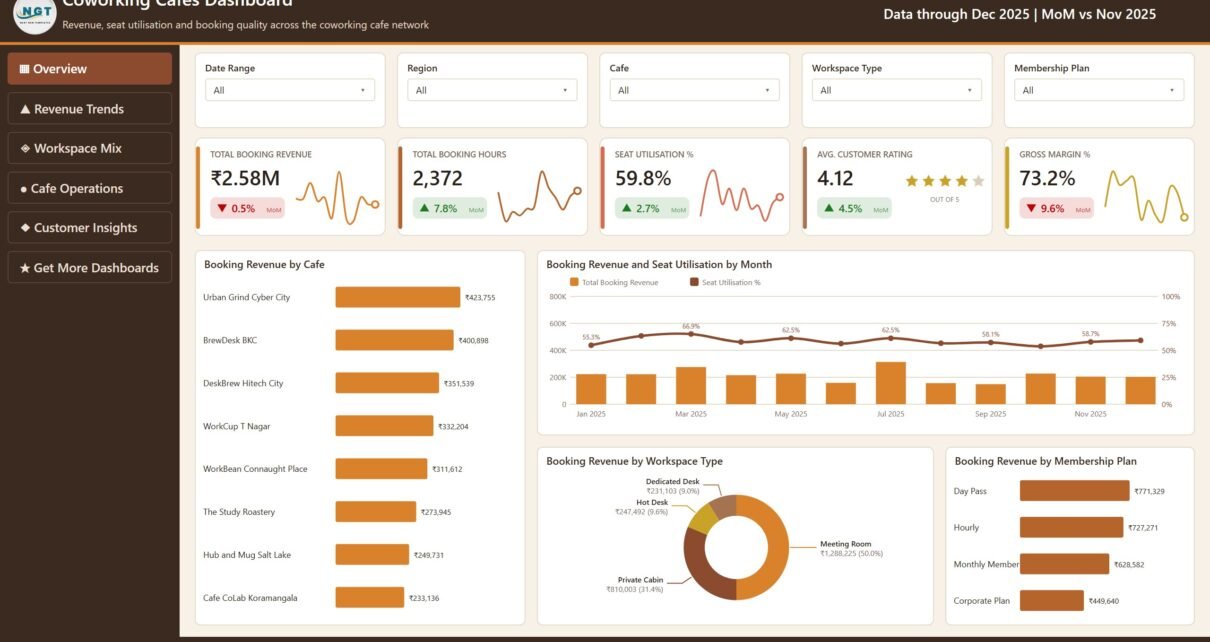
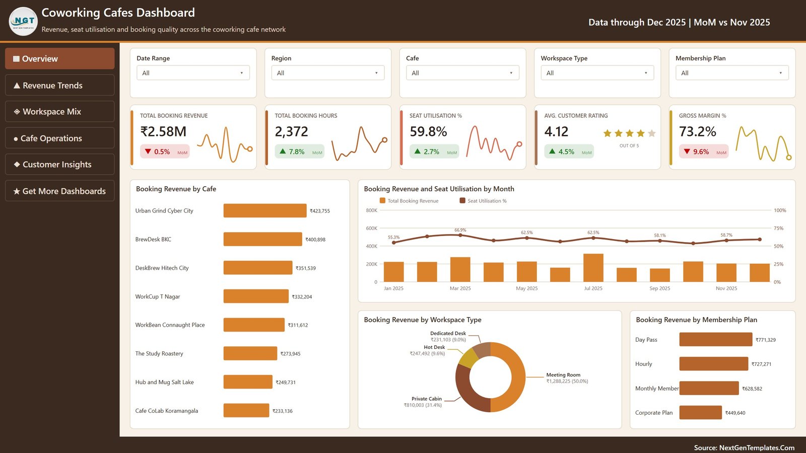
Subtitled “Revenue, seat utilisation and booking quality across the coworking cafe network”, this is the page you open in front of other people. Its five cards read Total Booking Revenue ₹2.58M (▼0.5% MoM), Total Booking Hours 2,372 (▲7.8%), Seat Utilisation % 59.8% (▲2.7%), Avg. Customer Rating 4.12 out of 5 (▲4.5%) and Gross Margin % 73.2% (▼9.6%).
Underneath, Booking Revenue by Cafe ranks all eight sites, from Urban Grind Cyber City at ₹423,755 down to Cafe CoLab Koramangala at ₹233,136 – a spread of less than two to one, which is itself a finding. Booking Revenue and Seat Utilisation by Month puts monthly revenue columns behind a utilisation line that moves between 55.3% and 66.9%. Two splits finish the page: Booking Revenue by Workspace Type, where Meeting Room takes ₹1,288,225 or 50.0% of everything, and Booking Revenue by Membership Plan, led by Day Pass at ₹771,329 ahead of Hourly at ₹727,271.
Page 2 – Revenue Trends
This page separates the income streams that Overview merges. Cafe Pass Revenue is ₹2.13M (▼4.4%), Food & Beverage Spend ₹301.1K (▲21.6%) and Meeting Room Spend ₹149.8K (▲20.1%), against an Avg. Revenue per Booking of ₹5,154. Revenue Streams by Month stacks the three so you can see F&B and meeting rooms growing while the pass revenue flattens. Gross Profit by Month traces a genuinely volatile line – ₹225,491 in July, ₹98,182 in September – and Operating Cost and Gross Margin by Month runs cost bars against a margin line that ranges from 66.1% to 78.1%.
Page 3 – Workspace Mix
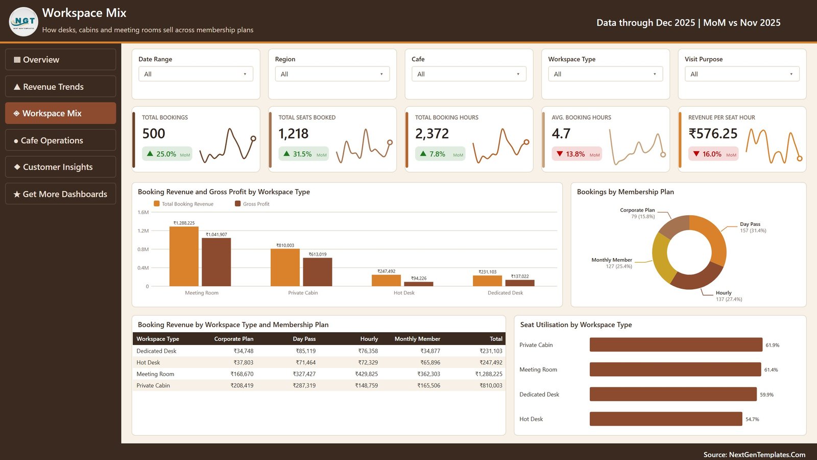
“How desks, cabins and meeting rooms sell across membership plans.” Cards: Total Bookings 500, Total Seats Booked 1,218, Total Booking Hours 2,372, Avg. Booking Hours 4.7 and Revenue per Seat Hour ₹576.25. The chart that earns the page is Booking Revenue and Gross Profit by Workspace Type: Meeting Room turns ₹1,288,225 into ₹1,041,907 of gross profit, Private Cabin ₹810,003 into ₹613,019, Hot Desk ₹247,492 into just ₹94,226. A hot desk is not a small meeting room; it is a different business. A four-by-four matrix crosses Workspace Type against Membership Plan with totals, and Seat Utilisation by Workspace Type ranks Private Cabin 61.9%, Meeting Room 61.4%, Dedicated Desk 59.9%, Hot Desk 54.7%.
Page 4 – Cafe Operations
The accountability page. Of 500 bookings, 317 Completed (63.4%), 91 still Confirmed (18.2%), 61 Cancelled (12.2%) and 31 No Show (6.2%) – an 18.4% Cancellation Rate carried against ₹690.6K Total Operating Cost. Booking Revenue by City ranks Gurugram, Mumbai, Hyderabad, Chennai, Delhi, Pune, Kolkata and Bengaluru. Booking Revenue against Gross Margin by Cafe is a scatter that answers the question a ranked bar chart cannot: Hub and Mug Salt Lake sits low on both axes, while Urban Grind Cyber City sits top-right on revenue and margin together. Seat Utilisation by Region closes it – North 61.2%, South 60.4%, West 59.8%, East 55.3%.
Page 5 – Customer Insights
“Who books, how they book and what keeps them coming back.” Returning Booking % is 67.2% (▲21.7%), F&B Attach % 11.7% (▲22.2%). Booking Revenue and Customer Rating by Customer Segment combines revenue columns with a rating line, and the Customer Segment Scorecard table spells it out: Freelancer 144 bookings / ₹784,077 / 4.13, Remote Employee 128 / ₹696,322 / 4.04, Startup Team 100 / ₹555,187 / 4.12, Consultant 71 / ₹270,138 / 4.17, Student 57 / ₹271,098 / 4.14. Bookings by Booking Channel splits Website 163, Mobile App 155, Walk-in 129, Partner 53, and Booking Revenue by Visit Purpose shows Focused Work at ₹841,469 ahead of Online Meeting, Team Collaboration, Client Meeting and Study Session.
The hidden pages
Three pages never appear in the rail. Details is a drillthrough bound on ten fields – Cafe, City, Region, Workspace Type, Membership Plan, Booking Channel, Customer Segment, Customer Type and more – reached by right-clicking a visual. Category Detail and Trend Detail are tooltip pages that render on hover. If you have not used report page tooltips before, Microsoft documents the mechanism in the Power BI tooltips guide.
Coworking Cafes Dashboard in Power BI vs. Excel vs. Paid Coworking SaaS – Feature Comparison
| This Power BI Dashboard | Excel Version | Paid Coworking SaaS | |
|---|---|---|---|
| Cost | One payment, $17.99 on sale | One payment, $17.99 on sale | $80–$250 per month per location |
| Platform | Power BI Desktop (free) | Excel 2016 or later | Vendor-hosted web app |
| Setup time | 15 minutes to repoint Data.xlsx | 10 minutes to paste rows | 2–6 weeks onboarding |
| Real-time team collaboration | After publishing to a workspace | OneDrive co-authoring | Yes, built in |
| Mobile access | Power BI mobile app | Excel mobile, read-only in practice | Yes |
| Customisable fields | Full – edit model and DAX | Full | Vendor-defined only |
| Share with link | Yes, after publishing | No, share the file | Yes |
| Year-1 cost at 5 users | $17.99 | $17.99 | $960–$3,000+ |
| Drillthrough to raw bookings | Yes – 10-field Details page | Pivot drill-down only | Varies by plan |
| Takes bookings and payments | No – reporting only | No | Yes |
Who Should Use This Template
Operators running two to fifteen coworking cafes who already export bookings to a spreadsheet, and want one report instead of five pivot tables. Hospitality and workspace analysts who have to defend pricing per workspace type with a chart rather than an opinion. Franchise and multi-site managers comparing cities on utilisation instead of on revenue alone. And Power BI learners who want a finished, laid-out report with SVG cards, a drillthrough and tooltip pages to reverse-engineer.
It is a poor fit if you need a booking engine or a POS – this reads bookings, it does not take them – or if you have a single cafe with forty bookings a month, where the Cafe, City and Region comparisons will simply look empty.
Real-World Use Cases
The monthly network review. Open Cafe Operations, set Date Range to last month, and read the completion donut. A cancellation rate that jumps from 18.4% to 25% is a scheduling or a staffing problem, and the Cafe slicer tells you at which site.
The pricing argument. A partner wants to rip out hot desks for meeting rooms. Workspace Mix settles it in one chart – ₹1,041,907 gross profit from meeting rooms against ₹94,226 from hot desks – and Seat Utilisation by Workspace Type provides the counter-argument, because hot desks at 54.7% still have room to grow before capital is needed.
The membership campaign. Customer Insights shows Returning Booking % at 67.2% and rates Consultants highest at 4.17 while Freelancers book the most volume. That splits the campaign into a retention track and a win-back track without guessing.
The landlord conversation. Booking Revenue against Gross Margin by Cafe puts each site on two axes at once, which is the chart to take into a rent renegotiation for a location that earns well but runs expensively.
Advantages of the Coworking Cafes Dashboard in Power BI
- Slicer parity. Date Range, Region and Cafe appear on every page in the same position, so a filter set on Overview means the same thing on Customer Insights.
- Deltas everywhere. Every one of the 25 cards carries a MoM comparison, so no number arrives without context.
- Real drillthrough. Ten bound fields means most visuals can reach the underlying bookings, not just one hand-picked chart.
- Portable model. Data.xlsx is a plain 22-column table. Swap it for SQL Server, a CSV folder or any Power BI connector and nothing else breaks.
- One payment. No per-seat licence, no renewal, and Power BI Desktop itself is free.
Opportunities for Improvement
Being honest about the limits is more useful than pretending there are none. The sample data is formatted in Indian Rupees because the eight cafes are Indian; changing currency means editing the format string on the revenue and cost measures. There is no forecasting page – the model reports what happened rather than projecting what will. It refreshes from a file, so it is only as current as your last export; scheduled refresh needs a published workspace and a gateway. And the eight-cafe sample is deliberately balanced, so your own data will look messier than the screenshots.
Best Practices
- Keep all 22 column headers exactly as they ship. The measures bind to names, not positions.
- Use Transform data → Data source settings to repoint the query rather than pasting rows into the sample file.
- Set Date Range first, then Region, then Cafe. Filtering in that order keeps the KPI deltas meaningful.
- Right-click before you export. The Details drillthrough usually answers the question a screenshot would only raise.
- Publish to a workspace if more than two people need it, and let the mobile layout do the rest.
- Keep Booking Status honest in your source data. Completed, Confirmed, Cancelled and No Show drive the whole Cafe Operations page.
Explore Relevant Templates
- Coworking Cafes Dashboard in Power BI – the template described in this post.
- Coworking Cafes Dashboard in Excel – the same topic as an Excel workbook, if your team lives in spreadsheets.
- Coworking Space Dashboard in Power BI – desk and membership analytics without the cafe revenue streams.
- Remote Work Communities Dashboard in Power BI – the community side of the same market.
- Power BI Dashboard Mega Collection – 15 premium Power BI templates in one bundle.
Frequently Asked Questions
Do I need a paid Power BI licence to use it?
No. Power BI Desktop is free and will open, edit and refresh the .pbix. A Pro or Premium licence is only needed to publish it to the Power BI service and share it by link.
What exactly is in the download?
A zip containing the .pbix report, the Data.xlsx that feeds it, and a Power BI user manual PDF.
Can I use my own currency?
Yes. The sample is in ₹ because the cafes are Indian. Change the format string on the revenue and cost measures in Power BI Desktop and every card, chart and table updates.
Will it handle more than 500 bookings?
Comfortably. The sample is small so the file downloads fast; the model is a standard import table with a Date table and handles hundreds of thousands of rows in Power BI Desktop.
Can I connect it to my booking system?
Yes – replace the Data query source with SQL Server, a CSV folder or any Power BI connector, keeping the 22 column names intact.
Does it take bookings or process payments?
No. It is a reporting template, not a booking engine, POS or membership billing system.
How is it different from the Excel version?
They are separate builds of the same topic. The Excel one uses pivot-driven charts and slicers across five sheets; this one is a Power BI model with DAX measures, a drillthrough page and two tooltip pages, and it publishes to the Power BI service.
About the Author
Built by PK – Microsoft Certified Professional with 15+ years of Excel, Google Sheets, and Power BI experience. Founder of NextGenTemplates, reaching 300K+ subscribers across YouTube channels. Every template is hand-built and tested before release.
Conclusion
The number worth remembering from this dashboard is not ₹2.58M. It is 18.4% – the share of bookings that were cancelled or no-showed, on a network already running at only 59.8% seat utilisation. A coworking cafe with those two figures is not short of demand; it is short of visibility. The Coworking Cafes Dashboard in Power BI gives you that visibility across five pages, twenty-five KPI cards and a drillthrough to every underlying booking, for one payment and no subscription.
For step-by-step Power BI and Excel tutorials, subscribe to youtube.com/@PKAnExcelExpert.