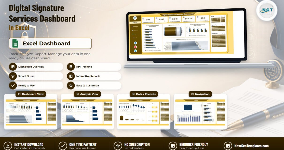
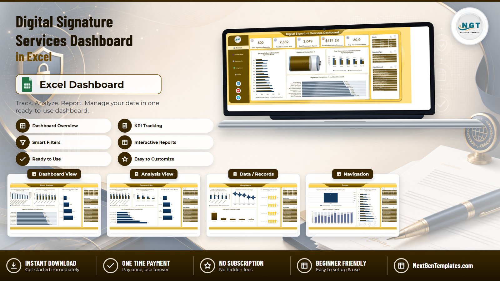
The Digital Signature Services Dashboard in Excel turns a raw signing-platform export into a five-page reporting pack. The sample workbook carries 500 signature requests across 23 data columns and reports 2,832 documents sent, 2,049 documents signed, a 72.4% signature completion rate, $474.2K in subscription revenue and 30.9 average turnaround hours. Five KPI cards, 19 charts and three synchronised slicers sit across Overview, Client Analysis, Document Mix, Compliance and Trends pages.
If you sell or operate e-signature services, your platform tells you what happened to each envelope, but it rarely tells you which client accounts are quietly failing to complete, which certificate authority is generating the most verification failures, or whether your margin is holding as volume grows. Those are portfolio questions, and they usually get answered in a spreadsheet anyway. This template is that spreadsheet, already built.
Key Features of the Digital Signature Services Dashboard in Excel
This is the analytical Excel Dashboard line – a multi-page workbook driven by pivot tables and slicers. It is deliberately not the Excel KPI Dashboard line and not the Excel KPI Scorecard line, both of which are month-picker scorecards with traffic lights. Different family, different job.
- Five KPI cards pinned to the Overview header: Total Signature Requests, Total Documents Sent, Total Documents Signed, Total Subscription Revenue and Avg. Turnaround Hours.
- Nineteen charts spread over five pages, each titled with the metric and the breakdown rather than the chart type – Signature Completion % by Client Account, Total Documents Sent by Channel, and so on.
- Three synchronised slicers – Month, Signature Type and Client Account – in a fixed right-hand rail that filters every visual on the active page in one click.
- Four signature types modelled throughout: Simple Electronic, Advanced Electronic, Qualified Electronic and Digital Certificate.
- Ten client accounts and seven industries in the sample data, spanning Legal Services, IT Services, Healthcare, Insurance, Real Estate, Government and Banking.
- A 23-column Data sheet plus a visible Support sheet holding the pivots, so nothing is hidden and everything is extensible.
- No macros and no add-ins – a plain .xlsx that opens on locked-down corporate machines without a security prompt.
Dashboard Pages Explanation
Page 1: Overview
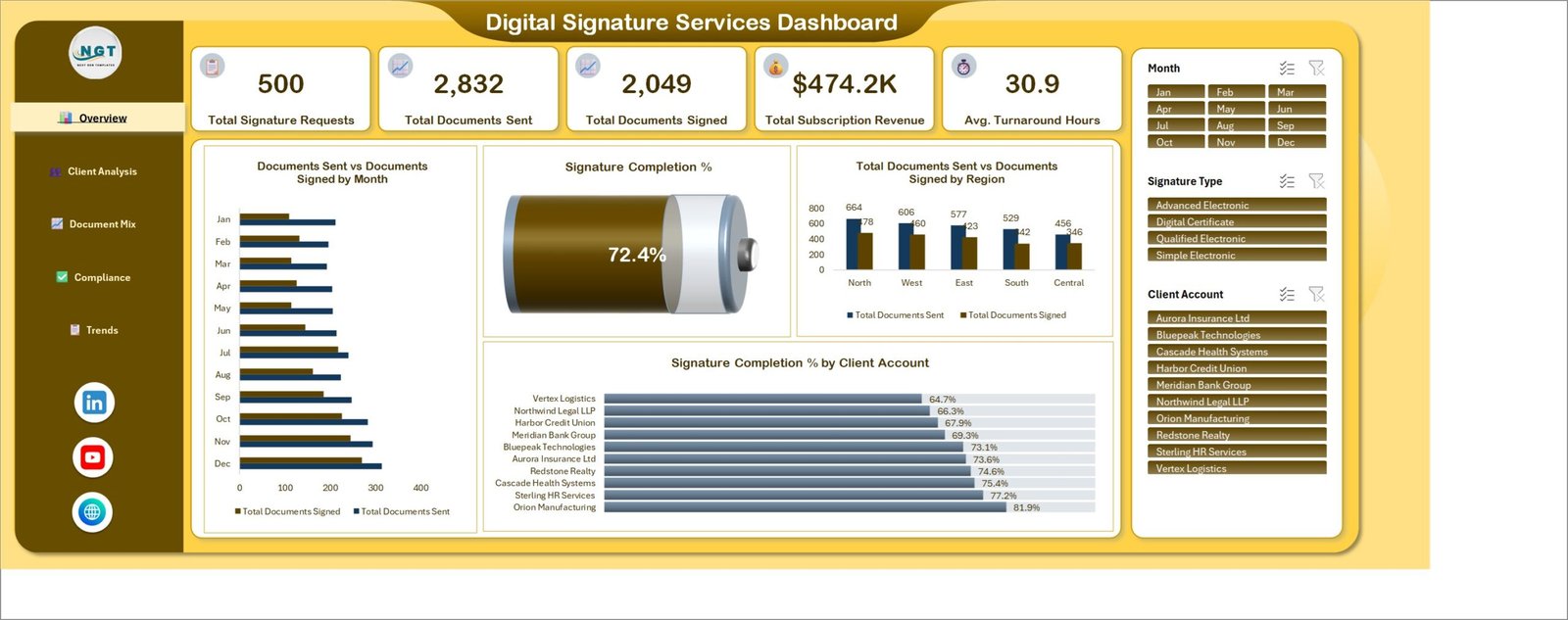
The landing page opens with the five KPI cards – 500 signature requests, 2,832 documents sent, 2,049 signed, $474.2K revenue and 30.9 average turnaround hours. Below them sit Documents Sent vs Documents Signed by Month, a Signature Completion % gauge reading 72.4%, Total Documents Sent vs Documents Signed by Region (North leads at 664 sent against 478 signed), and Signature Completion % by Client Account ranking all ten accounts from Vertex Logistics at 64.7% to Orion Manufacturing at 81.9%.
Page 2: Client Analysis
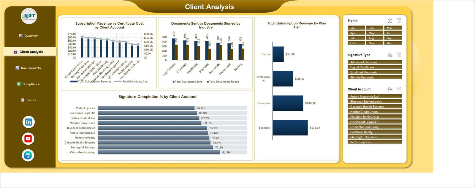
This page answers where the money is. Subscription Revenue vs Certificate Cost by Client Account puts revenue bars against a cost line on a secondary axis, so a low-margin account is visible immediately. Documents Sent vs Documents Signed by Industry shows Legal Services highest at 470 sent, and Total Subscription Revenue by Plan Tier splits the book into Business $171.4K, Enterprise $149.2K, Professional $99.6K and Starter $54.0K. Signature Completion % by Client Account repeats here so you can read completion and revenue together.
Page 3: Document Mix
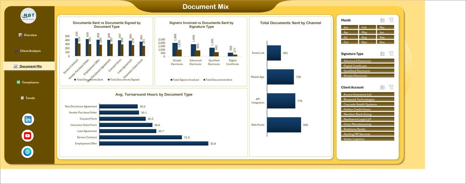
This page profiles what is actually being signed. Documents Sent vs Documents Signed by Document Type covers Service Contract, Vendor Purchase Order, Employment Offer, Non Disclosure Agreement, Consent Form, Loan Agreement and Insurance Claim Form. Signers Involved vs Documents Sent by Signature Type shows Simple Electronic carrying 1,988 signers against 1,019 documents. Total Documents Sent by Channel ranks Web Portal 936, API Integration 776, Mobile App 739 and Email Link 381. Avg. Turnaround Hours by Document Type runs from 30.0 hours for NDAs to 32.8 for Employment Offers.
Page 4: Compliance
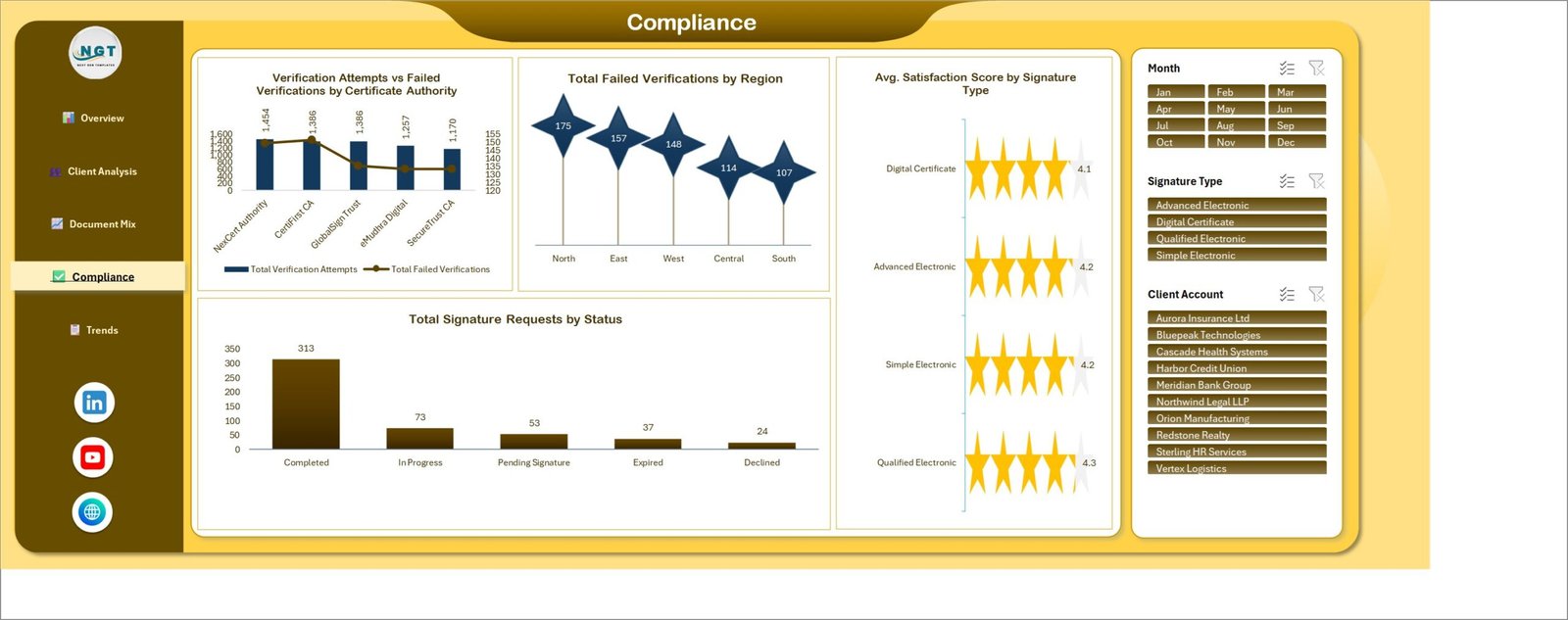
The audit view. Verification Attempts vs Failed Verifications by Certificate Authority compares NexCert Authority, CertFirst CA, GlobalSignTrust, eMudhra Digital and SecureTrust CA, with attempts as bars and failures as an overlaid line. Total Failed Verifications by Region puts North highest at 175 and South lowest at 107. Avg. Satisfaction Score by Signature Type renders as star ratings between 4.1 and 4.3, and Total Signature Requests by Status splits the book into 313 Completed, 73 In Progress, 53 Pending Signature, 37 Expired and 24 Declined.
Page 5: Trends
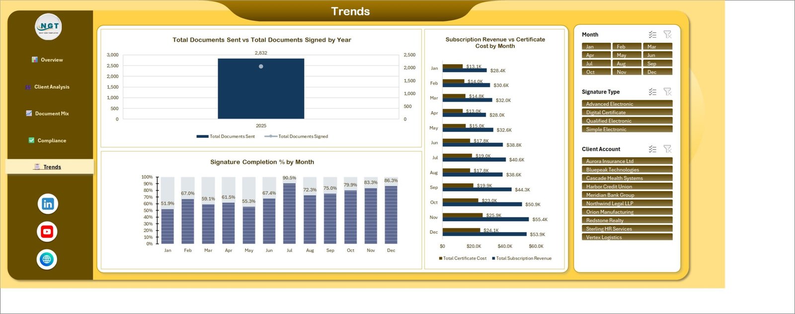
Movement over time. Total Documents Sent vs Total Documents Signed by Year gives the annual anchor, Signature Completion % by Month climbs from 51.9% in January through a 90.5% peak in July to 86.3% in December, and Subscription Revenue vs Certificate Cost by Month lets you watch both sides of the margin as monthly volume rises from $28.4K to $55.4K in revenue.
Data Sheet and Support Sheet
The Data sheet holds 500 sample rows across 23 columns: Request ID, Request Date, Client Account, Industry, Region, Country, Document Type, Signature Type, Certificate Authority, Plan Tier, Channel, Documents Sent, Documents Signed, Signers Involved, Turnaround Hours, Verification Attempts, Failed Verifications, Certificate Cost, Subscription Revenue, Satisfaction Score, Status, Month and Year. The Support sheet holds the pivot tables and helper calculations behind every chart. Both stay visible and unlocked.
Digital Signature Services Dashboard in Excel vs. a Google Sheets Build vs. DocuSign / Adobe Acrobat Sign Reporting – Feature Comparison
| Feature | Digital Signature Services Dashboard in Excel | Google Sheets equivalent | DocuSign / Adobe Acrobat Sign reporting |
|---|---|---|---|
| Cost | $17.99 one-time ✅ | $9-17 one-time | $25-65 per user per month |
| Platform | Microsoft Excel, works offline ✅ | Browser only | Vendor cloud only |
| Setup time | Under 10 minutes ✅ | Under 10 minutes | Days – admin roles and report builders |
| Works across multiple signing vendors | Yes – any CSV export ✅ | Yes | No – your own platform only |
| Certificate authority failure analysis | Built in ✅ | Build it yourself | Partial, enterprise tiers only |
| Real-time team collaboration | Via OneDrive / SharePoint | Native ✅ | Native |
| Mobile access | Excel mobile app | Any browser ✅ | Native app |
| Customisable fields and charts | Fully – unlocked pivots ✅ | Fully | Fixed report catalogue |
| Year-1 cost at 5 users | $17.99 total ✅ | $17 total | $1,500-3,900 |
For teams that want signature-completion, turnaround and certificate-failure reporting across every signing vendor they use without paying per-seat analytics fees, the Digital Signature Services Dashboard in Excel sits in the sweet spot.
Who Should Use This Template
Perfect for:
- Operations and customer-success leads at e-signature providers and trust service providers managing 10-500 client accounts
- Document-operations teams in law firms, banks, insurers and HR shared services sending hundreds of documents a month
- Compliance officers who need failed-verification evidence by certificate authority and region in a portable file
- Analysts who want a finished five-page layout rather than another blank pivot
Not a fit if:
- You need to send or sign documents – this reports on signing activity, it does not perform signing
- You need a continuous live feed rather than a refresh after each export
- You need SOC 2 controls, SSO and row-level security inside the reporting tool itself
- Your dataset runs to millions of rows, where Power BI is the better engine
Real-World Use Cases
Priya runs client operations at a regional e-signature provider with 40 accounts. Every Monday she opens the Overview page, reads Signature Completion % by Client Account, and pulls out anyone under 70%. In the sample file that is Vertex Logistics at 64.7% and Northwind Legal LLP at 66.3%. She books a workflow review with each before renewal season rather than discovering the problem at churn.
Daniel manages document operations at a mid-size law firm. He filters to Qualified Electronic signatures and reads Avg. Turnaround Hours by Document Type. Employment Offer packs run 32.8 hours against 30.0 for NDAs, which gives him the evidence to re-order the signer sequence on the slowest template and re-measure a month later.
Fatima is a compliance officer at an insurer. Each quarter she exports the Compliance page as a PDF – failed verifications by certificate authority, failures by region, satisfaction by signature type and the request-status split – and files it as her internal audit evidence pack. It replaced three manual pivot rebuilds and a screenshot collage.
Advantages of the Digital Signature Services Dashboard in Excel
The obvious advantage is cost: $17.99 once against $1,500-3,900 a year for five analytics seats on a vendor platform. The less obvious one is coverage. Vendor reporting is bounded by the vendor. If you route some volume through an API integration and some through a partner portal, only a neutral file can show you both, and 23 generic columns will accept an export from almost anything.
Speed is the third. Because the whole workbook is native pivot tables and slicers, a monthly refresh is a paste and a Ctrl+Alt+F5. There is no data model to reload, no gateway to schedule and no credentials to renew. Microsoft’s own PivotTable documentation covers everything you would need to extend it.
Opportunities for Improvement
Being straight about the limits: this is a snapshot tool, not a live one. It reflects the export you pasted, so a daily operations desk will want to refresh daily. The sample data covers a single year, so the Total Documents Sent vs Total Documents Signed by Year chart shows one column until you add history. There is no row-level security – anyone with the file sees every client account, which matters if you plan to share it outside the operations team. And at several hundred thousand rows Excel will start to feel it; that is the point where a Power BI model earns its keep.
Best Practices
- Keep the 23 column headers exactly as shipped and map your export to them once – future refreshes then need no rework.
- Append history rather than replacing it, so the Trends page has more than one year to compare.
- Save a copy of the untouched workbook before your first paste, as a clean reference layout.
- Standardise Client Account and Certificate Authority spellings at export time; a stray variant creates a duplicate bar.
- Use the Signature Type slicer before reading turnaround figures – Qualified Electronic behaves very differently from Simple Electronic.
- Export the Compliance page to PDF at the same point each quarter so your audit trail is consistent.
Explore Relevant Templates
If signature data is one part of a broader privacy remit, the Data Protection Office Dashboard in Excel covers DSARs, breach handling and GDPR workload on the same five-page pattern – there is a full walkthrough of it here. For the custody side of the keys and certificates, see the Digital Asset Custodians Dashboard in Excel.
Teams that track threat exposure alongside document risk usually add the Cyber Risk Management Dashboard in Power BI, while engineering-side reporting is covered by the DevOps Teams Dashboard in Excel. For a lighter monthly scorecard on the audit side, the Compliance Audit KPI Dashboard in Google Sheets works well, and the Meeting Minutes Data Entry System in Excel captures the approvals that lead to a signature request in the first place. The whole Excel Dashboard Templates collection is worth a browse.
Frequently Asked Questions
What KPIs does the Digital Signature Services Dashboard in Excel track?
The Digital Signature Services Dashboard in Excel tracks five headline KPIs – Total Signature Requests, Total Documents Sent, Total Documents Signed, Total Subscription Revenue and Avg. Turnaround Hours – plus signature completion rate, failed verifications, satisfaction score and certificate cost across 19 charts on five pages.
How long does setup take?
Under 10 minutes. Open the Digital Signature Services Dashboard in Excel, delete the 500 sample rows on the Data sheet, paste your own export in the same 23-column order, and press Ctrl+Alt+F5. All five pages recalculate immediately with no formula editing required.
How does this compare to DocuSign or Adobe Acrobat Sign reporting?
Vendor reporting only covers documents sent through that vendor and is billed per user per month. The Digital Signature Services Dashboard in Excel is a $17.99 one-time file that accepts a CSV export from any signing platform, so multi-vendor volume can be reported in one place.
Does the Digital Signature Services Dashboard in Excel need macros?
No. It is a standard .xlsx workbook built on pivot tables, slicers and native Excel charts. There is no VBA, no macro security warning and no add-in to install, so it opens cleanly on managed corporate machines and in Excel for the web.
Which Excel versions does it support?
The Digital Signature Services Dashboard in Excel works in Excel 2016 and later on Windows and Mac, and in Microsoft 365. Slicers and pivot charts are core features in all of those versions, so no separate licence or Power BI account is needed.
Can I add my own metrics or rebrand the colours?
Yes. The Support sheet holding the pivots is visible and unlocked, so you can add a column to the Data sheet, extend a pivot and place a new chart on any page. The brown-and-gold theme is ordinary Excel formatting and can be restyled to your brand in minutes.
Is this the same as the Excel KPI Dashboard line?
No. The Digital Signature Services Dashboard in Excel is an analytical five-page dashboard with slicers and pivot-driven charts. The Excel KPI Dashboard and Excel KPI Scorecard lines are month-picker scorecards with traffic lights and separate trend pages – a different template family entirely.
About the Author
Built by PK – Microsoft Certified Professional with 15+ years of Excel, Google Sheets and Power BI experience. Founder of NextGenTemplates, reaching 300K+ subscribers across YouTube channels. Every template is hand-built and tested before release.
Conclusion
Signature volume is easy to measure and signature quality is not. Completion rate by account, turnaround by document type, failed verifications by certificate authority and margin by month are the four numbers that tell you whether a signing operation is healthy, and none of them appear together on a vendor dashboard. The Digital Signature Services Dashboard in Excel puts all four on five screens you can open offline and hand to an auditor.
👉 Click here to Purchase the Digital Signature Services Dashboard in Excel
Instant download · One-time payment · No subscription
🎥 For step-by-step video tutorials, visit Youtube.com/@PK-AnExcelExpert.
Last updated: September 2026