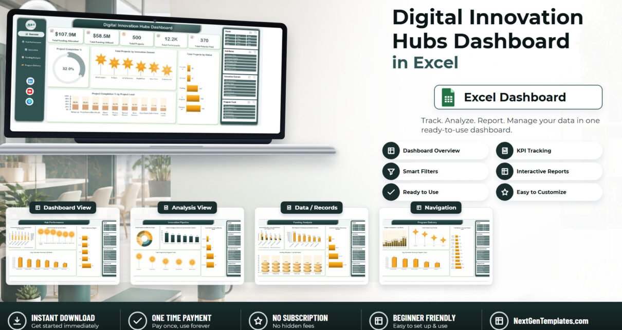
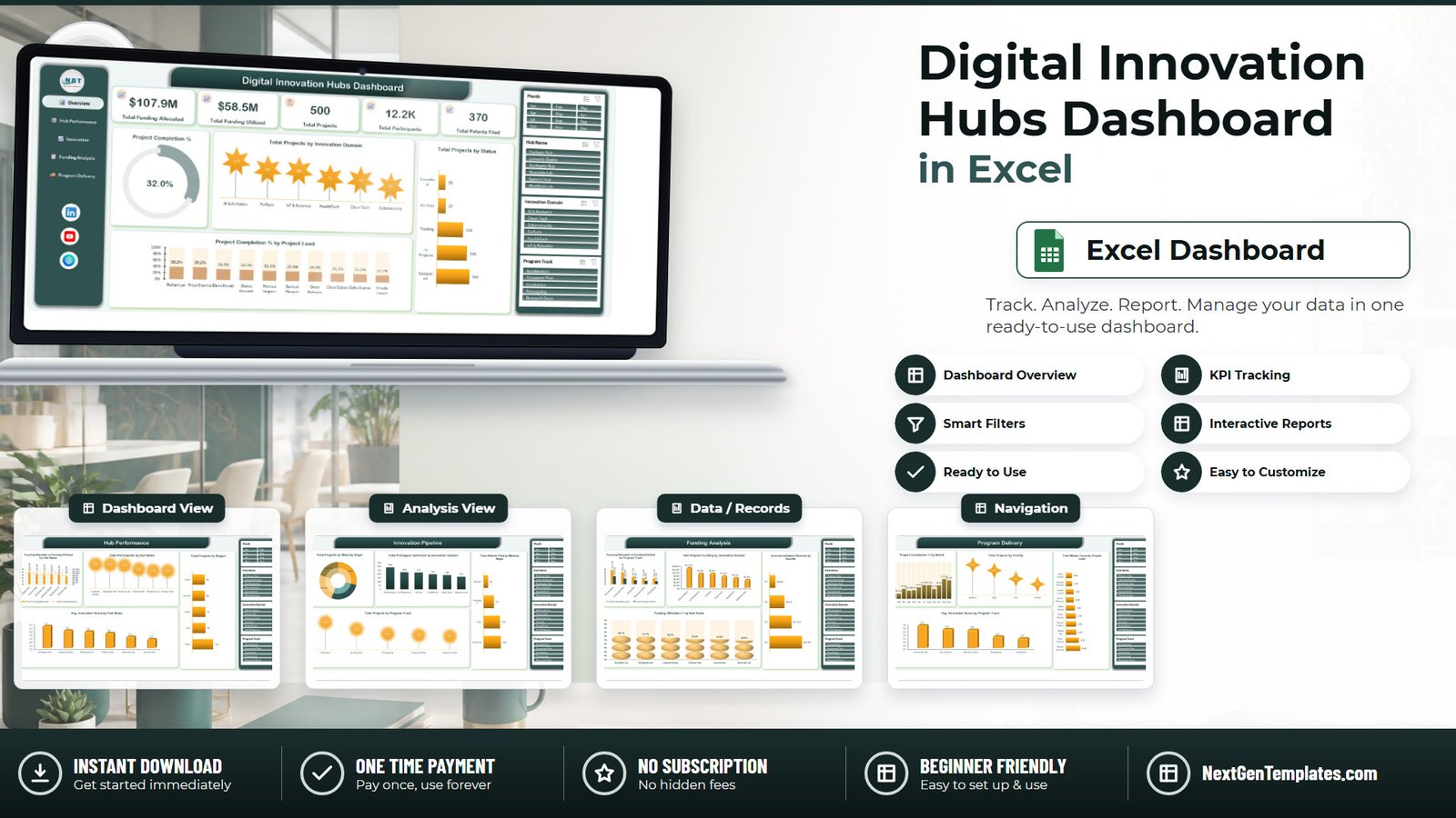
Most innovation hubs can tell you what they were given. Far fewer can show, on one screen, what happened to it. In the sample portfolio behind the Digital Innovation Hubs Dashboard in Excel, $107.9M was allocated across six hubs and only $58.5M was actually utilised – a 46% gap sitting idle while 500 projects moved through five program tracks, produced 370 patent filings and reached just 32.0% average completion. That gap is not a data problem. It is a reporting problem, and it is the one this template was built to fix. Digital Innovation Hubs Dashboard in Excel
Key Features of the Digital Innovation Hubs Dashboard in Excel
- Five linked report pages – Overview, Hub Performance, Innovation Pipeline, Funding Analysis and Program Delivery – navigated from a fixed left-hand panel that stays in place on every page.
- Five KPI cards on the Overview: Total Funding Allocated, Total Funding Utilized, Total Projects, Total Participants and Total Patents Filed.
- Four synchronised slicers – Month, Hub Name, Innovation Domain and Program Track – that filter all 18 charts across all five pages simultaneously.
- Six hubs (Harbour Hub, Lakeside Studio, Northgate Hub, Riverside Lab, Summit Hub, Westfield Lab) and six innovation domains (AI & Analytics, Clean Tech, Cybersecurity, FinTech, HealthTech, IoT & Robotics).
- Five program tracks – Incubation, Acceleration, Prototyping, Corporate Pilot and Research Grant – carried consistently through pipeline, funding and delivery views.
- 500 sample project records on a plain data sheet, ready to be replaced by your own export.
- No macros. It is a standard .xlsx built on pivot tables, slicers and charts, so it opens without a security warning in Excel 2016 and later, Microsoft 365 and Excel for Mac. Digital Innovation Hubs Dashboard in Excel
Dashboard Pages Explanation
Page 1 – Overview
The five KPI cards run across the top: $107.9M allocated, $58.5M utilised, 500 projects, 12.2K participants and 370 patents filed. Below them, a Project Completion % gauge reads 32.0%. Total Projects by Innovation Domain ranks AI & Analytics at 117 projects, then FinTech 94, IoT & Robotics 93, HealthTech 73, Clean Tech 70 and Cybersecurity 53. Total Projects by Status shows 160 completed, 146 in progress, 124 pending, 37 on hold and 33 cancelled – the on-hold and cancelled bars are the ones worth a conversation. Project Completion % by Project Lead ranks ten leads from Rohan Iyer at 39.2% down to Amelia Larsen at 22.7%.
Page 2 – Hub Performance
This is the site-by-site comparison. Funding Allocated vs Funding Utilized by Hub Name pairs columns with a line so the spread is obvious: Northgate Hub took the largest allocation at $20.5M, Summit Hub $19.0M, Riverside Lab $18.8M, Lakeside Studio $18.0M, Westfield Lab $16.3M and Harbour Hub $15.3M. Total Participants by Hub Name puts Lakeside Studio and Northgate Hub level at 2.3K each while Harbour Hub and Westfield Lab sit at 1.7K. Total Projects by Region shows West well ahead at 145 against 91 in the North and 86 each in Central and South. Avg. Innovation Score by Hub Name compresses the six hubs into a narrow 3.5 to 3.7 band.
Page 3 – Innovation Pipeline
The pipeline page answers whether projects are actually progressing. Total Projects by Maturity Stage is a doughnut across Ideation, Prototype, Pilot and Scale-Up, with Scale-Up holding 101 projects or 20% of the portfolio. Total Prototypes Delivered by Innovation Domain runs from AI & Analytics at 286 down to Cybersecurity at 165. Total Patents Filed by Maturity Stage is the sharpest chart on the page: 132 filings at Scale-Up and 125 at Pilot, against only 79 at Prototype and 34 at Ideation. Total Projects by Program Track puts Incubation at 149, Acceleration 113, Prototyping 86, Corporate Pilot 79 and Research Grant 73. Digital Innovation Hubs Dashboard in Excel
Page 4 – Funding Analysis
Where the money went, and where it did not. Funding Allocated vs Funding Utilized by Program Track exposes the biggest gap at Acceleration – $33.3M allocated against $18.8M used – followed by Corporate Pilot at $28.3M and $13.9M. Net Unspent Funding by Innovation Domain puts $12.5M of that idle money in AI & Analytics alone, then $9.0M each in IoT & Robotics and FinTech. Commercialization Revenue by Quarter climbs steadily from $3.2M in Q1 to $8.4M, $12.5M and $18.4M – the sequence that makes the funding case for next year. Funding Utilization % by Hub Name ranks Westfield Lab at 60.7% down to Riverside Lab at 48.3%.
Page 5 – Program Delivery
Project Completion % by Month traces the year from 15.6% in January through 37.0% mid-year to a 53.5% peak in November before easing to 50.0% in December. Total Projects by Priority shows a Medium-heavy mix – 185 Medium, 151 High, 99 Low and 65 Critical. Total Mentor Hours by Project Lead ranges from Daniel Bennett at 6.4K hours down to Clara Dubois at 2.6K – the chart to reach for when coaching capacity is questioned. Avg. Innovation Score by Program Track closes the page with Corporate Pilot, Acceleration and Research Grant at 3.6 and Prototyping and Incubation at 3.5.
Digital Innovation Hubs Dashboard in Excel vs. Google Sheets vs. Paid Innovation SaaS – Feature Comparison
| What matters | This Excel dashboard | Google Sheets equivalent | Paid SaaS (Sopheon, Planview, Brightidea) |
|---|---|---|---|
| Cost | $17.99 once | $9.99 once | $15,000-$60,000 per year |
| Platform | Excel 2016+, Microsoft 365, Mac | Browser, any device | Vendor cloud only |
| Setup time | Under 15 minutes | Under 15 minutes | 6-12 weeks |
| Real-time team collaboration | OneDrive or SharePoint co-authoring | Native, simultaneous | Native, with approvals |
| Mobile access | Excel mobile app | Full browser and app | Full app |
| Customizable fields | Any column you add | Any column you add | Admin-configured, often chargeable |
| Share with link | OneDrive share link | Sheet link | Per-seat licence |
| Year-1 cost at 5 users | $17.99 | $9.99 | $25,000+ |
| Patents and prototypes by maturity stage | Built in | Built in | Usually a paid IP module |
| Stage-gate workflow and idea voting | No | No | Yes |
Who Should Use This Template
It suits innovation-hub and incubator directors running two to ten sites who need a like-for-like comparison rather than six separate spreadsheets. It suits university technology-transfer offices whose funders ask about patents and grant utilisation, not activity. It suits corporate innovation leads tracking pilots across business units, and regional development agencies that must evidence how public allocation turned into prototypes, patents and commercialisation revenue.
It is the wrong choice if you need employees submitting ideas and voting through stage gates – that is workflow software. It is also the wrong choice for row-level permissions per hub, or automated nightly syncing from a grants system.
Real-World Use Cases
Quarterly board pack for a six-site network. Filter Hub Name to one site, export the Hub Performance and Funding Analysis pages to PDF, and the utilisation story tells itself: Westfield Lab converting 60.7% of allocation while Riverside Lab sits at 48.3%.
Grant renewal at a university TTO. The Innovation Pipeline page delivers patents filed by maturity stage in a single screenshot, and mentor hours by project lead supports the staffing line in the bid.
Mid-year budget reallocation. Corporate Pilot showing $28.3M allocated against $13.9M spent is the kind of number that moves money to Acceleration before the year closes.
Advantages of the Digital Innovation Hubs Dashboard in Excel
- No platform migration. Your project data almost certainly already lives in a spreadsheet or exports to one.
- Data stays in-house. Nothing is uploaded to a vendor; the workbook sits on your own drive or SharePoint.
- Consistent chart naming. Charts are titled by metric and dimension, so a page pasted into a deck needs no extra caption.
- One-time cost. $17.99 against a five-figure annual licence for the equivalent slice of a portfolio platform.
Opportunities for Improvement
Being honest about the limits saves support tickets. The workbook has no stage-gate approval workflow and no idea-capture form – it reports on a portfolio, it does not run one. Refresh is manual: after pasting new rows you must run Data > Refresh All. There is no row-level security, so anyone with the file sees every hub. And past roughly 100,000 project rows, pivot refresh starts to feel slow on an average laptop. If your portfolio is heading that way, move the data to Power Query or Power BI and keep this workbook for reporting layouts.
Best Practices
- Keep the header row untouched. The pivots are bound to those exact column names; rename one and the chart it feeds goes blank.
- Standardise your list values first. “AI & Analytics” and “AI and Analytics” become two separate slicer buttons.
- Convert the data sheet to an Excel Table so new rows are picked up automatically – see the Microsoft guidance on creating a PivotTable to analyse worksheet data.
- Refresh before every export with Ctrl + Alt + F5, so a stale pivot never reaches a board pack.
- Clear all slicers before saving and sharing, otherwise the next person opens a filtered view and misreads the totals.
Explore Relevant Templates
- Quantum Computing Labs Dashboard in Excel – the same five-page analytical build for a deep-tech research lab.
- Machine Learning Labs Dashboard in Excel – experiment pipelines and model throughput.
- Knowledge Transfer Partnerships Dashboard in Excel – academic-industry collaboration and grant spend.
- Product Development KPI Dashboard in Power BI – the scorecard counterpart, with targets and thresholds.
- Research Institutions Dashboard in Google Sheets – the browser-based alternative for a team without Excel.
Frequently Asked Questions
Which Excel versions does the Digital Innovation Hubs Dashboard in Excel support?
Excel 2016, 2019, 2021, 2024 and Microsoft 365 on Windows, plus Excel for Mac. It is a standard .xlsx with pivot tables and slicers, so there are no macros to enable and no add-ins to install.
How is this different from an Excel KPI dashboard or KPI scorecard?
This is the analytical dashboard line: five exploration pages, 18 charts and free-form slicing across 500 records. A KPI dashboard is a month-picker scorecard with targets and traffic lights, and a KPI scorecard is a one-page summary. They are separate templates that answer different questions.
Can I add my own hubs, domains or program tracks?
Yes. Type your own values into the data sheet columns and refresh – the slicers and charts rebuild around whatever list they find. Nothing is hard-coded to the six sample hubs.
Do the charts update automatically?
They update when you refresh. Paste your rows, then run Data > Refresh All (Ctrl + Alt + F5) once and all five pages redraw.
How many project records can it handle?
It ships with 500 rows and stays comfortable into the tens of thousands. Past roughly 100,000 rows, refresh times become noticeable.
What is in the download?
A ZIP containing the .xlsx workbook and a PDF user manual covering the data sheet layout and the refresh routine.
About the Author
Built by PK – Microsoft Certified Professional with 15+ years of Excel, Google Sheets, and Power BI experience. Founder of NextGenTemplates, reaching 300K+ subscribers across YouTube channels. Every template is hand-built and tested before release.
Conclusion
An innovation portfolio is judged on conversion, not activity: allocation into utilisation, prototypes into patents, pilots into commercialisation revenue. The Digital Innovation Hubs Dashboard in Excel puts all four of those chains on five pages that any Excel user can open, filter and export – no licence negotiation, no implementation project, no data leaving your organisation. Load your own export, press refresh, and the $46M-style gap in your own numbers stops being invisible.
Get the Digital Innovation Hubs Dashboard in Excel for $17.99 (regular $29.99) – instant download, one-time payment, lifetime access.
For more Excel dashboard walkthroughs and tutorials, subscribe at youtube.com/@PKAnExcelExpert.