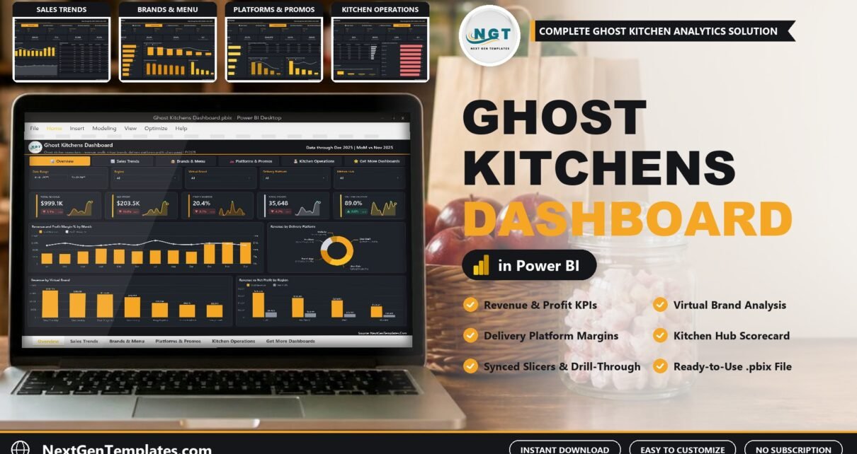
The Ghost Kitchens Dashboard in Power BI answers the question every delivery-only operator eventually asks: after the apps take their cut, which brands, platforms and kitchens actually make money? It reports revenue, net profit, platform fees, food cost, order volume and kitchen speed across five interactive pages. The sample model holds 500 kitchen shifts for FY2025, with $999.1K in revenue, $203.5K in net profit, a 20.4% profit margin, 35,648 orders and an 89.0% on-time delivery rate.
Watch the Ghost Kitchens Dashboard in Power BI walkthrough
A ghost kitchen runs several virtual brands out of shared hubs and sells almost everything through delivery apps. The sales number looks healthy, but the margin hides inside commission, packaging and labour. Order data sits in each platform’s portal, costs sit in a spreadsheet, and nobody can say quickly whether Taco Theory on Uber Eats is worth keeping. This report puts all of it in one model you refresh from a single workbook.
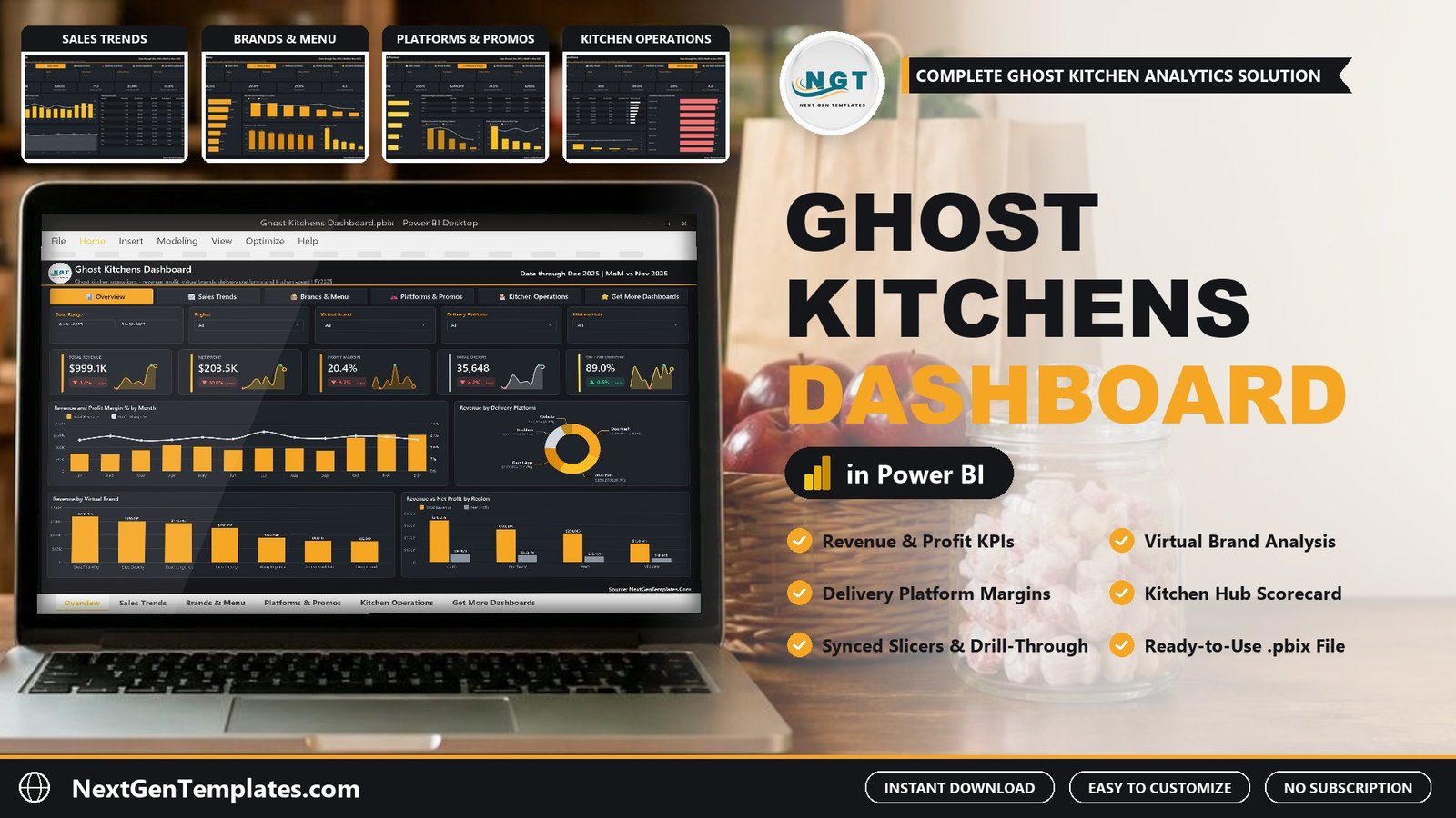
Key Features of the Ghost Kitchens Dashboard in Power BI
- Profit after every cost. Net profit is revenue minus food, packaging, labour and platform fees, so Profit Margin % (20.4% in the sample) is the margin you keep, not a gross figure.
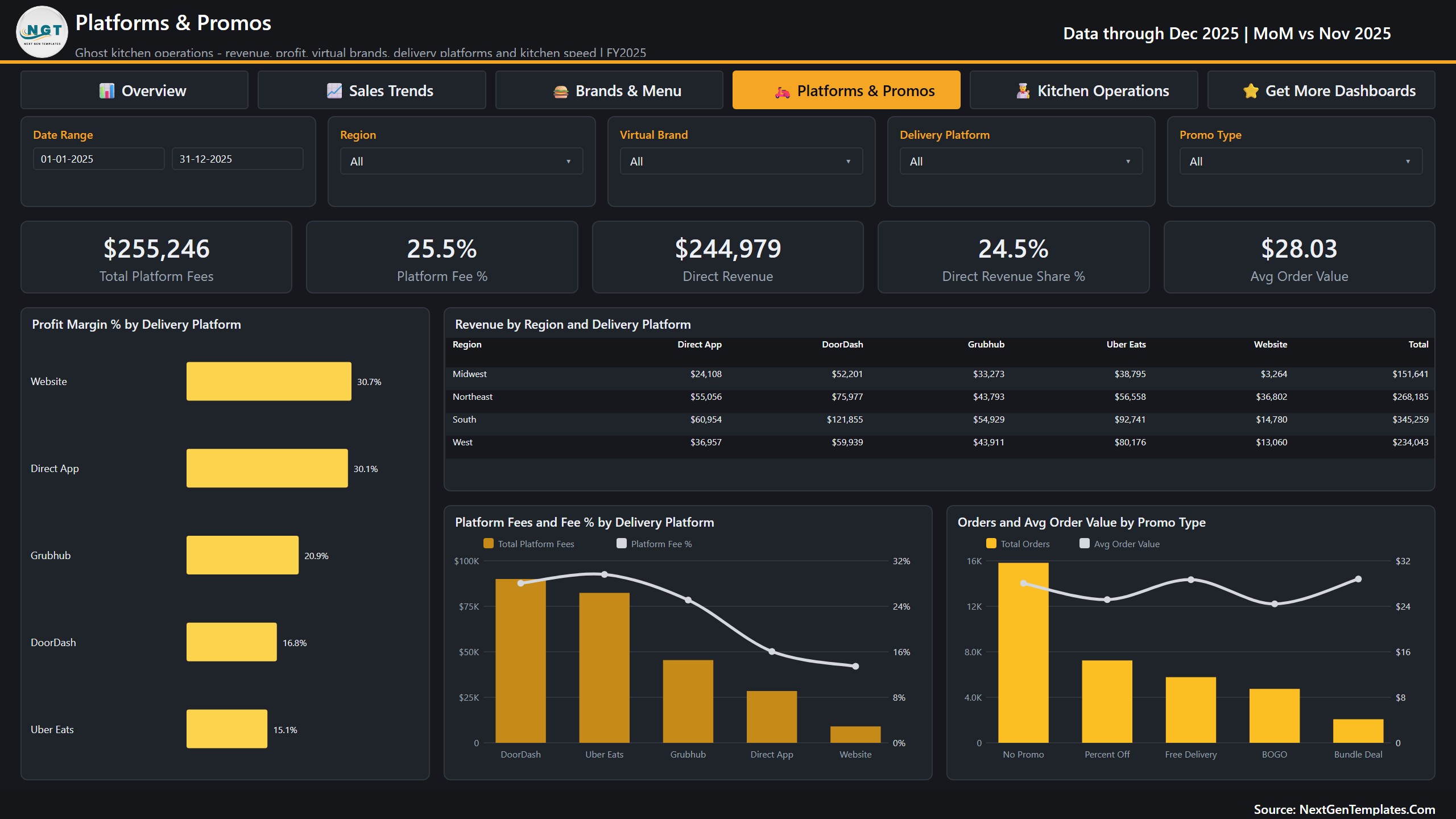
- Delivery platform margins side by side. DoorDash brings the most revenue in the sample ($309,973, 31.0% of sales) but keeps a 16.8% margin, while the Website (30.7%) and Direct App (30.1%) keep almost twice as much.
- Virtual brand and cuisine analysis. Seven brands are ranked by revenue and by Food Cost %, and seven cuisines by net profit and profit margin.
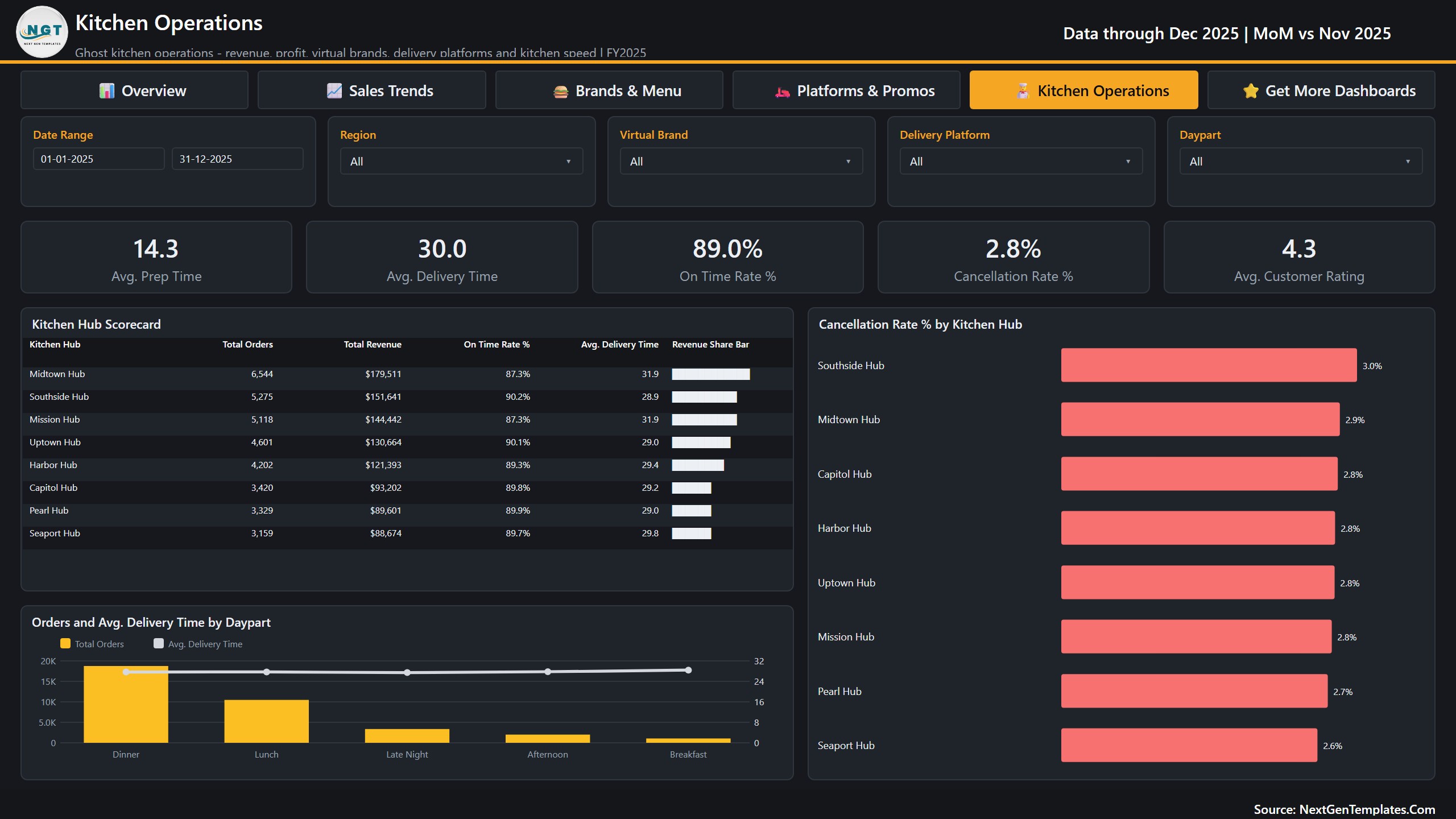
- A Kitchen Hub Scorecard comparing eight hubs on orders, revenue, on-time rate, average delivery time and revenue share, with a separate cancellation chart.
- Kitchen speed by daypart. Average prep time, average delivery time, on-time rate and cancellation rate, with orders split across Breakfast, Lunch, Afternoon, Dinner and Late Night.
- Five filters on every page. Date Range, Region, Virtual Brand and Delivery Platform, plus one page-specific slicer (Kitchen Hub, Cuisine, Promo Type or Daypart).
- Drill-through and tooltips. A hidden Details page opens from eight fields, and two tooltip pages add context on hover.
- Open and editable. 45 DAX measures, every visual and every colour can be changed in Power BI Desktop.
Dashboard Pages Explained
Page 1: Overview
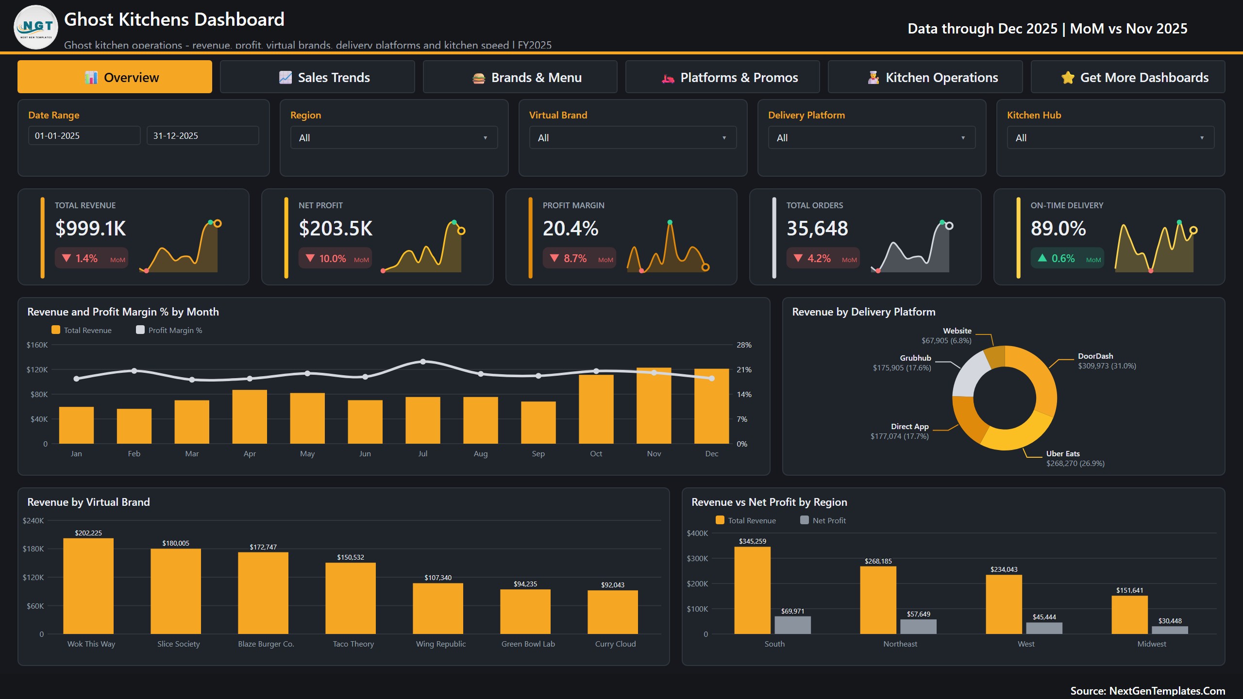
Five sparkline cards (Total Revenue, Net Profit, Profit Margin, Total Orders and On-Time Delivery) each show a month-on-month change, here December 2025 against November 2025. Below them sit Revenue and Profit Margin % by Month, Revenue by Delivery Platform, Revenue by Virtual Brand, and Revenue vs Net Profit by Region. Wok This Way is the top brand at $202,225, and the South region leads with $345,259 in revenue and $69,971 in net profit.
Page 2: Sales Trends
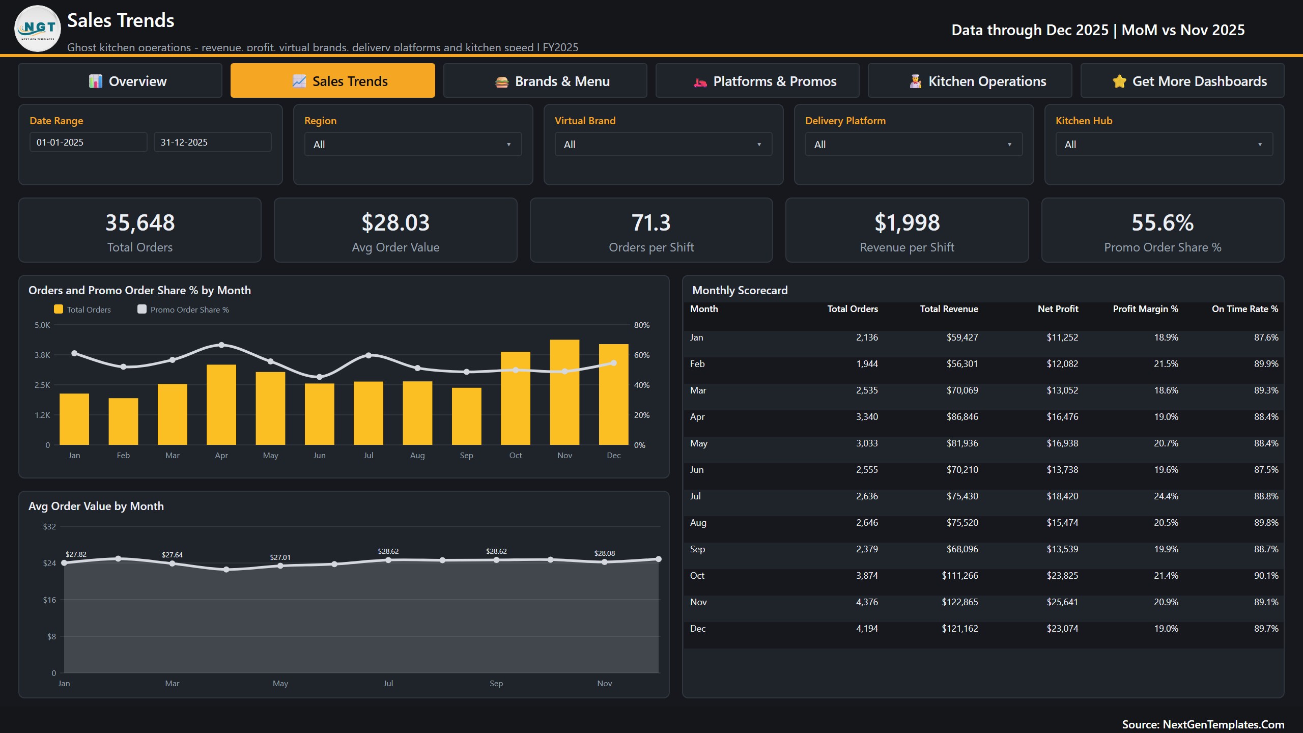
Cards for Total Orders, Avg Order Value ($28.03), Orders per Shift (71.3), Revenue per Shift ($1,998) and Promo Order Share % (55.6%). The charts trend orders, promo share and average order value by month, and a Monthly Scorecard lists orders, revenue, net profit, profit margin and on-time rate for each month. November is the peak in the sample with 4,376 orders and $122,865 in revenue.
Page 3: Brands & Menu
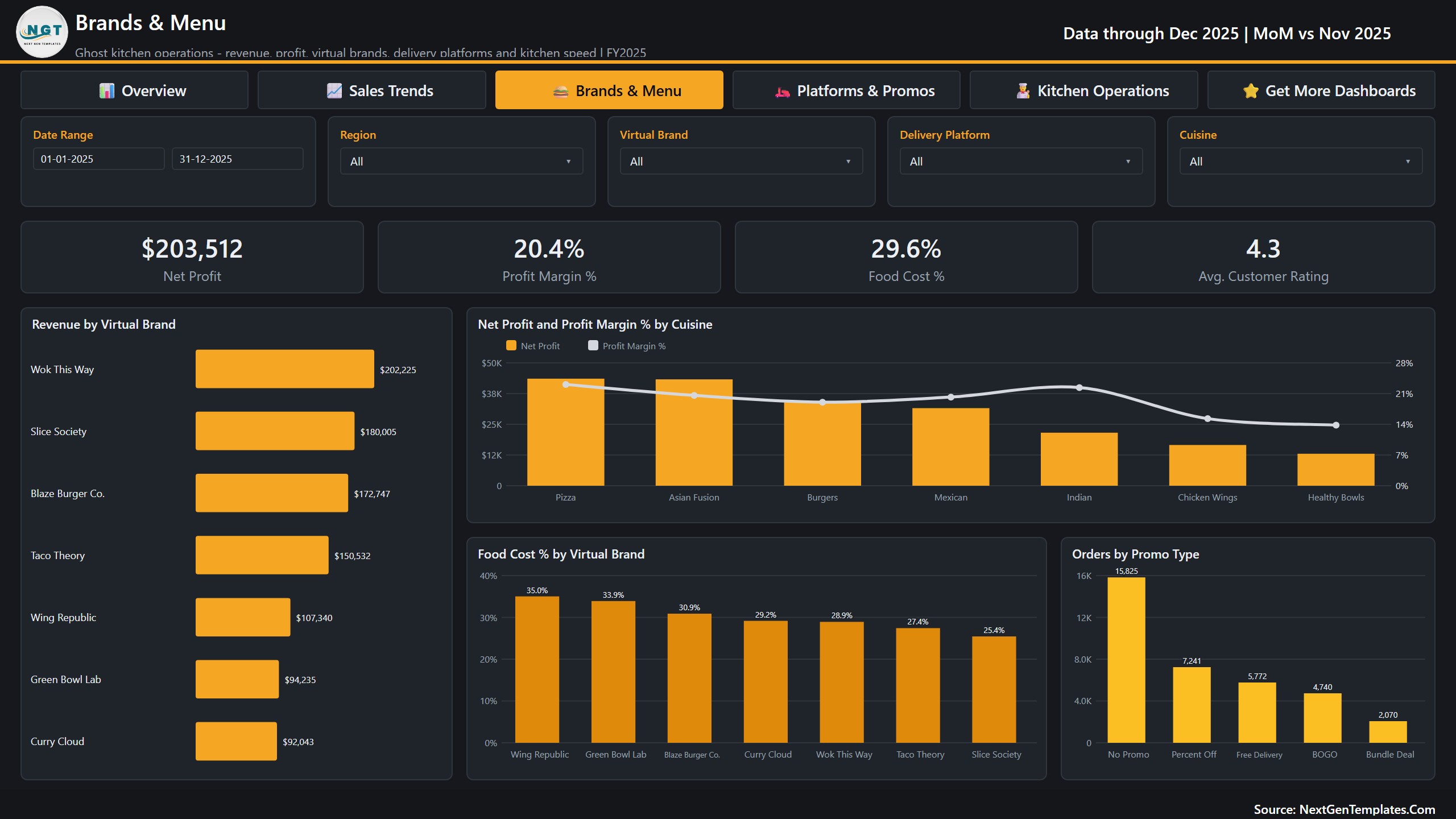
Cards for Net Profit ($203,512), Profit Margin %, Food Cost % (29.6%) and Avg. Customer Rating (4.3). The visuals are Revenue by Virtual Brand, Net Profit and Profit Margin % by Cuisine, Food Cost % by Virtual Brand and Orders by Promo Type. Wing Republic carries the highest food cost at 35.0%, Slice Society the lowest at 25.4%, which is the kind of gap a menu review should start from.
Page 4: Platforms & Promos
Cards for Total Platform Fees ($255,246), Platform Fee % (25.5%), Direct Revenue ($244,979), Direct Revenue Share % (24.5%) and Avg Order Value. The page shows Profit Margin % by Delivery Platform, a Revenue by Region and Delivery Platform matrix, Platform Fees and Fee % by Delivery Platform, and Orders and Avg Order Value by Promo Type. If you want to understand your ghost kitchen profit margin by channel, this is the page to open first.
Page 5: Kitchen Operations
Cards for Avg. Prep Time (14.3), Avg. Delivery Time (30.0), On Time Rate % (89.0%), Cancellation Rate % (2.8%) and Avg. Customer Rating. The Kitchen Hub Scorecard ranks eight hubs, led by Midtown Hub with 6,544 orders and $179,511, next to Cancellation Rate % by Kitchen Hub and Orders and Avg. Delivery Time by Daypart. Dinner and Lunch carry most of the volume in the sample.
The file also includes a Get More Dashboards page, the hidden Details drill-through page and two tooltip pages. The data model is one table of 500 shift rows and 24 columns plus a Date table.
Ghost Kitchens Dashboard vs. Custom Tableau / Qlik vs. Restaurant Analytics SaaS
| Feature | This Power BI template | Custom Tableau / Qlik build | Restaurant analytics SaaS |
|---|---|---|---|
| Cost | One-time purchase | Licences plus build time | Monthly fee, often per location |
| Ready-made ghost kitchen pages | Yes, five pages | No | Depends on vendor |
| Platform fee and margin by app | Yes | If you build it | Often |
| Kitchen hub scorecard | Yes | If you build it | Varies |
| Edit measures and visuals | Full access | Full access | Limited |
| Live sync with delivery apps or POS | No, you load an export | Possible with development | Usually yes |
| Data stays on your machine | Yes | Depends | No |
Who Should Use This Template
Ghost kitchen and cloud kitchen operators with several virtual brands, delivery kitchens running more than one hub, restaurant groups adding delivery-only brands, and analysts who need a food delivery dashboard for monthly reviews. It is not a fit if you need live order feeds, automatic sync with DoorDash, Uber Eats or Grubhub, or recipe and inventory costing. This is a reporting template that reads a workbook you fill or export.
Real-World Use Cases
- Platform terms: show what each app takes in fees and the margin left before renewing a contract.
- Brand portfolio review: keep, fix or retire a virtual brand using revenue, food cost and rating together.
- Direct ordering: watch Direct Revenue Share % grow as customers move to your own app or website.
- Hub staffing: compare on-time rate, delivery time and cancellations across hubs before changing shifts.
- Promo checks: see whether BOGO, Percent Off, Free Delivery or Bundle Deal orders lift order value.
Advantages
- Net profit and margin by platform, brand, cuisine, region and hub in one model.
- One-time purchase with no per-seat or per-location fee.
- Every measure and visual is open, so you can add your own KPIs.
- Your data stays in your own file and your own Power BI tenant.
Opportunities for Improvement
- There is no live connection to delivery platforms or POS systems. You export and paste data, or ask a developer to repoint Power Query.
- The Power Query source path points at our build folder, so you must use Change Source once after download.
- Data is held at shift level, so ticket-level questions (single orders, items, customers) need a more detailed table.
Best Practices
- Load platform fees exactly as charged, including marketing and service fees, or the margin by app will look better than it is.
- Keep brand, hub and platform names spelled the same every month so slicers stay clean.
- Refresh after every month close and review the Platforms & Promos page before any fee negotiation.
Explore Relevant Templates
- Food Waste Recycling Dashboard in Power BI
- Hotel Chains Dashboard in Excel
- Cloud Kitchen Management System Web App
- Food Delivery Dashboard in Excel
- Restaurants and Food Services Dashboard in Google Sheets
Frequently Asked Questions
What does this ghost kitchen dashboard measure?
Revenue, net profit, profit margin, orders, average order value, orders and revenue per shift, promo order share, food cost and platform fee ratios, direct revenue share, prep and delivery time, on-time rate, cancellation rate and customer rating, split by month, region, hub, brand, cuisine, platform, daypart and promo type.
Does it connect to DoorDash, Uber Eats or my POS?
No. It reads Data.xlsx. You paste or export your data into the workbook and press Refresh. The platform names in the sample are labels only, and NextGenTemplates is not affiliated with any of them.
Do I need a paid Power BI licence?
No. Power BI Desktop is free from Microsoft. You only need Pro or Premium to publish and share the report in the Power BI Service. See Microsoft’s Power BI Desktop overview.
How long does setup take?
About 10 minutes once your data matches the column headers: paste the rows, change the source path once and refresh.
Can I use it as a power bi restaurant dashboard for dine-in sales?
Yes, if you load dine-in as another channel in the Delivery Platform column. The pages are built around delivery, so platform fee measures will read zero for that channel.
Is the sample data real?
No. Brands, hubs and figures are fictional and only demonstrate the visuals.
About the Author
Built by PK, Microsoft Certified Professional with 15+ years of Excel, Google Sheets and Power BI experience and founder of NextGenTemplates. Watch the tutorials on @PKAnExcelExpert and @NextGenTemplates.
Conclusion
Delivery apps make it easy to sell and hard to see what you keep. The Ghost Kitchens Dashboard in Power BI shows revenue, fees, food cost and kitchen speed together, by brand, platform and hub, so decisions about menus, platforms and staffing rest on margin instead of sales alone.