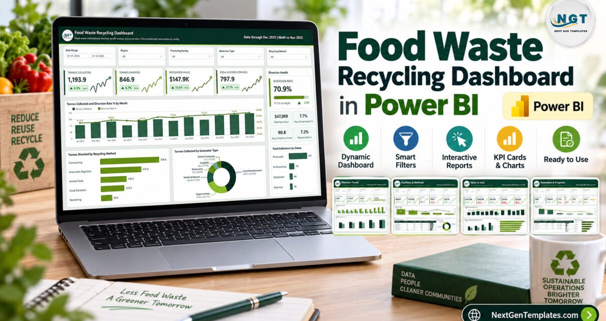
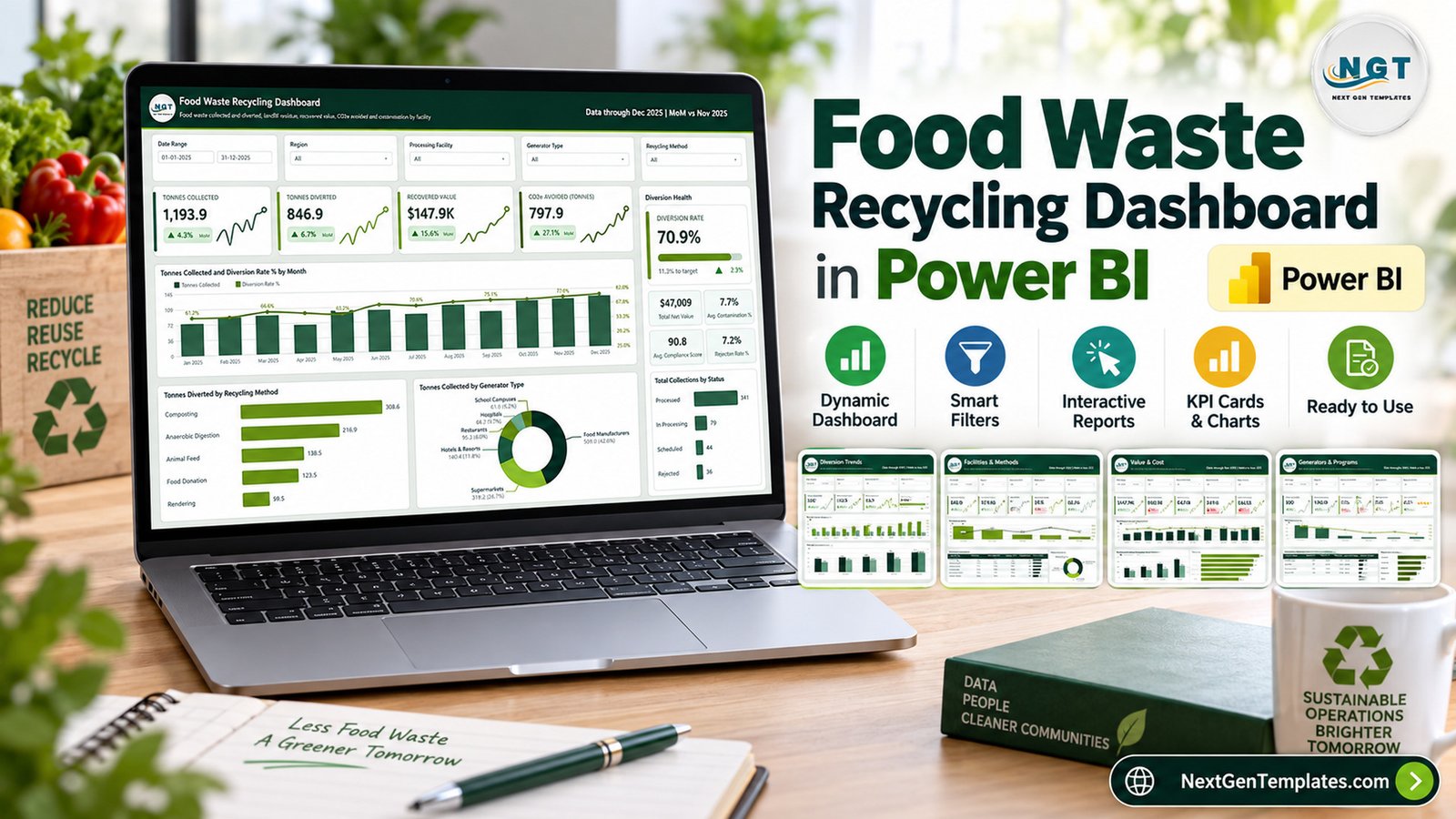
The Food Waste Recycling Dashboard in Power BI reports 20 named metrics across five interactive pages, laid out as 29 KPI tiles and 16 charts, tables and scorecards. The sample model carries 500 collections, 1,193.9 tonnes collected, 846.9 tonnes diverted and a 70.9% diversion rate through December 2025, with month-on-month movement shown on every card. Five filter controls sit on each page, so one click on a region or a plant reshapes the whole report.
Most organics operations already have the numbers. What they do not have is one place where tonnage, contamination, compliance and money sit together. Tonnage lives in the weighbridge export, rejections live in an email thread, recovered value lives in the finance sheet, and nobody can answer “which plant is losing us money on composting” without an afternoon of reconciliation. This template closes that gap with a finished Power BI model you point at your own workbook.
Key Features of the Food Waste Recycling Dashboard in Power BI
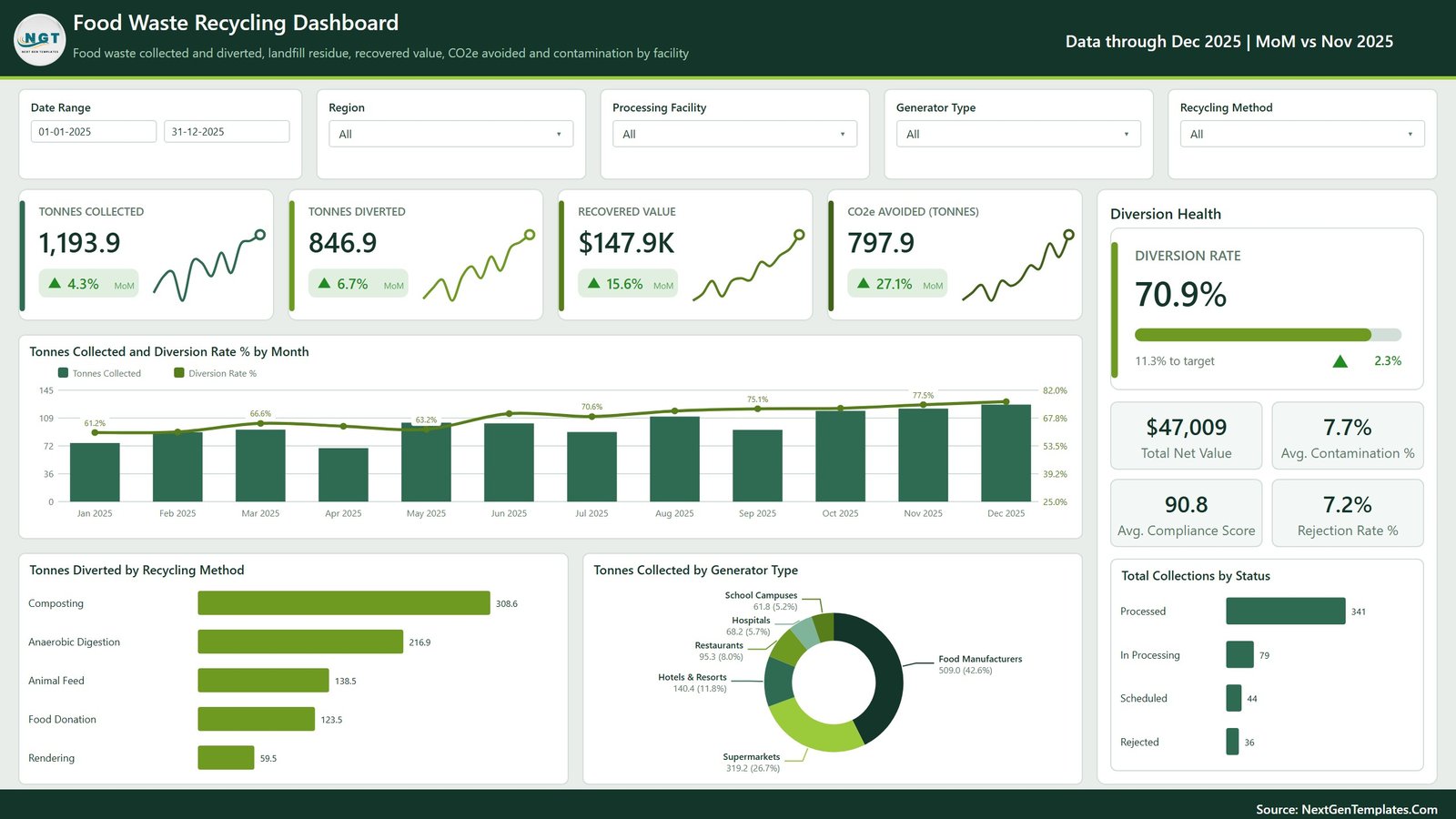
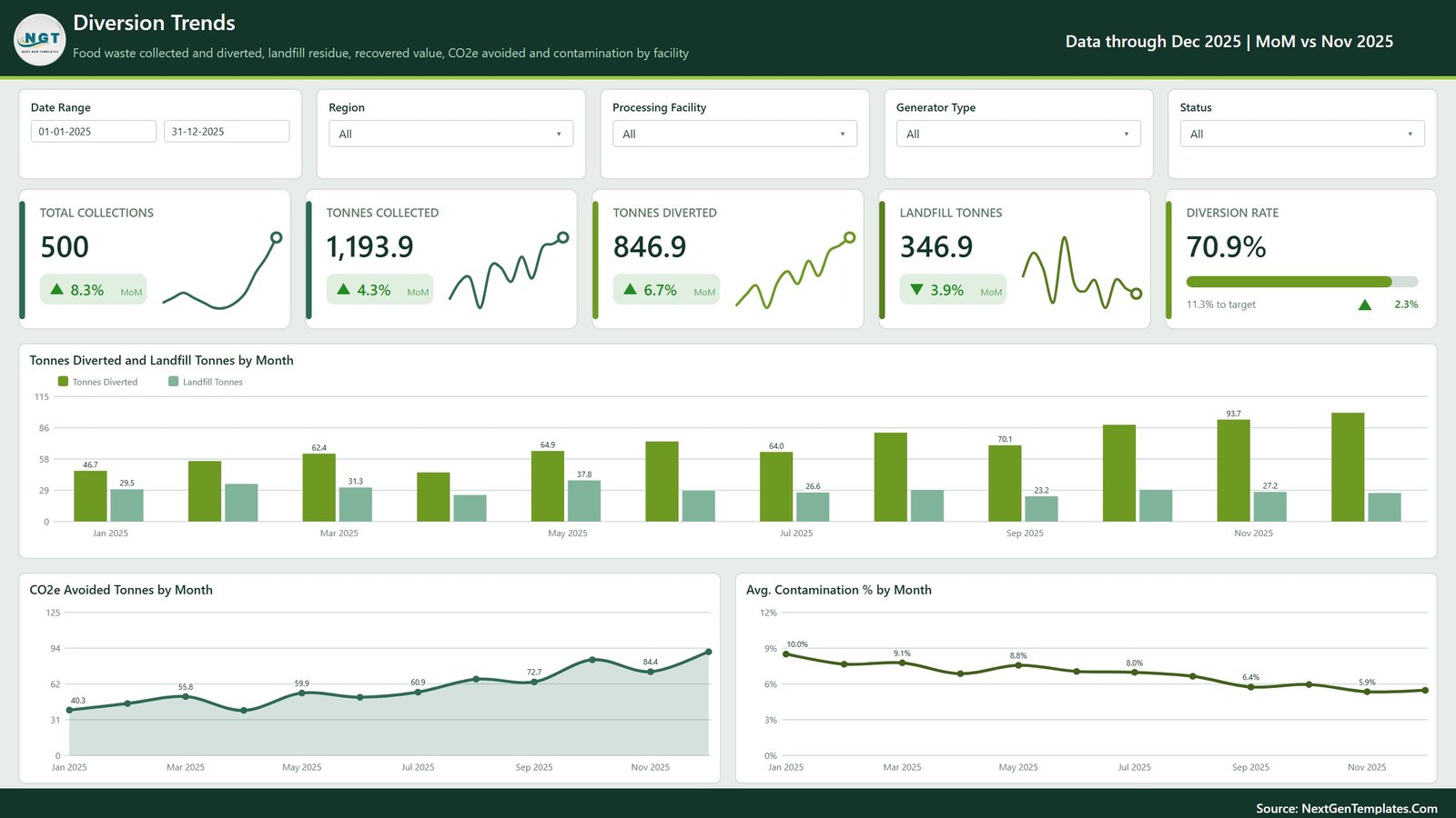
- The full collection-to-diversion chain. Tonnes Collected (1,193.9), Tonnes Diverted (846.9), Landfill Tonnes (346.9) and Diversion Rate (70.9%) are all live measures, each with a month-on-month arrow against the prior month.
- A Diversion Health panel on the overview page combines the diversion rate, a progress bar showing 11.3% still to target, Total Net Value ($47,009), Average Contamination % (7.7%), Average Compliance Score (90.8) and Rejection Rate % (7.2%).
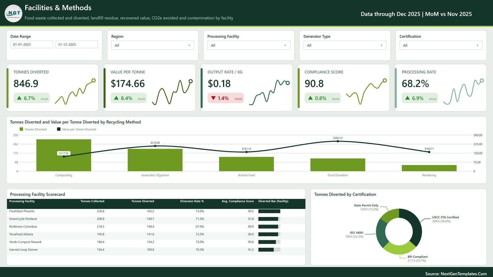
- A six-plant Processing Facility Scorecard covering FreshStart Phoenix, GreenCycle Portland, BioRenew Columbus, TerraFeed Atlanta, Verde Compost Newark and Harvest Loop Denver, each with tonnes collected, tonnes diverted, diversion rate, average compliance score and an in-row data bar.
- Five recycling methods priced individually. Composting, Anaerobic Digestion, Animal Feed, Food Donation and Rendering each carry diverted tonnage and value per tonne, from $117.55 on composting to $263.13 on food donation in the sample data.
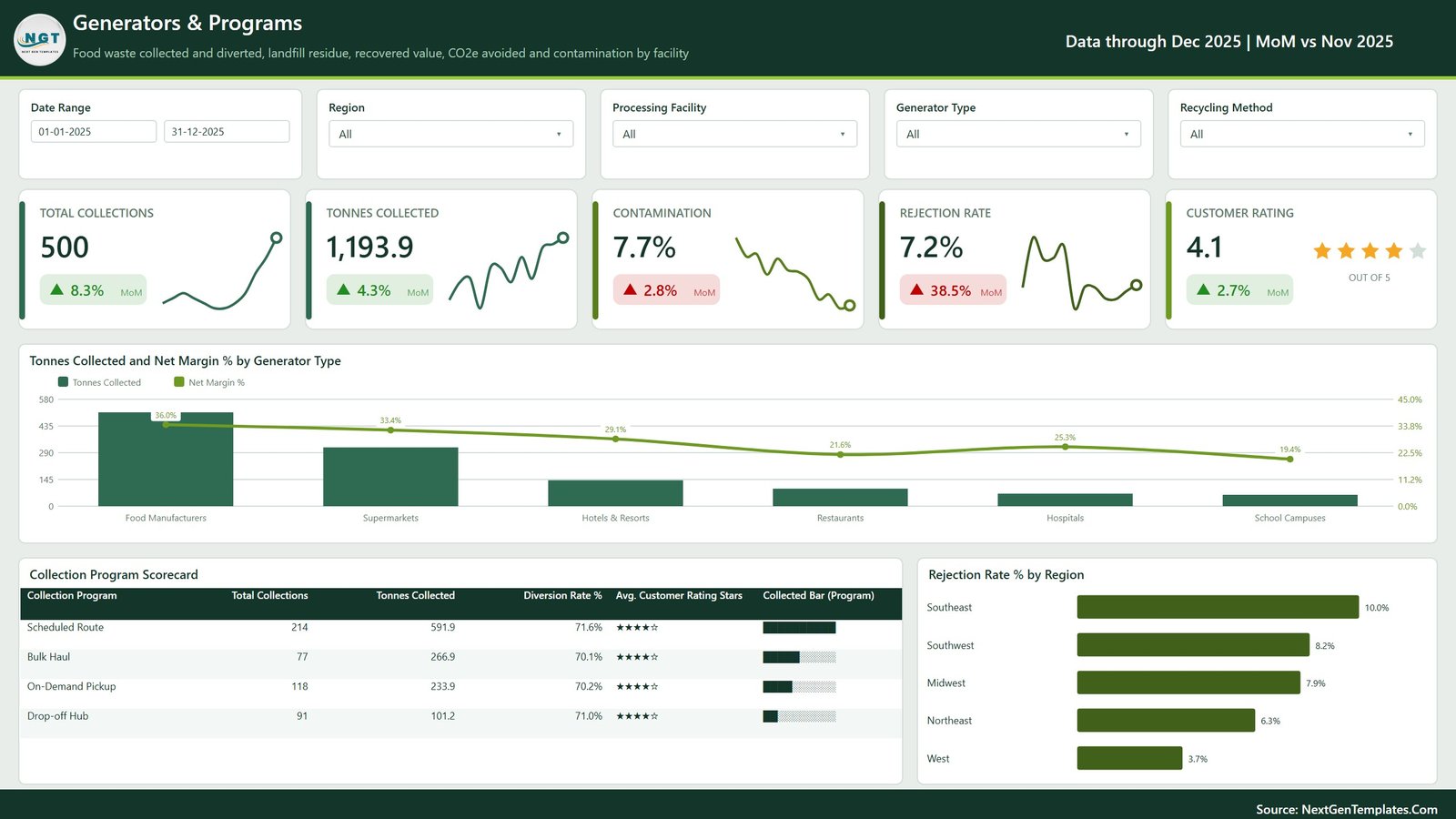
- Six generator types as a first-class dimension — Food Manufacturers, Supermarkets, Hotels & Resorts, Restaurants, Hospitals and School Campuses — each with collected tonnage and net margin.
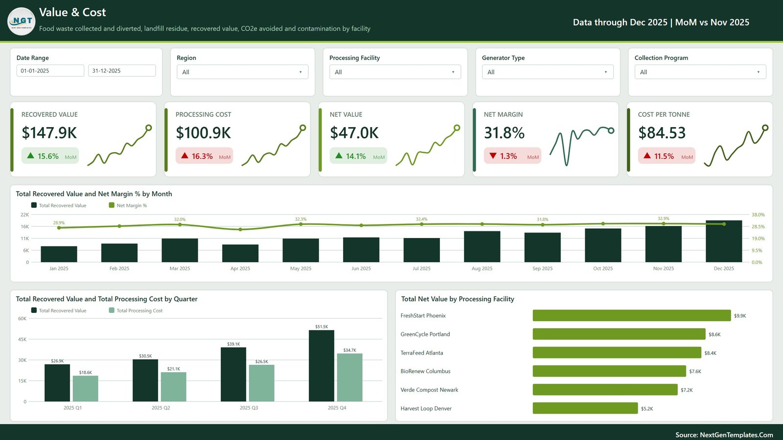
- A dedicated money page reporting Recovered Value ($147.9K), Processing Cost ($100.9K), Net Value ($47.0K), Net Margin (31.8%) and Cost per Tonne ($84.53).
- Nothing is locked. Every visual, measure, colour and page title is editable in Power BI Desktop, and the ZIP ships the .pbix, the sample Data.xlsx and a PDF user manual.
Dashboard Pages Explained
Page 1: Food Waste Recycling Dashboard (Overview)
The landing page leads with Tonnes Collected, Tonnes Diverted, Recovered Value and CO2e Avoided as sparkline KPI cards, with the Diversion Health panel down the right. Its charts are Tonnes Collected and Diversion Rate % by Month, Tonnes Diverted by Recycling Method, Tonnes Collected by Generator Type and Total Collections by Status, the last splitting the 500 collections into 341 processed, 79 in processing, 44 scheduled and 36 rejected.
Page 2: Diversion Trends
This page puts Total Collections, Tonnes Collected, Tonnes Diverted, Landfill Tonnes and Diversion Rate on one row and then trends each of them. Charts are Tonnes Diverted and Landfill Tonnes by Month, CO2e Avoided Tonnes by Month and Avg. Contamination % by Month. In the sample data contamination falls steadily from 10.0% in January to 5.9% in November — the shape you want to see if separation at source is improving.
Page 3: Facilities & Methods
Tonnes Diverted, Value per Tonne ($174.66), Output Rate / kg ($0.18), Compliance Score (90.8) and Processing Rate (68.2%) head this page. Beneath them sit Tonnes Diverted and Value per Tonne Diverted by Recycling Method, the Processing Facility Scorecard and Tonnes Diverted by Certification, which splits diverted tonnage across USCC STA Certified (309.6), BPI Compliant (217.9), ISO 14001 (190.4) and State Permit Only (129.0). Certification here is a field you record against each plant, not something the template awards.
Page 4: Value & Cost
Recovered Value, Processing Cost, Net Value, Net Margin and Cost per Tonne sit above Total Recovered Value and Net Margin % by Month, Total Recovered Value and Total Processing Cost by Quarter, and Total Net Value by Processing Facility. The quarterly chart is the one finance asks for: $26.9K recovered against $18.6K cost in Q1, rising to $51.5K against $34.7K in Q4. A Collection Program slicer replaces the recycling-method filter on this page.
Page 5: Generators & Programs
Total Collections, Tonnes Collected, Contamination, Rejection Rate and Customer Rating (4.1 out of 5) head the final page. Its visuals are Tonnes Collected and Net Margin % by Generator Type, the Collection Program Scorecard covering Scheduled Route, Bulk Haul, On-Demand Pickup and Drop-off Hub, and Rejection Rate % by Region, which ranges from 10.0% in the Southeast down to 3.7% in the West.
Food Waste Recycling Dashboard in Power BI vs. Tableau / Qlik vs. Paid Waste SaaS — Feature Comparison
| Feature | This template (Power BI) | Tableau / Qlik build | Rubicon / RTS / Zoho-style SaaS |
|---|---|---|---|
| Cost | One-time purchase ✅ | $75 / user / month (Tableau Creator) | $40–250 / site / month |
| Platform | Power BI Desktop (free) ✅ | Tableau Desktop or Qlik Sense licence | Vendor web portal only |
| Setup time | Under 10 minutes ✅ | 2–5 days of build work | 2–6 week onboarding |
| Data stays on your machine | Yes ✅ | Yes | No — vendor cloud |
| Edit every measure and visual | Yes, nothing locked ✅ | Yes | Fixed report set |
| Facility and programme scorecards | Pre-built ✅ | Build them yourself | Usually a paid add-on |
| Publish and share online | Power BI Service (separate licence) | Tableau Server / Cloud | ✅ Included |
| Weighbridge / route integration | No — workbook input | Custom connector | ✅ Included |
| Year-1 cost at 5 users | Under $20 ✅ | ~$4,500 | $2,400–15,000 |
For teams that want plant-by-plant diversion reporting without a per-seat BI licence or a multi-week SaaS rollout, this template sits in the sweet spot.
Who Should Use This Template
Perfect for:
- Food-waste haulers and composting or anaerobic-digestion operators running three to ten processing sites
- Sustainability and facilities managers at supermarket, hotel, hospital or campus groups who receive tonnage reports from several contractors
- Municipal and contract recycling programmes tracking diversion rate against a published target
- Analysts and consultants who want a finished model to re-skin for a client instead of building from an empty canvas
Not a fit if:
- You need a live feed from a weighbridge, route-optimisation or ERP system. This reads an Excel workbook that you maintain or export to.
- You need audited or third-party-verified emissions numbers. The CO2e Avoided measure is a modelled estimate derived from the tonnage you enter, not an assured carbon figure.
- You must file to a specific regulatory or ESG reporting standard. Use this for internal management reporting and let your assurance provider produce the filed numbers.
- You do not have Power BI Desktop, which Microsoft ships for Windows only.
Real-World Use Cases
Marcus runs operations for a regional organics hauler with six plants. Every Monday he opens the Processing Facility Scorecard, sorts by diversion rate, and takes the weakest site into the plant-manager call with its compliance score and contamination figure already on screen. The conversation that used to need three spreadsheets now needs one page.
Priya is sustainability lead for a 40-store supermarket chain. She filters the Generators & Programs page to Supermarkets, reads rejection rate by region, and uses the contamination trend to pick which stores get re-training on separation at source before the quarterly review.
Dan consults for municipal recycling programmes. He re-skins the file for a client in an afternoon, points Power Query at their tonnage extract and delivers a five-page diversion report — without buying anyone a Tableau seat.
Advantages
The obvious saving is licensing. A Tableau Creator seat runs about $75 a month, and a waste-management SaaS subscription starts around $40 per site per month before add-ons; this is a one-time purchase that runs on free software. The less obvious saving is build time. Five pages with synced slicers, a facility scorecard, a certification split and a quarterly cost comparison is several days of work for an experienced BI developer, and it is already done here.
There is also an argument for keeping the data local. Tonnage, contamination and customer-rating data about named clients does not have to leave your machine to be analysed, which is a much shorter conversation with a procurement team than onboarding a new cloud vendor.
Opportunities for Improvement
Being honest about the limits: the refresh is manual unless you set up a gateway and the Power BI Service, so the report is as current as the last time someone pressed Refresh. The data model expects the supplied column layout, so a very different source schema means editing the Power Query steps rather than pasting rows. There is no route planning, customer billing or driver app here — this is a reporting layer, not an operations system.
The CO2e Avoided measure deserves its own caveat. It is calculated from your tonnage using the model shipped in the file, and it is an illustrative internal indicator. It is not third-party verified, not audited and not designed to meet any disclosure standard. If a figure is going into a published report, have it produced or checked by whoever assures your environmental reporting. The US EPA’s Wasted Food Scale is useful background on how recovery pathways are ranked, but the template does not implement any regulatory methodology.
Best Practices
- Keep the column headers in Data.xlsx exactly as supplied. Renaming a column is the single most common cause of a broken refresh.
- Load at least twelve months of collections before judging any trend — the monthly and quarterly visuals are built for a full year.
- Agree internally what counts as “diverted” before you publish a diversion rate, and write it down on the report page.
- Use the Region and Processing Facility slicers together when investigating a rejection spike; the rejection-rate-by-region chart shows where, the facility scorecard shows who.
- Set your own diversion target in the model rather than leaving the sample value, or the progress bar will mislead everyone who reads it.
- Export to PDF for circulation and keep the .pbix as the master. Microsoft’s Power Query documentation covers repointing the source if your file moves.
Explore Relevant Templates
- E-waste Recycling Dashboard in Power BI — the same five-page treatment applied to electronics recovery streams.
- Recycling Infrastructure Dashboard in Power BI — capacity, throughput and investment across a recycling network.
- ESG Reporting Dashboard in Power BI — the wider environmental, social and governance picture.
- ESG Environmental Dashboard in Excel — the same territory for teams that live in Excel.
- Office Waste Management Dashboard in Power BI — building-level waste streams and disposal cost.
Frequently Asked Questions
What does the Food Waste Recycling Dashboard in Power BI actually measure?
It reports 20 named metrics, among them Tonnes Collected, Tonnes Diverted, Landfill Tonnes, Diversion Rate, Recovered Value, Processing Cost, Net Value, Net Margin, Cost per Tonne, Value per Tonne, Average Contamination, Rejection Rate, Average Compliance Score, Processing Rate, CO2e Avoided and Customer Rating.
Do I need a paid Power BI licence to use it?
No. The file opens and refreshes in Power BI Desktop, which Microsoft provides free for Windows. A Power BI Pro licence is only required if you want to publish the report to the Power BI Service and share it with colleagues online.
How long does setup take?
Under 10 minutes for most buyers. Open the .pbix, paste your collection records into the supplied Data.xlsx keeping the headers intact, repoint the source path in Power Query and press Refresh. No DAX editing is needed to see your own numbers.
Does it produce audited carbon or ESG figures?
No. The CO2e Avoided measure is a modelled, illustrative estimate calculated from the tonnage you enter. It is not third-party verified and is not designed to satisfy any regulatory, assurance or ESG reporting standard. Treat it as an internal management indicator.
Can it connect to my weighbridge or route-management system?
Not directly. It reads an Excel workbook, which most weighbridge and route systems can export to on a schedule. Because it uses standard Power Query, a developer on your team can repoint it at a database or an API instead.
How does this compare to a waste-management SaaS subscription?
SaaS platforms add route optimisation, customer billing and vendor integrations this template does not attempt. What it offers instead is full control of the model, no per-seat cost and no data leaving your machine, for a single payment rather than $40–250 per site per month.
Is the sample data real?
No. The plants, programmes, regions and tonnages in the file are fictional sample records that exist to demonstrate the visuals. Replace them with your own before presenting anything from the report.
About the Author
Built by PK — Microsoft Certified Professional with 15+ years of Excel, Google Sheets and Power BI experience. Founder of NextGenTemplates, reaching 300K+ subscribers across YouTube channels. Every template is hand-built and tested before release.
Conclusion
If your food-waste programme is reported in fragments today, the Food Waste Recycling Dashboard in Power BI puts tonnage, contamination, compliance and money on the same five pages, and lets you slice all of it by region, plant, generator type, recycling method and collection programme. Install Power BI Desktop, drop in your own workbook, and you have a working diversion report the same morning.
👉 Click here to purchase the Food Waste Recycling Dashboard in Power BI
Instant download · One-time payment · No subscription
🎥 For step-by-step video walkthroughs, visit Youtube.com/@PKAnExcelExpert.
Last updated: September 2026