Emergency Rescue Services Dashboard in Power BI is a ready-to-use Power BI report for emergency rescue teams that need a faster way to analyze incident volume, rescue cost, equipment cost, response time, resolution time, dispatch center workload, crew performance, vehicle usage, service quality, and patient assistance. Rescue operations can generate hundreds or thousands of records across multiple cities, shifts, priorities, crews, and service types. When that data stays in separate spreadsheets or manual reports, managers lose time before they can see where incidents are increasing, where cost is rising, and where response performance needs attention.
This template gives emergency service leaders a 5-page Power BI dashboard with KPI cards, slicers, and focused visual analysis. It is designed for EMS, fire rescue, road rescue, water rescue, dispatch centers, emergency operations teams, and public safety analysts who want clear reporting without building a Power BI report from scratch.
Emergency Rescue Services Dashboard in Power BI
Key Features of Emergency Rescue Services Dashboard in Power BI
- 5 report pages covering Overview, Incident Trends, Response Ops, Service Analysis, and Cost Review.
- High-level cards for Total Rescue Cost, Total Incidents, Total Equipment Cost, Resolved Incidents, and Patients Assisted.
- Interactive slicers for quick filtering by time period, priority, service type, region, shift, crew, dispatch center, vehicle type, and incident fields.
- Visuals for rescue cost, incident count, equipment cost, response minutes, resolution minutes, satisfaction score, city performance, and operational workload.
- Editable .pbix file that can be customized in Power BI Desktop.
- Suitable for rescue operations reporting, EMS analytics, public safety dashboards, and emergency service management reviews.
Dashboard Pages Explanation
1. Overview Page
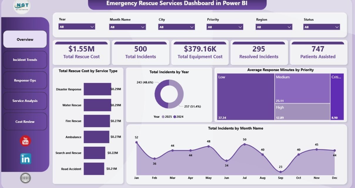
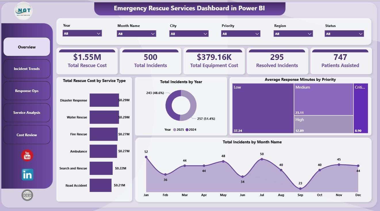
The Overview Page gives managers the first snapshot of emergency rescue performance. The top cards show Total Rescue Cost, Total Incidents, Total Equipment Cost, Resolved Incidents, and Patients Assisted. These KPIs help leadership see the size, cost, and outcome of rescue operations before reviewing detailed analysis.
Total Rescue Cost by Service Type: This chart compares rescue cost across different emergency service groups. It helps users identify which service types are driving the highest operational spending.
Total Incidents by Year: This visual shows annual incident volume so teams can monitor long-term demand. It is useful for planning resources, budgets, and future capacity.
Average Response Minutes by Priority: This chart compares response speed across priority levels. It helps managers check whether urgent incidents are being handled faster than lower-priority cases.
Total Incidents by Month Name: This visual shows seasonal incident patterns across the year. It supports crew planning, vehicle readiness, and peak-period preparation.
2. Incident Trends
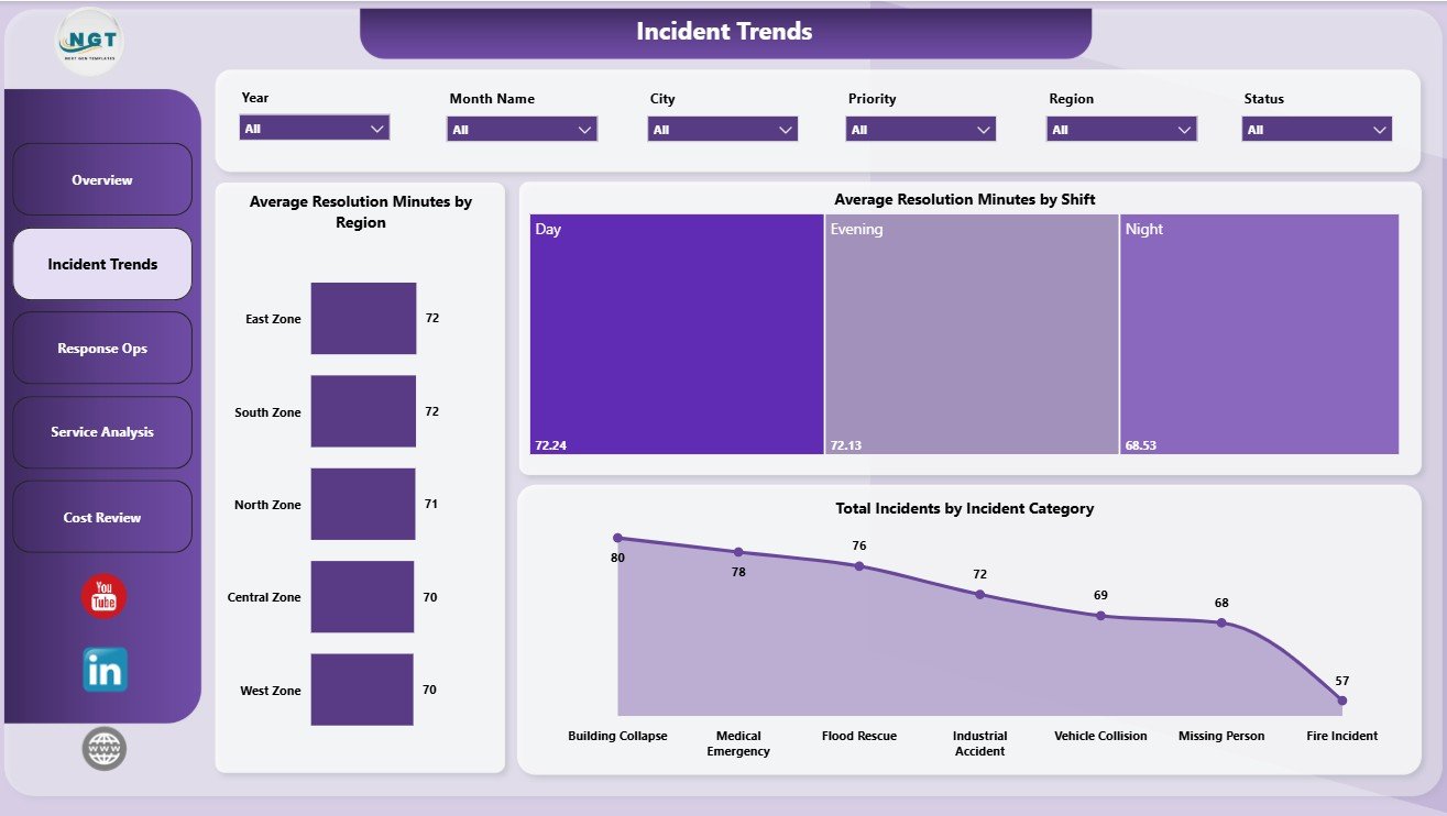
The Incident Trends page focuses on resolution performance and incident mix. Average Resolution Minutes by Region helps managers compare how quickly incidents are completed across service areas. Average Resolution Minutes by Shift makes it easier to see whether night, day, or evening operations need more support. Total Incidents by Incident Category shows which types of emergencies create the highest workload.
Incident Trends
3. Response Ops
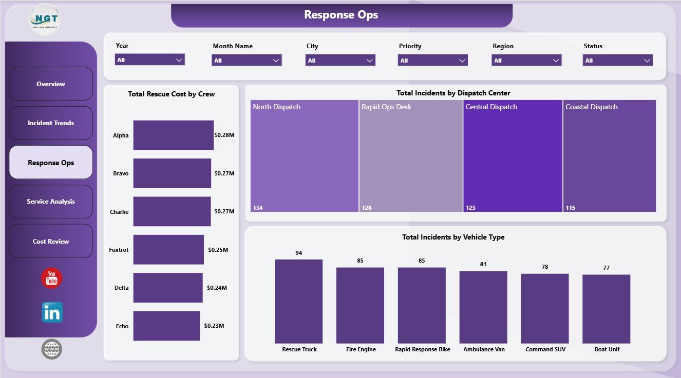
The Response Ops page is built for dispatch and operations review. Total Rescue Cost by Crew helps identify workload or cost concentration by team. Total Incidents by Dispatch Center compares incident demand across locations. Total Incidents by Vehicle Type helps managers understand how ambulances, fire vehicles, rescue vans, boats, or other vehicle groups are being used.
Response Ops
4. Service Analysis
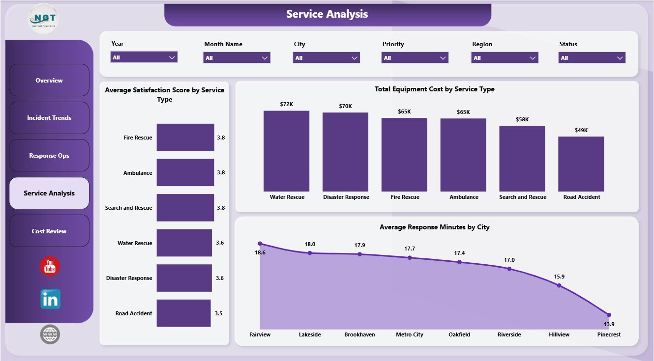
The Service Analysis page combines quality, equipment, and city-level response review. Average Satisfaction Score by Service Type helps compare service feedback across rescue categories. Total Equipment Cost by Service Type shows where equipment spending is concentrated. Average Response Minutes by City highlights local response performance gaps that may need staffing, routing, or resource review.
Service Analysis
5. Cost Review
The Cost Review page is useful for finance and operations discussions. Total Rescue Cost by Priority shows how emergency severity affects spending. Total Rescue Cost by Shift compares the cost profile of different working periods. Total Equipment Cost by Month Name shows monthly movement in equipment-related spending and can help teams review maintenance, replacement, and readiness costs.
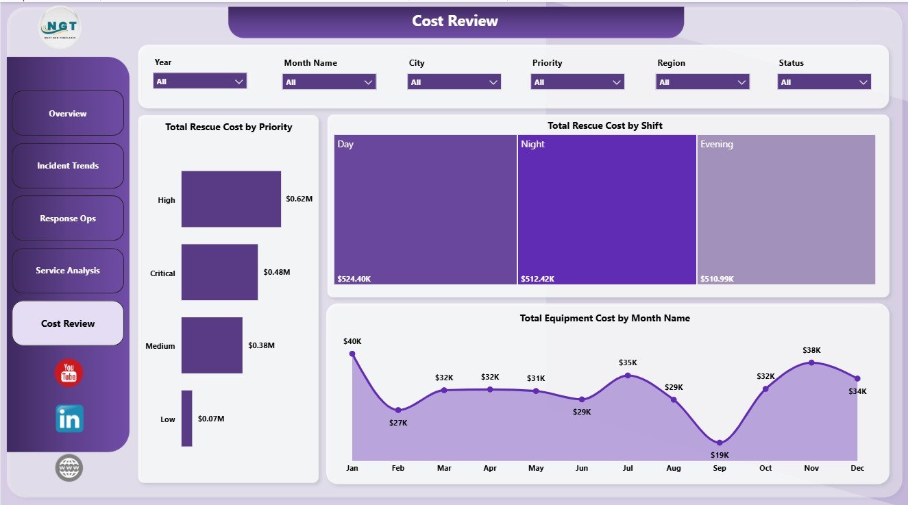
Cost Review
Emergency Rescue Services Dashboard in Power BI vs. Tableau vs. Paid CRM/SaaS – Feature Comparison
| Feature | This Power BI Template | Tableau Alternative | Paid Emergency SaaS |
|---|---|---|---|
| Cost | $17.99 one-time | Requires Tableau licensing and build time | Monthly or annual subscription |
| Platform | Power BI Desktop | Tableau Desktop or Cloud | Vendor cloud platform |
| Setup time | Open .pbix, connect data, refresh | Build the model and visuals manually | Implementation and onboarding needed |
| Real-time collaboration | Available after publishing to Power BI Service | Available through Tableau Cloud | Usually included by plan |
| Mobile access | Available through Power BI mobile options after publishing | Available through Tableau mobile options | Usually app based |
| Customizable fields | Editable visuals, fields, model, and measures | Editable if built manually | Limited by vendor configuration |
| Year-1 cost at 5 users | $17.99 plus any Microsoft licensing | Usually much higher | Often hundreds or thousands |
| Emergency rescue analytics | Pre-built across 5 report pages | Must be designed | Depends on module availability |
Who Should Use This Template
This dashboard is a strong fit for EMS managers, fire and rescue departments, emergency rescue coordinators, public safety reporting teams, dispatch center leaders, city operations analysts, healthcare-adjacent response teams, and consultants building dashboards for rescue service clients. It is especially useful when your team already has structured incident data and wants to turn it into visual reporting quickly.
It is not meant to replace live dispatch software, emergency alerting systems, field responder apps, GPS tracking, patient care record systems, or incident command tools. Use it as an analytics layer for reporting and management review.
Real-World Use Cases
Weekly operations meeting: A rescue operations chief reviews total incidents, patients assisted, resolved incidents, response minutes, and resolution minutes before discussing staffing and response coverage.
Dispatch center review: A dispatch manager compares total incidents by dispatch center and vehicle type to understand workload distribution and resource usage.
Budget and equipment planning: A finance analyst reviews rescue cost by priority, rescue cost by shift, and equipment cost by month to explain spending patterns.
Advantages of Emergency Rescue Services Dashboard in Power BI
- It saves report-building time because the pages, cards, slicers, and charts are already structured.
- It allows deeper filtering than a static PDF or screenshot report.
- It gives managers separate views for trends, operations, service quality, and cost.
- It can be edited in Power BI Desktop as your reporting needs change.
- It keeps the data model and visuals inside one .pbix file for easier handoff.
Opportunities for Improvement
Because this is a template, teams should review field names, source data structure, and measures before using it in live reporting. You may want to add organization-specific fields such as station, responder role, call source, exact location, weather condition, hospital destination, or incident severity. Teams that need live data refresh, secure sharing, mobile access, and scheduled refresh should publish the report to Power BI Service and configure permissions according to internal policy.
Best Practices
- Keep one clean source table for incident records before connecting it to Power BI.
- Use consistent names for service type, priority, city, shift, crew, vehicle type, and dispatch center.
- Validate the KPI cards after every data refresh.
- Review outlier response and resolution minutes before presenting results.
- Document any custom measures added to the .pbix file.
Microsoft explains that Power BI Desktop can connect to data, transform data, and create interactive visual reports. You can review the official getting-started guide here: Get started with Power BI Desktop.
Explore Relevant Templates
- Download the Emergency Rescue Services Dashboard in Power BI
- Emergency Rescue Services Dashboard in Excel
- Electric Utility Maintenance Dashboard in Power BI
- Browse more Power BI dashboard templates
Frequently Asked Questions
What is the Emergency Rescue Services Dashboard in Power BI?
It is an editable .pbix dashboard template for analyzing rescue incidents, rescue cost, equipment cost, response minutes, resolution minutes, patients assisted, crews, dispatch centers, vehicles, cities, service types, and priorities.
Do I need Power BI Desktop to use it?
Yes. Open and customize the file in Power BI Desktop. Sharing through Power BI Service may require Microsoft licensing.
Can I replace the sample data?
Yes. You can replace the sample data or connect the report to your own structured emergency rescue services data source.
Is this a live dispatch tool?
No. It is a reporting and analytics dashboard, not a live CAD dispatch, GPS, alerting, or incident command system.
Can I customize the visuals?
Yes. You can edit visuals, slicers, fields, pages, colors, measures, and data connections in Power BI Desktop.
Which teams can use this dashboard?
EMS, fire rescue, public safety, emergency operations, dispatch, rescue service, and healthcare response teams can adapt it if they track structured incident-level data.
About the Author
Built by PK – Microsoft Certified Professional with 15+ years of Excel, Google Sheets, and Power BI experience. Founder of NextGenTemplates, reaching 300K+ subscribers across YouTube channels. Every template is hand-built and tested before release.
Conclusion
The Emergency Rescue Services Dashboard in Power BI gives rescue leaders a practical way to review incident demand, response performance, service quality, equipment cost, and rescue spending in one report. Instead of preparing separate manual summaries for each meeting, teams can use the dashboard pages to move from high-level KPIs to detailed trend, operations, service, and cost analysis.
Visit PK An Excel Expert on YouTube for more Excel, Power BI, and dashboard tutorials.