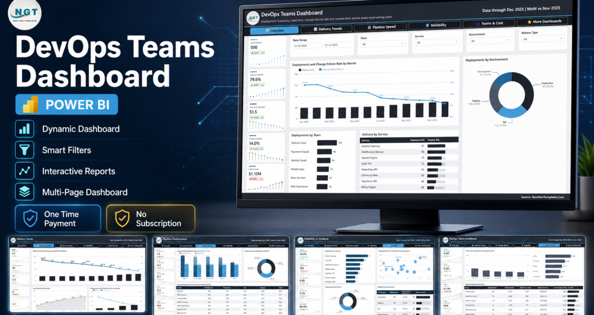
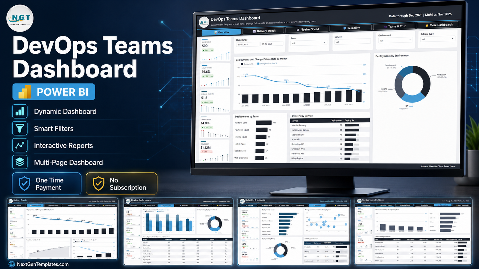
Most engineering teams can tell you how many things they shipped last month. Far fewer can tell you whether shipping got faster, whether it got safer, and what it cost. The DevOps Teams Dashboard in Power BI is a ready-to-open .pbix report built to answer all three in one sitting. The sample model carries 500 deployments across 6 engineering teams, 8 services, 4 environments and 5 cloud regions, driven by 80+ DAX measures. Straight out of the box it reports 500 deployments at 79.6% deploy success, a 51.5-hour average lead time, a 14.0% change failure rate, a 0.88-hour mean restore time and $1.12M of cloud cost – across five linked pages and 25 KPI cards.
It is worth being precise about what this is. It is a reporting template, not a monitoring product. You supply the deployment records; it does the analysis. There is no integration to set up and no agent to install.
Key Features of DevOps Teams Dashboard in Power BI
- Five analysis pages plus a hidden detail page. Overview, Delivery Trends, Pipeline Performance, Reliability & Incidents and Teams & Cost, with a row-level Details page already wired for drillthrough.
- 25 KPI cards, five per page. Each carries a sparkline and a month-on-month delta against the previous month, so a number that moved is visible without opening a second report.
- The four delivery metrics leaders get asked for. Deploys Per Day (2.0), Avg Lead Time Hrs (51.5), Change Failure (14.0%) and Mean Restore Hrs (0.88) – the DORA quartet, named the way the report labels them.
- Synced slicers across every page. Date Range, Team, Service and Environment travel with you; each page then adds one filter of its own – Release Type, Deployment Method, Priority or Cloud Region.
- A full semantic model. Typed columns, a proper M date table and 80+ measures. Nothing is hard-coded into a visual.
- Editable and unlocked. No custom visuals to license, no external image dependencies, no locked pages. The commercial licence covers rebranding it for client work.
- 19-column input contract. One flat table in Data.xlsx is the whole data requirement.
Dashboard Pages Explanation
Page 1 – Overview
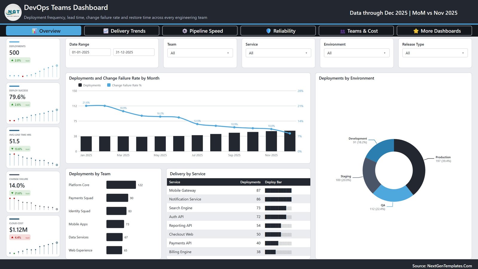
The card rail runs Deployments 500, Deploy Success 79.6%, Avg Lead Time Hrs 51.5, Change Failure 14.0% and Cloud Cost $1.12M. The main visual is Deployments and Change Failure Rate by Month, a combo chart where volume climbs while the failure line drops from 21.6% in January to roughly 9% in December – the shape every delivery review is hoping to see. Beside it, Deployments by Environment splits Production 197 (39.4%), QA 112 (22.4%), Staging 100 (20.0%) and Development 91 (18.2%). Underneath, Deployments by Team ranks Platform Core 122, Payments Squad 90, Identity Squad 83, Mobile Apps 73, Data Services 67 and Web Experience 65, while Delivery by Service tables Mobile Gateway 87 down to Billing Engine 38.
Page 2 – Delivery Trends
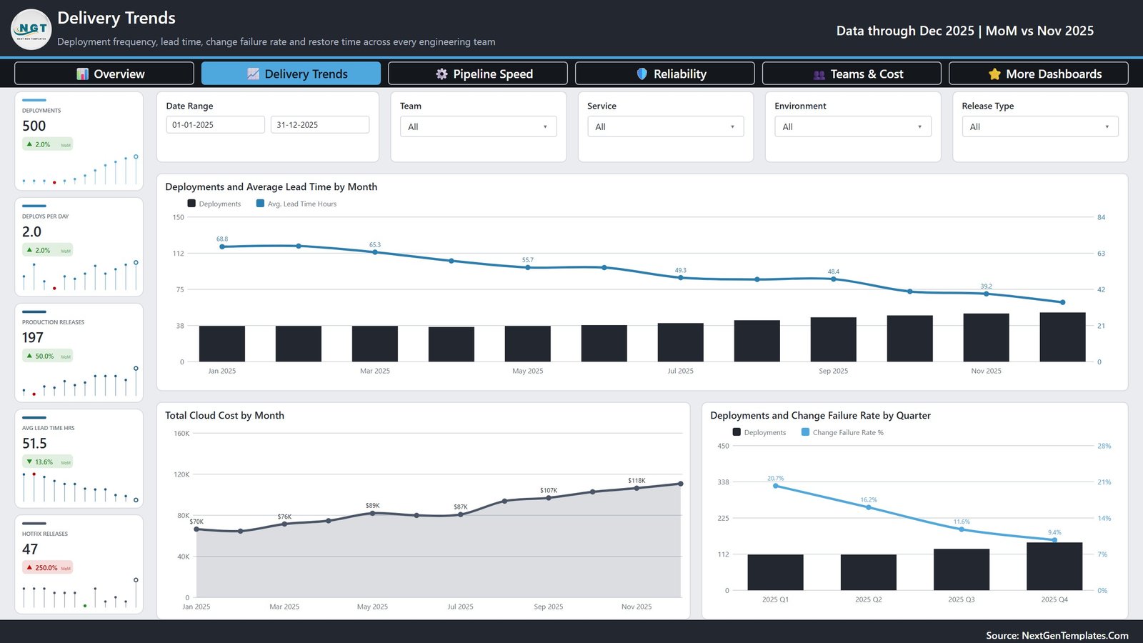
This is the page for the trend argument. Its cards add Deploys Per Day 2.0, Production Releases 197 and Hotfix Releases 47. Deployments and Average Lead Time by Month shows lead time falling from 68.8 hours in January to 39.2 by November as volume rises – the two lines moving in opposite directions is the point. Total Cloud Cost by Month climbs from $70K to $118K, and Deployments and Change Failure Rate by Quarter compresses the year into four bars: 20.7%, 16.2%, 11.6%, 9.4%.
Page 3 – Pipeline Performance
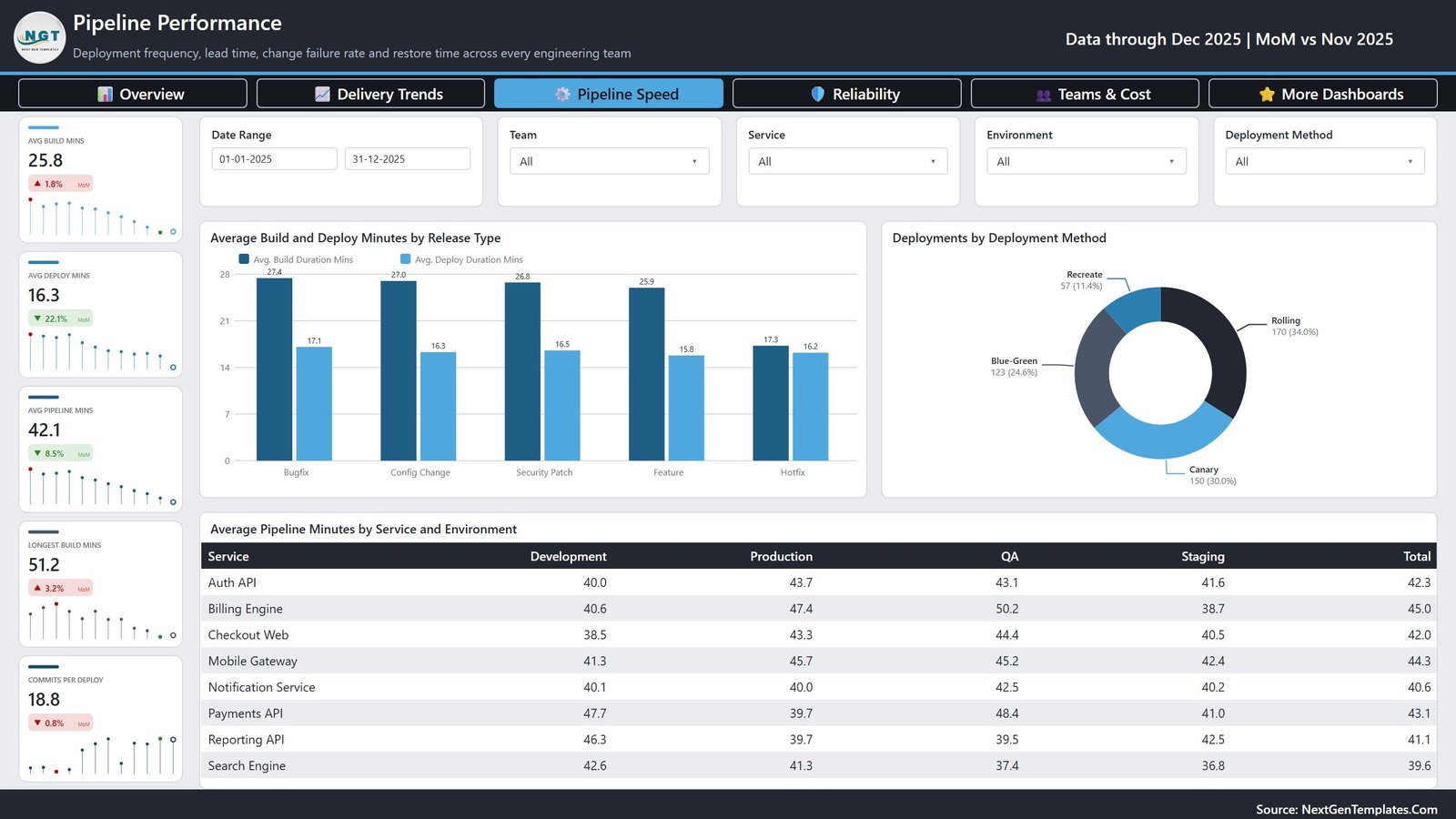
Cards here are Avg Build Mins 25.8, Avg Deploy Mins 16.3, Avg Pipeline Mins 42.1, Longest Build Mins 51.2 and Commits Per Deploy 18.8. Average Build and Deploy Minutes by Release Type puts Bugfix at 27.4 build minutes, Config Change 27.0, Security Patch 26.8, Feature 25.9 and Hotfix 17.3 – hotfixes are fast because they skip work, which is a useful thing to see stated numerically. Deployments by Deployment Method splits Rolling 170, Canary 150, Blue-Green 123 and Recreate 57. The Average Pipeline Minutes by Service and Environment matrix is where slow cells surface: Billing Engine in QA at 50.2 minutes against Search Engine in Staging at 36.8.
Page 4 – Reliability & Incidents
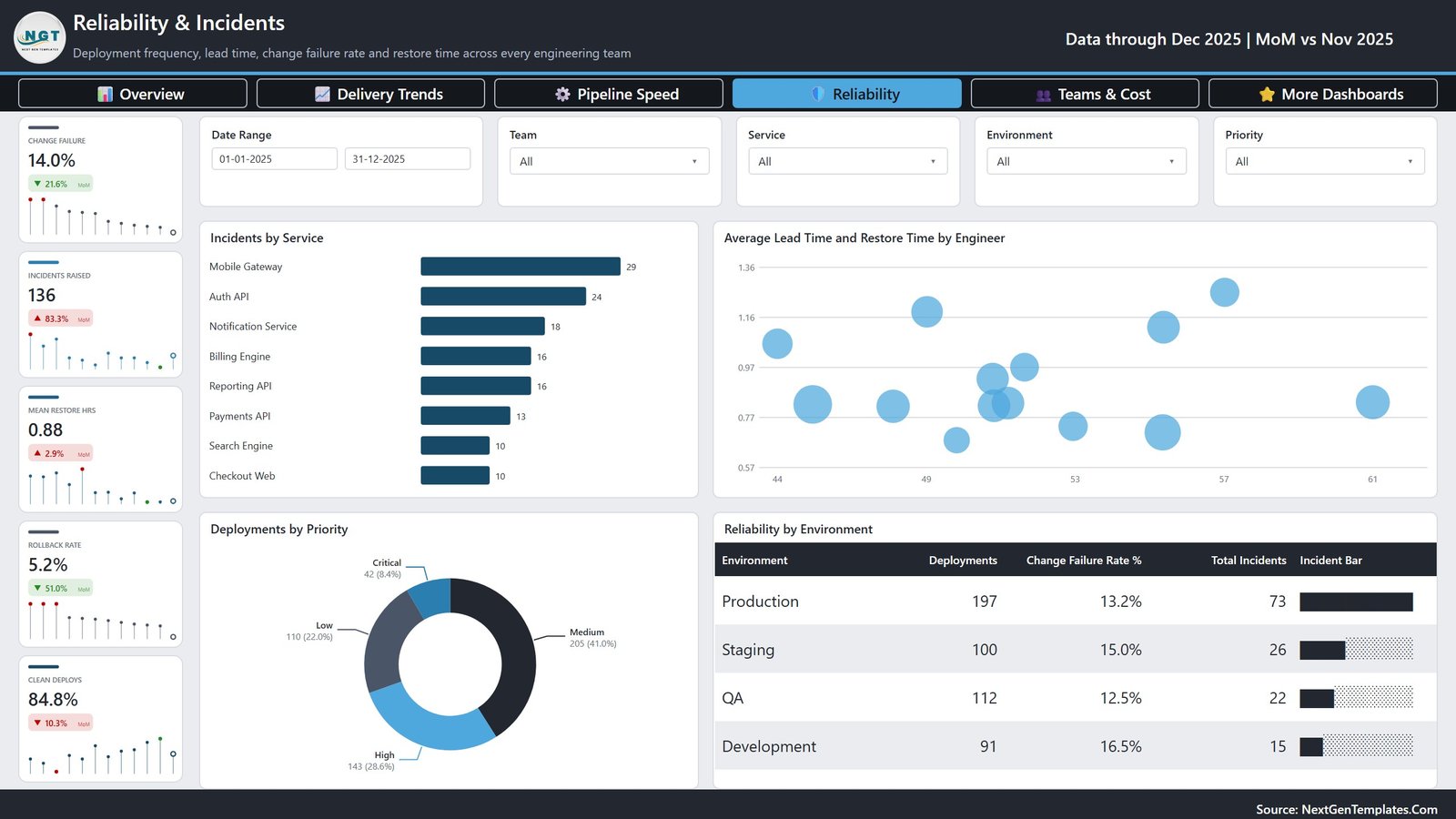
Change Failure 14.0%, Incidents Raised 136, Mean Restore Hrs 0.88, Rollback Rate 5.2% and Clean Deploys 84.8% head this page. Incidents by Service ranks Mobile Gateway 29, Auth API 24 and Notification Service 18. The Average Lead Time and Restore Time by Engineer scatter is deliberately not a league table – it spreads engineers across lead time and restore time so you look for clusters, not culprits. Deployments by Priority splits Medium 205, High 143, Low 110 and Critical 42, and Reliability by Environment tables the uncomfortable one: Development runs a 16.5% change failure rate against Production’s 13.2%.
Page 5 – Teams & Cost
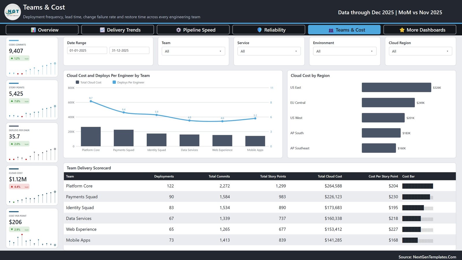
Code Commits 9,407, Story Points 5,425, Deploys Per Engr 35.7, Cloud Cost $1.12M and Cost Per Point $206. Cloud Cost and Deploys Per Engineer by Team overlays spend with productivity, Cloud Cost by Region runs US East $326K, EU Central $249K, US West $201K, AP South $183K and AP Southeast $160K, and the Team Delivery Scorecard closes the report with deployments, commits, story points, cloud cost and cost per story point for each of the six teams – a spread from $168 to $230 per point.
DevOps Teams Dashboard in Power BI vs. Tableau or Qlik vs. Paid DevOps Analytics SaaS – Feature Comparison
| This template (Power BI) | Tableau / Qlik build | DevOps analytics SaaS | |
|---|---|---|---|
| Cost | One-time purchase | Per-user licence plus build time | Recurring, usually per developer per month |
| Platform | Power BI Desktop (free) | Paid BI platform | Vendor-hosted web app |
| Setup time | Minutes – swap one file path and refresh | Days to weeks of authoring | Hours, once integrations are approved |
| Real-time team collaboration | Through the Power BI Service once published | Through the vendor’s server | Yes, built in |
| Mobile access | Power BI mobile app after publishing | Vendor mobile app | Yes |
| Customizable fields | Full – open model, open DAX, open layout | Full, if you build it | Limited to the vendor’s schema |
| Share with link | Yes, once published to the Service | Yes | Yes |
| Year-1 cost at 5 users | The purchase price, once | Five licences plus development days | Typically a four-figure annual contract |
| Connects to CI/CD and incident tools | No – you supply the records | No, unless you build the connector | Yes, that is the product |
| You own the model and the DAX | Yes | Yes | No |
Who Should Use This Template
Engineering managers who present to a leadership group monthly. Platform and SRE leads who need to show that a reliability investment paid off. Delivery managers running a quarterly business review. BI analysts asked to turn a pipeline export into something a CTO will read. Consultants who want a defensible DevOps report to hand a client without three days of authoring.
It is a poor fit if you want alerting, on-call paging or a live board on a wall. It is also the wrong file if you want a single-page scorecard with a month picker – that is the separate DevOps Teams KPI Dashboard in Power BI. This one is the five-page analytical dashboard.
Real-World Use Cases
Quarterly reliability review. An engineering manager at a payments company filters Environment to Production and reads change failure rate falling 20.7% to 9.4% across the four quarters, then screenshots the Reliability by Environment table to show Production at 13.2% against Development at 16.5%.
Making the case for build caching. An SRE lead opens Pipeline Performance, points at Bugfix builds taking 27.4 minutes against Hotfix at 17.3, and lands the argument with the service-by-environment matrix where Billing Engine in QA sits at 50.2 pipeline minutes.
Cost per unit of output for the board. A BI analyst supporting a CTO needs more than a cloud bill. Teams & Cost gives $206 cost per story point overall, and the scorecard shows Mobile Apps at $168 against Payments Squad at $230 – a conversation rather than a complaint.
Advantages of DevOps Teams Dashboard in Power BI
- It opens populated. Sample data ships inside, so you can evaluate every page before you touch your own numbers.
- Deltas are built in. Every card compares against the prior month, so trend is on screen without a second visual.
- The model is honest. Typed columns and a real date table mean time intelligence behaves; nothing is faked in a text box.
- Slicers are synced. Filter once and the story holds across all five pages, which is what makes it usable live in a meeting.
- No vendor lock-in. The file is yours, offline, forever, with the DAX readable and editable.
- It exports well. Publish to the Power BI Service for a link, or export to PDF or PowerPoint for the deck.
Opportunities for Improvement
Being straight about the limits is more useful than overselling. There is no live connection – it reads one Excel table, so it does not pull from GitHub Actions, Jenkins, Azure DevOps, PagerDuty or a cloud billing API, and it will not alert you to anything. Your column names have to match the 19 the model expects, or you edit the Power Query step yourself. Row-level security is not configured, so if different teams should see different data you will need to add it. And the sample year is 2025 calendar data; if your organisation runs on fiscal quarters you will want to adjust the date table.
Best Practices
- Fix your input first. One row per deployment, one date column, consistent team and service names. Ninety per cent of dashboard problems are data problems.
- Keep the 19 headers. Rename your export’s columns to match rather than rewiring the model, at least on the first pass.
- Read change failure rate as a trend, not a target. A single month’s 14.0% means little; the quarterly slope from 20.7% to 9.4% means a lot.
- Filter to one environment before you draw conclusions. Production and Development behave differently and averaging them hides both.
- Pair speed with reliability every time. Deploys Per Day next to Change Failure is the only pairing that resists gaming.
- Refresh on a schedule. Publish to the Service and set a refresh so the review pack is never assembled the night before.
- Rebrand once. Set your theme colours and logo on the first copy and every future refresh inherits them.
Explore Relevant Templates
- DevOps Teams Dashboard in Excel – the same territory for teams who live in Excel.
- DevOps Teams KPI Dashboard in Power BI – the compact month-picker scorecard.
- SaaS Development Dashboard in Power BI – revenue, delivery and capacity for product organisations.
- Bug Resolution KPI Dashboard in Power BI – defect ageing and resolution throughput.
- IT Manager & CISO Toolkit – ten Excel, Google Sheets and Power BI templates in one bundle.
Frequently Asked Questions
Does the DevOps Teams Dashboard connect to my CI/CD pipeline?
No. The semantic model imports a single Excel table. You export your deployment history from wherever it already lives, drop it into Data.xlsx or point Power Query at your own file, and refresh. Nothing in the report calls an external service.
What Power BI licence do I need?
Power BI Desktop is free from Microsoft and is all you need to open, edit and export the report. A Pro or Premium licence only comes into play if you want to publish and share through the Power BI Service.
What columns does my data need?
Nineteen: Deployment ID, Date, Team, Service, Environment, Release Type, Cloud Region, Deployment Method, Engineer, Priority, Status, Build Duration Mins, Deploy Duration Mins, Lead Time Hours, Restore Time Hours, Incidents, Code Commits, Story Points and Cloud Cost.
Can I change the colours and add my logo?
Yes. Nothing is locked – theme, header band, card rail and footer are all editable, and the commercial licence covers rebranding it for client delivery.
How many teams and services can it handle?
The sample uses 6 teams and 8 services because that reads cleanly on screen, but the model is not capped. Add more and the bar charts, tables and slicers extend to fit.
Is a user manual included?
Yes. The ZIP contains the .pbix, the Data.xlsx sample workbook and a Power BI user manual PDF.
Is this a subscription?
No. One-time payment, permanent licence, and the file works offline for as long as you keep it.
About the Author
Built by PK – Microsoft Certified Professional with 15+ years of Excel, Google Sheets, and Power BI experience. Founder of NextGenTemplates, reaching 300K+ subscribers across YouTube channels. Every template is hand-built and tested before release.
Conclusion
The gap between “we shipped a lot” and “we got better at shipping” is a reporting gap, and it is usually filled with a spreadsheet nobody trusts. The DevOps Teams Dashboard in Power BI closes it with five pages that already work: 500 sample deployments, 25 KPI cards with month-on-month deltas, 80+ DAX measures, synced slicers, and a change failure trend that reads at a glance. You bring the deployment records; the report does the rest, offline, with no integration to negotiate and nothing to renew.
Get the DevOps Teams Dashboard in Power BI on NextGenTemplates – instant download, one-time payment, commercial licence included.
For more Excel and Power BI walkthroughs, subscribe at youtube.com/@PKAnExcelExpert.