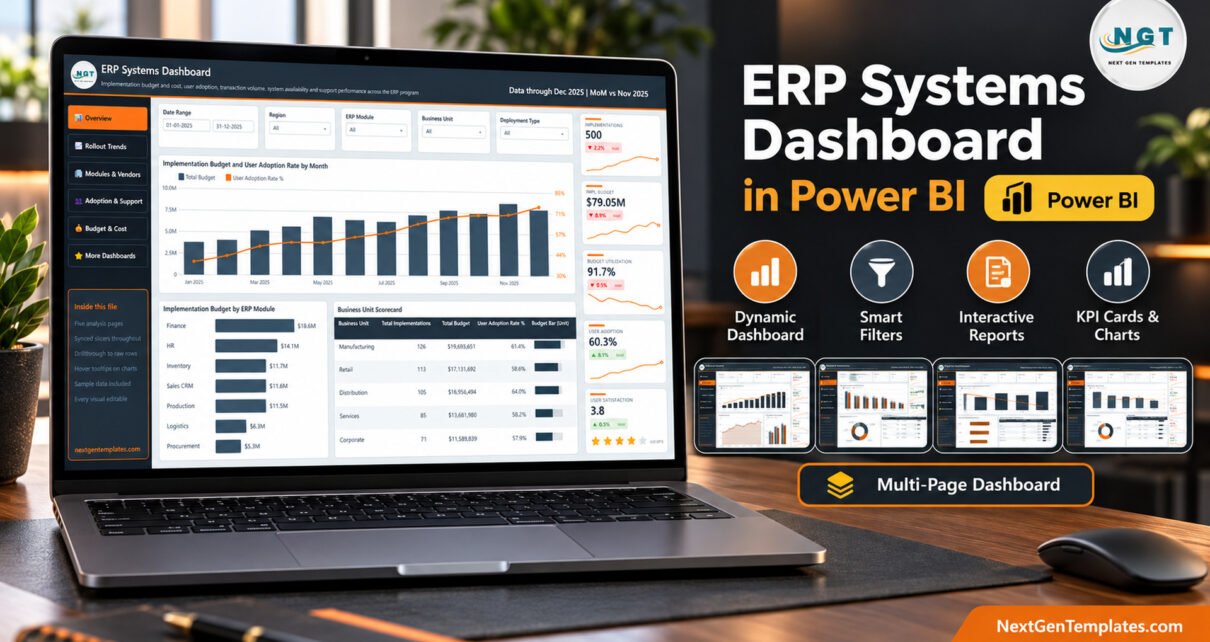
An ERP rollout generates an enormous amount of reportable activity – budget committed against budget spent, licences bought against licences actually used, transactions flowing, tickets piling up – and almost none of it arrives in a shape a steering committee can read. The ERP Systems Dashboard in Power BI is a finished PBIX report built to close that gap: five analysis pages that take an ordinary Excel export and turn it into a programme review pack.
Before anything else, one clarification that matters. This is a reporting template over data you supply. It does not connect to an ERP system, and it is not tied to any particular vendor. There is no connector, no API, no live sync and no automatic import. You maintain an Excel workbook, Power Query reads it, and the report redraws. Everything that ships in the file is demo data.
Key Features of the ERP Systems Dashboard in Power BI
- Five analysis pages plus a reference page, each with its own row of five KPI cards showing month-on-month movement and a sparkline.
- A drillthrough page bound on eight fields, so a right-click on any visual lands you on the underlying rows already filtered.
- Two custom tooltip pages that replace the default hover popup with three cards and a supporting chart.
- Synced slicers – date range, Region, ERP Module and Business Unit persist across pages, with one page-specific slicer on top.
- A 500-row, 21-column sample workbook covering a full calendar year, ready to be swapped for your own export.
- Standard visuals only – nothing from AppSource, so there is no second licence to buy.
Dashboard Pages Explanation
Overview. The programme at a glance: implementations, implementation budget, budget utilization, user adoption and user satisfaction across the top. Below them sit Implementation Budget and User Adoption Rate by Month, a ranked Implementation Budget by ERP Module bar chart, and a Business Unit Scorecard table with an inline data bar.
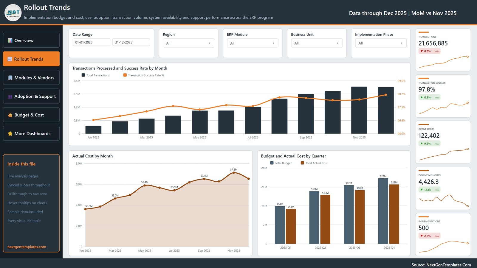
Rollout Trends. Throughput and spend over time – Transactions Processed and Success Rate by Month as a column-and-line combo, Actual Cost by Month as an area chart, and Budget and Actual Cost by Quarter as paired columns. This is the page that shows whether a programme is accelerating or just spending.
Modules & Vendors. Where the money and the volume actually sit: Budget and Actual Cost by ERP Module, a Transactions Processed by Vendor donut, and a matrix of Implementation Budget by ERP Module and Deployment Type broken out across Cloud, Hybrid and On-Premise.
Adoption & Support. The page that answers whether anyone is using what you bought. Licensed Users and Adoption Rate by Implementation Phase pairs licence counts against the adoption curve, next to Avg. Satisfaction by Deployment Type and an ERP Module Adoption and Support Scorecard.
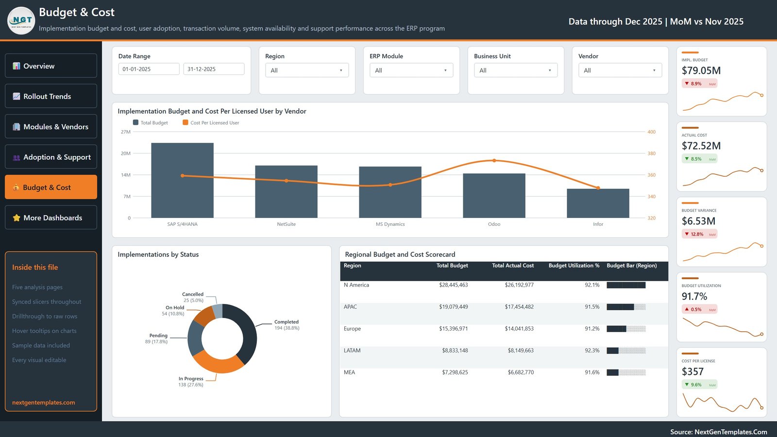
Budget & Cost. Unit economics – Implementation Budget and Cost Per Licensed User by Vendor, an Implementations by Status donut, and a Regional Budget and Cost Scorecard.
A sixth page, Get More Dashboards, is a catalogue and reference page rather than analysis – worth knowing about before you present the file, so it does not surprise you mid-meeting.
ERP Systems Dashboard in Power BI vs. an Excel Build vs. a Paid Analytics Subscription
| This Power BI template | A spreadsheet build | A paid analytics subscription | |
|---|---|---|---|
| Cost | One-off purchase | Free, plus your build time | Recurring per-seat fee |
| Drillthrough to row level | Wired on eight fields | Manual filtering | Usually included |
| Custom hover tooltips | Two dedicated pages | Not really available | Varies |
| Sharing | Publish to the Power BI Service, or export to PDF / PowerPoint | Email the file | Web app |
| Editable | Fully – no locked visuals | Fully | Rarely |
| Setup effort | Change one file path and Refresh | Days of chart building | Implementation project |
Who Should Use This Template
ERP programme managers who present to a steering committee. IT finance analysts tracking committed versus actual spend across modules. Change and training leads who need adoption evidence rather than anecdotes. Consultants running multiple client rollouts who want one reporting layout they can rebrand. And anyone who has been asked for “the numbers by Thursday” and does not want to rebuild a deck from scratch.
Real-World Use Cases
- Monthly steering pack – refresh, export to PDF, present. The KPI cards carry the month-on-month movement so you are not narrating deltas from memory.
- Budget challenge – filter to a region and a module, then drill through to the underlying implementation rows when someone asks which projects drove the variance.
- Adoption review – compare licensed against active users by implementation phase to find where training stalled.
- Deployment comparison – use the Deployment Type slicer to compare Cloud, Hybrid and On-Premise cost and satisfaction side by side.
- Vendor review – cost per licensed user by vendor, using your own supplier list in place of the sample names.
Advantages of This Power BI Dashboard
The drillthrough and tooltip pages are the real value. Any competent analyst can produce five pages of charts; wiring a drillthrough across eight fields and building two custom tooltip pages is the fiddly half-day that usually never happens. Here it is already done and tested.
The layout is also honest about scale. Every page uses the same navigation, the same slicer strip and the same five-card KPI rail, so a reader who learns one page can read all five. And because everything is a standard Power BI visual, your own team can extend it without hitting a custom-visual wall.
Opportunities for Improvement
Worth saying plainly, because template listings rarely do. The scorecard tables use an inline data-bar column that renders with a slightly dithered, blocky edge at export resolution – it reads fine on screen but is the least polished element in the file. The Actual Cost by Month area chart drops data labels on some points where they would collide, which is Power BI’s own label logic rather than a fault, but it means the December figure is unlabelled. And the ERP module matrix carries a Total column without a Total row; if you want a grand total at the foot, switch it on in the visual’s formatting pane.
On the sample data: the demo rows use five recognisable ERP product names as placeholder slicer text. They are strings in a column and nothing more – this template is vendor-agnostic, is not affiliated with or endorsed by any ERP vendor, and claims no integration or partnership with one. Replace them with your own supplier names.
Best Practices
- Keep the column headers. Swap the 500 demo rows for your own export but leave the 21 headers alone, and every visual follows automatically.
- Set the date slicer before you present. It defaults to the full sample year.
- Use drillthrough live. The fastest way to end a “where did that number come from” debate is to right-click it.
- Rebrand once. Change the logo and the theme colours on your first pass, then reuse the file for every period.
- Sanity-check your totals. Whatever the template shows, it reflects the workbook you fed it – confirm your export is complete before circulating anything.
Explore Relevant Templates
If a target-and-variance scorecard suits you better than an exploratory dashboard, look at the Fire Safety Services KPI Dashboard in Power BI, which follows the KPI-scorecard pattern. For another analytical Power BI build with the same page architecture, see the Eco Resorts Dashboard in Power BI. And for an IT-flavoured spreadsheet alternative there is the Endpoint Protection Services Dashboard in Excel.
A matching Excel workbook edition of this same dashboard, ERP Systems Dashboard in Excel, is being prepared and is not yet on sale, so it is deliberately not linked here – look it up by name once it goes live.
Get the template: ERP Systems Dashboard in Power BI on NextGenTemplates – PBIX, sample workbook and user manual in a single download.
Frequently Asked Questions
Does it connect to SAP, Oracle, Dynamics or any other ERP?
No. The ERP Systems Dashboard in Power BI reads an Excel workbook you maintain. There is no connector, no API, no live sync and no automatic import, and no vendor relationship of any kind is implied by the sample data.
Are the numbers in the file real?
No. All 500 rows are fictional demo data created so the visuals are legible out of the box. Every budget, rate and count on every page comes from that sample.
Can I rely on it for statutory or audit reporting?
Treat it as a management-reporting layout, not a financial control. It makes no claim about data accuracy, financial-reporting correctness, audit acceptance, or treatment under SOX, IFRS or GAAP, and it does not predict implementation outcomes.
What do I need to open it?
Power BI Desktop, which Microsoft provides free. It is not included in the download.
Can I use it for client work?
Yes – the licence covers commercial use, and every visual, measure and colour is editable.
About the Author
Written by the team at PK-AnExcelExpert.com, who build Excel, Power BI and Google Sheets reporting templates for businesses that would rather analyse their numbers than format them. We have shipped several hundred dashboard templates and answer support questions on every one.
Conclusion
An ERP programme is judged on how clearly it can explain itself. The ERP Systems Dashboard in Power BI gives you five readable pages, row-level drillthrough and custom tooltips on top of a spreadsheet you already maintain – no integration project, no subscription, no locked visuals. Swap in your export, set the date range, and you have a review pack you can defend line by line.