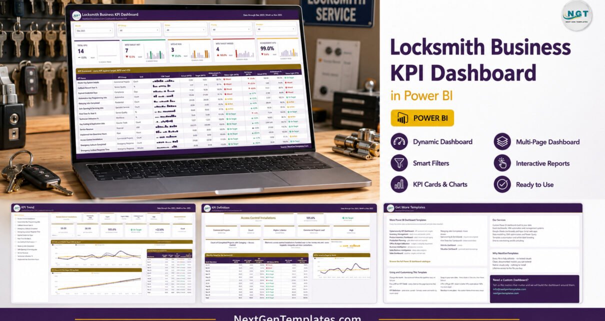
The Locksmith Business KPI Dashboard in Power BI tracks 14 locksmith KPIs across 4 report pages, driven by 38 DAX measures and two hidden tooltip pages. Ten of those KPIs are higher-is-better and four are lower-is-better, and the model knows the difference: a rising callback rate or a longer lockout response time scores below 100%, not above it. The whole thing runs on a four-sheet Excel workbook you can edit in ten minutes.
Most locksmith firms already have the numbers. They sit in a job-management system, a spreadsheet of van hours, an invoice export and somebody’s head. What is usually missing is one page each month that says, plainly, which parts of the business hit target and which did not. That is the gap the Locksmith Business KPI Dashboard in Power BI is built to close — and this post walks through every page of it, honestly, including the parts that are not what you might assume.
Key Features of the Locksmith Business KPI Dashboard in Power BI
- 14 locksmith KPIs across 11 groups. Emergency Response (Emergency Lockout Response Time, Emergency Callouts Completed), Service Quality (First-Time Fix Rate %, Callback Rework Rate %), Workforce (Technician Utilisation %), Financial (Service Revenue), Counter Trade (Key Cutting & Duplication Jobs), Residential (Rekeying Jobs Completed), Automotive (Automotive Key Programming Jobs), Commercial Projects (Access Control Installations, Master Key System Installs), Specialist Services (Safe Opening & Servicing Jobs), Fleet (Unplanned Van Downtime Hours) and Compliance (Expired Credential Days).
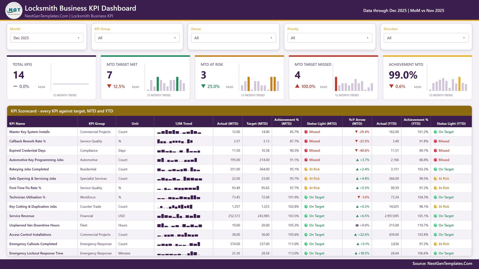
- Direction-aware scoring. Every KPI carries a UTB or LTB flag. Higher-is-better KPIs score Actual divided by Target; lower-is-better KPIs score Target divided by Actual. Callback Rework Rate % at 3.57 against a 3.13 target scores 87.7% and shows Missed — which is the correct answer, and the one a naive dashboard gets backwards.
- Three status bands, used identically for MTD and YTD. On Target is 100% or more, At Risk is 95% to under 100%, Missed is below 95%.
- Five slicers on the scorecard page: Month, KPI Group, Owner, Priority and Direction.
- Native Power BI visuals only — cards, tables, line charts, bar charts, slicers, shapes and text boxes. Nothing to install.
- A full sample year plus comparatives: twelve months of 2025 targets and actuals, and the complete 2024 actuals that drive every prior-year and YoY figure.
Dashboard Pages Explanation
The download is one ZIP containing three files: the .pbix report, Data.xlsx and a Power BI Dashboard – User Manual.pdf. The report has four visible pages and two hidden 280×360 tooltip pages that surface on hover.
Page 1: KPI Scorecard
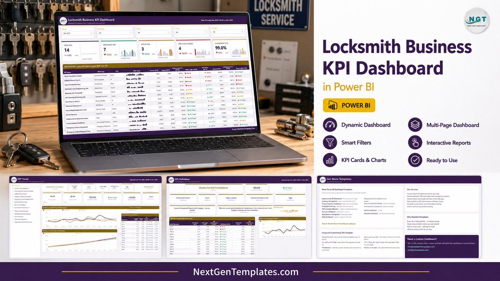
The month picker sits top-left, next to KPI Group, Owner, Priority and Direction slicers. Five header cards follow — Total KPIs, MTD Target Met, MTD At Risk, MTD Target Missed and Achievement MTD — each carrying a month-on-month delta and a 12-month trend strip. The scorecard grid underneath gives one row per KPI: Group, Unit, a 12-month mini trend, Actual and Target MTD, Achievement % MTD, a status light, a YoY arrow, then Actual YTD, Achievement % YTD and a second status light. In the December 2025 sample the split is 7 On Target, 3 At Risk and 4 Missed, and Achievement MTD averages out to 99.0%.
Page 2: KPI Trend
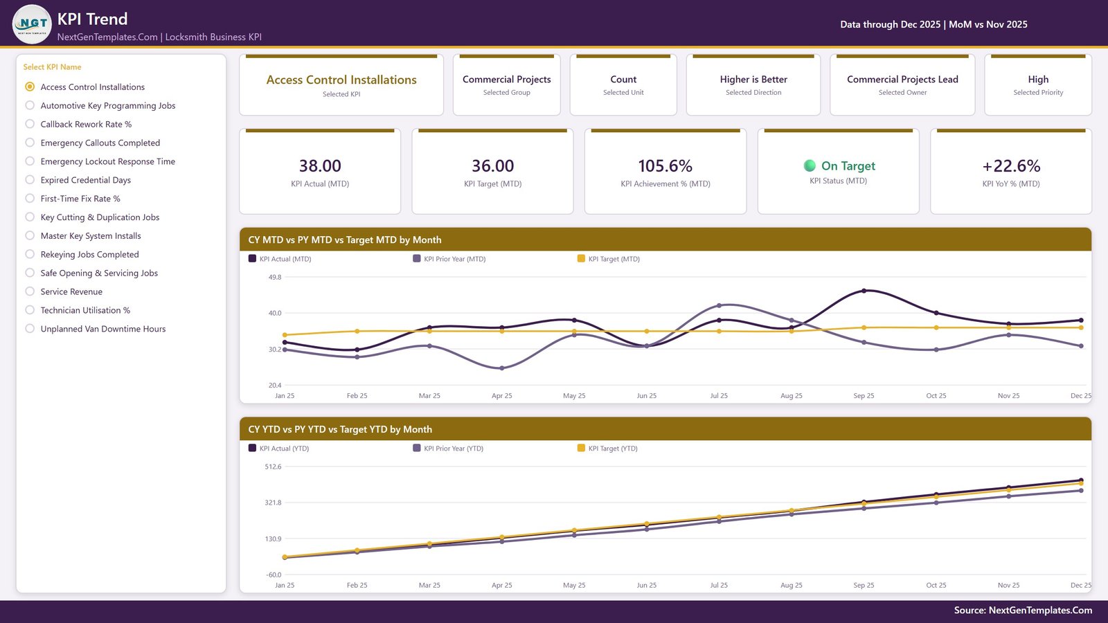
Choose one KPI from the list down the left and the entire page becomes that KPI. Six context cards restate the selected KPI, its group, unit, direction, owner and priority. Five value cards give Actual MTD, Target MTD, Achievement % MTD, the status light and YoY % MTD. Two line charts sit below: CY MTD vs PY MTD vs Target MTD by Month, and CY YTD vs PY YTD vs Target YTD by Month. It is the page for the question “is this getting better or worse, and against what?”
Page 3: KPI Definition
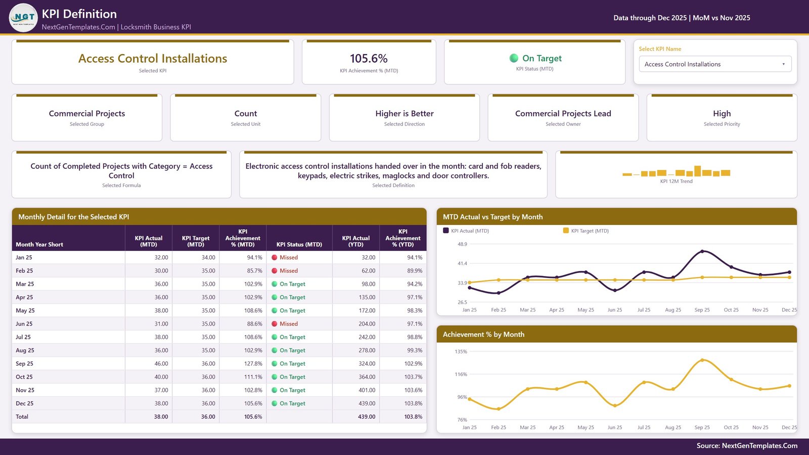
This page answers “what exactly is this number, and who owns it?” It restates the selected KPI group, unit, direction, owner and priority, then shows its written formula and a plain-English definition, a Monthly Detail table covering all twelve months, and two charts — MTD Actual vs Target by Month, and Achievement % by Month.
One thing worth stating plainly, because it trips people up: this page is not a drillthrough. There is no right-click menu to find. The page has its own Select KPI Name slicer that is synced to the slicer on the KPI Trend page, so choosing a KPI on either page carries straight to the other. Sibling templates in this range ship as real drillthroughs; this one does not, and knowing that saves you five minutes of hunting.
Page 4: Get More Templates
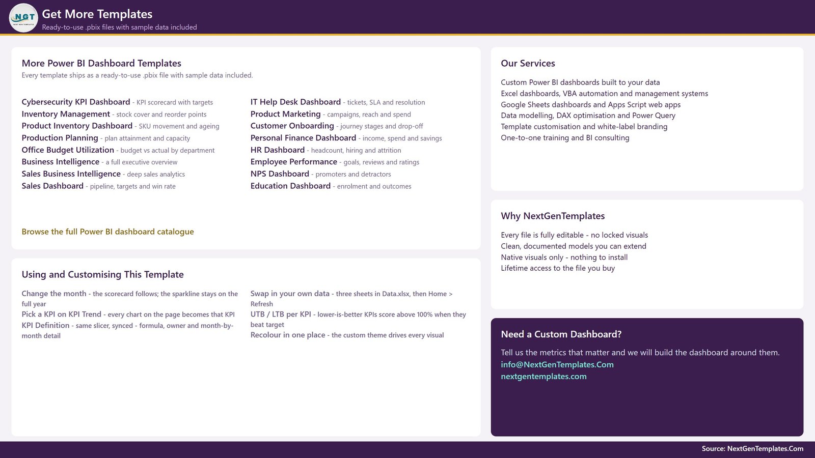
Page 4 is a reference and catalogue page rather than a data page, and it is fair to say so. Its left column is a genuinely useful “Using and Customising This Template” panel covering the month picker, the synced KPI slicer, UTB and LTB behaviour and where to recolour the report in one place. The rest lists other NextGenTemplates Power BI dashboards and a contact block. Keep it as a cheat sheet or delete the page from your own copy.
Locksmith Business KPI Dashboard in Power BI vs. Tableau/Qlik vs. Field-Service SaaS
| Feature | Locksmith Business KPI Dashboard in Power BI | Tableau / Qlik build | ServiceTitan / Jobber / Housecall Pro |
|---|---|---|---|
| Cost | $12.99 one-time | $75+ per user per month, plus build time | $49–$400+ per month, often per technician |
| Platform | Power BI Desktop (free) | Tableau Desktop or Qlik Sense licence | Vendor cloud only |
| Setup time | About 10 minutes | Days to weeks of dashboard building | Days, plus onboarding calls |
| KPIs included out of the box | 14, locksmith-specific | None — you design them | Fixed vendor KPI set |
| Lower-is-better scoring | Built in per KPI (UTB/LTB) | Hand-coded per measure | Rarely exposed |
| Add or rename a KPI | Add a row, press Refresh | Rebuild the calculation and the visuals | Vendor roadmap request |
| Data stays on your machine | Yes — local .pbix and .xlsx | Depends on deployment | No — vendor cloud |
| Real-time team collaboration | No — file-based | Yes, with server licences | Yes |
| Year-1 cost at 5 users | $12.99 total | $4,500+ | $3,000–$24,000+ |
For a locksmith owner who wants a monthly management scorecard without a per-technician subscription, the Locksmith Business KPI Dashboard in Power BI sits in the sweet spot. If you need live dispatch, invoicing and technician tracking, buy the field-service platform — this reports on your numbers, it does not run your jobs.
Who Should Use This Template
Perfect for:
- Owners and branch managers of locksmith firms with roughly 2–40 technicians who want one monthly review pack
- Operations and dispatch managers already exporting job counts, revenue and response times from a job-management system
- Multi-service shops mixing residential rekeying, automotive key programming, counter key cutting, safe work and commercial access-control projects
- Anyone who wants a Power BI KPI model they can open, read and extend, with no locked visuals
Not a fit if:
- You need live dispatch, scheduling, invoicing or technician tracking — this is a reporting layer, not an operations system
- You want a real-time cloud dashboard and do not have Power BI Desktop or a Power BI service workspace
- You expect it to connect automatically to your job-management software; it reads an Excel workbook you populate
- You are looking for compliance, licensing, insurance or key-control record-keeping. Every figure here is typed in by a person. Expired Credential Days is an internal management prompt and nothing more — it is not a record of any licence, bond, insurance policy or background check, and it must never be presented as evidence to a regulator, insurer, awarding body or customer.
Real-World Use Cases
Dean owns a six-van locksmith firm covering a metro area. First Monday of the month he sets the Month picker to the month just closed and reads four header cards. In the December sample, four KPIs sit in Missed — Master Key System Installs, Callback Rework Rate %, Expired Credential Days and Automotive Key Programming Jobs — and those four become the agenda. The review takes ten minutes instead of an afternoon of spreadsheet archaeology.
Priya manages dispatch and cares about the numbers that should be falling. She sets the Direction slicer to lower-is-better and gets exactly four rows: Emergency Lockout Response Time, Callback Rework Rate %, Unplanned Van Downtime Hours and Expired Credential Days. Response time at 25.30 minutes against a 28.58 target reads 113.0% On Target — and because the scoring is direction-aware, she can put that on a slide without explaining the arithmetic.
Marcus runs the commercial side of the business. He filters KPI Group to Commercial Projects and sees Access Control Installations at 38 against a 36 target, and Master Key System Installs at 12 against 14. When his lead asks where the second number comes from, Marcus opens the KPI Definition page and shows the written formula, the owner and the twelve-month detail table.
Advantages of This Power BI KPI Dashboard
It costs once. A field-service platform priced per technician is a permanent line in the budget. This is a single file. At five users the year-one difference runs into thousands.
The model is genuinely dynamic. Nothing in the report hard-codes a KPI name. Add a row to the KPI Definition sheet with its monthly target and actual rows and the new KPI appears in the counts, the scorecard grid, the KPI list on the Trend page and every chart. Rename one in all three sheets and it follows. Delete its rows and it disappears cleanly.
The direction logic is the real value. Getting lower-is-better KPIs right is where most home-built scorecards quietly fail — a rework rate that rises gets rendered as a green 114% and the meeting congratulates itself. Four of these fourteen KPIs are lower-is-better and all four score correctly.
Your data does not leave your machine. The report and the workbook are local files. There is no vendor account, no data-processing agreement and no export to negotiate if you stop using it.
It is readable. Thirty-eight DAX measures, all native visuals, and a documented data pack. If you know a little Power BI, you can extend it. If you do not, the manual and the on-report notes cover the day-to-day.
Opportunities for Improvement
Three honest limitations, because a template is more useful when you know its edges.
It is file-based, not collaborative. Two people cannot edit the same copy at once. If you need shared live editing, the Google Sheets edition of this dashboard suits better, or you publish the .pbix to a Power BI workspace.
There is no automatic data connection. The model reads Data.xlsx, so somebody has to move numbers out of the job-management system and into three sheets each month. That is deliberate — it keeps the template portable across every platform — but it is manual work, roughly ten minutes if your exports are tidy.
The workbook path matters. The report expects Data.xlsx beside it. Keep all three files from the ZIP in one folder. If you do move the workbook, the first Refresh will fail until you repoint it with Home > Transform data > Data source settings > Change Source. The Read Me sheet flags this too, but it is the single most common first-run stumble.
Best Practices
Fill the KPI Definition sheet before anything else. It is the join key. Get the KPI name, its unit and especially its UTB or LTB type right there, and the rest of the model follows.
Never let a percentage accumulate in the YTD column. For rates, ratios, days and index values, YTD should be the average of the months so far, not a running sum. A compliance percentage that reads 1,900% by December is the classic KPI-pack mistake and it makes every YTD chart meaningless. The Read Me sheet says the same thing.
Load the prior year. The Input_ Actual sheet wants the reporting year and the year before it. Skip 2024 and every PY line and YoY arrow goes flat.
Use the Owner column as a real assignment. Filtering the scorecard by Owner turns a fourteen-row grid into a one-to-one agenda for each manager.
Set targets you would actually defend. The three status bands are unforgiving by design — below 95% is Missed. Targets set to flatter will produce a page of green lights and tell you nothing. Microsoft’s own Power BI report design guidance is worth a read if you plan to extend the layout.
Explore Relevant Templates
If you want the same dashboard in a browser instead of Power BI Desktop, there is a Locksmith Business KPI Dashboard in Google Sheets. If you want the simpler scorecard line for the same trade, we have written up the Locksmith Business KPI Scorecard in Excel, and it is also available as a Google Sheets scorecard. Those are a different family — a flatter, single-page scorecard rather than the month-picker dashboard described here — so read the scorecard write-up before choosing.
Built the same way for neighbouring trades: the Fencing Contractor KPI Dashboard in Power BI, the Carpentry Workshop KPI Dashboard in Power BI, the Welding Shop KPI Dashboard in Power BI and the Masonry Contractor KPI Dashboard in Power BI. Same four-page architecture, same UTB/LTB scoring, different KPI sets. On the store side, the Garage Door Service and Window and Door Installation dashboards cover adjacent trades.
Frequently Asked Questions
What KPIs does the Locksmith Business KPI Dashboard in Power BI track?
The dashboard tracks 14 KPIs: Emergency Lockout Response Time, Emergency Callouts Completed, First-Time Fix Rate %, Callback Rework Rate %, Technician Utilisation %, Service Revenue, Key Cutting & Duplication Jobs, Rekeying Jobs Completed, Automotive Key Programming Jobs, Access Control Installations, Master Key System Installs, Safe Opening & Servicing Jobs, Unplanned Van Downtime Hours and Expired Credential Days.
How long does setup take?
About ten minutes if your figures are to hand. Unzip the three files into one folder, open the .pbix in Power BI Desktop, replace the sample rows in the three Data.xlsx input sheets with your own, and press Home > Refresh. Every card, chart and status light rebuilds from those sheets.
Is the KPI Definition page a drillthrough?
No. In the Locksmith Business KPI Dashboard in Power BI the KPI Definition page carries its own Select KPI Name slicer, synced to the one on the KPI Trend page. Picking a KPI on either page carries to the other automatically. There is no right-click drillthrough menu on this template, so there is nothing to hunt for.
How does it handle KPIs where lower is better?
Each KPI carries a UTB or LTB flag in the KPI Definition sheet. Higher-is-better KPIs score Actual divided by Target; lower-is-better KPIs score Target divided by Actual, so beating a response-time or rework target reads above 100%. Four of the fourteen sample KPIs are lower-is-better.
Can I add, rename or delete a KPI?
Yes. Nothing in the report hard-codes a KPI name. Add a row to the KPI Definition sheet plus its monthly Target and Actual rows, rename a KPI consistently across all three sheets, or delete its rows entirely, then press Refresh. The counts, the scorecard, the KPI list and every chart follow along.
How does this compare to ServiceTitan or Jobber?
Those platforms run the jobs — dispatch, scheduling, invoicing, technician tracking — for a recurring per-user fee. This template does none of that. It is a one-time-purchase reporting layer that turns numbers you already have into a monthly management scorecard, and it sits happily alongside whichever platform you run.
Does this help with licensing, bonding or compliance records?
No. Every figure in this dashboard is entered by hand. Expired Credential Days is an internal management prompt only — it is not a record of any licence, bond, insurance policy or background check, and it should never be offered as evidence to a regulator, insurer or customer.
What is the difference between the KPI Dashboard and the KPI Scorecard?
They are two different products with confusingly similar names. This is the KPI Dashboard family: a month picker, a traffic-light grid, MTD and YTD side by side, plus dedicated Trend and Definition pages. The KPI Scorecard is a separate, flatter template with its own layout and KPI set, available in Excel and Google Sheets for the same trade.
About the Author
Built by PK — Microsoft Certified Professional with 15+ years of Excel, Google Sheets and Power BI experience. Founder of NextGenTemplates, reaching 300K+ subscribers across YouTube channels. Every template is hand-built and tested before release.
Conclusion
The Locksmith Business KPI Dashboard does one job well: it turns a month of locksmith operating numbers into a single page a manager can read in ten minutes, with the direction of every KPI handled correctly. Four pages, fourteen KPIs, thirty-eight measures, a documented data pack and a user manual — and no subscription attached to any of it.
👉 Click here to purchase the Locksmith Business KPI Dashboard in Power BI
Instant download · One-time payment · No subscription · Lifetime access
For step-by-step video walkthroughs of this and other Power BI templates, visit YouTube.com/@PK-AnExcelExpert.
Last updated: September 2026