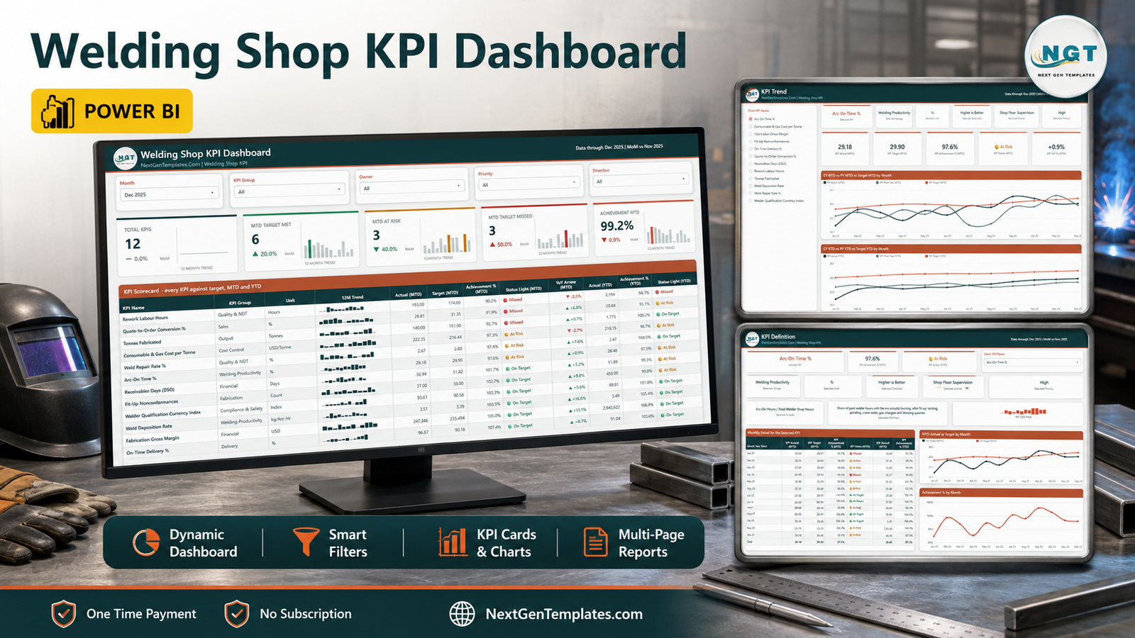
Most welding shops already know their numbers. The problem is that the numbers live in four places – the estimator’s quote log, the QA coordinator’s NDT register, the payroll export and somebody’s rework spreadsheet – and by the time they are pulled together for the monthly meeting, nobody quite agrees on them.
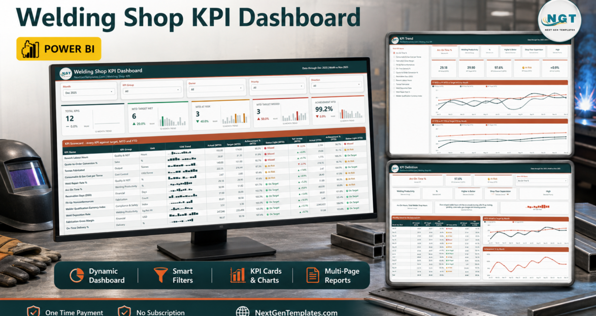
The Welding Shop KPI Dashboard in Power BI is a ready-to-use .pbix report that fixes the reporting half of that problem. It scores 12 welding and fabrication KPIs against target every month, in MTD and YTD, with traffic lights on both, and it does it the same way every month.
This is a KPI scorecard, not an analytical dashboard. It is not there to let you slice production six ways. It is there to answer one question in the first ten seconds of the meeting: which of our KPIs are we missing, and who owns them?
What the report actually contains
Four visible pages and two hidden tooltip pages.
1. KPI Scorecard
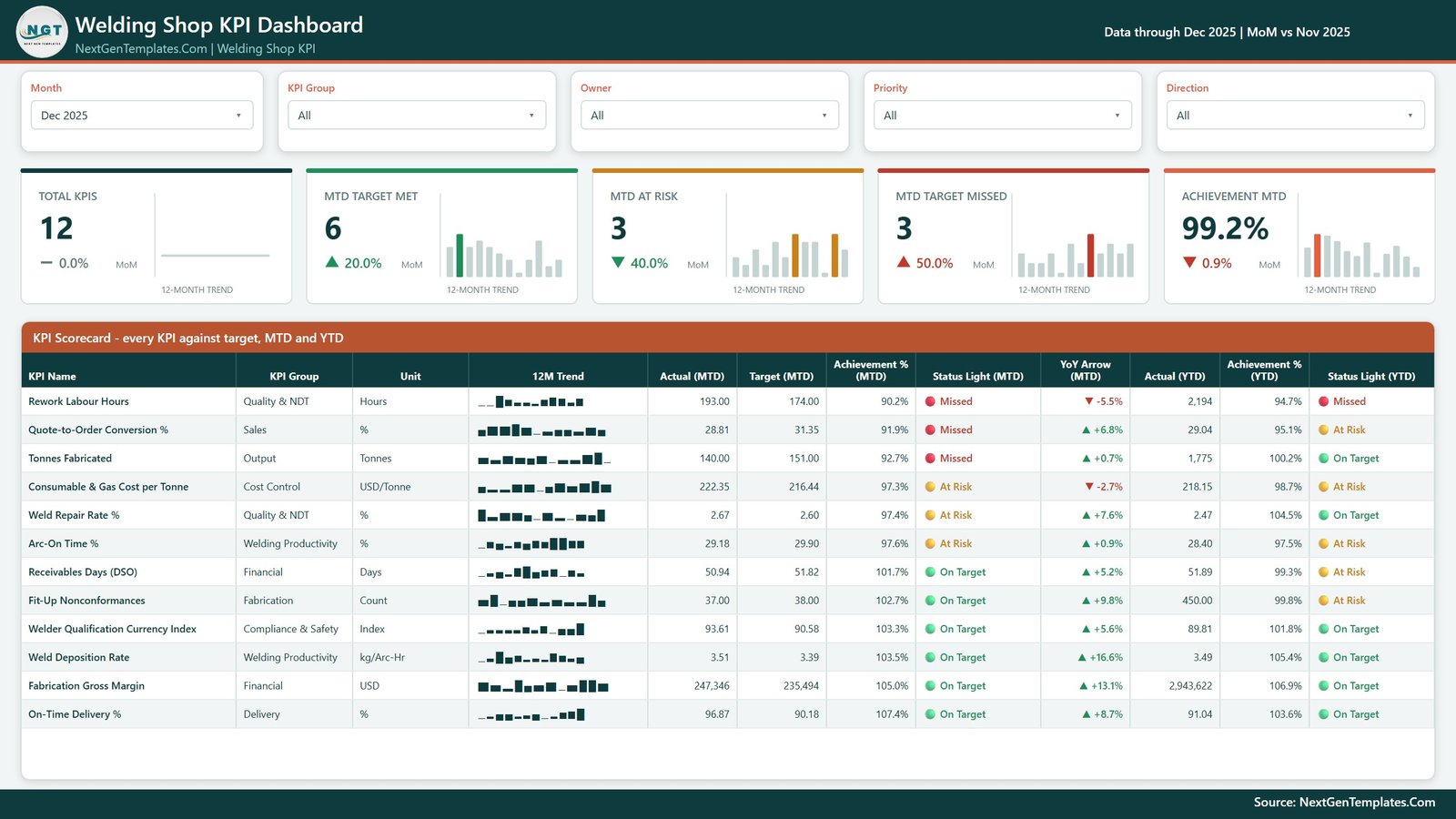
Five slicers across the top – Month, KPI Group, Owner, Priority and Direction – then five summary cards, each with its own 12-month bar trend and a month-on-month delta:
- Total KPIs
- MTD Target Met
- MTD At Risk
- MTD Target Missed
- Achievement MTD
Underneath sits the scorecard table itself, one row per KPI: group, unit, a 12-month sparkline, MTD actual, MTD target, MTD achievement %, MTD status light, a YoY arrow, then YTD actual, YTD achievement % and YTD status light.
It sorts worst-first by MTD achievement, which is the small design decision that makes it useful. The KPIs that need the meeting are at the top of the page, not filed alphabetically halfway down.
2. KPI Trend
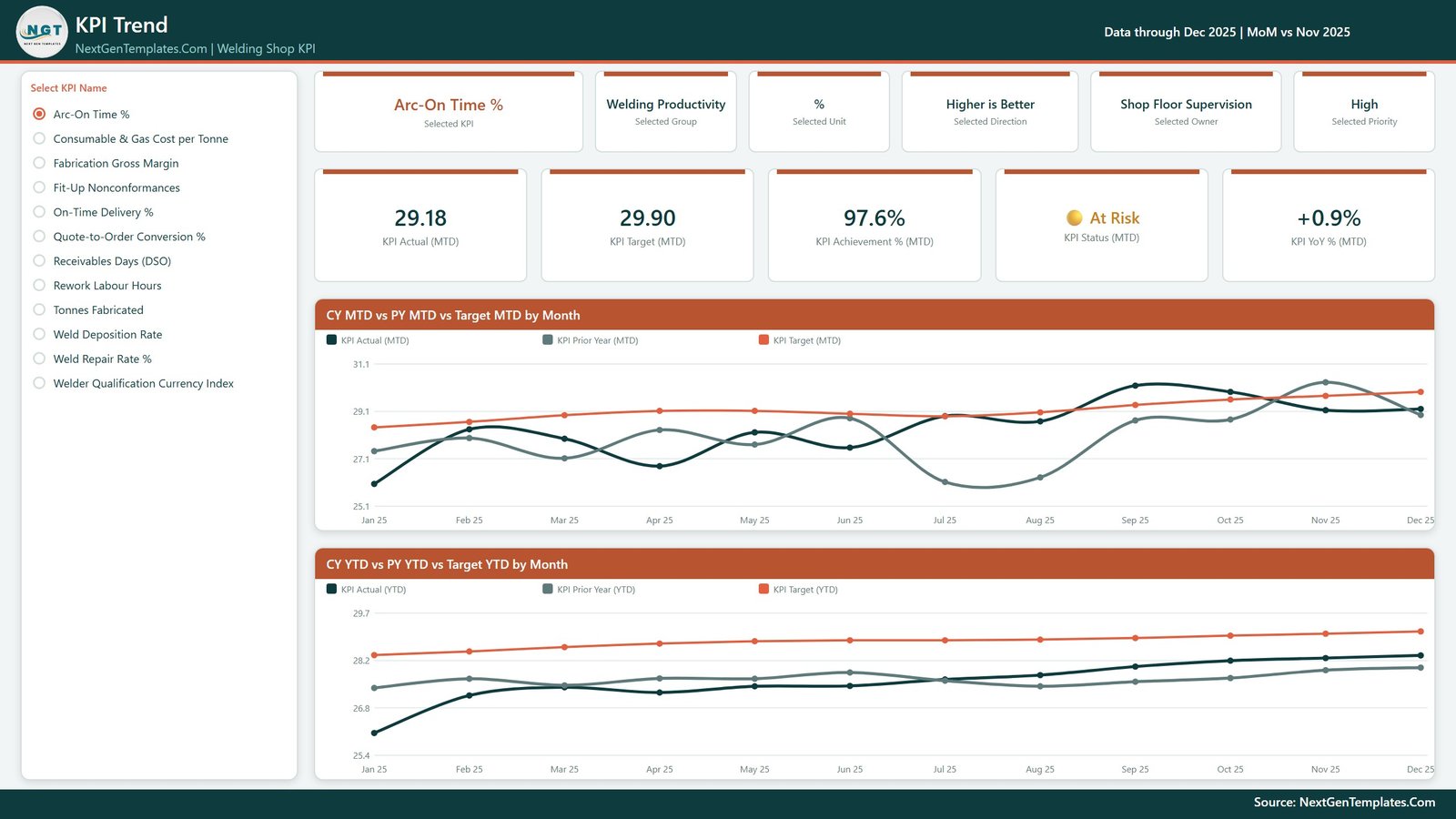
Pick one KPI from the list on the left and the whole page becomes that KPI. Six context cards name the selected KPI, its group, its unit, its direction, its owner and its priority. Five value cards give MTD actual, MTD target, MTD achievement %, MTD status and MTD YoY %.
Then two line charts run the full twelve months – CY MTD vs PY MTD vs Target MTD by Month and CY YTD vs PY YTD vs Target YTD by Month – so you can see whether a bad month is a blip or the shape of the year.
3. KPI Definition
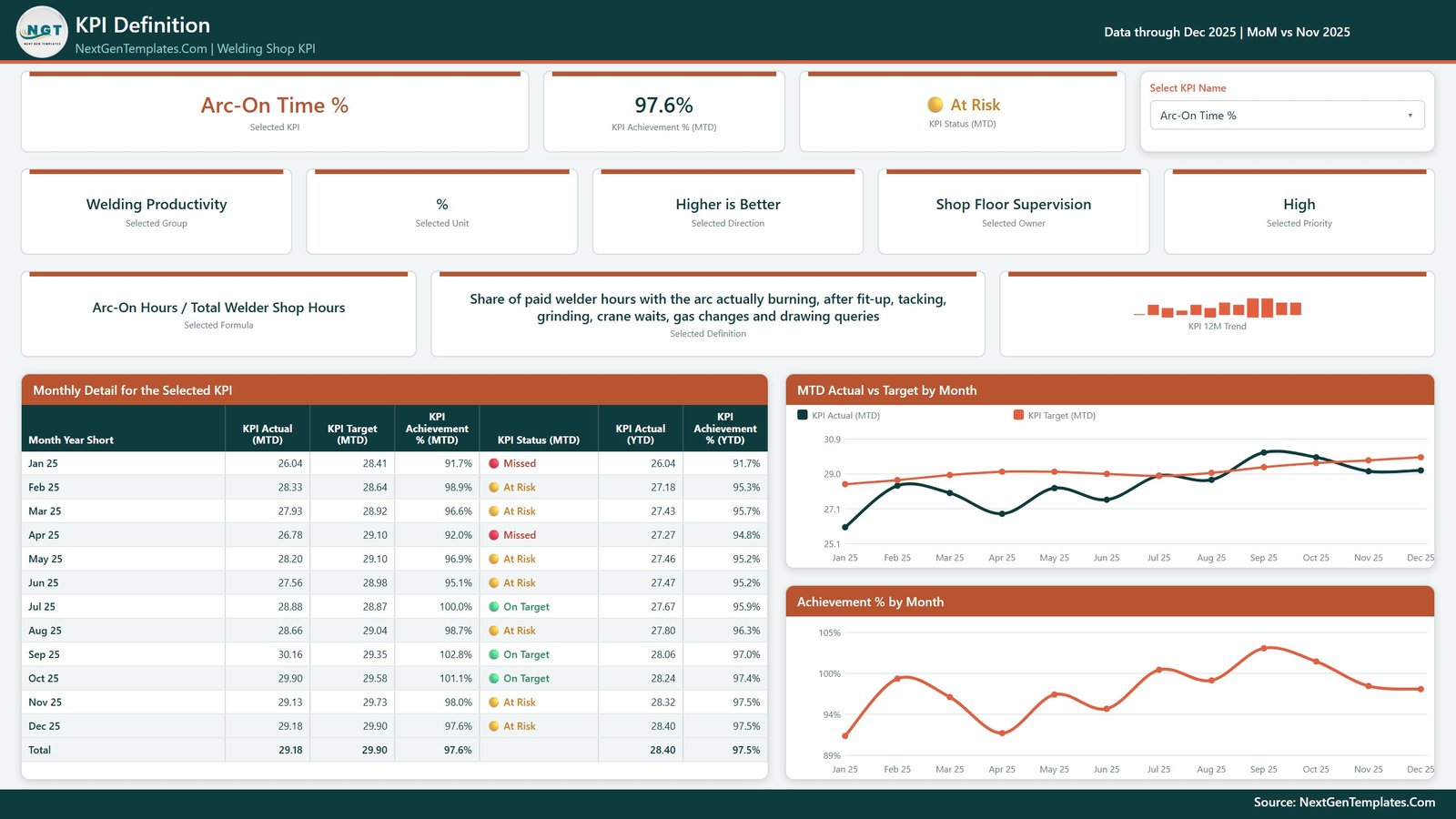
The same KPI selection, synced, plus the two things that stop a KPI argument dead: the formula and a written definition.
Arc-On Time %, for instance, is defined as Arc-On Hours / Total Welder Shop Hours, and described as the share of paid welder hours with the arc actually burning – after fit-up, tacking, grinding, crane waits, gas changes and drawing queries. When somebody says “that number looks low”, the definition is on the same screen as the number.
Beneath it, a month-by-month detail table with a total row, an MTD Actual vs Target by Month chart, and an Achievement % by Month chart.
4. Get More Templates
A catalogue page of other NextGenTemplates Power BI reports. It ships with the file; delete it before you circulate the report internally if you would rather not.
The 12 KPIs it ships with
You can replace all of them. These are the worked example, and they are grouped the way a fabrication shop actually reviews them.
| KPI | Group | Unit | Direction |
|---|---|---|---|
| Weld Deposition Rate | Welding Productivity | kg/Arc-Hr | Higher is better |
| Arc-On Time % | Welding Productivity | % | Higher is better |
| Tonnes Fabricated | Output | Tonnes | Higher is better |
| Weld Repair Rate % | Quality & NDT | % | Lower is better |
| Rework Labour Hours | Quality & NDT | Hours | Lower is better |
| Fit-Up Nonconformances | Fabrication | Count | Lower is better |
| Consumable & Gas Cost per Tonne | Cost Control | USD/Tonne | Lower is better |
| On-Time Delivery % | Delivery | % | Higher is better |
| Quote-to-Order Conversion % | Sales | % | Higher is better |
| Fabrication Gross Margin | Financial | USD | Higher is better |
| Receivables Days (DSO) | Financial | Days | Lower is better |
| Welder Qualification Currency Index | Compliance & Safety | Index | Higher is better |
Seven higher-is-better, five lower-is-better. Every one carries an owner – Welding Engineering, Shop Floor Supervision, Production Planning, QA / NDT Coordinator, Fabrication Supervision, Purchasing & Stores, Estimating & Sales, Finance – and a priority of Critical, High or Medium.
The part most KPI packs get wrong: direction
If you score every KPI as Actual / Target, then a shop that cut its rework hours from 200 to 174 looks like it missed by 13%. That single mistake has quietly wrecked more KPI packs than any other.
This report is direction-aware:
- Higher is better – achievement is Actual / Target.
- Lower is better – achievement is Target / Actual, so beating a cost, rework or DSO target scores above 100%.
The status bands then apply the same way to everything: On Target at 100% or more, At Risk from 95% to 100%, Missed below 95%. And because MTD and YTD are scored separately, a KPI can show a red month inside a green year – which is usually the most useful thing on the page.
There is a second trap the file handles: YTD for a rate. Money, tonnes and counts add up from January. A percentage, a ratio, a days figure or an index does not – it is averaged. A compliance percentage that reaches 1,900% by December is the classic symptom, and it makes every cumulative chart meaningless.
How you put your own numbers in
The ZIP holds three files: the .pbix, Data.xlsx, and a Power BI user manual PDF. Keep them in one folder.
Data.xlsx has four sheets:
- Read Me – the rules, in one page.
- KPI Definition – one row per KPI: group, name, unit, formula, definition, direction, owner, priority.
- Input_ Target – one row per KPI per month, MTD and YTD.
- Input_ Actual – the same, for the reporting year and the year before it. That prior year is where every PY line and YoY arrow comes from, so do not skip it.
Then Home > Refresh in Power BI Desktop. Nothing in the report hard-codes a KPI – the KPI name is the join key across the three sheets, so adding, renaming or deleting a KPI in the workbook updates the cards, the slicer lists, the scorecard, the charts and the tooltips. Moved the workbook? Repoint it with Home > Transform data > Data source settings > Change Source.
What it is not
Worth being blunt about, because welding is a trade where the wrong tool creates real risk:
- It is not a WPS or PQR management system and not a welder certification register.
- It is not an NDT report repository, a job-costing engine, or an MES.
- It does not connect to your shop-floor system, ERP or weld data recorders – you feed it a monthly workbook.
- A Welder Qualification Currency Index is a management indicator, not evidence of compliance. Your ASME IX / AWS D1.1 continuity records, procedure coverage and renewals still have to live and be audited in the systems your code and your customers require.
- The sample figures are an illustrative worked example, not welding-industry benchmarks. Replace them.
Scorecard or dashboard – which one do you want?
We publish near-identically named products, so it is worth naming the difference.
This is the KPI Dashboard line: a Power BI report with a month picker, traffic lights, a KPI Trend page and a KPI Definition page. If you would rather work in a spreadsheet, the same discipline exists as the Welding Shop KPI Scorecard in Excel and the Welding Shop KPI Scorecard in Google Sheets – different builds, same twelve-KPI thinking. Neither is a cut-down version of the other; pick the one that matches where your team already works.
Frequently Asked Questions
Do I need a paid Power BI licence?
No. Power BI Desktop is free from Microsoft and opens, edits and refreshes the file. You only need Pro or Premium if you want to publish it to the Power BI Service.
Can I use more or fewer than 12 KPIs?
Yes. Add or delete rows across the three data sheets and refresh. The KPI count card, the slicers and every visual follow the workbook.
Is there a drillthrough page?
No – two hidden tooltip pages (KPI Detail and Trend Detail) surface on hover, and KPI Definition carries the month-by-month detail.
Why does a KPI show 102.7% when the actual is below the target?
Because it is a lower-is-better KPI. Fit-Up Nonconformances at 37 against a target of 38 is a good month, and the direction-aware maths scores it as one.
Can I rebrand it?
Yes. It uses native Power BI visuals and a single custom theme file, so changing the palette in one place recolours every page.
Get the template
The Welding Shop KPI Dashboard in Power BI is a one-time purchase – no subscription, no per-seat fee – and you get the editable .pbix, the Data.xlsx workbook and the user manual.
For more Power BI, Excel and VBA walkthroughs, subscribe to the PK: An Excel Expert YouTube channel.