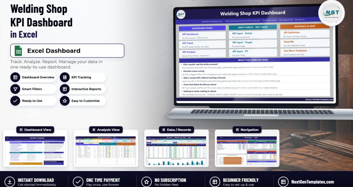
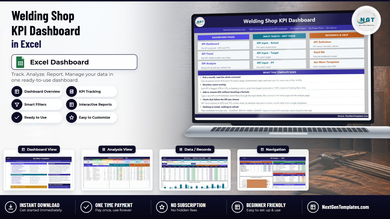
Most fabrication shops already know their numbers. The repair rate is in the QA log, arc-on time is in the machine report, rework hours are buried in a timesheet code, and the NDT rejection rate lives in a folder the Level III inspector keeps. What is usually missing is the one page that puts all of them next to a target, in the same direction, for the same month. The Welding Shop KPI Dashboard in Excel is that page: 14 welding KPIs across 6 groups, each with MTD and YTD actual, target, achievement percentage, a traffic-light status and a prior-year comparison, all driven by a single month dropdown.
It is an 11-sheet .xlsx workbook with a complete sample year (2025) already filled in, and it is 100 percent formula driven – VLOOKUP, MATCH, INDEX and COUNTIF, with no Power Query, no data model, no macros and no add-ins. That is why it opens straight in Excel 2013 and later and works in Excel for the web. This is the KPI scorecard style dashboard, not a pivot-and-slicer analytical dashboard.
Key Features of the Welding Shop KPI Dashboard in Excel
- One dropdown drives the whole scorecard. Cell D6 on KPI Dashboard holds the twelve months of the reporting year. Every KPI row, all seven summary cards and the entire KPI Analysis page follow it – there is no refresh button and no query to run.
- Direction-aware scoring per KPI. Each metric is tagged UTB (upper the better) or LTB (lower the better). Achievement is Actual ÷ Target for UTB and Target ÷ Actual for LTB, so a shop that pushes its repair rate down below target scores above 100 percent, exactly like a shop that pushes weld metres up.
- Editable traffic lights. On Target from 100 percent, At Risk 95 to 99 percent, Missed below 95 percent – and the thresholds sit in ordinary formulas in columns L and U on KPI Dashboard, so a shop with tighter governance can move them.
- Seven summary cards: Total KPIs Tracked, On Target (YTD), At Risk (YTD), Missed (YTD), Improving vs PY (MTD), Avg Achievement (MTD) and Avg Achievement (YTD).
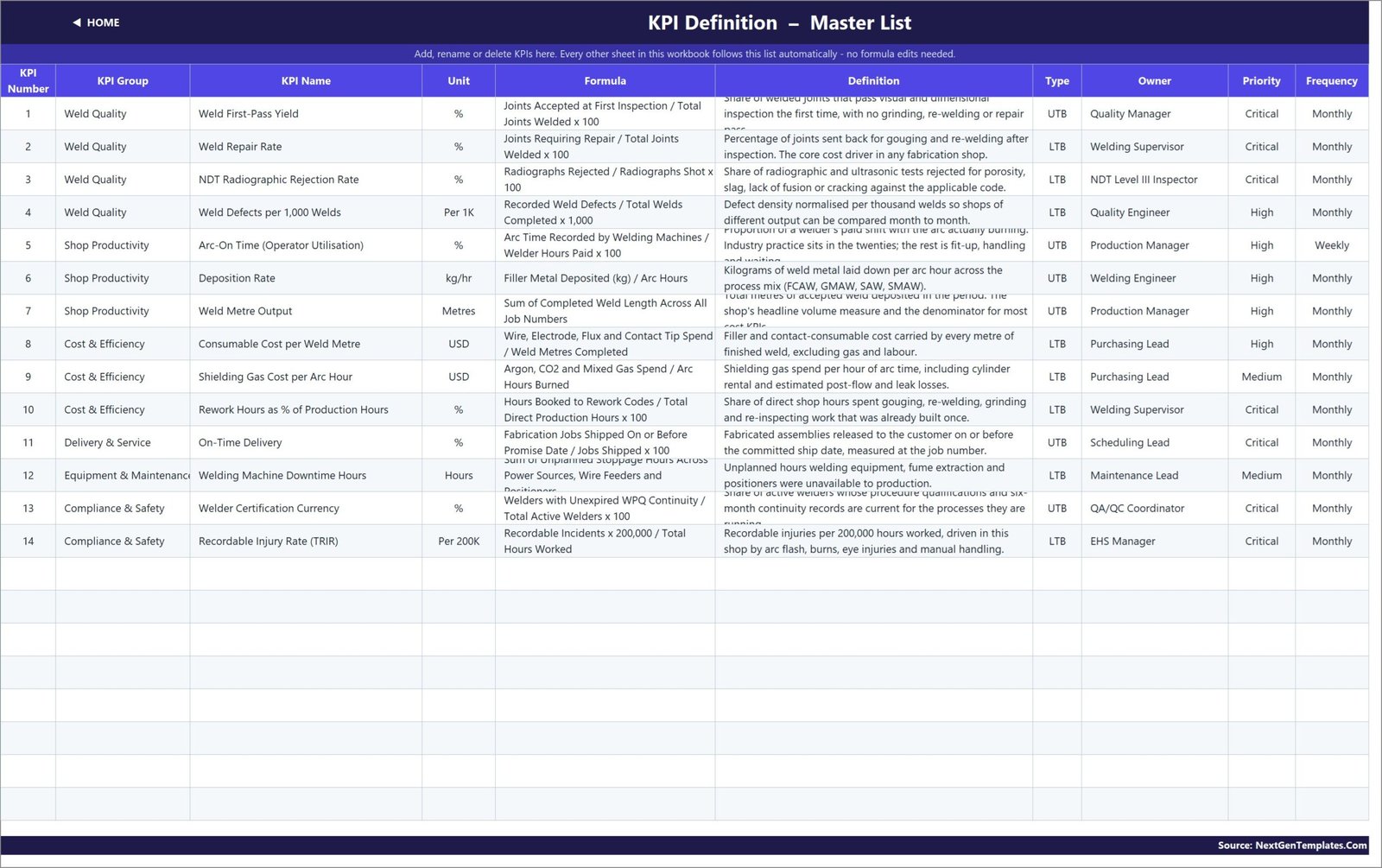
- A master KPI list. KPI Definition carries the group, unit, calculation formula, plain-English definition, UTB/LTB type, owner, priority and frequency for every KPI. Rename a KPI there and every other sheet follows. The workbook is wired for 22 KPI rows with 14 filled in.
Dashboard Pages Explanation
KPI Dashboard – the scorecard
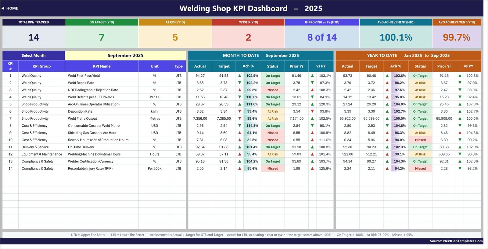
One row per KPI, split into a Month-to-Date block and a Year-to-Date block. Each block shows actual, target, achievement percentage, status and prior year, plus an arrow for the year-on-year direction. In the shipped sample year, September 2025 reads 14 KPIs tracked, 7 On Target, 5 At Risk, 2 Missed, 8 of 14 improving against the prior year, 100.1 percent average achievement MTD and 99.7 percent YTD.
The KPIs themselves, exactly as they ship:
- Weld Quality – Weld First-Pass Yield (%, UTB), Weld Repair Rate (%, LTB), NDT Radiographic Rejection Rate (%, LTB), Weld Defects per 1,000 Welds (Per 1K, LTB)
- Shop Productivity – Arc-On Time / Operator Utilisation (%, UTB), Deposition Rate (kg/hr, UTB), Weld Metre Output (Metres, UTB)
- Cost & Efficiency – Consumable Cost per Weld Metre (USD, LTB), Shielding Gas Cost per Arc Hour (USD, LTB), Rework Hours as % of Production Hours (%, LTB)
- Delivery & Service – On-Time Delivery (%, UTB)
- Equipment & Maintenance – Welding Machine Downtime Hours (Hours, LTB)
- Compliance & Safety – Welder Certification Currency (%, UTB), Recordable Injury Rate / TRIR (Per 200K, LTB)
KPI Trend – one KPI, twelve months
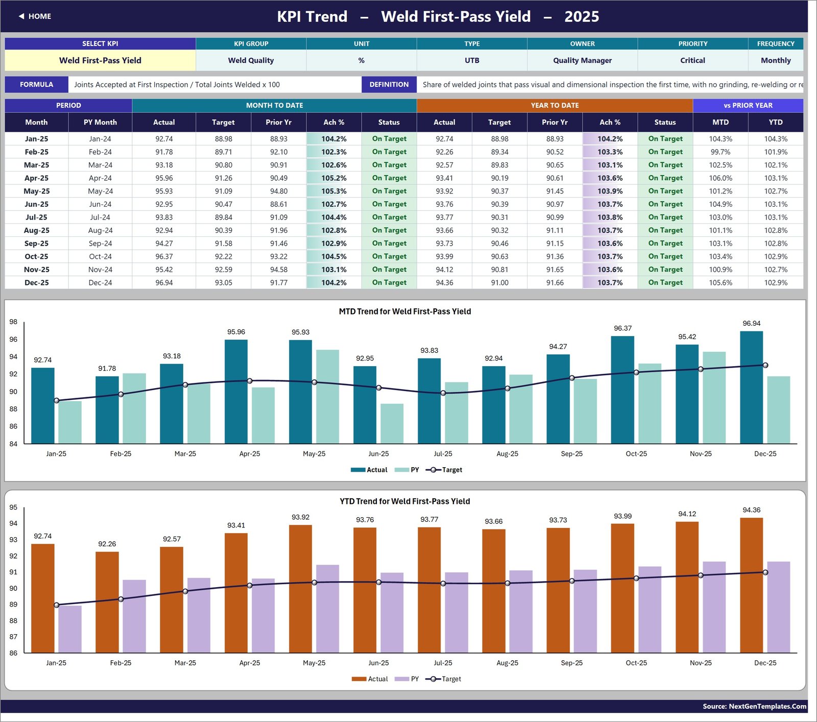
Pick any KPI in cell B4 and the page rebuilds: the attribute strip (group, unit, type, owner, priority, frequency), the calculation formula and the definition text, a twelve-month table of MTD and YTD actual, target, prior year, achievement and status, and two combo charts – actual and prior-year columns against a target line, one for MTD and one for YTD.
KPI Analysis – groups, and the two ends of the list
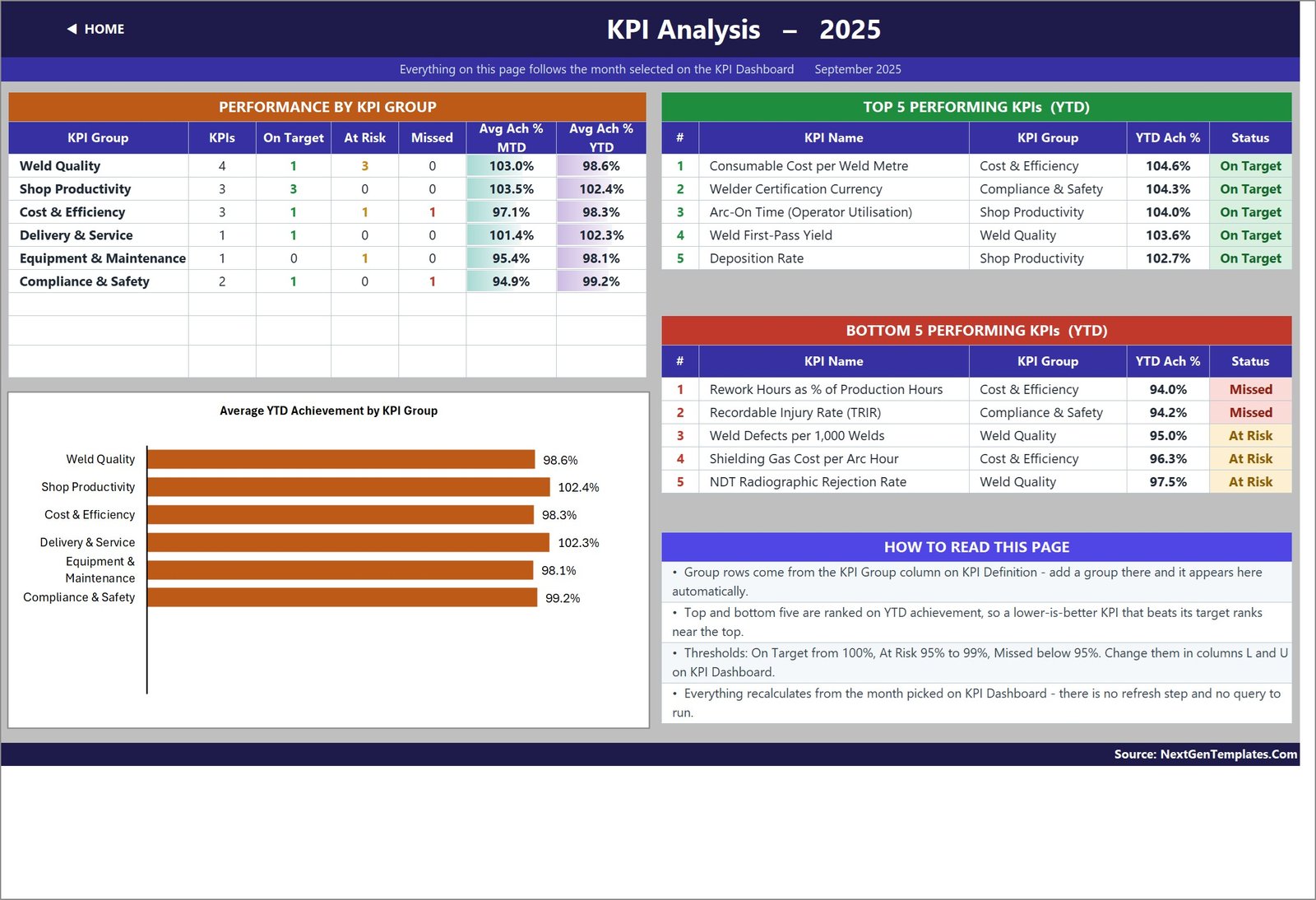
Achievement rolled up by KPI group with counts of On Target, At Risk and Missed, a bar chart of average YTD achievement per group, and ranked Top 5 and Bottom 5 performers for the year to date. Because the ranking uses direction-aware achievement, a lower-is-better KPI that beats its target ranks near the top rather than the bottom.
Three input sheets and a definition sheet
KPI Input – Actual, KPI Input – Target and KPI Input – PY are the only sheets you normally type into. Each holds an MTD and a YTD column for every month, and their KPI rows are driven by KPI Definition so the three sheets can never fall out of step. A hidden Support sheet holds the helper calculations, and Read Me documents the whole wiring in one page.
Welding Shop KPI Dashboard in Excel vs. Google Sheets vs. Paid Manufacturing Analytics
| This Excel dashboard | Google Sheets KPI scorecard | Paid MES / analytics suite | |
|---|---|---|---|
| Cost | 19.99 one time (12.99 on sale) | Similar one-time template price | Roughly 40-150 per user per month |
| Platform | Excel 2013+ and Excel for the web | Browser, Google account required | Vendor cloud plus shop-floor agents |
| Setup time | Under an hour – type over the sample year | Under an hour | Weeks of data collection and mapping |
| Real-time team collaboration | Through OneDrive or SharePoint co-authoring | Yes, native | Yes |
| Mobile access | Excel mobile app, read-first | Yes, browser and app | Yes, dedicated app |
| Customizable KPI names and units | Yes – one master list, no formula edits | Yes | Configurable, often billable |
| Share with link | Via OneDrive or SharePoint | Yes, native | Yes |
| Year-1 cost at 5 users | 19.99 total | Roughly the same | 2,400 – 9,000 |
| UTB / LTB direction-aware scoring | Built in per KPI | Built in per KPI | Usually configurable |
| Reads welders, NDT or ERP automatically | No – figures are typed monthly | No | Yes |
Who Should Use This Template
It suits a fabrication, structural steel or pipe-spool shop that already produces monthly numbers and needs them governed rather than gathered. A welding supervisor who has to explain repair rate and rework hours at a monthly review. A QA/QC coordinator who wants first-pass yield, NDT rejection rate and defects per 1,000 welds on one page instead of three printouts. A production manager tracking arc-on time, deposition rate and weld metre output. And an owner-operator of a small job shop who will never buy an MES but still wants to know which four things to fix next month.
It is not the right tool if you want figures pulled automatically from welding power sources or an NDT database, if you need job-level or weld-level detail (there is one row per KPI per month, not one per joint), or if you are looking for a safety or quality management system. Welder Certification Currency and TRIR are reported here as management metrics; the workbook records what you type and is not a system of record for WPS, WPQ or continuity documentation, and it makes no AWS, ASME, ISO or OSHA compliance claim.
Real-World Use Cases
The monthly quality review. A QA/QC coordinator types the four Weld Quality figures, picks the month, and walks in with one page: how many of the four are green, how each moved against the same month last year, and where they sit in the Top 5 / Bottom 5 ranking.
The cost conversation. Consumable cost per weld metre and shielding gas cost per arc hour are both lower-is-better, so a month where both fall below target shows as green with achievement above 100 percent. No one has to explain, again, why a smaller number is good news.
The improvement programme. Rework hours as a percentage of production hours is tagged Critical and owned by the welding supervisor. Watching it on the KPI Trend page across twelve months, against target and against last year, is a far better argument for a fit-up jig than a single month’s figure.
Advantages of the Welding Shop KPI Dashboard in Excel
- Nothing to install and nothing to refresh. Because every value is a worksheet formula, the file behaves the same on a shop-floor laptop, a locked-down corporate desktop and Excel for the web. If you want to see how the wiring works, the formulas use standard functions documented by Microsoft, including VLOOKUP.
- Extendable without formula surgery. Eight spare KPI rows are already live and empty; adding a fifteenth KPI is typing, not editing.
- Accountability is built into the data. Every KPI carries a named owner, a priority and a reporting frequency, so the scorecard says who is answerable, not just what the number is.
- A complete worked example. The sample year exercises every status band – the shipped September has On Target, At Risk and Missed KPIs in both the MTD and YTD blocks – so you can see the logic working before you replace a single figure.
Opportunities for Improvement
Three things are worth knowing before you buy, and none of them is hidden in the file.
YTD is typed, not derived. Both MTD and YTD columns are entered by you on all three input sheets. That is a deliberate design choice – it lets you define YTD however your business defines it, as a running average for rates and a cumulative total for volumes, which is exactly what the sample does – but it does mean the workbook will not recalculate YTD if you only update MTD.
The Frequency column is documentation, not a switch. Arc-On Time is labelled Weekly on KPI Definition because that is how most shops watch it, but the input grid is monthly for all 14 KPIs.
Two cosmetic points on the reference pages. On KPI Definition a few of the longer Definition and Formula cells clip at the printed row height, and the Read Me sheet’s “Cumulative or average YTD” row still uses examples from another industry (“aircraft deliveries, non-conformance reports”) rather than welding ones. Neither affects a single calculation – widening a row or editing that text takes seconds.
Best Practices
- Set cell E3 on ‘KPI Input – Actual’ to your own first reporting month before you type anything – every sheet title, the month dropdown and the prior-year sheet re-base from it.
- Edit ‘KPI Definition’ first, then the input sheets. Renaming a KPI after you have typed a year of numbers still works, but doing it first saves a re-read.
- Be deliberate about UTB and LTB. It is the one setting that changes whether a good month looks good, and it is the single most common thing people get wrong when they add their own KPI.
- Decide your YTD convention once – averages for rates and per-unit costs, cumulative totals for volumes and hours – and apply it consistently across all three input sheets.
- Adjust the status thresholds in columns L and U to match the bands your management review already uses, rather than changing the review to match the template.
- Keep the sample year in a copy of the file. It is the fastest way to check a formula still behaves after you have edited something.
Explore Relevant Templates
A Welding Shop KPI Dashboard in Power BI – the same KPI concept rebuilt as a .pbix report – is in preparation as the cross-platform sibling of this workbook and will be linked here once it is published.
If your shop reports on trades as well as fabrication, the same scorecard line covers the Masonry Contractor KPI Dashboard in Excel, the Roofing Contractor KPI Dashboard in Excel, the Flooring Installation KPI Dashboard in Excel and, for heavy fabrication, the Shipbuilding KPI Dashboard in Excel. There is also a lighter Welding Shop KPI Scorecard in Excel – a different build with a different KPI set and no dedicated trend and analysis pages. To capture the shop-floor detail that feeds these KPIs, pair the dashboard with the Job Work Order Data Entry System in Excel or the Scrap Record Data Entry System in Excel.
Frequently Asked Questions
Is this the KPI scorecard dashboard or an analytical Excel dashboard?
It is the KPI scorecard style: a month picker, traffic lights, a KPI Trend page and a KPI Analysis page, built on typed monthly figures. It is not the pivot-and-slicer analytical dashboard line, which works off a transaction table.
Do I need macros or Power Query?
No. There is no VBA, no query, no Power Pivot model and no add-in. Every number is a plain worksheet formula, which is why the file also opens in Excel for the web.
Can I add my own welding KPIs?
Yes. The sheets are wired for 22 KPI rows and 14 are filled, so eight more need only typing on KPI Definition. To go past 22, fill down the last data row on each sheet and widen the summary-card ranges on KPI Dashboard row 4 and the helper columns on Support.
Are the sample figures real welding industry benchmarks?
No. The 2025 sample year is fictional demonstration data designed to exercise every formula and every status band. Replace it with your own numbers before reporting anything.
Which Excel versions does it work in?
Excel 2013 and later on Windows and Mac, and Excel for the web. No add-ins are required.
Can I change the currency or the units?
Yes. The Unit column on KPI Definition is free text and the input sheets use ordinary Excel number formats, so USD, metres and kg/hr can all be swapped for your own.
About the Author
Built by PK – Microsoft Certified Professional with 15+ years of Excel, Google Sheets, and Power BI experience. Founder of NextGenTemplates, reaching 300K+ subscribers across YouTube channels. Every template is hand-built and tested before release.
Conclusion
A welding shop does not usually need more data. It needs the fourteen numbers that matter, scored in the right direction, against a target, next to last year, on one page that a supervisor can hand to a production manager without a covering explanation. That is what the Welding Shop KPI Dashboard in Excel does – in a plain formula-driven workbook with no macros, no query and no add-in, shipped with a full sample year so you can see it working before you type a single figure.
Get the Welding Shop KPI Dashboard in Excel on NextGenTemplates – instant download, one-time payment, lifetime access to the file, user manual included.
For Excel dashboard walkthroughs and template tutorials, subscribe to youtube.com/@PKAnExcelExpert.