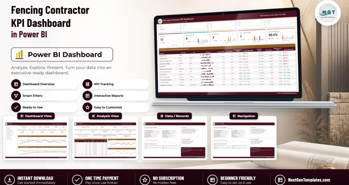
Most fencing contractors already know their revenue. What they usually cannot say, in one glance, is whether the month was good – whether the crews hit the linear feet they should have, whether waste crept up, whether the gate callbacks that ate last Tuesday were an outlier or a trend. The Fencing Contractor KPI Dashboard in Power BI is a finished answer to that question: twelve fencing KPIs, each scored against its own target, month to date and year to date, with a traffic light on both.
This post walks every page of the file, names every KPI, and is honest about what the report does not do. The sample data shipped inside it runs to December 2025, compared month-on-month against November 2025, with a full 2024 behind it for prior-year lines.Fencing Contractor KPI Dashboard in Power BI
Which of the three fencing templates is this?
NextGenTemplates ships three families with deliberately similar fencing names, and it is worth two sentences to place this one before you read on. Fencing Contractor KPI Dashboard in Power BI
- KPI Dashboard (this one) – a month picker, a target-versus-actual scorecard, three-state traffic lights, a KPI Trend page and a KPI Definition page. Available in Power BI, and separately in Excel.
- KPI Scorecard – a lighter, single-file build with its own shorter KPI list. Already live for fencing in Excel and Google Sheets.
- Dashboard – the analytical line, which slices revenue and volume by crew, region or fence type rather than scoring KPIs against target.
They are complements, not substitutes. If you already own the fencing Scorecard, this Dashboard adds the prior-year comparison, the per-KPI definition page and the slicer set that the Scorecard does not have.
The 12 KPIs, and who owns them
Nothing in this report is a generic “construction” metric bolted onto a fence business. Every KPI was written for fencing work – post setting, panel runs, gate hardware, 811 locates – and every one carries a group, a unit, a formula, a written definition, an owner and a priority.
| KPI | Group | Unit | Direction | Owner | Priority |
|---|---|---|---|---|---|
| Installed Feet per Crew-Day | Production | LF/Crew-Day | Higher is better | Field Operations | Critical |
| Linear Feet Installed | Production | LF | Higher is better | Field Operations | High |
| Bid Win Rate % | Sales | % | Higher is better | Estimating | Critical |
| Average Job Value | Sales | USD/Job | Higher is better | Estimating | Medium |
| Estimate to Install Lead Time | Scheduling | Days | Lower is better | Scheduling | High |
| Gross Margin % | Financial | % | Higher is better | Finance | Critical |
| Material Waste % | Materials | % | Lower is better | Purchasing | High |
| Post-Set Cost per Post | Materials | USD/Post | Lower is better | Purchasing | Medium |
| Utility Locate Turnaround | Compliance | Days | Lower is better | Permitting & Compliance | Medium |
| Gate & Latch Callback Count | Quality | Count | Lower is better | Warranty Service | High |
| Days Sales Outstanding | Financial | Days | Lower is better | Finance | Critical |
| Jobsite Safety Audit Score | Safety | Index | Higher is better | Safety (EHS) | High |
That is eight KPI groups – Production, Sales, Scheduling, Financial, Materials, Compliance, Quality and Safety – and eight named owners, at Critical (4 KPIs), High (5) or Medium (3). The owner column is not decoration: it is a slicer, so a purchasing lead can pull the scorecard down to the two numbers they are accountable for and ignore the rest.
Why direction matters more than it sounds
Six of the twelve KPIs are higher-is-better (UTB) and six are lower-is-better (LTB). The report scores them differently, and this is the single most common thing homemade KPI packs get wrong.
- Higher is better: Achievement % = Actual / Target.
- Lower is better: Achievement % = Target / Actual.
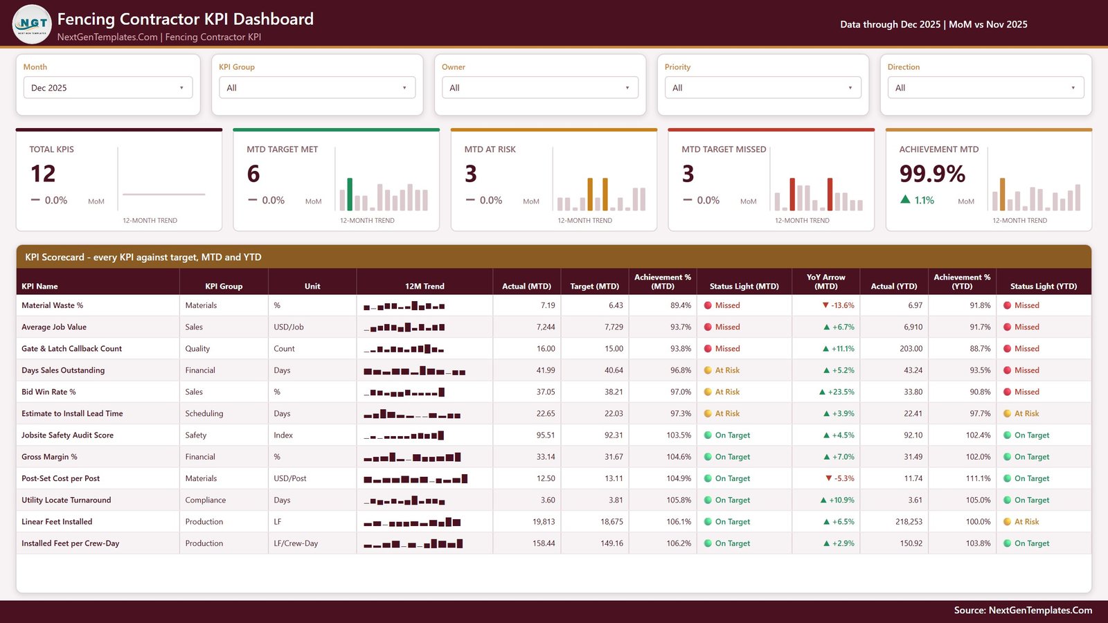
So in the shipped December sample, Post-Set Cost per Post came in at $12.50 against a $13.11 target and scores 104.9% – On Target. Purchasing beat the cost, and the number reads as a win rather than as the 95.3% shortfall a naive Actual / Target formula would have printed. The same logic turns Utility Locate Turnaround (3.60 days against a 3.81-day target) into 105.8%, and it is why Material Waste % at 7.19% against a 6.43% target reads as 89.4% – Missed, the worst score in the month.
Traffic lights are three-state and identical on both horizons: On Target at 100% or more, At Risk from 95% up to 100%, Missed below 95%.Fencing Contractor KPI Dashboard in Power BI
Page 1 – KPI Scorecard
The landing page. Five slicers run across the top – Month, KPI Group, Owner, Priority and Direction – and under them five summary cards, each with its own twelve-month trend bars and a month-on-month delta:
- Total KPIs – 12
- MTD Target Met – 6
- MTD At Risk – 3
- MTD Target Missed – 3
- Achievement MTD – 99.9%, up 1.1% on November
Below that sits the scorecard table itself, twelve columns wide: KPI Name, KPI Group, Unit, a 12-month sparkline, Actual (MTD), Target (MTD), Achievement % (MTD), Status Light (MTD), YoY Arrow (MTD), Actual (YTD), Achievement % (YTD) and Status Light (YTD). Rows sort by achievement, worst first, so the conversation starts where it should.
The two-horizon layout is the point. In the December sample, Bid Win Rate % reads At Risk at 97.0% for the month but Missed at 90.8% for the year – a KPI that looks recoverable this month and is not, for the year. Days Sales Outstanding does the same thing: 96.8% At Risk in December, 93.5% Missed year to date. A single-horizon scorecard hides both.
Page 2 – KPI Trend
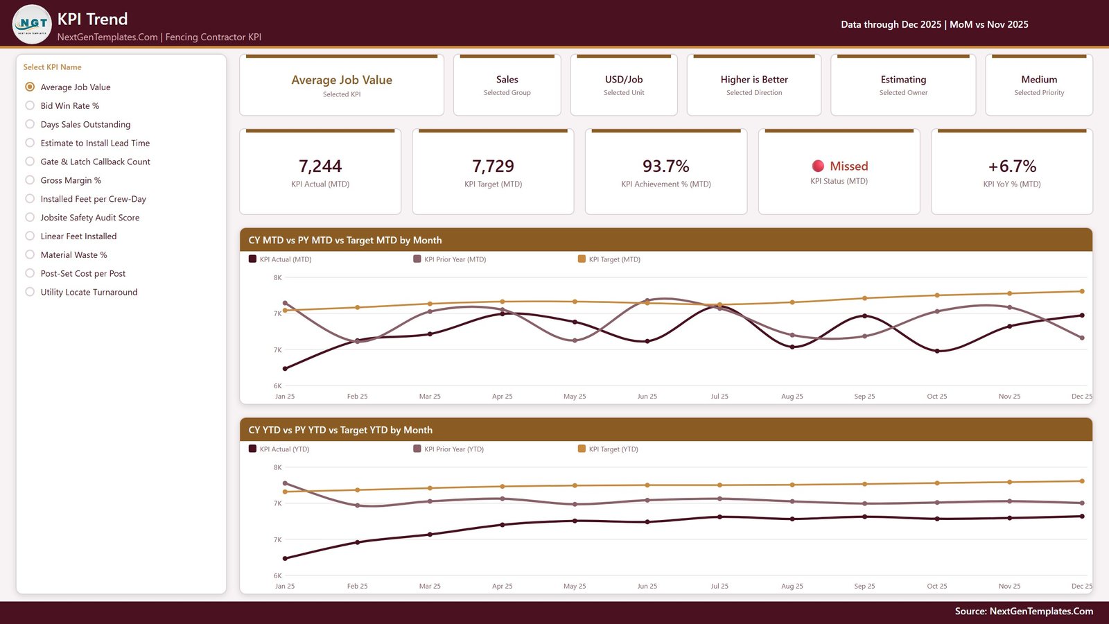
One KPI at a time, twelve months deep. A “Select KPI Name” list runs down the left. Pick one and the whole page redraws: six context cards name the Selected KPI, Selected Group, Selected Unit, Selected Direction, Selected Owner and Selected Priority, then five value cards give KPI Actual (MTD), KPI Target (MTD), KPI Achievement % (MTD), KPI Status (MTD) and KPI YoY % (MTD).
Under those sit the two charts that make the page worth having:
- CY MTD vs PY MTD vs Target MTD by Month – three lines, this year, last year and target, month by month.
- CY YTD vs PY YTD vs Target YTD by Month – the same three lines on a cumulative basis.
The prior-year line is real. The data pack carries 288 rows of actuals – twelve KPIs across twenty-four months, 2024 as well as 2025 – so every PY line and every YoY arrow comes from typed history rather than an estimate or a shifted copy of this year.
Page 3 – KPI Definition
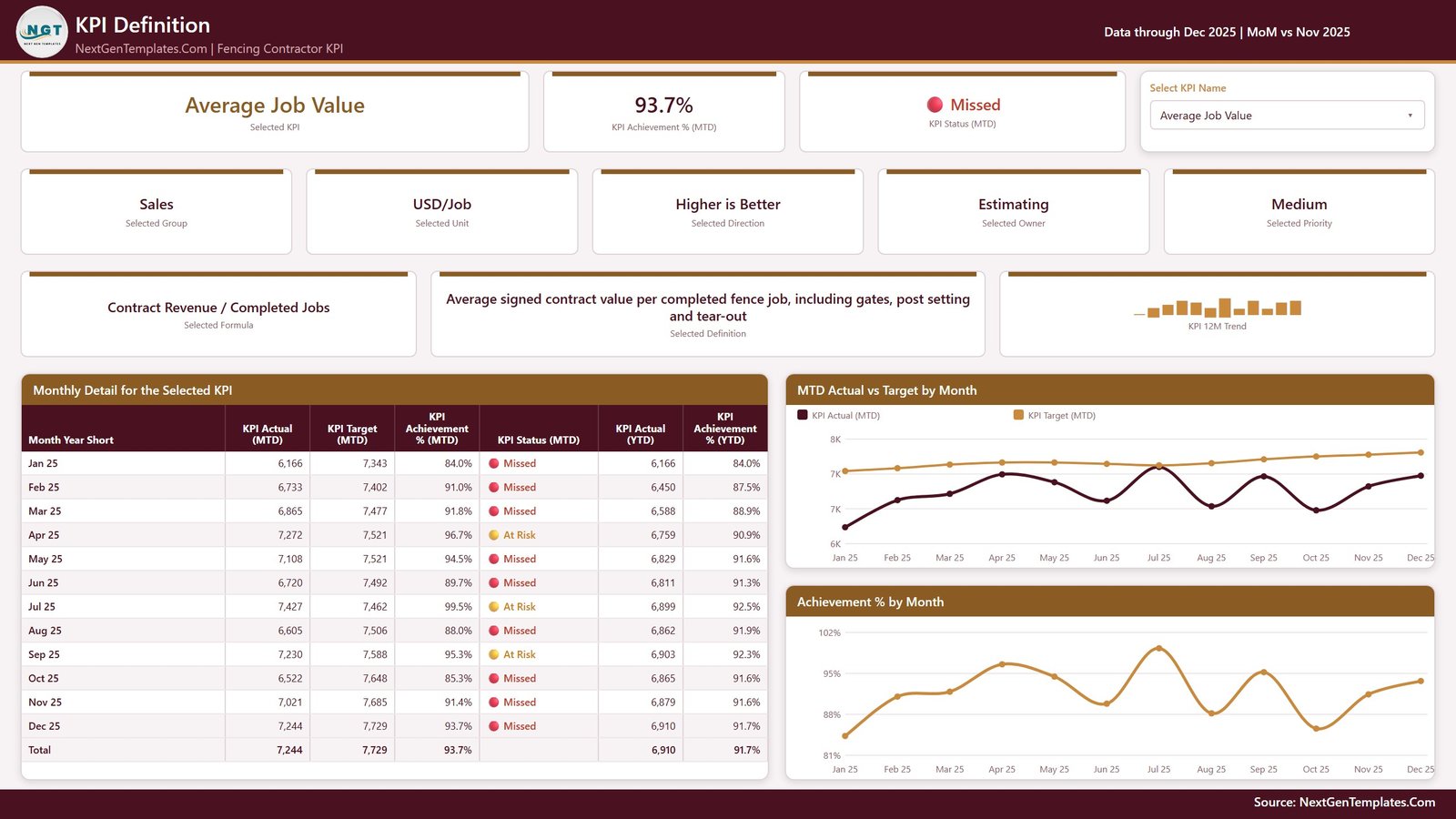
This is the page most KPI packs skip, and it is the one that stops arguments. The same KPI selector appears here as a dropdown, synced with the KPI Trend page, so whichever KPI you picked is already applied when you switch tabs.
Pick Average Job Value and the page shows its formula – Contract Revenue / Completed Jobs – alongside the written definition: “Average signed contract value per completed fence job, including gates, post setting and tear-out.” Beside them sit the achievement, the status and a twelve-month trend for that KPI alone.
Under that: a Monthly Detail for the Selected KPI table covering all twelve months plus a total row (Actual MTD, Target MTD, Achievement % MTD, Status MTD, Actual YTD, Achievement % YTD), an MTD Actual vs Target by Month chart and an Achievement % by Month chart. For Average Job Value the monthly table runs from 6,166 against a 7,343 target in January (84.0%) to 7,244 against 7,729 in December (93.7%) – a year that improved steadily and still never caught the target.
Page 4 – Get More Templates
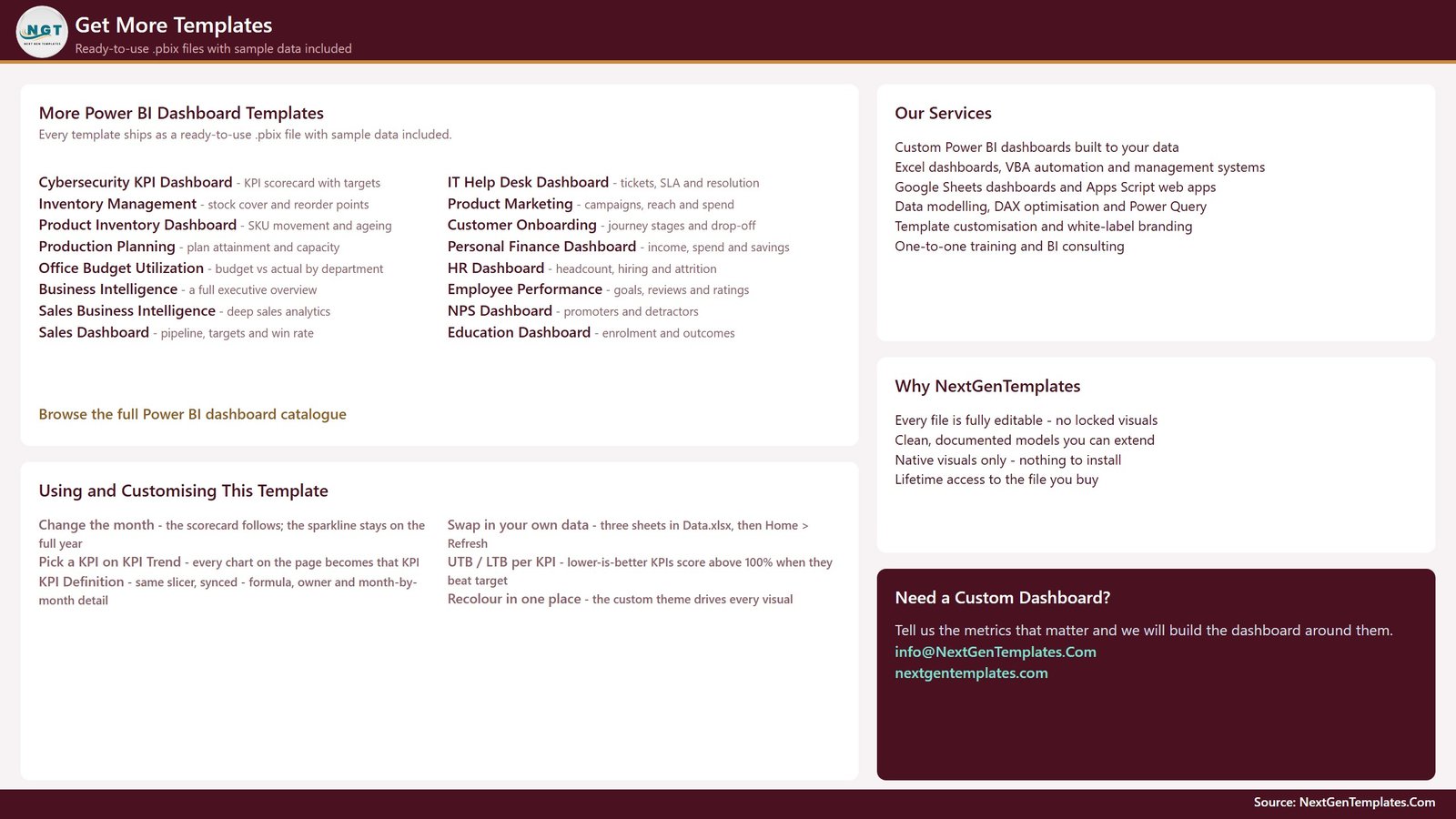
A short catalogue and customisation page: other Power BI templates, the services list, and a “Using and Customising This Template” panel covering the four things people ask first – change the month, pick a KPI on KPI Trend, swap in your own data, and recolour in one place because a single custom theme file drives every visual.
Behind the four visible pages sit two hidden tooltip pages, KPI Detail and Trend Detail, both 280×360. They surface on hover and never appear in the page tabs.
The data pack, and what actually drives the report
Everything you see comes out of one workbook, Data.xlsx, with four sheets:
- Read Me – the model explained, including the rule that trips up most homemade packs: a rate, ratio or index YTD is the average of the months so far, never a sum. A compliance percentage that adds up to 1,900% by December makes every YTD chart useless.
- KPI Definition – 12 rows, one per KPI: group, unit, formula, definition, UTB/LTB type, owner, priority.
- Input_ Target – 144 rows: 12 KPIs by 12 months, MTD and YTD.
- Input_ Actual – 288 rows, because it carries 2024 as well as 2025.
The KPI name is the join key across all three sheets. Nothing in the report hard-codes a KPI: add a row, delete a row, or rename a KPI in all three sheets, press Home > Refresh, and the counts, the scorecard, the selector lists and every chart follow. The model itself is one imported table plus a Date table generated in Power Query, and every figure on screen is a DAX measure rather than a stored column. Native Power BI visuals only – nothing from AppSource, nothing to install.
What it does not do
Worth being blunt, because it saves refund requests.
- No live connection. There is no API, no gateway, no scheduled refresh and no connector to QuickBooks, Xero, Sage, ServiceTitan, Jobber, Housecall Pro or Procore. You type actuals into the workbook and refresh.
- No drill-through. There is no right-click drill-through page. The KPI Definition page is reached from the page tabs, with its selector synced to KPI Trend.
- No per-job detail. This is a company-level monthly scorecard by design. Individual jobs, crews and properties are not dimensions in the model.
- It does not file 811 tickets. Utility Locate Turnaround is a number you supply. The report does not submit dig tickets, talk to any state one-call centre, store ticket numbers or act as a damage-prevention system.
- It is not a safety management system. Jobsite Safety Audit Score is your own audit result, typed in. No OSHA recordkeeping, no toolbox-talk tracking, no training records.
- The targets are sample data. All twelve of them. There is no benchmark set and no industry average behind any number in the file. Replace them before anyone treats a traffic light as meaningful.Fencing Contractor KPI Dashboard in Power BI
Getting it running
- Unzip all three files – the
.pbix,Data.xlsxand the user manual PDF – into one folder and keep them together. - Open the
.pbixin Power BI Desktop, free from Microsoft, Windows only. The December 2025 sample is already loaded, so look around first. - Repoint the query: Home > Transform data > Data source settings > Change Source, aimed at your copy of
Data.xlsx. The saved path is the folder the file was built in. - Put your own KPIs on KPI Definition, your monthly targets on Input_ Target, and your actuals – this year and last – on Input_ Actual.
- Home > Refresh. Everything rebuilds around whatever KPIs now exist. Fencing Contractor KPI Dashboard in Power BI
More on this blog: Fencing Contractor KPI Scorecard in Excel, HVAC Contractor KPI Dashboard in Excel and Drywall Contractor KPI Dashboard in Excel.
Frequently asked questions
Do I need a paid Power BI licence?
No. Power BI Desktop is free from Microsoft and opens, edits and refreshes the file. It is Windows-only. A Pro or Premium seat is needed only if you want to publish to the Power BI Service and share the report with colleagues. Fencing Contractor KPI Dashboard in Power BI
Can I change the KPI list?
Yes – that is how the build is designed. Add, delete or rename KPIs across the three sheets and refresh. The summary cards, the scorecard, both KPI selectors and every chart follow. Fencing Contractor KPI Dashboard in Power BI
Is there an Excel version?
Yes, and it is a genuinely different build rather than the same file exported twice. The Fencing Contractor KPI Dashboard in Excel tracks 14 KPIs across 6 groups, driven by two dropdowns, adds a KPI Analysis page with group roll-ups and a top and bottom five, is wired for up to 22 KPIs, and ships a September 2025 sample. This Power BI edition tracks 12 KPIs across 8 groups with five slicers, a sparkline in every scorecard row, month-on-month deltas on the cards, a KPI Definition page and two years of actuals. Only two KPI names – Linear Feet Installed and Days Sales Outstanding – appear verbatim in both. Fencing Contractor KPI Dashboard in Power BI
Why is my lower-is-better KPI showing above 100%?
Because it beat its target. Lower-is-better KPIs score Target / Actual, so a waste rate, callback count or DSO figure that lands under target scores above 100% and lights green. That is the intended behaviour, not a formula error.
What is in the download?
One ZIP holding the .pbix report, Data.xlsx and a Power BI Dashboard user manual PDF. One payment, lifetime access to the file.Fencing Contractor KPI Dashboard in Power BI
Where to get it
The Fencing Contractor KPI Dashboard in Power BI is $12.99 (regular $19.99) – a one-time payment, instant download, no subscription.
Related templates on the same build: Drywall Contractor KPI Dashboard in Power BI, Masonry Contractor KPI Dashboard in Power BI, Painting Contractor KPI Dashboard in Power BI and Flooring Installation KPI Dashboard in Power BI. For the same trade in a lighter build, see the Fencing Contractor KPI Scorecard in Excel or in Google Sheets.