The Business Transformation Dashboard in Power BI is a finished .pbix report with 5 interactive pages, 47 DAX measures, 23 KPI cards and 5 synced slicers on every page. It sits on a single 24-column initiative table, ships with 500 rows of sample data, and adds a hidden drillthrough page plus two custom tooltip pages – nine pages in the file altogether.
If you run a transformation office, a programme or a PMO, the reporting problem is rarely the analysis. It is that the initiative register lives in a spreadsheet and the monthly pack gets rebuilt by hand. This template takes that register as its only input and turns it into budget, delivery, value, adoption and risk views that refresh in one click.
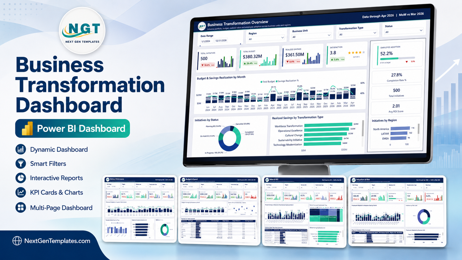
A note on the numbers you are about to see. Every figure in the screenshots below comes from the sample dataset that ships with the file – 500 invented rows created only to fill the visuals. They are demo data. They are not benchmarks, industry averages, survey findings or results you should expect. Replace them with your own.
Key Features of the Business Transformation Dashboard in Power BI
- 47 DAX measures already written. Totals like Total Budget, Total Actual Spend, Total Realized Savings, Total Expected Savings, Total Milestones Completed, Total Employees Impacted and Total Employees Adopted, plus ratios such as Budget Utilization %, Savings Realization %, Milestone Completion %, Adoption Rate %, Completion Rate %, Cancellation Rate % and High Risk %.
- 23 KPI cards, each with a sparkline and a month-on-month delta. A card shows the current value, a small bar sparkline of recent months, and an arrow with the percentage change against the previous month.
- Five slicers per page, synced across the report. Date range, Region, Business Unit and Transformation Type are on all five pages; each page adds one of its own – Status, Phase, Priority, Executive Sponsor or Risk Level.
- A hidden Details drillthrough page bound to nine fields, with an initiative-level table, six summary cards and a back button.
- Two custom tooltip pages at 280×360, so hovering a visual shows a mini bar chart and three figures instead of a single grey number.
- Two matrix scorecards with in-cell data bars – one by Business Unit, one by Region – and a third by Transformation Type, each with a totals row.
- A 24-column, 500-row sample source file so you can see exactly which columns the model expects before you swap in your own.
Dashboard Pages Explanation
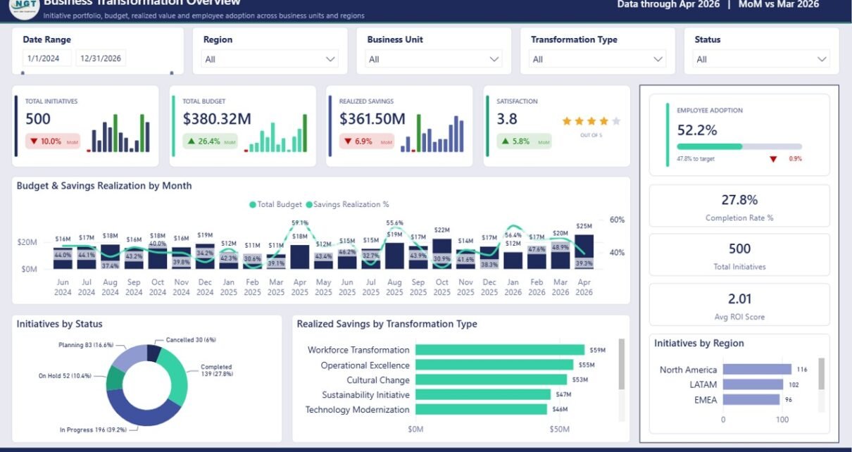
Page 1: Business Transformation Overview
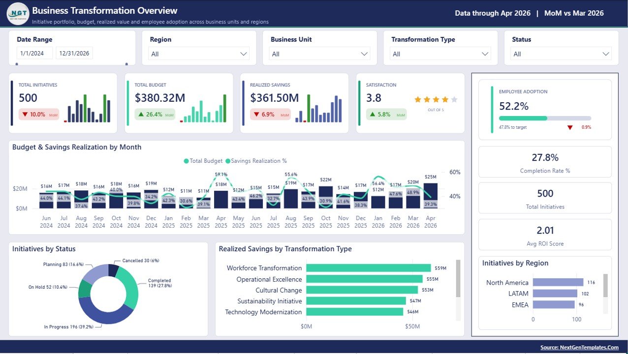
The landing page holds eight tiles: Total Initiatives, Total Budget, Realized Savings, a Satisfaction score out of 5 rendered as stars, an Employee Adoption progress bar against target, Completion Rate %, Total Initiatives and Avg ROI Score. The charts are Budget & Savings Realization by Month, Initiatives by Status, Realized Savings by Transformation Type and Initiatives by Region.
Page 2: Delivery Performance
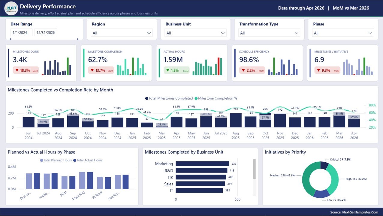
Five cards cover Milestones Done, Milestone Completion %, Actual Hours, Schedule Efficiency % and Milestones per Initiative. Charts are Milestones Completed vs Completion Rate by Month, Planned vs Actual Hours by Phase, Milestones Completed by Business Unit and Initiatives by Priority.
Page 3: Budget & Spend
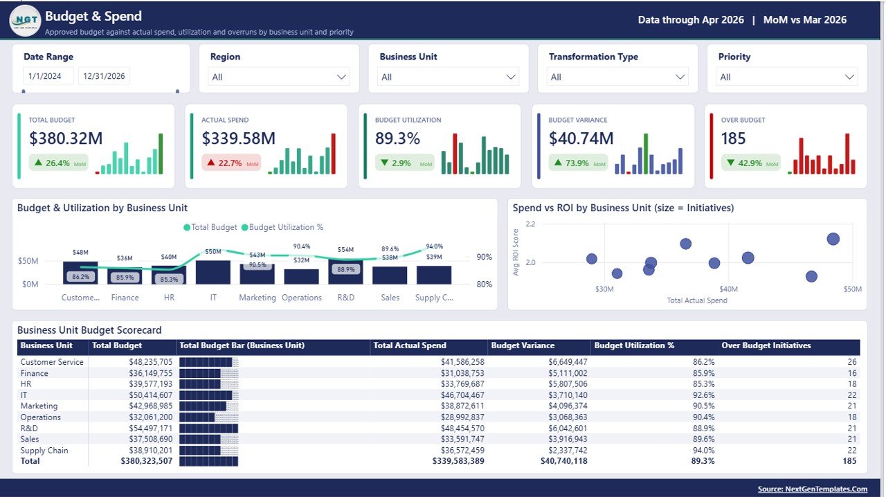
Cards show Total Budget, Actual Spend, Budget Utilization %, Budget Variance and a count of Over Budget initiatives. Below them sit Budget & Utilization by Business Unit, Spend vs ROI by Business Unit – a scatter where bubble size is the number of initiatives – and a Business Unit Budget Scorecard matrix with data bars and a totals row.
Page 4: Value & ROI
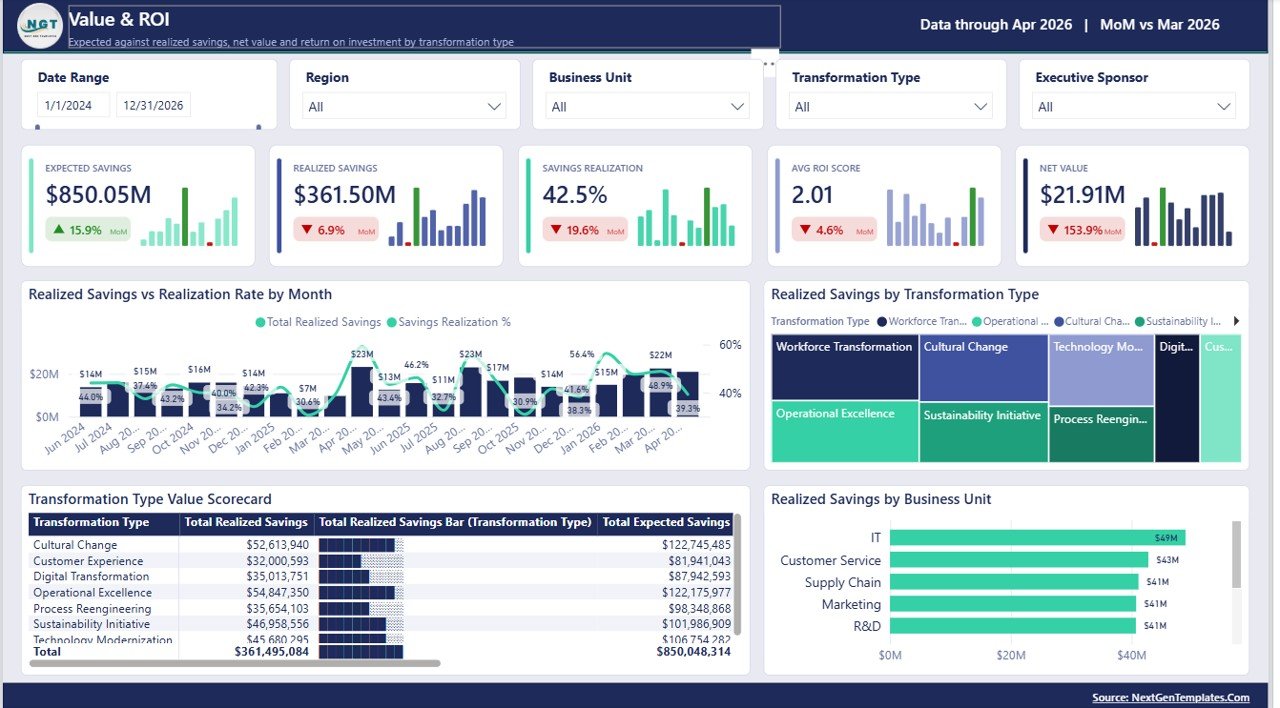
Cards cover Expected Savings, Realized Savings, Savings Realization %, Avg ROI Score and Net Value. Visuals are Realized Savings vs Realization Rate by Month, Realized Savings by Transformation Type as a treemap, a Transformation Type Value Scorecard matrix and Realized Savings by Business Unit.
Page 5: Adoption & Risk
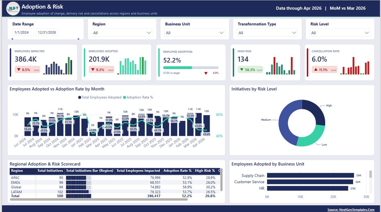
Cards show Employees Impacted, Employees Adopted, Employee Adoption % against a target bar, a High Risk initiative count and Cancellation Rate %. Charts are Employees Adopted vs Adoption Rate by Month, Initiatives by Risk Level, a Regional Adoption & Risk Scorecard matrix and Employees Adopted by Business Unit.
The three hidden pages
Beyond the five report pages and a “Get More Dashboards” page, the file contains a hidden Details page and two hidden tooltip pages. Right-click any bar, slice or matrix row and choose Drillthrough to reach Details, which is filtered by whichever of the nine bound fields you came from. Microsoft documents how this works in its Power BI drillthrough guide if you want to add fields of your own.
Business Transformation Dashboard in Power BI vs. Tableau / Qlik vs. Planview or Smartsheet – Feature Comparison
| Feature | Business Transformation Dashboard in Power BI | Tableau / Qlik build | Planview / Clarity PPM / Smartsheet |
|---|---|---|---|
| Cost | $17.99 one-time | $70-115 / user / month plus build time | $25-200 / user / month |
| Platform | Power BI Desktop (free) | Paid desktop plus server licence | Vendor cloud only |
| Setup time | Under 30 minutes | Days to build from scratch | Weeks of configuration |
| Pages ready on day one | 5 report pages + drillthrough | Blank canvas | Fixed vendor screens |
| Measures pre-written | 47 DAX measures | Write your own | Not editable |
| Customisable fields | Fully editable .pbix | Editable | Limited to vendor schema |
| Share with a link | Publish to your own workspace | Server or Cloud licence needed | Built in |
| Data stays on your machine | Yes, runs locally | Depends on deployment | Stored on vendor cloud |
| Year-1 cost at 5 users | $17.99 total | $4,200+ | $1,500-12,000 |
For teams that want a working transformation report this week without signing a per-seat PPM contract, the Business Transformation Dashboard in Power BI sits in the sweet spot.
Who Should Use This Template
Perfect for:
- Transformation office and PMO leads with an initiative register already in Excel
- Programme managers who assemble a monthly steering-committee pack
- Power BI users who would rather start from a finished layout, theme and measure set than a blank canvas
- Consultants delivering a client report on a fixed fee
Not a fit if:
- You expect the file to run or fix a transformation – it reports, nothing more
- You have no initiative-level data yet; the model needs one row per initiative
- You want benchmarks or target values supplied – none are, and the sample figures are invented
- You need task management, resource booking or timesheets
- You are on macOS, where Power BI Desktop is not available
Real-World Use Cases
Priya leads the transformation office at a 900-person insurer. Sixty initiatives sit in one spreadsheet and the board pack was rebuilt by hand every month. She now pastes her register into the sample file, hits Refresh, and exports the Overview and Budget & Spend pages straight into the deck.
Daniel is a programme manager at a manufacturer mid-way through an ERP rollout. He uses Planned vs Actual Hours by Phase to find the phase running hottest, then right-clicks it to drill through to the individual initiatives behind the variance.
Ana is an independent consultant. She bought the template once, re-colours it per client, and delivers a working report in an afternoon rather than quoting three days of Power BI build.
Advantages of the Business Transformation Dashboard in Power BI
- One-time cost. $17.99 replaces a per-seat reporting subscription for this particular job.
- Nothing to configure. The measures, theme, slicer sync, drillthrough and tooltips are already in place, so the first useful output is the first refresh.
- Your data does not move. The report reads a local file and runs in Power BI Desktop; nothing is uploaded anywhere unless you publish it yourself.
- Genuinely editable. No locked model, no custom visuals, no external dependencies – rename pages, recolour the theme, add measures.
- Consistency month to month. The same five pages with the same definitions make a monthly pack comparable rather than freshly invented.
Opportunities for Improvement
Three honest limitations, and two cosmetic defects in the shipped build worth knowing before you buy.
- The page-4 title box has a stray selection outline. In the exported snapshot of the Value & ROI page, the “Value & ROI” title text box renders with a thin border and a resize handle around it – an artefact of how the page was captured. The title text itself is correct and the outline is trivial to clear in Power BI Desktop.
- Two matrix scorecards clip at the default page size. The Transformation Type Value Scorecard on page 4 cuts its last row in half above the totals line, and the Regional Adoption & Risk Scorecard on page 5 hides its right-hand column behind a horizontal scrollbar. Both scroll fine when you interact with them, but they do not fit fully in a static export – widen the visual or shrink the font if you plan to export to PDF.
- The monthly axis labels are cramped. With 23 months on screen the date labels rotate and truncate on some pages. Narrowing the date-range slicer fixes it.
- No target or benchmark data is supplied. The adoption progress bars compare against a value in the sample file, not an industry figure. If you want targets, add a small target table of your own.
- One flat table, no incremental refresh. The model is deliberately simple – a single fact table and a date table. If you need multiple sources, a proper dimension model or scheduled incremental refresh, treat this as a starting point.
Best Practices
- Keep the 24 column headers exactly as supplied while you get your first refresh working; rename them afterwards if you must.
- Load a couple of months of real data before a full history – it is much faster to spot a mis-mapped column.
- Set the date-range slicer to your actual reporting window before exporting, both for readability and for the axis labels.
- Use the drillthrough page in review meetings rather than screenshots; “show me the initiatives behind that bar” answers itself.
- Rename Transformation Type values to your own programme vocabulary early, so the treemap and scorecards read naturally to your audience.
Explore Relevant Templates
For the technology slice of the same portfolio, see the Digital Transformation Dashboard in Power BI, and for the people driving adoption the Change Agents Office Dashboard in Power BI. If you want a lighter monthly traffic-light view instead of a full analytics report, the Business Transformation KPI Dashboard in Power BI is the scorecard version. Automation-led programmes may prefer the Robotics Process Automation Dashboard in Power BI, and leadership pipelines are covered by the Leadership Development Dashboard in Power BI. Our round-up of Power BI dashboard templates ranked by industry is a good place to browse, and the Consultant’s Toolkit bundle packages ten Excel and Power BI reports together.
Frequently Asked Questions
Are the figures in the screenshots real data?
No. Every number in the Business Transformation Dashboard in Power BI screenshots comes from a 500-row sample file built purely to populate the visuals. It is demo data, not a benchmark, average or survey result. Delete it and load your own initiative register.
What software do I need?
Power BI Desktop, free from Microsoft for Windows. The Business Transformation Dashboard in Power BI is a plain .pbix file with no custom visuals, no paid add-ins and no external connectors, so it opens and refreshes offline.
How long does it take to set up?
Under 30 minutes for most buyers. Swap the included Data.xlsx for your own file using the same 24 column headers and click Refresh; the 47 measures, five pages and every slicer keep working untouched.
Can I edit the measures and visuals?
Yes. Nothing in the Business Transformation Dashboard in Power BI is locked. Every DAX measure is visible in the model, the theme is editable, and you can add or remove pages and visuals freely.
How does this compare with Planview or Smartsheet?
Those are per-user PPM platforms that manage work as well as report on it. The Business Transformation Dashboard in Power BI only reports, costs $17.99 once, and keeps your data on your own machine or tenant.
Will this improve my transformation programme?
No, and it makes no such claim. The Business Transformation Dashboard in Power BI is a reporting layer over figures you already collect. It puts budget, milestones, savings, adoption and risk in one place; every decision stays with you.
Is an Excel or Google Sheets version included?
No. This is the Power BI build only, sold as a single .pbix with its sample data and manual. Related dashboards in other tools are listed separately in the catalogue.
About the Author
Built by PK – Microsoft Certified Professional with 15+ years of Excel, Google Sheets and Power BI experience. Founder of NextGenTemplates, reaching 300K+ subscribers across YouTube channels. Every template is hand-built and tested before release.
Conclusion
If your transformation reporting is a monthly rebuild of the same slides, the Business Transformation Dashboard in Power BI removes that work: five pages, 47 measures, a drillthrough and two tooltip pages over the register you already maintain. The sample data is there only to show you the shape of the file – the value starts when your own rows go in.
👉 Click here to Purchase the Business Transformation Dashboard in Power BI
Instant download · One-time payment · No subscription
For step-by-step video walkthroughs, visit Youtube.com/@PK-AnExcelExpert.
Last updated: August 2026