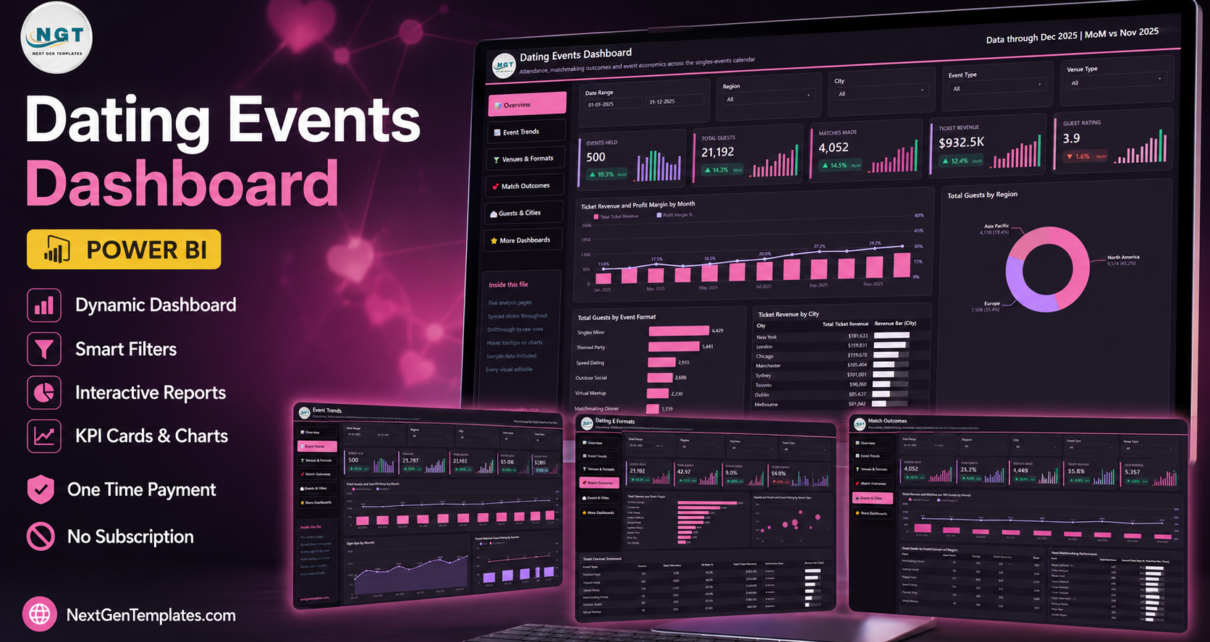
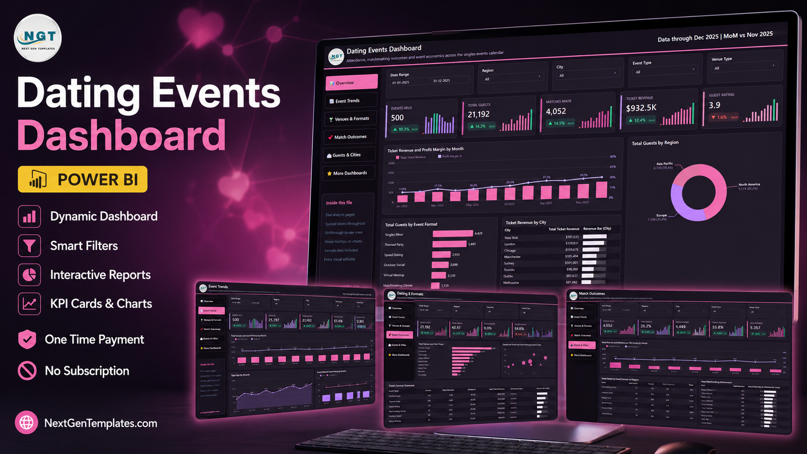
The Dating Events Dashboard in Power BI reports on a calendar of 500 singles events across 9 venue types, 6 event formats, 8 cities and 3 regions, using 35 DAX measures spread over five analysis pages. On the sample data supplied with the file — January to December 2025 — that calendar totals 25,797 sign-ups, 21,192 guests, a 65.0% seat fill rate, 4,052 matches, 1,449 second dates and $932.5K of ticket revenue against $208.2K of net profit.
Most singles-events operators know what they sold and almost nothing else. The ticketing platform reports revenue per event, but it cannot tell you that your rooftop nights fill at a different rate to your fine-dining nights, that one host produces a materially better second-date rate than another, or that a third of your calendar quietly runs under-filled. That gap is what the Dating Events Dashboard in Power BI is built to close — and it closes it as an operations report, on event-level numbers, with no personal data about anybody who attended.
Key Features of the Dating Events Dashboard in Power BI
- Five analysis pages plus four support pages. Overview, Event Trends, Venues & Formats, Match Outcomes and Guests & Cities are the pages you work in. Behind them sit a “Get More Dashboards” page, a hidden Details drillthrough page and two hidden 280×360 tooltip pages.
- 35 DAX measures referenced by the visuals. Attendance, seat fill rate, sold-out rate, guests per event, revenue per guest, revenue per event, ticket revenue, net profit, guest rating, match rate, matches per 100 guests, second-date rate and member conversion.
- Synced slicers on all five pages. Date Range, Region, City and Event Type stay in step as you move around. A fifth slicer changes with the page — Venue Type on Overview, Event Status on Event Trends, Age Group on Venues & Formats and Match Outcomes, and Host on Guests & Cities.
- A real drillthrough, wired to seven fields. Right-click any bar, donut slice or scorecard row and drill to the raw event rows behind it, filtered by Event Type, Venue Type, City, Region, Host, Age Group or Event Status.
- 500 rows of sample data across 20 columns. The included Data.xlsx opens populated, so you can see every visual working before you touch your own numbers.
- Event-level only, by design. One row is one event. There are no attendee names, emails, phone numbers, profiles, photos or messages anywhere in the model.
Dashboard Pages Explanation
Page 1: Overview
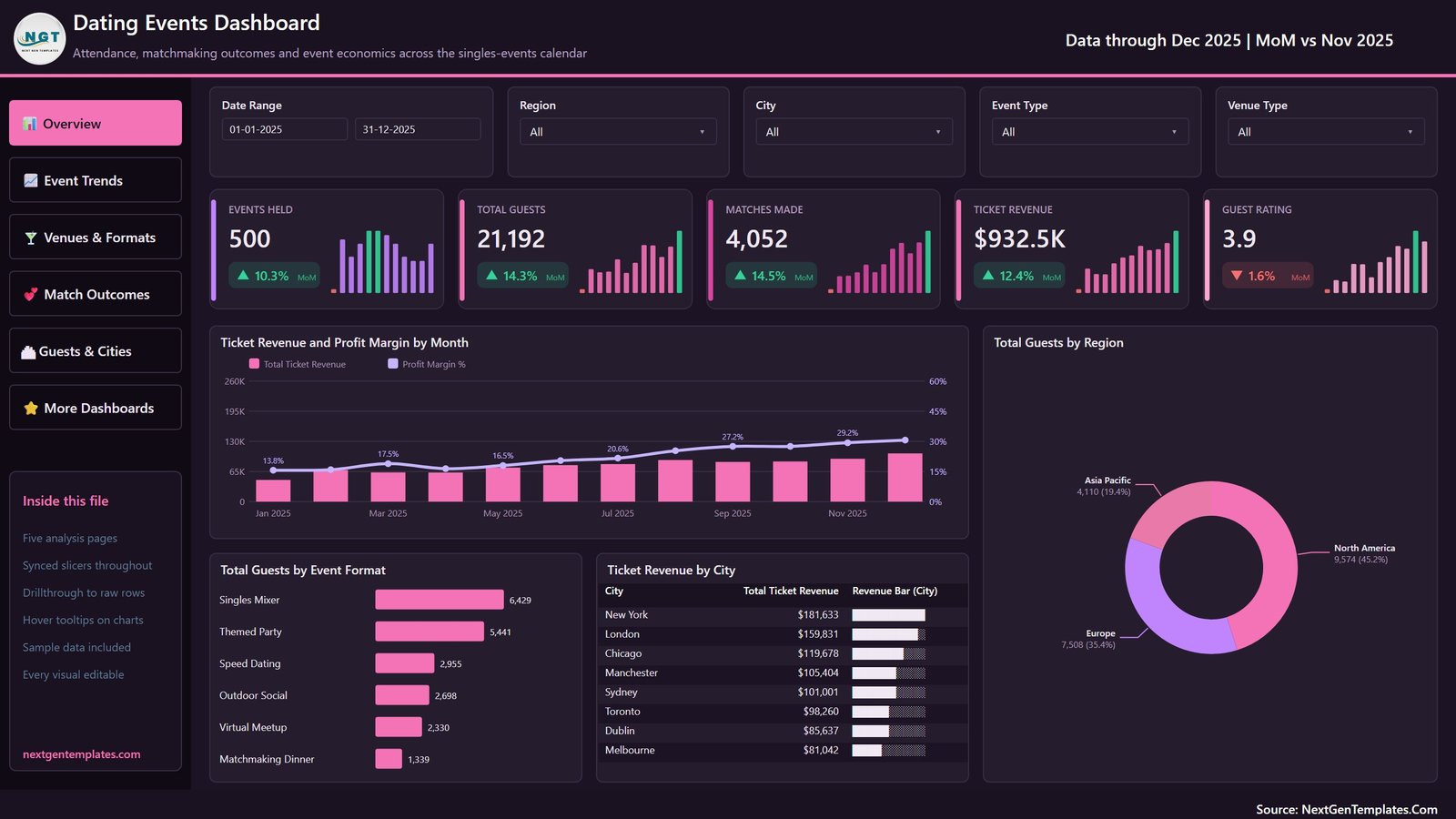
The landing page carries cards for Events Held, Total Guests, Matches Made, Ticket Revenue and Guest Rating, each with a month-on-month delta and a sparkline. Charts are Ticket Revenue and Profit Margin by Month, Total Guests by Region, Total Guests by Event Format, and Ticket Revenue by City. On the sample data the profit margin line climbs from 13.8% in January to 29.2% in November.
Page 2: Event Trends
Cards for Events Held, Sign-Ups, Total Guests, Seat Fill Rate and Revenue per Event. Charts are Total Guests and Seat Fill Rate by Month, Sign-Ups by Month, and Events Held and Guest Rating by Quarter. This is the page that shows the gap between people who registered and people who turned up — 25,797 against 21,192 on the sample.

Page 3: Venues & Formats
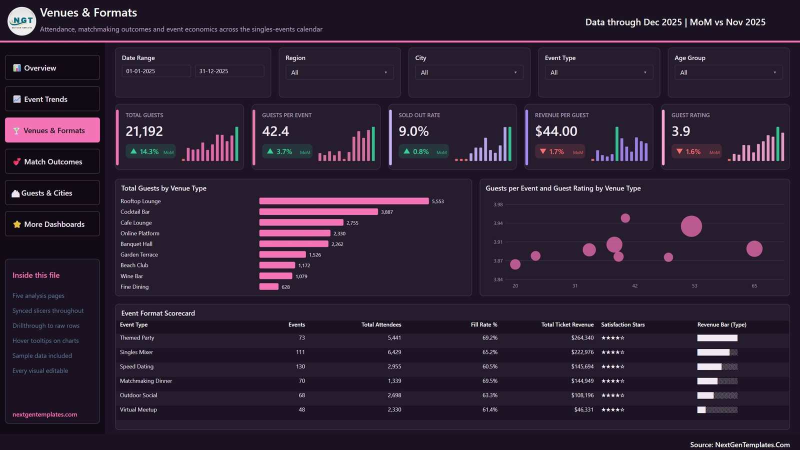
Cards for Total Guests, Guests per Event, Sold Out Rate, Revenue per Guest and Guest Rating. Charts are Total Guests by Venue Type and Guests per Event and Guest Rating by Venue Type, sitting above an Event Format Scorecard with events, total attendees, fill rate, ticket revenue and a star rating for each of the six formats. On the sample, Rooftop Lounge draws 5,553 guests against Fine Dining’s 628.
Page 4: Match Outcomes
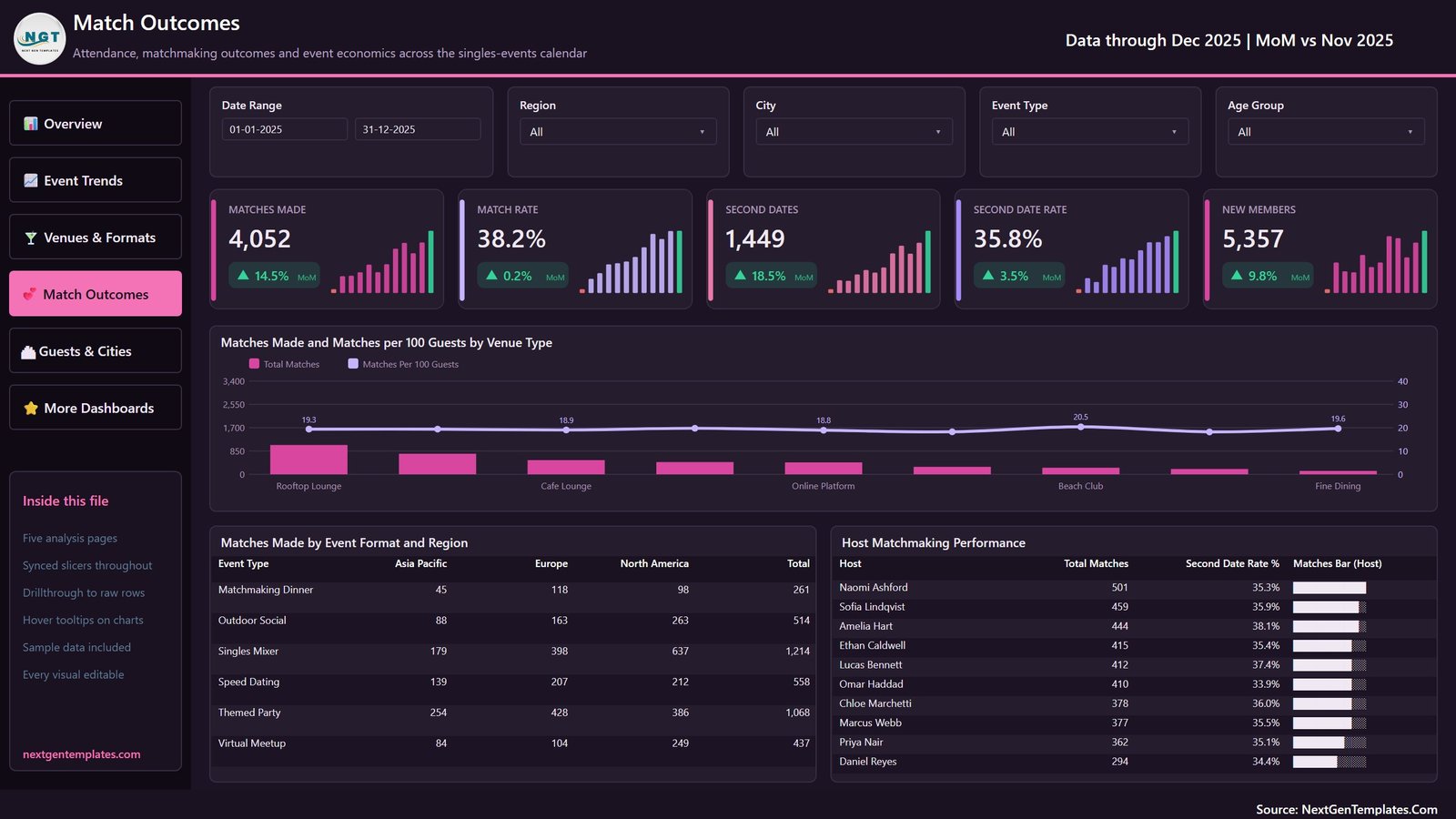
Cards for Matches Made, Match Rate, Second Dates, Second Date Rate and New Members. Charts are Matches Made and Matches per 100 Guests by Venue Type and Matches Made by Event Format and Region, next to a Host Matchmaking Performance table listing total matches and second-date rate per host. These are event counts your team records, not predictions about anyone.
Page 5: Guests & Cities
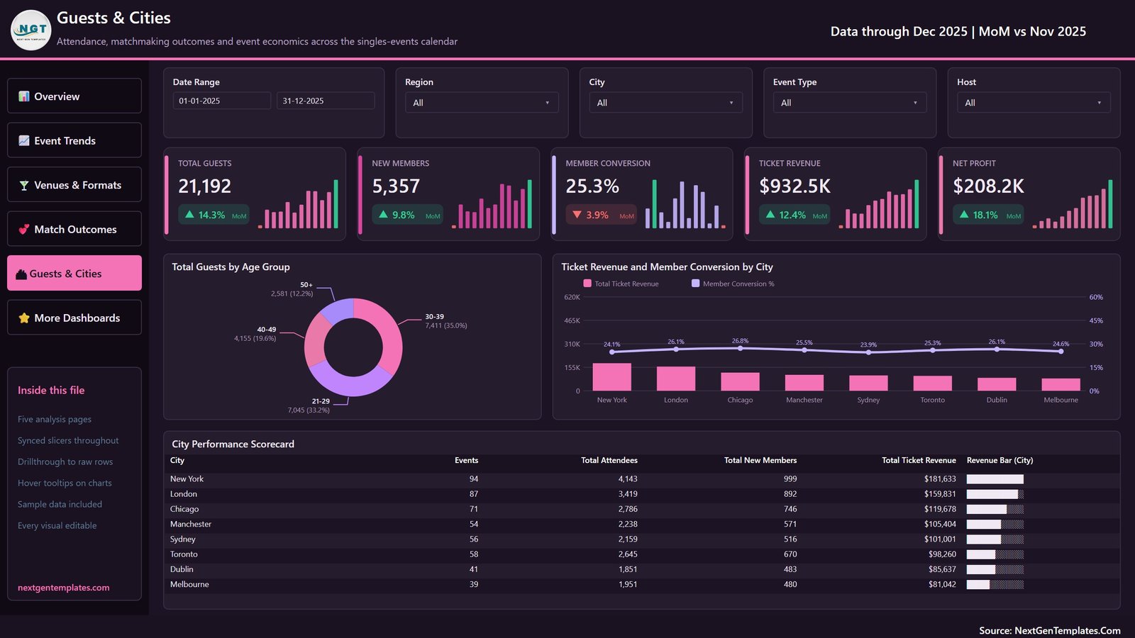
Cards for Total Guests, New Members, Member Conversion, Ticket Revenue and Net Profit. Charts are Total Guests by Age Group and Ticket Revenue and Member Conversion by City, above a City Performance Scorecard for all eight cities. Net profit on the sample is $208.2K, after $474.6K of event cost and $249.8K of marketing spend.
Dating Events Dashboard in Power BI vs. Tableau / Qlik vs. Eventbrite Pro / Splash — Feature Comparison
| Feature | Dating Events Dashboard in Power BI | Tableau / Qlik build | Eventbrite Pro / Splash |
|---|---|---|---|
| Cost | $17.99 one-time ✅ | $75 / user / month plus build time | $99-$500 / month plus ticket fees |
| Platform | Power BI Desktop (free) ✅ | Paid desktop licence | Vendor-hosted only |
| Setup time | Under 10 minutes ✅ | Days to weeks | Hours, plus data migration |
| Your data stays local | Yes — one .pbix on your machine ✅ | Depends on server | No, hosted by the vendor |
| Matchmaking metrics built in | Yes — match rate, second dates, matches per 100 guests ✅ | Build them yourself | No, ticketing metrics only |
| Venue and format profitability | Yes — 9 venue types, 6 formats ✅ | Build it yourself | Limited |
| Drillthrough to raw event rows | Yes — 7 fields ✅ | Yes, once built | Export to CSV |
| Rebrand for a client | Yes — every visual editable ✅ | Yes | Limited white-label tiers |
| Year-1 cost at 5 users | $17.99 ✅ | $4,500+ | $1,188-$6,000 |
For an events team that wants venue, format and matchmaking analytics without a per-seat BI licence or a hosted ticketing subscription, the Dating Events Dashboard in Power BI sits in the sweet spot.
Who Should Use This Template
Perfect for:
- Singles-events and speed-dating organisers running 10-100 events a year across several cities
- Matchmaking agencies and social clubs that need venue and format profitability side by side
- Event marketers reporting on seat fill, sign-up-to-attendance conversion and cost per guest
- Analysts and freelancers building an events report for a client from a working semantic model
- Anyone learning Power BI who wants a finished report with drillthrough and tooltips to take apart
Not a fit if:
- You want a matchmaking or compatibility engine. This reports on events that already happened. It does not score, rank or predict anything about people, and it makes no claim about relationship outcomes.
- You need ticketing or booking. There is no checkout, no payment handling and no guest list in this file.
- You want person-level analysis. The model is event-level by design, and building a person-level model brings data-protection duties this template does not address.
- You do not have Power BI Desktop, which is Windows-only.
- You need a live connector to Eventbrite, Meetup or a CRM. You point Power Query at your own workbook instead.
Real-World Use Cases
Priya runs a speed-dating series across four UK cities. She lives on the Venues & Formats page, comparing guests per event and revenue per guest by venue. The bubble chart showed her that two venues were pulling the average down all year, and she rebooked the next quarter around the ones that actually fill.
Marcus manages hosts for a matchmaking agency. The Host Matchmaking Performance table gives him total matches and second-date rate per host in one view, so his monthly one-to-ones start from numbers rather than impressions. He drills through to the raw rows when a host queries a figure.
Dana is a freelance analyst with an events client. She swapped the theme colours, pointed Power Query at the client’s twelve months of data and delivered a five-page report the same afternoon — rather than spending two days building a model and a date table from scratch.
Advantages of the Dating Events Dashboard in Power BI
- It costs once. $17.99 against $1,188 a year at the entry tier of a hosted events platform, or $4,500 a year for five Tableau Creator seats.
- It is honest about what it is. Every number on every page comes from a column you filled in. Nothing is inferred, modelled or predicted.
- The venue and format analysis is the part nobody else gives you. Ticketing platforms report per event; this reports per venue type and per format, across the whole calendar.
- The drillthrough closes the loop. Any figure anyone questions is seven fields away from the raw rows behind it.
- Nothing is locked. Every measure, visual, colour and page is editable, under a commercial licence you can rebrand.
Opportunities for Improvement
Two things are worth knowing before you quote a number from this report.
The per-event averages are calendar-wide. The sample’s 500 rows include 27 cancelled and 27 postponed events, which carry zero attendees and zero revenue. That drags Guests per Event to 42.4 and Revenue per Event to $1,865. Scoped with the Event Status slicer to the 446 events that actually ran, the same figures are 47.5 and $2,091. Sold Out Rate of 9.0% is likewise 45 of all 500 calendar rows. Use the slicer before you put a per-event average in front of anybody.
There is no live connection. Refresh is manual: you replace rows in the workbook and hit Refresh in Power BI Desktop. For a monthly or weekly reporting rhythm that is fine; for a live operations wall it is not. Setting up a scheduled refresh in the Power BI Service is the usual next step, and it needs a gateway if the workbook stays on your own machine.
A third, smaller point: Match Rate on page 4 reads 38.2% while Matches per 100 Guests reads about 19.3. Those are two different framings of the same 4,052 matches. Both measures are visible in the model, so if your organisation defines match rate differently you can re-base it in a minute.
Best Practices
- Keep the 20 column headers exactly as they ship. The measures and the date table are bound to those names.
- Record cancelled and postponed events rather than deleting them — then filter with Event Status. Deleting them hides a real operational cost.
- Fill in Seats Offered honestly. Seat fill rate, sold-out rate and guests per event all hang off it.
- Keep Host values consistent. The Host Matchmaking Performance table splits on exact text.
- Use the Age Group column as an event cohort label, not as a field about individuals. That is what keeps the model free of personal data.
- Publish to the Power BI Service or export pages to PDF for a board pack rather than emailing the .pbix around.
Explore Relevant Templates
- Dating Events Dashboard in Excel — the same subject as an Excel workbook. We wrote it up in this post if you want the comparison.
- Event Management Analysis Dashboard in Power BI — a broader events report covering budgets and attendance across event types.
- Private Clubs Dashboard in Power BI — membership, retention and venue revenue for a members’ club.
- Catering Services Dashboard in Power BI — the food-and-beverage side of the same calendar.
- Event Planning KPI Dashboard in Power BI — the KPI-scorecard line, with a month picker and traffic lights rather than analysis pages.
- Sports Event Data Entry System in Excel — if you need to capture the events before you analyse them.
Frequently Asked Questions
What does the Dating Events Dashboard in Power BI actually measure?
The Dating Events Dashboard in Power BI measures event operations: events held, sign-ups, attendance, seat fill rate, sold-out rate, ticket revenue, event cost, marketing spend, net profit, guest rating, matches made, second dates and new members. Every figure is an event-level count recorded by your team.
Does it store any personal data about attendees?
No. The Dating Events Dashboard in Power BI holds one row per event, not per person. There are no attendee names, emails, phone numbers, profiles or messages in the model. Host is the staff member who ran the event, and Age Group is a cohort label applied to the event itself.
How long does it take to set up?
Under ten minutes. Open the .pbix in Power BI Desktop, copy the included Data.xlsx, paste your own events under the same 20 headers, repoint the Power Query source at your file and refresh. No DAX editing is required unless you want to change a definition.
Why does Guests per Event read 42.4 on the sample?
Because the 500-row calendar includes 27 cancelled and 27 postponed events with zero attendees. Across the 446 events that ran, the Dating Events Dashboard in Power BI shows 47.5 guests per event and $2,091 revenue per event. Filter with the Event Status slicer before quoting a per-event average.
How does this compare to Eventbrite Pro or Splash?
Eventbrite Pro and Splash sell tickets and host your data for a monthly fee. The Dating Events Dashboard in Power BI does not sell tickets — it analyses the results afterwards, on your own machine, for a single payment, and adds venue, format and host analysis those platforms do not report on.
Can I change the measures and the branding?
Yes. All 35 DAX measures referenced by the visuals are editable, and every visual, colour and page is unlocked. The Dating Events Dashboard in Power BI ships with a commercial licence, so agencies and freelancers can rebrand it and hand it to a client.
Do I need a paid Power BI licence?
Not to use the file. Power BI Desktop is a free download from Microsoft and opens the .pbix as it ships. A paid licence only becomes relevant when you want to publish the report to the Power BI Service and share it with colleagues.
About the Author
Built by PK — Microsoft Certified Professional with 15+ years of Excel, Google Sheets and Power BI experience. Founder of NextGenTemplates, reaching 300K+ subscribers across YouTube channels. Every template is hand-built and tested before release.
Conclusion
If you run singles events for a living, the numbers that decide your year are venue fill, format mix, host performance and the cost of filling a seat — and none of them live in a ticketing report. The Dating Events Dashboard in Power BI puts all four on five pages you can slice, drill into and rebrand, on event data you already collect and nothing more sensitive than that.
👉 Click here to purchase the Dating Events Dashboard in Power BI
Instant download · One-time payment · No subscription
🎥 For step-by-step video tutorials, visit Youtube.com/@PK-AnExcelExpert
Last updated: September 2026