The Dental Practice Dashboard in Power BI is a professionally designed analytics template that gives dental clinics, orthodontic offices, and oral healthcare providers a complete visual overview of their practice operations. Built entirely in Power BI Desktop, this dashboard tracks treatment costs, patient payments, dentist performance, insurance analytics, and patient demographics across 5 interactive pages — all with dynamic slicers and cross-highlighting for instant drill-down analysis. Whether you run a single-chair practice or manage a multi-location dental group, this template turns raw appointment and billing data into actionable insights without requiring any DAX expertise.
👉 Click here to Purchase the Dental Practice Dashboard in Power BI
Key Features of the Dental Practice Dashboard in Power BI
This dental analytics template stands out for its depth and ease of use. Here are the major features that make it a must-have for any dental practice looking to embrace data-driven decision-making:
- 5 Interactive Dashboard Pages — Overview, Treatment Analysis, Dentist Performance, Insurance Analysis, and Patient Insights, each packed with dynamic visuals and KPI cards.
- 5 KPI Summary Cards — Total Patients, Total Patient Paid, Total Treatment Cost, Avg Satisfaction Score, and Insurance Coverage Rate displayed prominently on the Overview page.
- Slicer-Based Filtering — Multiple slicers on the Overview page let you filter the entire dashboard by department, treatment type, dentist, month, and more.
- Dynamic Cross-Highlighting — Click on any visual element and all other charts on the page update to reflect the selected data point, providing contextual drill-down analysis.
- Completion Rate Gauge — A visual gauge on the Overview page shows your appointment completion rate for instant scheduling efficiency monitoring.
- No DAX Expertise Required — All measures, visuals, and data connections are pre-built. Replace sample data and click Refresh to update everything.
- Professional Dark Theme — Clean, modern design with consistent color schemes optimized for readability and executive presentations.
- Power BI Service Compatible — Publish to Power BI cloud for team sharing, scheduled refresh, and mobile access.
Dashboard Pages Explained
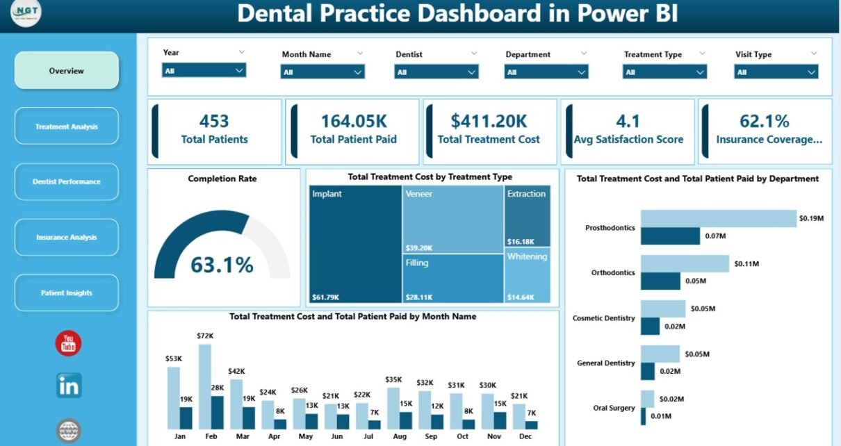
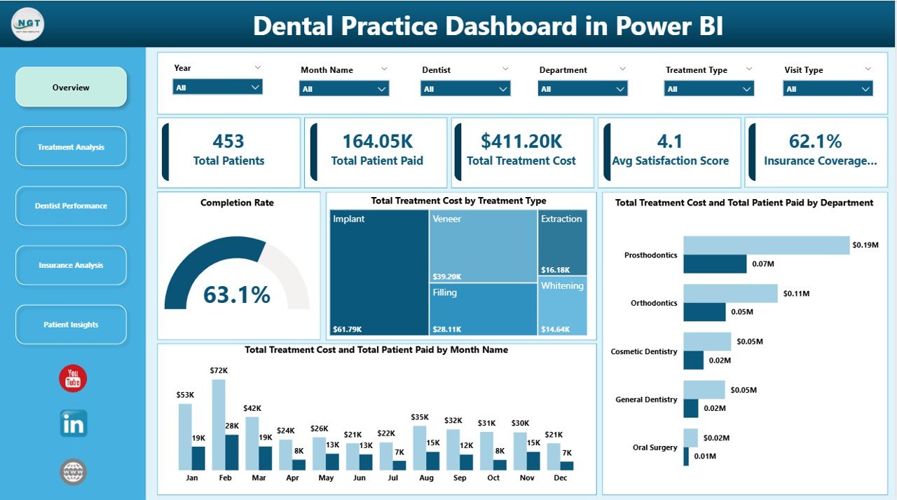
1. Overview Page
The Overview page serves as the command center for your dental practice analytics. At the top, five KPI cards provide an instant snapshot of your practice health: Total Patients shows the count of all patients in the dataset, Total Patient Paid reveals the actual collected revenue, Total Treatment Cost shows the cumulative value of all treatments rendered, Avg Satisfaction Score measures patient experience, and Insurance Coverage Rate displays the percentage of treatments covered by insurance.
Below the cards, several charts visualize your data from different angles. The Completion Rate gauge provides a quick view of appointment completion efficiency. The Total Treatment Cost by Treatment Type chart breaks down which procedures generate the most revenue. The Total Treatment Cost and Total Patient Paid by Department chart highlights revenue gaps across clinical departments. The Total Treatment Cost and Total Patient Paid by Month Name chart tracks your financial performance over time. Multiple slicers allow you to apply filters and see the filtered dashboard instantly.
Dental Practice Dashboard in Power BI
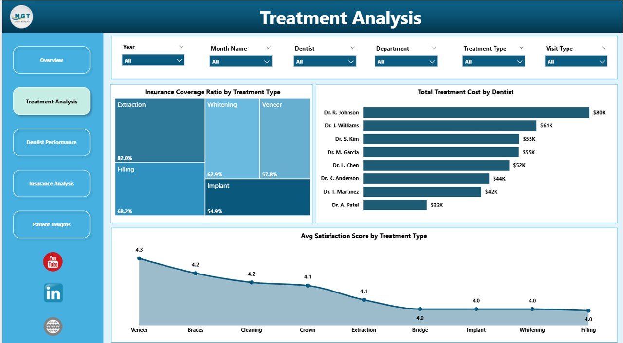
2. Treatment Analysis
The Treatment Analysis page provides a deeper look into how individual treatment types perform across your practice. The Insurance Coverage Ratio by Treatment Type chart reveals how much of each procedure is typically covered by insurance, which is invaluable for patient billing conversations and financial planning. The Total Treatment Cost by Dentist chart connects treatment revenue to individual practitioners, providing a bridge to the Dentist Performance page. The Avg Satisfaction Score by Treatment Type chart helps you identify which procedures leave patients most satisfied, offering direct feedback for service improvement.
Treatment Analysis
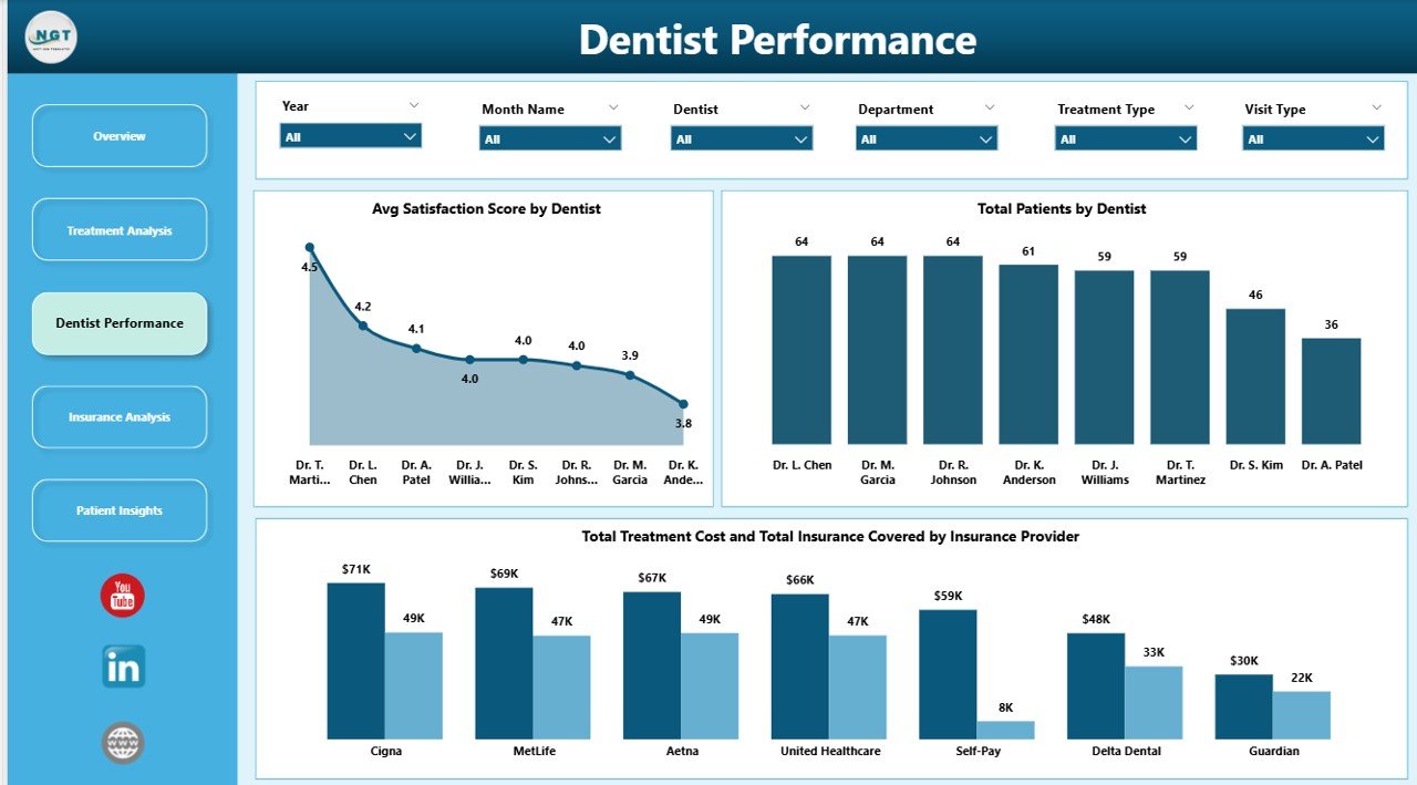
3. Dentist Performance
This page is designed for practice managers who need to evaluate and compare dentist productivity. The Avg Satisfaction Score by Dentist chart ranks your dentists by patient experience scores so you can identify top performers and those who may need additional support. The Total Patients by Dentist chart shows patient load distribution, helping you balance workloads across your team. The Total Treatment Cost and Total Insurance Covered by Insurance Provider chart provides a unique cross-reference between revenue and insurance payer performance. For Google Sheets users, a similar KPI-focused version is available in the Dental Practice KPI Dashboard in Google Sheets.
Dentist Performance
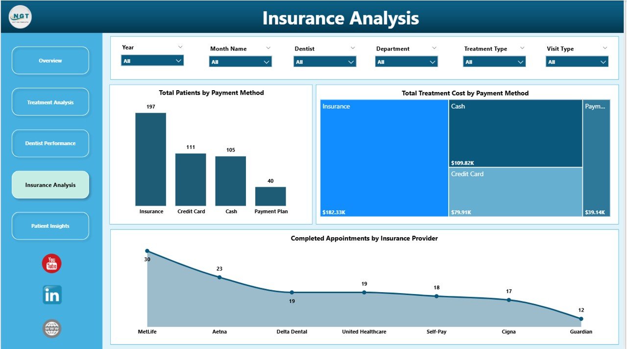
4. Insurance Analysis
Understanding your insurance payer mix is critical for dental practice revenue optimization. The Total Patients by Payment Method chart shows how patients pay — cash, credit card, insurance, or other methods — giving you insight into collection patterns. The Total Treatment Cost by Payment Method chart breaks down revenue by payment channel. The Completed Appointments by Insurance Provider chart reveals which insurers send you the most completed patients, helping with network decisions and annual contract negotiations.
Insurance Analysis
5. Patient Insights
The Patient Insights page focuses on understanding who your patients are and how they found you. The Total Treatment Cost by Gender chart provides demographic segmentation of treatment revenue. The Total Treatment Cost by Visit Type chart categorizes appointments (new patient, follow-up, emergency, etc.) and compares their revenue contribution. The Total Patient Paid by Referral Source chart reveals your most effective patient acquisition channels — whether it is Google, word-of-mouth, insurance referrals, or social media. This data directly informs your marketing budget allocation. For hospital-level healthcare analytics, also explore the Hospitals Dashboard in Excel.
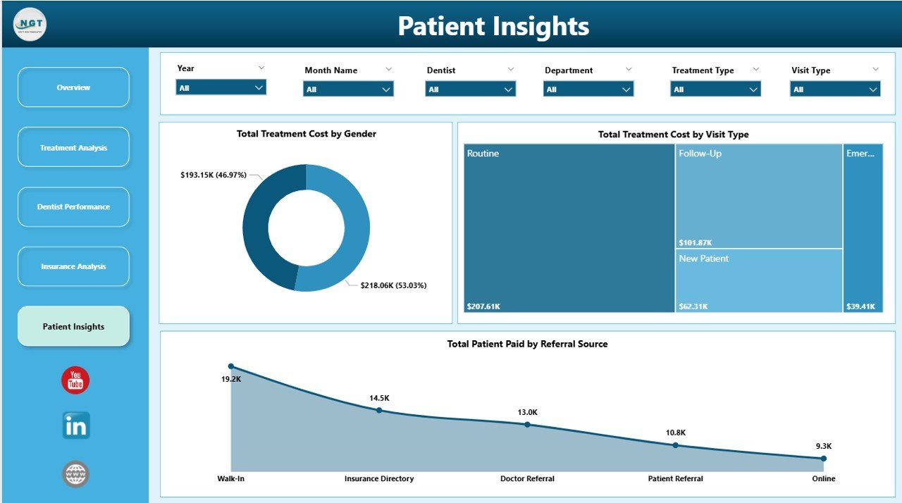
Patient Insights
Advantages of the Dental Practice Dashboard in Power BI
- Immediate Visibility — Stop guessing about practice performance. Five KPI cards and dynamic charts give you instant clarity on revenue, patient flow, dentist productivity, and insurance analytics.
- Zero Learning Curve — No DAX formulas, no complex modeling. Replace the sample data, click Refresh, and your dashboard is ready.
- Interactive Cross-Highlighting — Click any data point in any chart and every other visual on the page instantly updates to show related data, enabling powerful exploratory analysis.
- Cloud Publishing — Publish to Power BI Service for cloud-based access, scheduled data refresh, team sharing, and mobile dashboard viewing.
- Multi-Dimensional Analysis — Five dedicated pages ensure you can analyze treatments, dentists, insurance, patients, and financials without cluttering a single view.
- Cost-Effective — Get dental practice analytics without investing in expensive dental management software. Power BI Desktop is free from Microsoft.
Opportunities for Improvement
- Appointment Scheduling Timeline — Adding a calendar or timeline view could help visualize appointment density and identify scheduling gaps.
- Trend Alerts — Conditional formatting on KPI cards to highlight when satisfaction drops below a threshold or cancellation rates spike would add proactive monitoring.
- Patient Retention Tracking — A dedicated metric for repeat visit rates and patient retention over time would strengthen the Patient Insights page.
- Cost vs. Profit Margins — Including procedure cost data alongside revenue would enable profit margin analysis per treatment type.
Best Practices for Using This Dental Dashboard
- Update Data Regularly — Connect your data source or paste new records regularly and refresh to keep your analytics current.
- Use Slicers First — Before interpreting any chart, use the Overview page slicers to focus on the specific department, time period, or dentist you want to analyze.
- Compare Month-Over-Month — Use the monthly chart on the Overview page to track trends and catch seasonal dips early.
- Share Dentist Performance Reports — Publish to Power BI Service and share the Dentist Performance page during team meetings to drive accountability.
- Monitor Insurance Coverage — The Insurance Analysis page helps you evaluate which insurance networks are most profitable. Use this during annual contract negotiations.
- Leverage Cross-Highlighting — Click on a specific dentist in one chart to instantly see their performance across all other visuals on the same page.
Explore Relevant Templates
If you find the Dental Practice Dashboard in Power BI valuable, you may also want to explore these related templates from NextGenTemplates:
- Dental Services Dashboard in Power BI — Advanced dental analytics with Power BI interactivity for larger practice groups and multi-location reporting.
- Dental Services KPI Dashboard in Power BI — KPI-focused dental analytics with target tracking and trend analysis.
- Dental Practice Dashboard in Excel — Pivot-table-powered dental analytics for teams who prefer Excel.
- Dental Practice KPI Dashboard in Google Sheets — A Google Sheets alternative for dental practices that prefer cloud-based spreadsheets.
- Hospitals Dashboard in Excel — Broader healthcare analytics for hospital administration and clinical operations.
Frequently Asked Questions
What KPIs does the Dental Practice Dashboard in Power BI track?
The Dental Practice Dashboard in Power BI tracks 5 key performance indicators on the Overview page: Total Patients, Total Patient Paid, Total Treatment Cost, Average Satisfaction Score, and Insurance Coverage Rate. Additional analysis across 4 more dashboard pages covers treatment cost breakdowns by type and department, dentist productivity and satisfaction scores, insurance coverage ratios, payment method analysis, and patient demographics including gender, visit type, and referral source.
Do I need advanced Power BI skills to use this dental dashboard template?
No. This template is built with pre-configured visuals, measures, and data connections. Simply open the .pbix file in Power BI Desktop (free download from Microsoft), replace the sample data with your own dental practice records, and click Refresh. Every chart and KPI card updates instantly. No DAX formulas to write and no visuals to create from scratch.
How do I add my own data to the Dental Practice Dashboard?
Open the .pbix file in Power BI Desktop. Navigate to the data model and replace the sample data tables with your own dental practice records — patient details, treatment types, dentist assignments, departments, insurance info, payment amounts, satisfaction scores, and appointment dates. Click Refresh to update all 5 dashboard pages automatically.
Can I customize the charts or add new treatment types and dentists?
Yes. Since this is a standard Power BI .pbix file, you can modify any visual, add new pages, create additional DAX measures, or extend the data model. Any new treatment types, dentists, insurance providers, or departments in your data will automatically appear in the relevant charts after refreshing.
Is this template compatible with Power BI Service?
Yes. You can publish this .pbix file to Power BI Service for cloud-based sharing, scheduled refresh, and mobile access. Share the dashboard with your dental team, set up automatic data refresh schedules, and access your practice analytics from any device through the Power BI mobile app.
What is the best Power BI template for tracking dental practice performance?
The Dental Practice Dashboard in Power BI from NextGenTemplates is one of the most comprehensive options available. It covers treatment analysis, dentist performance evaluation, insurance analytics, and patient demographics across 5 dedicated interactive dashboard pages with dynamic slicers and cross-highlighting, making it ideal for any dental clinic looking to make data-driven decisions using Power BI.
Conclusion
The Dental Practice Dashboard in Power BI empowers dental clinics to move beyond raw data and into visual, actionable analytics. With 5 interactive dashboard pages covering treatments, dentist performance, insurance, and patient insights, plus dynamic slicers and cross-highlighting, this template is the most efficient way to monitor and improve your dental practice operations using Power BI.
👉 Click here to Purchase the Dental Practice Dashboard in Power BI
For step-by-step video tutorials on how to use Power BI dashboards, visit our YouTube channel:
🎥 Youtube.com/@PK-AnExcelExpert