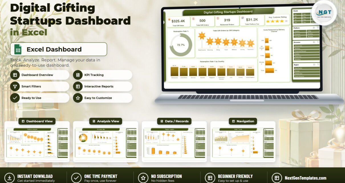
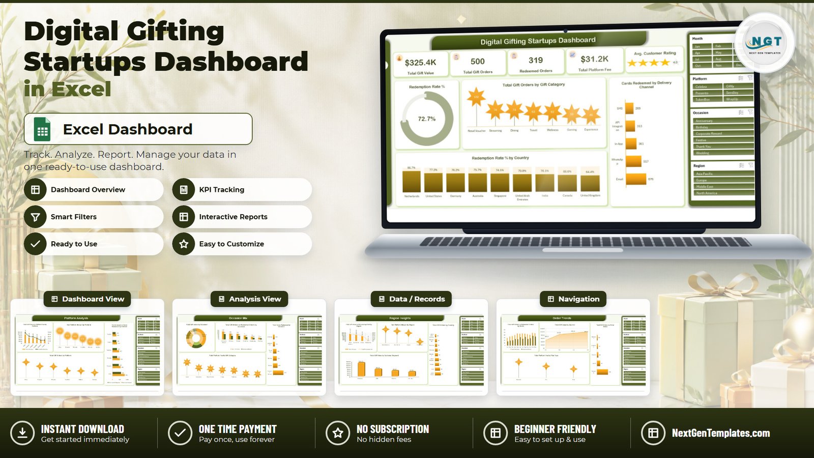
Digital gifting has a measurement problem that most spreadsheets quietly skip: a gift card that is issued is not revenue, and a gift card that is redeemed is not the same event as an order marked complete. The Digital Gifting Startups Dashboard in Excel separates the two and reports both. On its sample book of 500 e-gift orders placed between 1 January and 30 December 2025, it shows $325.4K in total gift value, 319 redeemed orders out of 500, $31.2K in platform fee, a 4.0 average customer rating, and a 72.7% card redemption rate built from 2,136 cards redeemed against 2,940 issued.
Behind those numbers sit 26 pivot tables, 21 charts and a 500-row Data sheet in 30 columns, spread across five report pages with four slicers cloned onto every one of them. There are no macros, no add-ins and no Power Query steps, so the file opens and refreshes on a locked-down corporate laptop. This article walks through what each page reports, where the template is strong, and where it deliberately stops.
Key Features of the Digital Gifting Startups Dashboard in Excel
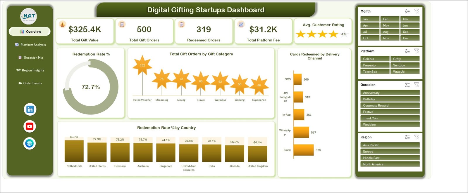
- Five KPI cards on the Overview: Total Gift Value, Total Gift Orders, Redeemed Orders, Total Platform Fee and an Avg. Customer Rating star gauge.
- A card-level redemption gauge. The 72.7% donut divides cards redeemed by cards issued. Order-level redemption (319 of 500, or 63.8%) is reported separately on two other pages, so nobody confuses the two.
- 21 charts across five pages, each named for the metric it plots rather than for its chart type – Total Gift Orders by Gift Category, Net Platform Margin by Region, Total Platform Fee by Plan Type, and so on.
- Four slicers – Month, Platform, Occasion, Region – repeated on all five pages. Filter once and the whole report re-cuts; you never have to scroll back to a control page.
- Five separate cost and value columns – Gift Value, Discount Amount, Platform Fee, Processing Cost, Marketing Cost – so net platform margin is an actual subtraction. It totals $13.0K on the sample data.
- A 500-row Data sheet in 30 columns, including four calculated helper columns (Month, Year, Quarter, Order Value Band) that fill down from Order Date automatically.
- A Support sheet carrying the pivot layer, so every figure on a report page can be traced back to the rows that produced it.
- Left-hand page navigation with the NGT branding bar, so the workbook behaves like an app rather than a stack of tabs.
Dashboard Pages Explanation
Page 1 – Overview
The five KPI cards sit across the top. Below them, the Redemption Rate % donut reads 72.7%. Total Gift Orders by Gift Category ranks seven categories – Retail Voucher 132, Streaming 74, Dining 73, Travel 63, Wellness 62, Gaming 50, Experience 46 – which sums cleanly to the 500 orders in the book. Cards Redeemed by Delivery Channel puts Email at 676 and WhatsApp at 517, well ahead of In-App 361, API Integration 313 and SMS 269. Redemption Rate % by Country closes the page, running from the Netherlands at 86.7% down to the United Kingdom at 64.4%.
Page 2 – Platform Analysis
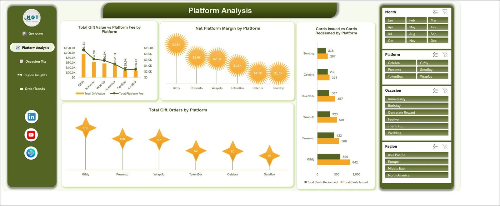
This is the partner page. Total Gift Value vs Platform Fee by Platform plots both on a dual axis. Net Platform Margin by Platform ranks Giftly $3.9K, Presento $2.6K, WrapUp $2.5K, TokenBox $1.8K, Celebra $1.1K and SendJoy $1.0K. Total Gift Orders by Platform shows the same six partners at 135, 100, 97, 62, 60 and 46 orders. The fourth chart, Cards Issued vs Cards Redeemed by Platform, is the one that earns the page: Giftly issues 842 cards and redeems 590, while SendJoy issues 267 and redeems 218 – a higher redemption ratio on a fraction of the volume.
Page 3 – Occasion Mix
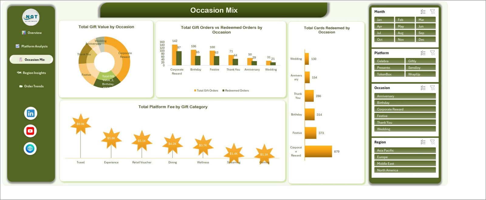
Total Gift Value by Occasion is a donut across six occasions. Total Gift Orders vs Redeemed Orders by Occasion pairs them: Corporate Reward 142 ordered against 97 redeemed, then Birthday 106/65, Festive 100/63, Thank You 71/44, Anniversary 50/29 and Wedding 31/21. Total Cards Redeemed by Occasion shows how lopsided bulk corporate issuance is – Corporate Reward alone accounts for 879 of the 2,136 redeemed cards. Total Platform Fee by Gift Category rounds the page off, led by Travel at $9.9K and trailed by Gaming at $1.1K.
Page 4 – Region Insights
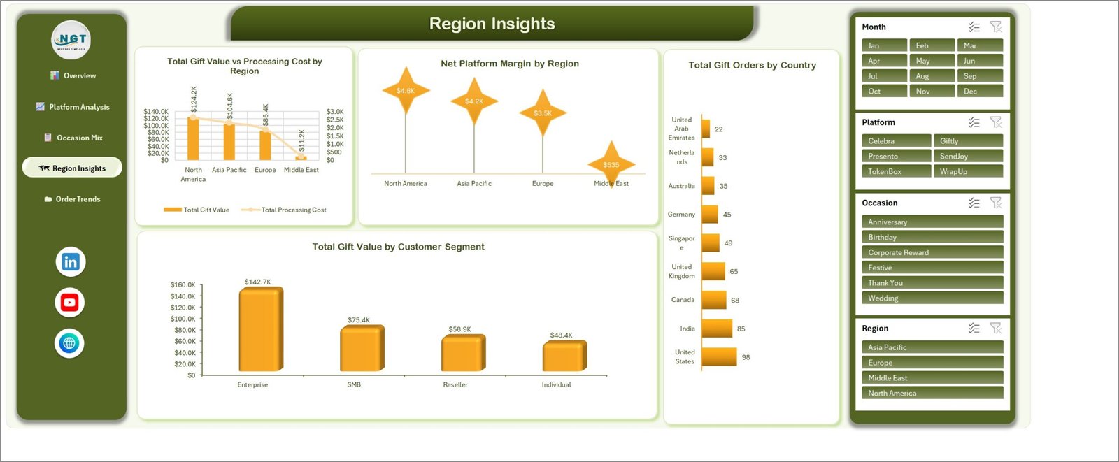
Total Gift Value vs Processing Cost by Region covers four regions: North America $124.2K, Asia Pacific $104.6K, Europe $85.4K and Middle East $11.2K. Net Platform Margin by Region follows the same order at $4.8K, $4.2K, $3.5K and $535. Total Gift Orders by Country breaks the same book into nine markets, from the United States at 98 orders down to the United Arab Emirates at 22. Total Gift Value by Customer Segment closes with Enterprise $142.7K, SMB $75.4K, Reseller $58.9K and Individual $48.4K – a reminder that in gifting, four segments rarely contribute equally.
Page 5 – Order Trends
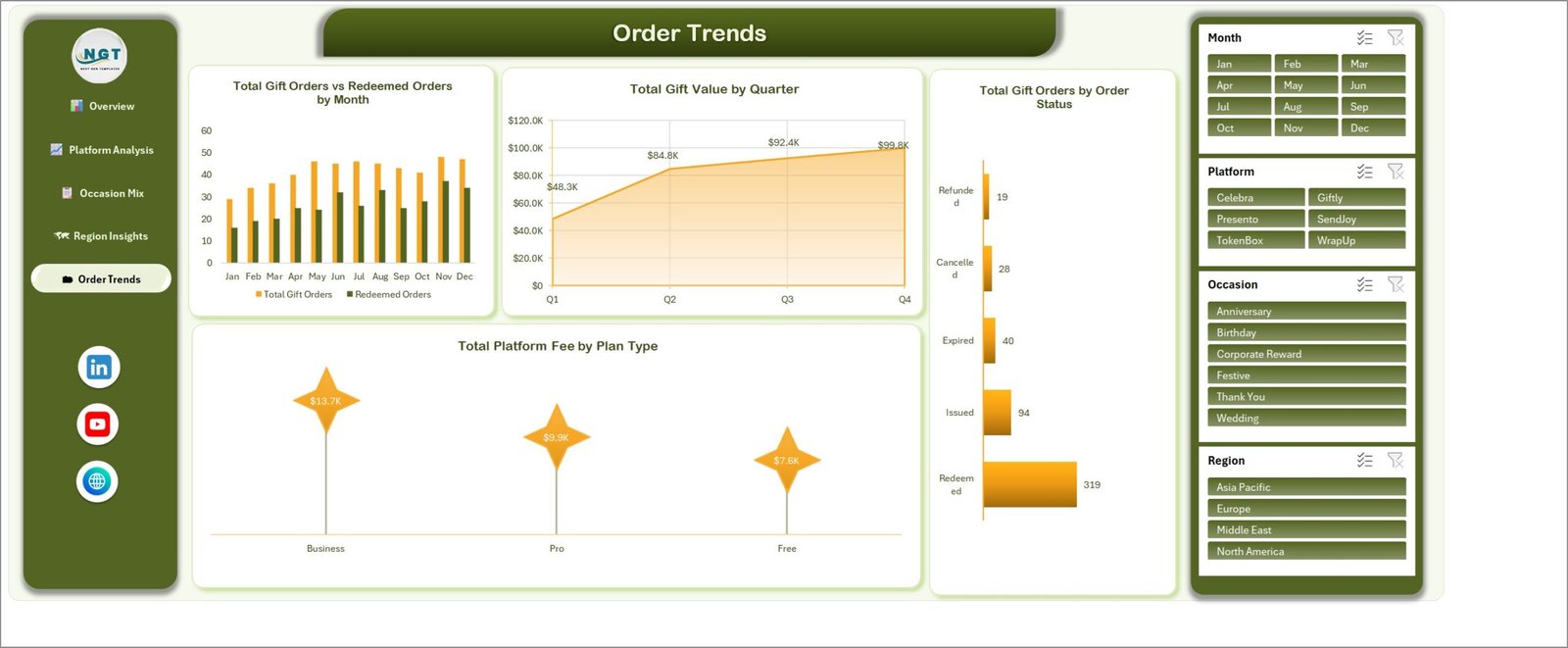
Total Gift Orders vs Redeemed Orders by Month runs the full twelve months as paired columns. Total Gift Value by Quarter is an area chart climbing from $48.3K in Q1 to $84.8K, $92.4K and $99.8K – a steady build rather than a festive spike, which is worth knowing before you staff for December. Total Gift Orders by Order Status splits the 500 orders into Redeemed 319, Issued 94, Expired 40, Cancelled 28 and Refunded 19. Total Platform Fee by Plan Type finishes with Business $13.7K, Pro $9.9K and Free $7.6K.
Digital Gifting Startups Dashboard in Excel vs. Google Sheets vs. Paid Analytics SaaS – Feature Comparison
| This Excel dashboard | Google Sheets build | Looker Studio / Mixpanel plan | |
|---|---|---|---|
| Cost | $17.99 once | Free tool, days of build time | $70-$300+ per month |
| Platform | Excel 2016+, Microsoft 365, desktop | Browser | Browser, vendor-hosted |
| Setup time | About 15 minutes – paste and Refresh All | 1-3 days | Days of connector work |
| Real-time team collaboration | Via OneDrive or SharePoint co-authoring | Yes, native | Yes |
| Mobile access | Excel mobile app – read and filter | Yes | Yes |
| Customisable fields | All 30 columns, add your own | Full, but you build it | Limited to vendor schema |
| Share with a link | Yes, from OneDrive | Yes | Yes, seat-limited |
| Year-1 cost at 5 users | $17.99 | $0 plus your build time | $4,200-$18,000 |
| Cards issued vs redeemed maths | Built in, per platform and occasion | Only if you model it | Needs a custom event schema |
| Works offline | Yes | No | No |
Who Should Use This Template
It is built for e-gift card platforms, corporate gifting startups, rewards and incentive marketplaces, loyalty voucher issuers, and agencies that run gifting programmes on behalf of clients. Practically, it suits a team of one to thirty people that has outgrown a CSV export but cannot justify a per-seat BI licence.
It is a poor fit if you need a live API feed from your card issuer or payment processor – this is a paste-and-refresh workbook. It is also not a warehouse or fulfilment system for physical gift boxes, and it is not a single-page scorecard: if you want a month picker with MTD/YTD columns and traffic lights against targets, that is the KPI Dashboard format, a different template family entirely.
Real-World Use Cases
A nine-person corporate gifting platform. The founder filters Occasion to Corporate Reward and finds 142 orders generating 879 redeemed cards – far more cards per order than any consumer occasion. That single ratio reframes support staffing and breakage assumptions, because bulk enterprise issuance behaves nothing like a birthday gift.
A growth lead at an e-gift marketplace. Redemption Rate % by Country spans 86.7% in the Netherlands to 64.4% in the United Kingdom – a 22-point gap on the same product. Crossed with Cards Redeemed by Delivery Channel (Email 676 against SMS 269), it turns into a delivery-channel experiment in the two weakest markets rather than another acquisition spend.
A finance manager at a rewards startup. Platform Analysis shows Giftly carrying the largest volume at 135 orders while SendJoy returns just $1.0K of net margin on 46. The take-rate renegotiation with the smallest partner finally has an evidence base, and Total Gift Value vs Processing Cost by Region shows where that margin is being eaten.
Advantages of the Digital Gifting Startups Dashboard in Excel
- It reports the metric the category actually runs on. Card-level redemption, split from order-level redemption, is the difference between an honest breakage forecast and a hopeful one.
- Every number is auditable. Pivot tables on the Support sheet mean you can double-click into any figure and see the underlying rows.
- The chart totals reconcile. Orders by category, by platform, by occasion and by status each sum to 500; cards redeemed by channel, platform and occasion each sum to 2,136; platform fee by category and by plan type each sum to $31.2K. That internal consistency is what makes a dashboard safe to show a board.
- No macro warning. Standard pivot tables, slicers and charts only, so IT policy does not block it and the file opens on Mac.
- One payment. No renewals, no seats, and the workbook still works if you stop paying attention to it for a year.
Opportunities for Improvement
Being straight about the limits: there is no live connector, so refreshing means pasting a fresh export. There is no cohort or repeat-purchase view – the model is order-grained, not customer-grained, so you cannot yet see whether a recipient came back as a buyer. Breakage is implied by the gap between issued and redeemed cards rather than being reported as its own currency line, and there are no target or variance columns, because targets belong to the KPI Dashboard format. If you need any of those, budget an afternoon to extend the Data sheet and add the pivots – the structure is open and nothing is protected.
Best Practices
- Keep the 30 headers exactly as shipped when you paste your own orders; the pivots bind by header name.
- Paste values, not formatted cells, so the calculated Month, Year, Quarter and Order Value Band columns can fill down cleanly.
- Run Data > Refresh All after every paste, then spot-check one KPI card against a manual SUM before you circulate the file.
- Record cards issued and cards redeemed as counts, not as a percentage – the gauge derives the rate, and pre-computed rates cannot be re-aggregated when you slice.
- Clear all four slicers before exporting a page to PDF, or note the active filter in the file name.
- Keep the master copy in OneDrive or SharePoint so the team reads one version. Microsoft’s own guidance on using slicers to filter data is a good ten-minute read for anyone on the team who has not met them before.
- Archive a dated copy each quarter. Refresh All overwrites the previous view, and quarter-on-quarter comparison is easier from snapshots.
Explore Relevant Templates
- Digital Gifting Startups Dashboard in Excel – the template described in this article.
- Gift Shops Dashboard in Excel – the same analysis for physical retail gifting.
- Airline Loyalty Programs Dashboard in Excel – issue-and-redeem economics applied to loyalty points.
- Fashion E-commerce KPI Dashboard in Excel – the scorecard format, with targets and traffic lights.
- Gift Tracker Data Entry System in Excel – a form-driven entry tool for capturing gift records.
- Related reading: Cybersecurity Startups Dashboard in Power BI and Digital Asset Custodians Dashboard in Excel.
Frequently Asked Questions
Which versions of Excel does it work in?
Excel 2016, 2019, 2021 and Microsoft 365, on Windows or Mac. It uses only pivot tables, slicers and charts – no Power Pivot, no Power Query and no VBA.
Can I load more than 500 rows?
Yes. The Data sheet uses a real Excel table (TblData, B3:AE503), so pasting past the last row extends it and the pivots pick the new records up on the next Refresh All.
Why does the redemption gauge say 72.7% when 319 of 500 orders were redeemed?
Because they measure different things. The gauge is card-level: 2,136 cards redeemed out of 2,940 issued. Order-level redemption – 319 of 500 – is shown on the Occasion Mix and Order Trends pages. Bulk corporate orders issue many cards at once, which is exactly why the two diverge.
Can I rename the platforms and occasions?
Yes. Overwrite Giftly, Presento, WrapUp, TokenBox, Celebra and SendJoy with your own partners, and do the same for occasions and gift categories. The slicers and every chart label rebuild on refresh.
Is this the same as a KPI dashboard or a KPI scorecard?
No. This is the analytical five-page Excel Dashboard line. The KPI Dashboard and KPI Scorecard lines are separate products with a month picker, MTD and YTD columns and traffic-light targets. Different layouts for different jobs.
What comes in the download?
A ZIP with the .xlsx workbook and an Excel Dashboard user manual PDF. Instant download, one payment, no subscription.
About the Author
Built by PK – Microsoft Certified Professional with 15+ years of Excel, Google Sheets, and Power BI experience. Founder of NextGenTemplates, reaching 300K+ subscribers across YouTube channels. Every template is hand-built and tested before release.
Conclusion
Digital gifting businesses fail their own reporting in a predictable way: they count orders, call it growth, and discover breakage and channel weakness only when the cash does not arrive. The Digital Gifting Startups Dashboard in Excel is a small, honest correction to that – five pages, 21 charts, four slicers and a 500-row data model that separates cards issued from cards redeemed, and gift value from the fee you actually keep. It will not replace a data warehouse, and it does not pretend to. It will give a founder, a growth lead and a finance manager the same set of numbers to argue over, for $17.99 and about fifteen minutes of setup.
Get the Digital Gifting Startups Dashboard in Excel, and subscribe to youtube.com/@PKAnExcelExpert for walkthroughs of this and every other dashboard in the range.