Logistics Automation Dashboard in Power BI is a ready-to-use PBIX report for logistics managers, carrier operations teams, warehouse leaders, transportation coordinators, and supply chain analysts who need a clear view of automation, cost, shipment volume, and transit reliability. The report includes 5 Power BI pages, 5 high-level KPI cards, 20 analysis visuals, and slicers for fast filtering. Teams can use it to review Total Logistics Cost, Total Handling Cost, Total Freight Cost, Total Shipments, On Time Rate, automation rate, carrier cost, service level performance, transit hours, regional freight cost, and hub-level cost trends from one reporting file.
Because logistics data often arrives from multiple operational systems, reporting teams lose time rebuilding the same analysis again and again. This dashboard gives you a structured Power BI starting point: connect or replace your data, refresh the model, and use the ready-made pages for management review. For setup guidance, Microsoft provides official documentation for getting started with Power BI Desktop.
Key Features of Logistics Automation Dashboard in Power BI
- 5 report pages: Overview, Automation, Carrier Ops, Transit, and Cost.
- 5 KPI cards: Total Logistics Cost, Total Handling Cost, Total Freight Cost, Total Shipments, and On Time Rate.
- 20 analysis visuals: automation, carrier, service level, transit, regional, hub, month, quarter, and year views.
- Interactive slicers: filter by available logistics dimensions to review the specific operating slice you need.
- Editable Power BI file: customize visuals, measures, pages, fields, colors, and model logic in Power BI Desktop.
- Cost and reliability focus: connect freight cost, handling cost, transit hours, shipment volume, and on-time results.
Dashboard Pages Explanation
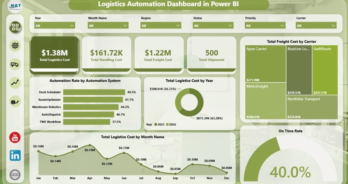
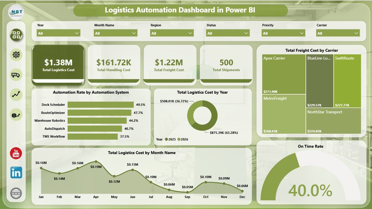
1 – Overview Page
The Overview Page gives leadership a fast view of the logistics operation. It shows the headline cards for Total Logistics Cost, Total Handling Cost, Total Freight Cost, Total Shipments, and On Time Rate, then supports deeper review through charts and slicers.
Automation Rate by Automation System: This visual compares automation adoption across systems. It helps managers see which tools are supporting automated logistics workflows and where manual effort may still be high.
Total Logistics Cost by Year: This chart shows annual cost movement. It is useful for budget planning, leadership reviews, and year-over-year logistics cost control.
Total Freight Cost by Carrier: This carrier comparison highlights where freight spend is concentrated. It helps procurement and logistics teams review carrier dependency and negotiation priorities.
Total Logistics Cost by Month Name: This trend reveals month-to-month cost movement. It helps teams spot seasonal pressure and compare cost after carrier, hub, or automation changes.
On Time Rate by Total Shipments: This visual connects service reliability with shipment volume. It helps teams understand whether higher shipment counts are affecting on-time performance.
Logistics Automation Dashboard in Power BI
2 – Automation
The Automation page focuses on where automated processes are working and where operational teams may still need to improve. It combines automation rate, region, carrier cost, service level, and handling cost views.
Automation Rate by Region: This chart compares automation performance across regions. It helps identify locations where automation adoption is strong and regions that may require process review.
Total Logistics Cost by Carrier: This visual compares logistics cost across carriers. It helps teams connect carrier usage with total cost impact.
Automation Rate by Service Level: This chart shows whether automation differs across priority, express, standard, or other service tiers. It helps managers check if faster service levels are being processed consistently.
Total Handling Cost by Month Name: This monthly view tracks handling cost movement. It helps teams see whether automation is helping stabilize or reduce handling expense.
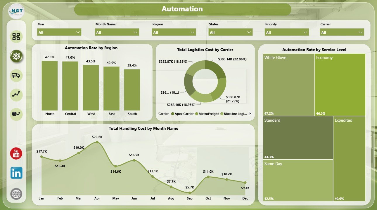
Automation
3 – Carrier Ops
The Carrier Ops page is built for carrier performance and service-level reviews. It supports operational conversations around shipment type, freight cost, transit speed, and monthly transit trends.
Total Shipments by Shipment Type: This chart shows the shipment mix by type. It helps teams understand whether the workload is dominated by parcel, pallet, container, bulk, or other shipment categories.
Total Freight Cost by Service Level: This visual compares freight spend across service tiers. It helps managers see how premium or urgent service choices affect cost.
Average Transit Hours by Carrier: This carrier speed view highlights faster and slower carriers. It is useful for carrier scorecards and performance review meetings.
Average Transit Hours by Month Name: This monthly trend shows whether transit speed is improving, stable, or worsening. It helps teams review service reliability over time.
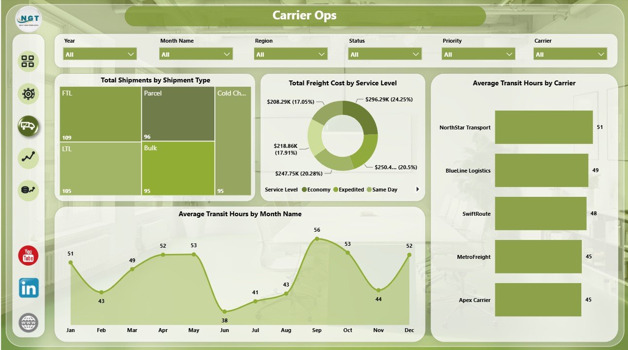
Carrier Ops
4 – Transit
The Transit page focuses on service reliability, priority mix, shipment type, and regional cost. It helps teams understand whether shipment demand and freight spend are aligned with on-time performance.
Total Shipments by Priority: This chart shows shipment volume by priority. It helps teams understand how much workload is urgent, high priority, standard, or low priority.
On Time Shipments by Region: This visual compares regional on-time output. It helps managers identify locations with strong service reliability and regions that need corrective action.
Average Transit Hours by Shipment Type: This chart compares transit hours across shipment categories. It helps teams find shipment types that consistently take longer.
Total Freight Cost by Region: This visual compares regional freight cost. It helps leaders connect geography with cost pressure and service performance.
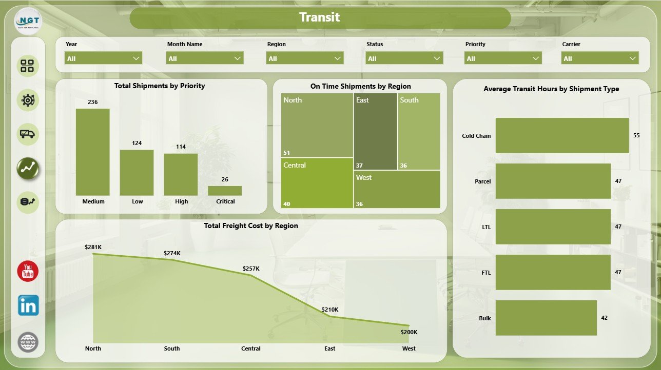
Transit
5 – Cost
The Cost page gives finance and operations teams a deeper view of logistics cost by time period and hub. It is helpful for monthly cost reviews, quarterly planning, and hub performance comparisons.
Total Shipments by Destination Hub: This chart shows where shipment volume is landing. It helps teams identify high-volume destination hubs and demand concentration.
Total Logistics Cost by Quarter: This quarterly trend supports management reporting and budget review. It helps leaders see whether logistics cost is rising or falling across quarters.
Total Logistics Cost by Origin Hub: This chart compares logistics cost by origin hub. It helps teams identify expensive hubs and investigate the operating drivers behind the spend.
Total Freight Cost by Month Name: This monthly freight trend supports recurring cost tracking. It helps managers see seasonal movement and changing carrier spend patterns.
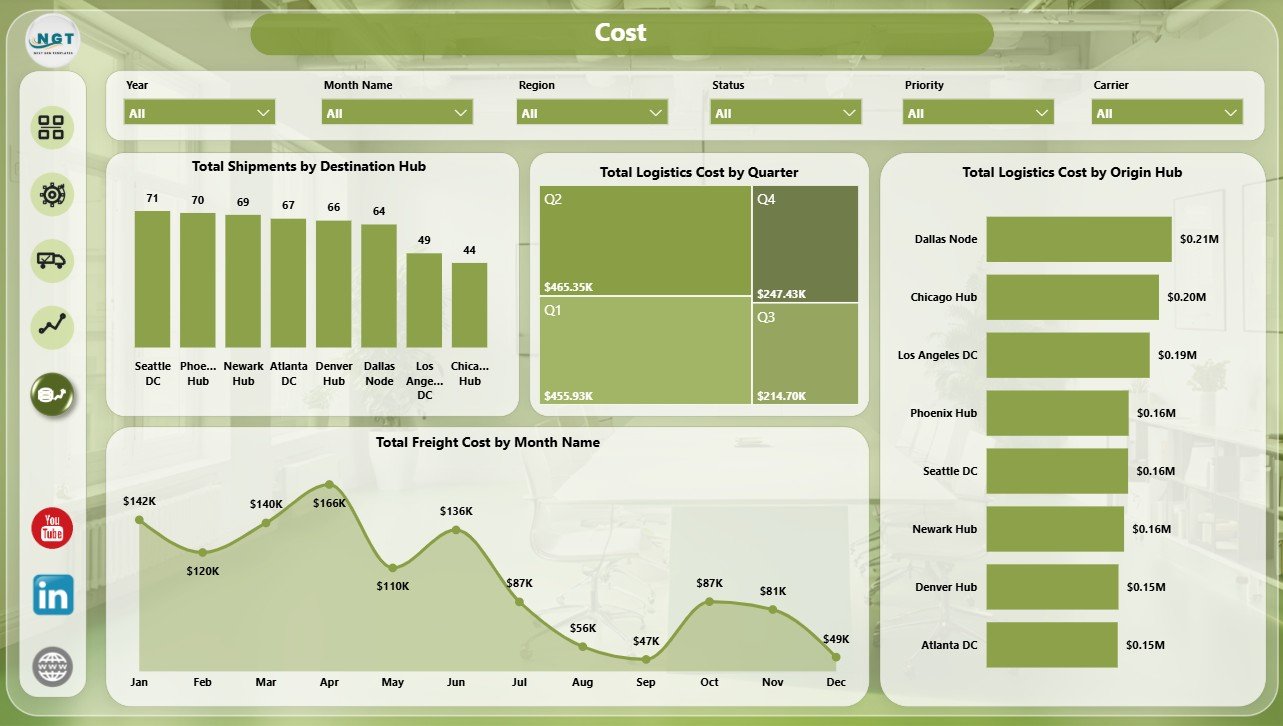
Cost
Logistics Automation Dashboard in Power BI vs. Tableau vs. Paid Logistics SaaS – Feature Comparison
| Feature | This Power BI dashboard | Tableau or Qlik alternative | Paid logistics SaaS |
|---|---|---|---|
| Cost | $17.99 one-time | License plus build time | Monthly or annual subscription |
| Platform | Power BI Desktop and Power BI Service | Tableau, Qlik, or another BI tool | Vendor-hosted system |
| Setup time | Open PBIX, connect or replace data, refresh | Build or adapt dashboards | Implementation and onboarding |
| Real-time team collaboration | Available through Power BI Service when published | Available with cloud plans | Usually included |
| Mobile access | Power BI mobile after publishing | Plan dependent | Usually included |
| Customizable fields | Editable model, pages, visuals, and slicers | Editable with BI skills | Depends on vendor permissions |
| Share with link | Available through Power BI Service | Available with cloud publishing | Login controlled |
| Year-1 cost at 5 users | $17.99 plus any Microsoft licensing | License and implementation dependent | Often hundreds or thousands |
| Logistics automation analytics | Included across 5 ready-made pages | Must be built or purchased | Depends on module and plan |
Who Should Use This Template
This template is designed for logistics managers, supply chain analysts, transportation coordinators, carrier operations teams, warehouse reporting teams, 3PL analysts, procurement teams, and consultants who need a clear dashboard for logistics cost, freight cost, handling cost, automation rate, shipment volume, on-time performance, transit hours, carriers, hubs, regions, and service levels.
It is not a live dispatch platform, route optimizer, GPS tracking system, transport management system, barcode scanning tool, carrier API connector, or warehouse execution system. It works best as a management reporting layer after your logistics data has been exported or connected to Power BI.
Real-World Use Cases
Ravi, logistics operations manager: Ravi uses the Overview and Transit pages before weekly meetings to review logistics cost, freight spend, shipment volume, on-time rate, and regional service performance.
Meera, supply chain analyst: Meera uses the Automation page to compare automation rate by region, automation system, and service level, then checks handling cost by month to see whether automation is improving cost control.
Daniel, 3PL reporting consultant: Daniel adapts the PBIX file for client reporting and uses the Carrier Ops and Cost pages to explain carrier speed, service-level freight cost, origin hub spend, and destination hub volume.
Advantages of Logistics Automation Dashboard in Power BI
The biggest advantage is speed. You do not need to design a report layout, create every chart from scratch, or decide which logistics pages to include. The structure is already built around common logistics questions: how much are we spending, which carriers cost more, where is automation working, which regions are on time, and which hubs are driving cost?
The second advantage is flexibility. Since this is a Power BI file, you can edit measures, visuals, colors, labels, slicers, pages, and model relationships. A team can use the template as-is for quick reporting or treat it as a foundation for a more customized internal logistics analytics model.
Opportunities for Improvement
This dashboard is a reporting template, so it depends on clean source data. If carrier names, hub names, dates, service levels, priorities, shipment types, and automation system names are inconsistent, the visuals may need cleanup before they tell a reliable story.
Teams that need live operational execution should pair this with their TMS, WMS, ERP, or carrier platform. The dashboard is best for analysis and management reporting, not dispatching, routing, scanning, or shipment tracking.
Best Practices
Keep a stable data structure before connecting your own source. Use consistent carrier names, region names, hub codes, service levels, and shipment types. Validate totals for logistics cost, handling cost, freight cost, shipment count, and on-time rate after the first refresh.
Use the Overview page for leadership review, the Automation page for process improvement, the Carrier Ops page for carrier meetings, the Transit page for reliability analysis, and the Cost page for finance or budget discussions. This keeps the dashboard focused and easier to explain.
Explore Relevant Templates
You can download the product here: Logistics Automation Dashboard in Power BI.
Related templates include Logistics Automation Dashboard in Excel, Last-mile Delivery Dashboard in Power BI, Third-Party Logistics (3PL) Dashboard in Power BI, and the Power BI Dashboard Mega Collection.
Frequently Asked Questions
What does this Power BI dashboard track?
It tracks logistics cost, handling cost, freight cost, shipment volume, on-time rate, automation rate, carrier cost, service level cost, transit hours, regional freight cost, origin hub cost, destination hub volume, monthly trends, quarterly trends, and yearly trends.
Do I need Power BI Desktop?
Yes. The downloadable file is designed to open in Power BI Desktop. You can publish it to Power BI Service if your Microsoft account and license allow online sharing.
Can I connect my own data?
Yes. You can replace the sample data or connect the report to your own logistics source, then refresh the visuals and validate the totals.
Can I customize pages and visuals?
Yes. You can edit pages, chart types, fields, slicers, colors, labels, measures, and the data model inside Power BI Desktop.
Is this a transport management system?
No. It is a reporting and analytics dashboard, not a dispatch, route optimization, GPS tracking, scanning, or carrier execution platform.
Can this help with carrier review meetings?
Yes. The Carrier Ops page is designed to review freight cost by service level, shipments by shipment type, transit hours by carrier, and transit hours by month.
About the Author
Built by PK – Microsoft Certified Professional with 15+ years of Excel, Google Sheets, and Power BI experience. Founder of NextGenTemplates, reaching 300K+ subscribers across YouTube channels. Every template is hand-built and tested before release.
Conclusion
The Logistics Automation Dashboard in Power BI is a practical reporting template for teams that want to monitor logistics automation, freight cost, handling cost, carrier operations, shipment volume, on-time performance, transit hours, and hub-level cost without building every report page from scratch. Use it as a ready-made Power BI reporting layer, customize it for your operation, and refresh it whenever your logistics data changes.
Visit YouTube.com/@PKAnExcelExpert for more Excel, Power BI, and dashboard tutorials.