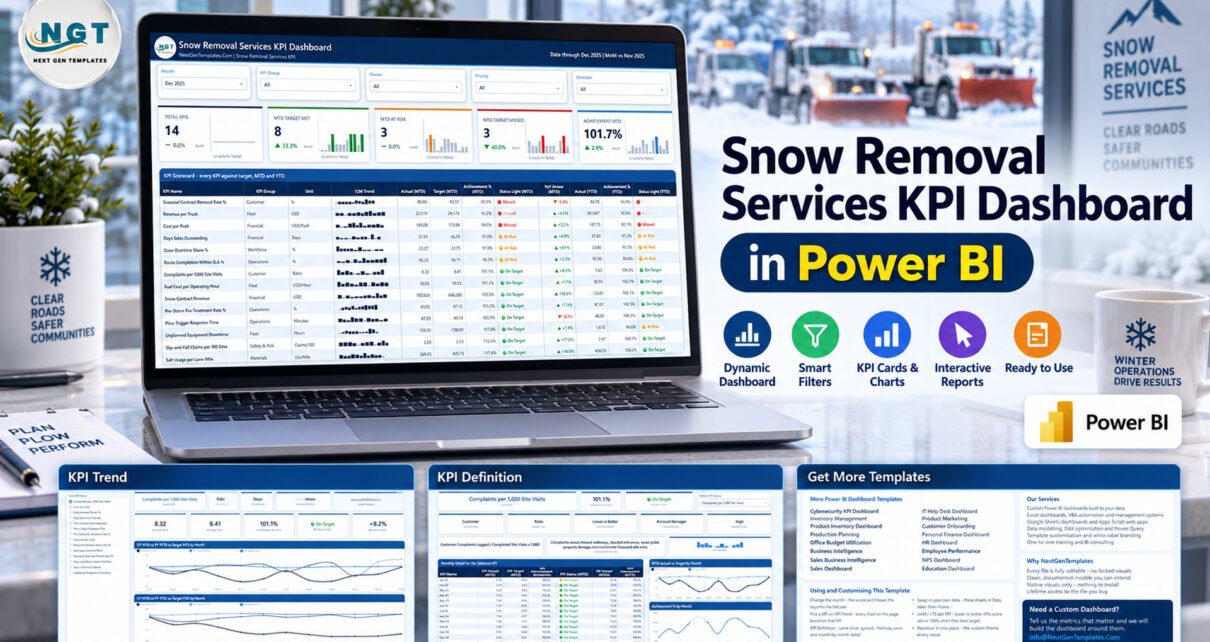
Snow Removal Services KPI Dashboard in Power BI gives winter-operations teams one place to review 14 KPIs across operations, fleet, finance, customer service, workforce, safety, and materials. Instead of reading isolated monthly spreadsheets, managers can filter by month, KPI group, owner, priority, and direction, then compare actuals with targets and prior-year performance. The template combines a full scorecard, selected-KPI trend analysis, detailed definitions, and 12-month history. If you need a structured snow removal kpi dashboard without building the report from scratch, this guide explains exactly what the template does—and what it deliberately does not do.
Download the Snow Removal Services KPI Dashboard in Power BI from NextGenTemplates. The download includes the editable PBIX, Data.xlsx, and a user manual.
Power BI KPI template for snow-removal service performance
Key Features of the Power BI Template
This power bi kpi dashboard template focuses on performance review rather than operational transaction processing. It is also suitable as a snow removal performance dashboard or winter operations kpi dashboard when your team already maintains monthly actual, target, and prior-year data.
- 14 defined KPIs spanning commercial, operational, fleet, service, workforce, safety, and material-use perspectives.
- MTD and YTD analysis with actual, target, achievement percentage, status, and year-over-year movement.
- On Target, At Risk, and Missed lights that respect upper-the-better and lower-the-better KPI direction.
- Five slicers for Month, KPI Group, Owner, Priority, and Direction.
- 12-month trend views for the selected KPI across current-year, prior-year, and target series.
- Definition and ownership context including formula, definition, unit, group, owner, direction, and priority.
- Editable Power BI files backed by a supplied Excel data source.
Dashboard Pages Explanation
KPI Scorecard
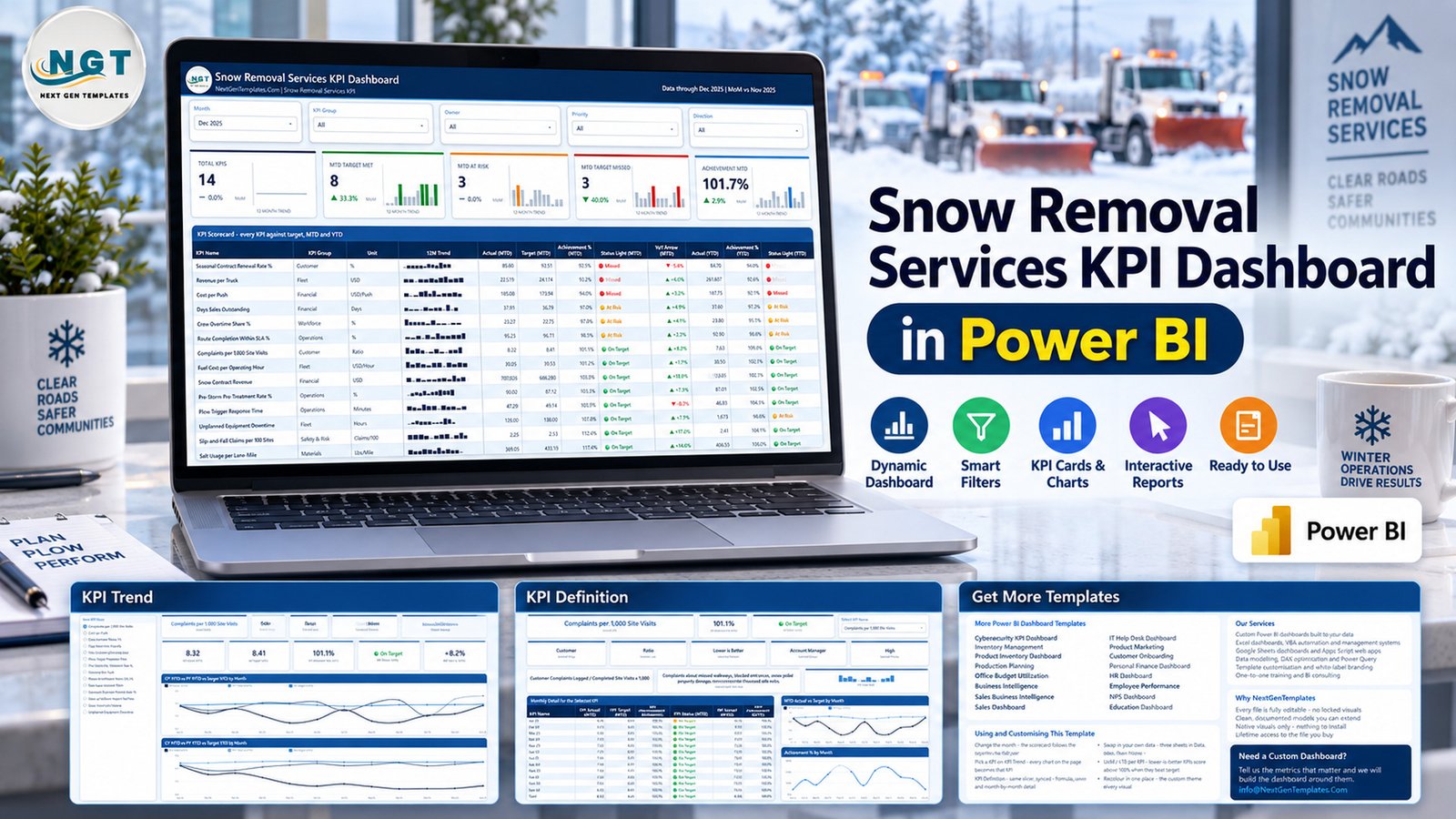
The first page is the operating overview. Five filters sit above five summary cards: Total KPIs, MTD Target Met, MTD At Risk, MTD Target Missed, and Achievement MTD. The detailed table then lists every KPI with a 12-month sparkline, MTD actual, MTD target, achievement, status light, MTD year-over-year direction, YTD actual, YTD achievement, and YTD status.
The 14 included measures are Seasonal Contract Renewal Rate, Revenue per Truck, Cost per Push, Days Sales Outstanding, Crew Overtime Share, Route Completion Within SLA, Complaints per 1,000 Site Visits, Fuel Cost per Operating Hour, Snow Contract Revenue, Pre-Storm Pre-Treatment Rate, Plow Trigger Response Time, Unplanned Equipment Downtime, Slip-and-Fall Claims per 100 Sites, and Salt Usage per Lane-Mile.
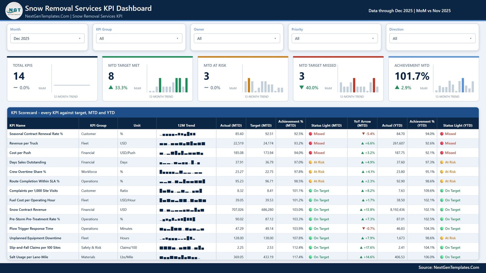
The main scorecard shows all KPIs against MTD and YTD targets
KPI Trend
The Trend page begins with a KPI selector and metadata cards for group, unit, direction, owner, and priority. It then shows actual, target, achievement, status, and year-over-year change for the selected month. Two line charts compare current-year actual, prior-year actual, and target by month for MTD and YTD. This makes it easier to distinguish a one-month exception from a developing pattern.
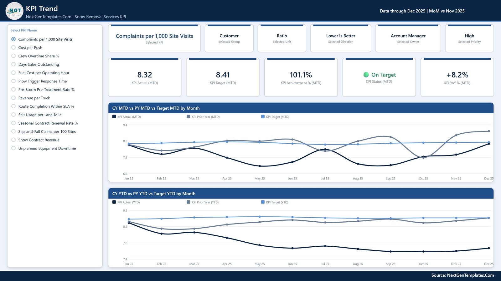
Selected-KPI MTD and YTD trends
KPI Definition
The Definition page adds the context that executive scorecards often omit. For the selected KPI, it displays formula, written definition, group, unit, direction, owner, and priority. A monthly table shows actual, target, achievement, status, YTD actual, and YTD achievement, while two charts visualise actual-versus-target and achievement percentage.
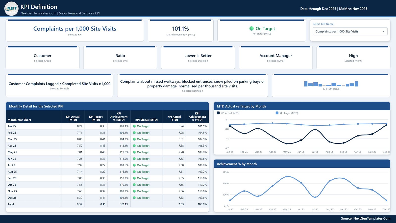
Definition, ownership, and monthly performance for one KPI
Template Information and Support
The fourth page is an in-report guide. It explains how to change the month, pick a KPI, swap in your own data through the three sheets in Data.xlsx, refresh the report, interpret upper-the-better and lower-the-better KPIs, and recolour the report through its custom theme. It also links users to other template and consulting resources.
Snow Removal Services KPI Dashboard in Power BI vs. Excel vs. Paid SaaS – Feature Comparison
| Feature | This Power BI template | Excel dashboard | Field-service SaaS |
|---|---|---|---|
| Primary purpose | Interactive KPI review | Spreadsheet KPI reporting | Broader operational workflow |
| Commercial model | One-time template purchase | One-time workbook purchase | Usually recurring subscription |
| Monthly trend analysis | Interactive MTD and YTD charts | Possible with workbook charts | Varies by vendor and plan |
| Custom fields and visuals | Editable in Power BI Desktop | Editable in Excel | Usually controlled by configuration |
| Dispatch and GPS | Not included | Not included | Often available |
| Data source | Supplied Excel tables | Workbook tables | Vendor database and integrations |
| Sharing | Depends on Microsoft licensing and workspace setup | File or cloud-workbook sharing | Usually included for licensed users |
Who Should Use This Template
Snow-removal operations managers can review route completion, pre-treatment, response time, complaints, and material use before monthly service meetings. Fleet managers can monitor revenue per truck, downtime, fuel cost, and cost per push. Finance and account leaders can connect snow contract revenue, days sales outstanding, and renewal rate with operational outcomes.
The template is not designed for teams that need live vehicle tracking, route optimisation, crew dispatch, work orders, invoicing, weather feeds, or automated source-data capture. It also does not guarantee regulatory, contractual, or safety compliance. Those processes require appropriate operational systems, controls, and professional review.
Real-World Use Cases
Pre-season baseline and ownership review
Load prior-year and target values, confirm which manager owns each KPI, and agree which measures are upper-the-better or lower-the-better before the first significant event.
Monthly contract-performance meeting
Filter the scorecard to customer, fleet, operations, or financial groups, then move from a missed status to its 12-month trend and written definition before assigning action.
Fleet cost and availability discussion
Review downtime, fuel cost per operating hour, revenue per truck, and cost per push together rather than treating each measure as an isolated spreadsheet.
Service-quality and risk review
Use complaints per 1,000 site visits, route completion within SLA, response time, and slip-and-fall claims as monitoring inputs. The dashboard reports entered data; it is not a substitute for incident investigation or safety management.
Advantages of This Power BI KPI Template
The strongest advantage is consistency. Each KPI uses the same review pattern: definition, ownership, target, actual, achievement, status, and history. Power BI lets users move from portfolio-level status to a single KPI without maintaining separate reports. The supplied Excel source also gives teams a familiar data-entry layer, while the PBIX remains editable for analysts who want to extend it.
The visual model is intentionally compact: a scorecard for breadth, Trend for time context, and Definition for meaning. This avoids pretending that more pages always create more insight.
Opportunities for Improvement
The template does not include automated feeds, mobile forms, alerting, write-back, route maps, or dispatch functions. Teams can extend the model with their own systems, but such integration work is not included. The supplied KPIs should also be reviewed against your contracts, operating model, data definitions, and local requirements before they are adopted as management measures.
Power BI sharing may require licences or an organisational workspace. Check the current guidance in Microsoft Learn’s Power BI sharing documentation before planning distribution.
Best Practices
- Keep an untouched copy of the download before modifying the model.
- Define one accountable owner and one written formula for every KPI.
- Confirm direction logic: a lower value is favourable for measures such as response time, downtime, complaints, and cost, while a higher value is favourable for measures such as renewal or revenue.
- Refresh on a consistent monthly cut-off and document late data.
- Investigate status changes with operational evidence rather than treating the traffic light as a conclusion.
- Review targets periodically so that achievement percentages remain meaningful.
Explore Relevant Templates
If you want a related construction-services Power BI view, see the published Crane Rental KPI Dashboard in Power BI and Scaffolding Services KPI Dashboard in Power BI. For a broader spreadsheet example in an adjacent outdoor-services area, review the Landscaping Dashboard in Excel. These are separate templates, so choose the platform and KPI structure that match your workflow.
Frequently Asked Questions
What is included in the download?
You receive the editable PBIX file, Data.xlsx source workbook, and the Power BI dashboard user manual.
How many KPIs are included?
The report contains 14 KPIs shown on the scorecard and available on the Trend and Definition pages.
Can I replace the sample data?
Yes. Replace the sample data while preserving the expected table and column structure, then refresh the PBIX in Power BI Desktop.
Does it provide real-time data?
No. It reports the data loaded into the supplied source structure. No live weather, telematics, GPS, dispatch, or finance-system connector is included.
Can I share the report with my team?
You can share according to your Power BI licensing and workspace configuration. Microsoft licensing is separate from this template.
Is the KPI status logic editable?
Yes. The PBIX is editable, although changing measures or direction logic requires suitable Power BI and DAX knowledge.
Is this the same as a KPI scorecard?
No. This edition includes the Power BI scorecard plus dedicated Trend, Definition, and information pages. Excel, Google Sheets, and scorecard editions are separate products.
About the Author
Built by PK – Microsoft Certified Professional with 15+ years of Excel, Google Sheets, and Power BI experience. Founder of NextGenTemplates, reaching 300K+ subscribers across YouTube channels. Every template is hand-built and tested before release.
Conclusion
This Power BI dashboard is a practical starting point for teams that already collect monthly performance data and want a clearer review system. Its 14-KPI scorecard shows where performance stands, Trend adds time context, and Definition explains what each selected measure means and who owns it.
Download the template, replace the sample data, validate the definitions against your operation, and use the dashboard to support—not replace—managerial judgement.
For more Excel and Power BI tutorials, visit the PK: An Excel Expert YouTube channel.