In today’s digital world, IT and Tech departments play a critical role in business growth, innovation, and service delivery. But with so much data and multiple teams involved, reporting performance to stakeholders can be challenging. That’s where the IT and Tech Stakeholder Reporting KPI Dashboard in Excel comes in.
This ready-to-use Excel-based dashboard helps IT leaders monitor key metrics, spot performance trends, and deliver powerful reports to internal or external stakeholders. In this article, you’ll learn everything about this tool—its features, benefits, best practices, and more.
Click to Purchases IT and Tech Stakeholder Reporting KPI Dashboard in Excel
What Is the IT and Tech Stakeholder Reporting KPI Dashboard?
The IT and Tech Stakeholder Reporting KPI Dashboard is a structured Excel tool designed to help technology teams track and report performance indicators clearly and effectively. Built for IT managers, analysts, and decision-makers, this dashboard converts raw performance data into meaningful insights.
It includes 7 dedicated worksheets, user-friendly drop-downs, interactive charts, and built-in formulas for automation. With minimal effort, you can generate monthly and year-to-date (YTD) reports, highlight performance gaps, and measure trends over time—all within Microsoft Excel.
Why Do You Need a Stakeholder KPI Dashboard in IT?
In any tech-driven environment, data gets scattered across systems. Metrics like incident resolution time, system uptime, software deployment rates, and customer satisfaction scores matter—but collecting and explaining them to stakeholders can become chaotic.
A KPI dashboard solves that by:
-
Centralizing performance data
-
Automating calculations
-
Providing visual representation
-
Saving reporting time
-
Enabling data-driven decisions
Key Worksheets in the KPI Dashboard
Let’s walk through the 7 powerful sheets included in the IT and Tech Stakeholder Reporting KPI Dashboard:
Home Sheet: Your Control Center
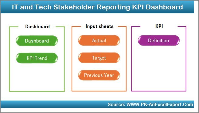
This is the index sheet that acts as the command center. It includes six navigation buttons that allow you to jump directly to any worksheet in the dashboard with a single click. No need to scroll through tabs—just point and go!
Click to Purchases IT and Tech Stakeholder Reporting KPI Dashboard in Excel
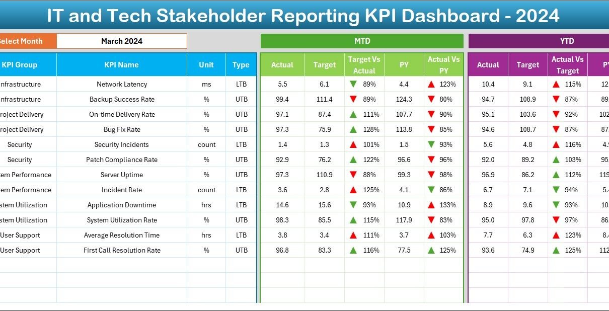
Dashboard Sheet: Monthly & YTD Snapshot
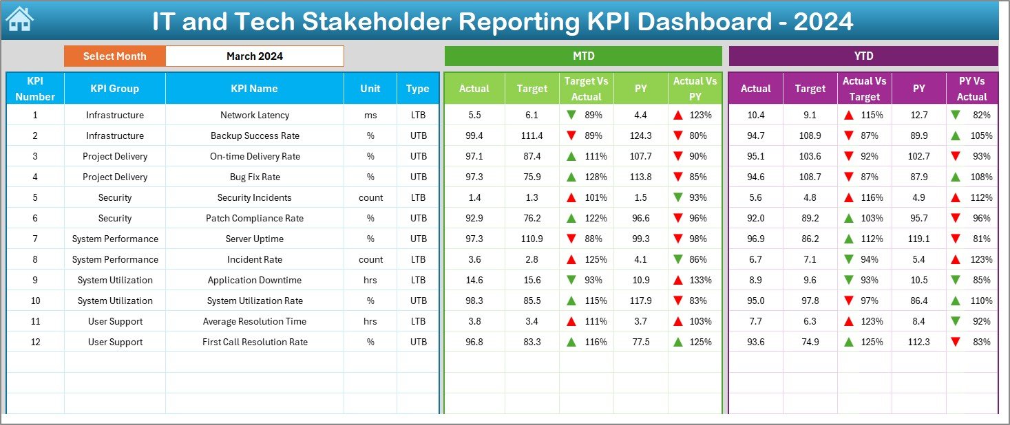
This is the main dashboard—designed for visual impact and high-level decision-making.
-
You can select any month from a drop-down in cell D3, and the entire dashboard updates instantly.
-
View MTD (Month-To-Date) metrics including Actual, Target, Previous Year, and performance comparisons.
-
Similarly, get YTD (Year-To-Date) values with conditional formatting:
- Upward arrows for improvement
- Downward arrows for decline
-
This dashboard is perfect for presenting at meetings, showing trends, and aligning performance with business goals.
KPI Trend Sheet: Visualize Long-Term Performance
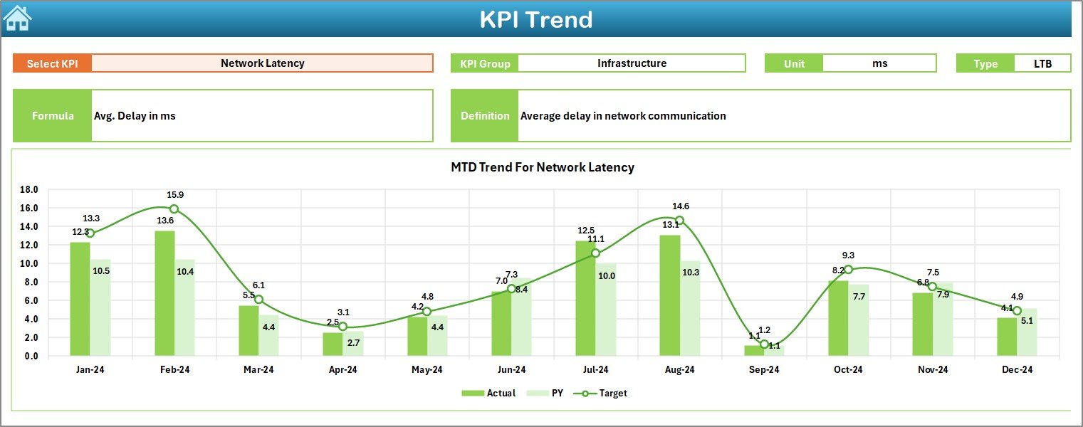
In this tab, you can select a specific KPI from the dropdown in cell C3.
-
It displays the KPI Group, Unit, Formula, and Type (UTB – Upper The Better or LTB – Lower The Better).
Click to Purchases IT and Tech Stakeholder Reporting KPI Dashboard in Excel
Includes two trend charts for:
- MTD trend of Actual, Target, PY
- YTD trend of Actual, Target, PY
-
This is useful for identifying whether a KPI is consistently improving or needs intervention.
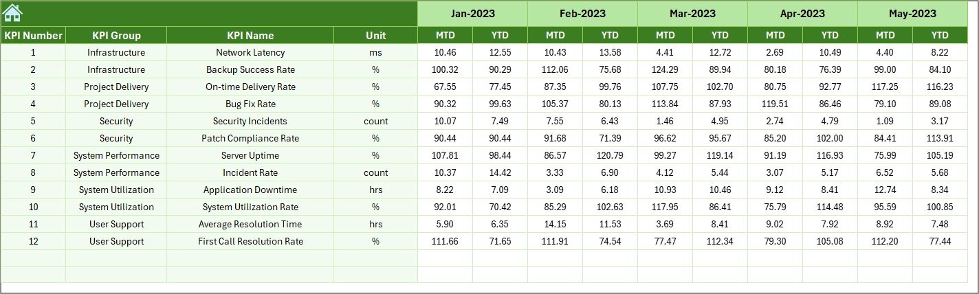
Actual Numbers Input Sheet: Feed Live Data
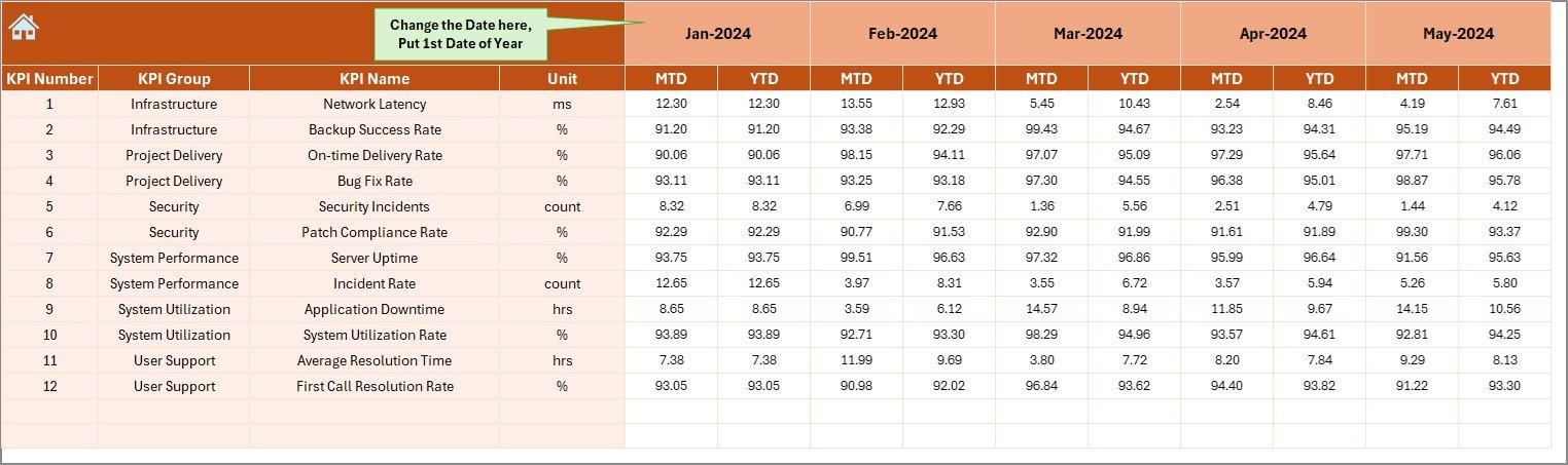
This is the worksheet where you enter the real-time data for each month.
-
Update the actual MTD and YTD values as the month progresses.
-
You can also define the start month of the year in cell E1, which adjusts the calculations accordingly.
-
This flexibility helps global teams that may not follow the standard January-December calendar.
Target Sheet: Set Performance Goals
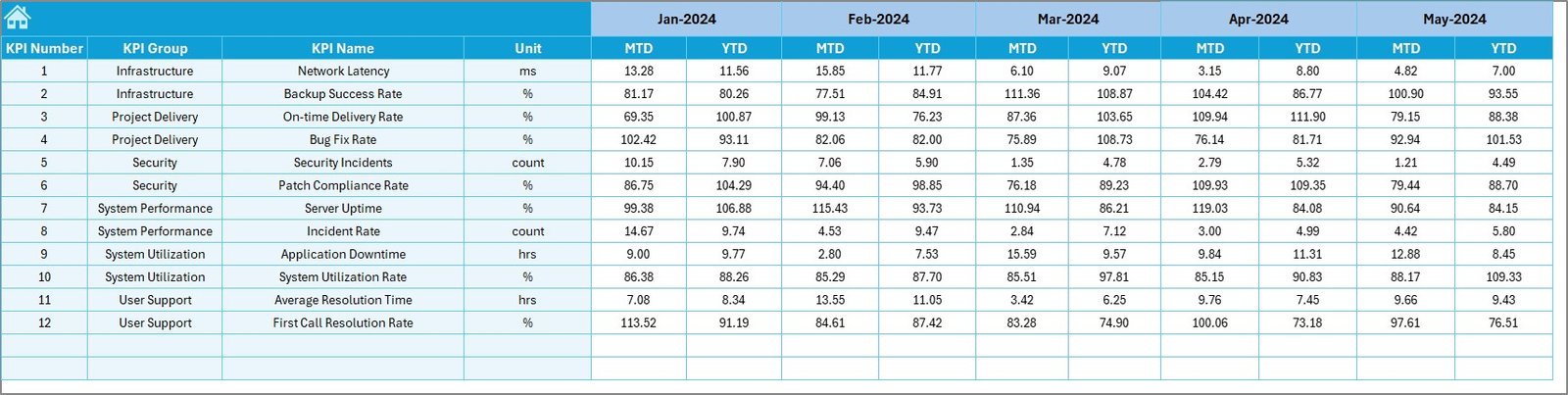
You can enter monthly and year-to-date target values for every KPI here.
-
Helps you benchmark current performance against defined goals.
-
The dashboard automatically pulls these values for comparison with actual performance.
Previous Year Number Sheet: Historical Data Tracking
This worksheet is meant to capture the same KPIs for the previous year.
-
Inputting these numbers allows year-over-year (YoY) comparison.
-
Stakeholders can see whether the team has improved, stagnated, or regressed over time.
KPI Definition Sheet: Keep Everyone on the Same Page
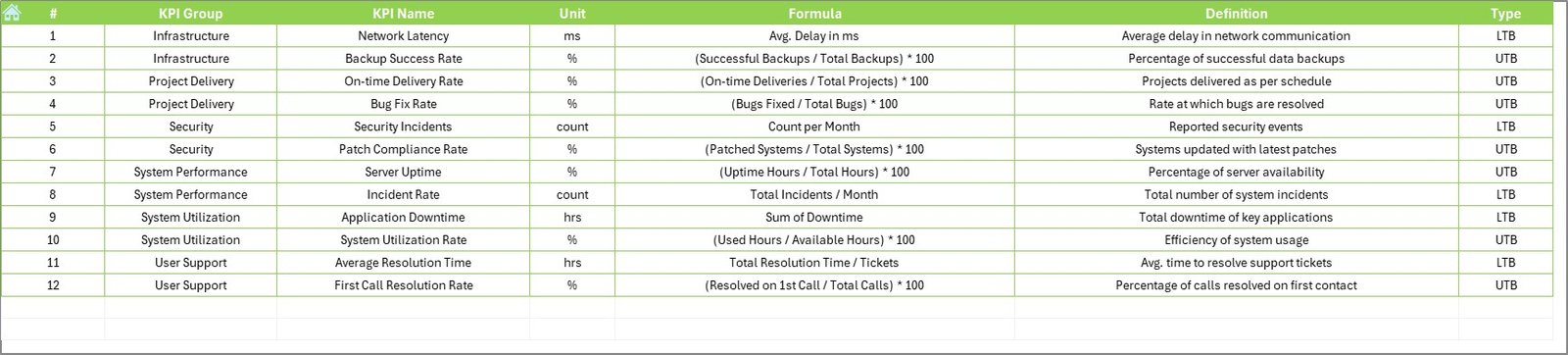
This tab defines every KPI you’re tracking.
-
Includes columns for KPI Name, KPI Group, Unit, Formula, and Definition.
-
It helps eliminate confusion and aligns teams on what each metric actually means.
Advantages of Using an IT and Tech KPI Dashboard in Excel
Let’s now explore how this Excel dashboard benefits your IT operations and stakeholder communication.
📊 Simplifies Stakeholder Reporting
You can generate monthly and YTD summaries in seconds, avoiding the hassle of PowerPoint slides or scattered spreadsheets.
🚀 Enables Quick Decision-Making
With conditional formatting and charts, trends and anomalies become obvious—helping leaders act faster.
🧠 Ensures Transparency
Every metric is clearly defined and accessible. There’s no guesswork or hidden data.
⏱ Saves Time and Reduces Errors
Manual calculation or cross-checking becomes a thing of the past. Excel does the heavy lifting.
📈 Enhances Data-Driven Culture
Once stakeholders see regular, reliable reports, it builds a culture that values measurement and performance.
Best Practices for Using the IT & Tech Stakeholder KPI Dashboard
To get the most from this Excel tool, follow these practical tips:
1. Keep KPI Definitions Simple
Avoid jargon. Use short and easy-to-understand definitions for each KPI.
2. Update Data Regularly
Ensure Actual, Target, and Previous Year data are entered timely each month.
3. Use Consistent Units
Always use the same unit (e.g., %, hours, count) for a KPI across months and years.
4. Limit KPIs to What Matters
Don’t overcomplicate the dashboard with too many metrics. Focus on the 12-15 KPIs that matter most to your stakeholders.
5. Use Visuals Wisely
Conditional formatting, arrows, and trend lines should highlight performance—not confuse the viewer.
How to Customize the Dashboard for Your IT Team?
Every organization is different. Luckily, Excel makes it easy to customize this dashboard:
-
Add or remove KPIs based on team needs.
-
Change units (e.g., Hours to Minutes).
-
Modify slicers and dropdowns.
-
Add charts or export to PDF for stakeholder presentations.
-
Protect sheets or lock formulas to avoid accidental changes.
How Often Should You Share the KPI Dashboard?
Most IT leaders prefer monthly updates, especially during leadership reviews. However:
-
Share weekly or bi-weekly updates for critical metrics (like system uptime or ticket backlogs).
-
Use quarterly summaries to show long-term trends and team performance.
You can even automate email reports using Excel VBA or Power Automate if desired.
Conclusion: Make Stakeholder Reporting Smarter, Not Harder
The IT and Tech Stakeholder Reporting KPI Dashboard in Excel is more than just a spreadsheet. It’s a powerful tool that brings structure, clarity, and impact to your performance reporting.
You no longer need to spend hours gathering, calculating, and formatting data. With this dashboard, all your KPIs are in one place—updated, visual, and presentation-ready.
Start using it today to make reporting faster, easier, and more strategic.
Frequently Asked Questions (FAQs)
❓ What is a stakeholder reporting dashboard?
A stakeholder reporting dashboard is a visual tool used to communicate key performance indicators (KPIs) to internal or external stakeholders. It helps summarize performance, trends, and areas for improvement.
❓ How do I use the KPI Dashboard in Excel?
You simply input monthly data into the Actual, Target, and Previous Year sheets. Then, select the month from the dropdown on the Dashboard sheet. The charts and figures update automatically.
❓ Can I add more KPIs to this dashboard?
Yes. You can add new rows in the KPI Definition, Actuals, Target, and Previous Year sheets. Make sure to adjust any formulas or charts if needed.
❓ What’s the difference between MTD and YTD in this dashboard?
-
MTD (Month-to-Date) shows current month’s progress.
-
YTD (Year-to-Date) accumulates performance from the start of the year up to the current month.
❓ Is this dashboard compatible with Google Sheets?
This dashboard uses Excel-specific formulas and features like slicers and conditional formatting. It is best used in Excel. You can try importing into Google Sheets, but some functionalities may not work as expected.
Visit our YouTube channel to learn step-by-step video tutorials