Managing a team in today’s fast-paced business environment requires more than just assigning tasks and monitoring progress. Organizations need data-driven insights to evaluate productivity, identify gaps, and improve overall performance. This is where a Team Performance Dashboard in Power BI becomes invaluable.
Power BI provides interactive dashboards that transform raw data into meaningful insights. With a well-designed Team Performance Dashboard, businesses can visualize tasks, monitor completion rates, evaluate efficiency, and analyze workload distribution. In this article, we will explore the structure, benefits, and best practices of a Team Performance Dashboard in Power BI, while also addressing common questions professionals often have.
Click to Purchases Team Performance Dashboard in Power BI
What Is a Team Performance Dashboard in Power BI?
A Team Performance Dashboard in Power BI is a data visualization tool that helps organizations measure and track the effectiveness of their teams. By integrating task data from Excel or other sources, Power BI transforms this information into charts, KPIs, and reports that highlight trends and progress in real time.
Unlike static reports, this dashboard allows managers to drill down into details, analyze performance by team, task type, or time frame, and make informed decisions that enhance productivity.
Key Features of the Team Performance Dashboard
This ready-to-use dashboard captures data in Excel and processes it within Power BI. It consists of five key pages, each designed to provide unique insights:
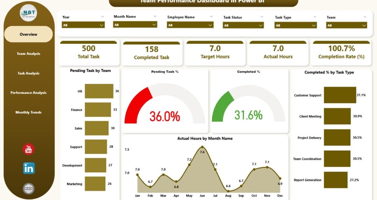
Overview Page
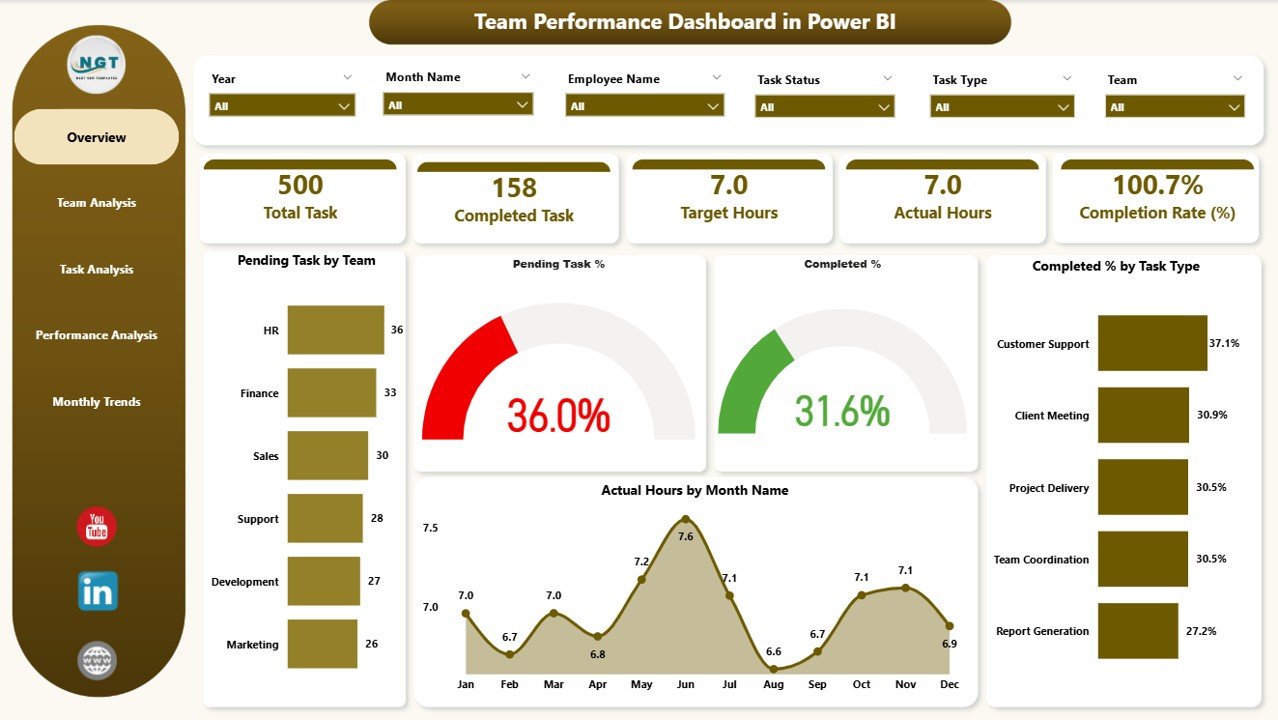
The Overview Page acts as the entry point of the dashboard.
-
It includes six slicers for filtering data.
-
Five cards display critical KPIs such as Pending Tasks, Completion Percentage, and Overall Progress.
Four charts give a quick snapshot:
- Pending Tasks by Team
- Pending Task Percentage
- Completed Percentage by Task Type
- Actual Hours by Month
This page enables managers to instantly identify task distribution and completion status.
Team Analysis Page
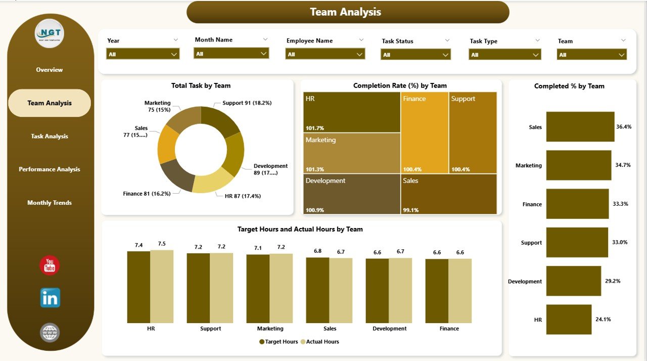
The Team Analysis Page focuses on performance at the team level.
-
Six slicers make it easy to filter by department, team, or time period.
Four key charts showcase:
- Total Tasks by Team
- Completion Rate (%) by Team
- Completed Percentage by Team
- Target Hours vs Actual Hours by Team
This section highlights workload distribution, efficiency, and whether teams are meeting targets.
Click to Purchases Team Performance Dashboard in Power BI
Task Analysis Page
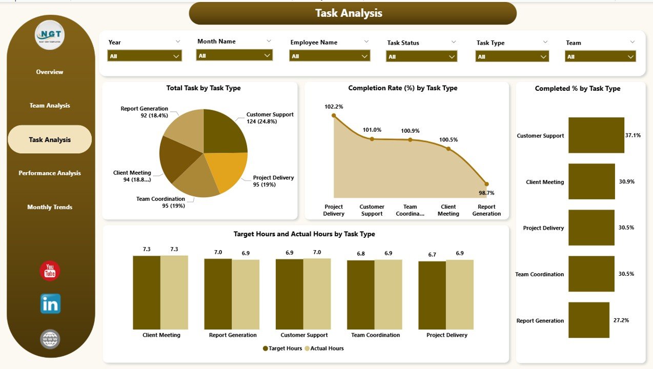
The Task Analysis Page provides detailed insights into task types.
-
Six slicers enable users to refine analysis.
Four critical charts show:
- Total Tasks by Task Type
- Completion Rate (%) by Task Type
- Completed Percentage by Task Type
- Target Hours vs Actual Hours by Task Type
With this view, managers can identify which types of tasks consume the most time and which contribute most to overall success.
Performance Analysis Page
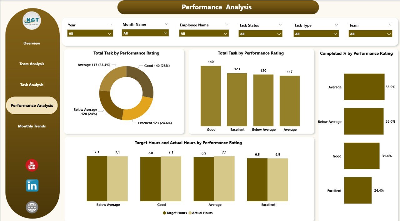
The Performance Analysis Page evaluates outcomes by performance rating.
-
Six slicers support flexible filtering.
Four charts highlight:
- Total Tasks by Performance Rating
- Completed Percentage by Performance Rating
- Overall Tasks Completed
- Target Hours vs Actual Hours by Rating
This helps organizations link task execution with quality ratings and recognize top performers.
Monthly Trends Page
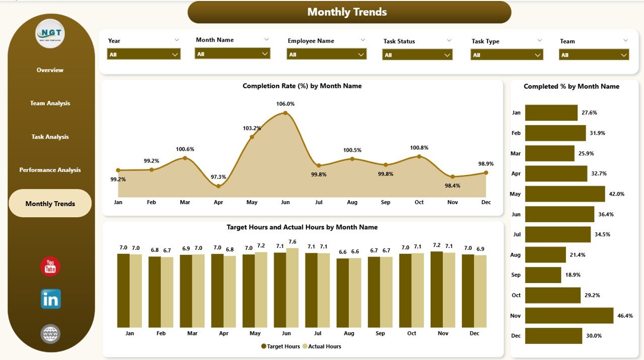
The Monthly Trends Page tracks performance over time.
Charts display:
- Completion Rate (%) by Month
- Completed Percentage by Month
- Target Hours vs Actual Hours by Month
This time-based analysis helps in identifying seasonal variations and long-term trends.
Why Use a Team Performance Dashboard in Power BI?
A Team Performance Dashboard provides clarity, visibility, and actionable insights. Instead of relying on manual reports or static spreadsheets, Power BI brings interactivity and automation. Teams and leaders can monitor progress, identify bottlenecks, and improve collaboration through real-time data.
Advantages of a Team Performance Dashboard in Power BI
Here are the major benefits of using this dashboard:
📊 Real-time insights – Track task progress as it happens.
⏱ Improved efficiency – Spot delays early and take corrective action.
🎯 Goal alignment – Compare actual performance against targets.
📈 Trend analysis – Identify performance patterns across months.
👥 Team accountability – Evaluate workload and task completion by team.
✅ Informed decisions – Use data to allocate resources more effectively.
🔍 Transparency – Ensure managers and employees are aligned with performance expectations.
Best Practices for Building a Team Performance Dashboard in Power BI
To maximize the value of your dashboard, follow these best practices:
-
Keep it simple and clear: Avoid clutter. Focus on KPIs and charts that matter.
-
Use slicers wisely: Enable users to filter by team, task, or time for flexibility.
-
Ensure data accuracy: Validate your data sources before visualization.
-
Highlight KPIs: Use cards and progress bars to emphasize metrics like completion rate.
-
Leverage drill-throughs: Allow deeper analysis for managers who need detailed insights.
-
Focus on user experience: Use consistent colors, clean layouts, and clear labels.
-
Update regularly: Refresh data to ensure stakeholders always see the latest performance results.
How to Implement a Team Performance Dashboard in Power BI
-
Collect Data – Start with task data from Excel, project management tools, or databases.
-
Clean and Transform Data – Use Power Query to remove duplicates, standardize formats, and prepare the dataset.
-
Load Data into Power BI – Import the processed data into Power BI Desktop.
-
Build Visualizations – Create cards, charts, and slicers to represent KPIs.
-
Design Dashboard Pages – Organize visuals into pages like Overview, Team Analysis, and Monthly Trends.
-
Apply Filters and Slicers – Add interactivity to make data exploration easy.
-
Publish and Share – Deploy the dashboard in Power BI Service and share it with stakeholders.
Common Challenges and How to Overcome Them
-
Data Quality Issues – Ensure data consistency by cleaning records before import.
-
Too Many Visuals – Focus on the most important KPIs to avoid overwhelming users.
-
Lack of User Adoption – Train teams on how to use and interpret the dashboard.
-
Performance Issues – Optimize large datasets by using aggregations and filtering.
Conclusion
A Team Performance Dashboard in Power BI is more than just a reporting tool—it is a decision-making powerhouse. It gives organizations a complete view of productivity, helps managers allocate resources effectively, and encourages teams to stay accountable. With proper implementation and best practices, businesses can turn raw data into actionable insights and foster a culture of continuous improvement.
Frequently Asked Questions (FAQs)
1. What is a Team Performance Dashboard in Power BI?
It is a visual reporting tool that tracks team productivity, task completion, and performance trends using Power BI.
2. Can I connect data sources other than Excel?
Yes, Power BI supports multiple sources like SQL databases, SharePoint, and cloud services.
3. How often should I update the dashboard?
You should refresh data daily or weekly depending on business needs and reporting frequency.
4. Who benefits from this dashboard?
Managers, HR professionals, project leaders, and executives benefit by gaining visibility into team performance.
5. Is Power BI better than Excel for dashboards?
Yes. While Excel is great for static reporting, Power BI offers interactivity, automation, and real-time data visualization.
6. Can I customize the dashboard for my organization?
Absolutely. You can modify visuals, KPIs, and layout to align with your company’s objectives.
7. How secure is Power BI for sensitive team data?
Power BI includes strong security features like role-based access control and encryption to protect sensitive data.
Visit our YouTube channel to learn step-by-step video tutorials