An Office Budget Utilization Dashboard in Power BI is a pre-built, interactive reporting solution that integrates financial data from Excel or other data sources. It allows organizations to track approved budgets, actual spending, variances, and utilization percentages across multiple dimensions such as departments, vendors, and categories.
This dashboard eliminates the guesswork from budget monitoring and ensures that financial decisions are based on accurate, real-time data. Instead of spending hours compiling spreadsheets, decision-makers can instantly access insights and take action.
Click to Purchases Office Budget Utilization Dashboard in Power BI
Structure of the Office Budget Utilization Dashboard
This dashboard is built with five pages in Power BI Desktop, each dedicated to a unique perspective of budget utilization. Let’s break down each page:
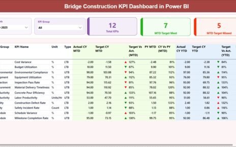
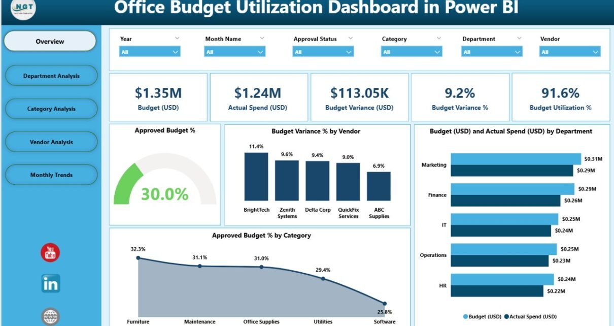
Overview Page
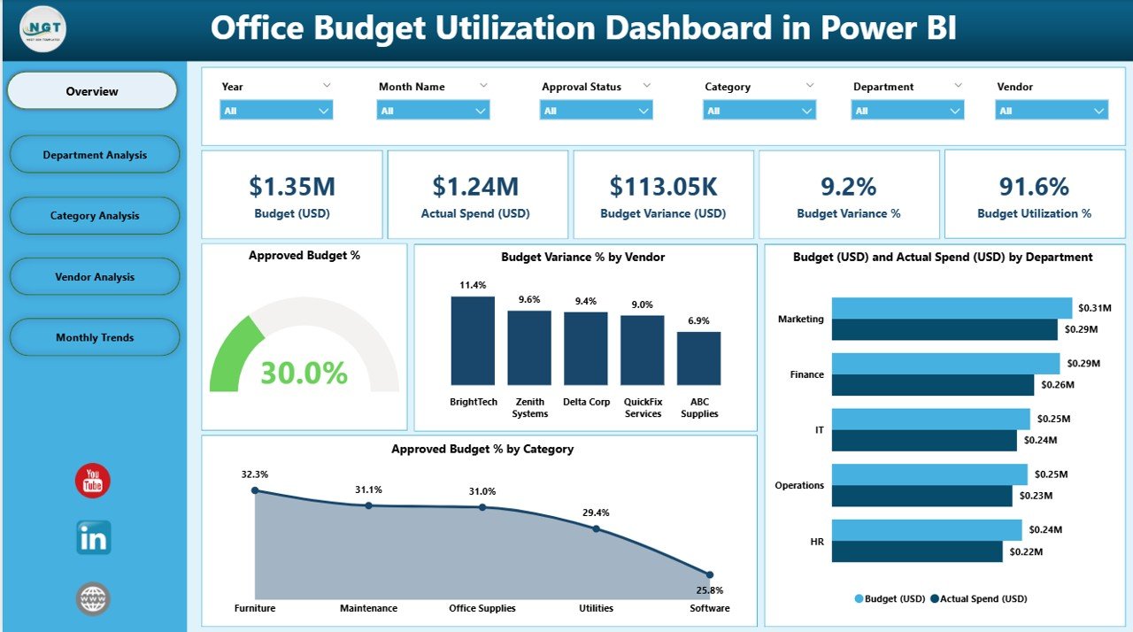
The Overview Page acts as the control center of the dashboard. It provides high-level insights and a snapshot of overall budget performance.
Key elements include:
-
5 KPI Cards: These cards display quick metrics such as Approved Budget %, Budget Variance %, and other high-priority financial indicators.
4 Visual Charts:
- Approved Budget %
- Budget Variance % by Vendor
- Budget (USD) vs Actual Spend (USD) by Department
- Approved Budget % by Category
With slicers included, users can filter the view by time periods, vendors, or categories, making it interactive and tailored to specific queries.
Department Analysis Page
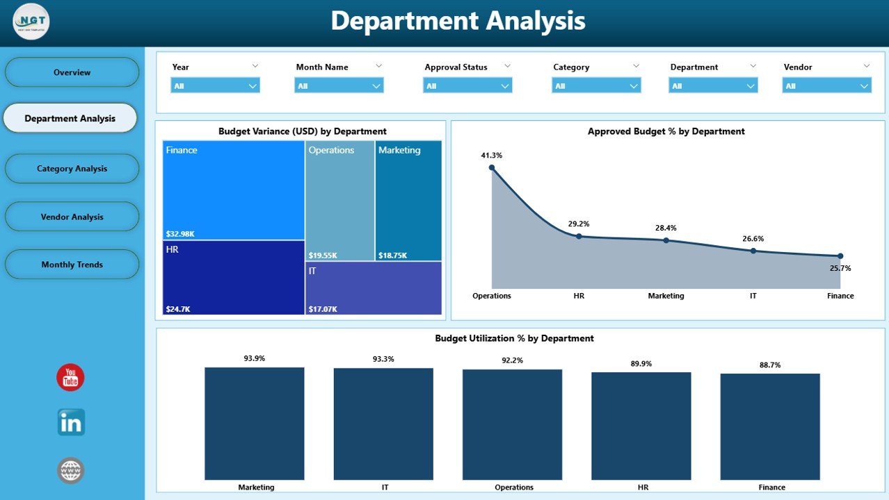
This page provides a breakdown of how each department manages its allocated funds.
Key elements include:
-
Budget Variance (USD) by Department – Identifies departments overspending or underutilizing their budgets.
-
Approved Budget % by Department – Shows how much of the approved budget is used by each unit.
-
Budget Utilization % by Department – Measures efficiency in budget spending across teams.
This analysis helps leadership ensure resources are distributed and consumed appropriately across departments.
Category Analysis Page
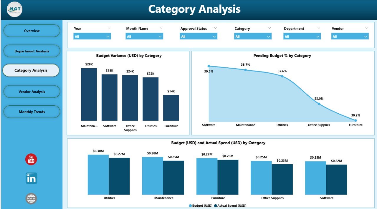
Every organization categorizes its budget differently—such as marketing, operations, HR, or IT. This page ensures visibility at the category level.
Key elements include:
-
Budget Variance (USD) by Category
-
Pending Budget % by Category – Shows funds that remain unutilized.
-
Budget (USD) vs Actual Spend (USD) by Category
By identifying which categories consume more funds, businesses can realign financial strategies to achieve better cost optimization.
Click to Purchases Office Budget Utilization Dashboard in Power BI
Vendor Analysis Page
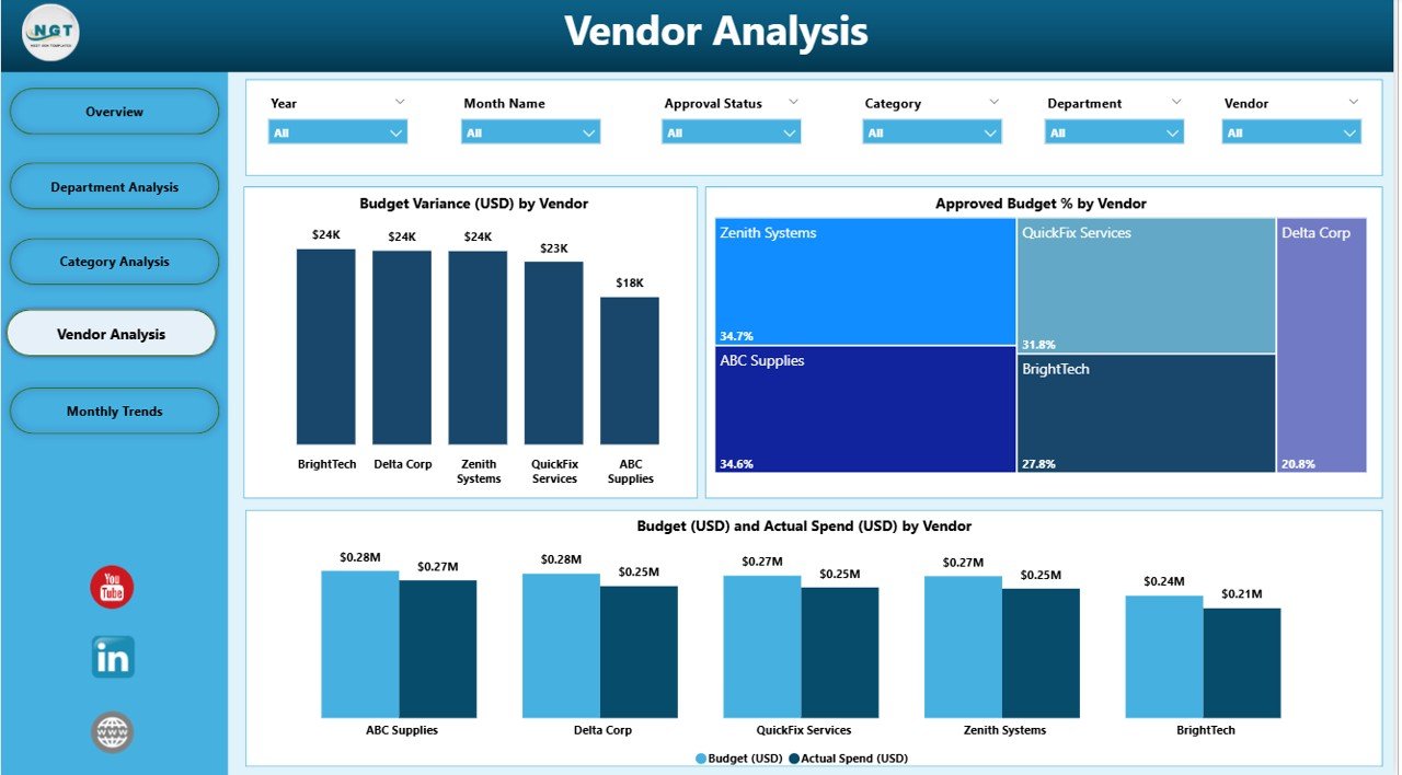
Vendor costs often account for a large portion of office budgets. This page helps track and evaluate vendor-related expenses.
Key elements include:
-
Budget Variance (USD) by Vendor – Detects cost overruns or underutilization at the vendor level.
-
Approved Budget % by Vendor – Measures budget utilization by each vendor relationship.
-
Budget (USD) vs Actual Spend (USD) by Vendor
Vendor analysis ensures transparency in procurement and helps negotiate better deals.
Monthly Trends Page
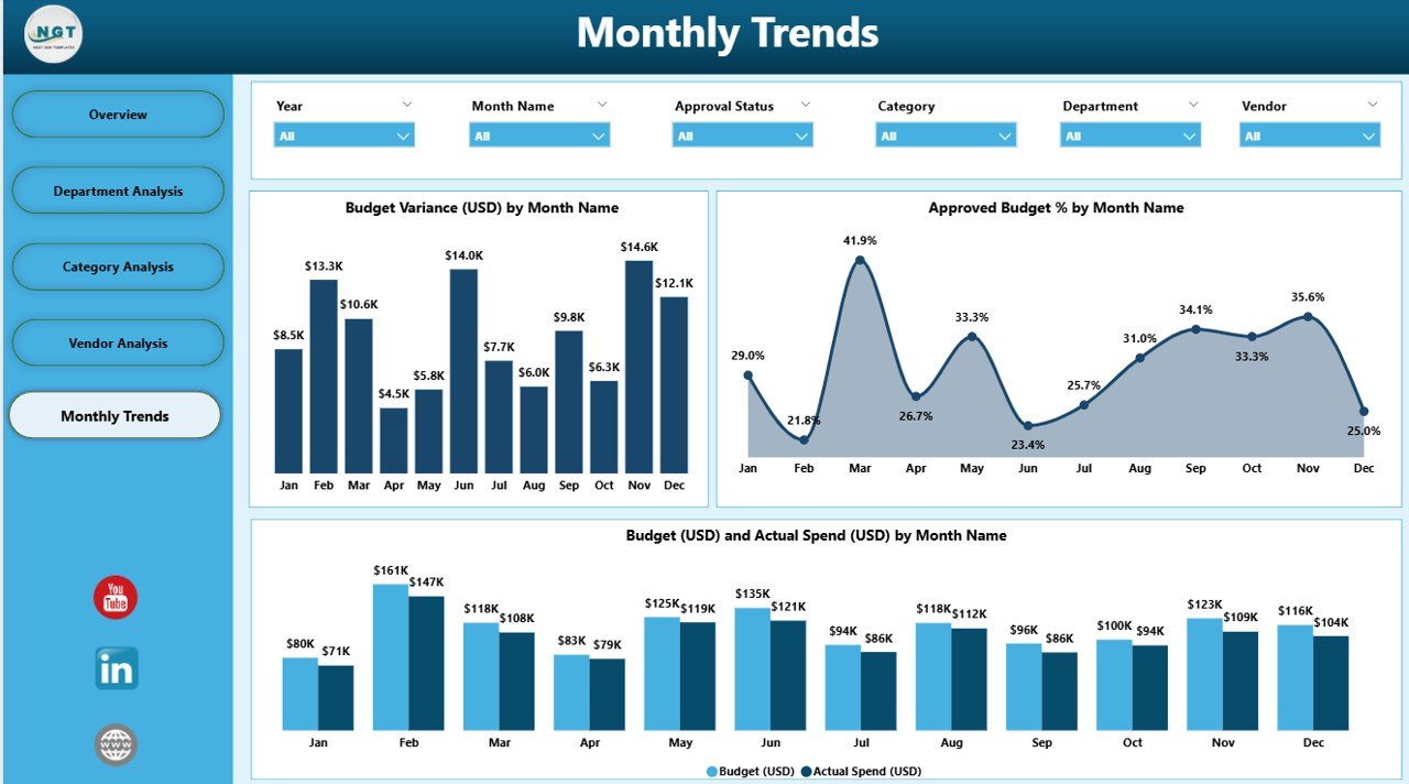
Financial performance is not static. The Monthly Trends Page highlights spending behavior over time.
Key elements include:
-
Budget Variance (USD) by Month – Highlights deviations from planned budgets.
-
Approved Budget % by Month – Tracks budget approval utilization monthly.
-
Budget (USD) vs Actual Spend (USD) by Month – Compares forecast vs reality.
This view is essential for forecasting, identifying seasonality, and preparing for future budget cycles.
Advantages of Office Budget Utilization Dashboard in Power BI
An Office Budget Utilization Dashboard brings multiple advantages to organizations:
✅ Real-Time Visibility
-
Gain instant access to financial performance data without manual updates.
✅ Enhanced Decision-Making
-
Managers can base decisions on facts, not assumptions.
✅ Department-Level Accountability
-
Each department’s performance is visible, promoting responsible spending.
✅ Cost Optimization
-
Detect overspending or underutilization early and take corrective action.
✅ Vendor Transparency
-
Easily analyze vendor costs and compare budget vs actual expenses.
✅ Improved Forecasting
-
Monthly trends provide insights for accurate financial planning.
Best Practices for Office Budget Utilization Dashboard
To maximize the effectiveness of this dashboard, follow these best practices:
1. Standardize Data Sources
Ensure that budget and expense data from Excel or ERP systems are clean, consistent, and regularly updated.
2. Define Clear KPIs
Track essential metrics such as Budget Variance %, Utilization %, and Pending Budget %. Avoid clutter by focusing only on actionable KPIs.
3. Use Interactive Slicers
Allow users to filter by department, vendor, or time period for deeper analysis.
4. Update Data Regularly
Maintain a refresh schedule to ensure decision-makers always view up-to-date numbers.
5. Train Users
Provide basic Power BI training so managers can interact with the dashboard confidently.
6. Compare Trends Over Time
Analyze monthly or quarterly performance to uncover long-term spending patterns.
7. Align with Business Goals
Ensure the dashboard supports company objectives such as cost savings, efficiency, and compliance.
Opportunities for Improvement
While this dashboard is powerful, organizations can enhance it further by:
-
Integrating Predictive Analytics – Use AI-driven insights to forecast future spending.
-
Automating Alerts – Set up notifications for when spending crosses predefined thresholds.
-
Expanding Data Sources – Include data from ERP, HR, or CRM tools for holistic analysis.
-
Adding Benchmarking – Compare performance with industry standards.
Conclusion
An Office Budget Utilization Dashboard in Power BI is more than just a financial reporting tool—it is a strategic enabler. By providing insights into budgets, variances, and utilization, it empowers organizations to make smarter financial decisions, promote accountability, and optimize resources.
From overview snapshots to detailed departmental, vendor, and category analysis, this dashboard ensures every dollar is tracked and utilized effectively. Combined with best practices and continuous improvement, it transforms financial management into a driver of organizational success.
Frequently Asked Questions (FAQs)
1. What is the purpose of an Office Budget Utilization Dashboard?
The purpose is to monitor approved budgets, actual spending, and utilization percentages across departments, categories, and vendors in real time.
2. Can small businesses use this dashboard?
Yes, even small businesses benefit from real-time budget tracking, as it prevents overspending and improves cost efficiency.
3. How does Power BI improve budget management compared to Excel alone?
Power BI provides interactive dashboards, automated data refresh, and visual insights, which Excel alone cannot deliver efficiently.
4. What KPIs should I track in budget utilization?
Common KPIs include Approved Budget %, Budget Variance %, Utilization %, and Pending Budget %.
5. How often should the dashboard be updated?
Ideally, update it daily or weekly depending on transaction volumes. Power BI supports scheduled refresh for automation.
6. Can I integrate this dashboard with other tools?
Yes, Power BI can connect to ERP, HR, CRM, and other databases to provide a complete financial picture.
7. Is technical expertise required to use the dashboard?
No, once set up, the dashboard is user-friendly and designed for managers, not just analysts.
Visit our YouTube channel to learn step-by-step video tutorials