In today’s world, architecture and design firms handle dozens of projects simultaneously — each with unique budgets, deadlines, and design phases. Managing these projects manually or through scattered spreadsheets often leads to confusion, data silos, and missed opportunities.
That’s where the Architecture & Design Dashboard in Power BI becomes a true game-changer. It turns complex project data into interactive visuals that help architects, designers, and project managers monitor progress, manage costs, and make informed decisions instantly.
This article explores everything you need to know about this dynamic dashboard — including its structure, features, advantages, best practices, and frequently asked questions.
Click to Purchases Architecture & Design Dashboard in Power BI
What Is an Architecture & Design Dashboard in Power BI?
An Architecture & Design Dashboard in Power BI is a visual analytics solution built on Microsoft’s powerful business intelligence platform. It connects to your project data — typically stored in Excel or other databases — and transforms it into visually rich insights that make performance tracking easier and faster.
With this dashboard, you can view project completion percentages, cost variances, design status, and departmental performance — all in one place. It eliminates the need to manually compile reports, enabling faster and more accurate decision-making.
For architectural firms, design consultancies, and engineering organizations, this dashboard acts as the command center for all project insights.
Key Features of the Architecture & Design Dashboard in Power BI
The Architecture & Design Dashboard comes with five detailed analytical pages, each serving a specific purpose in your design operations. Let’s explore them one by one.
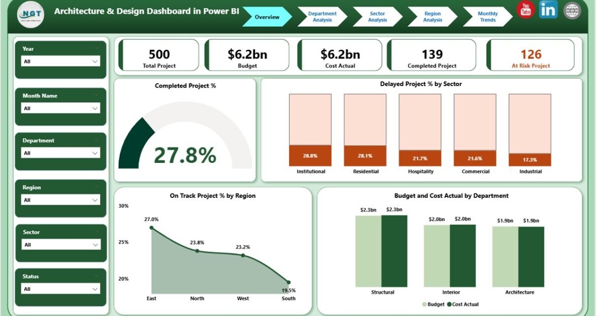
1. Overview Page

The Overview Page serves as the central hub of the dashboard. It provides a high-level summary of all active, completed, and delayed projects.
Cards Displayed:
- Total Projects
- Completed Projects %
- Delayed Projects %
- Total Budget (USD)
- Actual Cost (USD)
Charts Displayed:
- Completed Project % by Sector
- Delayed Project % by Sector
- On Track Project % by Region
- Budget and Cost Actual by Department
Click to Purchases Architecture & Design Dashboard in Power BI
This page helps leaders assess overall performance at a glance. It’s perfect for board meetings, project reviews, and executive reporting.
2. Department Analysis Page
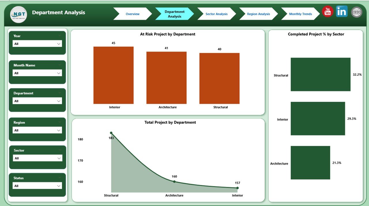
The Department Analysis Page dives deeper into how each department is performing. It highlights which teams are on track, at risk, or facing resource bottlenecks.
Charts Displayed:
- At Risk Projects by Department
- Completed Project % by Sector
- Total Projects by Department
By visualizing performance at the departmental level, management can identify which departments consistently meet deadlines and which need additional resources or better coordination.
3. Sector Analysis Page
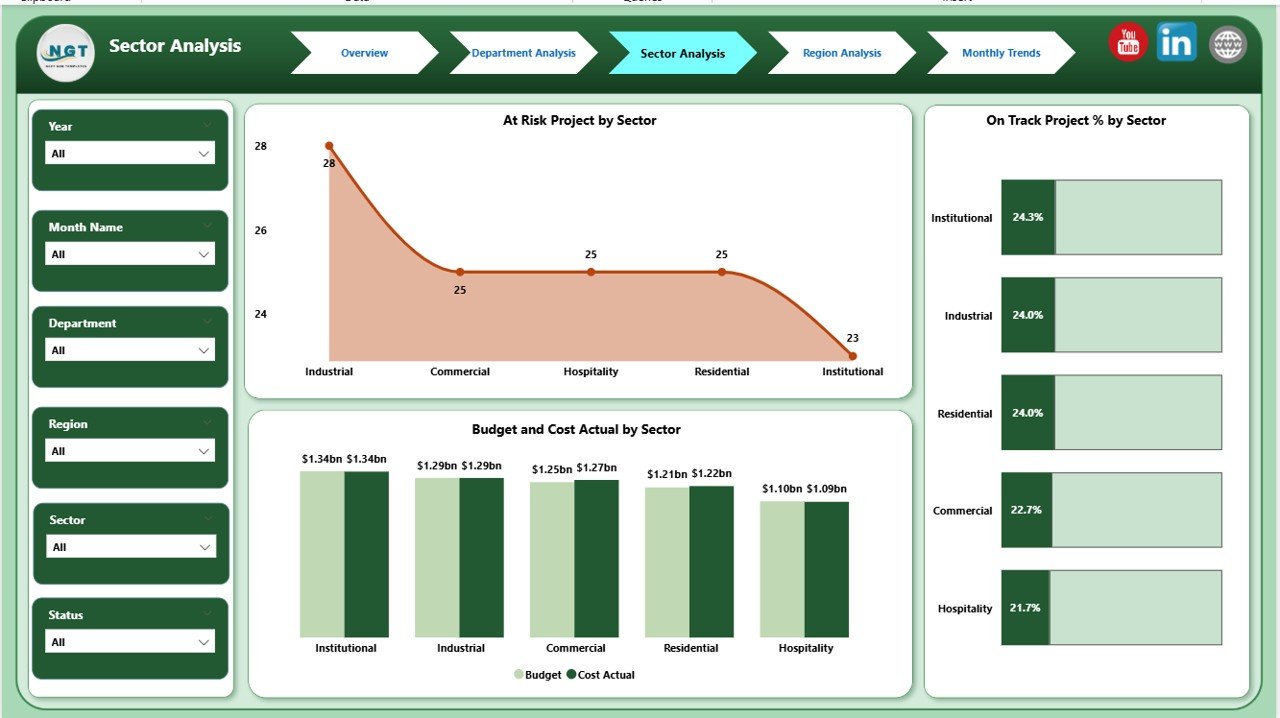
The Sector Analysis Page helps evaluate how each industry or project sector (such as commercial, residential, institutional, or public works) is performing.
Charts Displayed:
- At Risk Projects by Sector
- On Track Project % by Sector
- Budget and Cost Actual by Sector
This section is especially valuable for large architecture firms working across multiple sectors. It helps determine which sectors generate the most value and which need process improvements or budget adjustments.
Click to Purchases Architecture & Design Dashboard in Power BI
4. Region Analysis Page
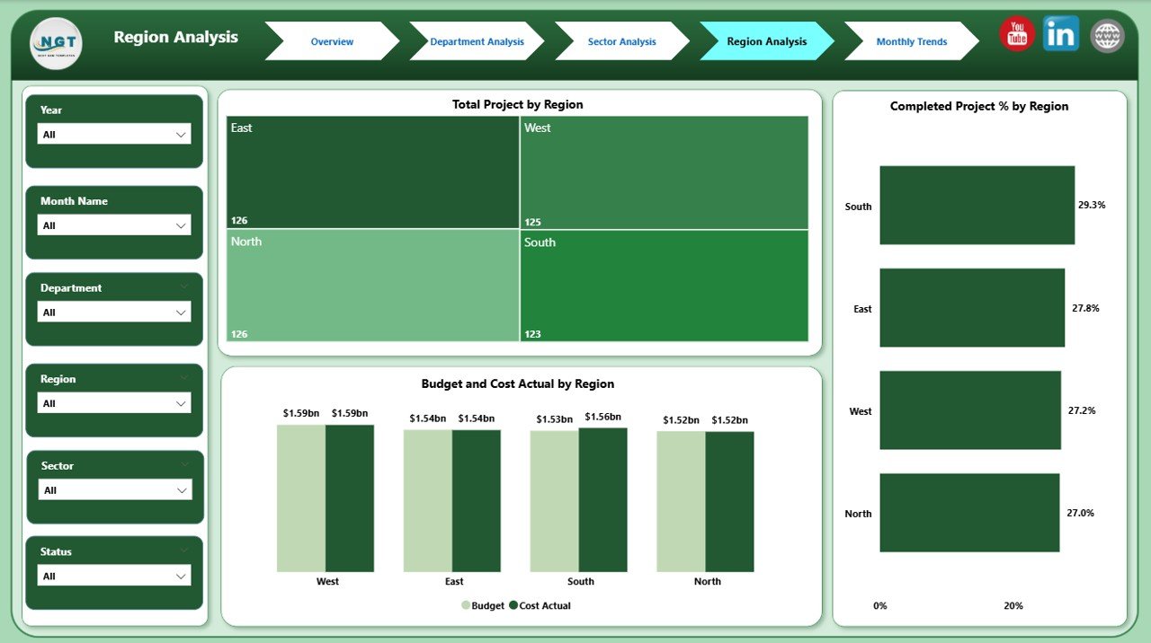
The Region Analysis Page focuses on geographic performance. Whether your firm operates locally or internationally, this section helps compare outcomes across different locations.
Charts Displayed:
- Total Projects by Region
- Completed Project % by Region
- Budget and Cost Actual by Region
Regional insights help firms balance workloads, allocate budgets efficiently, and understand local challenges affecting design or construction timelines.
5. Monthly Trends Page
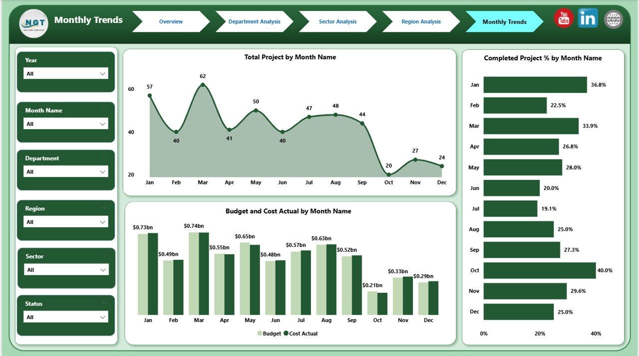
The Monthly Trends Page visualizes project data across months. It shows patterns in completion rates, cost variations, and workload distribution throughout the year.
Charts Displayed:
- Total Projects by Month
- Completed Project % by Month
- Budget and Cost Actual by Month
This page supports trend analysis and forecasting. Decision-makers can quickly see which months tend to have project delays or cost overruns — helping them plan better for upcoming quarters.
🧭 Why Every Architecture Firm Needs This Dashboard
Managing architectural and design projects isn’t just about creativity — it’s about execution, budgets, and client satisfaction. Power BI makes it possible to unify all these elements into one interactive visualization layer.
Here’s why adopting the Architecture & Design Dashboard in Power BI is essential:
-
Gain real-time visibility into all ongoing and completed projects.
-
Identify bottlenecks early using visual indicators like red/yellow status bars.
-
Analyze budget vs. actual spending to control costs.
-
Monitor departmental performance and ensure resource balance.
-
Compare regional or sector-based performance instantly.
-
Simplify client reporting with shareable dashboards and clean visuals.
Instead of struggling with multiple spreadsheets, you can manage everything in one interactive platform — ensuring clarity and accountability.
🧩 How the Dashboard Works
Click to Purchases Architecture & Design Dashboard in Power BI
The Architecture & Design Dashboard connects Power BI with your Excel project dataset. The Excel file usually includes project names, departments, sectors, budget, actual cost, project status, timelines, and responsible teams.
Power BI then imports this data, applies built-in calculations, and presents the results through cards, charts, and slicers. Users can filter the visuals by region, department, or sector to get customized views instantly.
Each chart updates dynamically when you select different filters — giving you real-time, context-rich insights.
💡 Advantages of the Architecture & Design Dashboard in Power BI
Let’s look at how this dashboard adds real value to design organizations:
1. Complete Visibility of All Projects
You can see every project’s status, from design to completion, on a single screen. No more manual tracking or scattered reports.
2. Improved Budget Management
The dashboard compares actual costs versus planned budgets across departments, regions, and sectors. You can easily identify cost overruns and take corrective action early.
3. Better Resource Allocation
By tracking departmental workloads and at-risk projects, managers can allocate resources effectively and prevent burnout or idle capacity.
4. Enhanced Decision-Making
Visual data storytelling helps leaders make faster and smarter decisions. You don’t need to rely on guesswork — the dashboard provides evidence-backed insights.
5. Time and Effort Savings
Automated data refreshes save hours of manual compilation and reporting each week. The dashboard updates automatically when new data is uploaded in Excel.
6. Customizable and Scalable
Every chart, card, and slicer can be customized to fit the firm’s reporting needs. As your company grows, you can easily add new data fields, departments, or KPIs.
7. Stronger Client Communication
Visual dashboards make client presentations more impressive and transparent. You can share performance snapshots with stakeholders in seconds.
🧰 Best Practices for the Architecture & Design Dashboard in Power BI
To maximize the benefits of this dashboard, it’s essential to follow a few best practices.
1. Keep Data Consistent and Clean
Ensure your Excel file has standardized column names, data types, and formats. Inconsistent entries (like “HR Dept” vs. “Human Resources”) can cause reporting errors.
2. Refresh Data Regularly
Set Power BI to refresh automatically, so you always view the most recent performance metrics.
3. Use Filters and Slicers Intelligently
Leverage slicers for region, department, or sector. This helps you find the exact insights you need without overwhelming users with too many visuals at once.
4. Design a User-Friendly Layout
Keep important KPIs at the top of your Overview page. Use colors, icons, and conditional formatting to make insights intuitive.
5. Establish KPI Targets
Set performance targets for cost, completion rate, and project timelines. Then use conditional formatting (like green for achieved, red for missed) to make results clear.
6. Incorporate Trend Analysis
Use the Monthly Trends page to identify seasonal patterns in project performance. This helps with resource planning and budget forecasting.
7. Secure Data Access
If your firm works with multiple departments or external partners, define user roles and access permissions to protect sensitive data.
8. Automate Reports for Clients
Create Power BI report exports or dashboards that can be shared online. Clients appreciate real-time transparency into their project’s status.
📊 Example Insights You Can Derive
The power of this dashboard lies in the actionable insights it delivers. Here are a few examples:
-
Identify which departments consistently deliver on time and which face recurring delays.
-
Compare budget utilization across regions to detect overspending.
-
Spot seasonal trends in project delays or cost overruns.
-
Highlight top-performing sectors contributing to profitability.
-
Monitor overall completion rate to assess organizational efficiency.
These insights empower management to improve processes, allocate resources wisely, and enhance profitability.
🏢 Real-World Use Case Example
Imagine a large design firm managing 60+ projects across multiple regions. Before adopting Power BI, their data was stored in Excel and presented through static charts. Reporting took several days each month.
After implementing the Architecture & Design Dashboard, they achieved:
-
70% faster reporting cycles.
-
35% improvement in on-time project delivery.
-
20% better cost control across departments.
-
Seamless visibility for stakeholders through interactive visuals.
This case illustrates how a digital transformation in analytics can streamline even the most complex project portfolios.
🧭 How to Get Started
To start using the Architecture & Design Dashboard in Power BI:
-
Prepare your Excel data — include fields like Project Name, Sector, Department, Budget, Actual Cost, Start Date, End Date, and Status.
-
Import your dataset into Power BI Desktop.
-
Use Power BI visuals such as cards, clustered column charts, and line graphs.
-
Set up slicers for region, sector, and department filters.
-
Design your Overview and Analysis pages following the structure described above.
-
Publish your report to Power BI Service for online access and sharing.
You’ll have a professional, interactive dashboard ready to guide your design decisions in just a few hours.
✅ Conclusion
The Architecture & Design Dashboard in Power BI is more than a data visualization tool — it’s a strategic asset for architecture and design firms. It simplifies complex reporting, improves accuracy, and enhances decision-making with real-time insights.
By visualizing KPIs like project completion rate, budget variance, and sector performance, organizations can optimize their resources and deliver exceptional results.
Whether you manage residential buildings, commercial complexes, or design studios, this dashboard helps you stay on track, within budget, and ahead of deadlines.
❓ Frequently Asked Questions (FAQs)
1. What data sources can connect to the Architecture & Design Dashboard?
You can connect Excel files, SQL databases, Google Sheets, or project management tools like MS Project or Primavera to Power BI.
2. Can non-technical users operate this dashboard?
Yes, Power BI dashboards are user-friendly. With basic training, anyone can use filters, explore visuals, and interpret results easily.
3. How often should the data refresh?
Ideally, schedule daily or weekly refreshes, depending on how frequently your project data changes.
4. Is this dashboard suitable for small architecture firms?
Absolutely. Power BI scales easily — from small design studios to global architecture firms. You can start with Excel-based data and expand later.
5. Can the visuals be customized?
Yes. You can modify colors, chart types, KPIs, and page layouts to match your organization’s reporting needs and branding.
6. What’s the biggest benefit of using Power BI for design analytics?
The biggest advantage is real-time, centralized visibility into all projects — empowering smarter, faster decisions and reducing manual reporting efforts.
Visit our YouTube channel to learn step-by-step video tutorials