Running an art gallery is more than curating beautiful pieces—it’s about managing operations, improving visitor engagement, tracking financial performance, and ensuring sustainability. With growing pressure to balance creativity with data-driven decisions, art gallery managers need more than just spreadsheets.
That’s where the Art Gallery KPI Dashboard in Power BI steps in.
This dynamic, ready-to-use dashboard offers an elegant yet powerful way to visualize performance and gain insights that help galleries grow.
In this article, we’ll walk you through everything you need to know about this dashboard—its components, benefits, best practices, and real-world use. Let’s begin your journey to smarter gallery management!
Click to Purchases Art Gallery KPI Dashboard in Power BI
What Is the Art Gallery KPI Dashboard in Power BI?
The Art Gallery KPI Dashboard in Power BI is a prebuilt business intelligence tool designed to track, analyze, and visualize key performance indicators for art galleries. It helps curators, managers, and decision-makers monitor both creative and operational success across multiple dimensions.
Powered by Excel as the data source, this dashboard connects directly to three structured Excel sheets: Actuals, Targets, and KPI Definitions. All this is visually translated in Power BI across three interactive pages:
-
✅ Summary Page
-
📈 KPI Trend Page
-
📘 KPI Definition Page
Together, they deliver an efficient, visual experience for reviewing gallery metrics.
Key Features of the Art Gallery KPI Dashboard
Let’s break down the features that make this dashboard an invaluable asset:
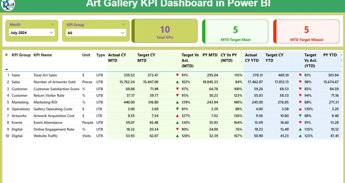
Summary Page: The Core Overview
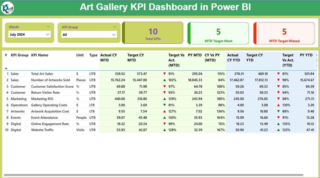
This is the heart of your dashboard. It gives a one-glance view of all important metrics. Here’s what it includes:
Slicers:
- Month slicer to filter by time
- KPI Group slicer to filter by performance area (e.g., Visitors, Revenue, Engagement)
KPI Cards:
- Total KPIs
- MTD Target Met
- MTD Target Missed
Detailed KPI Table showing:
- KPI Number
- KPI Group
- KPI Name
- Unit (e.g., %, Count, Currency)
- Type (UTB: Upper the Better or LTB: Lower the Better)
Performance Values:
- Actual MTD vs Target MTD with percentage comparison
- Previous Year MTD values
- CY vs PY MTD (%)
- Actual YTD vs Target YTD
- Previous Year YTD values
- CY vs PY YTD (%)
- Color-coded Arrow Indicators:
- Green ▲ for positive performance
- Red ▼ for below-target performance
KPI Trend Page: Track Progress Over Time

- This page features:
-
Combo Charts: Visualize Current Year (CY), Previous Year (PY), and Target trends for both MTD and YTD.
-
Slicers: Filter specific KPI Names for focused analysis.
- You can instantly identify seasonal dips, growth patterns, or performance plateaus.
Click to Purchases Art Gallery KPI Dashboard in Power BI
KPI Definition Page (Drillthrough)
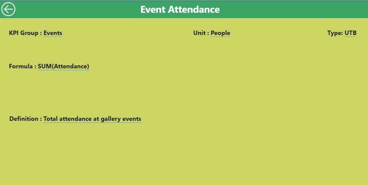
- This hidden but powerful page allows you to drill through from the summary and see:
-
KPI Formula
-
Definition
-
Type
-
Unit of measurement
- This promotes data transparency and helps team members understand what each KPI actually means.
-
✅ Use the back button on the top-left to return to the summary.
Excel Data Source: Easy Input, Big Insights
- The backbone of this dashboard is an Excel file with three structured sheets:
- ✅ 1.
Input_Actual - This sheet captures:
-
KPI Name
-
Date (First day of the month)
-
MTD Actual
-
YTD Actual
- ✅ 2.
Input_Target - This captures:
-
KPI Name
-
Date (First day of the month)
-
MTD Target
-
YTD Target
- ✅ 3.
KPI Definition - This defines:
-
KPI Number
-
Group (e.g., Sales, Engagement)
-
KPI Name
-
Unit
-
Formula
-
Type (LTB or UTB)
-
Definition (plain language)
- ✅ Measure exhibition success (footfall, dwell time, revenue)
-
✅ Track online engagement and campaign effectiveness
-
✅ Understand peak visiting times and visitor trends
-
✅ Ensure budget adherence and donor accountability
-
✅ Improve strategic decisions using visual metrics
Advantages of Using the Art Gallery KPI Dashboard
- 🎯 Focused KPI Monitoring
- You no longer need to check 10 reports—see all relevant KPIs in one clean dashboard.
- 📈 Real-Time Data
- The Excel integration enables regular data refreshes, ensuring your dashboard always reflects the latest numbers.
- 🎨 Visually Appealing
- Just like art, design matters. This dashboard uses clean layouts, color-coded icons, and slicers to create a visually intuitive experience.
- 📊 MTD and YTD Views
- Easily compare Month-to-Date and Year-to-Date actuals with targets and previous year performance.
- 🔍 Drillthrough Details
- Curious about a KPI? Click and drill through to see its full definition, formula, and logic.
- 💼 Easy Maintenance
- Even non-technical users can maintain the Excel file. Just update three sheets, and the dashboard does the rest.
Use Cases of the Art Gallery KPI Dashboard
- Wondering how to use this in real life? Here are a few practical applications:
- 1. Gallery Operations
- Track daily visitors, ticket sales, tour bookings, and exhibit attendance.
- 2. Marketing & Outreach
- Monitor social media followers, engagement rates, email open rates, and ad performance.
- 3. Revenue Performance
- Measure sales from merchandise, ticketing, donations, and grants.
- 4. Curatorial Metrics
- Track number of exhibits curated, artwork turnover, or audience ratings.
- 5. Staff and Volunteer Management
- Monitor onboarding time, engagement hours, and retention.
🔄 Best Practices for Using the Dashboard
- To get the most from your dashboard, follow these expert tips:
-
📅 Update data monthly: Ensure Excel sheets are filled with accurate, timely data (use 1st of month for dates).
-
🧠 Train your team: Help them understand how to interpret KPIs like UTB (Lower the Better) vs UTB (Upper the Better).
-
📌 Set consistent targets: Maintain uniformity in how MTD and YTD targets are defined.
-
📈 Use slicers wisely: Always filter by KPI Group or Month to isolate what matters.
-
🔁 Automate refresh: Use Power BI’s scheduled refresh to update charts without manual effort.
-
🛠️ Audit your KPIs: Review KPI definitions quarterly to ensure they remain relevant.
🔍 How to Get Started with the Dashboard
- Here’s a quick step-by-step to implement this in your gallery:
-
Download the Excel template and Power BI file
-
Open Excel and input your actuals, targets, and KPI definitions
-
Open Power BI Desktop and connect to the Excel source
-
Refresh the dashboard to see your metrics populate
-
Customize slicers and visuals if needed
-
Publish to Power BI Service for team access
-
🛡️ Pro Tip: Always back up your Excel source file before each monthly update.
🌟 Why Power BI Is Ideal for Art Galleries
- Still wondering why Power BI? Let’s clear it up.
-
✅ No coding required – Just drag-and-drop interface
-
✅ Free to use (for Desktop version)
-
✅ Secure and cloud-based sharing
-
✅ Integrates with Excel and other data tools
-
✅ Scales with your growth – from small galleries to multi-location institutions
🧠 Conclusion
- The Art Gallery KPI Dashboard in Power BI blends creativity with data intelligence. It equips galleries with the right tools to track performance, make informed decisions, and continuously improve.
- Whether you manage a small community gallery or a large metropolitan museum, this dashboard simplifies your reporting, enhances visual analysis, and makes your organization more agile.
❓ Frequently Asked Questions (FAQs)
- Q1. Can I customize the KPIs in this dashboard?
- Yes. You can add or modify KPI names, formulas, or groups directly in the Excel “KPI Definition” sheet.
- Q2. Do I need to know Power BI to use this dashboard?
- No. This template is plug-and-play. Basic Excel knowledge is sufficient. Power BI is mostly used for viewing and light customization.
- Q3. Can I use Google Sheets instead of Excel?
- Power BI currently supports Excel best. For Google Sheets, you’d need third-party connectors or to export data to Excel format.
- Q4. Can I track multiple galleries in this dashboard?
- Absolutely! You can add a “Gallery Name” field to your data tables and add slicers or filters in Power BI for each location.
- Q5. What if my KPIs are monthly only, not YTD?
- No problem. You can skip the YTD columns and update visuals to hide YTD metrics if not applicable.
Click to Purchases Art Gallery KPI Dashboard in Power BI
Visit our YouTube channel to learn step-by-step video tutorials