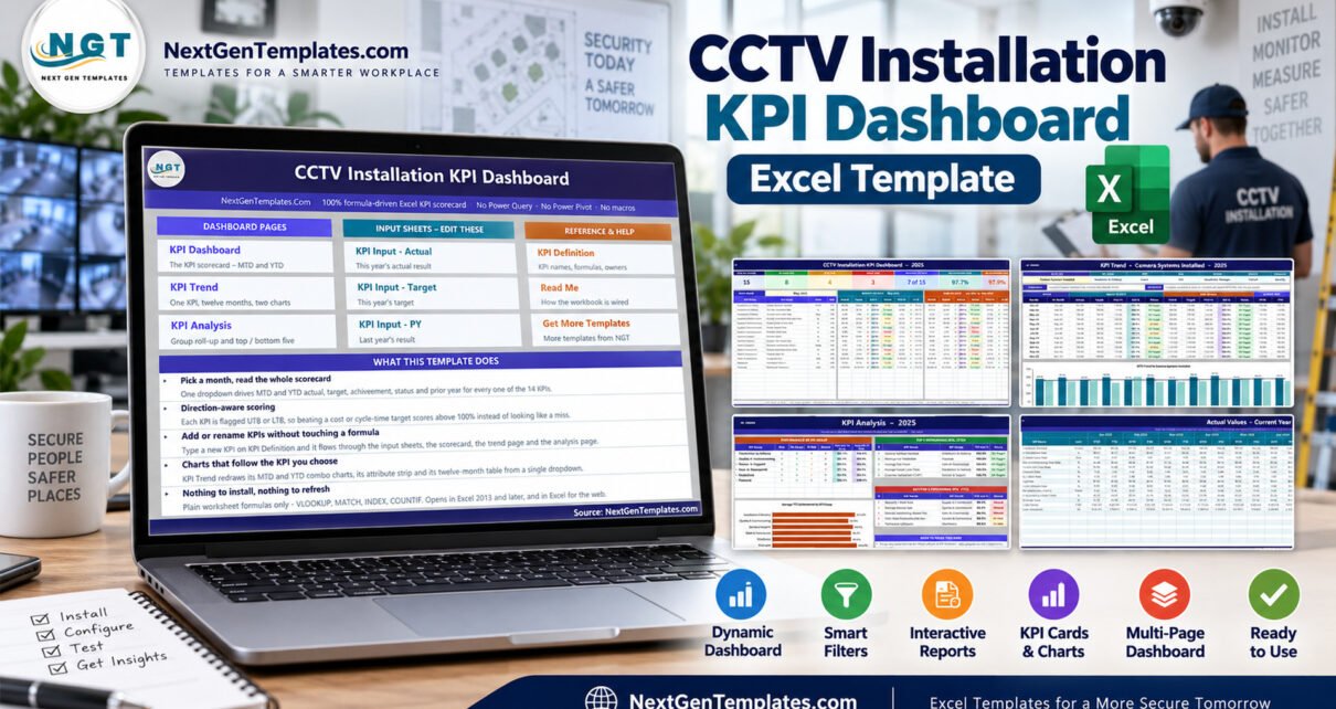
Most CCTV installation businesses already know their revenue. Far fewer can say, in one screen, how many camera systems they handed over last month, how many passed commissioning first time, how much cable had to be re-pulled, and whether the technicians were busy enough to justify the headcount. The CCTV Installation KPI Dashboard in Excel is a plain-formula workbook built to answer exactly those questions in a monthly review – 15 KPIs, six groups, one month dropdown, and no add-ins of any kind.
This post walks through what is in the file, how its scoring works, what it deliberately does not do, and the handful of cosmetic issues we found in this release and are disclosing rather than hiding.
Read This Before Anything Else – What the Workbook Actually Is
CCTV is surveillance of people, so it is worth being blunt about scope. This is an Excel reporting template over data the buyer types in. It holds installation project records only: counts, percentages, days, an index score and a few money figures, all entered by hand on three input sheets.
It does not:
- view, record, store, analyse or process any video, image or footage;
- perform or enable facial recognition, biometric identification or video analytics;
- establish compliance with the GDPR or UK GDPR, the EU AI Act, the Data Protection Act 2018, the Surveillance Camera Code of Practice, BIPA, state CCTV or two-party-consent laws, data-retention rules, or any installer licensing scheme such as the SIA or a state alarm and CCTV licence;
- constitute a Data Protection Impact Assessment, a surveillance risk assessment, a system design, a commissioning record or an inspection certificate;
- certify camera performance, coverage, uptime or evidential quality. The System Uptime KPI is a number you type in, not a measurement the workbook takes.
A data-protection caveat that matters. If you decide to record client site names, camera positions, addresses or technician names in this workbook, then lawful handling, storage, access control and retention of that personal data are entirely your responsibility. A spreadsheet has no encryption, no access log and no retention policy. Nothing in this post or in the file is legal advice – take your own on the surveillance and data-protection law that applies where you operate.
One more thing worth repeating: every KPI figure shipped in the file is buyer-entered demo data. The 2025 numbers exist so the charts and traffic lights have something to draw. None of them describe a real company.
What Is in the CCTV Installation KPI Dashboard in Excel
Eleven sheets ship in the workbook:
- Home – a navigation page linking every other sheet.
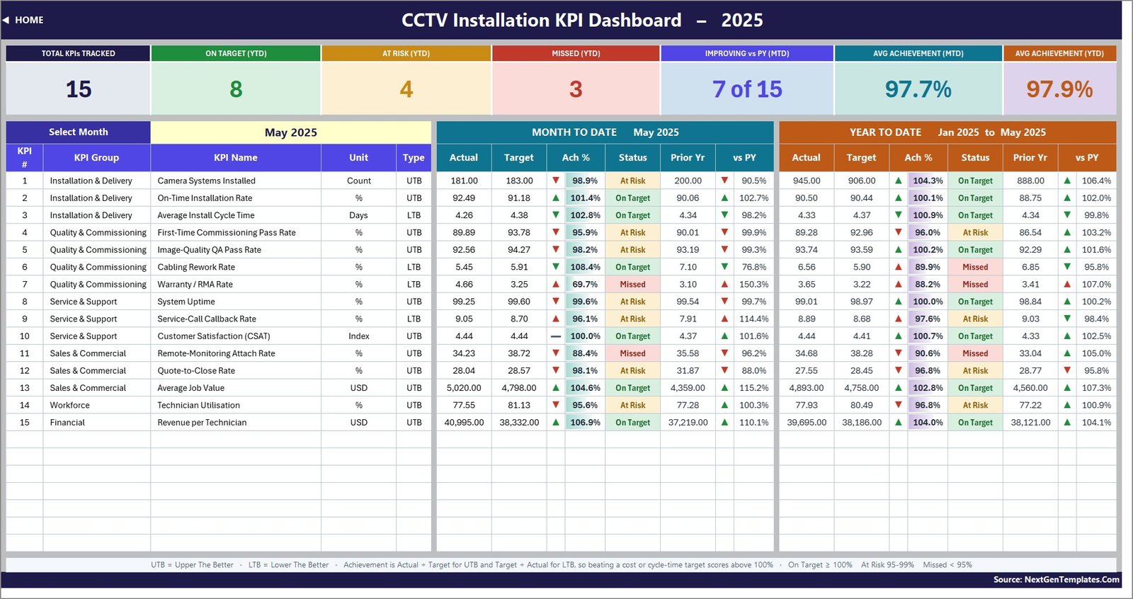
- KPI Dashboard – the scorecard. A month dropdown, seven summary cards, and one row per KPI carrying MTD and YTD actual, target, achievement, status, prior year and year-on-year movement.
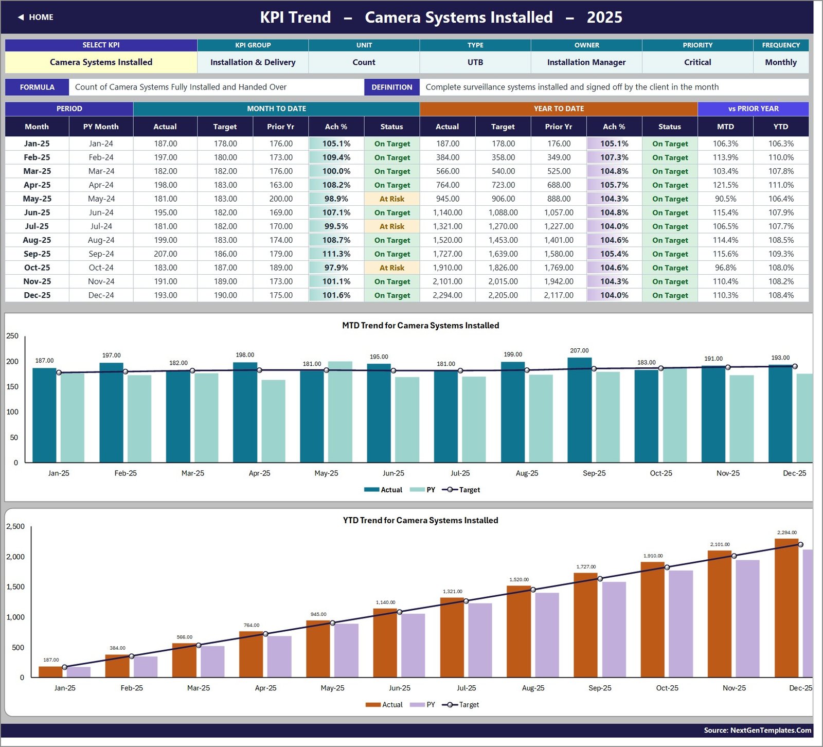
- KPI Trend – one KPI at a time: its attributes, formula and definition, a twelve-month table, and MTD and YTD combo charts with actual and prior-year columns against a target line.
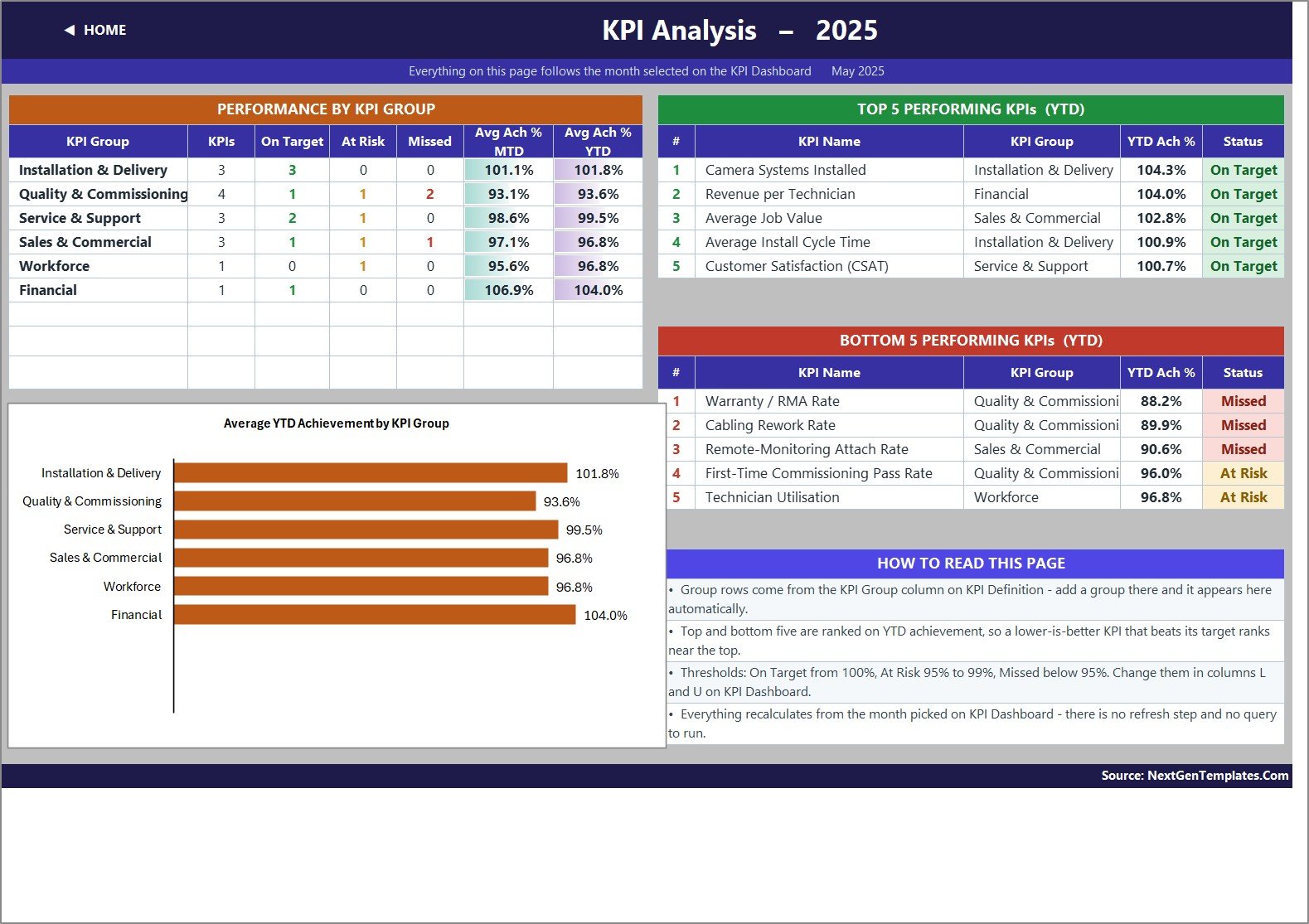
- KPI Analysis – achievement rolled up by KPI group with a bar chart, plus Top 5 and Bottom 5 KPIs by year-to-date achievement.
- KPI Input – Actual, Target and PY – the three data sheets, each with an MTD and a YTD column for all twelve months.
- KPI Definition – the master list. Number, group, name, unit, formula, definition, UTB/LTB type, owner, priority and frequency.
- Support – helper calculations you never edit.
- Read Me and Get More Templates – documentation and an in-workbook catalogue page.
The whole thing runs on VLOOKUP, MATCH, INDEX and COUNTIF plus conditional formatting. No Power Query, no data model, no macros, no add-ins. It opens in Excel 2013 and later and in Excel for the web.
The 15 KPIs, Group by Group
Installation and Delivery (3). Camera Systems Installed (count, higher is better), On-Time Installation Rate (%, higher is better) and Average Install Cycle Time (days from confirmed site survey to handover, lower is better).
Quality and Commissioning (4). First-Time Commissioning Pass Rate, Image-Quality QA Pass Rate – the share of cameras meeting focus, framing and night-vision standards – plus Cabling Rework Rate and Warranty / RMA Rate, both lower-is-better.
Service and Support (3). System Uptime, Service-Call Callback Rate (the share of calls that needed a second visit, lower is better) and Customer Satisfaction as a 1-to-5 index.
Sales and Commercial (3). Remote-Monitoring Attach Rate – the share of new installs sold with a recurring monitoring plan – Quote-to-Close Rate and Average Job Value.
Workforce (1). Technician Utilisation, billable hours over available hours.
Financial (1). Revenue per Technician.
All fifteen are editable. The sheets are wired for 22 KPIs, so seven more rows are already live and empty – type a name on KPI Definition and it flows straight through to the input sheets, the scorecard, the trend page and the analysis page with no formula work.
How the Scoring Works
This is the part that separates a usable KPI pack from a spreadsheet that quietly lies to you.
Direction-aware achievement. Each KPI is flagged UTB (upper the better) or LTB (lower the better). Achievement is Actual divided by Target for a UTB KPI and Target divided by Actual for an LTB one. So beating a cycle-time or rework target scores above 100%, exactly the way beating a revenue target does – instead of appearing as a miss.
Status thresholds. On Target from 100%, At Risk from 95% to 99%, Missed below 95%. The thresholds live in the formulas in columns L and U of the KPI Dashboard sheet, so you can move them to match your own governance.
Arrows coloured by direction, not by movement. The arrow itself shows raw direction, but its colour is driven by whether that direction is good for that KPI. A falling Cabling Rework Rate gets a green down-arrow; a rising Warranty / RMA Rate gets a red up-arrow. This is a detail plenty of KPI templates get wrong, and we checked it cell by cell in this build – it is correct in both the MTD and the YTD blocks.
YTD that behaves. Counts accumulate through the year; rates, ratios and indices are running averages. That is why no percentage in this file climbs to 1,100% by December, which is the classic tell of an invented KPI pack.
Reading the Sample Month
With May 2025 selected, the demo data shows 15 KPIs tracked, 8 On Target, 4 At Risk and 3 Missed on a year-to-date basis, average achievement of 97.7% MTD and 97.9% YTD, and 7 of 15 KPIs improving against prior year. That “7 of 15” is computed direction-aware – an upper-the-better KPI counts as improving when it is above last year, a lower-the-better one when it is below.
The three YTD misses are Warranty / RMA Rate at 88.2% achievement, Cabling Rework Rate at 89.9% and Remote-Monitoring Attach Rate at 90.6%. Two of the three sit in the same group, which is the sort of pattern a monthly review is meant to surface: rework and warranty returns usually trace back to the same root cause.
Known Issues in This Release
We recomputed every headline figure in the CCTV Installation KPI Dashboard in Excel from its own input sheets before publishing. Here is what we found, good and bad.
What is wrong:
- The Home sheet and the Read Me sheet both describe the file as having 14 KPIs. It actually ships 15. The dashboard’s own Total KPIs Tracked card reads 15 correctly and every formula counts the real rows – only the prose is stale.
- On the KPI Analysis sheet, the KPI Group column in the Top 5 and Bottom 5 tables is too narrow, so “Quality & Commissioning” prints clipped as “Quality & Commissioni”. Widening the column fixes it.
- The “Cumulative or average YTD” row on the Read Me sheet is slightly too short, so its final line is cut off. Increase the row height to read it.
- That same Read Me paragraph illustrates cumulative KPIs with “aircraft deliveries, non-conformance reports” – example wording carried over from the shared template rather than written for CCTV. The rule it describes is right, and it is applied correctly here.
- Every actual, target and prior-year cell is formatted #,##0.00, so a count of 181 camera systems prints as 181.00, and the USD KPIs carry no currency symbol (the Unit column names it instead).
- The vs PY column is a raw Actual divided by Prior Year ratio rather than a direction-aware score, so on a lower-is-better KPI a figure above 100% means worse. Warranty / RMA Rate at 107.0% YTD is a deterioration, and the red arrow beside it is the signal to read.
What checked out clean: all seven summary cards reconcile exactly against a fresh calculation from the input sheets. The KPI Analysis group averages and the Top 5 and Bottom 5 rankings reproduce exactly. Chart axes carry full unabbreviated numbers, with no two gridlines rounding to the same label, no bars overrunning the plot area and no data labels printing over one another. Units are sane – install cycle time really is in days at about 4.3, not a minutes-versus-seconds mix-up – and digit grouping is standard Western (4,893.00), not Indian.
Excel, Google Sheets or a Field-Service Platform?
| Decision point | This Excel workbook | Google Sheets edition | Paid field-service SaaS |
|---|---|---|---|
| Cost model | One-time purchase | One-time purchase | Per-user monthly subscription |
| Where it runs | Excel 2013+ or Excel for the web | Any browser | Vendor-hosted |
| Data entry | Manual, three input sheets | Manual | Captured from jobs and tickets |
| Time to first report | Replace the sample values | Copy the sheet and edit | Configuration and imports first |
| Best at | A controlled offline monthly review | Shared online review | Dispatch, mobile work orders, billing |
| Touches video or footage | No | No | Sometimes, via integrations |
Pick the Excel edition when reporting already lives in Excel and you want a file you own outright and can work on offline. Pick the Google Sheets edition when browser sharing matters more. Pick a platform when you need dispatching, technician mobile apps, ticketing or a customer portal – a spreadsheet does none of those.
Setting It Up in About Ten Minutes
- Unzip the download. It contains the .xlsx workbook and the Excel KPI Dashboard user manual as a PDF.
- Open KPI Definition and rewrite the KPI list to match how your business actually reports. Keep the UTB/LTB flag honest – it drives the scoring.
- Set cell E3 on KPI Input – Actual to the first month of your reporting year. Everything else re-bases from it.
- Replace the sample MTD and YTD numbers on the Actual, Target and PY sheets.
- Pick a month on KPI Dashboard, pick a KPI on KPI Trend, and run the review.
Best Practices for a Monthly CCTV KPI Review
- Review Quality and Commissioning as a block, not KPI by KPI. Commissioning failures, cabling rework and warranty returns are usually one problem wearing three hats.
- Never read Technician Utilisation on its own. High utilisation with a rising callback rate means work is being rushed.
- Set targets before the month starts and leave them alone. A target edited after the fact is not a target.
- Keep personal data out of the workbook unless you genuinely need it, and if you do need it, decide the retention period before you type the first row.
Frequently Asked Questions
Does this handle CCTV footage or make our surveillance compliant?
No – to both. The workbook never touches video, images or footage, and it creates no compliance position under the GDPR or UK GDPR, the EU AI Act, the DPA 2018, the Surveillance Camera Code of Practice, BIPA, state CCTV or consent laws, or any installer licensing scheme. It is a spreadsheet that adds up numbers you type in.
Are the numbers in the screenshots real?
No. Every KPI figure in the file is buyer-entered demo data, shipped so the dashboard has something to display. Replace all of it.
Do I need macros, Power Query or Power Pivot?
No. Plain worksheet formulas and conditional formatting only, with no refresh step.
Can I add or rename KPIs?
Yes. Edit KPI Definition and every other sheet follows. The file is wired for 22 KPIs and 15 are used, so there is room for seven more with no formula work.
Is this the same as the CCTV KPI Scorecard?
No – they are separate products. The Scorecard line is a more compact traffic-light format; a CCTV Installation KPI Scorecard in Excel is being prepared separately and is not this file.
Is there a Power BI version?
A CCTV Installation KPI Dashboard in Power BI is being prepared and is not live yet, so there is nothing to link to. A CCTV Installation KPI Dashboard in Google Sheets is already published.
Related Reading
If you run other installation or field-service lines, these walk through the same scorecard pattern applied to different trades: Solar Panel Installation KPI Dashboard in Excel, Window and Door Installation KPI Dashboard in Excel, Glass Installation KPI Dashboard in Excel and Elevator Maintenance KPI Dashboard in Excel.
About the Author
Written by PK – Microsoft Certified Professional with 15+ years of Excel, Google Sheets and Power BI experience, founder of NextGenTemplates and host of the PK: An Excel Expert YouTube channel. Every template is hand-built and tested before release.
Conclusion
A CCTV installation business does not need a platform to start managing by numbers. It needs fifteen KPIs that mean something, a target beside each one, last year’s figure for context, and a review that happens every month without fail. That is precisely the job the CCTV Installation KPI Dashboard in Excel is built for – and if you would rather work in a browser, the Google Sheets edition is already available.