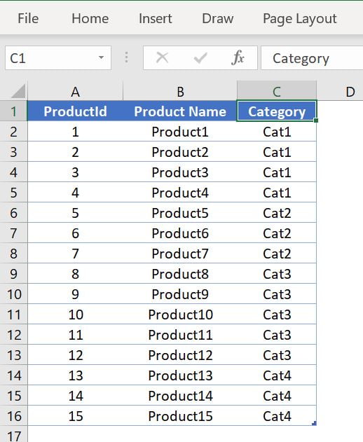
Ultimate Speedometer is one of my favorite visual. This speedometer has been created in Excel with help of auto-shapes. We
In the dynamic world of food packaging, staying ahead of operational metrics isn’t just useful—it’s essential. That's where the Food
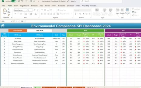
Environmental compliance is critical for businesses, industries, and organizations to ensure that they meet environmental regulations, minimize environmental impact, and