In today’s fast-paced world, government agencies face constant pressure to deliver efficient, transparent, and accountable services. Citizens expect timely updates, proper resource allocation, and data-backed decision-making. However, managing these responsibilities without a structured performance tracking system often becomes overwhelming.
This is where a Government Administration KPI Dashboard in Excel comes into play. By consolidating critical data into a single interactive platform, it allows administrators to track progress, identify gaps, and ensure that government services align with goals and public expectations.
This article will walk you through everything you need to know about this powerful tool—its features, advantages, setup process, best practices, and even frequently asked questions.
Click to Purchases Government Administration KPI Dashboard in Excel
What is a Government Administration KPI Dashboard in Excel?
A KPI (Key Performance Indicator) Dashboard is a visual reporting tool that brings together the most important metrics of government operations. In the context of government administration, KPIs can include:
-
Budget Utilization
-
Project Completion Rate
-
Citizen Satisfaction
-
Policy Compliance
-
Service Delivery Timeliness
By using Excel as the platform, you gain flexibility, cost-effectiveness, and accessibility. Government officials at all levels can interact with the dashboard, update data, and extract insights without the need for expensive business intelligence software.
Key Features of the Government Administration KPI Dashboard
The ready-to-use template has been structured into 7 worksheets, each serving a specific purpose. Let’s explore them one by one:
Home Sheet (Navigation Hub)
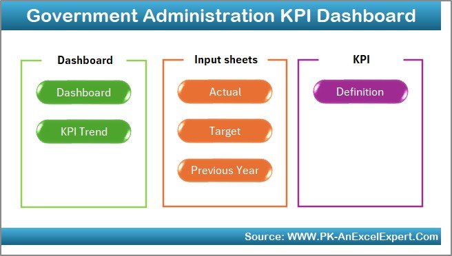
The Home sheet acts as the central index of the dashboard. It includes buttons that link to all other sheets, making navigation quick and seamless. This saves time for administrators and ensures users can jump to the right section without scrolling endlessly.
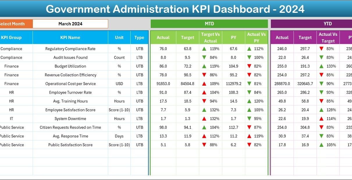
Dashboard Sheet (Analytics at a Glance)
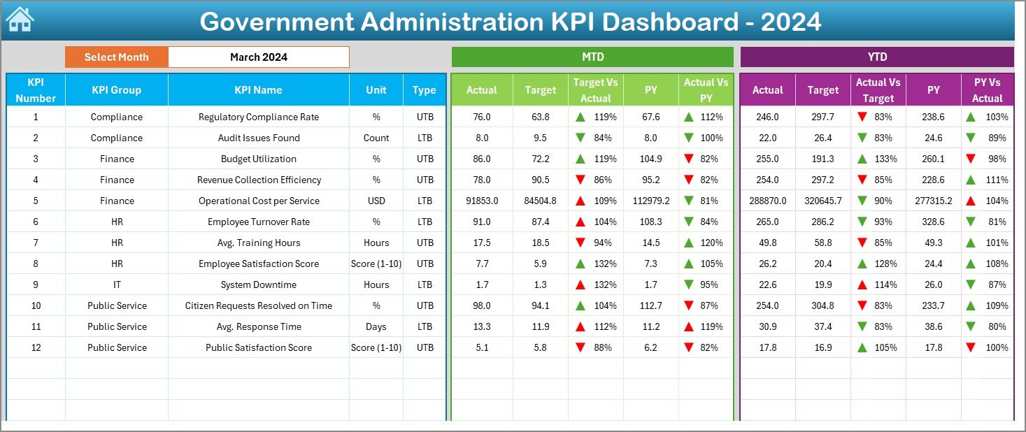
This is the heart of the dashboard. It displays the most crucial information in a clean, visual format.
-
A drop-down selector (cell D3) allows users to choose the month.
-
Once a month is selected, all dashboard numbers refresh automatically.
Metrics include:
- MTD (Month-to-Date) Actual, Target, and Previous Year values
- YTD (Year-to-Date) Actual, Target, and Previous Year values
- Conditional formatting arrows to highlight positive or negative performance trends.
This makes it easy to spot underperformance or celebrate achievements.
Click to Purchases Government Administration KPI Dashboard in Excel
KPI Trend Sheet (In-Depth Analysis)
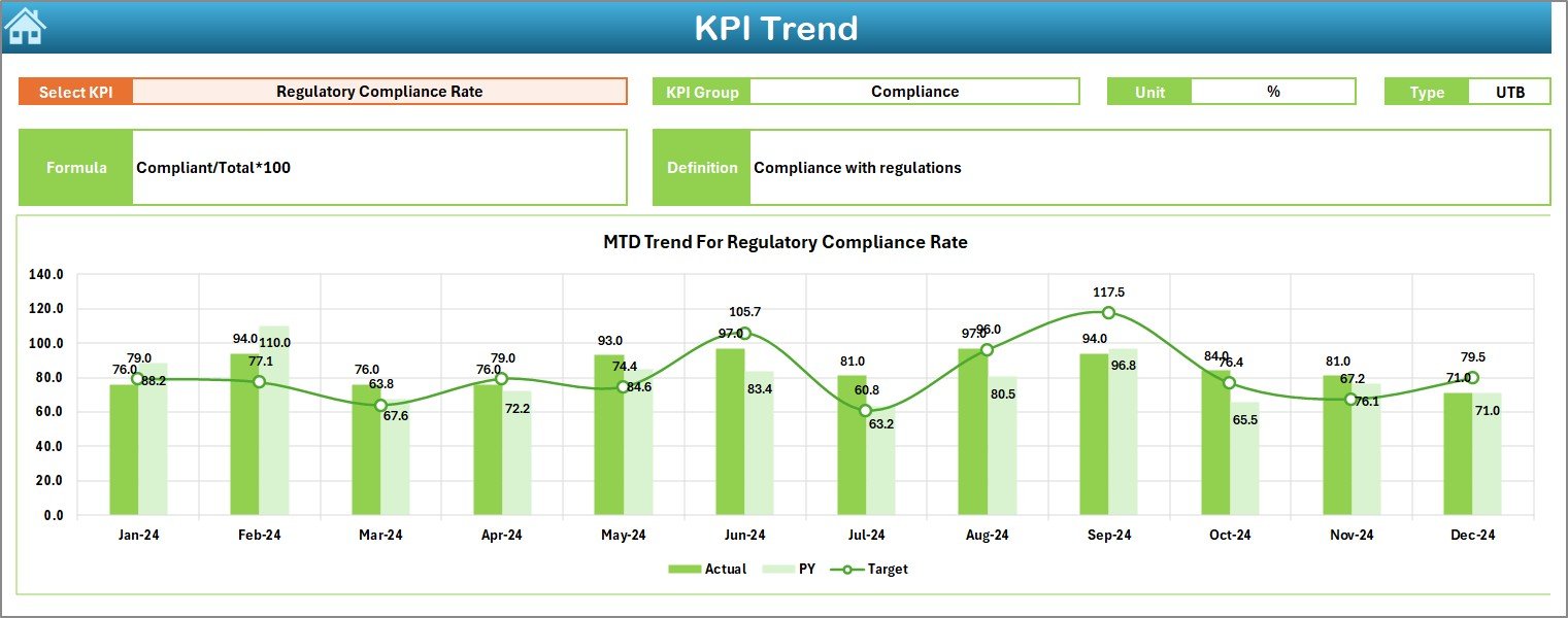
This sheet helps track the performance of each KPI over time.
-
Select a KPI from the drop-down menu (cell C3).
Instantly view its details such as:
- KPI Group
- Unit of measurement
- Type (Lower the Better or Upper the Better)
- Formula
- Definition
-
MTD and YTD charts show Actual vs. Target vs. Previous Year trends.
This feature enables administrators to identify long-term patterns rather than focusing only on monthly snapshots.
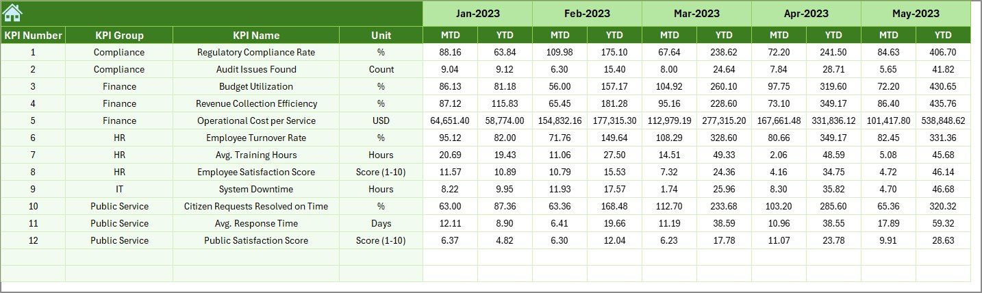
Actual Numbers Input Sheet (Data Entry Section)
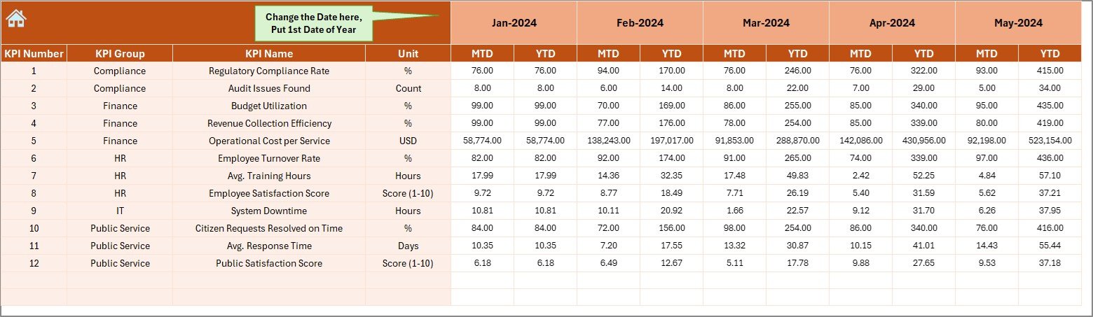
-
Enter the real-world MTD and YTD numbers for each KPI.
-
Cell E1 allows you to set the starting month of the year.
-
By updating this sheet, the entire dashboard automatically recalculates and updates visuals.
This simple input system keeps data entry organized and efficient.
Target Sheet (Goal-Setting Section)
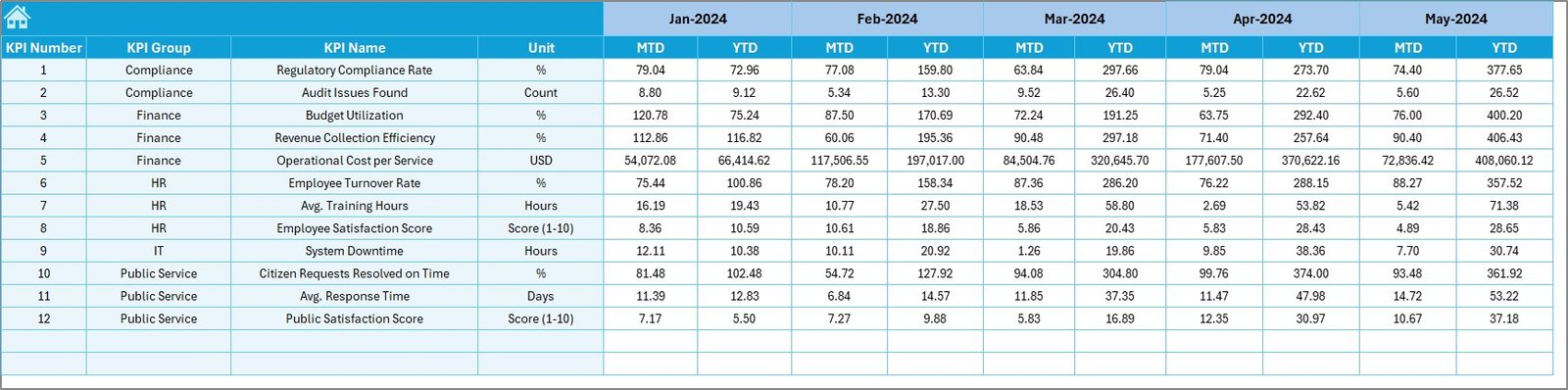
-
Enter the monthly MTD and YTD targets for each KPI.
-
Serves as a benchmark to evaluate whether actual performance meets expectations.
-
Ensures clarity in goal-setting and accountability.
Previous Year Number Sheet (Historical Data Reference)
-
Stores past year’s performance figures for every KPI.
-
Provides valuable context for comparing current performance with historical trends.
-
Helps highlight whether initiatives have truly led to improvements.
KPI Definition Sheet (Reference Guide)
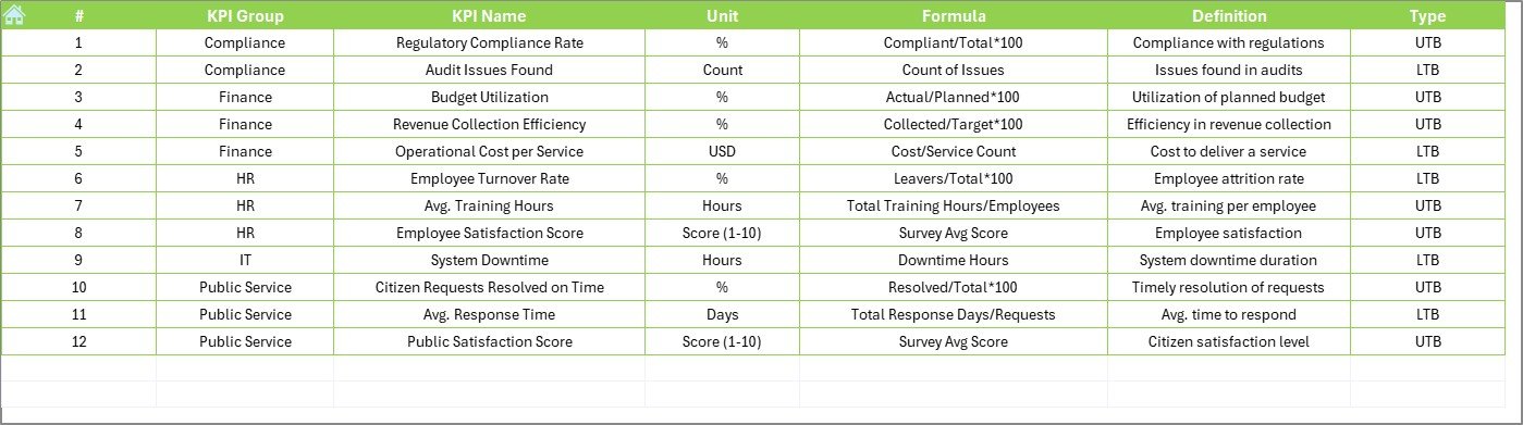
-
Acts as a dictionary of KPIs.
-
Includes: KPI Name, KPI Group, Unit, Formula, and Definition.
-
Promotes consistency and ensures everyone understands each KPI the same way.
Why Use Excel for Government KPI Dashboards?
While there are advanced tools like Power BI or Tableau, Excel remains the most practical choice for many government agencies because:
✅ Low Cost – No need for expensive licenses.
✅ Universal Access – Every department already uses Excel.
✅ Flexibility – Can be customized easily for local, state, or federal needs.
✅ Offline Functionality – Works without internet access.
✅ Quick Setup – No need for complex IT support.
Advantages of a Government Administration KPI Dashboard
Using such a dashboard transforms how government agencies operate. Here are the key advantages:
📊 Transparency in Operations – Citizens and stakeholders can see real progress.
⏱️ Improved Decision-Making – Data-backed decisions reduce errors.
💰 Efficient Resource Allocation – Budgets are optimized with clear utilization tracking.
👥 Better Citizen Services – Agencies can spot delays and improve service delivery.
🔄 Continuous Monitoring – Real-time tracking prevents last-minute surprises.
📈 Performance Benchmarking – Compare current performance with past years.
Opportunities for Improvement
Although powerful, Excel-based dashboards also have limitations. Here are areas where administrators can improve:
🔐 Data Security – Ensure access control to prevent unauthorized edits.
⚡ Automation – Use macros or VBA to reduce manual data entry.
🌍 Integration – Link Excel dashboards with external databases for live updates.
📱 Accessibility – Develop simplified versions for mobile users.
🧩 Scalability – For larger datasets, agencies may eventually move to Power BI or other platforms.
Best Practices for the Government Administration KPI Dashboard
To maximize the impact of your dashboard, follow these best practices:
-
Define Clear KPIs – Make sure KPIs reflect true priorities of the agency.
-
Standardize Data Entry – Use drop-downs and validations to avoid errors.
-
Review Regularly – Update targets and actuals consistently each month.
-
Use Conditional Formatting – Highlight underperformance in red and achievements in green.
-
Maintain Historical Data – Always compare with previous year’s numbers.
-
Train Staff – Provide basic Excel training for consistent use.
-
Automate Where Possible – Use formulas and charts to reduce manual work.
How to Build the Dashboard Step-by-Step
If you want to create your own version, follow these steps:
-
Identify KPIs – Choose metrics such as budget utilization, citizen complaints resolved, or project completion.
-
Create KPI Definition Sheet – Document the KPIs with formulas and definitions.
-
Set Targets – Populate the target sheet with MTD and YTD goals.
-
Collect Data – Record actual monthly figures in the Actual Numbers Input sheet.
-
Add Historical Data – Enter past year numbers for benchmarking.
-
Design Dashboard – Use pivot tables, charts, and conditional formatting.
-
Automate Trends – Create charts to track progress month-over-month.
-
Test and Refine – Share with stakeholders and refine based on feedback.
Real-World Use Cases
-
Municipal Corporations – Track waste collection efficiency and public grievance redressal.
-
State Governments – Monitor education programs, healthcare initiatives, and infrastructure projects.
-
Federal Agencies – Measure compliance with national regulations and financial performance.
-
Public Utilities – Track electricity, water, or transport service delivery metrics.
Conclusion
A Government Administration KPI Dashboard in Excel is a simple yet powerful tool for driving accountability, transparency, and efficiency in public services. With its structured design, it allows decision-makers to focus on what truly matters: improving citizen satisfaction and ensuring policies deliver real results.
When used correctly, this dashboard becomes more than a reporting tool—it becomes a foundation for smarter governance.
Frequently Asked Questions (FAQs)
1. What is the purpose of a Government Administration KPI Dashboard?
It helps track performance, ensure accountability, and improve decision-making by consolidating key government metrics in one place.
2. Why use Excel instead of other tools?
Excel is cost-effective, widely accessible, and easy to customize. It doesn’t require special software or advanced technical skills.
3. How many KPIs should be included?
Typically, 10–15 well-defined KPIs are enough to cover financial, operational, and citizen service aspects.
4. Can the dashboard be automated?
Yes. By using Excel formulas, pivot tables, and VBA macros, you can automate calculations and reduce manual input.
5. Who can use this dashboard?
It is useful for government administrators, policymakers, project managers, and public service officers at all levels.
6. Is it possible to upgrade later to Power BI?
Absolutely. Excel dashboards can serve as the starting point, and later data can be integrated into Power BI for advanced visualization.
Visit our YouTube channel to learn step-by-step video tutorials