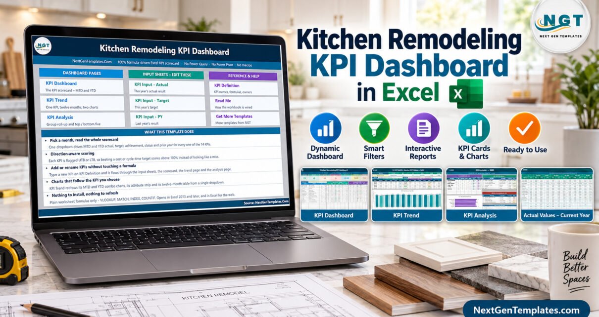
Most kitchen remodeling firms already have the numbers. They are just scattered – closing rates in the sales inbox, margin in the accountant’s file, punch-list counts on a clipboard, callbacks in someone’s memory. The Kitchen Remodeling KPI Dashboard in Excel is a small, honest attempt to pull one month of those numbers onto a single page you can actually read in a Monday meeting.
This article walks through what the workbook contains, what the sample month shows, what it deliberately does not do, and the handful of defects that shipped in this build. Everything below was checked by opening the file and recomputing the figures, not by reading the marketing copy.
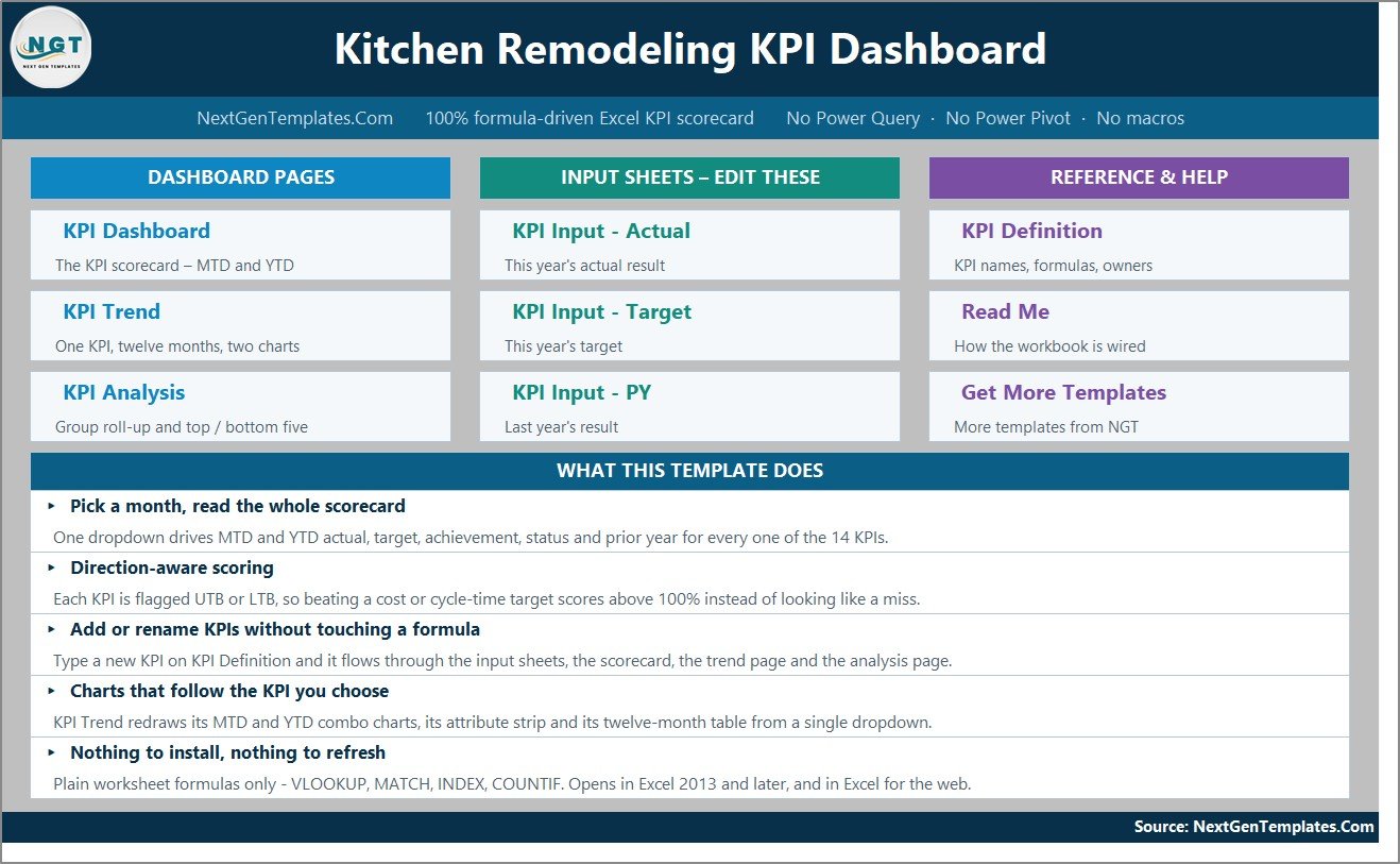
What the Kitchen Remodeling KPI Dashboard in Excel Actually Is
It is an .xlsx workbook of eleven worksheets, all driven by ordinary worksheet formulas – VLOOKUP, MATCH, INDEX, COUNTIF, AVERAGEIF and SUMPRODUCT. There is no macro, no Power Query, no data model and no add-in. It opens in Excel 2013 and later, in Excel for Mac and in Excel for the web.
Crucially, it is a reporting layer over data you type in. It has no connection to your accounting package, your estimating software or your scheduling tool. You enter thirteen KPIs, month by month, for the current year, the target and last year. The workbook then does the arithmetic and the colour coding.
The file ships with a full year of fictional demo data for 2025 so that every card, chart and traffic light is populated the moment you open it. None of those numbers are benchmarks. They are invented figures for a made-up remodeling firm, and the first thing any buyer should do is delete them.
The Scorecard Page
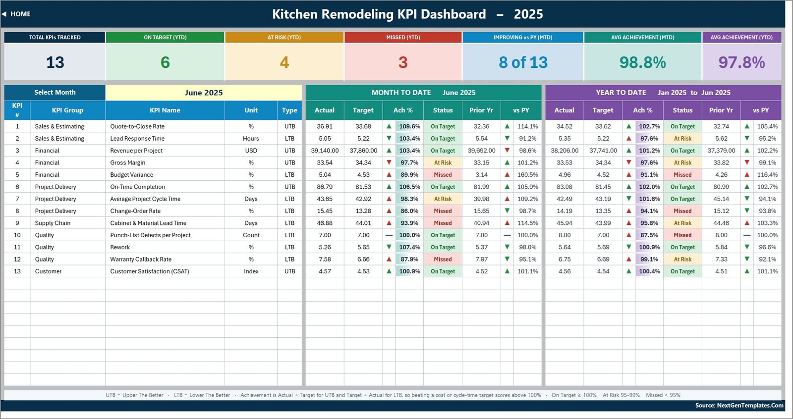
The KPI Dashboard sheet is the heart of the file. A single dropdown in cell D6 picks the month; everything else follows. Across the top sit seven summary cards: Total KPIs Tracked, On Target (YTD), At Risk (YTD), Missed (YTD), Improving vs PY (MTD), Avg Achievement (MTD) and Avg Achievement (YTD).
Below them, one row per KPI, split into a Month to Date block and a Year to Date block. Each block carries actual, target, achievement %, a status chip and the prior-year comparator with an arrow. The achievement formula is direction-aware: for an upper-the-better KPI it is actual divided by target, and for a lower-the-better KPI it is target divided by actual. That is why beating a cycle-time or callback target scores above 100% rather than looking like a shortfall.
Status thresholds are On Target from 100%, At Risk from 95% to 99%, and Missed below 95%. They live in the formulas in columns L and U, so you can move them to match your own governance.
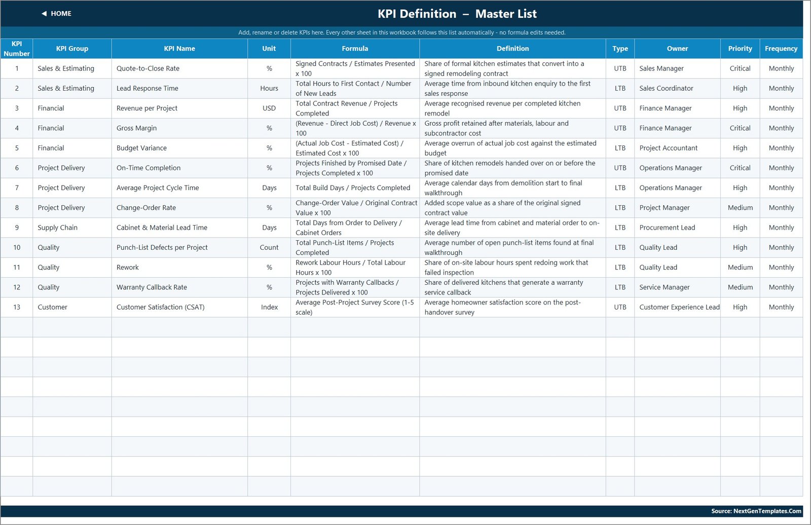
The thirteen KPIs
| Group | KPIs |
|---|---|
| Sales & Estimating | Quote-to-Close Rate (%), Lead Response Time (hours) |
| Financial | Revenue per Project (USD), Gross Margin (%), Budget Variance (%) |
| Project Delivery | On-Time Completion (%), Average Project Cycle Time (days), Change-Order Rate (%) |
| Supply Chain | Cabinet & Material Lead Time (days) |
| Quality | Punch-List Defects per Project (count), Rework (%), Warranty Callback Rate (%) |
| Customer | Customer Satisfaction CSAT (index) |
Note what is absent: there is no safety, incident or compliance KPI, no cost-code ledger and no labour-hour capture. This build is a commercial and delivery scorecard, nothing more.
What the June 2025 Demo Month Shows
With June 2025 selected, the sample file reads: 13 KPIs tracked, 6 On Target, 4 At Risk and 3 Missed on the year to date, 8 of 13 improving against prior year on the month, average achievement 98.8% MTD and 97.8% YTD.
We recomputed all of that from the three input sheets rather than trusting the screenshots. Every summary card, every group roll-up on the analysis page and both the Top 5 and Bottom 5 rankings reconcile exactly with the KPI rows. There is no wrong denominator hiding anywhere in this build – a real risk in scorecard templates, and worth stating plainly when it is absent.
In the sample, Quote-to-Close Rate leads at 102.7% YTD and Punch-List Defects per Project trails at 87.5%. Again – invented numbers, chosen to make the traffic lights show all three states.
The Trend Page
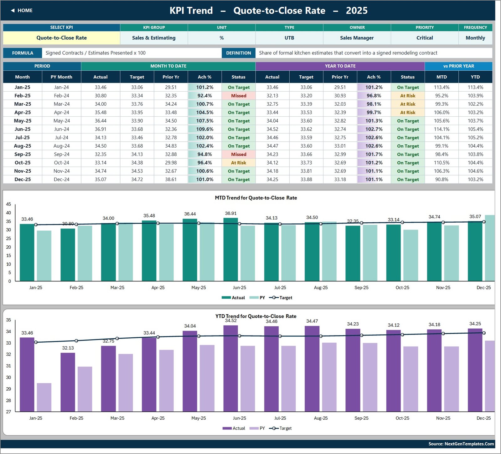
KPI Trend takes one KPI at a time, chosen from a dropdown in cell B4. It shows the KPI’s attribute strip – group, unit, type, owner, priority, frequency – plus its formula and definition, then a twelve-month table of actual, target, prior year, achievement and status for both MTD and YTD, and finally two combo charts: MTD Trend and YTD Trend. Each chart plots actual and prior-year columns against a target line.
This page follows the KPI dropdown, not the month picker on the scorecard, which is the correct behaviour for a twelve-month trend and is what the Read Me says it does.
The Analysis Page
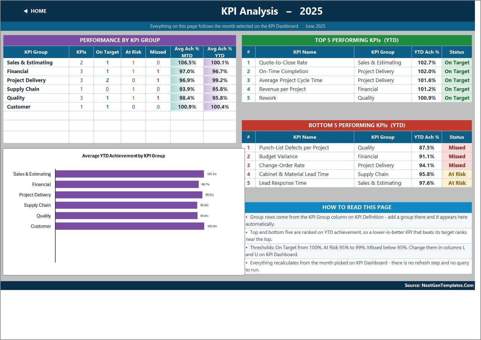
KPI Analysis rolls the scorecard up by KPI group – count, On Target, At Risk, Missed, average achievement MTD and YTD – and draws an Average YTD Achievement by KPI Group bar chart. Alongside it sit Top 5 and Bottom 5 performing KPIs for the year to date, ranked on YTD achievement so that a lower-is-better KPI beating its target ranks near the top.
The group rows are generated from the KPI Group column on the definition sheet, so adding a group there makes a new row appear here without any formula work.
The Input Sheets
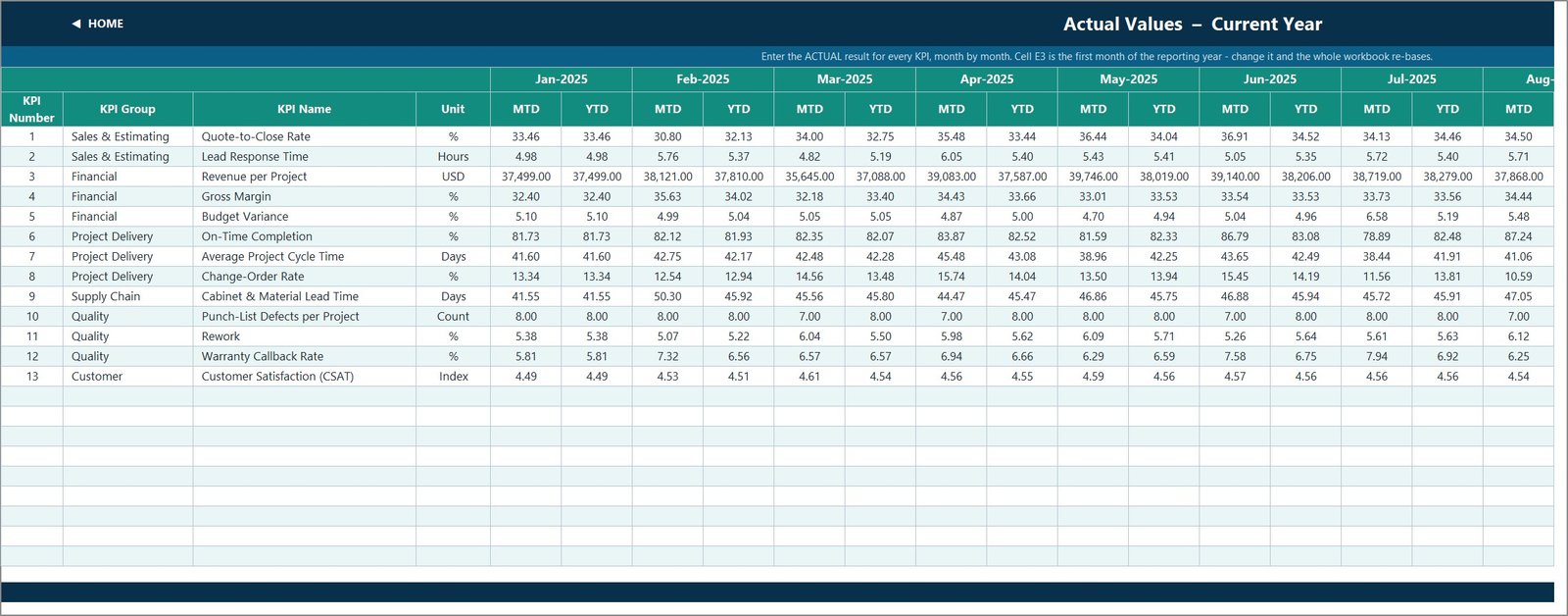
Three sheets – Actual, Target and Prior Year – hold your data. Each has an MTD and a YTD column for every month of the reporting year. Storing YTD rather than computing it is a deliberate choice: it lets you decide whether a KPI accumulates through the year or runs as an average, which matters because a percentage that sums to 1,100% by December is nonsense.
Cell E3 on the Actual sheet sets the first month of the reporting year. Change it and every sheet title, the month dropdown and the prior-year headers re-base automatically. The KPI rows on all three sheets are driven by the KPI Definition sheet, so they always line up.
Defects That Shipped in This Build
We list what we find. None of these break a calculation, but you should know before you buy.
- The KPI count in the copy disagrees with the file. The Home page says “every one of the 14 KPIs” and the Read Me says “14 are filled in”. The workbook holds thirteen. The dashboard’s own Total KPIs Tracked card reads 13 correctly, because it counts rows rather than trusting the sentence.
- An aerospace example survives in the Read Me. The note on cumulative versus average YTD offers “aircraft deliveries, non-conformance reports” as its examples – leftover text from the base template that should have been rewritten for kitchen remodeling. The rule it explains is still right.
- Clipped rows. Several explanation cells on the Read Me and Get More Templates sheets are taller than their row height, so the last line is cut off on screen and in the page images.
- Counts formatted with two decimals. Punch-List Defects per Project is a whole-number count formatted
#,##0.00, so it renders as “7.00” and “8.00”. - No currency symbol on Revenue per Project. It is tagged USD but displays as “39,140.00”. The digit grouping is standard thousands, not lakh/crore – a common defect in this family that this build avoids.
- The group bar chart uses a zero-based axis, so six group averages between 95.8% and 100.4% look almost identical until you set a minimum on the value axis.
And the things we checked that are correct: the year-on-year arrow colours are genuinely direction-aware, driven by four conditional-formatting rules that pair the arrow glyph with the KPI’s UTB or LTB flag, so a falling cost shows a green down-arrow; no achievement percentage rounds up into a status it has not earned; no KPI is stored in the wrong unit; and no target-cap label overprints a value label on either chart.
What It Does Not Do
This matters more on a remodeling topic than on most. The workbook is a reporting spreadsheet over buyer-entered numbers. It does not:
- establish or evidence compliance with building codes, permitting, contractor licensing, mechanics-lien rules or home-improvement contract law;
- constitute a structural, electrical, plumbing, gas or safety assessment, an inspection record, a permit, a certificate or a warranty;
- produce estimates, bids, change orders or contracts that are binding, accurate or fit to hand to a customer;
- replace the statutory duties of a licensed contractor, designer, engineer or inspector.
Every margin, cycle time, change-order rate, punch-list count and satisfaction score in the file is a number a human typed in. The workbook cannot tell whether that number is right, and nothing in it should be used to make a safety, legal or pricing decision.
Excel, Google Sheets or Dedicated Software?
| Requirement | This Excel workbook | Google Sheets edition | Job-costing / CRM software |
|---|---|---|---|
| Cost model | One-time | One-time | Monthly per seat |
| Time to first report | Minutes | Minutes | Weeks |
| Works offline | Yes | No | Usually no |
| Live cost capture | No | No | Yes |
| Estimating and proposals | No | No | Usually yes |
| Editable formulas | Yes | Yes | No |
| Best for | An owner who already keeps monthly totals in a spreadsheet | Google Workspace teams | Firms with many concurrent jobs and full cost capture |
Who Should Use It
It fits an owner, project coordinator, sales manager or office manager at a firm delivering roughly two to thirty kitchens a year, who wants one reviewable page instead of another subscription. It does not fit anyone who needs per-job profit and loss, timesheet capture, scheduling, estimating or a client portal – that is dedicated construction software, and this is not a substitute for it.
Setting It Up
- Unzip and open the .xlsx file.
- Set cell E3 on KPI Input – Actual to the first month of your reporting year.
- Replace the demo numbers on all three input sheets with your own MTD and YTD figures.
- Rename KPIs on KPI Definition to match how you actually measure, and set each one’s UTB or LTB flag.
- Pick your month on KPI Dashboard and read the scorecard.
- While you are in there, correct the two “14 KPIs” sentences on Home and Read Me.
If any of the formatting steps are unfamiliar, Microsoft’s Excel support library covers number formats, conditional formatting and chart axis settings.
Frequently Asked Questions
Does this make our remodeling work compliant or our estimates accurate?
No. It is a reporting template with no view of codes, permits, licensing, lien deadlines or contract terms, and no ability to validate anything you type. It does not inspect, certify, warrant or price. It only summarises results you have already produced and verified elsewhere.
Is the sample data real?
No. Every number in the file and in the images above is invented demo data for a fictional firm across 2025.
How many KPIs are there?
Thirteen, in six groups. The Home and Read Me sheets incorrectly say fourteen.
Can I add more KPIs?
Yes. The grid is wired for 22 rows, so nine more can be added by typing them onto KPI Definition – no formula editing required.
Does it need macros or an add-in?
No. Plain worksheet formulas only.
How is this different from a KPI scorecard?
A scorecard is a compact target-versus-actual sheet. The Kitchen Remodeling KPI Dashboard in Excel is the larger MTD/YTD build with a month picker, a per-KPI trend page and a group analysis page. They are separate products.
Where to Get It
The workbook is listed as the Kitchen Remodeling KPI Dashboard in Excel on NextGenTemplates, priced at 19.99 with a 12.99 launch price. The download is a single ZIP holding the .xlsx file and a PDF user manual.
A Google Sheets edition of this dashboard and a Kitchen Remodeling KPI Scorecard in Excel are both being prepared and are not live yet, so they are named here rather than linked. The published Kitchen Remodeling KPI Scorecard in Google Sheets is a different, more compact product on the same topic.
For more workbooks of this kind, browse the dashboard articles on this site.
About the Author
Written by the team at PK-AnExcelExpert, who build and review Excel, Power BI and Google Sheets reporting templates full time. Every workbook covered here is opened, recalculated and checked before it is written about, and whatever is wrong with it goes into the article.