The Medical Device KPI Dashboard in Power BI is a powerful and ready-to-use tool designed to track and visualize key performance indicators (KPIs) in the medical device sector. This dashboard captures and processes data from Excel to provide insightful analytics on various KPIs, helping medical device companies monitor their performance efficiently and effectively.
In this article, we will walk you through the key features, best practices, advantages, and frequently asked questions related to using the Medical Device KPI Dashboard in Power BI. This guide will help you understand how to make the most of this dashboard and leverage its full potential to enhance decision-making processes.
Click to Purchases Medical Device KPI Dashboard in Power BI
What is a Medical Device KPI Dashboard in Power BI?
A Medical Device KPI Dashboard in Power BI is an interactive dashboard built to track and analyze the performance of critical KPIs specific to the medical device industry. Power BI, a powerful business analytics tool, helps transform raw data into insightful reports and interactive visualizations, allowing users to make data-driven decisions.
This dashboard offers various pages, slicers, and detailed metrics to help users easily monitor KPIs such as monthly and year-to-date targets, actual values, comparisons to previous periods, and more. By using data from Excel, this dashboard allows seamless integration with existing company data.
Key Features of the Medical Device KPI Dashboard in Power BI
The Medical Device KPI Dashboard comes with several features designed to provide a comprehensive view of your KPIs. Below are the key highlights:
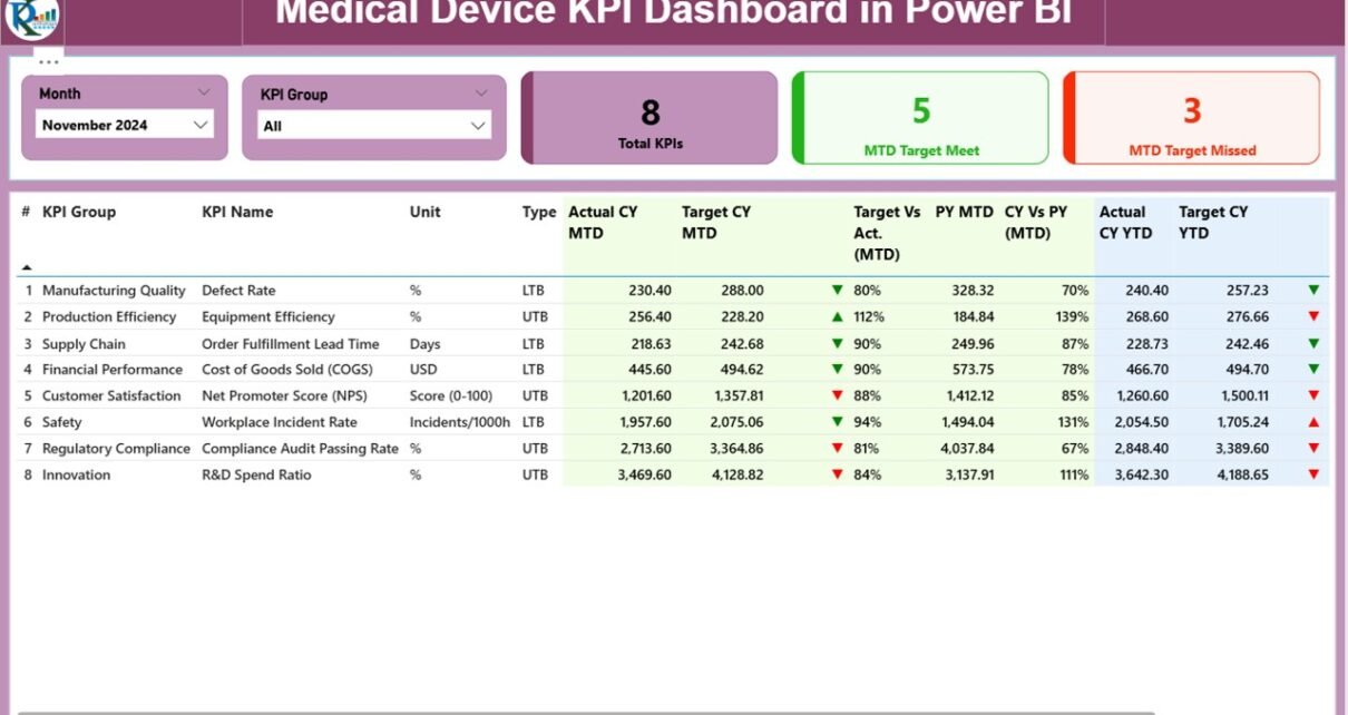
Summary Page
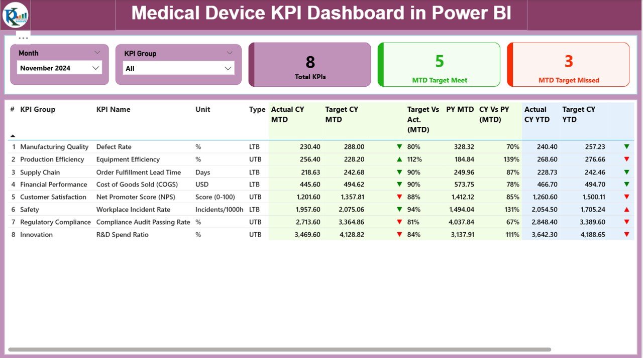
The Summary Page is the main page of the dashboard, offering a quick overview of the performance metrics. Key components of this page include:
-
Month and KPI Group Slicer: Allows users to filter data by the desired month and KPI category.
KPI Performance Cards: These cards display three essential metrics:
- Total KPIs Count
- MTD Target Met Count
- MTD Target Missed Count
Detailed KPI Table: This table showcases all the important details for each KPI, including:
- KPI Number: Sequential number for each KPI.
- KPI Group: Category or group of the KPI.
- KPI Name: The name of the KPI.
- Unit: The measurement unit for the KPI (e.g., percentage, quantity).
- Type (LTB or UTB): Indicates whether the KPI is “Lower the Better” (LTB) or “Upper the Better” (UTB).
- Actual CY MTD: Current year’s actual performance for the month-to-date (MTD).
- Target CY MTD: Current year’s target performance for MTD.
- MTD Icon: A visual indicator (▲ for met targets, ▼ for missed targets).
- Target Vs Actual (MTD): Percentage comparison between actual and target values for MTD.
- Previous Year MTD (PY MTD): Comparison to the same period last year.
- CY Vs PY (MTD): Year-over-year comparison percentage for MTD.
- Actual CY YTD: Current year’s actual performance for the year-to-date (YTD).
- Target CY YTD: Current year’s target performance for YTD.
- YTD Icon: A visual indicator for YTD performance (▲ or ▼).
- Target Vs Actual (YTD): Percentage comparison between actual and target values for YTD.
- PY YTD: Previous year’s YTD performance.
- CY Vs PY (YTD): Year-over-year comparison percentage for YTD.
KPI Trend Page
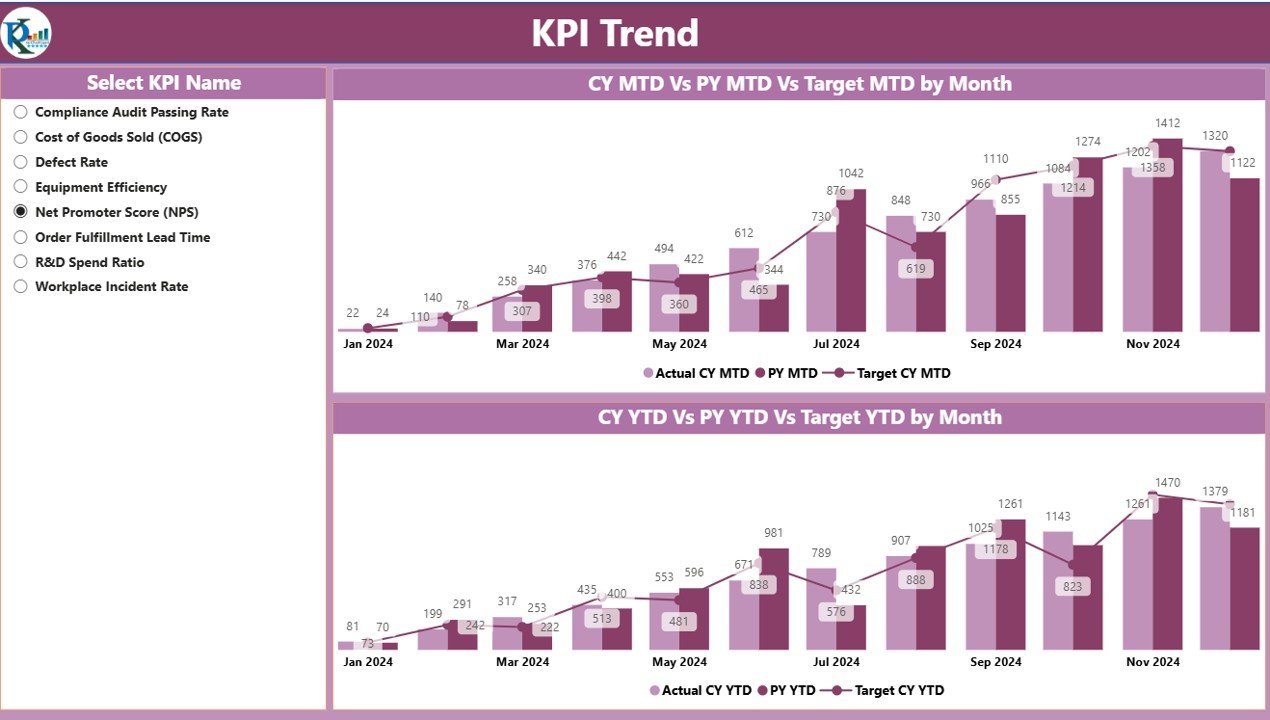
The KPI Trend Page focuses on showing historical trends and comparisons for KPIs. It includes:
-
Combo Charts: Visual charts displaying the actual numbers for the current year, previous year, and targets for both MTD and YTD.
-
KPI Selector: A slicer that allows users to select the desired KPI for analysis.
KPI Definition Page
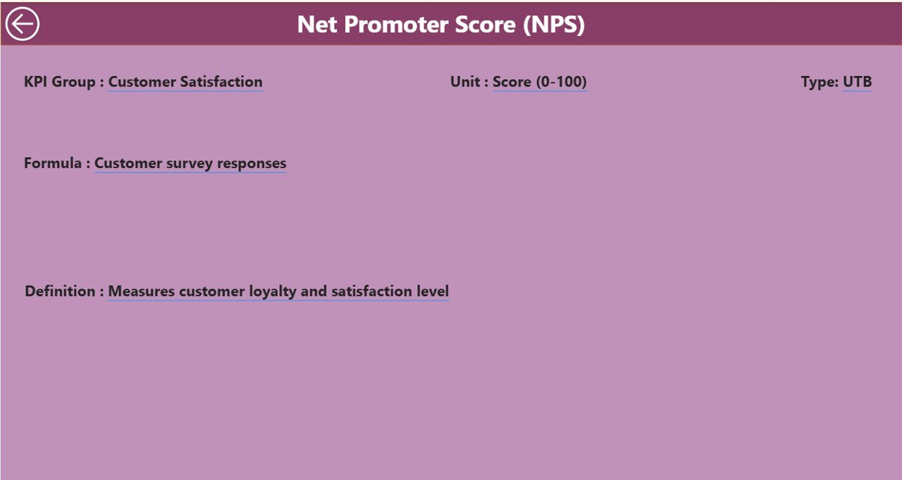
The KPI Definition Page provides detailed definitions, formulas, and descriptions for each KPI. This page is accessible via drill-through from the Summary Page, providing in-depth insights into the calculations and data used for each KPI.
Advantages of the Medical Device KPI Dashboard in Power BI
Click to Purchases Medical Device KPI Dashboard in Power BI
The Medical Device KPI Dashboard in Power BI brings several advantages to medical device manufacturers, managers, and executives who need quick access to important performance metrics. Some of the key advantages include:
1. Centralized Data Management
This dashboard allows you to centralize and consolidate data from multiple sources, including Excel, making it easier to access and analyze all performance-related data in one place.
2. Real-Time Data Visualization
The Power BI tool is designed to provide real-time updates, so users can stay on top of their KPIs and monitor performance as it happens. This helps decision-makers respond quickly to any trends or issues.
3. Easy-to-Understand Reports
With visualizations like cards, charts, and icons, the dashboard makes complex data easier to interpret. It simplifies performance analysis, even for non-technical users.
4. Increased Efficiency
By automating the process of data tracking and reporting, the dashboard reduces the need for manual work and significantly improves the efficiency of KPI analysis.
5. Improved Decision-Making
By providing insights into trends, comparisons, and variances, this dashboard empowers management teams to make better, data-driven decisions that align with business goals.
Best Practices for Using the Medical Device KPI Dashboard in Power BI
To maximize the value of the Medical Device KPI Dashboard, it’s essential to follow some best practices:
1. Keep Your Data Updated
Ensure that your Excel data is regularly updated to reflect the most accurate and timely performance figures. The accuracy of your dashboard relies on the quality of your data.
2. Customize for Specific Needs
While the dashboard is ready-to-use, it’s essential to tailor it to your specific needs. Modify the KPIs, target values, and other parameters to suit your business goals.
3. Use Filters for Detailed Insights
Leverage the slicers and filters available in Power BI to drill down into specific KPIs, time periods, and groups. This allows you to get a more granular understanding of your performance.
4. Analyze Trends Over Time
Take advantage of the KPI trend visualizations to track how your KPIs are performing over time. This will help you identify patterns, successes, and areas for improvement.
5. Regularly Review the Summary Page
The Summary Page is your go-to page for quick insights into overall performance. Regularly review this page to ensure your team is meeting KPIs and targets.
Conclusion
The Medical Device KPI Dashboard in Power BI is a powerful tool that provides medical device companies with the necessary insights to monitor and analyze their performance efficiently. By leveraging the key features and following best practices, users can streamline their KPI management process and make informed decisions. With its ability to display real-time data, historical trends, and clear visualizations, this dashboard is an indispensable tool for any organization looking to improve its operational efficiency and drive success.
Frequently Asked Questions (FAQ)
1. What is the purpose of the Medical Device KPI Dashboard in Power BI?
The dashboard helps track and analyze key performance indicators (KPIs) for medical device companies. It consolidates data from Excel and visualizes it in an easy-to-understand format, allowing users to monitor performance in real-time.
2. How do I update the data for the dashboard?
You can update the data by modifying the Input_Actual and Input_Target Excel sheets with the latest figures for MTD and YTD numbers. After updating, refresh the Power BI dashboard to reflect the changes.
3. What KPIs can I track with this dashboard?
The dashboard can track various KPIs relevant to the medical device industry, such as production efficiency, quality control, sales performance, regulatory compliance, and more. You can customize the dashboard to include KPIs that suit your specific needs.
4. Can I customize the dashboard for different departments?
Yes, the dashboard is fully customizable. You can adjust the KPI groups, targets, and other parameters to align with different departmental goals and performance metrics.
5. How do I interpret the MTD and YTD performance indicators?
MTD (Month-to-Date) shows how you’re performing within the current month, while YTD (Year-to-Date) tracks performance from the beginning of the year. The icons next to these values (▲ for target met, ▼ for target missed) give a quick visual representation of performance.
Visit our YouTube channel to learn step-by-step video tutorials