In today’s fast-changing healthcare environment, ophthalmology clinics and hospitals must manage large volumes of clinical, financial, and operational data every day. However, many eye care providers still rely on scattered Excel sheets, manual reports, and delayed summaries. As a result, decision-making often becomes slow, reactive, and less accurate.
That is exactly where an Ophthalmology Services Dashboard in Power BI becomes a powerful solution.
This detailed and SEO-friendly article explains what an Ophthalmology Services Dashboard in Power BI is, why it matters, how it works, its page-wise dashboard structure, key advantages, best practices, and frequently asked questions. Moreover, the article uses simple language, strong transitions, and active voice to ensure clarity and readability.
Click to Purchases Ophthalmology Services Dashboard in Power BI
What Is an Ophthalmology Services Dashboard in Power BI?
An Ophthalmology Services Dashboard in Power BI is an interactive data visualization tool designed to track, analyze, and monitor key performance indicators related to eye care services.
Instead of reviewing multiple disconnected reports, this dashboard brings OPD visits, surgeries, revenue, insurance cases, discounts, and service performance into one centralized Power BI report. Consequently, clinic managers, doctors, and administrators gain real-time visibility into operational and financial performance.
Because Power BI connects seamlessly with Excel and other data sources, ophthalmology teams can update data easily and analyze performance across regions, doctors, services, and months.
Why Do Ophthalmology Clinics Need a Power BI Dashboard?
Ophthalmology services involve complex workflows. Clinics must track patient visits, surgeries, billing, insurance claims, and doctor productivity at the same time. However, manual tracking increases errors and delays insights.
Therefore, an Ophthalmology Services Dashboard in Power BI helps clinics:
-
Monitor revenue and charges accurately
-
Analyze patient demographics clearly
-
Track surgery and OPD performance consistently
-
Identify regional and service-level trends
-
Improve financial control and planning
As a result, leadership teams make faster and smarter decisions.
How Does an Ophthalmology Services Dashboard in Power BI Work?
An Ophthalmology Services Dashboard in Power BI works by transforming raw healthcare data into meaningful visuals.
First, clinics capture data in an Excel file or hospital management system. This data includes patient visits, revenue, surgery flags, insurance indicators, regions, doctors, and service types.
Next, Power BI imports this data and applies data modeling, relationships, and calculations.
Finally, Power BI displays the data through interactive charts, cards, and slicers, allowing users to filter performance by region, doctor, service, or month.
Because everything updates dynamically, users always see the latest insights.
What Are the Key Pages of the Ophthalmology Services Dashboard in Power BI?
This ready-to-use Ophthalmology Services Dashboard in Power BI contains five structured pages, each designed for a specific level of analysis.
Let us explore each page in detail.
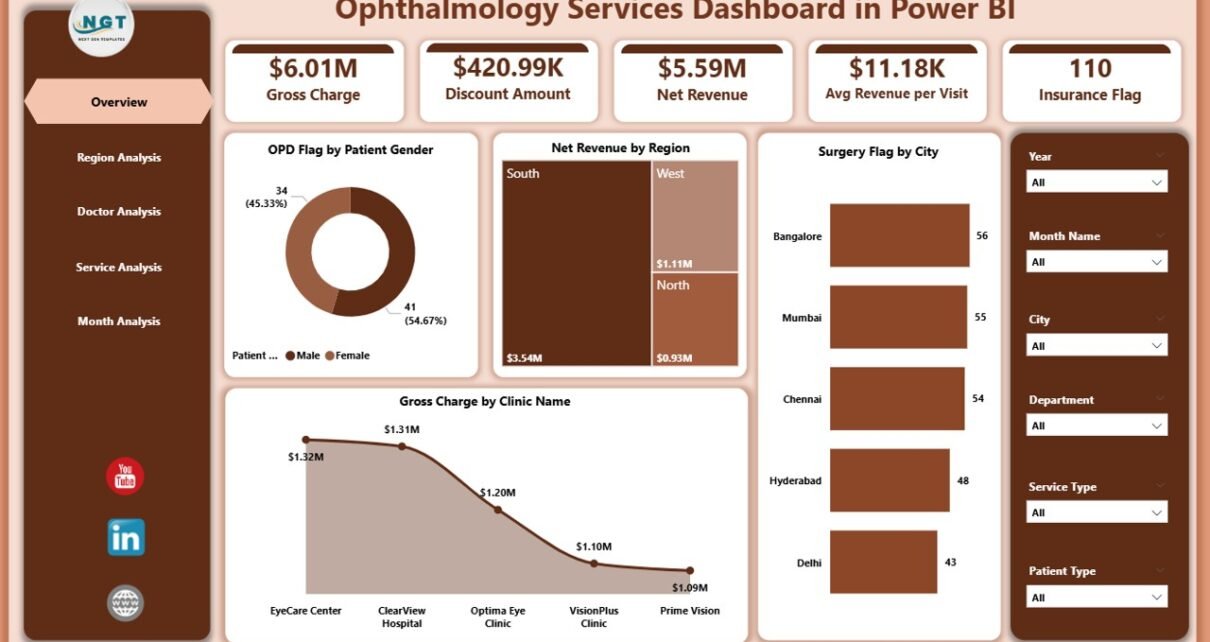
Overview Page: What Does the Overview Page Show?
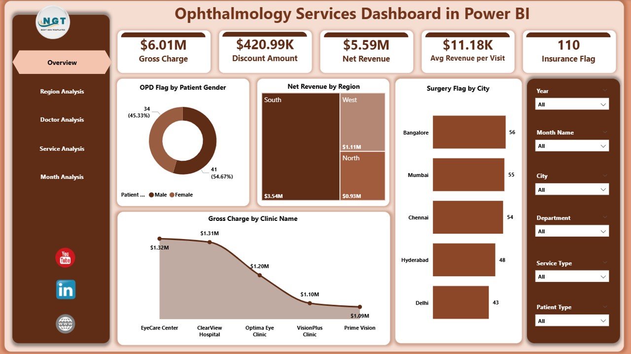
The Overview Page acts as the central summary of the entire dashboard. From this page, users can quickly understand overall performance without diving into detailed reports.
Key Features of the Overview Page
-
Slicers (Filters)
Users can filter data dynamically using slicers. These slicers allow analysis by time period, region, or other dimensions. -
KPI Cards (4 Cards)
The four cards highlight high-level metrics, such as total revenue or overall activity indicators. As a result, users instantly understand performance status.
Charts on the Overview Page
-
OPD Flag by Patient Gender
This chart shows OPD visits split by gender. Therefore, clinics can analyze patient demographics easily. -
Net Revenue by Region
This visual highlights which regions generate higher revenue. Consequently, management can focus on high-performing or underperforming regions. -
Surgery Flag by City
This chart tracks surgical procedures across cities. As a result, planners can identify demand patterns. -
Gross Charge by Clinic Name
This visual compares gross charges across clinics, helping leadership evaluate clinic-level performance.
Region Analysis Page: How Does Regional Performance Get Analyzed?
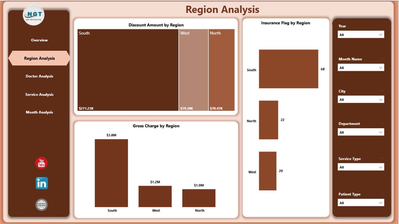
The Region Analysis Page focuses on geographical performance. This page helps management understand how different regions contribute to revenue, discounts, and insurance cases.
Key Charts on the Region Analysis Page
-
Discount Amount by Region
This chart shows total discounts offered across regions. Therefore, finance teams can control excessive discounts. -
Insurance Flag by Region
This visual highlights insurance-based cases region-wise. As a result, billing teams can plan insurance claim processes better. -
Gross Charge by Region
This chart compares gross charges across regions, making regional performance transparent.
Because of this page, clinics can align marketing, pricing, and service strategies region-wise.
Click to Purchases Ophthalmology Services Dashboard in Power BI
Doctor Analysis Page: How Can Clinics Measure Doctor Performance?
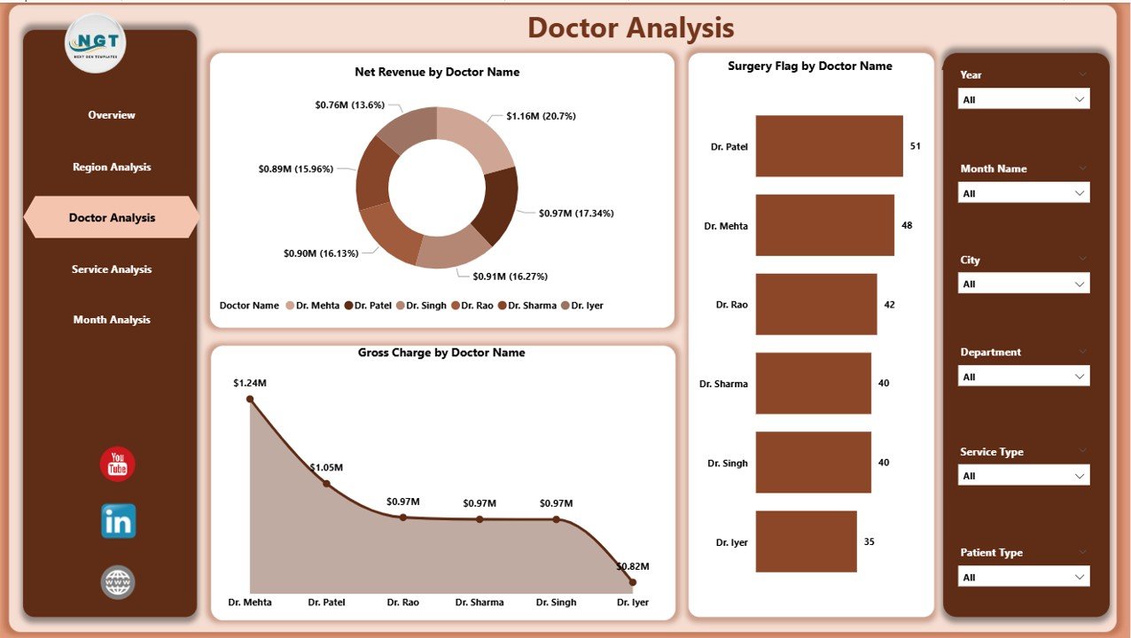
The Doctor Analysis Page provides insights into individual doctor performance. This page plays a critical role in productivity analysis and resource planning.
Key Charts on the Doctor Analysis Page
-
Net Revenue by Doctor Name
This chart highlights revenue generated by each doctor. As a result, management can recognize top performers. -
Surgery Flag by Doctor Name
This visual tracks surgical procedures handled by each doctor. Therefore, clinics can balance workloads effectively. -
Gross Charge by Doctor Name
This chart compares billing amounts by doctor, supporting transparent performance reviews.
Because of this analysis, clinics can improve doctor allocation and incentive planning.
Service Analysis Page: How Do Different Ophthalmology Services Perform?
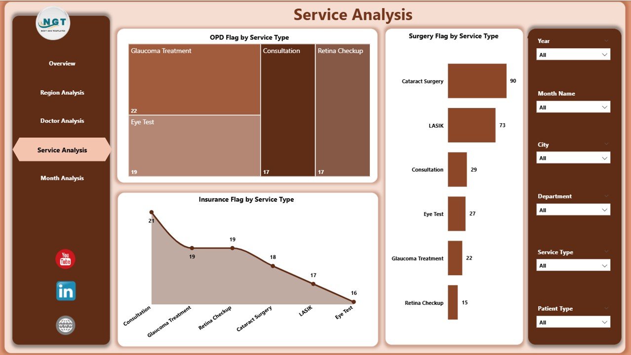
The Service Analysis Page focuses on different ophthalmology service types, such as OPD, surgeries, and insurance-related services.
Key Charts on the Service Analysis Page
-
OPD Flag by Service Type
This chart shows OPD visits across service categories. Therefore, clinics can identify high-demand services. -
Surgery Flag by Service Type
This visual tracks surgical volumes by service type, helping planners allocate resources. -
Insurance Flag by Service Type
This chart highlights insurance involvement across services, supporting financial forecasting.
With this page, clinics can optimize service offerings and pricing strategies.
Monthly Trends Page: Why Are Trends Important in Ophthalmology?
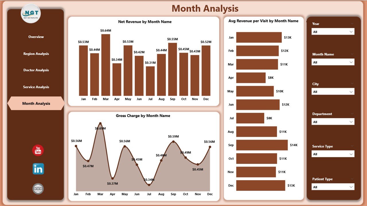
The Monthly Trends Page helps clinics analyze performance changes over time. Trend analysis supports forecasting and long-term planning.
Key Charts on the Monthly Trends Page
-
Net Revenue by Month
This chart shows how revenue changes month by month. As a result, clinics can detect seasonal patterns. -
Average Revenue Per Visit by Month
This visual highlights revenue efficiency per visit, supporting pricing and service optimization. -
Gross Charge by Month
This chart tracks total billing trends over time, helping finance teams plan cash flows.
Because trends reveal hidden patterns, this page plays a crucial role in strategic decisions.
Click to Purchases Ophthalmology Services Dashboard in Power BI
Advantages of Ophthalmology Services Dashboard in Power BI
An Ophthalmology Services Dashboard in Power BI offers several practical advantages.
Key Advantages
-
Centralized Performance Tracking
All KPIs appear in one dashboard, reducing report dependency. -
Faster Decision-Making
Interactive visuals provide instant insights. -
Improved Revenue Visibility
Clinics can track revenue, charges, and discounts clearly. -
Enhanced Doctor Productivity Analysis
Performance metrics help balance workloads. -
Better Regional and Service Planning
Data-driven insights improve resource allocation. -
Reduced Manual Reporting Effort
Automated visuals save time and reduce errors.
Best Practices for the Ophthalmology Services Dashboard in Power BI
To get maximum value from the dashboard, clinics should follow proven best practices.
Best Practices
-
Maintain Clean and Accurate Data
Always validate source data before loading it into Power BI. -
Define Clear KPIs
Focus on meaningful ophthalmology-specific metrics. -
Use Consistent Naming Conventions
Keep doctor names, regions, and services standardized. -
Update Data Regularly
Schedule regular data refreshes for accuracy. -
Train Users Properly
Ensure doctors and managers understand how to use slicers and visuals. -
Review Dashboard Periodically
Improve visuals based on user feedback and business needs.
Who Can Benefit from an Ophthalmology Services Dashboard in Power BI?
Several stakeholders benefit directly from this dashboard:
-
Ophthalmology clinic owners
-
Hospital administrators
-
Medical directors
-
Finance and billing teams
-
Operations managers
-
Data analysts
Each stakeholder gains clarity, control, and confidence in decision-making.
How Does This Dashboard Support Strategic Growth?
Because the dashboard combines clinical and financial insights, it supports long-term growth.
Clinics can identify profitable services, high-performing doctors, and growth regions. Moreover, trend analysis supports expansion planning and cost control. As a result, leadership teams align strategy with real data instead of assumptions.
Conclusion: Why Should Clinics Invest in an Ophthalmology Services Dashboard in Power BI?
An Ophthalmology Services Dashboard in Power BI transforms raw healthcare data into actionable insights. Instead of relying on static reports, clinics gain a dynamic, interactive, and centralized analytics solution.
With structured pages such as Overview, Region Analysis, Doctor Analysis, Service Analysis, and Monthly Trends, this dashboard supports smarter decisions at every level. Moreover, it improves operational efficiency, financial control, and patient service planning.
Therefore, investing in an Ophthalmology Services Dashboard in Power BI is no longer optional—it is essential for modern eye care organizations.
Frequently Asked Questions (FAQs)
What data is required for an Ophthalmology Services Dashboard in Power BI?
The dashboard typically requires patient visit data, revenue details, doctor information, service types, regions, insurance flags, and billing amounts.
Can small ophthalmology clinics use this dashboard?
Yes, small clinics can use this dashboard effectively. Power BI scales easily and works well with Excel-based data.
How often should clinics update the dashboard?
Clinics should update the dashboard daily or weekly, depending on operational needs.
Does the dashboard require advanced Power BI skills?
No, end users do not need advanced skills. However, a basic understanding of slicers and visuals helps.
Can the dashboard integrate with hospital management systems?
Yes, Power BI can integrate with multiple data sources, including hospital management systems and databases.
How does this dashboard improve financial control?
The dashboard tracks revenue, gross charges, discounts, and insurance flags, helping finance teams manage costs and profitability.
Visit our YouTube channel to learn step-by-step video tutorials