Patient Care Homes Dashboard in Excel is a ready-to-use reporting template for residential care homes, patient care homes, assisted living operators, healthcare administrators, finance teams, and quality managers. CDC FastStats reports that the U.S. had 14,700 nursing homes, 1.6 million licensed beds, and 1.2 million residents in 2022. When a care home team is tracking beds, care records, revenue, costs, incidents, readmissions, and satisfaction across multiple homes or regions, a structured Excel dashboard can save hours of manual reporting.
This template brings the main care home metrics into one workbook with multiple dashboard pages, slicers, charts, a Data sheet, and a Support sheet powered by PivotTables. Users can replace the sample data, click Refresh All, and review updated dashboard visuals without building a reporting model from scratch.
Click to Buy Patient Care Homes Dashboard in Excel
Key Features of Patient Care Homes Dashboard in Excel
- Multiple dashboard pages: Overview, Home Analysis, Care Mix, Quality, and Regional Trend.
- High-level KPI cards: Track Total Revenue, Net Care Profit, Total Care Records, Total Occupied Beds, and Avg. Satisfaction.
- Financial monitoring: Compare revenue, cost, profit, care margin, admission sources, and monthly performance.
- Occupancy analysis: Review occupied beds and occupancy percentage by region and home name.
- Quality tracking: Monitor incidents, readmissions, satisfaction, shift activity, staff team results, and care type trends.
- Interactive slicers: Filter dashboard pages quickly during review meetings.
- Editable workbook: Update the Data sheet, refresh PivotTables, and customize charts in Microsoft Excel.
Dashboard Pages Explanation
1 – Overview Page
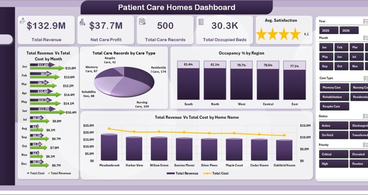
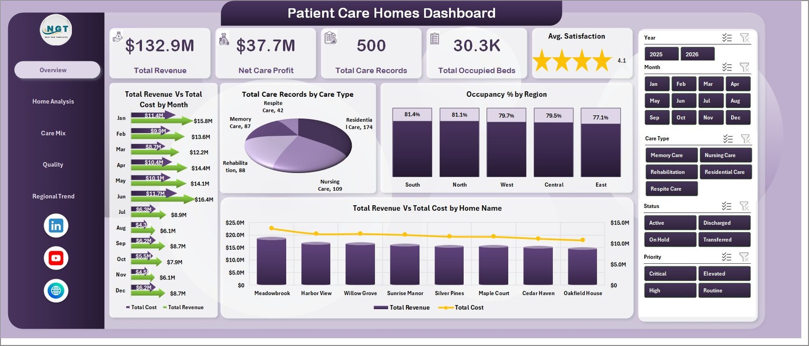
The Overview page is the main executive view. At the top, it shows five KPI cards: Total Revenue, Net Care Profit, Total Care Records, Total Occupied Beds, and Avg. Satisfaction. These cards give care home leaders a fast snapshot of financial performance, activity volume, occupancy, and resident or family experience.
Total Revenue Vs Total Cost by Month: This chart compares income and cost over time. It helps finance teams see whether operating cost is rising faster than revenue and where monthly profit pressure may exist.
Total Care Records by Care Type: This chart shows how care activity is distributed by care type. It helps managers understand service demand and plan staffing or resource allocation accordingly.
Occupancy % by Region: This chart compares utilization across regions. It helps regional managers identify high-demand areas, underused capacity, and locations that may need deeper investigation.
Total Revenue Vs Total Cost by Home Name: This chart compares financial results by individual home. It is useful for location-level reviews and for identifying homes that need cost control or revenue improvement.
2 – Home Analysis
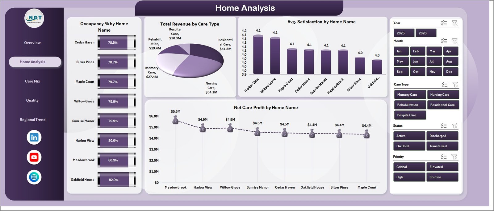
The Home Analysis sheet focuses on care home-level comparisons. Occupancy % by Home Name helps users compare bed utilization across facilities. Total Revenue by Care Type shows which care categories contribute the most income. Avg. Satisfaction by Home Name compares experience scores across homes. Net Care Profit by Home Name highlights which homes are contributing the strongest net profit.
3 – Care Mix
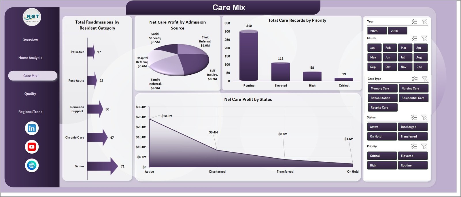
The Care Mix sheet helps teams review resident categories, admission channels, priorities, and statuses. Total Readmissions by Resident Category helps identify resident groups that may need additional care planning. Net Care Profit by Admission Source shows which admission channels are financially stronger. Total Care Records by Priority highlights workload by priority level. Net Care Profit by Status connects operational status with profit outcomes.
4 – Quality
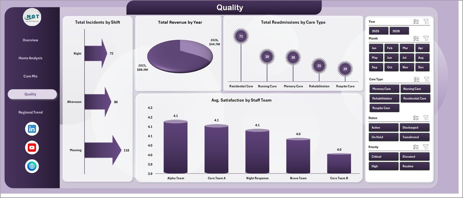
The Quality sheet supports safety, readmission, and satisfaction review. Total Incidents by Shift shows when incidents are most concentrated. Total Revenue by Year gives a yearly financial trend. Total Readmissions by Care Type helps teams review readmissions across different care types. Avg. Satisfaction by Staff Team compares satisfaction across staff teams and can support coaching or recognition.
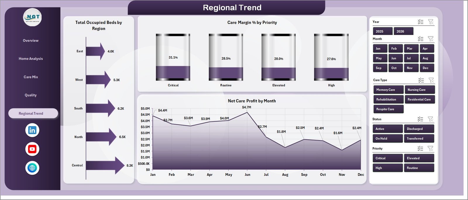
5 – Regional Trend
The Regional Trend sheet is designed for monthly and regional decision-making. Total Occupied Beds by Region shows where occupancy is concentrated. Care Margin % by Priority helps finance and operations teams compare profitability by priority level. Net Care Profit by Month shows whether profit is improving, declining, or staying stable over time.
6 – Data Sheet Tab
The Data Sheet tab is where the source records are stored. Add or replace records in the same format, keep the column headers unchanged, and then refresh the workbook so all PivotTables and charts update correctly.

7 – Support Sheet Tab
The Support sheet contains the PivotTables used to create the dashboard dynamically. After updating the Data sheet, go to the Data tab in the Excel Ribbon and click Refresh All. The pivots and charts will refresh, and you can keep this sheet hidden during regular use.

Patient Care Homes Dashboard in Excel vs. Google Sheets vs. Paid Healthcare SaaS – Feature Comparison
| Feature | This Excel dashboard | Google Sheets alternative | Paid healthcare SaaS |
|---|---|---|---|
| Cost | One-time template purchase | Low software cost, but manual build time | Subscription or implementation cost |
| Platform | Microsoft Excel | Browser-based spreadsheet | Vendor-managed cloud platform |
| Setup time | Replace data and refresh | Build pivots, formulas, charts, and permissions | Vendor onboarding and configuration |
| Real-time team collaboration | Available through OneDrive or SharePoint | Native collaboration | Usually included by plan |
| Mobile access | Limited through Excel mobile or shared files | Good browser access | Usually included |
| Customizable fields | Editable workbook and source table | Editable but must be designed manually | Often limited by vendor settings |
| Share with link | Possible with Microsoft 365 sharing | Native link sharing | Login-controlled sharing |
| Year-1 cost at 5 users | Template price plus Microsoft licensing | Workspace cost plus dashboard build time | Often much higher |
| Care home analytics | Built for revenue, cost, occupancy, beds, care records, satisfaction, readmissions, incidents, and regions | Requires custom design | Depends on the reporting module |
Who Should Use This Template
This template is useful for care home administrators, residential care owners, quality managers, regional operations leads, finance analysts, healthcare consultants, and small to mid-sized healthcare organizations that need a structured Excel reporting process.
It is not intended to replace a clinical system, EHR, claims platform, compliance product, billing software, or live alerting system. It works best when your operational data can be exported or prepared in spreadsheet format.
Real-World Use Cases
Weekly operations review: A care home administrator reviews occupancy, incidents, occupied beds, and care records before a leadership meeting.
Monthly finance reporting: A finance analyst compares revenue, cost, net care profit, admission source, and regional trends for management reporting.
Quality improvement planning: A quality lead reviews readmissions, incidents by shift, satisfaction by staff team, and care type performance to identify follow-up actions.
Advantages of Patient Care Homes Dashboard in Excel
The biggest advantage is speed. Instead of building a workbook from a blank file, users get a ready structure with pages, slicers, cards, charts, a Data sheet, and a PivotTable support layer. Excel also gives users control over formulas, formatting, chart edits, and source data structure. For care homes that already use Excel exports, this can be a practical bridge between raw data and management-level reporting.
Opportunities for Improvement
Like any spreadsheet-based dashboard, this template depends on clean source data. Users should standardize date formats, home names, region names, care types, priorities, and status labels before refreshing. Larger organizations may eventually connect Excel to Power Query, Power BI, SharePoint, or a database for deeper automation. Microsoft provides guidance on Excel data tools through Microsoft Excel support.
Best Practices
- Keep the Data sheet structure consistent.
- Use the same naming conventions for homes, regions, care types, staff teams, and statuses.
- Refresh the workbook after every data update.
- Validate revenue, cost, bed, incident, and satisfaction fields before management meetings.
- Keep the Support sheet protected or hidden for end users who only need the dashboard pages.
- Create a monthly archive copy before major data updates.
Explore Relevant Templates
You may also like Nursing Homes Dashboard in Excel, Palliative Care Dashboard in Excel, and Medical Tourism Dashboard in Excel. You can also browse more Excel Dashboard templates.
Frequently Asked Questions
What is the Patient Care Homes Dashboard in Excel?
It is an editable Excel workbook for tracking care home revenue, cost, occupancy, beds, care records, satisfaction, readmissions, incidents, care mix, quality, and regional trends.
Can I use my own patient care home data?
Yes. Add your data to the Data Sheet tab in the same format, then refresh the workbook.
Does this dashboard use PivotTables?
Yes. The Support sheet contains PivotTables that power the dashboard charts and cards.
Can I hide the Support sheet?
Yes. You can keep the Support sheet hidden after setup, especially for end users who only need the dashboard pages.
Does the workbook require macros?
No macro requirement is stated. The dashboard workflow uses Excel sheets, charts, slicers, PivotTables, and Refresh All.
Is this a healthcare compliance or clinical record system?
No. It is a reporting dashboard for prepared management data, not an EHR, clinical decision system, compliance system, or patient registry.
About the Author
Built by PK – Microsoft Certified Professional with 15+ years of Excel, Google Sheets, and Power BI experience. Founder of NextGenTemplates, reaching 300K+ subscribers across YouTube channels. Every template is hand-built and tested before release.
Conclusion
The Patient Care Homes Dashboard in Excel gives care home teams a practical way to monitor revenue, cost, occupancy, satisfaction, quality, readmissions, incidents, and regional trends from a single workbook. With editable data, PivotTables, slicers, and multiple dashboard pages, it is a strong fit for teams that want structured reporting without a complex software rollout.
Click to Buy Patient Care Homes Dashboard in Excel
Visit our YouTube channel for step-by-step Excel, dashboard, and reporting tutorials.