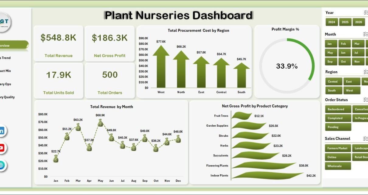
Plant nurseries generate more operational data than most teams realize: orders, revenue, procurement cost, units sold, product categories, regions, nurseries, quality ratings, loss units, fulfillment status, sales channels, and staff performance. A small nursery processing 50 orders per week can create more than 2,500 records in a year, and that is enough data for margin leaks, fulfillment delays, and product loss patterns to hide in plain sight. The Plant Nurseries Dashboard in Excel turns those records into a 7-tab workbook with 5 dashboard pages, 4 KPI cards, slicers, a Data Sheet, and a Support Sheet.
This Excel dashboard is built for nursery owners, garden center teams, agriculture analysts, and operations managers who want a repeatable reporting file without building charts and pivot tables from scratch. You can replace the sample data, click Data > Refresh All, and review sales, procurement, inventory quality, fulfillment, region, category, customer type, and staff performance. Microsoft explains Excel data refresh options here: Microsoft Excel Help and Training.
Click here to purchase Plant Nurseries Dashboard in Excel
Key Features of Plant Nurseries Dashboard in Excel
5 dashboard pages: The workbook includes Overview, Sales Trend, Product Mix, Nursery Ops, and Inventory Quality pages. Each page answers a different management question for nursery sales, procurement, inventory, and operations review.
4 executive KPI cards: The Overview page displays Total Revenue, Net Gross Profit, Total Units Sold, and Total Orders. These cards help leaders review business volume and profit health before drilling into the charts.
18 focused chart views: The dashboard covers procurement cost by region, revenue by month, gross profit by product category, orders by status, revenue by channel, units sold by category, customer type revenue, nursery cost, staff quality rating, city orders, regional revenue, loss %, fulfillment status, loss units, fulfillment %, regional margin, and staff gross profit.
Interactive slicers: Slicers make the dashboard easier to review during meetings. Instead of rebuilding pivot tables manually, users can filter by available fields such as date, region, nursery, product category, sales channel, customer type, order status, fulfillment status, or staff.
Editable Excel workbook: Because this is an Excel template, users can adjust labels, colors, charts, formulas, pivot tables, and source records as their plant nursery reporting process grows.
Dashboard Pages Explanation
1 – Overview Page
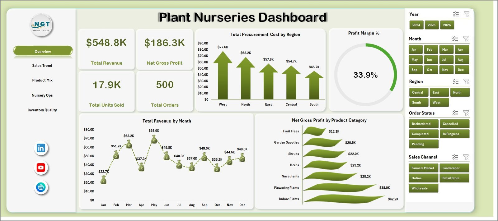
The Overview page is the leadership summary for the Plant Nurseries Dashboard in Excel. At the top, the dashboard shows Total Revenue, Net Gross Profit, Total Units Sold, and Total Orders so users can quickly understand sales value, profitability, volume, and order count.
Total Procurement Cost by Region: This chart compares procurement spending across regions. It helps identify where plant sourcing, supplier activity, freight, or local purchasing is creating higher cost pressure.
Profit Margin % by Overall Dashboard: This visual summarizes overall margin performance. It helps users see whether revenue is converting into healthy profit after procurement cost and loss impact.
Total Revenue by Month: This chart shows month-wise revenue movement. It helps nursery teams spot seasonal peaks, slower demand periods, and month-to-month changes in sales performance.
Net Gross Profit by Product Category: This chart ranks product categories by gross profit contribution. It helps teams identify which plant groups, supplies, or nursery categories deserve promotion, price review, or better stock planning.
Plant Nurseries Dashboard in Excel
2 – Sales Trend
The Sales Trend tab explains how orders and revenue behave across order status, channel, category, and month. It is useful for weekly sales meetings and for reviewing where growth is coming from.
Total Orders by Order Status: This chart compares order count by status. It helps teams understand how many orders are completed, pending, cancelled, returned, or in another workflow stage.
Total Revenue by Sales Channel: This chart shows revenue by channel. It helps compare retail, wholesale, online, marketplace, landscaping, or other sales routes when those values exist in the data.
Total Revenue by Product Category: This chart identifies which categories produce the most sales. It is useful for merchandising, pricing, and category-level stock planning.
Profit Margin % by Month: This chart tracks monthly profitability. It helps identify months where higher revenue may still be weakened by procurement cost, loss, or product mix.
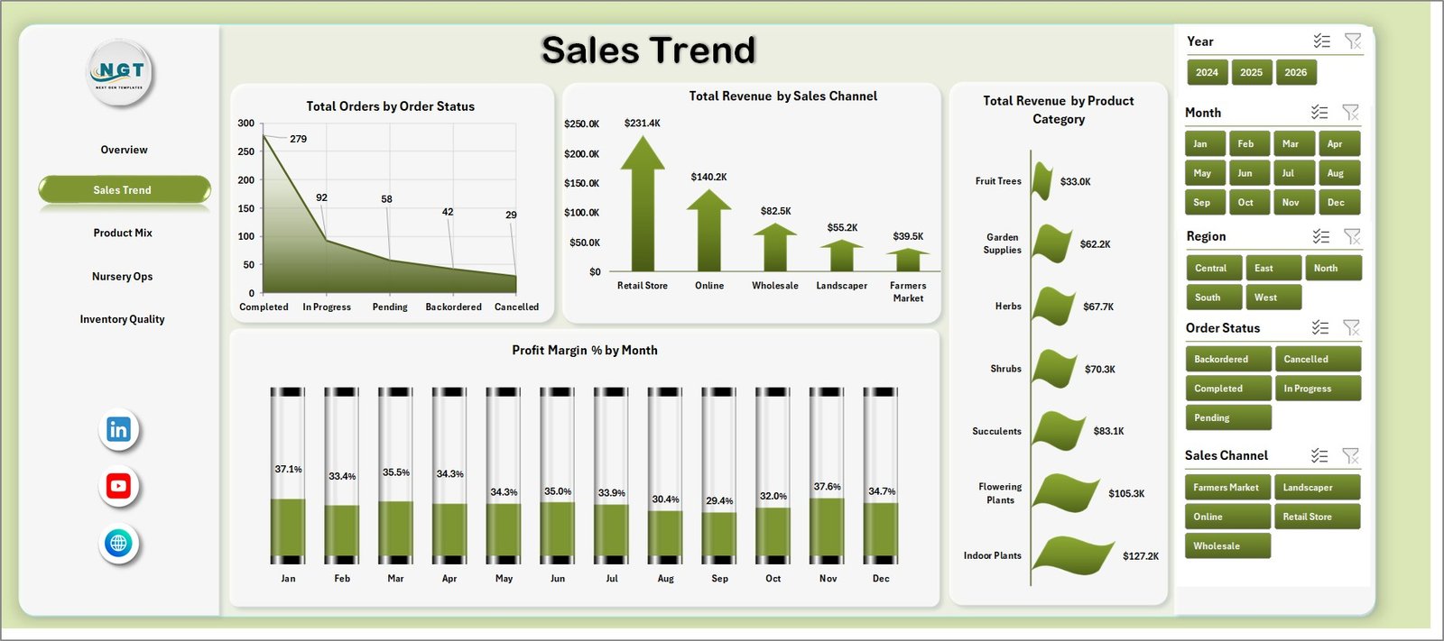
Sales Trend
3 – Product Mix
The Product Mix tab shows how product categories, customer types, nurseries, and staff quality ratings shape results. It helps users decide which categories are driving volume and which customer groups are driving revenue.
Total Units Sold by Product Category: This chart compares volume across categories. It helps identify fast-moving product groups and categories that may need better stock availability.
Total Revenue by Customer Type: This chart compares revenue by customer segment. It helps distinguish retail customers, wholesale buyers, landscapers, commercial clients, or other buyer groups.
Total Procurement Cost by Nursery: This chart shows procurement cost by nursery. It supports supplier review, internal location comparison, and cost-control discussions.
Avg. Quality Rating by Staff: This chart compares quality rating by staff member. It helps managers recognize strong performance and identify where training, inspection, or process review may help.
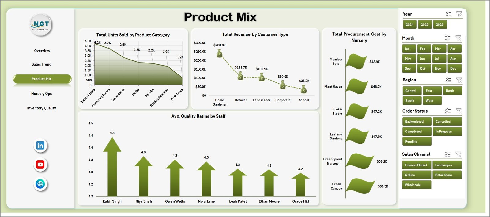
Product Mix
4 – Nursery Ops
The Nursery Ops tab focuses on locations, regions, product loss, and fulfillment status. It is the page to use when the business needs to compare city demand, regional revenue, and operational completion.
Total Orders by City: This chart shows order count by city. It supports service-area planning, delivery review, regional marketing, and branch-level demand comparison.
Total Revenue by Region: This chart compares sales value across regions. It helps teams understand which regions are contributing most to revenue.
Loss % by Product Category: This chart highlights product categories with higher loss rates. It helps identify spoilage, damage, shrinkage, or slow-moving inventory concerns.
Total Orders by Fulfillment Status: This chart shows order volume by fulfillment status. It helps managers monitor completion, pending workload, delays, and cancellations.
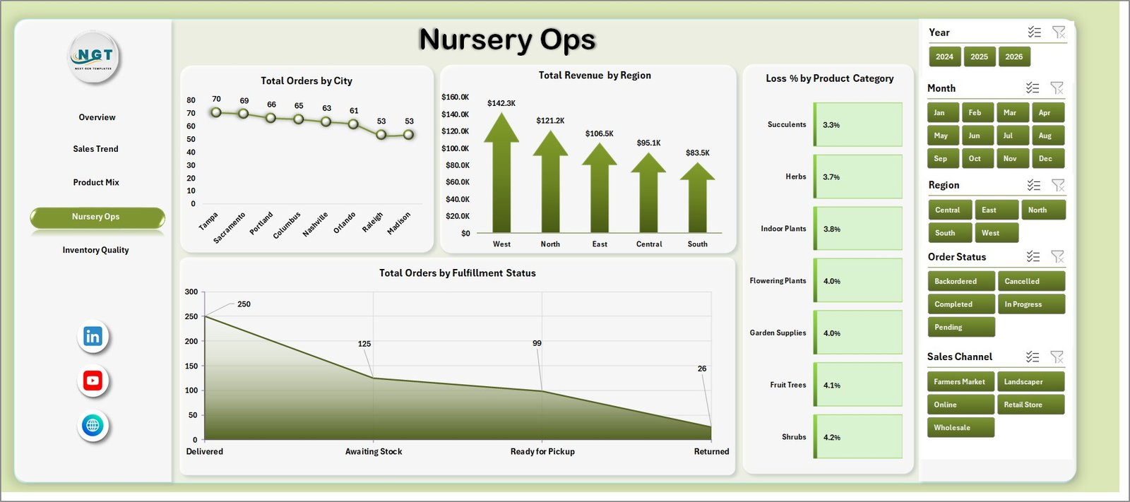
Nursery Ops
5 – Inventory Quality
The Inventory Quality tab connects product loss, fulfillment, regional margin, and staff-level gross profit. It is especially useful for managers who need to balance sales growth with stock quality and operational reliability.
Total Loss Units by Nursery: This chart identifies nurseries with higher loss units. It can point to handling, storage, stock rotation, procurement, or demand-planning issues.
Fulfillment % by Sales Channel: This chart compares fulfillment reliability by channel. It helps teams see whether online, retail, wholesale, or other channels are being served consistently.
Profit Margin % by Region: This chart compares regional profitability. It helps separate high-revenue regions from high-margin regions.
Net Gross Profit by Staff: This chart shows staff-level gross profit contribution. It helps managers review contribution, coaching needs, and workload balance.
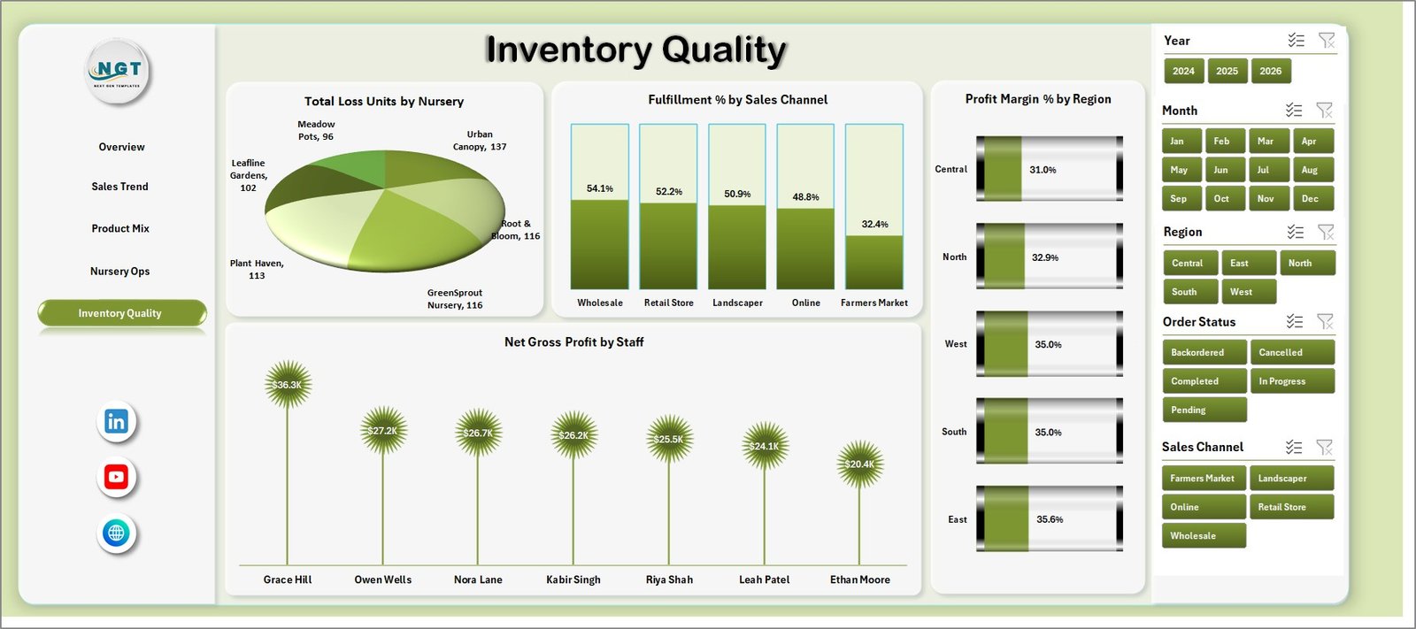
Inventory Quality
6 – Data Sheet Tab
The Data Sheet is where users add their own records in the same format as the sample rows. Keep the column names and structure unchanged so the dashboard pages, slicers, pivot tables, and charts continue working correctly.

Data Sheet tab
7 – Support Sheet
The Support Sheet contains multiple pivot tables used to create the dashboard dynamically. After updating the Data Sheet, go to the Excel Ribbon, open the Data tab, and click Refresh All. All pivots and charts will refresh. You can keep this sheet hidden after setup, but it should not be deleted.

Support sheet tab
Plant Nurseries Dashboard in Excel vs. Google Sheets vs. Paid CRM/SaaS – Feature Comparison
| Feature | Plant Nurseries Dashboard in Excel | Google Sheets Dashboard | Paid Retail or Nursery SaaS |
|---|---|---|---|
| Cost | $17.99 one-time sale price | Low cost but usually manual to build | Monthly or annual subscription |
| Platform | Microsoft Excel | Browser spreadsheet | Vendor-hosted platform |
| Setup time | Replace sample data and refresh | Build formulas, pivots, and sharing | Onboarding and setup |
| Real-time team collaboration | Possible through OneDrive or SharePoint | Native collaboration | Usually included by plan |
| Mobile access | Depends on Excel storage setup | Strong mobile access | Usually included |
| Customizable fields | Editable workbook, sheets, charts, and pivots | Editable but requires maintenance | Often limited by plan |
| Share with link | Possible through Microsoft 365 | Native link sharing | Vendor-controlled access |
| Year-1 cost at 5 users | Template price plus existing Excel access | Your build and maintenance time | Often hundreds or thousands per year |
| Nursery analytics | Revenue, orders, procurement, loss, fulfillment, quality, region, nursery, and staff views included | Must be built manually | Depends on reporting module |
Who Should Use This Template
This template is best for plant nursery owners, garden center managers, greenhouse teams, procurement managers, agriculture analysts, inventory leads, retail operations teams, and consultants who need a repeatable Excel reporting format. It is useful for teams that already export order, procurement, sales, and quality records but need a cleaner way to review performance.
It is not a live POS system, payment processor, barcode scanner, ERP, supplier portal, greenhouse sensor system, or accounting tool. Use it for reporting and decision support, not for real-time operational control.
Real-World Use Cases
Anika runs a plant nursery with retail and wholesale buyers. She reviews Total Revenue by Sales Channel and Total Revenue by Customer Type each week to understand which buyer groups are creating the most value.
Rohan manages procurement for three nurseries. He uses Total Procurement Cost by Region and Total Procurement Cost by Nursery to identify cost pressure and prepare supplier negotiation notes.
Meera prepares monthly nursery operations reports. She combines Loss % by Product Category, Fulfillment % by Sales Channel, and Net Gross Profit by Staff to show where operations are improving and where follow-up is needed.
Advantages of Plant Nurseries Dashboard in Excel
The main advantage is speed. The workbook already includes dashboard pages, cards, charts, slicers, Data Sheet, and Support Sheet, so users do not need to design reporting from a blank file.
The second advantage is ownership. Because it is an Excel workbook, users can customize labels, charts, pivots, and data fields as the nursery reporting process changes. The one-time purchase also helps teams avoid another recurring dashboard subscription.
Opportunities for Improvement
This dashboard depends on clean structured data. If the source data has missing dates, inconsistent category names, mixed staff spellings, or incomplete cost values, users should clean those records before refreshing. Future versions could include deeper stock aging, supplier scorecards, plant survival rates, and forecast views.
Best Practices
Keep one clean Data Sheet structure and avoid changing column names unless you also update the related pivots. Before refreshing, check for blank regions, inconsistent product categories, missing order status values, and incorrect procurement cost entries. Use consistent names for nurseries, staff, cities, regions, channels, customer types, and product categories so slicers group records correctly.
Explore Relevant Templates
You can compare this workbook with Garden Center Dashboard in Excel, Garden Center Dashboard in Power BI, Organic Seeds Providers Dashboard in Power BI, and Floriculture KPI Dashboard in Excel. For more Excel reporting files, browse the Excel Dashboard Templates category.
Frequently Asked Questions
What does the Plant Nurseries Dashboard in Excel track?
It tracks revenue, net gross profit, units sold, orders, procurement cost, product categories, sales channels, customer types, nurseries, cities, regions, loss %, fulfillment status, fulfillment %, quality rating, and staff performance.
Can I use my own data?
Yes. Add your records in the Data Sheet using the same column structure, then click Data and Refresh All to update the dashboard pages.
Do I need advanced Excel knowledge?
No. Basic Excel skills are enough to update the Data Sheet, refresh the workbook, and use slicers. Advanced users can customize pivots, charts, and formulas if needed.
Can I hide the Support Sheet?
Yes. You can keep the Support Sheet hidden after setup. Do not delete it because it contains the pivot tables that power the dashboard.
Is this a live inventory system?
No. It is a reporting dashboard, not a POS, barcode scanner, ERP, accounting system, or live stock-control tool.
Can it work for multiple locations?
Yes. The dashboard includes city, region, nursery, channel, product category, and fulfillment views that support multi-location or multi-territory nursery reporting.
About the Author
Built by PK – Microsoft Certified Professional with 15+ years of Excel, Google Sheets, and Power BI experience. Founder of NextGenTemplates, reaching 300K+ subscribers across YouTube channels. Every template is hand-built and tested before release.
Conclusion
The Plant Nurseries Dashboard in Excel gives nursery teams a practical way to convert sales, procurement, inventory quality, and fulfillment records into clear management insight. With 5 dashboard pages, 4 KPI cards, slicers, a Data Sheet, and a Support Sheet, it is a useful workbook for owners and managers who want better reporting without rebuilding Excel charts every month.
Click here to purchase Plant Nurseries Dashboard in Excel
Last updated: July 24, 2026.
Watch Excel and dashboard tutorials on YouTube.com/@PK-AnExcelExpert.