In today’s highly competitive digital marketplace, product reviews and customer ratings influence buying decisions more than ever before. Customers trust real experiences, star ratings, and honest feedback before choosing any product. Therefore, businesses must not only collect reviews but also analyze them properly. That is exactly where a Product Reviews and Ratings KPI Dashboard in Power BI becomes an essential business tool.
Instead of manually reviewing scattered data, companies now rely on structured dashboards to measure performance, identify improvement areas, and enhance customer satisfaction. Moreover, Power BI makes this process visual, interactive, and actionable.
In this detailed guide, you will learn everything about the Product Reviews and Ratings KPI Dashboard in Power BI. Additionally, the article explains why this dashboard matters, how it works, its page-wise structure, Excel data design, advantages, best practices, and frequently asked questions.
Click to Purchases Product Reviews and Ratings KPI Dashboard in Power BI
What Is a Product Reviews and Ratings KPI Dashboard in Power BI?
A Product Reviews and Ratings KPI Dashboard in Power BI is a centralized analytics solution that tracks, monitors, and visualizes key performance indicators related to customer reviews, product ratings, and feedback trends.
Instead of checking raw Excel files or reading hundreds of reviews manually, this dashboard converts review data into meaningful insights. As a result, decision-makers clearly understand how customers perceive products across time.
Moreover, the dashboard compares Actual vs Target, Current Year vs Previous Year, and MTD vs YTD performance. Therefore, businesses can take timely actions to improve product quality and customer experience.
Why Do Businesses Need a Product Reviews and Ratings KPI Dashboard?
Customer feedback directly impacts brand reputation and sales. However, raw data alone does not help. Businesses need clarity, comparisons, and trends.
Here is why this dashboard becomes critical:
-
First, it converts reviews into measurable KPIs
-
Second, it highlights strengths and weaknesses instantly
-
Third, it tracks performance against targets
-
Fourth, it supports data-driven product decisions
-
Finally, it improves customer satisfaction and loyalty
Because of these reasons, companies across e-commerce, retail, SaaS, and manufacturing increasingly adopt Power BI dashboards for review analytics.
How Does the Product Reviews and Ratings KPI Dashboard Work?
This dashboard uses Excel as a data source and Power BI for visualization. Users enter Actual, Target, and KPI definition data into Excel sheets. Then, Power BI automatically processes the data and displays insights across interactive pages.
As a result, users do not need advanced technical skills. Instead, they only need to update Excel regularly. Meanwhile, Power BI refreshes the visuals instantly.
What Are the Key Features of the Product Reviews and Ratings KPI Dashboard?
This dashboard comes as a ready-to-use Power BI solution with a structured design and meaningful KPIs. Let us explore its core features in detail.
How Is the Dashboard Structured? (Page-Wise Explanation)
The Product Reviews and Ratings KPI Dashboard in Power BI includes three well-designed pages. Each page serves a specific purpose and enhances decision-making.
What Does the Summary Page Show?
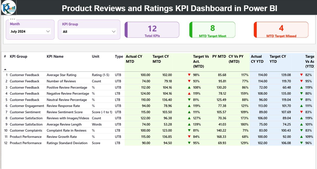
The Summary Page acts as the main landing page of the dashboard. It provides a consolidated overview of all KPIs in one place.
Key Elements of the Summary Page
-
Month Slicer at the top to switch between months
-
KPI Group Slicer to filter KPIs by category
-
Three KPI Cards:
-
Total KPIs Count
-
MTD Target Meet Count
-
MTD Target Missed Count
-
These cards immediately show overall performance status.
What Information Does the KPI Detail Table Include?
Below the cards, the Summary Page displays a detailed KPI table with the following columns:
-
KPI Number – Unique sequence number of each KPI
-
KPI Group – Category of the KPI (Ratings, Reviews, Quality, Experience, etc.)
-
KPI Name – Name of the performance metric
-
Unit – Measurement unit such as %, Score, Count
-
Type – KPI type:
-
UTB (Upper the Better)
-
LTB (Lower the Better)
-
How Does MTD Performance Tracking Work?
The dashboard shows detailed Month-to-Date (MTD) performance using the following fields:
-
Actual CY MTD – Current Year actual MTD value
-
Target CY MTD – Target MTD value
-
MTD Icon – Green ▲ or Red ▼ to show performance status
-
Target vs Actual (MTD) – Actual ÷ Target (percentage)
-
PY MTD – Previous Year MTD value
-
CY vs PY (MTD) – CY MTD ÷ PY MTD comparison
Because of these metrics, users instantly see whether performance improves or declines.
How Does YTD Performance Tracking Work?
Similarly, the dashboard tracks Year-to-Date (YTD) performance:
-
Actual CY YTD – Current Year actual YTD value
-
Target CY YTD – Target YTD value
-
YTD Icon – Performance indicator
-
Target vs Actual (YTD) – Actual ÷ Target
-
PY YTD – Previous Year YTD value
-
CY vs PY (YTD) – Year-over-Year growth comparison
As a result, businesses monitor long-term performance effectively.
What Is the KPI Trend Page Used For?
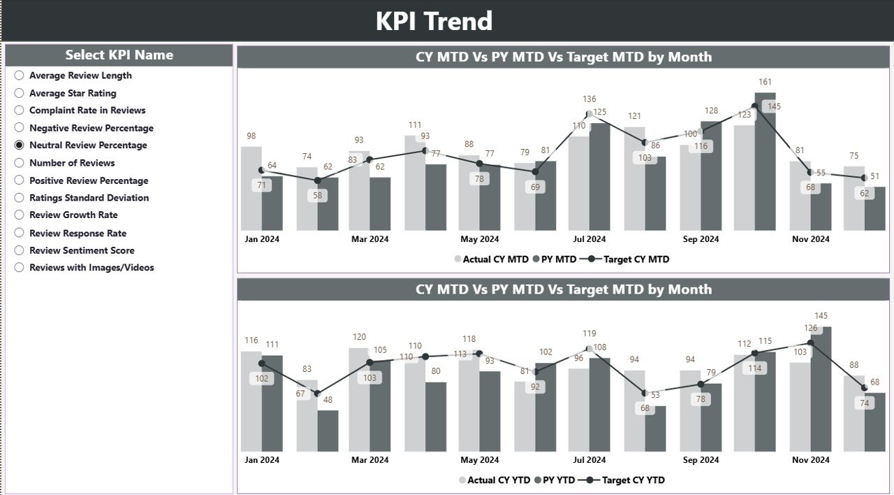
The KPI Trend Page focuses on visual trend analysis.
Key Highlights of the KPI Trend Page
-
KPI Name Slicer on the left side
-
Two Combo Charts:
-
MTD Actual, Target, and PY trend
-
YTD Actual, Target, and PY trend
-
These charts allow users to visually compare progress over time. Therefore, identifying patterns becomes easier and faster.
Click to Purchases Product Reviews and Ratings KPI Dashboard in Power BI
What Is the KPI Definition Page?
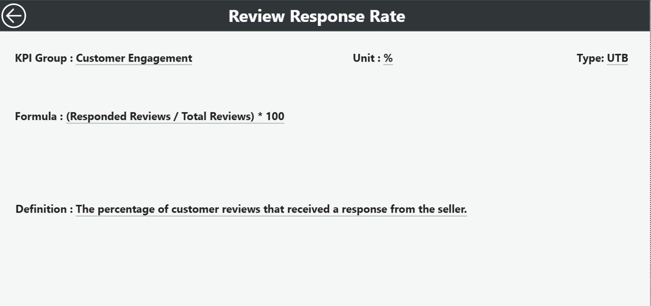
The KPI Definition Page acts as a drill-through page. It remains hidden by default to keep the dashboard clean.
What Information Does This Page Show?
-
KPI Number
-
KPI Name
-
KPI Group
-
Unit
-
Formula
-
Definition
-
KPI Type (UTB or LTB)
Users can drill through from the Summary Page to understand each KPI clearly. Additionally, a Back button helps users return easily.
How Is Excel Used as the Data Source?
The dashboard uses a structured Excel file as its data source. This approach keeps the system simple, flexible, and scalable.
What Is the Input_Actual Sheet?
This sheet captures actual KPI performance data.
Required Fields:
-
KPI Name
-
Month (First date of the month)
-
MTD Value
-
YTD Value
Users update this sheet regularly to reflect real performance.
What Is the Input_Target Sheet?
This sheet stores target KPI values.
Required Fields:
-
KPI Name
-
Month (First date of the month)
-
MTD Target
-
YTD Target
Because targets remain predefined, businesses can track goal achievement accurately.
What Is the KPI Definition Sheet?
This sheet defines the structure and logic of each KPI.
Required Fields:
-
KPI Number
-
KPI Group
-
KPI Name
-
Unit
-
Formula
-
Definition
-
Type (LTB or UTB)
As a result, the dashboard stays consistent and standardized.
Advantages of Product Reviews and Ratings KPI Dashboard in Power BI
Using this dashboard offers multiple business advantages.
Key Advantages
-
✔ Centralized review performance monitoring
-
✔ Clear visibility of customer satisfaction trends
-
✔ Easy comparison between Actual, Target, and Previous Year
-
✔ Faster identification of problem areas
-
✔ Interactive filtering and drill-through analysis
-
✔ Reduced manual reporting effort
-
✔ Better product and quality decisions
Because of these benefits, businesses gain both operational and strategic advantages.
How Does This Dashboard Improve Decision-Making?
This dashboard transforms raw review data into actionable insights. Therefore, managers do not rely on assumptions. Instead, they rely on facts.
Moreover, trend analysis helps predict future issues. Meanwhile, KPI comparisons highlight performance gaps early. As a result, businesses improve faster.
Click to Purchases Product Reviews and Ratings KPI Dashboard in Power BI
Best Practices for the Product Reviews and Ratings KPI Dashboard in Power BI
To maximize dashboard value, follow these best practices.
1. Keep KPI Definitions Clear
Always maintain clear KPI names, formulas, and definitions. This practice avoids confusion and improves trust in data.
2. Update Excel Data Regularly
Frequent updates ensure that insights remain accurate and relevant.
3. Set Realistic Targets
Unrealistic targets distort performance interpretation. Therefore, align targets with business goals.
4. Use KPI Groups Strategically
Group KPIs logically, such as Ratings, Reviews, Quality, or Experience. This approach improves filtering and analysis.
5. Review Trends, Not Just Numbers
Numbers alone do not tell the full story. Always analyze trends for deeper insights.
6. Train Stakeholders
Ensure that users understand how to read icons, percentages, and trend charts.
Who Can Use This Dashboard?
This dashboard suits multiple roles and industries:
-
Product Managers
-
Quality Assurance Teams
-
Customer Experience Teams
-
E-commerce Businesses
-
Retail Brands
-
SaaS Companies
-
Marketing Analysts
Because of its flexibility, the dashboard adapts easily across sectors.
Conclusion: Why Should You Use a Product Reviews and Ratings KPI Dashboard in Power BI?
A Product Reviews and Ratings KPI Dashboard in Power BI empowers businesses to understand customer feedback deeply. Instead of guessing customer sentiment, companies rely on structured KPIs and trends.
Moreover, the dashboard simplifies performance tracking, enhances transparency, and supports better product decisions. Therefore, any organization that values customer satisfaction should adopt this solution.
Frequently Asked Questions (FAQs)
1. What is the main purpose of a Product Reviews and Ratings KPI Dashboard?
The main purpose is to track, analyze, and improve product performance based on customer reviews and ratings.
2. Can beginners use this Power BI dashboard?
Yes, beginners can use it easily because data entry happens in Excel, and visuals update automatically.
3. Does this dashboard support monthly and yearly analysis?
Yes, it supports both MTD and YTD analysis with comparisons to targets and previous years.
4. What does UTB and LTB mean in KPIs?
UTB means Upper the Better, while LTB means Lower the Better.
5. Can I customize KPI groups and definitions?
Yes, you can fully customize KPIs using the KPI Definition Excel sheet.
6. Is Excel mandatory as a data source?
In this dashboard, Excel acts as the primary data source for simplicity and flexibility.
7. How often should I update the dashboard?
You should update Excel data monthly or more frequently for accurate insights.
Visit our YouTube channel to learn step-by-step video tutorials