In today’s data-driven world, the publishing industry relies heavily on analytics to understand audience behavior, author performance, revenue generation, and content success across multiple platforms. Managing vast amounts of data manually can be challenging. That’s where a Publishing Dashboard in Power BI becomes an essential solution.
This interactive and ready-to-use Power BI dashboard allows publishers, media houses, and content teams to visualize, monitor, and analyze key performance indicators (KPIs) in real time. Built with precision and clarity, it provides valuable insights into revenue, publication trends, author productivity, and platform performance—all in a single, dynamic interface.
Let’s explore what this dashboard is, how it works, its key features, advantages, and best practices to get the most out of it.
Click to Purchases Publishing Dashboard in Power BI
What Is a Publishing Dashboard in Power BI?
A Publishing Dashboard in Power BI is an interactive reporting tool that consolidates all publishing-related data into a single visual workspace. It connects seamlessly with Excel or any data source to display metrics related to publications, reviews, revenues, categories, authors, and platforms.
This dashboard empowers decision-makers to track monthly trends, identify top-performing departments, analyze content categories, and measure publishing efficiency using visually rich charts and KPIs.
Whether you run a traditional publishing house, a digital content platform, or an independent media agency, this dashboard helps transform raw data into actionable insights.
Structure of the Publishing Dashboard
The Publishing Dashboard in Power BI consists of five analytical pages, each designed to focus on a different dimension of the publishing ecosystem. Let’s understand them in detail.
1️⃣ Overview Page – The Central Insight Hub
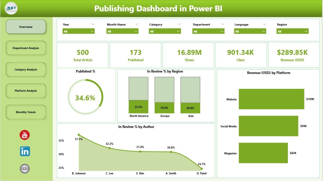
The Overview Page acts as the control center of the dashboard. Here, you can see all the crucial metrics that define publishing performance at a glance.
Key Highlights:
-
📊 5 KPI Cards – Show summary metrics like total publications, in-review items, approved content, and revenue progress.
-
🌍 Published % and In Review % by Region – Visual charts that highlight how efficiently different regions are managing their publishing workflow.
-
💰 Revenue (USD) by Platform – Tracks revenue contributions from different platforms, helping to identify where content performs best.
-
✍️ In Review % by Author – Compares how much content from each author is still under review, enabling managers to improve efficiency.
The Overview Page helps you monitor overall performance, spot trends, and quickly address delays or bottlenecks in the publication process.
Click to Purchases Publishing Dashboard in Power BI
2️⃣ Department Analysis Page – Evaluating Team Performance
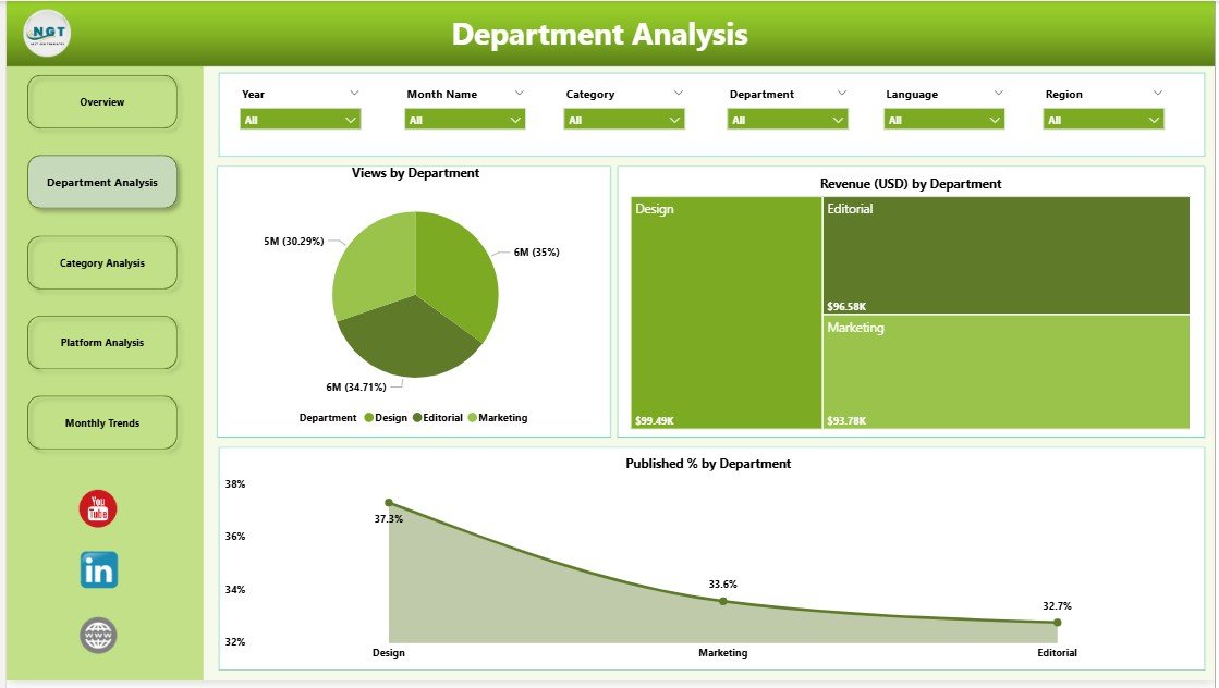
The Department Analysis Page focuses on how each department contributes to the publishing process. It’s a great way to identify top-performing teams and those needing improvement.
Key Charts:
-
🧭 Views by Department – Understand which department’s work attracts the most readers or views.
-
💵 Revenue (USD) by Department – Evaluate how each department contributes to overall earnings.
-
🏆 Published % by Department – Measure content completion and publication rates by team.
This section gives management clear visibility into departmental performance, ensuring that efforts are aligned with business goals and deadlines.
3️⃣ Category Analysis Page – Tracking Content Success by Category
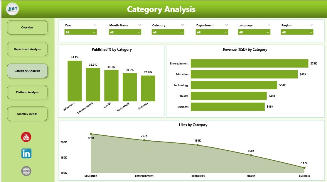
Every publisher deals with multiple content categories—such as education, lifestyle, fiction, or technology. The Category Analysis Page breaks down the data to show how each category performs.
Key Insights:
-
❤️ Likes by Category – Reveals which categories attract the most engagement or appreciation.
-
💰 Revenue (USD) by Category – Highlights the most profitable content types.
-
📈 Published % by Category – Displays the ratio of published vs. pending content for each category.
By analyzing this page, you can identify what content resonates with audiences, where to invest resources, and which categories need more attention.
4️⃣ Platform Analysis Page – Measuring Digital Reach and Impact
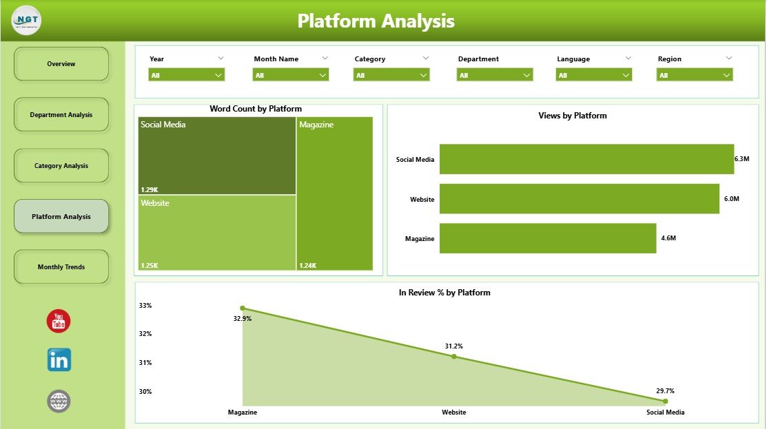
In the digital era, content is distributed across several platforms like websites, mobile apps, e-readers, and partner portals. The Platform Analysis Page allows you to compare their performance.
Key Metrics:
-
✍️ Word Count by Platform – Evaluates the total word count published per platform, showing productivity.
-
👀 Views by Platform – Identifies which platforms attract the highest readership or engagement.
-
🔎 In Review % by Platform – Shows the percentage of content pending review on each platform.
This page is especially useful for digital publishing managers who need to allocate marketing budgets or publishing resources effectively based on platform performance.
5️⃣ Monthly Trends Page – Monitoring Time-Based Insights
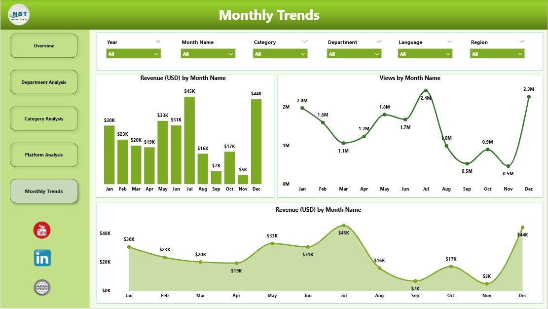
The Monthly Trends Page provides a time-based view of performance metrics, allowing users to track progress over months and identify patterns.
Included Charts:
-
💰 Revenue (USD) by Month
-
📊 Views by Month
-
📈 Publications Trend by Month
Trend analysis enables data-driven forecasting and performance comparisons between months or quarters. It also helps identify seasonal trends or content surges.
Why Do Publishers Need a Power BI Dashboard?
Click to Purchases Publishing Dashboard in Power BI
Manual reporting and spreadsheets can no longer keep up with the fast-paced digital publishing environment. A Power BI dashboard automates the data visualization process, ensuring that leaders can make decisions faster and more confidently.
Here’s why it’s so essential:
-
📈 Real-time data updates and refreshes
-
⚙️ Automated insights and trend tracking
-
📊 Unified reporting across regions and platforms
-
🎯 Goal-based performance measurement
-
🚀 Improved collaboration between departments
In short, a Publishing Dashboard in Power BI helps transform data chaos into strategic clarity.
Advantages of Using a Publishing Dashboard in Power BI
Let’s explore the major benefits of using this powerful analytics solution:
1. Unified View of All Metrics
You can bring together data from various Excel sheets, databases, or systems into one consolidated dashboard.
2. Real-Time Performance Tracking
Monitor real-time updates on published content, reviews, and revenue without manual refreshes.
3. Better Decision Making
Visual charts and KPI cards make it easy to identify what’s working and what needs improvement.
4. Saves Time and Effort
Power BI automates report creation, eliminating the need for repetitive data entry or manual calculations.
5. Boosts Transparency and Accountability
Team leads and authors can clearly see how their contributions impact overall goals.
6. Encourages Data-Driven Culture
It empowers every department to rely on facts instead of assumptions when making decisions.
7. Enhances Productivity
With quick access to trends and analytics, management can focus on strategic improvements rather than chasing data.
How to Use the Publishing Dashboard Effectively
To make the most of your dashboard, follow these simple steps:
-
Connect the Data Source:
Link your Excel or database file to Power BI using Power Query. -
Set Data Refresh Schedules:
Schedule automatic refreshes to ensure your dashboard always shows updated information. -
Use Filters and Slicers:
Apply slicers for region, department, platform, and category to view detailed insights. -
Compare MTD vs. YTD Performance:
Track monthly and yearly progress side by side for better goal management. -
Export Insights for Reports:
Power BI allows you to export visuals and summaries for stakeholder presentations.
Best Practices for the Publishing Dashboard in Power BI
Here are some expert recommendations to ensure your dashboard remains insightful and efficient:
1. Keep the Design Clean and Focused
Avoid unnecessary visuals. Each chart should tell a story.
2. Use Consistent Color Coding
Use uniform color schemes for KPIs like green for “on target,” yellow for “warning,” and red for “below target.”
3. Highlight Key Metrics
Keep your main KPIs (like Revenue and Published %) at the top for easy access.
4. Use Dynamic Filters
Allow users to change views using slicers for month, region, and platform.
5. Regularly Review Data Accuracy
Ensure your data sources remain valid and that no outdated values affect decisions.
6. Include Tooltips for Clarity
Add short descriptions or tooltips for complex charts to make them user-friendly.
7. Automate Refresh and Sharing
Set auto-refresh intervals and share the dashboard through Power BI Service for collaboration.
Opportunities for Improvement
Even though the Publishing Dashboard in Power BI is a robust solution, continuous improvement ensures it stays relevant:
-
🔄 Add predictive analytics to forecast revenue and readership trends.
-
🧠 Incorporate AI-driven insights for anomaly detection or sentiment analysis.
-
📱 Optimize for mobile view so teams can monitor performance on the go.
-
⏳ Add time comparisons like YoY (Year over Year) for better context.
-
🧩 Integrate external tools like Google Analytics or CRM data for richer insights.
Conclusion
The Publishing Dashboard in Power BI is a game-changer for modern publishers. It transforms raw data into powerful visual insights, enabling real-time decisions and strategic growth. With five analytical pages—Overview, Department, Category, Platform, and Monthly Trends—it provides a complete 360° view of publishing performance.
By tracking KPIs like revenue, views, likes, published percentage, and review cycles, publishing teams can optimize productivity, identify bottlenecks, and enhance profitability. It’s not just a dashboard—it’s a performance powerhouse designed for every publishing professional.
Frequently Asked Questions (FAQs)
1. What is the main purpose of a Publishing Dashboard in Power BI?
It helps publishers analyze performance metrics such as revenue, views, publication rate, and author productivity through visual charts and KPIs.
2. Can I connect this dashboard to other data sources besides Excel?
Yes, Power BI supports connections to multiple data sources like SQL Server, Google Sheets, and online APIs.
3. Is this dashboard suitable for small publishers?
Absolutely! Even small publishing firms or individual authors can use it to track performance efficiently.
4. How often should I update the dashboard?
You can set an automatic refresh schedule—daily, weekly, or monthly—depending on how frequently new data is generated.
5. Can I customize the visuals in the dashboard?
Yes. Power BI allows full customization of visuals, layouts, and KPIs based on your business needs.
6. What are the key insights I can gain from this dashboard?
You can track revenue growth, regional performance, author efficiency, platform engagement, and monthly publishing trends.
7. How does this dashboard help in decision-making?
It converts raw data into visual insights that highlight trends, bottlenecks, and opportunities, supporting data-driven strategic planning.
Visit our YouTube channel to learn step-by-step video tutorials