Sentiment Analysis Startups Dashboard in Power BI is a ready-to-use report template for AI SaaS founders, NLP product teams, customer success leaders, revenue operations managers, and BI consultants who need one place to review revenue, mention volume, net sentiment, model quality, and customer churn risk. Research Nester estimates the sentiment analytics market at USD 4.64 billion in 2025 and forecasts it may cross USD 16.03 billion by 2035, which means many teams will need clearer reporting around customer language, model output, and account health. This Power BI dashboard gives you 5 report pages, 5 KPI cards, multiple slicers, and 22 analytical visuals in an editable .pbix file.
Key Features of Sentiment Analysis Startups Dashboard in Power BI
- 5 KPI cards: Total Analyses, Texts Processed, Subscription Revenue, Net Sentiment Score, and Avg Accuracy Score.
- 5 report pages: Overview, Revenue Ops, Sentiment Mix, Model Quality, and Customer Risk.
- Revenue reporting: Compare subscription revenue, gross margin, gross profit by region, segment revenue mix, and startup P and L.
- Sentiment reporting: Review mention mix by month, segment, language, industry, and data source.
- Model quality reporting: Track analysis volume, average accuracy, response time, model type performance, and pipeline status.
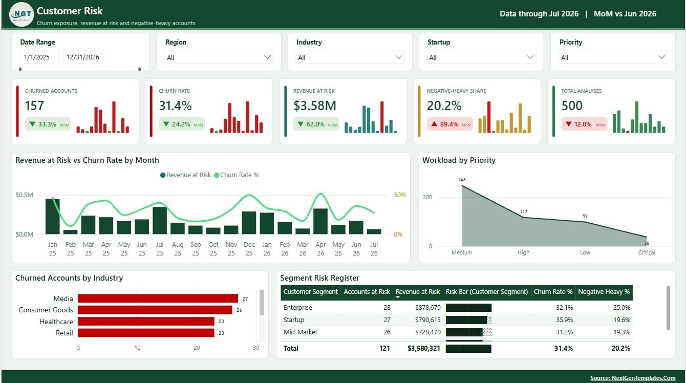
- Customer risk reporting: Monitor revenue at risk, churn rate, workload by priority, churned accounts by industry, and segment risk.
- Power BI workflow: Open the .pbix file in Power BI Desktop, replace the sample source, refresh the report, and customize pages as needed.
Dashboard Pages Explanation
1 – Overview Page
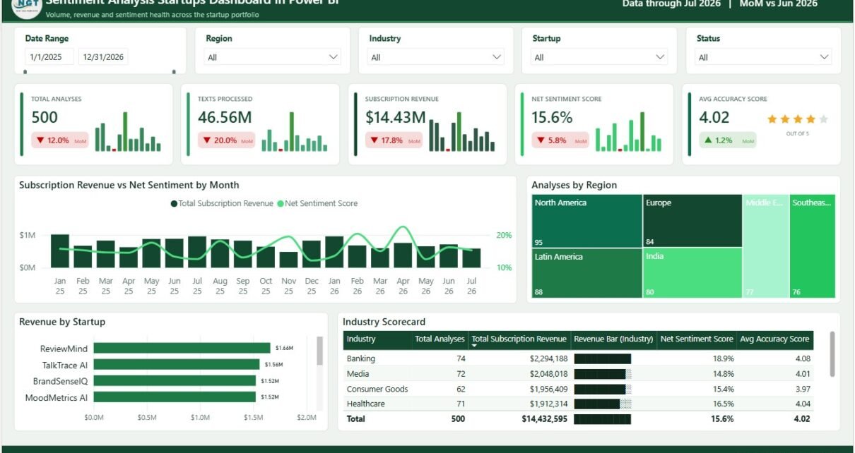
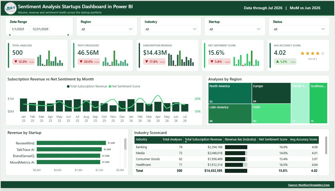
The Overview page is the executive summary page of the report. At the top, the KPI cards show Total Analyses, Texts Processed, Subscription Revenue, Net Sentiment Score, and Avg Accuracy Score so leaders can review scale, revenue, sentiment health, and model quality without switching pages.
Subscription Revenue vs Net Sentiment by Month: This chart compares monthly revenue movement with net sentiment movement. It helps leaders see whether revenue growth is supported by stronger customer perception or whether risk is building behind the numbers.
Analyses by Region: This chart shows where analysis volume is concentrated geographically. It helps operations teams understand which regions are creating the most sentiment workload.
Revenue by Startup: This visual ranks startup accounts by subscription revenue. It helps revenue teams identify the accounts that matter most for recurring income.
Industry Scorecard: This scorecard compares key performance by industry. It helps teams see which verticals are stronger for revenue, sentiment, accuracy, or processing activity.
2 – Revenue Ops
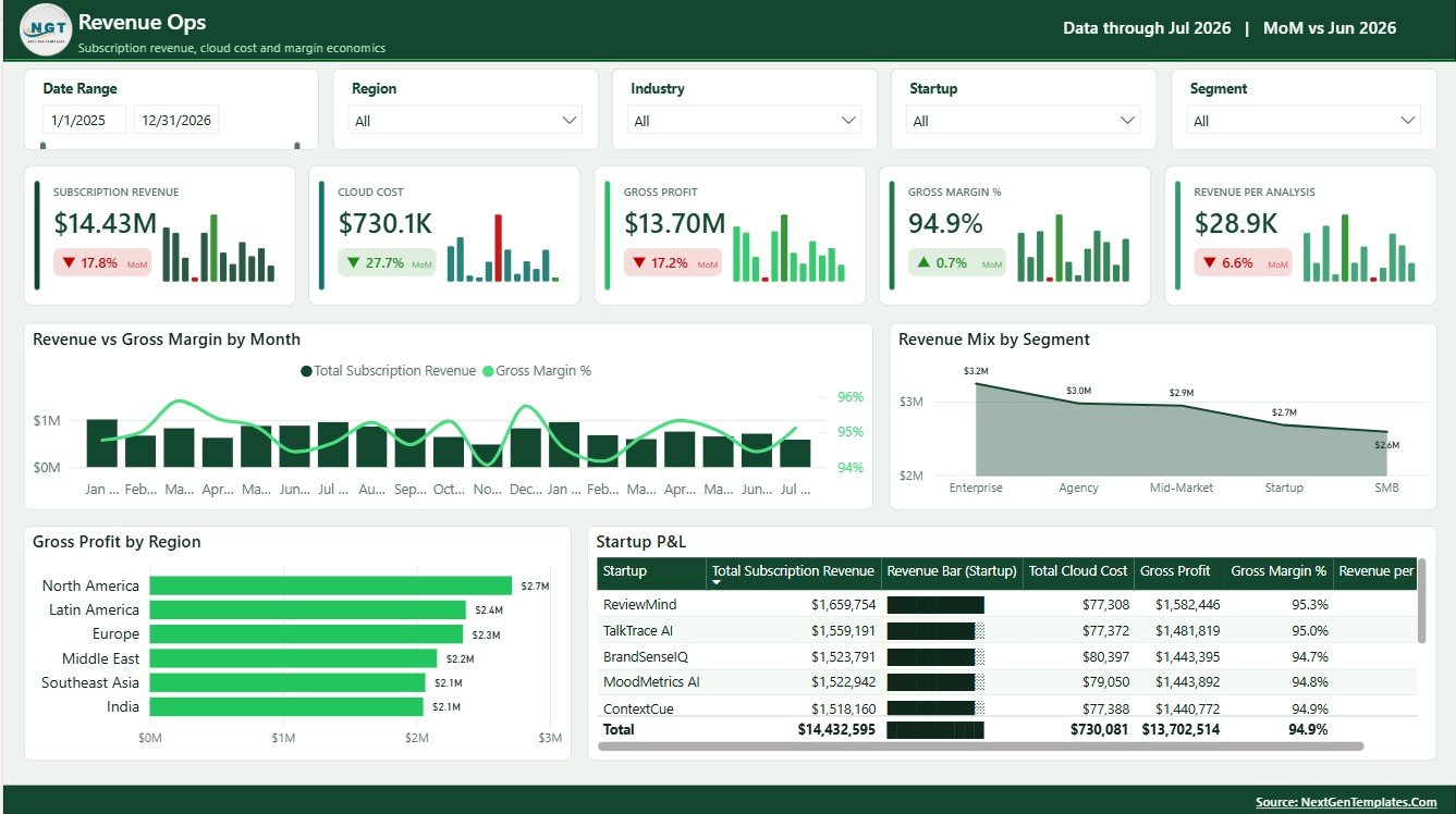
The Revenue Ops page is built for commercial and finance review. It connects subscription revenue, gross margin, regional profit, segment mix, and startup-level P and L into one view.
Revenue vs Gross Margin by Month: This chart compares revenue with margin over time. It helps teams spot months where higher usage, cloud cost, or delivery effort may be reducing profitability.
Revenue Mix by Segment: This chart shows how revenue is distributed by customer segment. It helps sales and leadership teams understand which buyer groups drive the business.
Gross Profit by Region: This visual compares gross profit across regions. It helps identify strong markets and areas where costs, pricing, or account health may need review.
Startup P and L: This table-style view summarizes account-level profit and loss. It helps founders and finance teams decide which customers deserve deeper attention.
3 – Sentiment Mix
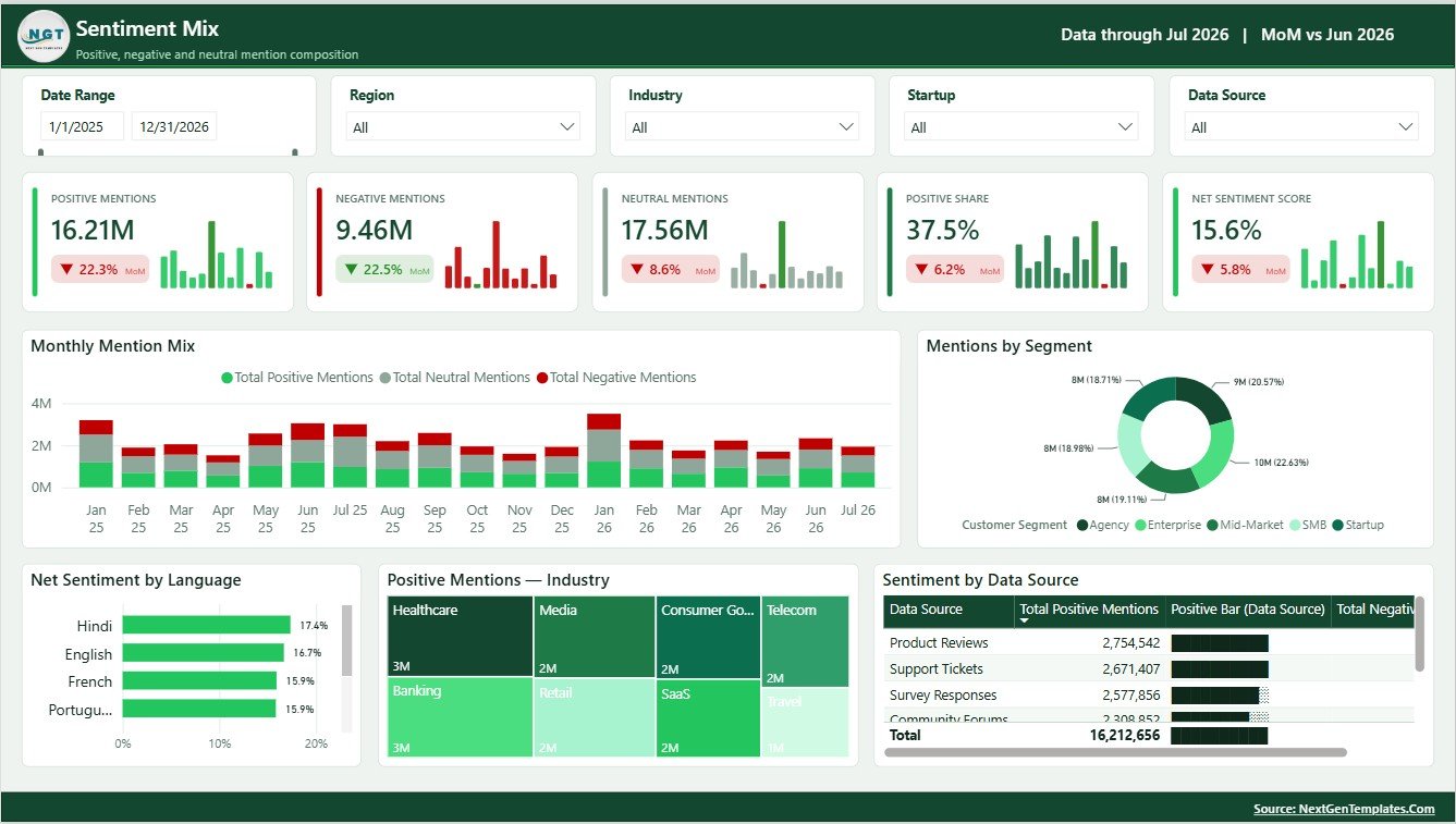
The Sentiment Mix page explains where mentions are coming from and how positive, neutral, and negative signals vary across months, languages, customer segments, industries, and sources.
Monthly Mention Mix by Month: This chart tracks mention composition across months. It helps product and success teams catch changes in positive, neutral, or negative feedback early.
Mentions by Segment: This visual shows conversation volume by customer segment. It helps teams prioritize the groups generating the strongest feedback signal.
Net Sentiment by Language: This chart compares sentiment by language. It is useful for teams managing multilingual models, support operations, or localization quality.
Positive Mentions by Industry: This visual highlights industries with stronger positive feedback. It can help marketing teams choose proof points and sales teams identify better-fit verticals.
Sentiment by Data Source: This chart compares sentiment across sources such as tickets, chats, reviews, surveys, or social channels. It helps teams understand where negative feedback is concentrated.
4 – Model Quality
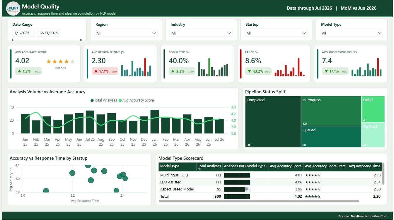
The Model Quality page is for teams that need to connect processing volume with accuracy, response time, model type, and pipeline status.
Analysis Volume vs Average Accuracy by Month: This chart compares workload and accuracy together. It helps analysts see whether higher processing volume is affecting model quality.
Pipeline Status Split by Pipeline Status: This visual shows how analyses are distributed by status. It helps managers find bottlenecks, failures, pending work, or review-heavy process stages.
Accuracy vs Response Time by Startup: This chart compares model quality and speed by account. It helps teams identify customers where model performance may be too slow or not accurate enough.
Model Type Scorecard: This scorecard compares performance across model types. It helps analytics teams decide whether routing, model selection, or tuning needs adjustment.
5 – Customer Risk
The Customer Risk page turns sentiment and account activity into a practical retention view. It is useful before renewal reviews, success planning, and leadership risk meetings.
Revenue at Risk vs Churn Rate by Month: This chart compares at-risk revenue with churn rate over time. It helps leaders understand whether customer risk is increasing in value, rate, or both.
Workload by Priority: This chart shows analysis or support workload by priority level. It helps operations teams make sure urgent work is receiving attention.
Churned Accounts by Industry: This visual shows churn concentration by industry. It helps teams identify verticals where onboarding, pricing, value delivery, or product fit may be weaker.
Segment Risk Register: This register summarizes risk by customer segment. It helps leaders convert churn signals into account follow-up and action plans.
Sentiment Analysis Startups Dashboard in Power BI vs. Tableau vs. Paid CRM/SaaS – Feature Comparison
| Feature | This Power BI dashboard | Tableau alternative | Paid CRM/SaaS alternative |
|---|---|---|---|
| Cost | One-time template purchase | License cost plus build time | Recurring subscription |
| Platform | Power BI Desktop and Power BI Service | Tableau Desktop or Tableau Cloud | Vendor-hosted app |
| Setup time | Replace sample data and refresh | Build workbook and calculations manually | Configure users, integrations, and workflows |
| Real-time team collaboration | Available through Power BI Service | Available through Tableau Cloud | Plan dependent |
| Customizable fields | Edit visuals, fields, measures, pages, and relationships | Editable with Tableau skills | Limited by vendor settings |
| Share with link | Yes, when published with proper permissions | Yes, when published with proper permissions | Usually login controlled |
| Year-1 cost at 5 users | Template cost plus Microsoft licensing if needed | Usually higher due to licenses | Often hundreds or thousands annually |
| Sentiment startup views | Revenue, sentiment, model quality, and churn risk included | Must be built | Depends on product and plan |
Who Should Use This Template
This template is a good fit for AI SaaS founders, NLP startups, social listening companies, customer feedback platforms, product analytics teams, BI freelancers, startup finance teams, and customer success managers who already have sentiment-related data and need a professional Power BI reporting layer.
It is not a sentiment analysis engine, text classifier, annotation platform, API connector, or live data warehouse. If you need automated NLP processing or secure production-grade integrations, use this dashboard after those systems have produced usable data.
Real-World Use Cases
Anika, AI startup founder: uses the Overview and Revenue Ops pages before investor updates to explain revenue, sentiment score, text volume, and customer risk in one story.
Rohan, customer success leader: reviews the Customer Risk page before renewal meetings to identify segments with high revenue at risk or churn patterns.
Maya, ML operations analyst: uses the Model Quality page to compare accuracy, response time, pipeline status, and model type before suggesting routing improvements.
Advantages of Sentiment Analysis Startups Dashboard in Power BI
- It gives startup teams a structured reporting model without starting from a blank Power BI file.
- It connects commercial, sentiment, model quality, and retention views in one report.
- It supports executive review and operational drill-down through separate pages.
- It can be customized by Power BI users who want to change visuals, measures, or fields.
- It is easier to explain to non-technical stakeholders than raw sentiment exports.
Opportunities for Improvement
Advanced teams may want to connect the .pbix file directly to a warehouse, API export, or production data model. You may also add row-level security, additional pages for account drill-through, benchmark measures by industry, or advanced DAX for cohort-level retention analysis. Those additions depend on your actual data structure and internal reporting process.
Best Practices
- Keep source column names consistent before refreshing the report.
- Validate sentiment scores before presenting trend changes to leadership.
- Review accuracy and response time together, not separately.
- Use slicers to compare segments, industries, and regions before making customer decisions.
- Publish through Power BI Service only after reviewing workspace permissions.
- Use Microsoft Learn’s Power BI Desktop getting started guide if you are new to opening and editing .pbix files.
Explore Relevant Templates
You can download the Sentiment Analysis Startups Dashboard in Power BI from NextGenTemplates. You may also review the sibling Sentiment Analysis Startups Dashboard in Excel if your team prefers Excel, plus more Power BI dashboard templates.
Frequently Asked Questions
What is included in the dashboard?
The dashboard includes 5 Power BI pages: Overview, Revenue Ops, Sentiment Mix, Model Quality, and Customer Risk. It also includes KPI cards, slicers, and visuals for revenue, margin, sentiment, model accuracy, response time, pipeline status, churn, and risk.
Do I need Power BI Desktop?
Yes. You need Power BI Desktop to open and edit the .pbix file. You can then publish it to Power BI Service if your organization uses Microsoft sharing.
Does the dashboard perform sentiment analysis?
No. It is a reporting dashboard, not an NLP model. Use it after your sentiment scores, mention counts, revenue data, and customer records are available.
Can I customize the dashboard?
Yes. Power BI users can edit pages, visuals, fields, filters, measures, colors, and relationships.
Can this work for customer feedback data?
Yes. It can work for feedback, review, survey, social listening, support ticket, or chat sentiment data if your source columns are mapped into the report model.
Is it suitable for internal reporting?
Yes. It is designed for internal reporting, founder updates, customer success reviews, model quality reviews, and revenue operations analysis.
About the Author
Built by PK – Microsoft Certified Professional with 15+ years of Excel, Google Sheets, and Power BI experience. Founder of NextGenTemplates, reaching 300K+ subscribers across YouTube channels. Every template is hand-built and tested before release.
Conclusion
The Sentiment Analysis Startups Dashboard in Power BI gives AI and customer intelligence teams a clean way to monitor revenue, sentiment, model quality, and churn risk without building every report page from scratch. Download the template, replace the sample data, refresh the model, and use the slicers to answer the questions that matter most to founders, analysts, customer success teams, and revenue leaders.
For more tutorials, visit PK: An Excel Expert on YouTube.